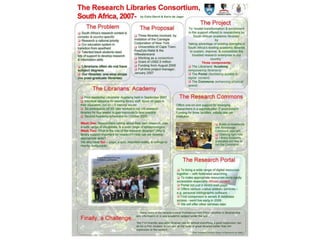
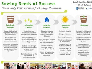
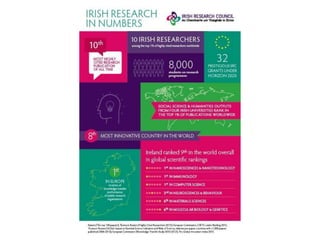
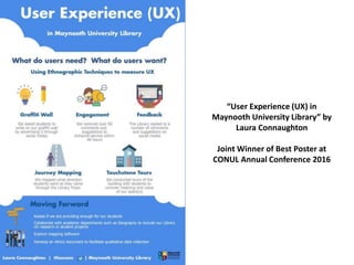
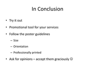
Posters that get noticed…
...a how to guide
Why design a
poster for a
conference?
Hands up
who
ENJOYS
public
speaking?
https://leadershipfreak.wordpress.com/2011/05/27/public-speaking-tips-from-the-ceo-of-deloitte/
Still not convinced?
• Public speaking nervousness – allows you to engage on
a one-to-one basis
• Allows you to personally interact with people who are
interested in your topic
• Visible and accessible e.g. Slideshare, Twitter
• Reach more people
• Can be viewed any time at a conference
Show
your
creative
side
https://www.flickr.com/photos/lisa_g_pics/362781834/in/photolist-y4mpd-a
Everything starts with an idea...
Project New Service Innovative
Workflow
Look at the
conference
themes for
inspiration
Emerging
Roles & Skill
Set
Collaboration
Poster Submissions
LAI/CILIP 2019
• Library design for all
• Inclusive digital library services
• Developing Library services and space
for all (e.g. students/users with a
disability, international students,
users from different socio-economic
and cultural backgrounds)
• Outreach activities in Libraries (e.g.
mobile libraries, working with schools
and communities)
• Research or studies exploring
inclusiveness in Libraries
• Open Access, Open Science, Open
Research and Open Data
• The role of Libraries in society
Academic and Special Libraries 2019
• Space as experienced by
users/customers/patrons – how does
space enhance or suppress emotions,
creativity, learning?
• Space for those who work in a
cultural/information environment on a
daily basis – how does space affect their
work?
• How do the ideas, concepts and thoughts
of architects, designers and planners
impact on space and its use – for better or
worse?
• How do we ascertain and incorporate the
needs of our known (and unknown) users
and employees?
• Space as a state of mind – how does the
physical and virtual environment we work
and live in enhance our wellbeing
Where to start?
• Browse online for inspiration
• Draft, draft and draft again
• Content, words, flow, clarity, font size and
type, spelling, layout, illustrative material,
photographs
• Follow the guidelines
• Quick impact and attract immediate interest
The Design Process
• Formulate and
articulate your idea
• Know your target
audience
• What do you want to
achieve with the
poster?
• Be brave!
What do I want to say?
• Rough draft of what you
want to say
• What is your idea?
Point? Process?
• Back to paper if you
prefer
• Sketch or brainstorm
your idea
Content and Words
• Your message
• First time viewers
• Be concise
• Title
• Ability to stand alone
• Use a logical pathway
• Not too much text
• Tell a story
• Author, affiliations and
contact details
Layout and Colour
• Try to create a ‘visual
sequence’
• No need to fill every
inch – white space is
good
• Two/three main colours
• Be consistent e.g. Use
one colour for all
headings
Typeface
1. This is a big one. You have to develop a
hierarchy in your design’s typography. Use a
hierarchy that makes sense. The headline should
always be the biggest, boldest text. The sub-
headline should be differentiated somehow. It
doesn’t have to be bold, but it should be larger
than the other headline sections, if you have
different body paragraphs. The body copy
should be smaller, while still being legible. Any
footnotes should be the smallest and placed at
the bottom of the page, below the text. Also
any asides should be made to stand out
differently as well. You could use a different
colour, or you could italicize the text
2. This is a big one. You have to develop a hierarchy in your design’s typography.
Use a hierarchy that makes sense. The headline should always be the biggest,
Typeface
• Use one typeface, max. two – will distract
otherwise
• Be consistent
• Use ample spacing between lines
• Keep in mind spacing between subject areas
• Be concise – keep sentence length short
• Use ‘special effects’ sparingly e.g. Italic, bold
• Avoid acronyms
Illustrative Material
• Photographs
• Charts and Graphs
• Quotes
• Icons
• Good resolution
• Logos
• Reference any images
you use
Feedback
• Look for an honest
opinion
• Listen to the
constructive feedback
• Try out the suggested
changes...
• ...or get a second
opinion
What makes a good poster?
• Interesting and well thought out content
• Flow and clarity
• Easy to read typeface and size
• Correct spelling and nice layout
• Use of illustrative material to catch the eye
Some Examples
The Impact of
Colour & Layout
Some winning
examples...
“Making the Modern Academic
Librarian”
Claire Sewell
Office of Scholarly
Communication
University of Cambridge
“Stages of the Self-Guided Library
Tours Project”
University of Derby Library
“Support Academic Research by
Improving Interlibrary Loan
Services”
Colleen Tierney, Queen’s
University Library
“User Experience (UX) in
Maynooth University Library” by
Laura Connaughton
Joint Winner of Best Poster at
CONUL Annual Conference 2016
“The Liam O’Leary
Archive: Ireland’s
Film on Paper” by
Joanne Carroll
Joint Winner of Best
Poster at CONUL
Annual Conference
2016
Picture Perfect Presentations
by Niamh O’Sullivan (IBTS)
Winner of Best Poster A & SL 2016
In Conclusion
• Try it out
• Promotional tool for your services
• Follow the poster guidelines
– Size
– Orientation
– Professionally printed
• Ask for opinions – accept them graciously 
Useful Sources
• LAI CDG Blog
https://laicdg.wordpress.com/2015/03/24/designing-an-academic-poster/
• Scientific Poster Tutorials
http://www.makesigns.com/tutorials/poster-design-layout.aspx
• Graphic Design Tips
http://graphicdesign.stackexchange.com/
• Designing conference posters
http://colinpurrington.com/tips/poster-design
• Example of poor poster design
http://colinpurrington.com/2012/example-of-bad-scientific-poster/
Guidelines and Tips
Poster Design: Guidelines & Tips by Helen Fallon and Brian Dempsey
http://eprints.maynoothuniversity.ie/4625/1/HF_poster_guidelines.pdf
LAI Career Development Blog – Designing an Academic Poster
https://laicdg.wordpress.com/2015/03/24/designing-an-academic-poster
Designing Conference Posters
http://colinpurrington.com/2012/example-of-bad-scientific-poster/
Free Software for Poster Design
• Piktochart – Infographic Creator
http://piktochart.com/
• Poster My Wall
http://postermywall.com
• Canva
http://canva.com
• Nerdgraph Infographics
http://www.nerdgraph.com/
• Visual.ly
http://visual.ly/
• Infogram
https://infogr.am/
MS Powerpoint
Free Images
• https://medium.com/@dustin/stock-photos-
that-dont-suck-62ae4bcbe01b#.5zk92cz3w
• www.pixabay.com
• Google Images
• Remember to reference all images you use!
Thank You
Laura.Connaughton@nuim.ie / 01 708 3429
@lozconn
References
• https://laicdg.wordpress.com/2015/03/24/designing-an-academic-poster/
• http://eprints.maynoothuniversity.ie/
• http://education.byu.edu/identity/academic_posters.html
• http://colinpurrington.com/2012/example-of-bad-scientific-poster/
• CONUL Conference Posters on Slideshare: http://www.slideshare.net/conulconference
• Connaughton, Laura and Payne, Val (2015) The Summon Discovery Tool: Its Implementation and
Impact on Usage Statistics in Maynooth University. In: CONUL Annual Conference, 3rd/ 4th June,
2015, Radisson Blu Hotel, Athlone, Co. Westmeath. (Unpublished)
• Cullen, Christine (2015) Self-Service in UCD Library. In: CONUL Annual Conference, 3rd/ 4th June,
2015, Radisson Blu Hotel, Athlone, Co. Westmeath. (Unpublished)
Reference for Images Used
• Backhanded Compliment
http://www.chicagonow.com/lipstick-lollipops/files/2014/06/backhanded-compliment.png
• Standing out from the crowd (slide 1, tulips)
http://www.beautybyyourdesign.com/uncategorized/stand-out-from-the-crowd-three-key-steps
• Lightbulb, slide 2 (Fer Gregory)
https://www.flickr.com/photos/freg/4898274127/sizes/l
• The Design Process, slide 5
http://darmano.typepad.com/logic_emotion/2007/03/designers_are_t.html
• What to show picture (Austin Kelon)
https://medium.com/show-your-work/10-ways-to-share-your-creativity-and-get-discovered-7fb5fdfbc068
• Toast (Brittany Wright)
http://wrightkitchen.com/
• Good Typography, slide 8
http://www.creativebeacon.com/good-typography-essential-guide/
• Apples in order (Brittany Wright)
http://wrightkitchen.com/y2nw75k59pu5xp0rms8tuc6vjdsu90
• Good, Bad Scale
http://marketingtobridesonline.com/what-do-i-think-of-your-website-2-2/360-good-bad-scale/
• Poster Presentation PGCD WPP
http://www.glogster.com/nmp2012/wwp-academic-poster/g-6ljcd66c8dpumm1k4nkc1a0
• Professional Template
http://www.slideserve.com/nevan/professional-template-for-a-48x36-poster-presentation
Danger don’t spread disease
https://www.pinterest.com/pin/366339750921959061/
Please keep the library tidy
http://paperzip.co.uk/classroom/banners-posters/keep-the-library-tidy

Posters that get noticed: A how to guide by Laura Connaughton

  • 1.
    Posters that getnoticed… ...a how to guide
  • 2.
    Why design a posterfor a conference?
  • 3.
  • 4.
    Still not convinced? •Public speaking nervousness – allows you to engage on a one-to-one basis • Allows you to personally interact with people who are interested in your topic • Visible and accessible e.g. Slideshare, Twitter • Reach more people • Can be viewed any time at a conference
  • 5.
  • 6.
    Everything starts withan idea... Project New Service Innovative Workflow Look at the conference themes for inspiration Emerging Roles & Skill Set Collaboration
  • 7.
    Poster Submissions LAI/CILIP 2019 •Library design for all • Inclusive digital library services • Developing Library services and space for all (e.g. students/users with a disability, international students, users from different socio-economic and cultural backgrounds) • Outreach activities in Libraries (e.g. mobile libraries, working with schools and communities) • Research or studies exploring inclusiveness in Libraries • Open Access, Open Science, Open Research and Open Data • The role of Libraries in society Academic and Special Libraries 2019 • Space as experienced by users/customers/patrons – how does space enhance or suppress emotions, creativity, learning? • Space for those who work in a cultural/information environment on a daily basis – how does space affect their work? • How do the ideas, concepts and thoughts of architects, designers and planners impact on space and its use – for better or worse? • How do we ascertain and incorporate the needs of our known (and unknown) users and employees? • Space as a state of mind – how does the physical and virtual environment we work and live in enhance our wellbeing
  • 8.
    Where to start? •Browse online for inspiration • Draft, draft and draft again • Content, words, flow, clarity, font size and type, spelling, layout, illustrative material, photographs • Follow the guidelines • Quick impact and attract immediate interest
  • 9.
    The Design Process •Formulate and articulate your idea • Know your target audience • What do you want to achieve with the poster? • Be brave!
  • 10.
    What do Iwant to say? • Rough draft of what you want to say • What is your idea? Point? Process? • Back to paper if you prefer • Sketch or brainstorm your idea
  • 11.
    Content and Words •Your message • First time viewers • Be concise • Title • Ability to stand alone • Use a logical pathway • Not too much text • Tell a story • Author, affiliations and contact details
  • 12.
    Layout and Colour •Try to create a ‘visual sequence’ • No need to fill every inch – white space is good • Two/three main colours • Be consistent e.g. Use one colour for all headings
  • 13.
    Typeface 1. This isa big one. You have to develop a hierarchy in your design’s typography. Use a hierarchy that makes sense. The headline should always be the biggest, boldest text. The sub- headline should be differentiated somehow. It doesn’t have to be bold, but it should be larger than the other headline sections, if you have different body paragraphs. The body copy should be smaller, while still being legible. Any footnotes should be the smallest and placed at the bottom of the page, below the text. Also any asides should be made to stand out differently as well. You could use a different colour, or you could italicize the text 2. This is a big one. You have to develop a hierarchy in your design’s typography. Use a hierarchy that makes sense. The headline should always be the biggest,
  • 14.
    Typeface • Use onetypeface, max. two – will distract otherwise • Be consistent • Use ample spacing between lines • Keep in mind spacing between subject areas • Be concise – keep sentence length short • Use ‘special effects’ sparingly e.g. Italic, bold • Avoid acronyms
  • 15.
    Illustrative Material • Photographs •Charts and Graphs • Quotes • Icons • Good resolution • Logos • Reference any images you use
  • 16.
    Feedback • Look foran honest opinion • Listen to the constructive feedback • Try out the suggested changes... • ...or get a second opinion
  • 17.
    What makes agood poster? • Interesting and well thought out content • Flow and clarity • Easy to read typeface and size • Correct spelling and nice layout • Use of illustrative material to catch the eye
  • 18.
  • 20.
    The Impact of Colour& Layout Some winning examples...
  • 25.
    “Making the ModernAcademic Librarian” Claire Sewell Office of Scholarly Communication University of Cambridge
  • 26.
    “Stages of theSelf-Guided Library Tours Project” University of Derby Library
  • 27.
    “Support Academic Researchby Improving Interlibrary Loan Services” Colleen Tierney, Queen’s University Library
  • 28.
    “User Experience (UX)in Maynooth University Library” by Laura Connaughton Joint Winner of Best Poster at CONUL Annual Conference 2016
  • 29.
    “The Liam O’Leary Archive:Ireland’s Film on Paper” by Joanne Carroll Joint Winner of Best Poster at CONUL Annual Conference 2016
  • 30.
    Picture Perfect Presentations byNiamh O’Sullivan (IBTS) Winner of Best Poster A & SL 2016
  • 31.
    In Conclusion • Tryit out • Promotional tool for your services • Follow the poster guidelines – Size – Orientation – Professionally printed • Ask for opinions – accept them graciously 
  • 33.
    Useful Sources • LAICDG Blog https://laicdg.wordpress.com/2015/03/24/designing-an-academic-poster/ • Scientific Poster Tutorials http://www.makesigns.com/tutorials/poster-design-layout.aspx • Graphic Design Tips http://graphicdesign.stackexchange.com/ • Designing conference posters http://colinpurrington.com/tips/poster-design • Example of poor poster design http://colinpurrington.com/2012/example-of-bad-scientific-poster/
  • 34.
    Guidelines and Tips PosterDesign: Guidelines & Tips by Helen Fallon and Brian Dempsey http://eprints.maynoothuniversity.ie/4625/1/HF_poster_guidelines.pdf LAI Career Development Blog – Designing an Academic Poster https://laicdg.wordpress.com/2015/03/24/designing-an-academic-poster Designing Conference Posters http://colinpurrington.com/2012/example-of-bad-scientific-poster/
  • 35.
    Free Software forPoster Design • Piktochart – Infographic Creator http://piktochart.com/ • Poster My Wall http://postermywall.com • Canva http://canva.com • Nerdgraph Infographics http://www.nerdgraph.com/ • Visual.ly http://visual.ly/ • Infogram https://infogr.am/ MS Powerpoint
  • 36.
    Free Images • https://medium.com/@dustin/stock-photos- that-dont-suck-62ae4bcbe01b#.5zk92cz3w •www.pixabay.com • Google Images • Remember to reference all images you use!
  • 37.
  • 38.
    References • https://laicdg.wordpress.com/2015/03/24/designing-an-academic-poster/ • http://eprints.maynoothuniversity.ie/ •http://education.byu.edu/identity/academic_posters.html • http://colinpurrington.com/2012/example-of-bad-scientific-poster/ • CONUL Conference Posters on Slideshare: http://www.slideshare.net/conulconference • Connaughton, Laura and Payne, Val (2015) The Summon Discovery Tool: Its Implementation and Impact on Usage Statistics in Maynooth University. In: CONUL Annual Conference, 3rd/ 4th June, 2015, Radisson Blu Hotel, Athlone, Co. Westmeath. (Unpublished) • Cullen, Christine (2015) Self-Service in UCD Library. In: CONUL Annual Conference, 3rd/ 4th June, 2015, Radisson Blu Hotel, Athlone, Co. Westmeath. (Unpublished)
  • 39.
    Reference for ImagesUsed • Backhanded Compliment http://www.chicagonow.com/lipstick-lollipops/files/2014/06/backhanded-compliment.png • Standing out from the crowd (slide 1, tulips) http://www.beautybyyourdesign.com/uncategorized/stand-out-from-the-crowd-three-key-steps • Lightbulb, slide 2 (Fer Gregory) https://www.flickr.com/photos/freg/4898274127/sizes/l • The Design Process, slide 5 http://darmano.typepad.com/logic_emotion/2007/03/designers_are_t.html • What to show picture (Austin Kelon) https://medium.com/show-your-work/10-ways-to-share-your-creativity-and-get-discovered-7fb5fdfbc068 • Toast (Brittany Wright) http://wrightkitchen.com/ • Good Typography, slide 8 http://www.creativebeacon.com/good-typography-essential-guide/ • Apples in order (Brittany Wright) http://wrightkitchen.com/y2nw75k59pu5xp0rms8tuc6vjdsu90 • Good, Bad Scale http://marketingtobridesonline.com/what-do-i-think-of-your-website-2-2/360-good-bad-scale/ • Poster Presentation PGCD WPP http://www.glogster.com/nmp2012/wwp-academic-poster/g-6ljcd66c8dpumm1k4nkc1a0 • Professional Template http://www.slideserve.com/nevan/professional-template-for-a-48x36-poster-presentation Danger don’t spread disease https://www.pinterest.com/pin/366339750921959061/ Please keep the library tidy http://paperzip.co.uk/classroom/banners-posters/keep-the-library-tidy

Editor's Notes

  • #4 Allows you to engage on a one-to-one basis Posters allow you to reach more people Can be viewed at any time during a conference – clashes in workshops
  • #6 Allows you to personally interact with people who are interested in your topic Visible and accessible e.g. Slideshare, Twitter etc.