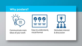
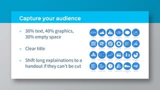
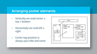
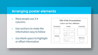
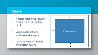
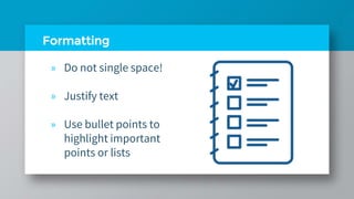
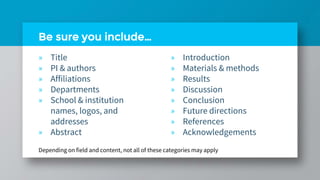
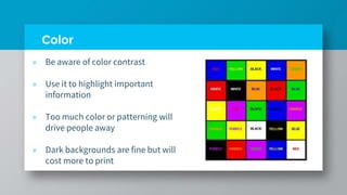
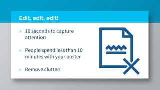
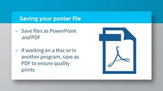
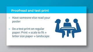
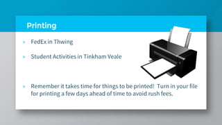
The document provides guidance on designing effective academic posters, including recommendations for layout, formatting, and inclusion of key elements such as the title, authors, sections, and visual elements. It discusses best practices for font size, style, and color usage, as well as tips for balancing text and graphics to engage audiences. The document also covers software, editing, printing, and presenting considerations to help researchers create high-quality posters that clearly communicate their work.
The document provides tips for creating effective PowerPoint presentations that clearly convey key points and information to an audience. It covers best practices for slide structure, fonts, color, backgrounds, clip art, graphs, spelling and grammar. For slide structure, it recommends using 1-2 slides per minute, writing in point form with 4-5 points per slide, and showing one point at a time. For fonts, it suggests using a minimum 24-point size in a standard font. Backgrounds should be attractive but simple and consistent. Clip art should enhance the presentation without being distracting. Graphs are best for conveying data trends but should have clear titles and formatting. Proofreading is important to catch errors. The conclusion should summarize main
This document provides guidance on effective PowerPoint presentations. It discusses advantages like employing visual aids and incorporating different media. Disadvantages include presentations dominating over speaker ideas. Proper planning is important, including understanding why, how, when to use PowerPoint. Formatting tips include using limited colors, readable text sizes, and simple graphs. Speakers should enhance but not replace their ideas. Effective listeners focus on messages over styles.
This document provides guidelines for designing effective academic posters using PowerPoint. It discusses determining the appropriate size and orientation based on paper sizes like A0, A1, etc. It recommends including the title, author, headings and body text in large, easily readable fonts. Graphics and images should use file types like PNG instead of JPEG for quality. Text should be left-aligned for readability. Effective use of color, contrast, white space and layout are also covered to create a poster that clearly conveys key information to viewers in a short time. Examples of good and bad design aspects are presented.
Workshop: Designing Effective Poster Presentations Jolene W
This document provides guidance on designing effective poster presentations. It discusses why poster sessions are conducted, including to summarize work, gain exposure and feedback. Key aspects of poster design are covered, such as using all the available space, limiting text, and telling a clear story. Design tools like PowerPoint, InDesign and Canva are recommended. Free image and design resources are listed. Poster printing services through the Russell Library are described, including size limits and pricing. Examples of well-designed academic posters are referenced. Presentation tips are offered, such as being prepared to discuss the work and asking questions of other presenters.
How to create effective powerpoint presentationSteve Johnson
The document provides tips for creating an effective PowerPoint presentation, recommending that the presentation have a simple design with easily readable fonts and font sizes, coordinated text and background colors, concise bullet points instead of lengthy explanations, images only where necessary, and minimal animations or sound effects that could distract from the content. Overall, the presentation should be clear, explanatory, and focus on the key points without unnecessary additions that make it complex or confusing.
The document provides tips for creating an effective PowerPoint presentation with consistent fonts, colors, and backgrounds throughout slides. It recommends using relevant graphics and WordArt to emphasize points but avoiding overuse of animations and sounds which can be distracting. The key is to stick to one idea per slide and keep the audience on task.
This document provides guidelines for creating effective PowerPoint presentations with tips on fonts, text, graphics, and design. The key recommendations include using no more than two fonts, keeping font sizes 32 point or larger, limiting the number of words and bullets per slide, choosing simple backgrounds, and focusing on the content rather than flashy designs. Overall, the guidelines emphasize keeping presentations clear, concise and focused on conveying the central message through the content.
How to Make a Good Presentation (academical) -Professorillama ep1David Christianto
The document provides tips for making an effective presentation. It discusses including an agenda to structure the presentation, keeping the cover slide simple with the title and presenter's name, using illustrations to emphasize key concepts, and tailoring the introduction to the target audience by including background, aims, benefits and limitations for academic presentations or background and facts for assignments. Examples of introduction, methods and conclusion slides are also provided. The document emphasizes preparing well and using high quality slides to improve presentation skills and reduce nervousness.
This document provides tips for creating effective PowerPoint slides and avoiding common pitfalls. It discusses best practices for slide structure, fonts, color, backgrounds, graphs, spelling and grammar. Key recommendations include using point form, limiting text per slide, large readable fonts, high contrast between text and background, simple consistent designs, properly labeled graphs, and proofreading. The document demonstrates good slide design principles and identifies examples of ineffective slide features to avoid.
This is a workshop on presentation skills that I have designed and delivered to partner schools as part of Business in the Community's Skills@Work programme.
This workshop introduces students to the area of presentations, with a particular focus on:
- why presentations are so important to our careers and professional lives,
- the principles of planning, preparing and writing a great presentation,
- Learning how to conquer any nerves you might have about speaking in public,
- the basics of creating a new presentation in Microsoft Powerpoint
- The document provides tips for creating effective PowerPoint slides, including using outlines, proper slide structure, fonts, colors, backgrounds, graphs, and spelling and grammar.
- Key recommendations include using 18pt font or larger, point form with 4-5 points per slide, consistent backgrounds, clearly labeled graphs, and proofreading for errors.
- The document cautions against overly long text, small or decorative fonts, distracting colors or backgrounds, and improperly formatted or unlabeled graphs.
1) O documento discute conceitos fundamentais de diagramação para criação de peças gráficas impressas como formatos, grid, mancha gráfica e zonas de visualização.
2) Apresenta principais formatos de diagramação de revistas como 3, 4 ou 5 colunas e diagramação livre.
3) Discorre sobre elementos estruturais de revistas como capa, sumário, editorial e expediente.
The document provides guidelines for effective PowerPoint presentations, including:
- Use dark text on light backgrounds for paper and light text on dark backgrounds for projections.
- Stick to a single background and don't overuse graphics or styles to draw attention away from the information.
- Left justify and balance bullets, graphics, and text for readability. Employ consistent font sizes and stick to familiar fonts.
- Avoid overwhelming slides with too much text and keep content concise and easy to understand for audiences.
The document provides tips for creating effective PowerPoint presentations with 3 main points:
1. Keep presentations simple with easy to read bullet points, concise language, and large font sizes. The presenter should provide elaboration rather than overloading slides with text.
2. Use formatting techniques like varying font sizes and styles, as well as colors and graphics sparingly to draw attention to important points and emphasize key messages.
3. Follow design principles such as using consistent backgrounds, grouping related items visually, and limiting text to avoid overwhelming the audience. Slides should guide the presenter and enhance the presentation rather than serving as a script.
The document provides guidelines for creating good PowerPoint presentations, recommending that slides contain key concepts and not too much information to avoid confusion. It suggests using appropriate fonts, high-quality images to engage the audience, and colors suited to the audience and context. Slides should complement but not replace a full document by concisely conveying essential information.
The document provides dos and don'ts for creating effective PowerPoint presentations. It recommends organizing thoughts before creating slides, using outlines to structure content, and proofreading text. For design, it suggests using minimal text per slide, consistent formatting, and high-contrast colors. Graphics and images should complement the content without distracting. The presentation should be practiced to ensure readability and remove unnecessary elements before presenting.
This document provides tips and guidelines for creating effective presentations. It discusses font choices, sizes, and decorations to ensure readability. Main points include using clear, uniform fonts between 36-44 for headings and 28-32 for main text. Color and italics/bold can be used to emphasize text. The document also recommends having a concise story or message, using visuals over walls of text, practicing extensively, and following design principles for contrast and readability. Presenters should consolidate opinions, review content, use relevant graphics with minimal text, and allow for adjustments based on practice sessions.
Creating an effective power point presentationMslms
This document provides tips for creating an effective PowerPoint presentation. It recommends choosing a topic you are familiar with, organizing the presentation in a consistent manner, practicing delivery, using images to engage the audience, providing clear transitions between slides, starting with an introduction and ending with a question and answer section. It also offers guidance on font choice, use of color, and maintaining good body language during the presentation.
Basic Guidelines For PowerPoint PresentationNikki Dapanas
This document provides guidelines for creating effective PowerPoint presentations with 3 or fewer bullet points per slide, use of clear fonts and colors, inclusion of informative graphs, and balance of text and graphics. Key recommendations include using an outline slide to structure the presentation, writing in point form rather than sentences, employing consistent backgrounds and fonts, proofreading for errors, and closing with a summary and question slide.
This document discusses the importance of dealing successfully with people. It argues that 90% of people fail in life due to an inability to deal with people. Influencing people is described as an art rather than a gimmick. Several key points are made about human egos and how to satisfy others' egos in order to have smoother relationships and make others feel important. Feeding others' egos through praise, recognition and appreciation is recommended as the quickest way to improve dealings with people.
Irrespective of background (be it business, career, academics or any field that requires one to convey/sell ideas, to make a pitch and in general to communicate to a group with people), this is a preparatory (beginner level) material on ever-essential presentation skills.
The document provides guidance on writing an effective essay plan in 3 steps: 1) Create a list of ideas and relevant historical facts. 2) Refine the list into paragraphs that will structure the essay. 3) Draw boxes for each paragraph and fill them with the main idea and 2-3 supporting facts for each. Planning helps write more logically, coherently, and faster. Examples are given for each step to illustrate how to plan an essay on economic development in the USSR under Stalin.
This document discusses technical writing and compares it to other types of writing. It defines technical writing as writing that transfers information about a topic to audiences with varying levels of knowledge to ensure clear understanding. The document notes technical writing is practical, has defined audiences and purposes, and uses effective language. It also provides qualities needed for technical writers, such as writing skills, training, language abilities, teaching skills, and professionalism. Finally, it discusses how jargon is formed through new words, borrowing terms, and appropriating common language.
The document discusses effective note-making strategies. It defines note-making as an active process of reading, questioning, evaluating, summarizing and paraphrasing information from written sources and lectures. The key reasons for note-making are to organize information for revision, act as memory hooks for retention, and aid in understanding complex ideas. Effective note-making involves surveying materials in advance, posing questions, actively listening and writing down key points and summaries in your own words during lectures and readings. Notes should be reviewed shortly after to reinforce learning and address any gaps.
Presentation on Poster Design, January 2014, MITDUSP
January 15, 2014
duspviz@mit.edu
Presenter: Michael Foster (@mjfoster83)
Contributors to this presentation and content include Michael Foster (@mjfoster83), Chris Rhie (@chris_rhie), and Annemarie Gray (@annemariegray).
Seven Habits of Highly Effective Designers - IAP 2014DUSPviz
Presentation and workshop on Design Fundamentals and Poster Creation, January 2014, MIT DUSP - special focus on event poster creation.
January 15, 2014
duspviz@mit.edu
Presenter: Michael Foster (@mjfoster83)
Presentation is licensed under a CC-BY-SA 3.0 license: http://creativecommons.org/licenses/by-sa/3.0/. Significant contributors to this work include Michael Foster (@mjfoster83), Chris Rhie (@chris_rhie), and Annemarie Gray (@annemariegray).
The document provides guidance on designing an effective scientific poster, including recommended components such as an introduction, objectives, discussion, and conclusions. It discusses layout, design, and formatting tips, such as using bullets and images to break up text, using large readable fonts, and consistent colors. The document also outlines poster requirements and deadlines for a class project involving creating and presenting a scientific poster.
A poster presentation is something that helps you advertise any project you want to. It combines text and graphics to present the project in a different way. It is visually interesting and accessible. A poster presentation allows you to display your work to a large group of scholars, so you can talk about it and receive feedback from all interested viewers.
Rule 1: Define the Purpose of your Poster Presentation
Rule 2: Sell your work in a short time
Rule 3: The title of your Poster Presentation is important
Rule 4: Poster acceptance means nothing
Rule 5: Many of the rules for writing a good poster apply to posters, too
Rule 6: Good poster have unique features not pertinent to papers
Rule 7: Layout and formal are critical
Rule 8: Content is important, but keep it concise
Rule 9: Posters should have your personality
Rule 10: The impact of a poster presentation happens both during and after the poster session
Read this article for details: https://www.postersessiononline.com/poster-presentation/
This presentation covers some basics of good poster design, examples/critique of sample posters, and some tips for the oral component of the poster session.
This document provides guidance on creating an effective academic poster. It recommends including the title, author(s) contact details, introduction, methods, results, conclusions, and references. For layout, it suggests using headings in 50-60 pt font, body text in 24 pt font, and line spacing of 1.0. Photos should be at least 150 dpi for print. Charts and tables should be kept simple with enlarged text and thickened lines. The poster should have a limited color scheme, be proofread thoroughly, and explained to audiences to promote discussion of the research.
This document provides guidance on creating effective research posters. It discusses assessing the target audience and goals, developing concise content that guides viewers through the research, and using visual design principles like graphics, whitespace and formatting to make the poster engaging and easy to understand. Tips are provided for organizing information logically, crafting an attention-grabbing title and takeaway message, and confidently discussing the poster with viewers. Creating posters in PowerPoint or downloading templates is recommended.
This document provides guidance on creating effective research posters. It discusses assessing the target audience and goals, developing concise content that focuses on the key message, and using visual design principles like formatting, graphics, and color to make the poster easy to read and engaging. The document also offers tips on organizing information logically, incorporating visual aids to supplement the text, and how to discuss the poster confidently with audiences.
This document provides guidance for creating a research poster. It discusses assessing the target audience and goals, developing engaging content in a logical flow, using visual aids and design principles for readability, and how to discuss the poster. Key recommendations include selecting a clear title and takeaway message, using graphics and white space, considering fonts sizes and colors, and being prepared to engage viewers about the research. The overall goal is to concisely communicate the purpose and findings of the research project through an eye-catching visual display.
This document provides guidance on creating research posters. It discusses assessing the target audience and goals, developing concise content that follows a logical flow, and designing the poster for readability with visual aids and white space. Tips are provided for organizing information efficiently in PowerPoint or other software and for discussing the poster confidently. Creating an engaging summary, using graphics appropriately, and getting feedback are emphasized for effective research poster creation.
1. A scientific poster should communicate research findings visually and concisely. It should highlight key findings and attract viewers from a distance.
2. Effective posters use a clear layout with sections arranged from top left to bottom right. Text should be brief and graphics should support the message. Less than 30% of the poster should be text.
3. Important elements include the title, author names, introduction/abstract, objectives, methods, results, conclusions, and references. Font sizes should be large enough to read from 3 feet away.
This document provides guidance on creating effective research posters. It discusses assessing the goal and audience for the poster, developing the content, organizing the material, and designing the visual elements. Key recommendations include using a logical visual flow, crafting a clear takeaway message, employing visuals like images and graphs, using large readable text sizes and fonts, incorporating white space and symmetry, and proofreading before printing and displaying the poster. The overall aim is to inform and engage the audience in a casual yet informative manner.
The Science of Visual Design: Creating Strong Graphics for IDJames Washok
As an instructional designer with a background in graphic design, I see a lot of poorly created materials due to the lack of an understanding of the of the SCIENCE behind visuals.
This document discusses visual design basics and principles. It defines visual design as focusing on aesthetics through strategic use of colors, fonts, images and other elements. It provides examples of good and bad design, highlighting important design considerations like color palette, typography, media use, hierarchy, white space and layout. Gestalt principles of perception and using design to enhance engagement are also covered. The document aims to educate on scientific and user-centered approaches to visual design.
The document provides guidance on desktop publishing and design best practices. It discusses pre-planning questions like objectives, audience, and deadlines. It covers design elements like layout, balance, headings, images and calls to action. It also addresses technical specifications around files, resolution, raster vs vector images, and finding quality stock photos while ensuring proper licensing. The overall document aims to help users effectively plan, design and produce high-quality printed materials and publications.
The document discusses the concepts of layout and design in newspapers. It defines layout as the arrangement of texts and graphics on a page, including the selection of font styles, sizes, and colors. Good layout establishes an overall appearance, allows for a smooth flow of information, and makes the content easy to read. Key aspects of layout mentioned include page margins, image and figure sizes and positions. Design is described as a plan that shows how a newspaper will look and function. The document emphasizes that good layout and design are important for readers to easily understand content, and for organizations to effectively communicate their message. It notes several principles of good design, such as using minimalism, good color schemes, consistent fonts, and alignment of elements.
Posters are an effective method of presenting academic work or research in progress and, because some information is better presented visually, a poster may be more memorable than a verbal presentation. A poster presentation may be a required assessment task for undergraduate or postgraduate students. Posters are often included in the scientific program of a conference, and are usually displayed during a conference with times allocated for presenters to be available to discuss their content with attendees. A poster is an excellent way for beginning presenters to introduce their work to their peers. This also allows for valuable networking opportunities.
Before starting your poster Consider your audience: their interests and/or academic level. Allow enough time to plan and produce it. A good poster takes time. Know the presentation requirements including: poster dimensions; method of display; any mandatory content inclusions or presentation details; or if handouts are required as part of the presentation. Know the evaluation criteria for both the abstract (if required) and the poster. Critically review other posters for design, clarity, layout and overall quality. Consider different methods of production. These can range from cut and paste to a professionally developed and computer-generated poster.
This document provides guidance on designing effective conference posters. It emphasizes keeping the poster clear, concise and well-organized with a visual hierarchy. Key tips include cutting body text to under 1000 words, using design principles like contrast and alignment, and considering typography, color schemes, graphics and layout. The goal is to attract readers from a distance and communicate your message in a glance. Resources for images, templates and tutorials are also listed.
This document provides an overview of wound healing, its functions, stages, mechanisms, factors affecting it, and complications.
A wound is a break in the integrity of the skin or tissues, which may be associated with disruption of the structure and function.
Healing is the body’s response to injury in an attempt to restore normal structure and functions.
Healing can occur in two ways: Regeneration and Repair
There are 4 phases of wound healing: hemostasis, inflammation, proliferation, and remodeling. This document also describes the mechanism of wound healing. Factors that affect healing include infection, uncontrolled diabetes, poor nutrition, age, anemia, the presence of foreign bodies, etc.
Complications of wound healing like infection, hyperpigmentation of scar, contractures, and keloid formation.
This slide is special for master students (MIBS & MIFB) in UUM. Also useful for readers who are interested in the topic of contemporary Islamic banking.
ISO/IEC 27001, ISO/IEC 42001, and GDPR: Best Practices for Implementation and...PECB
Denis is a dynamic and results-driven Chief Information Officer (CIO) with a distinguished career spanning information systems analysis and technical project management. With a proven track record of spearheading the design and delivery of cutting-edge Information Management solutions, he has consistently elevated business operations, streamlined reporting functions, and maximized process efficiency.
Certified as an ISO/IEC 27001: Information Security Management Systems (ISMS) Lead Implementer, Data Protection Officer, and Cyber Risks Analyst, Denis brings a heightened focus on data security, privacy, and cyber resilience to every endeavor.
His expertise extends across a diverse spectrum of reporting, database, and web development applications, underpinned by an exceptional grasp of data storage and virtualization technologies. His proficiency in application testing, database administration, and data cleansing ensures seamless execution of complex projects.
What sets Denis apart is his comprehensive understanding of Business and Systems Analysis technologies, honed through involvement in all phases of the Software Development Lifecycle (SDLC). From meticulous requirements gathering to precise analysis, innovative design, rigorous development, thorough testing, and successful implementation, he has consistently delivered exceptional results.
Throughout his career, he has taken on multifaceted roles, from leading technical project management teams to owning solutions that drive operational excellence. His conscientious and proactive approach is unwavering, whether he is working independently or collaboratively within a team. His ability to connect with colleagues on a personal level underscores his commitment to fostering a harmonious and productive workplace environment.
Date: May 29, 2024
Tags: Information Security, ISO/IEC 27001, ISO/IEC 42001, Artificial Intelligence, GDPR
-------------------------------------------------------------------------------
Find out more about ISO training and certification services
Training: ISO/IEC 27001 Information Security Management System - EN | PECB
ISO/IEC 42001 Artificial Intelligence Management System - EN | PECB
General Data Protection Regulation (GDPR) - Training Courses - EN | PECB
Webinars: https://pecb.com/webinars
Article: https://pecb.com/article
-------------------------------------------------------------------------------
For more information about PECB:
Website: https://pecb.com/
LinkedIn: https://www.linkedin.com/company/pecb/
Facebook: https://www.facebook.com/PECBInternational/
Slideshare: http://www.slideshare.net/PECBCERTIFICATION
How to Make a Field Mandatory in Odoo 17Celine George
In Odoo, making a field required can be done through both Python code and XML views. When you set the required attribute to True in Python code, it makes the field required across all views where it's used. Conversely, when you set the required attribute in XML views, it makes the field required only in the context of that particular view.
Strategies for Effective Upskilling is a presentation by Chinwendu Peace in a Your Skill Boost Masterclass organisation by the Excellence Foundation for South Sudan on 08th and 09th June 2024 from 1 PM to 3 PM on each day.
Chapter wise All Notes of First year Basic Civil Engineering.pptxDenish Jangid
Chapter wise All Notes of First year Basic Civil Engineering
Syllabus
Chapter-1
Introduction to objective, scope and outcome the subject
Chapter 2
Introduction: Scope and Specialization of Civil Engineering, Role of civil Engineer in Society, Impact of infrastructural development on economy of country.
Chapter 3
Surveying: Object Principles & Types of Surveying; Site Plans, Plans & Maps; Scales & Unit of different Measurements.
Linear Measurements: Instruments used. Linear Measurement by Tape, Ranging out Survey Lines and overcoming Obstructions; Measurements on sloping ground; Tape corrections, conventional symbols. Angular Measurements: Instruments used; Introduction to Compass Surveying, Bearings and Longitude & Latitude of a Line, Introduction to total station.
Levelling: Instrument used Object of levelling, Methods of levelling in brief, and Contour maps.
Chapter 4
Buildings: Selection of site for Buildings, Layout of Building Plan, Types of buildings, Plinth area, carpet area, floor space index, Introduction to building byelaws, concept of sun light & ventilation. Components of Buildings & their functions, Basic concept of R.C.C., Introduction to types of foundation
Chapter 5
Transportation: Introduction to Transportation Engineering; Traffic and Road Safety: Types and Characteristics of Various Modes of Transportation; Various Road Traffic Signs, Causes of Accidents and Road Safety Measures.
Chapter 6
Environmental Engineering: Environmental Pollution, Environmental Acts and Regulations, Functional Concepts of Ecology, Basics of Species, Biodiversity, Ecosystem, Hydrological Cycle; Chemical Cycles: Carbon, Nitrogen & Phosphorus; Energy Flow in Ecosystems.
Water Pollution: Water Quality standards, Introduction to Treatment & Disposal of Waste Water. Reuse and Saving of Water, Rain Water Harvesting. Solid Waste Management: Classification of Solid Waste, Collection, Transportation and Disposal of Solid. Recycling of Solid Waste: Energy Recovery, Sanitary Landfill, On-Site Sanitation. Air & Noise Pollution: Primary and Secondary air pollutants, Harmful effects of Air Pollution, Control of Air Pollution. . Noise Pollution Harmful Effects of noise pollution, control of noise pollution, Global warming & Climate Change, Ozone depletion, Greenhouse effect
Text Books:
1. Palancharmy, Basic Civil Engineering, McGraw Hill publishers.
2. Satheesh Gopi, Basic Civil Engineering, Pearson Publishers.
3. Ketki Rangwala Dalal, Essentials of Civil Engineering, Charotar Publishing House.
4. BCP, Surveying volume 1
LAND USE LAND COVER AND NDVI OF MIRZAPUR DISTRICT, UPRAHUL
This Dissertation explores the particular circumstances of Mirzapur, a region located in the
core of India. Mirzapur, with its varied terrains and abundant biodiversity, offers an optimal
environment for investigating the changes in vegetation cover dynamics. Our study utilizes
advanced technologies such as GIS (Geographic Information Systems) and Remote sensing to
analyze the transformations that have taken place over the course of a decade.
The complex relationship between human activities and the environment has been the focus
of extensive research and worry. As the global community grapples with swift urbanization,
population expansion, and economic progress, the effects on natural ecosystems are becoming
more evident. A crucial element of this impact is the alteration of vegetation cover, which plays a
significant role in maintaining the ecological equilibrium of our planet.Land serves as the foundation for all human activities and provides the necessary materials for
these activities. As the most crucial natural resource, its utilization by humans results in different
'Land uses,' which are determined by both human activities and the physical characteristics of the
land.
The utilization of land is impacted by human needs and environmental factors. In countries
like India, rapid population growth and the emphasis on extensive resource exploitation can lead
to significant land degradation, adversely affecting the region's land cover.
Therefore, human intervention has significantly influenced land use patterns over many
centuries, evolving its structure over time and space. In the present era, these changes have
accelerated due to factors such as agriculture and urbanization. Information regarding land use and
cover is essential for various planning and management tasks related to the Earth's surface,
providing crucial environmental data for scientific, resource management, policy purposes, and
diverse human activities.
Accurate understanding of land use and cover is imperative for the development planning
of any area. Consequently, a wide range of professionals, including earth system scientists, land
and water managers, and urban planners, are interested in obtaining data on land use and cover
changes, conversion trends, and other related patterns. The spatial dimensions of land use and
cover support policymakers and scientists in making well-informed decisions, as alterations in
these patterns indicate shifts in economic and social conditions. Monitoring such changes with the
help of Advanced technologies like Remote Sensing and Geographic Information Systems is
crucial for coordinated efforts across different administrative levels. Advanced technologies like
Remote Sensing and Geographic Information Systems
9
Changes in vegetation cover refer to variations in the distribution, composition, and overall
structure of plant communities across different temporal and spatial scales. These changes can
occur natural.
বাংলাদেশের অর্থনৈতিক সমীক্ষা ২০২৪ [Bangladesh Economic Review 2024 Bangla.pdf] কম্পিউটার , ট্যাব ও স্মার্ট ফোন ভার্সন সহ সম্পূর্ণ বাংলা ই-বুক বা pdf বই " সুচিপত্র ...বুকমার্ক মেনু 🔖 ও হাইপার লিংক মেনু 📝👆 যুক্ত ..
আমাদের সবার জন্য খুব খুব গুরুত্বপূর্ণ একটি বই ..বিসিএস, ব্যাংক, ইউনিভার্সিটি ভর্তি ও যে কোন প্রতিযোগিতা মূলক পরীক্ষার জন্য এর খুব ইম্পরট্যান্ট একটি বিষয় ...তাছাড়া বাংলাদেশের সাম্প্রতিক যে কোন ডাটা বা তথ্য এই বইতে পাবেন ...
তাই একজন নাগরিক হিসাবে এই তথ্য গুলো আপনার জানা প্রয়োজন ...।
বিসিএস ও ব্যাংক এর লিখিত পরীক্ষা ...+এছাড়া মাধ্যমিক ও উচ্চমাধ্যমিকের স্টুডেন্টদের জন্য অনেক কাজে আসবে ...
A workshop hosted by the South African Journal of Science aimed at postgraduate students and early career researchers with little or no experience in writing and publishing journal articles.
3. Qualities of a good poster
Readable Legible Well Organized Succinct
4. Where to place items on your poster
and how to make it look good
Layout & Design
5. Capture your audience
» 30% text, 40% graphics,
30% empty space
» Clear title
» Shift long explainations to a
handout if they can’t be cut
6. Arranging poster elements
» Vertically we read center →
top → bottom
» Horzontally we read left →
right
» Center top position is
always your title and name
7. Arranging poster elements
» Most people use 3-4
columns
» Use sections to make the
information easy to follow
» Use blank space to highlight
or offset information
8. Space
» Without space your reader
has no visual pauses to
think
» Leave space around
sections and images
» Leave at least ½” margin
around the poster
Poster content
9. Formatting
» Do not single space!
» Justify text
» Use bullet points to
highlight important
points or lists
10. Be sure you include…
» Title
» PI & authors
» Affiliations
» Departments
» School & institution
names, logos, and
addresses
» Abstract
» Introduction
» Materials & methods
» Results
» Discussion
» Conclusion
» Future directions
» References
» Acknowledgements
Depending on field and content, not all of these categories may apply
12. Color
» Be aware of color contrast
» Use it to highlight important
information
» Too much color or patterning will
drive people away
» Dark backgrounds are fine but will
cost more to print
13. Font style
» Basic, sans-serif font such
as Arial, Calibiri, Heveltica,
and Tahoma
» Avoid using multiple fonts
» Be aware of color
14. Font size
» Needs to be large; easily
read from 4-6 ft. away
» Test by viewing on your
computer at 100% zoom
and stepping back
17. Images
» Place related items close together
» Use color
» Include captions
» 300 dpi resolution
» Use .jpg or .png files Figure 1. Health Centers
18. Graphs
» Avoid complexity and
excessive numbers
» Use color to distinguish
groups
» Avoid fine patterns
19. Tables
» Keep these compact
» Only use tables when
they tell the story better
than a graph
20. Image Resources
Logos The Noun
Project
Data Visualisation
Catalogue
Data Viz Project
Additional resources at: https://researchguides.case.edu/posterdesign/home
21. How to make sure it comes out the
way you want
Pulling it all together
22. Time
» Design takes time
» Minimum of 2-3 days of
concentrated effort
» Leave space for items
you don’t yet have
23. Software
» Unless you have plenty
of time, don’t learn
something new.
» Use what you’re
comfortable with!
25. Edit, edit, edit!
» 10 seconds to capture
attention
» People spend less than 10
minutes with your poster
» Remove clutter!
26. Saving your poster file
» Save files as PowerPoint
and PDF
» If working on a Mac or in
another program, save as
PDF to ensure quality
prints
27. Proofread and test print
» Have someone else read your
poster
» Do a test print on regular
paper: Print → scale to fit →
letter size paper → landscape
28. Printing
» FedEx in Thwing
» Student Activities in Tinkham Veale
» Remember it takes time for things to be printed! Turn in your file
for printing a few days ahead of time to avoid rush fees.
29. Presenting
» Prep an elevator pitch to
introduce people to your
work in 1 minute or less
» Enjoy your accomplishment
» Be enthusiastic
» Have fun!
30. Credits
Adapted from a presentation by Ann Holstein
Slide template Gremio by Slides Carnival
Editor's Notes
So you may be wondering, why a poster? Posters allow you to communicate the main ideas of your work in a clear, easy to understand, visual format. A poster isn’t meant to cover a topic in detail – that’s what papers are for – but to give you a chance to start discussions about what you’re working on and what you discovered while working on it.
Since a poster is a visual medium, there are a number of things to keep in mind when designing it.
Readable
Make sure there is a logical flow to your ideas and that you lay them out in order. It’s okay to label sections on your poster to make it easy to follow your thought process – in fact, it’s encouraged! You don’t want people to have to work at figuring out what you’re trying to say or how you made connections between one idea and the next.
When writing the text of your poster, keep the language simple and proofread it for spelling and grammar errors. There is a place for long, grandiose, flowery sentences, but it’s not on a poster. You want your audience to be able to understand you without a looking things up in a dictionary, so keep your sentences simple. Bullet points are highly encouraged.
Legible
You could have the most well-written, easy to understand text on your poster, but no one is going to pay attention to it if they can’t read it. Watch your font sizes, font style choices, and coloring choices.
Well Organized
This goes back to what I mentioned about having a logical order to your thoughts. Be sure the order in which you place things on your poster makes sense – don’t make it so they have to solve a puzzle in order to understand what’s going on.
Succinct
You only have 10 seconds to grab someone’s attention, so use it well! Make sure your title gets to the heart of your topic and make it stand out on the page – make it nice and big and bold. Keep the amount of text to a minimum – people often grasp concepts faster through the use of graphics, so use as many charts, graphs, and pictures as you can. Finally, don’t attempt to include all the details! Again, that’s what papers are for. Posters are to give an overview of the concepts and spark conversation, not give an in-depth look at the topic.
Now that we’ve gone over some of the design elements, there are a couple of things to keep in mind once you’re ready to sit down and start working on your poster.
You should have a greater than or equal amount of images as compared to text. A good rule of thumb is 30% text, 40% graphics, 30% space
Decide what the main message is. What’s the point you’re trying to make? Focus on that, and don’t include all the details! Stick to the main points. Keep it as short and easy to understand as possible.
Remember you’re trying to capture an audience here. Large blocks of text are hard to read and will often turn people away from your poster. Make sure the main points are clear and if you absolutely must have a lot of detail, shift the details onto a handout to accompany the poster. You can talk about the details when people approach the poster and ask you questions. Also be sure that you are using language that the audience will understand – don’t use words from a specific discipline if your audience won’t understand them. Keep it simple, easy to read, and easy to understand or you’ll lose them.
Remember, posters are visual. Clear, easy to understand graphics will take you a lot farther than text.
Put the most important item at the top center position. This is the title slot – so make sure it’s descriptive of your topic. Then follow the progression outlined here. It’s important that your title and name be placed in the top center position as that will be seen in the first 10 seconds a person looks at your poster.
Columns are the most common type of layout. Most often I see 3 or 4 columns.
Organize your material into clearly marked sections.
Don’t forget to leave white space (blank space) around the sections to make it easy to read and to highlight important information.
Space is important! Leave a margin around your poster – it’s very difficult to read posters that go all the way to the edge of the paper. Be sure to do the same thing between bullet points, around graphics, and around sections of text. Without the white space people won’t be able to make sense of the information – they’ll find it too cluttered and walk away.
Sketch out your poster on paper
Check for sizing and spacing
Limited space
Do not single space your text! Remember what I’ve been saying about white space – you need it to make your poster readable
Use indentations and bullets for lists and don’t be afraid to justify your test – it often makes it fill the space better.
Don’t be afraid to use bullets!
That said, there are certain elements that all posters need to have on them. These include:
Title – nice and bold at the top
Principal investigators name
Other authors if applicable and affiliation of each
Department and school name, addresses of school and other institutions
These are often located right under the title
The bulk of your poster area will usually be taken up by:
Abstract, introduction, materials & methods, results, discussion, conclusion, future directions, references, acknowledgements, logos
Now, this is a typical list for most scientific posters, so you may or may not be including all of these items. Think about which sections are most appropriate for your project and include them.
Use color, but be careful when you do! Don’t use colors that are difficult for people to view for a long time, such as neon colors. Use it to highlight important information. Proper color contrast will reduce eye strain and make the poster more legible and interesting visually, but using it wrong will decrease the impact of your data and turn people away
When you do use color, don’t go overboard! Not everything has to be color – use it mixed in with black and white.
Avoid lots of patterns or motifs.
Dark backgrounds are okay, but be careful using them because it’ll often make your poster more expensive to print.
Choose your font wisely! You want a Sans-serif font that is easy to read and that most printers would be able to print. Using multiple fonts can be distracting, so stick to one (maybe two) and use things like sizing, italicizing, coloring, and bolding to make the text pop where needed. While using color to make your text pop is good, be careful about your color choices to make sure they are easy to read and don’t clash with your background.
Posters are large and read at a distance, which means your font sizes need to be much larger than usual. If you’ve set your slide size to the size of the poster try zooming in at a 100% and stepping a few feet back from your screen. If you can read it easily, then you’re in good shape.
Here are some minimum guidelines on font sizes.
Title: 60 point bold
Researchers and affiliations: 48 point
Section headings: color of your choice, 30 point bold
Text: black, 24 point
Figure, graph and table captions: black, 20 point
References and acknowledgements: black, 20 point
Photo/image credit: black, 14 point
Will have to go larger for larger posters
Be sure to place related items next to each other so that people can easily see how your images relate to each other and the text around them.
Don’t be afraid of color – greyscale images don’t pop.
Be sure to include captions on your images that explain what they mean.
High quality images – can always make something smaller without losing quality but not larger.
While I encourage the use of graphs, charts, and tables, be sure they’re not overly complex and cluttered. Use color to help make your point and make them stand out. Fine patterns won’t be seen, so stick to colors and bold patterns.
Graphs are generally better to use than tables, but if you do use a table keep it compact. Don’t be afraid to use color or shading in your charts to make them pop.
Be sure to give yourself plenty of time to design your poster. A poster is a visual medium, and so you’ll have to spend time not only writing but also creating graphics and laying them out in an easy to understand fashion. Give yourself a few days to work on it. If you’re waiting for data that’s going to come in at the last minute, leave a space in your design for it and add it once it’s ready – don’t wait for it.
Choose your design software wisely. Use something you’re comfortable with – you’re going to have plenty of work creating the poster, you don’t want to be fighting with the software too. We recommend Microsoft PowerPoint due to its ease of use.
The average person looking at your poster will spend less than 10 minutes on your work, and you only have 10 seconds to get their attention. Cluttered, crowded posters that try to convey too much will turn people away. If you’re thinking you have too much on your poster, you probably do. Edit things out and move on.
Don’t forget to save your work periodically and in the proper format! At KSL we can only print pdf files, so if you’re using us to print bring one of those. Other printers may also accept .jpeg files, but saving your poster as such will often reduce the quality.
Before your print, have someone proofread your work! If they’re confused, then you’ll have some more work to do to clarify your points. Pay attention to what isn’t necessary – for posters less is more!
Test print your poster on a regular sheet of paper. You can do this easily in powerpoint by scaling your poster to fit on letter size paper. Don’t change any of the other settings or it might change your poster!
When you’re ready to print there are several places on campus that can help.
Remember it takes time for things to be printed! Turn in your file for printing a few days ahead of time to avoid rush fees.
When getting ready to present your poster, you may want to want to prep a short presentation or elevator pitch to go with it so you’re ready when people approach to talk to you about your work.
While all of this is a lot of work, don’t forget that it will pay off in the end. You’re showing off something you spent a lot of time on – have fun with it! Take time to enjoy talking to people and try to get a chance to interact with others. This is your work, be enthusiastic about showing it.
***Show them how to set slide size in powerpoint