Download as PDF, PPTX


![“It’s about making [the
text] scannable, quite
modular,”
— Nathalie Malinarich,
mobile editor for BBC
News](https://image.slidesharecdn.com/poyntercopy-150205115556-conversion-gate02/85/Poynter-Mobile-Prezo-33-320.jpg)

![“It’s about
producing
something
that works on
social. The
[social
media]
‘share’ is a
good
indication of
how much
your
audience
values you.”
— Luke Lewis
BuzzFeed UK](https://image.slidesharecdn.com/poyntercopy-150205115556-conversion-gate02/85/Poynter-Mobile-Prezo-35-320.jpg)


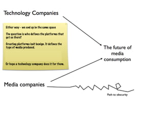
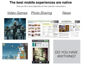
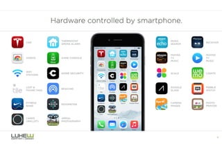
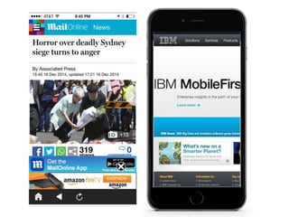
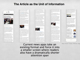
The document discusses considerations for designing mobile experiences, including: - Native mobile experiences provide the best user experience by utilizing touchscreen capabilities. - Content needs to be scannable and modular to account for users consuming information differently on mobile. - Common mistakes to avoid include slow performance, bad transitions, and bad signup processes that frustrate users. - Effective mobile design requires thinking about how content can be consumed without full context on small screens.


