Downloaded 13 times


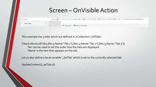
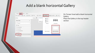
![Define the Gallery
Set [Items] to the Collection created at
'OnVisible' of the screen.
Edit the Gallery
Add a Button control to the Gallery.
You may either want to change the colour of
the header rectangle or the fill color of the
button.](https://image.slidesharecdn.com/powerapps-screenwithtabs-190827132152/85/PowerApps-Canvas-Screen-with-Tabs-8-320.jpg)
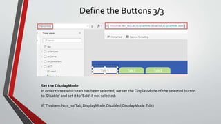
![Define the Buttons 1/3
Make it a nice button:
Select the Button
Set RadiusBottomRight = 0
Set RadiusBottomLeft = 0
Set the top left and right
radius' to half the height of
the button
Add the text label:
With the button selected set
[Text]=ThisItem.Name
This will add the
corresponding name from the
Collection.](https://image.slidesharecdn.com/powerapps-screenwithtabs-190827132152/85/PowerApps-Canvas-Screen-with-Tabs-9-320.jpg)
![Define the Buttons 2/3
Add some Action:
With the button selected set
[OnSelect]=UpdateContext({_selTab:ThisItem.No})
The local variable [_selTab] is set to the number of the tab as defined in the collection](https://image.slidesharecdn.com/powerapps-screenwithtabs-190827132152/85/PowerApps-Canvas-Screen-with-Tabs-10-320.jpg)
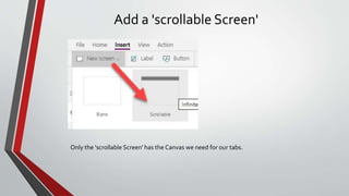
![Display the Screens
Set the screensVisible property:
By default the [Visible] property of all DataCards is 'true'
Select a DataCard in the tree view which
should be displayed ifTab1 is selected:
Select the [Visible] property
Set the value to 'If(_selTab=1,true,false)'
The other DataCards go like
If(_selTab=2,true,false) and
If(_selTab=3,true,false)
TheVisible property of the DataCard is set
by the value of the local variable [_selTab].](https://image.slidesharecdn.com/powerapps-screenwithtabs-190827132152/85/PowerApps-Canvas-Screen-with-Tabs-12-320.jpg)


This document provides instructions for creating a screen with tabs in PowerApps. It describes adding a scrollable screen, three sections to represent each tab, setting the fill color of each section/tab, defining a collection and variable to track the selected tab, adding a horizontal gallery to display the tabs, and setting the visible property of each section based on the selected tab variable.


![20260201 [FOSDEM] gomodjail - library sandboxing for Go modules.pdf](https://cdn.slidesharecdn.com/ss_thumbnails/20260201fosdemgomodjail-librarysandboxingforgomodules-260201225659-76609ec4-thumbnail.jpg?width=640&height=640&fit=bounds)


