Download as PDF, PPTX

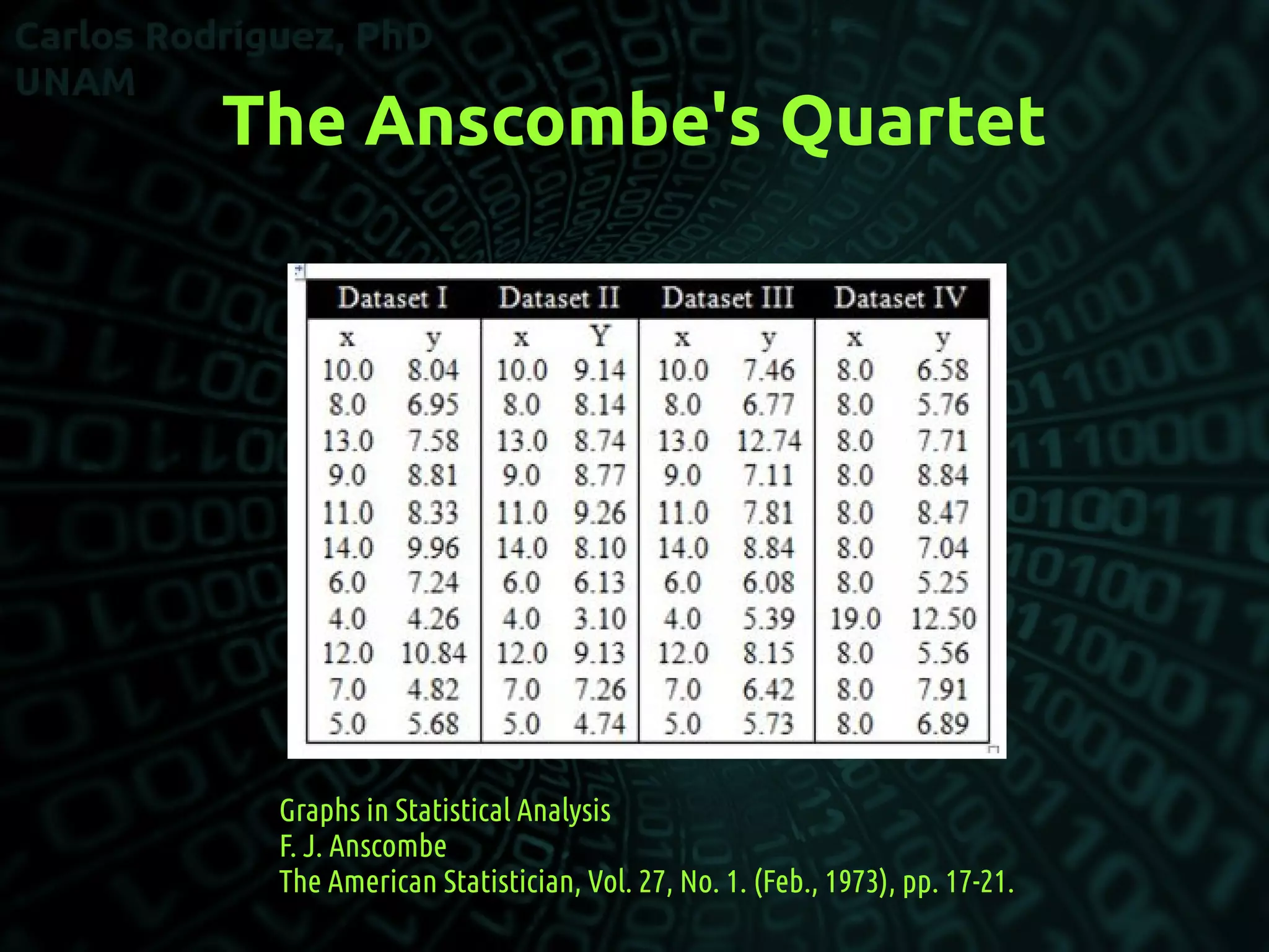
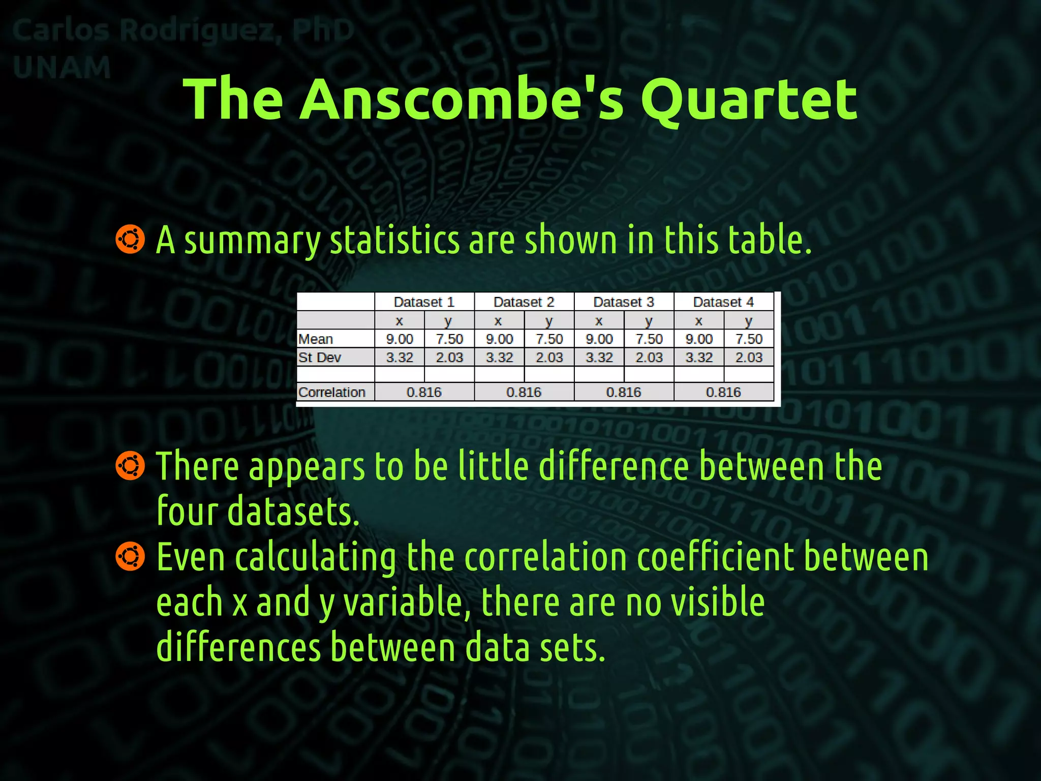
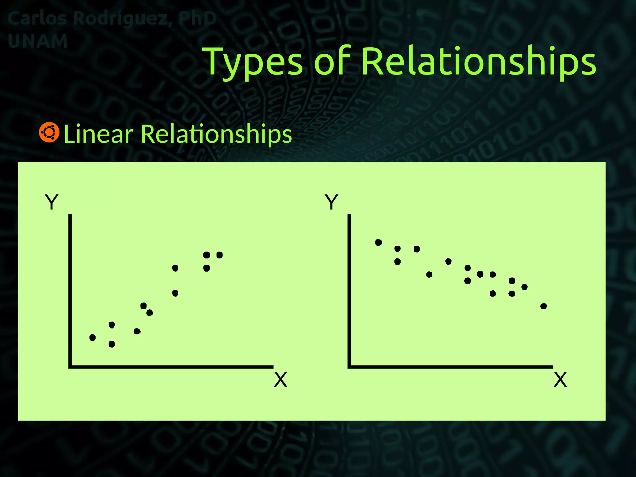
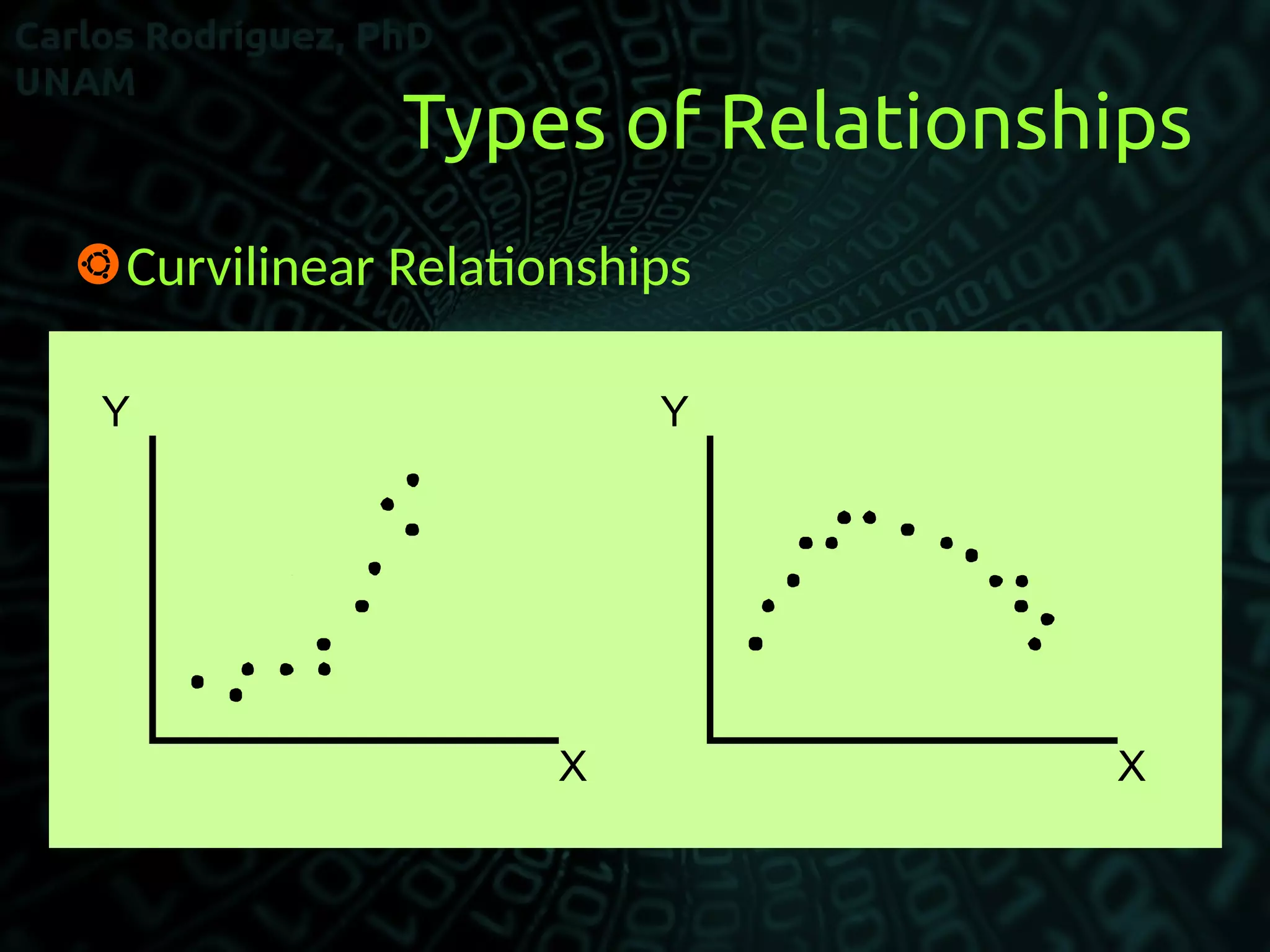
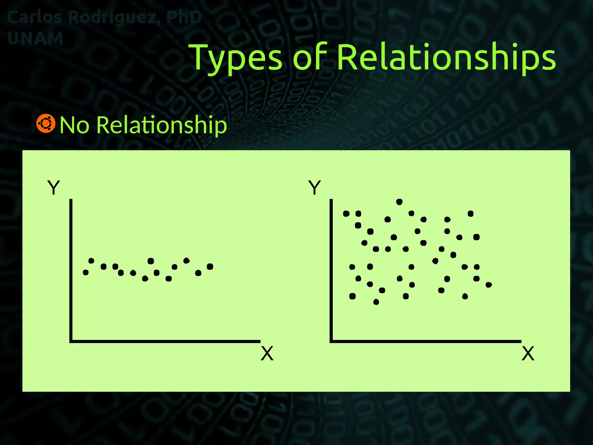
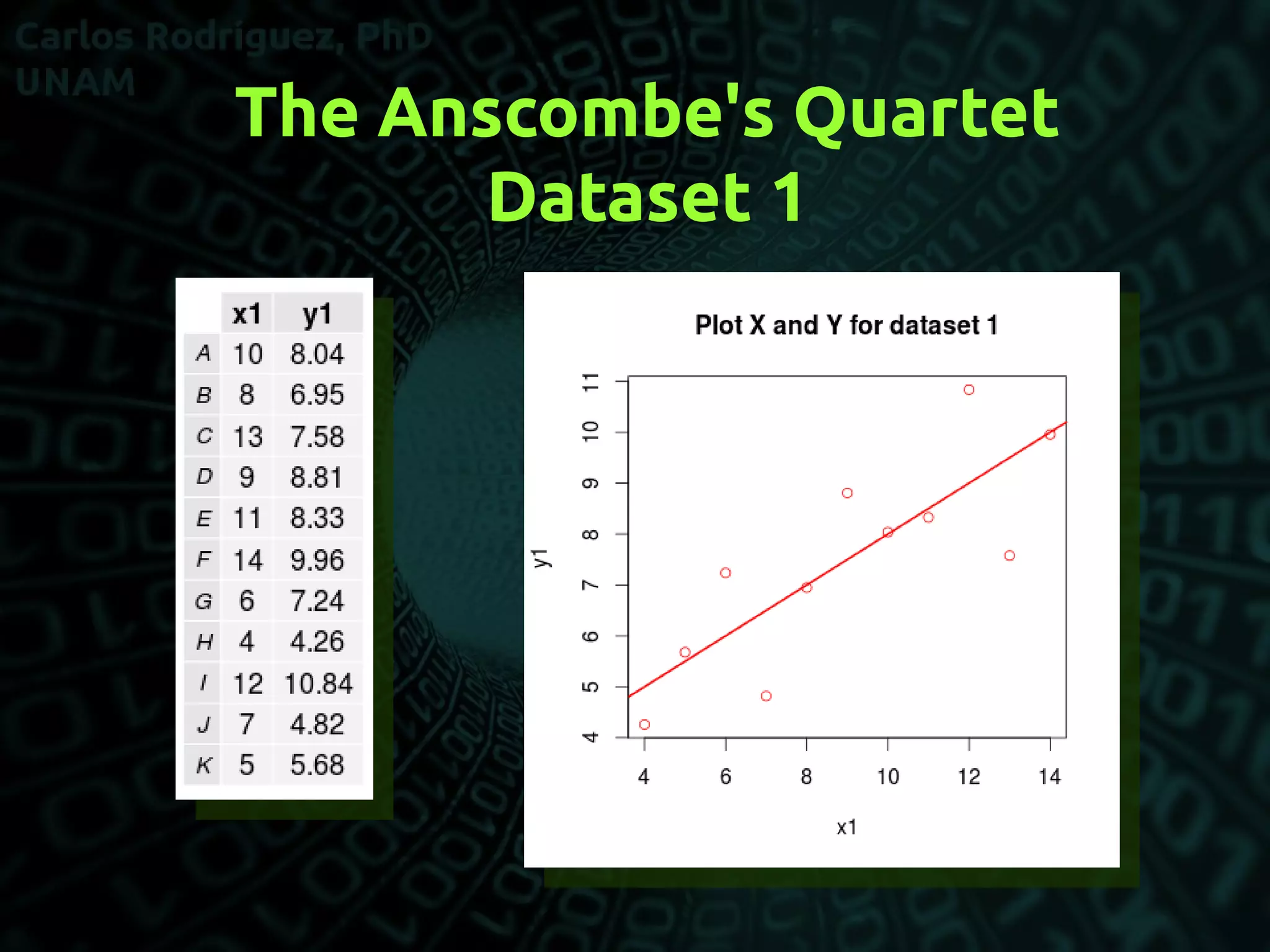

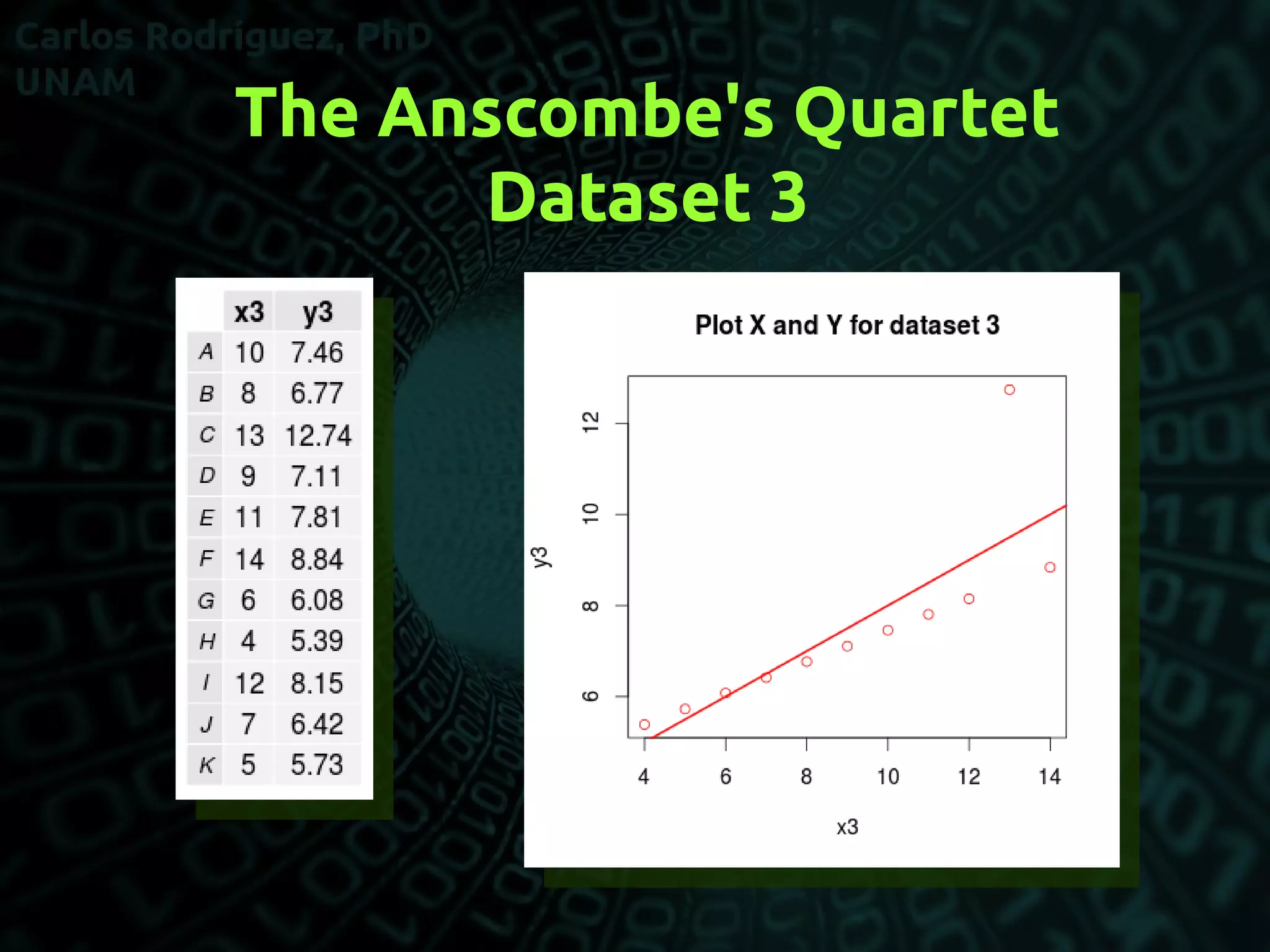
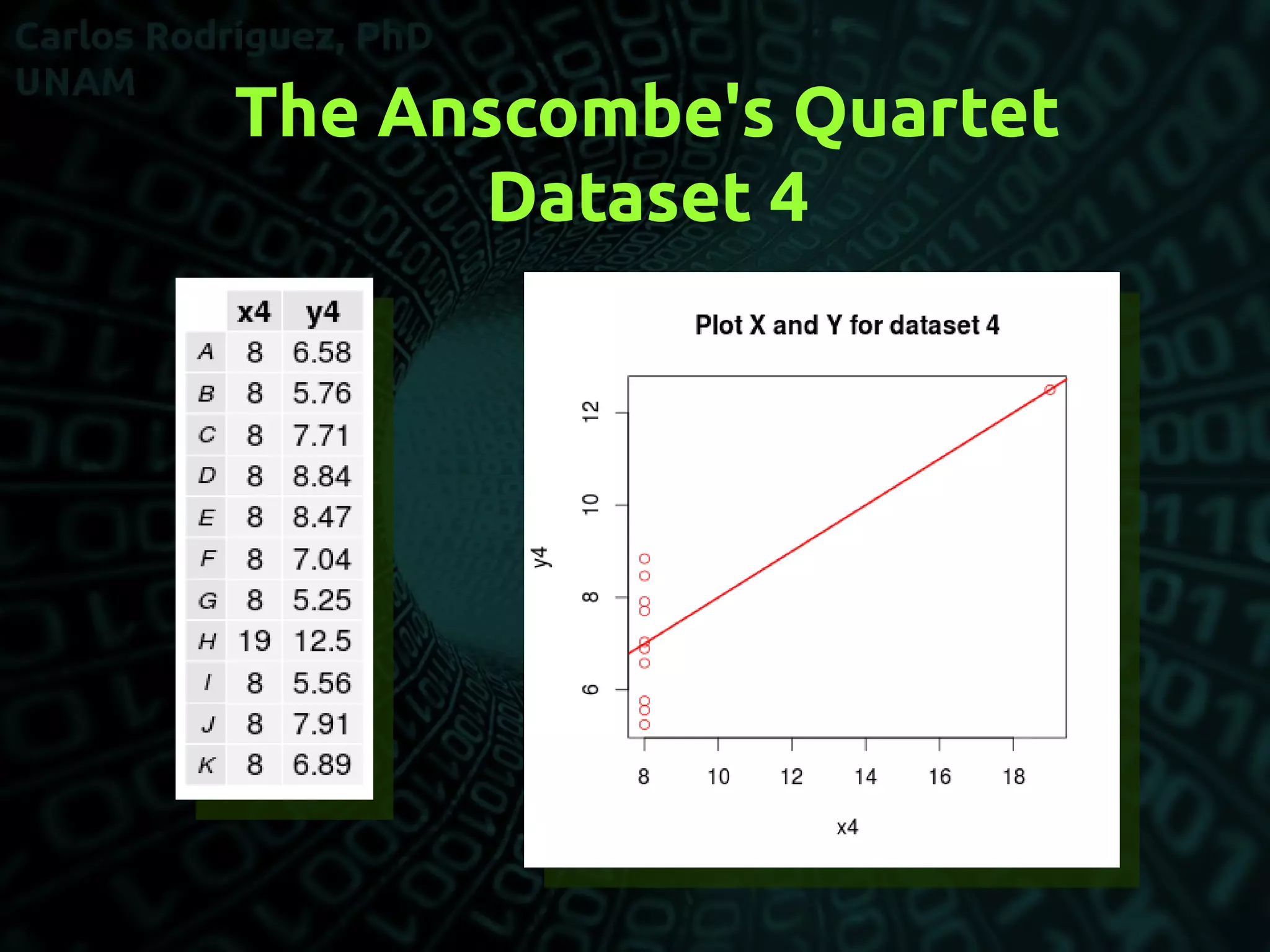
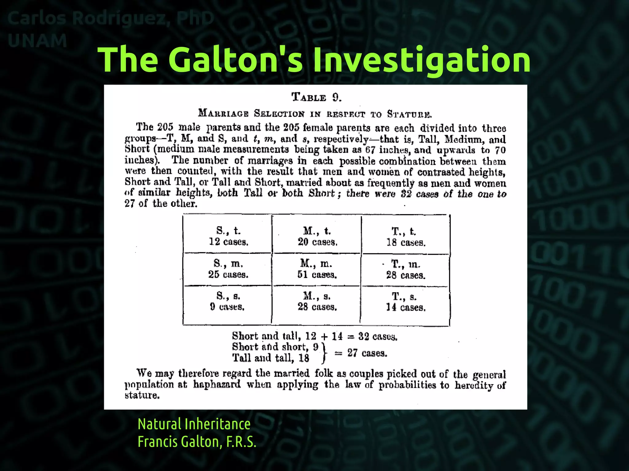
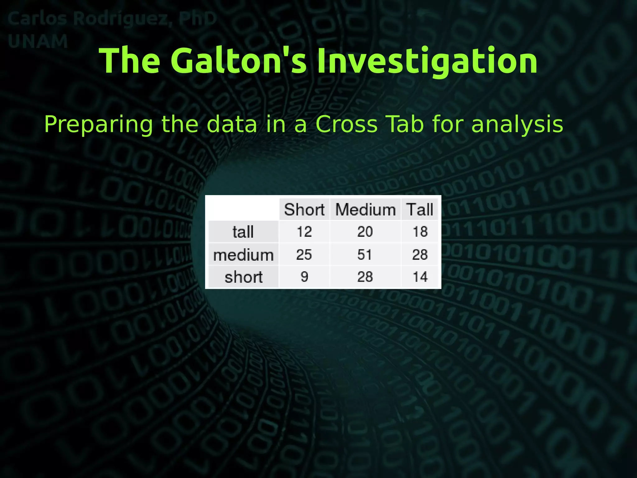
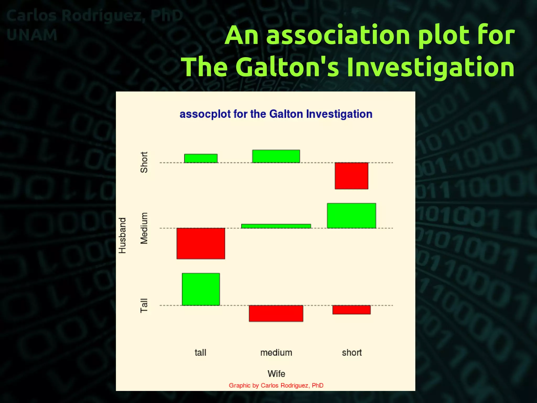
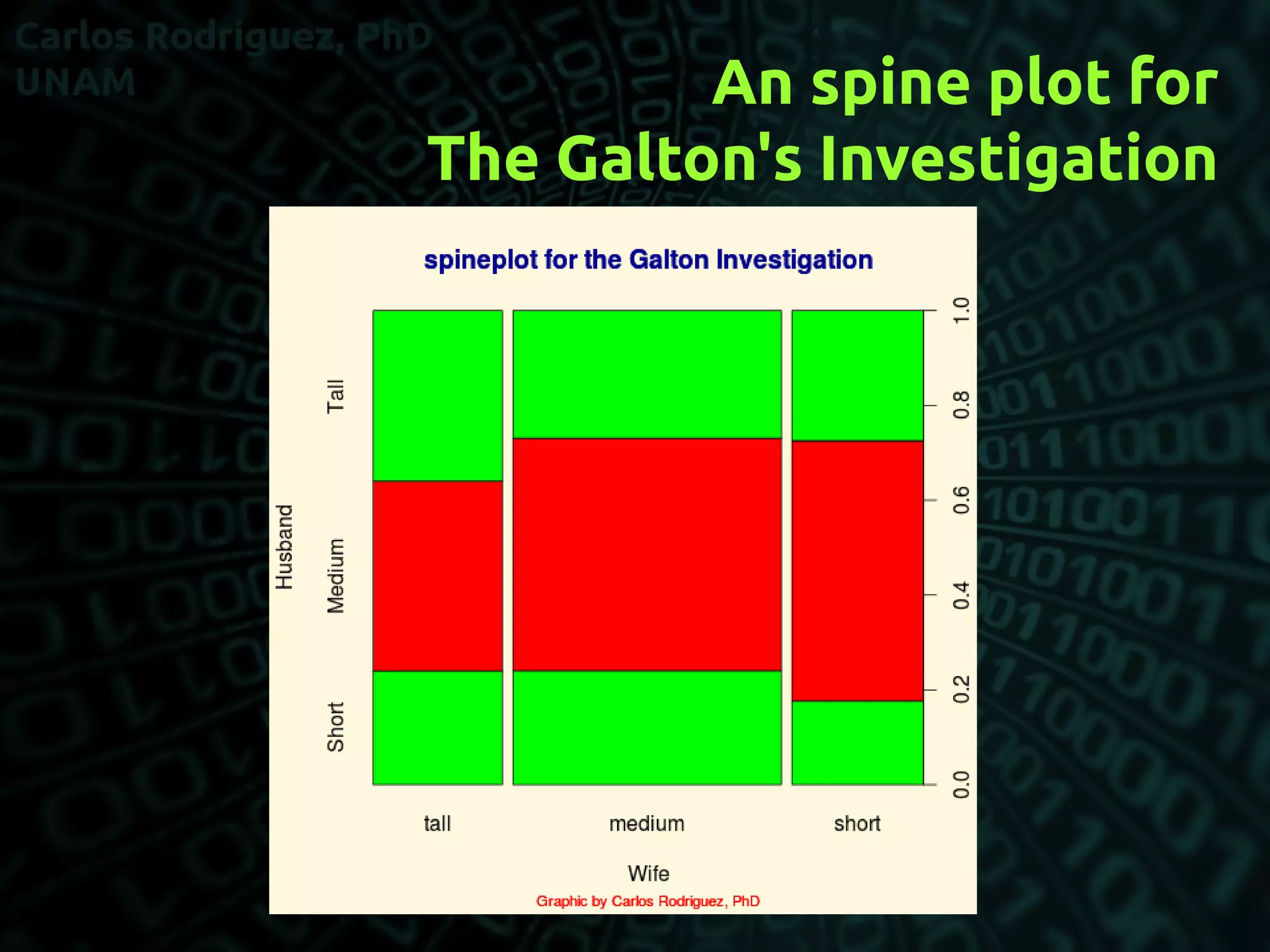
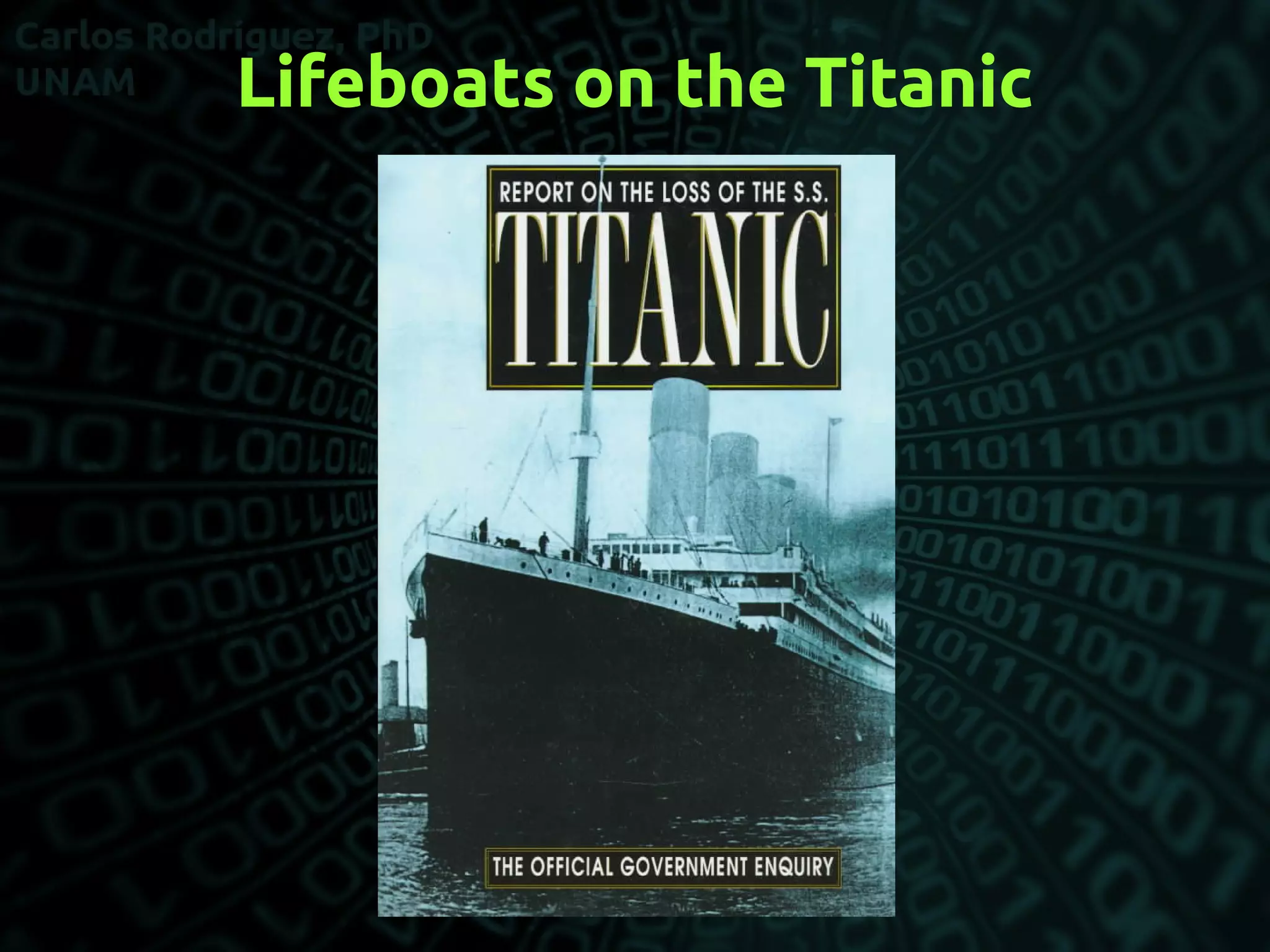
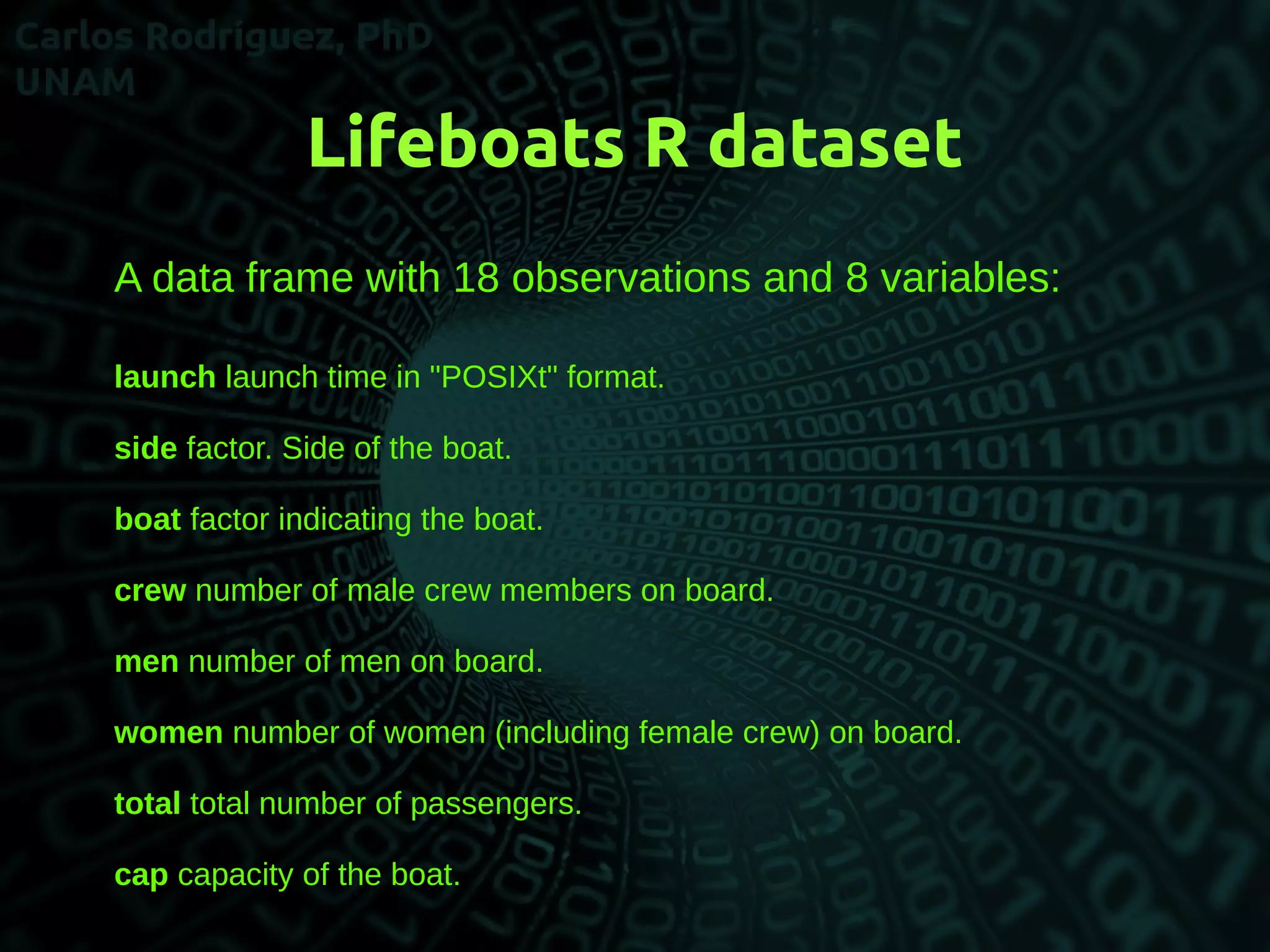
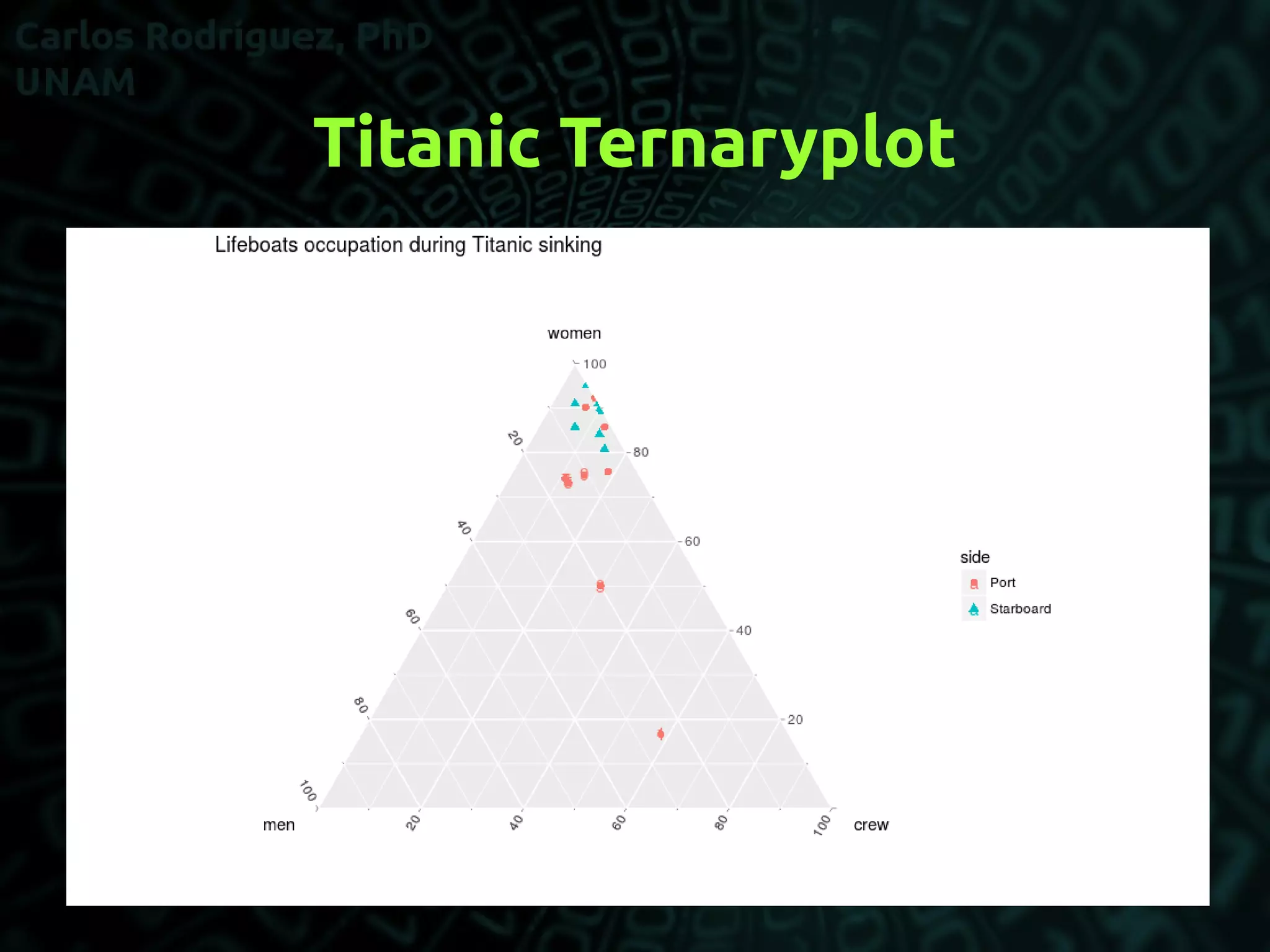


This document discusses scientific data visualization and provides examples to illustrate its power. It first introduces data visualization and its importance. It then analyzes Anscombe's Quartet, a classic example showing that datasets can appear similar based on summary statistics but differ in their relationships. Further examples include Galton's study of marriage selection and stature, and lifeboat data from the Titanic. Code files are provided to recreate the visualizations.