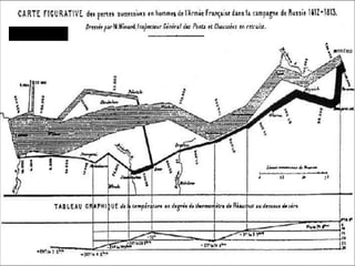
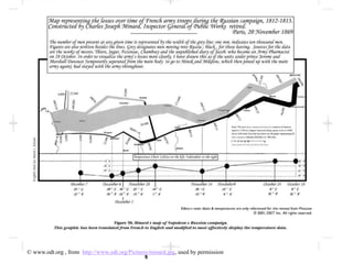
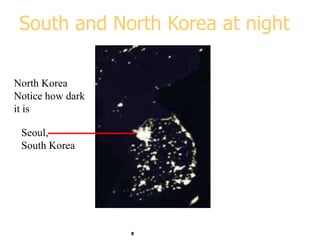
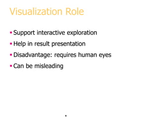
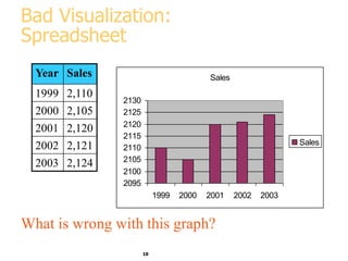
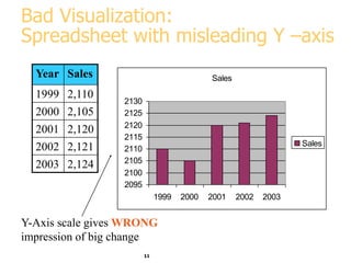
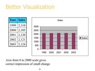
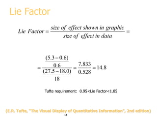
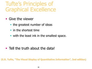
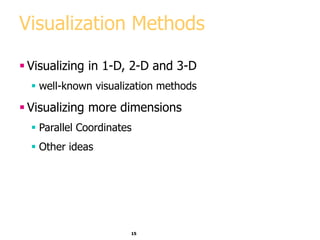
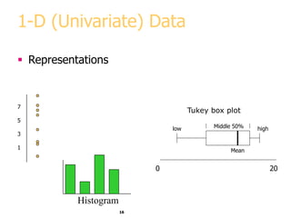
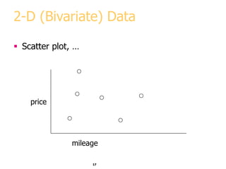
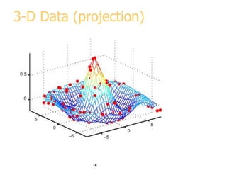
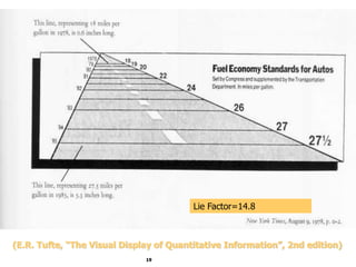
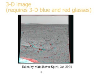
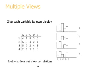
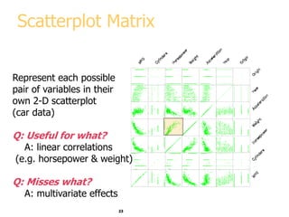
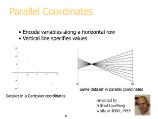
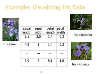
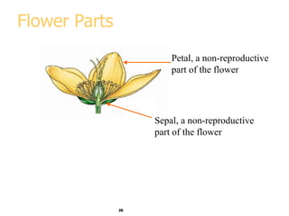
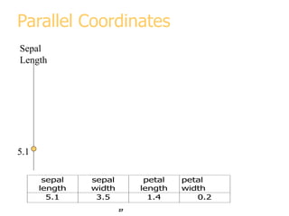
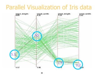
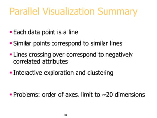
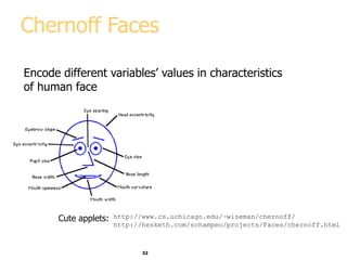
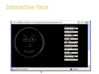
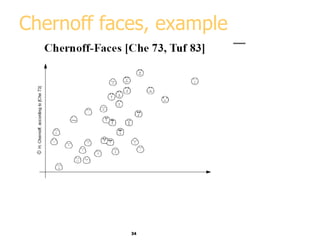
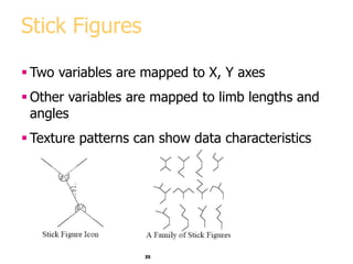
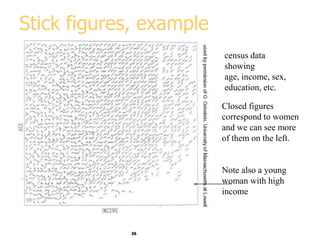
Visualization
and
Data Mining
2
Outline
 Graphical excellence and lie factor
 Representing data in 1,2, and 3-D
 Representing data in 4+ dimensions
 Parallel coordinates
 Scatterplots
 Stick figures
3
Napoleon Invasion of Russia, 1812
Napoleon
4
Marley, 1885
5
© www.odt.org , from http://www.odt.org/Pictures/minard.jpg, used by permission
6
Snow’s Cholera
Map, 1855
7
Asia at night
8
South and North Korea at night
Seoul,
South Korea
North Korea
Notice how dark
it is
9
Visualization Role
 Support interactive exploration
 Help in result presentation
 Disadvantage: requires human eyes
 Can be misleading
10
Bad Visualization:
Spreadsheet
Year Sales
1999 2,110
2000 2,105
2001 2,120
2002 2,121
2003 2,124
Sales
2095
2100
2105
2110
2115
2120
2125
2130
1999 2000 2001 2002 2003
Sales
What is wrong with this graph?
11
Bad Visualization:
Spreadsheet with misleading Y –axis
Year Sales
1999 2,110
2000 2,105
2001 2,120
2002 2,121
2003 2,124
Sales
2095
2100
2105
2110
2115
2120
2125
2130
1999 2000 2001 2002 2003
Sales
Y-Axis scale gives WRONG
impression of big change
12
Better Visualization
Year Sales
1999 2,110
2000 2,105
2001 2,120
2002 2,121
2003 2,124
Sales
0
500
1000
1500
2000
2500
3000
1999 2000 2001 2002 2003
Sales
Axis from 0 to 2000 scale gives
correct impression of small change
13
Lie Factor


data
in
effect
of
size
graphic
in
shown
effect
of
size
Factor
Lie
8
.
14
528
.
0
833
.
7
18
)
0
.
18
5
.
27
(
6
.
0
)
6
.
0
3
.
5
(





Tufte requirement: 0.95<Lie Factor<1.05
(E.R. Tufte, “The Visual Display of Quantitative Information”, 2nd edition)
14
Tufte’s Principles of
Graphical Excellence
 Give the viewer
 the greatest number of ideas
 in the shortest time
 with the least ink in the smallest space.
 Tell the truth about the data!
(E.R. Tufte, “The Visual Display of Quantitative Information”, 2nd edition)
15
Visualization Methods
 Visualizing in 1-D, 2-D and 3-D
 well-known visualization methods
 Visualizing more dimensions
 Parallel Coordinates
 Other ideas
16
1-D (Univariate) Data
 Representations
7
5
3
1
0 20
Mean
low high
Middle 50%
Tukey box plot
Histogram
17
2-D (Bivariate) Data
 Scatter plot, …
price
mileage
18
3-D Data (projection)
price
19
Lie Factor=14.8
(E.R. Tufte, “The Visual Display of Quantitative Information”, 2nd edition)
20
3-D image
(requires 3-D blue and red glasses)
Taken by Mars Rover Spirit, Jan 2004
21
Visualizing in 4+ Dimensions
 Scatterplots
 Parallel Coordinates
 Chernoff faces
 Stick Figures
 …
22
Multiple Views
Give each variable its own display
A B C D E
1 4 1 8 3 5
2 6 3 4 2 1
3 5 7 2 4 3
4 2 6 3 1 5
A B C D E
1
2
3
4
Problem: does not show correlations
23
Scatterplot Matrix
Represent each possible
pair of variables in their
own 2-D scatterplot
(car data)
Q: Useful for what?
A: linear correlations
(e.g. horsepower & weight)
Q: Misses what?
A: multivariate effects
24
Parallel Coordinates
• Encode variables along a horizontal row
• Vertical line specifies values
Dataset in a Cartesian coordinates
Same dataset in parallel coordinates
Invented by
Alfred Inselberg
while at IBM, 1985
25
Example: Visualizing Iris Data
sepal
length
sepal
width
petal
length
petal
width
5.1 3.5 1.4 0.2
4.9 3 1.4 0.2
... ... ... ...
5.9 3 5.1 1.8
Iris setosa
Iris versicolor
Iris virginica
26
Flower Parts
Petal, a non-reproductive
part of the flower
Sepal, a non-reproductive
part of the flower
27
Parallel Coordinates
Sepal
Length
5.1
sepal
length
sepal
width
petal
length
petal
width
5.1 3.5 1.4 0.2
28
Parallel Coordinates: 2 D
Sepal
Length
5.1
Sepal
Width
3.5
sepal
length
sepal
width
petal
length
petal
width
5.1 3.5 1.4 0.2
29
Parallel Coordinates: 4 D
Sepal
Length
5.1
Sepal
Width
Petal
length
Petal
Width
3.5
sepal
length
sepal
width
petal
length
petal
width
5.1 3.5 1.4 0.2
1.4
0.2
30
5.1
3.5
1.4
0.2
Parallel Visualization of Iris data
31
Parallel Visualization Summary
 Each data point is a line
 Similar points correspond to similar lines
 Lines crossing over correspond to negatively
correlated attributes
 Interactive exploration and clustering
 Problems: order of axes, limit to ~20 dimensions
32
Chernoff Faces
Encode different variables’ values in characteristics
of human face
http://www.cs.uchicago.edu/~wiseman/chernoff/
http://hesketh.com/schampeo/projects/Faces/chernoff.html
Cute applets:
33
Interactive Face
34
Chernoff faces, example
35
Stick Figures
 Two variables are mapped to X, Y axes
 Other variables are mapped to limb lengths and
angles
 Texture patterns can show data characteristics
36
Stick figures, example
census data
showing
age, income, sex,
education, etc.
Closed figures
correspond to women
and we can see more
of them on the left.
Note also a young
woman with high
income
37
Visualization software
Free and Open-source
 Ggobi
 Xmdv
 Many more - see
www.KDnuggets.com/software/visualization.html
38
Visualization Summary
 Many methods
 Visualization is possible in more than 3-D
 Aim for graphical excellence

dm15-visualization-data-mining.ppt