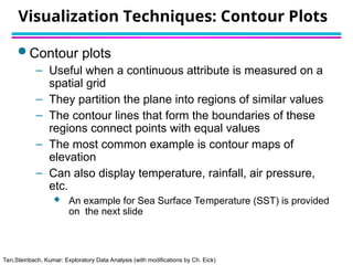
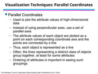
Tan,Steinbach, Kumar: Exploratory Data Analysis (with modifications by Ch. Eick)
Data Mining: “New” Teaching Road Map
1. Introduction to Data Mining and KDD
2. Exploratory Data Analysis (just transparencies)
3. Preprocessing (Han; chapter 3)
4. Concept Description (Han; chapter 5)
5. Classification (Tan chapter 4,…)
Questionnaire
(15 minutes)
Tan,Steinbach, Kumar: Exploratory Data Analysis (with modifications by Ch. Eick)
What is data exploration?
 Key motivations of data exploration include
– Helping to select the right tool for preprocessing, data analysis and data
mining
– Making use of humans’ abilities to recognize patterns
 People can recognize patterns not captured by data analysis tools
 Related to the area of Exploratory Data Analysis (EDA)
– Created by statistician John Tukey
– Seminal book is Exploratory Data Analysis by Tukey
– A nice online introduction can be found in Chapter 1 of the NIST
Engineering Statistics Handbook
http://www.itl.nist.gov/div898/handbook/index.htm
A preliminary exploration of the data to
better understand its characteristics.
Tan,Steinbach, Kumar: Exploratory Data Analysis (with modifications by Ch. Eick)
Exploratory Data Analysis
Get Data
Preprocessing
Data Mining
Tan,Steinbach, Kumar: Exploratory Data Analysis (with modifications by Ch. Eick)
Techniques Used In Data Exploration
 In EDA, as originally defined by Tukey
– The focus was on visualization
– Clustering and anomaly detection were viewed as
exploratory techniques
– In data mining, clustering and anomaly detection are
major areas of interest, and not thought of as just
exploratory
 In our discussion of data exploration, we focus
on
1. Summary statistics
2. Visualization
Tan,Steinbach, Kumar: Exploratory Data Analysis (with modifications by Ch. Eick)
Iris Sample Data Set
 Many of the exploratory data techniques are illustrated with the Iris Plant data set.
– Can be obtained from the UCI Machine Learning Repository
http://www.ics.uci.edu/~mlearn/MLRepository.html
– From the statistician Douglas Fisher
– Three flower types (classes):
Setosa
Virginica
Versicolour
– Four (non-class) attributes
Sepal width and length
Petal width and length
Virginica. Robert H. Mohlenbrock. USDA
NRCS. 1995. Northeast wetland flora: Field
office guide to plant species. Northeast National
Technical Center, Chester, PA. Courtesy of
USDA NRCS Wetland Science Institute.
Tan,Steinbach, Kumar: Exploratory Data Analysis (with modifications by Ch. Eick)
1. Summary Statistics
 Summary statistics are numbers that summarize
properties of the data
– Summarized properties include frequency, location and
spread
 Examples: location - mean
spread - standard deviation
– Most summary statistics can be calculated in a single
pass through the data
Tan,Steinbach, Kumar: Exploratory Data Analysis (with modifications by Ch. Eick)
Frequency and Mode
 The frequency of an attribute value is the
percentage of time the value occurs in the
data set
– For example, given the attribute ‘gender’ and a
representative population of people, the gender
‘female’ occurs about 50% of the time.
 The mode of a an attribute is the most frequent
attribute value
 The notions of frequency and mode are typically
used with categorical data
Tan,Steinbach, Kumar: Exploratory Data Analysis (with modifications by Ch. Eick)
Percentiles
 For continuous data, the notion of a percentile is
more useful.
Given an ordinal or continuous attribute x and a
number p between 0 and 100, the pth percentile is
a value of x such that p% of the observed
values of x are less than .
 For instance, the 50th percentile is the value
such that 50% of all values of x are less than .

xp

xp

xp

x50%
x50%
Tan,Steinbach, Kumar: Exploratory Data Analysis (with modifications by Ch. Eick)
Measures of Location: Mean and Median
 The mean is the most common measure of the
location of a set of points.
 However, the mean is very sensitive to outliers.
 Thus, the median or a trimmed mean is also
commonly used.
Tan,Steinbach, Kumar: Exploratory Data Analysis (with modifications by Ch. Eick)
Measures of Spread: Range and Variance
 Range is the difference between the max and min
 The variance or standard deviation
 However, this is also sensitive to outliers, so that
other measures are often used.
(Mean Absolute Deviation) [Han]
(Absolute Average Deviation) [Tan]
(Median Absolute Deviation)
standard_deviation(x)= sx
0, 2, 3, 7, 8
11.
5
3.
3
2.8
1
5
Tan,Steinbach, Kumar: Exploratory Data Analysis (with modifications by Ch. Eick)
2. Visualization
Visualization is the conversion of data into a visual
or tabular format so that the characteristics of the
data and the relationships among data items or
attributes can be analyzed or reported.
 Visualization of data is one of the most powerful
and appealing techniques for data exploration.
– Humans have a well developed ability to analyze large
amounts of information that is presented visually
– Can detect general patterns and trends
– Can detect outliers and unusual patterns
Tan,Steinbach, Kumar: Exploratory Data Analysis (with modifications by Ch. Eick)
Example: Sea Surface Temperature
 The following shows the Sea Surface
Temperature (SST) for July 1982
– Tens of thousands of data points are summarized in a
single figure
Tan,Steinbach, Kumar: Exploratory Data Analysis (with modifications by Ch. Eick)
Representation
 Is the mapping of information to a visual format
 Data objects, their attributes, and the relationships
among data objects are translated into graphical
elements such as points, lines, shapes, and
colors.
 Example:
– Objects are often represented as points
– Their attribute values can be represented as the
position of the points or the characteristics of the
points, e.g., color, size, and shape
– If position is used, then the relationships of points, i.e.,
whether they form groups or a point is an outlier, is
easily perceived.
Tan,Steinbach, Kumar: Exploratory Data Analysis (with modifications by Ch. Eick)
Arrangement
 Is the placement of visual elements within a
display
 Can make a large difference in how easy it is to
understand the data
 Example:
Tan,Steinbach, Kumar: Exploratory Data Analysis (with modifications by Ch. Eick)
Example: Visualizing Universities
Tan,Steinbach, Kumar: Exploratory Data Analysis (with modifications by Ch. Eick)
Selection
 Is the elimination or the de-emphasis of certain
objects and attributes
 Selection may involve the chosing a subset of
attributes
– Dimensionality reduction is often used to reduce the
number of dimensions to two or three
– Alternatively, pairs of attributes can be considered
 Selection may also involve choosing a subset of
objects
– A region of the screen can only show so many points
– Can sample, but want to preserve points in sparse
areas
Tan,Steinbach, Kumar: Exploratory Data Analysis (with modifications by Ch. Eick)
Visualization Techniques: Histograms
 Histogram
– Usually shows the distribution of values of a single variable
– Divide the values into bins and show a bar plot of the number of
objects in each bin.
– The height of each bar indicates the number of objects
– Shape of histogram depends on the number of bins
 Example: Petal Width (10 and 20 bins, respectively)
Tan,Steinbach, Kumar: Exploratory Data Analysis (with modifications by Ch. Eick)
Two-Dimensional Histograms
 Show the joint distribution of the values of two
attributes
 Example: petal width and petal length
– What does this tell us?
Tan,Steinbach, Kumar: Exploratory Data Analysis (with modifications by Ch. Eick)
Visualization Techniques: Box Plots
 Box Plots
– Invented by J. Tukey
– Another way of displaying the distribution of data
– Following figure shows the basic part of a box plot
outlier
10th
percentile
25th
percentile
75th
percentile
50th
percentile
90th
percentile
Tan,Steinbach, Kumar: Exploratory Data Analysis (with modifications by Ch. Eick)
Example of Box Plots
 Box plots can be used to compare attributes
Tan,Steinbach, Kumar: Exploratory Data Analysis (with modifications by Ch. Eick)
Visualization Techniques: Scatter Plots
 Scatter plots
– Attributes values determine the position
– Two-dimensional scatter plots most common, but can
have three-dimensional scatter plots
– Often additional attributes can be displayed by using
the size, shape, and color of the markers that
represent the objects
– It is useful to have arrays of scatter plots can
compactly summarize the relationships of several pairs
of attributes
 See example on the next slide
Tan,Steinbach, Kumar: Exploratory Data Analysis (with modifications by Ch. Eick)
Scatter Plot Array of Iris Attributes
Tan,Steinbach, Kumar: Exploratory Data Analysis (with modifications by Ch. Eick)
Visualization Techniques: Contour Plots
 Contour plots
– Useful when a continuous attribute is measured on a
spatial grid
– They partition the plane into regions of similar values
– The contour lines that form the boundaries of these
regions connect points with equal values
– The most common example is contour maps of
elevation
– Can also display temperature, rainfall, air pressure,
etc.
 An example for Sea Surface Temperature (SST) is provided
on the next slide
Tan,Steinbach, Kumar: Exploratory Data Analysis (with modifications by Ch. Eick)
Contour Plot Example: SST Dec, 1998
Celsius
Tan,Steinbach, Kumar: Exploratory Data Analysis (with modifications by Ch. Eick)
Visualization Techniques: Parallel Coordinates
 Parallel Coordinates
– Used to plot the attribute values of high-dimensional
data
– Instead of using perpendicular axes, use a set of
parallel axes
– The attribute values of each object are plotted as a
point on each corresponding coordinate axis and the
points are connected by a line
– Thus, each object is represented as a line
– Often, the lines representing a distinct class of objects
group together, at least for some attributes
– Ordering of attributes is important in seeing such
groupings
Tan,Steinbach, Kumar: Exploratory Data Analysis (with modifications by Ch. Eick)
Parallel Coordinates Plots for Iris Data
Tan,Steinbach, Kumar: Exploratory Data Analysis (with modifications by Ch. Eick)
Other Visualization Techniques
 Star Coordinate Plots
– Similar approach to parallel coordinates, but axes radiate from a
central point
– The line connecting the values of an object is a polygon
 Chernoff Faces
– Approach created by Herman Chernoff
– This approach associates each attribute with a characteristic of a
face
– The values of each attribute determine the appearance of the
corresponding facial characteristic
– Each object becomes a separate face
– Relies on human’s ability to distinguish faces
– http://people.cs.uchicago.edu/~wiseman/chernoff/
– http://kspark.kaist.ac.kr/Human%20Engineering.files/Chernoff/Ch
ernoff%20Faces.htm#
Tan,Steinbach, Kumar: Exploratory Data Analysis (with modifications by Ch. Eick)
Star Plots for Iris Data
Setosa
Versicolour
Virginica
Pedal length
Sepal length
Pedal width
Sepal Width
Tan,Steinbach, Kumar: Exploratory Data Analysis (with modifications by Ch. Eick)
Chernoff Faces for Iris Data
Setosa
Versicolour
Virginica
Translation: sepal lengthsize of face; sepal width forhead/jaw relative to arc-length;
Pedal lengthshape of forhead; pedal width shape of jaw; width of mouth…; width between eyes…

slides for basics-visualizations ppt.ppt

  • 1.
    Tan,Steinbach, Kumar: ExploratoryData Analysis (with modifications by Ch. Eick) Data Mining: “New” Teaching Road Map 1. Introduction to Data Mining and KDD 2. Exploratory Data Analysis (just transparencies) 3. Preprocessing (Han; chapter 3) 4. Concept Description (Han; chapter 5) 5. Classification (Tan chapter 4,…) Questionnaire (15 minutes)
  • 2.
    Tan,Steinbach, Kumar: ExploratoryData Analysis (with modifications by Ch. Eick) What is data exploration?  Key motivations of data exploration include – Helping to select the right tool for preprocessing, data analysis and data mining – Making use of humans’ abilities to recognize patterns  People can recognize patterns not captured by data analysis tools  Related to the area of Exploratory Data Analysis (EDA) – Created by statistician John Tukey – Seminal book is Exploratory Data Analysis by Tukey – A nice online introduction can be found in Chapter 1 of the NIST Engineering Statistics Handbook http://www.itl.nist.gov/div898/handbook/index.htm A preliminary exploration of the data to better understand its characteristics.
  • 3.
    Tan,Steinbach, Kumar: ExploratoryData Analysis (with modifications by Ch. Eick) Exploratory Data Analysis Exploratory Data Analysis Get Data Preprocessing Data Mining
  • 4.
    Tan,Steinbach, Kumar: ExploratoryData Analysis (with modifications by Ch. Eick) Techniques Used In Data Exploration  In EDA, as originally defined by Tukey – The focus was on visualization – Clustering and anomaly detection were viewed as exploratory techniques – In data mining, clustering and anomaly detection are major areas of interest, and not thought of as just exploratory  In our discussion of data exploration, we focus on 1. Summary statistics 2. Visualization
  • 5.
    Tan,Steinbach, Kumar: ExploratoryData Analysis (with modifications by Ch. Eick) Iris Sample Data Set  Many of the exploratory data techniques are illustrated with the Iris Plant data set. – Can be obtained from the UCI Machine Learning Repository http://www.ics.uci.edu/~mlearn/MLRepository.html – From the statistician Douglas Fisher – Three flower types (classes): Setosa Virginica Versicolour – Four (non-class) attributes Sepal width and length Petal width and length Virginica. Robert H. Mohlenbrock. USDA NRCS. 1995. Northeast wetland flora: Field office guide to plant species. Northeast National Technical Center, Chester, PA. Courtesy of USDA NRCS Wetland Science Institute.
  • 6.
    Tan,Steinbach, Kumar: ExploratoryData Analysis (with modifications by Ch. Eick) 1. Summary Statistics  Summary statistics are numbers that summarize properties of the data – Summarized properties include frequency, location and spread  Examples: location - mean spread - standard deviation – Most summary statistics can be calculated in a single pass through the data
  • 7.
    Tan,Steinbach, Kumar: ExploratoryData Analysis (with modifications by Ch. Eick) Frequency and Mode  The frequency of an attribute value is the percentage of time the value occurs in the data set – For example, given the attribute ‘gender’ and a representative population of people, the gender ‘female’ occurs about 50% of the time.  The mode of a an attribute is the most frequent attribute value  The notions of frequency and mode are typically used with categorical data
  • 8.
    Tan,Steinbach, Kumar: ExploratoryData Analysis (with modifications by Ch. Eick) Percentiles  For continuous data, the notion of a percentile is more useful. Given an ordinal or continuous attribute x and a number p between 0 and 100, the pth percentile is a value of x such that p% of the observed values of x are less than .  For instance, the 50th percentile is the value such that 50% of all values of x are less than .  xp  xp  xp  x50% x50%
  • 9.
    Tan,Steinbach, Kumar: ExploratoryData Analysis (with modifications by Ch. Eick) Measures of Location: Mean and Median  The mean is the most common measure of the location of a set of points.  However, the mean is very sensitive to outliers.  Thus, the median or a trimmed mean is also commonly used.
  • 10.
    Tan,Steinbach, Kumar: ExploratoryData Analysis (with modifications by Ch. Eick) Measures of Spread: Range and Variance  Range is the difference between the max and min  The variance or standard deviation  However, this is also sensitive to outliers, so that other measures are often used. (Mean Absolute Deviation) [Han] (Absolute Average Deviation) [Tan] (Median Absolute Deviation) standard_deviation(x)= sx 0, 2, 3, 7, 8 11. 5 3. 3 2.8 1 5
  • 11.
    Tan,Steinbach, Kumar: ExploratoryData Analysis (with modifications by Ch. Eick) 2. Visualization Visualization is the conversion of data into a visual or tabular format so that the characteristics of the data and the relationships among data items or attributes can be analyzed or reported.  Visualization of data is one of the most powerful and appealing techniques for data exploration. – Humans have a well developed ability to analyze large amounts of information that is presented visually – Can detect general patterns and trends – Can detect outliers and unusual patterns
  • 12.
    Tan,Steinbach, Kumar: ExploratoryData Analysis (with modifications by Ch. Eick) Example: Sea Surface Temperature  The following shows the Sea Surface Temperature (SST) for July 1982 – Tens of thousands of data points are summarized in a single figure
  • 13.
    Tan,Steinbach, Kumar: ExploratoryData Analysis (with modifications by Ch. Eick) Representation  Is the mapping of information to a visual format  Data objects, their attributes, and the relationships among data objects are translated into graphical elements such as points, lines, shapes, and colors.  Example: – Objects are often represented as points – Their attribute values can be represented as the position of the points or the characteristics of the points, e.g., color, size, and shape – If position is used, then the relationships of points, i.e., whether they form groups or a point is an outlier, is easily perceived.
  • 14.
    Tan,Steinbach, Kumar: ExploratoryData Analysis (with modifications by Ch. Eick) Arrangement  Is the placement of visual elements within a display  Can make a large difference in how easy it is to understand the data  Example:
  • 15.
    Tan,Steinbach, Kumar: ExploratoryData Analysis (with modifications by Ch. Eick) Example: Visualizing Universities
  • 16.
    Tan,Steinbach, Kumar: ExploratoryData Analysis (with modifications by Ch. Eick) Selection  Is the elimination or the de-emphasis of certain objects and attributes  Selection may involve the chosing a subset of attributes – Dimensionality reduction is often used to reduce the number of dimensions to two or three – Alternatively, pairs of attributes can be considered  Selection may also involve choosing a subset of objects – A region of the screen can only show so many points – Can sample, but want to preserve points in sparse areas
  • 17.
    Tan,Steinbach, Kumar: ExploratoryData Analysis (with modifications by Ch. Eick) Visualization Techniques: Histograms  Histogram – Usually shows the distribution of values of a single variable – Divide the values into bins and show a bar plot of the number of objects in each bin. – The height of each bar indicates the number of objects – Shape of histogram depends on the number of bins  Example: Petal Width (10 and 20 bins, respectively)
  • 18.
    Tan,Steinbach, Kumar: ExploratoryData Analysis (with modifications by Ch. Eick) Two-Dimensional Histograms  Show the joint distribution of the values of two attributes  Example: petal width and petal length – What does this tell us?
  • 19.
    Tan,Steinbach, Kumar: ExploratoryData Analysis (with modifications by Ch. Eick) Visualization Techniques: Box Plots  Box Plots – Invented by J. Tukey – Another way of displaying the distribution of data – Following figure shows the basic part of a box plot outlier 10th percentile 25th percentile 75th percentile 50th percentile 90th percentile
  • 20.
    Tan,Steinbach, Kumar: ExploratoryData Analysis (with modifications by Ch. Eick) Example of Box Plots  Box plots can be used to compare attributes
  • 21.
    Tan,Steinbach, Kumar: ExploratoryData Analysis (with modifications by Ch. Eick) Visualization Techniques: Scatter Plots  Scatter plots – Attributes values determine the position – Two-dimensional scatter plots most common, but can have three-dimensional scatter plots – Often additional attributes can be displayed by using the size, shape, and color of the markers that represent the objects – It is useful to have arrays of scatter plots can compactly summarize the relationships of several pairs of attributes  See example on the next slide
  • 22.
    Tan,Steinbach, Kumar: ExploratoryData Analysis (with modifications by Ch. Eick) Scatter Plot Array of Iris Attributes
  • 23.
    Tan,Steinbach, Kumar: ExploratoryData Analysis (with modifications by Ch. Eick) Visualization Techniques: Contour Plots  Contour plots – Useful when a continuous attribute is measured on a spatial grid – They partition the plane into regions of similar values – The contour lines that form the boundaries of these regions connect points with equal values – The most common example is contour maps of elevation – Can also display temperature, rainfall, air pressure, etc.  An example for Sea Surface Temperature (SST) is provided on the next slide
  • 24.
    Tan,Steinbach, Kumar: ExploratoryData Analysis (with modifications by Ch. Eick) Contour Plot Example: SST Dec, 1998 Celsius
  • 25.
    Tan,Steinbach, Kumar: ExploratoryData Analysis (with modifications by Ch. Eick) Visualization Techniques: Parallel Coordinates  Parallel Coordinates – Used to plot the attribute values of high-dimensional data – Instead of using perpendicular axes, use a set of parallel axes – The attribute values of each object are plotted as a point on each corresponding coordinate axis and the points are connected by a line – Thus, each object is represented as a line – Often, the lines representing a distinct class of objects group together, at least for some attributes – Ordering of attributes is important in seeing such groupings
  • 26.
    Tan,Steinbach, Kumar: ExploratoryData Analysis (with modifications by Ch. Eick) Parallel Coordinates Plots for Iris Data
  • 27.
    Tan,Steinbach, Kumar: ExploratoryData Analysis (with modifications by Ch. Eick) Other Visualization Techniques  Star Coordinate Plots – Similar approach to parallel coordinates, but axes radiate from a central point – The line connecting the values of an object is a polygon  Chernoff Faces – Approach created by Herman Chernoff – This approach associates each attribute with a characteristic of a face – The values of each attribute determine the appearance of the corresponding facial characteristic – Each object becomes a separate face – Relies on human’s ability to distinguish faces – http://people.cs.uchicago.edu/~wiseman/chernoff/ – http://kspark.kaist.ac.kr/Human%20Engineering.files/Chernoff/Ch ernoff%20Faces.htm#
  • 28.
    Tan,Steinbach, Kumar: ExploratoryData Analysis (with modifications by Ch. Eick) Star Plots for Iris Data Setosa Versicolour Virginica Pedal length Sepal length Pedal width Sepal Width
  • 29.
    Tan,Steinbach, Kumar: ExploratoryData Analysis (with modifications by Ch. Eick) Chernoff Faces for Iris Data Setosa Versicolour Virginica Translation: sepal lengthsize of face; sepal width forhead/jaw relative to arc-length; Pedal lengthshape of forhead; pedal width shape of jaw; width of mouth…; width between eyes…