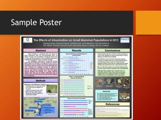
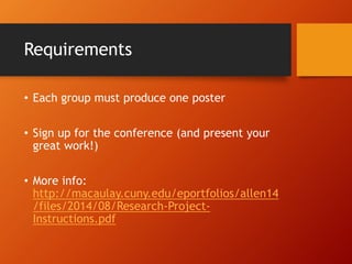
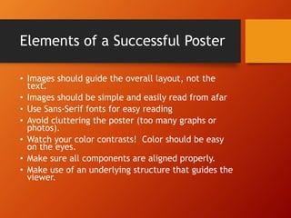
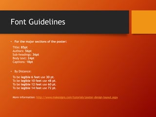
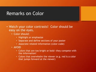
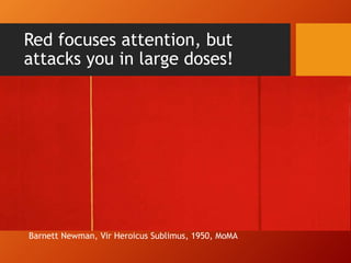
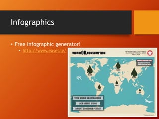
Scientific Poster 
Design 
Seminar Three / Professor Allen 
October 31, 2014 
Gwendolyn Shaw, gwendolyn.shaw@macaulay.cuny.edu 
ITF, Macaulay Honors College at Baruch College 
(with slides borrowed from Kirsten Greene, Craig Willse and 
Emily Sherwood)
Workshop Goals 
• Understand project expectations 
• Learn the basics of poster design 
• Meet with and talk to your group to begin 
planning your posters
Possible Dimensions—Just FYI 
• 36"x48" 
• 30"x42" 
• 26"x38" 
• 27"x39" 
• 17"x22" 
• 24"x36" 
• 18"x24" 
• 34"x44" 
• 28"x40" 
• 22"x34" 
• Other (NB—PPT produces up to 56”x56”
What is a poster, anyway?? 
• Visual means for communicating research to 
an academic or professional community. 
• Summary of research that serves to create 
interest by highlighting the most important 
things.
Sample Poster
Requirements 
• Each group must produce one poster 
• Sign up for the conference (and present your 
great work!) 
• More info: 
http://macaulay.cuny.edu/eportfolios/allen14 
/files/2014/08/Research-Project- 
Instructions.pdf
Elements of a Successful Poster 
• Images should guide the overall layout, not the 
text. 
• Images should be simple and easily read from afar 
• Use Sans-Serif fonts for easy reading 
• Avoid cluttering the poster (too many graphs or 
photos). 
• Watch your color contrasts! Color should be easy 
on the eyes. 
• Make sure all components are aligned properly. 
• Make use of an underlying structure that guides the 
viewer.
Font Guidelines 
• For the major sections of the poster: 
Title: 85pt 
Authors: 56pt 
Sub-headings: 36pt 
Body text: 24pt 
Captions: 18pt 
• By Distance: 
To be legible 6 feet use 30 pt. 
To be legible 10 feet use 48 pt. 
To be legible 12 feet use 60 pt. 
To be legible 14 feet use 72 pt. 
More information: http://www.makesigns.com/tutorials/poster-design-layout.aspx
Remarks on Color 
• Watch your color contrasts! Color should be 
easy on the eyes. 
• Color should: 
• Highlight or emphasize 
• Separate and define sections of your poster 
• Associate related information (color-code) 
• AVOID 
• Colors that are too bright or bold—they compete with 
the information! 
• Colors that overwhelm the viewer (e.g. red is a color 
that jumps forward at the viewer)
Red focuses attention, but 
attacks you in large doses! 
Barnett Newman, Vir Heroicus Sublimus, 1950, MoMA
Ways to choose a color scheme 
• Using Photos? Let them dictate the color 
scheme of your poster 
• Useful tools 
• Color scheme generator (uses a photograph as the 
basis) 
• http://www.pictaculous.com/ 
• http://www.cssdrive.com/imagepalette/ 
• Remember: Keep the Back in Background
Sizing 
• Figures 
• No figures should be smaller than 5x7” 
• All figures should have captions (and ideally 
numbers) 
• Photographs 
• 300 dpi (high resolution) 
• Crop to highlight what is important the focal point 
• Thin black outlines help legibility 
• Use iNaturalist or other open-source, creative 
commons licensed resources
Infographics 
• Free Infographic generator! 
• http://www.easel.ly/
General Organization 
• Title Block 
• Abstract / Introduction 
• Methods 
• Results 
• Conclusions 
• Sources
Title Block 
• Most prominent feature (make it big to be 
legible from afar) 
• Located at the top of your poster 
• Centered or left justified
Basic Layout 
• Landscape-oriented (hot-dog style) 
• Separate into at least 2 columns (do not have to be 
equal width) 
• Read left-to-right 
• Portrait-oriented (hamburger-style) 
• Read top-to-bottom 
• Divided into horizontal registers or bands for easy 
legibility 
• No matter what—align your edges, use 
borders, and leave plenty of white space
Abstract / Introduction 
• Introduction should briefly present the topic 
and your thesis. 
• Thesis should be brief, direct, and succinct. 
• You might address the following: 
• Why does the problem matter? 
• Has anyone else looked at this problem? 
• What are some of the related findings? 
• Be sure to cite references.
Abstract / Introduction
Methods 
• How are you answering your question, testing 
your hypothesis, or fulfilling your statement of 
purpose? 
• What data did you use for your study? 
• What are the methods you are using to analyze 
your data? 
• What are the drawbacks?
Methods
Results 
• What did you find? 
• This should be purely descriptive. 
• Pictures, images, and charts are particularly 
important for this part. 
• You still want to describe your pictures. 
• Aside from thesis, this is the most important 
part.
Results
Conclusions 
• Wrap it up 
• What did you discover? 
• Do you accept or reject your hypothesis? 
• How do you answer your question?
Conclusions
Sources 
• You must cite the sources of any images, data, 
or sources you reference. 
• Posters are like papers and plagiarism applies. 
• Follow standard citation procedures.
Sources
The Good, the Bad, and the 
Ugly
Compare: Left and Right
Do’s and Don’t’s
Things To Keep in Mind 
• You have no more than 10 minutes of someone’s 
attention for a formal presentation. Even LESS 
when presenting informally 
• The more pictures the better 
• The less text the better 
• Leave lots of white/blank space 
• Have a border 
• Does your poster make good organizational sense? 
(Is the layout easy to follow?) 
• Look at examples on the web (I will post links to 
our website)
Resources 
• Guidelines and step-by-step instructions 
• http://www.makesigns.com/tutorials/ 
• Infographics on Easel.ly 
• www.Easel.ly 
• Image editing 
• www.Pixlr.com or you have Gimp on your Macs 
• Tips on Design and Layout 
• http://colinpurrington.com/tips/academic/posterd 
esign
Get to Work! 
Meet with your group to discuss the elements 
of style and organization you might use for 
your poster. Use some time in class for 
planning, and ask questions if you have them! 
Gwendolyn.shaw@macaulay.cuny.edu

Poster pressem 3 10-31-14(1)

  • 1.
    Scientific Poster Design Seminar Three / Professor Allen October 31, 2014 Gwendolyn Shaw, gwendolyn.shaw@macaulay.cuny.edu ITF, Macaulay Honors College at Baruch College (with slides borrowed from Kirsten Greene, Craig Willse and Emily Sherwood)
  • 2.
    Workshop Goals •Understand project expectations • Learn the basics of poster design • Meet with and talk to your group to begin planning your posters
  • 3.
    Possible Dimensions—Just FYI • 36"x48" • 30"x42" • 26"x38" • 27"x39" • 17"x22" • 24"x36" • 18"x24" • 34"x44" • 28"x40" • 22"x34" • Other (NB—PPT produces up to 56”x56”
  • 4.
    What is aposter, anyway?? • Visual means for communicating research to an academic or professional community. • Summary of research that serves to create interest by highlighting the most important things.
  • 5.
  • 6.
    Requirements • Eachgroup must produce one poster • Sign up for the conference (and present your great work!) • More info: http://macaulay.cuny.edu/eportfolios/allen14 /files/2014/08/Research-Project- Instructions.pdf
  • 7.
    Elements of aSuccessful Poster • Images should guide the overall layout, not the text. • Images should be simple and easily read from afar • Use Sans-Serif fonts for easy reading • Avoid cluttering the poster (too many graphs or photos). • Watch your color contrasts! Color should be easy on the eyes. • Make sure all components are aligned properly. • Make use of an underlying structure that guides the viewer.
  • 8.
    Font Guidelines •For the major sections of the poster: Title: 85pt Authors: 56pt Sub-headings: 36pt Body text: 24pt Captions: 18pt • By Distance: To be legible 6 feet use 30 pt. To be legible 10 feet use 48 pt. To be legible 12 feet use 60 pt. To be legible 14 feet use 72 pt. More information: http://www.makesigns.com/tutorials/poster-design-layout.aspx
  • 9.
    Remarks on Color • Watch your color contrasts! Color should be easy on the eyes. • Color should: • Highlight or emphasize • Separate and define sections of your poster • Associate related information (color-code) • AVOID • Colors that are too bright or bold—they compete with the information! • Colors that overwhelm the viewer (e.g. red is a color that jumps forward at the viewer)
  • 10.
    Red focuses attention,but attacks you in large doses! Barnett Newman, Vir Heroicus Sublimus, 1950, MoMA
  • 11.
    Ways to choosea color scheme • Using Photos? Let them dictate the color scheme of your poster • Useful tools • Color scheme generator (uses a photograph as the basis) • http://www.pictaculous.com/ • http://www.cssdrive.com/imagepalette/ • Remember: Keep the Back in Background
  • 12.
    Sizing • Figures • No figures should be smaller than 5x7” • All figures should have captions (and ideally numbers) • Photographs • 300 dpi (high resolution) • Crop to highlight what is important the focal point • Thin black outlines help legibility • Use iNaturalist or other open-source, creative commons licensed resources
  • 13.
    Infographics • FreeInfographic generator! • http://www.easel.ly/
  • 14.
    General Organization •Title Block • Abstract / Introduction • Methods • Results • Conclusions • Sources
  • 15.
    Title Block •Most prominent feature (make it big to be legible from afar) • Located at the top of your poster • Centered or left justified
  • 16.
    Basic Layout •Landscape-oriented (hot-dog style) • Separate into at least 2 columns (do not have to be equal width) • Read left-to-right • Portrait-oriented (hamburger-style) • Read top-to-bottom • Divided into horizontal registers or bands for easy legibility • No matter what—align your edges, use borders, and leave plenty of white space
  • 17.
    Abstract / Introduction • Introduction should briefly present the topic and your thesis. • Thesis should be brief, direct, and succinct. • You might address the following: • Why does the problem matter? • Has anyone else looked at this problem? • What are some of the related findings? • Be sure to cite references.
  • 18.
  • 19.
    Methods • Howare you answering your question, testing your hypothesis, or fulfilling your statement of purpose? • What data did you use for your study? • What are the methods you are using to analyze your data? • What are the drawbacks?
  • 20.
  • 21.
    Results • Whatdid you find? • This should be purely descriptive. • Pictures, images, and charts are particularly important for this part. • You still want to describe your pictures. • Aside from thesis, this is the most important part.
  • 22.
  • 23.
    Conclusions • Wrapit up • What did you discover? • Do you accept or reject your hypothesis? • How do you answer your question?
  • 24.
  • 25.
    Sources • Youmust cite the sources of any images, data, or sources you reference. • Posters are like papers and plagiarism applies. • Follow standard citation procedures.
  • 26.
  • 27.
    The Good, theBad, and the Ugly
  • 31.
  • 32.
  • 33.
    Things To Keepin Mind • You have no more than 10 minutes of someone’s attention for a formal presentation. Even LESS when presenting informally • The more pictures the better • The less text the better • Leave lots of white/blank space • Have a border • Does your poster make good organizational sense? (Is the layout easy to follow?) • Look at examples on the web (I will post links to our website)
  • 34.
    Resources • Guidelinesand step-by-step instructions • http://www.makesigns.com/tutorials/ • Infographics on Easel.ly • www.Easel.ly • Image editing • www.Pixlr.com or you have Gimp on your Macs • Tips on Design and Layout • http://colinpurrington.com/tips/academic/posterd esign
  • 35.
    Get to Work! Meet with your group to discuss the elements of style and organization you might use for your poster. Use some time in class for planning, and ask questions if you have them! Gwendolyn.shaw@macaulay.cuny.edu