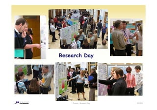
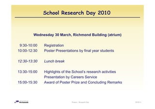
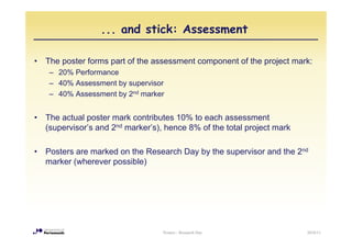
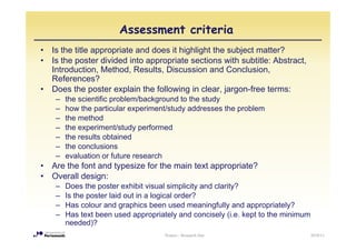
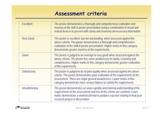
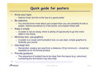
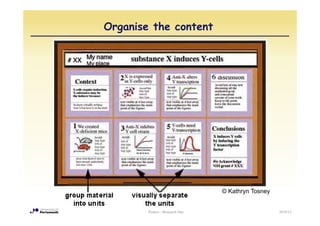
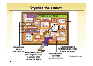
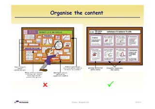
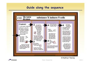
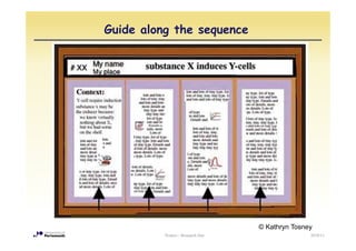
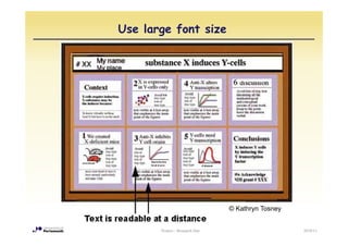
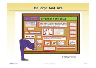
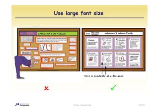
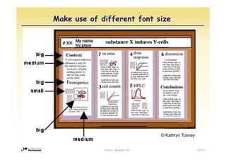
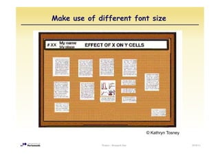
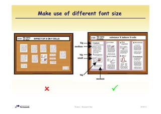
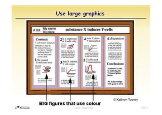
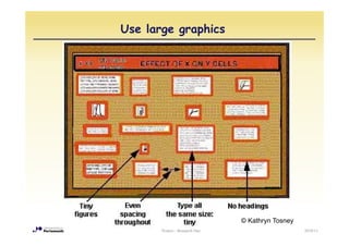
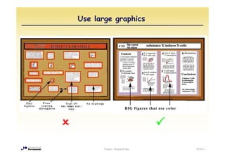
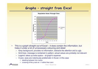
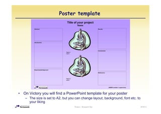
Honours Projects

Introduction into the Poster presentation


                 Posters - Research Day     2010/11
Research Day


    Posters - Research Day   2010/11
School Research Day 2010


        Wednesday 30 March, Richmond Building (atrium)

 9:30-10:00   Registration
10:00-12:30   Poster Presentations by final year students

12:30-13:30   Lunch break

13:30-15:00   Highlights of the School’s research activities
              Presentation by Careers Service
15:00-15:30   Award of Poster Prize and Concluding Remarks


                               Posters - Research Day          2010/11
Carrot: Poster Prize...


•   Fisher Scientific are sponsoring the prize for the best poster

•   YOU are the judges
     – During the poster session, you can vote for your favourite poster
     – The poster with largest number of votes wins


•   The Poster Prize is awarded in the afternoon following the Careers
                                       afternoon,
    presentation


                                       Posters - Research Day              2010/11
... and stick: Assessment

•   The poster forms part of the assessment component of the project mark:
     – 20% Performance
     – 40% Assessment by supervisor
     – 40% Assessment by 2nd marker


•   The actual poster mark contributes 10% to each assessment
    (supervisor’s and 2nd marker’s), hence 8% of the total project mark
                        d


•   Posters are marked on the Research Day by the supervisor and the 2nd
    marker (wherever possible)


                                    Posters - Research Day                2010/11
Assessment criteria
•   Is the title appropriate and does it highlight the subject matter?
•   Is the poster divided into appropriate sections with subtitle: Abstract,
    Introduction, Method, Results
    Introduction Method Results, Discussion and Conclusion
                                                       Conclusion,
    References?
•   Does the poster explain the following in clear, jargon-free terms:
     –   the i tifi
         th scientific problem/background t th study
                           bl /b k       d to the t d
     –   how the particular experiment/study addresses the problem
     –   the method
     –   the
         th experiment/study performed
                   i    t/ t d    f    d
     –   the results obtained
     –   the conclusions
     –   evaluation or f t
             l ti      future research
                                     h
•   Are the font and typesize for the main text appropriate?
•   Overall design:
     –   Does the poster exhibit visual simplicity and clarity?
     –   Is the poster laid out in a logical order?
     –   Has colour and graphics been used meaningfully and appropriately?
     –   Has text been used appropriately and concisely (i.e. kept to the minimum
         needed)?
                                      Posters - Research Day                        2010/11
Assessment criteria
Excellent        The poster demonstrates a thorough and comprehensive realisation and
                 mastery of the skill of poster presentation using a combination of visual and
                 textual devices to present with clarity and economy all necessary information
                                                                                    information.

Very Good        The poster is excellent, but not outstanding, when assessed against the
                 above criteria. The poster demonstrates a thorough and comprehensive
                 realisation of the skill of poster presentation. Higher marks in this category
                 demonstrate greater mastery of the requirements.
Good             The poster is judged to be average to very good when assessed against the
                 above criteria. The poster has some weaknesses in clarity, economy and
                 completeness. Higher marks in this category demonstrate greater realisation
                 of the requirements.
Satisfactory
S ti f t         The
                 Th poster iis jjudged t b of poor quality when assessed against the above
                           t      d d to be f          lit h               d     i t th b
                 criteria. The poster demonstrates poor realisation of the requirements of the
                 assessment. There are major general weaknesses. Lower marks in this
                 category demonstrate more serious failures to satisfy the requirements.
Unsatisfactory   The poster demonstrates an unacceptable and minimal understanding of the
                 requirements of the assessment and few of the criteria are satisfied. Lower
                 marks demonstrate a minimal attempt to p
                                                   p produce a p    poster relating to final y
                                                                                   g         year
                 research project or dissertation.

                                    Posters - Research Day                                          2010/11
How to prepare the poster


          Posters - Research Day   2010/11
Poster format

•   The format of the posters is A2 (420x594 mm, equivalent to 4 A4 pages),
    portrait or landscape

•   Posters can be prepared in Powerpoint and printed by the University
    printing service (1st Floor Portland Building, Park Building), for £5
     – See http://www.is.port.ac.uk/printing/largeformatprinting/
•   Alternatively, posters can be prepared by arranging text and graphic
    printouts on cardboard

•   The posters should also be submitted in electronic format (to the
    supervisor)
     – It is a good idea to show a draft to the supervisor for feedback
                                      f                    f f


                                       Posters - Research Day               2010/11
Timeline for Poster preparation


•   Start early!

     – The poster presentation is on 30 March


•   Therefore, your poster should be ready and printed well BEFORE that
    date (Monday 28 March latest)

•   Check with your supervisor for possible IP (intellectual property)
    problems before public display


                                   Posters - Research Day                2010/11
Quick guide for posters
•   Know your topic
     – Seems trivial, but this is the key to a good poster
•   Be selective
     – You should know more about your project than you can possibly fit onto a
       poster; restrict yourselves to a few points, and explain these well
•   Keep it simple
     – A poster is not an essay; there is plenty of opportunity to go into more
       detail in the thesis
•   Minimise text, use graphics
     – A poster is a visual communication tool, so use clear, simple graphics to
       illustrate you po s
          us a e your points
•   Use large font
     – Remember, posters are read from a distance (18 pt minimum) – should be
       readable as an A4 format printout
•   Provide guidance
     – The sequence of content has to be clear from the layout (e.g. columnar);
       numbering the text blocks may also help
•   http://www.bio.miami.edu/ktosney/file/PosterHome.html
                                      Posters - Research Day                       2010/11
Organise the content


                                 © Kathryn T
                                   K th    Tosney


        Posters - Research Day                      2010/11
Organise the content


                                 © Kathryn Tosney

        Posters - Research Day                  2010/11
Organise the content


        Posters - Research Day   2010/11
Guide along the sequence


                                   © Kathryn Tosney
          Posters - Research Day                      2010/11
Guide along the sequence


                                   © Kathryn Tosney
          Posters - Research Day                  2010/11
Guide along the sequence


                                   © Kathryn Tosney


          Posters - Research Day                      2010/11
Guide along the sequence


          Posters - Research Day   2010/11
Use large font size


                                © Kathryn T
                                  K th    Tosney


       Posters - Research Day                      2010/11
Use large font size


                                © Kathryn Tosney


       Posters - Research Day                      2010/11
Use large font size


       Posters - Research Day   2010/11
Make use of different font size


                                      © Kathryn Tosney


             Posters - Research Day                      2010/11
Make use of different font size


                                      © Kathryn Tosney

             Posters - Research Day                      2010/11
Make use of different font size


             Posters - Research Day   2010/11
Use large graphics


                                © Kathryn Tosney

       Posters - Research Day                      2010/11
Use large graphics


                                © Kathryn Tosney
       Posters - Research Day                      2010/11
Use large graphics


       Posters - Research Day   2010/11
Graphs – straight from Excel


•   This is a graph straight out of Excel – it does contain the information, but
    hides it under a lot of unnecessary colouring and detail
     –   Grey background: provides no i f
         G     b k       d      id      information, di t t the attention and i ugly
                                               ti    distracts th tt ti      d is l
     –   Grid lines: message is contained in pattern; actual values are probably not relevant
     –   Legend: takes up extra space – at graph’s expense
     –   X-axis:
         X axis: axes are notoriously problematic in Excel, in this case
                                                     Excel
          • labelling between tick marks
          • crossing of the y-axis at –1 rather then zero
                                             Posters - Research Day                        2010/11
Graphs - better


•   This is already better, but still looks a bit cluttered
    – Axis scales: emphasis on pattern, so detail of axis values not required
    – Legend: much easier to simply label the lines
    – Data markers: individual data points are less relevant than pattern, no need to
      highlight them

                                        Posters - Research Day                          2010/11
Graphs – simple and clear


                       Example by George Hess, NC State University
                      http://www.ncsu.edu/project/posters/GoodGraphs/
                         p                p j     p              p


•   Finally, all unnecessary detail and distractions are removed
•   The message of the graph is now immediately clear

                                        Posters - Research Day          2010/11
Before – and after


       Posters - Research Day   2010/11
Examples from last year

•   The following slides show some of the posters from previous years

•   They exemplify the wide variety of design options
     –   Portrait or landscape format
     –   Use of 2, 3 or 4 columns
     –   Background images or plain background
     –   Emphasis on graphics or text
     –   Different use of colour
     –   …


                                     Posters - Research Day             2010/11
Two versions of the same poster


•   Which version would you prefer?
                         y p
•   Why?
•   Any suggestions for further improvement of the poster?


                                   Posters - Research Day    2010/11
☺ Clear structure
  Very heavy on text information
                           Posters - Research Day   2010/11
☺ Interesting layout
  Background and graphs overloaded
                        Posters - Research Day   2010/11
☺ Clear layout
                           Very heavy on text
                           information


Posters - Research Day                          2010/11
☺ Plenty of graphical information (including flow diagram)
  Information overload
                            Posters - Research Day           2010/11
☺ Eye catching
  Background too dominant
                        Posters - Research Day   2010/11
☺ Nice images
  Very heavy on text information
                           Posters - Research Day   2010/11
☺ Very clear structure
  Maybe too understated
                          Posters - Research Day   2010/11
☺ Clear structure, large graphs
  Any?
                           Posters - Research Day   2010/11
☺ Interesting layout,
                           good illustrations
                           Any?


Posters - Research Day                           2010/11
☺ Clear structure, plenty of graphics
  Any?
                            Posters - Research Day   2010/11
Poster template


•   On Victory you will find a PowerPoint template for your poster
     – The size is set to A2, but you can change layout, background, font etc. to
       your liking
                                     Posters - Research Day                         2010/11
Finally...

•   Your poster will be visited by many people, not just the assessors

•   They may give you feedback on your project, your results, or their
    interpretation

•   Make use of these comments when you are finalising your thesis!


                                    Posters - Research Day               2010/11

Poster presentation

  • 1.
    Honours Projects Introduction intothe Poster presentation Posters - Research Day 2010/11
  • 2.
    Research Day Posters - Research Day 2010/11
  • 3.
    School Research Day2010 Wednesday 30 March, Richmond Building (atrium) 9:30-10:00 Registration 10:00-12:30 Poster Presentations by final year students 12:30-13:30 Lunch break 13:30-15:00 Highlights of the School’s research activities Presentation by Careers Service 15:00-15:30 Award of Poster Prize and Concluding Remarks Posters - Research Day 2010/11
  • 4.
    Carrot: Poster Prize... • Fisher Scientific are sponsoring the prize for the best poster • YOU are the judges – During the poster session, you can vote for your favourite poster – The poster with largest number of votes wins • The Poster Prize is awarded in the afternoon following the Careers afternoon, presentation Posters - Research Day 2010/11
  • 5.
    ... and stick:Assessment • The poster forms part of the assessment component of the project mark: – 20% Performance – 40% Assessment by supervisor – 40% Assessment by 2nd marker • The actual poster mark contributes 10% to each assessment (supervisor’s and 2nd marker’s), hence 8% of the total project mark d • Posters are marked on the Research Day by the supervisor and the 2nd marker (wherever possible) Posters - Research Day 2010/11
  • 6.
    Assessment criteria • Is the title appropriate and does it highlight the subject matter? • Is the poster divided into appropriate sections with subtitle: Abstract, Introduction, Method, Results Introduction Method Results, Discussion and Conclusion Conclusion, References? • Does the poster explain the following in clear, jargon-free terms: – the i tifi th scientific problem/background t th study bl /b k d to the t d – how the particular experiment/study addresses the problem – the method – the th experiment/study performed i t/ t d f d – the results obtained – the conclusions – evaluation or f t l ti future research h • Are the font and typesize for the main text appropriate? • Overall design: – Does the poster exhibit visual simplicity and clarity? – Is the poster laid out in a logical order? – Has colour and graphics been used meaningfully and appropriately? – Has text been used appropriately and concisely (i.e. kept to the minimum needed)? Posters - Research Day 2010/11
  • 7.
    Assessment criteria Excellent The poster demonstrates a thorough and comprehensive realisation and mastery of the skill of poster presentation using a combination of visual and textual devices to present with clarity and economy all necessary information information. Very Good The poster is excellent, but not outstanding, when assessed against the above criteria. The poster demonstrates a thorough and comprehensive realisation of the skill of poster presentation. Higher marks in this category demonstrate greater mastery of the requirements. Good The poster is judged to be average to very good when assessed against the above criteria. The poster has some weaknesses in clarity, economy and completeness. Higher marks in this category demonstrate greater realisation of the requirements. Satisfactory S ti f t The Th poster iis jjudged t b of poor quality when assessed against the above t d d to be f lit h d i t th b criteria. The poster demonstrates poor realisation of the requirements of the assessment. There are major general weaknesses. Lower marks in this category demonstrate more serious failures to satisfy the requirements. Unsatisfactory The poster demonstrates an unacceptable and minimal understanding of the requirements of the assessment and few of the criteria are satisfied. Lower marks demonstrate a minimal attempt to p p produce a p poster relating to final y g year research project or dissertation. Posters - Research Day 2010/11
  • 8.
    How to preparethe poster Posters - Research Day 2010/11
  • 9.
    Poster format • The format of the posters is A2 (420x594 mm, equivalent to 4 A4 pages), portrait or landscape • Posters can be prepared in Powerpoint and printed by the University printing service (1st Floor Portland Building, Park Building), for £5 – See http://www.is.port.ac.uk/printing/largeformatprinting/ • Alternatively, posters can be prepared by arranging text and graphic printouts on cardboard • The posters should also be submitted in electronic format (to the supervisor) – It is a good idea to show a draft to the supervisor for feedback f f f Posters - Research Day 2010/11
  • 10.
    Timeline for Posterpreparation • Start early! – The poster presentation is on 30 March • Therefore, your poster should be ready and printed well BEFORE that date (Monday 28 March latest) • Check with your supervisor for possible IP (intellectual property) problems before public display Posters - Research Day 2010/11
  • 11.
    Quick guide forposters • Know your topic – Seems trivial, but this is the key to a good poster • Be selective – You should know more about your project than you can possibly fit onto a poster; restrict yourselves to a few points, and explain these well • Keep it simple – A poster is not an essay; there is plenty of opportunity to go into more detail in the thesis • Minimise text, use graphics – A poster is a visual communication tool, so use clear, simple graphics to illustrate you po s us a e your points • Use large font – Remember, posters are read from a distance (18 pt minimum) – should be readable as an A4 format printout • Provide guidance – The sequence of content has to be clear from the layout (e.g. columnar); numbering the text blocks may also help • http://www.bio.miami.edu/ktosney/file/PosterHome.html Posters - Research Day 2010/11
  • 12.
    Organise the content © Kathryn T K th Tosney Posters - Research Day 2010/11
  • 13.
    Organise the content © Kathryn Tosney Posters - Research Day 2010/11
  • 14.
    Organise the content Posters - Research Day 2010/11
  • 15.
    Guide along thesequence © Kathryn Tosney Posters - Research Day 2010/11
  • 16.
    Guide along thesequence © Kathryn Tosney Posters - Research Day 2010/11
  • 17.
    Guide along thesequence © Kathryn Tosney Posters - Research Day 2010/11
  • 18.
    Guide along thesequence Posters - Research Day 2010/11
  • 19.
    Use large fontsize © Kathryn T K th Tosney Posters - Research Day 2010/11
  • 20.
    Use large fontsize © Kathryn Tosney Posters - Research Day 2010/11
  • 21.
    Use large fontsize Posters - Research Day 2010/11
  • 22.
    Make use ofdifferent font size © Kathryn Tosney Posters - Research Day 2010/11
  • 23.
    Make use ofdifferent font size © Kathryn Tosney Posters - Research Day 2010/11
  • 24.
    Make use ofdifferent font size Posters - Research Day 2010/11
  • 25.
    Use large graphics © Kathryn Tosney Posters - Research Day 2010/11
  • 26.
    Use large graphics © Kathryn Tosney Posters - Research Day 2010/11
  • 27.
    Use large graphics Posters - Research Day 2010/11
  • 28.
    Graphs – straightfrom Excel • This is a graph straight out of Excel – it does contain the information, but hides it under a lot of unnecessary colouring and detail – Grey background: provides no i f G b k d id information, di t t the attention and i ugly ti distracts th tt ti d is l – Grid lines: message is contained in pattern; actual values are probably not relevant – Legend: takes up extra space – at graph’s expense – X-axis: X axis: axes are notoriously problematic in Excel, in this case Excel • labelling between tick marks • crossing of the y-axis at –1 rather then zero Posters - Research Day 2010/11
  • 29.
    Graphs - better • This is already better, but still looks a bit cluttered – Axis scales: emphasis on pattern, so detail of axis values not required – Legend: much easier to simply label the lines – Data markers: individual data points are less relevant than pattern, no need to highlight them Posters - Research Day 2010/11
  • 30.
    Graphs – simpleand clear Example by George Hess, NC State University http://www.ncsu.edu/project/posters/GoodGraphs/ p p j p p • Finally, all unnecessary detail and distractions are removed • The message of the graph is now immediately clear Posters - Research Day 2010/11
  • 31.
    Before – andafter Posters - Research Day 2010/11
  • 32.
    Examples from lastyear • The following slides show some of the posters from previous years • They exemplify the wide variety of design options – Portrait or landscape format – Use of 2, 3 or 4 columns – Background images or plain background – Emphasis on graphics or text – Different use of colour – … Posters - Research Day 2010/11
  • 33.
    Two versions ofthe same poster • Which version would you prefer? y p • Why? • Any suggestions for further improvement of the poster? Posters - Research Day 2010/11
  • 34.
    ☺ Clear structure Very heavy on text information Posters - Research Day 2010/11
  • 35.
    ☺ Interesting layout Background and graphs overloaded Posters - Research Day 2010/11
  • 36.
    ☺ Clear layout Very heavy on text information Posters - Research Day 2010/11
  • 37.
    ☺ Plenty ofgraphical information (including flow diagram) Information overload Posters - Research Day 2010/11
  • 38.
    ☺ Eye catching Background too dominant Posters - Research Day 2010/11
  • 39.
    ☺ Nice images Very heavy on text information Posters - Research Day 2010/11
  • 40.
    ☺ Very clearstructure Maybe too understated Posters - Research Day 2010/11
  • 41.
    ☺ Clear structure,large graphs Any? Posters - Research Day 2010/11
  • 42.
    ☺ Interesting layout, good illustrations Any? Posters - Research Day 2010/11
  • 43.
    ☺ Clear structure,plenty of graphics Any? Posters - Research Day 2010/11
  • 44.
    Poster template • On Victory you will find a PowerPoint template for your poster – The size is set to A2, but you can change layout, background, font etc. to your liking Posters - Research Day 2010/11
  • 45.
    Finally... • Your poster will be visited by many people, not just the assessors • They may give you feedback on your project, your results, or their interpretation • Make use of these comments when you are finalising your thesis! Posters - Research Day 2010/11