
Recommended
More Related Content
What's hot
What's hot (15)
Similar to Poster creation 3
Similar to Poster creation 3 (20)
More from bananasessop
More from bananasessop (6)
Recently uploaded
Recently uploaded (20)
Poster creation 3
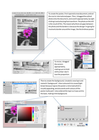
- 1. To create the poster,firstIopenedanew document,andset the size to internationalpaper.Then,Idraggedthe edited photoonto the document,andsizeditappropriately,byright clickingitandselectingfree transform.The photoonthe left isthe resultof this.The reasonwhythere are gaps between the photoand the bordersis because the designI’mgoingfor involvedaborderaroundthe image,like the birdmanposter. To resize,Idragged the corners appropriately, makingsure to hold shiftsothat I don’t lose the proportion. Thento create the background,Icreateda new layerand namedit‘background’.Ithencoloureditto cream/light brownbecause itgivesthe postera retrolookwhichis visuallyappealing,andalsoworkswith coloursof the posterreallywell.Ialsoorderedthe layersoitwassentto the back, makingitthe background.
- 2. Then,I wantedtocreate more space at the bottomof the posterforthe filmtitle,and the creditblock,and the release date,andso inorder to dothis,insteadof cuttingthe image,Ifadeditout usinga layermask.To do this,Ifirstselectedthe layerwiththe photo,thenI selectedcreate layermask, made the foregroundandbackground coloursblackand white,thenselectedthe gradienttool,anddrew a vertical line onthe sectionof the posterI wantedtofade out, makingsure it wason the layermask.What thisdoesisthat it hidespartof the poster and blendsitwiththe background.The resultof thiscan be seenbelow. Then,to create the filmtitle,Iusedthe texttool,anddrew a box aroundthe areaI wantedto the textto go. Then,Iselectedthe colourblack,as thiswill standoutagainstthe lightinthe photo, chose an appropriate fontthatI thinksuitedthe aestheticof the filmwell andalsosuccessfullytargetedthe audience myposteris aimedat,who are sophisticatedmiddle classfilmgoers.Ichose an appropriate size thatmade itstand out,and alsomade the textbold.Ithenhighlightedthe O’sof ‘Blossom’andmade them pink,thenIgot the paintbuckettofill the O’sinpinkas well.Idid thisbecause itmatchesthe pinkof the flowerandtherefore presentsalastingvisual appeal andwill stickinthe viewershead aftertheysee it,and italso presentsthe filmwell andhintsat whatit couldbe about. I alteredthe size,style andfontinthisbar.
- 3. I thenuse the texttool again forthe tagline of the filmposter.Ithoughtthat,the posterdidn’t effectivelypresentthe actual genre of the filmsofar,howeverIcouldamendthisusingthe tagline of the film.Inorderto put across the comingof age aspectof the film, Idecidedtofocusongrowingup inthe tagline.ThenIthoughtaboutthe story of our film, andhow it’sabouthow growingis complicatedanddifficult,andhowwe presentthe ‘adult’partof the filminblackandwhite.There’s phrase mostlyeveryoneisfamiliarwith,called‘blackandwhite’,suggestingthateverythingissimple. Thistiesinwell withourfilmbecause we are tryingtoshow that growingupisn’tsimple,andwe presentpartof the filminblackand white,andsothe tagline Icame upwithwas ‘Growingupisn’t all Black andWhite’.Thissuccessfullyconnotesvisual aspectsof the film, manythemesof the filmand tieswell withthe poster,asthe posterisn’tall blackandwhite,the flowerisincolour,hintingtowards the endof the film,howeverthe audience won’tknow this.Ithinkthe tagline successfullytargetsthe rightaudience anditis a clevertagline once one thinksfurtheraboutit,whichthereforeleaves audience tothinkaboutitonce theystoplooking.Imade the writingfontquite formal tosuit the poster,andmade the colourpink,butmade the ‘black’white andthe ‘white’black.The resultof this can be seeninthe printscreenbelow.
- 4. I thenaddedthe date of release sothe audience would knowwhenthe filmiscomingout,andmade ita faded grey,so that itdoesn’tstandoutas muchas the title or the tagline butstill visible.Ididthisonce againusingthe Texttool,and drawinga box. Here you can see me makingthe release date texta dark grey The final thingI hadto was create a creditsblockatthe bottomto make it lookprofessional andtogive the audience relevant informationif theyseekit.The reasonIdon’tmake the directors name or actors name large and boldand visible isbecauseit isn’ta recognisable name andwouldthereforebe awaste of space,as thiswon’tturn heads.Tocreate a creditblockI useda template I foundonline,Iaddedall the detailssuchasdirector,actor, cinematographer,producerandpasteditat the bottom of the photo,made itthe size justrightenoughtofit,and made itthe same colouras the release date text.Myfinal designdraftand resultof thiscan be seenbelow.