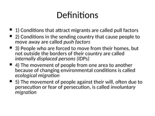
1) Conditionsthat attract migrants are called pull factors
2) Conditions in the sending country that cause people to
move away are called push factors
3) People who are forced to move from their homes, but
not outside the borders of their country are called
internally displaced persons (IDPs)
4) The movement of people from one area to another
because of changing environmental conditions is called
ecological migration
5) The movement of people against their will, often due to
persecution or fear of persecution, is called involuntary
migration
Definitions
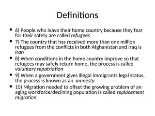
5.
6) Peoplewho leave their home country because they fear
for their safety are called refugees
7) The country that has received more than one million
refugees from the conflicts in both Afghanistan and Iraq is
Iran
8) When conditions in the home country improve so that
refugees may safely return home, the process is called
voluntary repatriation
9) When a government gives illegal immigrants legal status,
the process is known as an amnesty
10) Migration needed to offset the growing problem of an
aging workforce/declining population is called replacement
migration
Definitions
6.
These are:Voluntary or involuntary? Permanent or temporary?
Legal or illegal? International or internal?
11) The two main ways that people become illegal immigrants are
- entering a country illegally
- illegally remaining in the country after a visa has expired or an
asylum application has been denied
12) The two regions in the world that receive the most illegal
immigrants are United States and Western Europe
13) Two Canadian provinces that have had their populations
increased because of internal migration are Alberta, British
Columbia
The various categories of migration
are determined by four questions
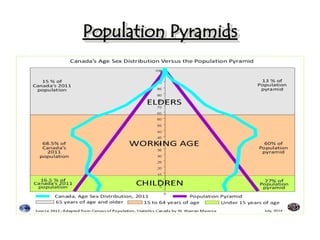
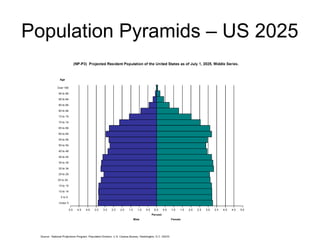
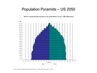
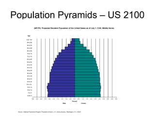
Population Pyramids
• Apopulation pyramid is two back-to-back bar
graphs, one showing the number of males and
one showing females in a particular population
in five-year age groups (also called cohorts).
• A great deal of information about the population
broken down by age and sex can be read from a
population pyramid, and this can shed light on
the extent of its development.
– Birth rate trends
– Death rate trends
– Number of economic dependents (<15, >65)
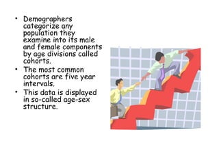
• Demographers
categorize any
populationthey
examine into its male
and female components
by age divisions called
cohorts.
• The most common
cohorts are five year
intervals.
• This data is displayed
in so-called age-sex
structure.
20.
• Because theage-sex
structures of many
countries take a triangular
or pyramidal shape, this
type of graph is called
POPULATION PYRAMID.
21.
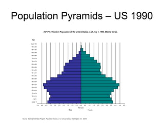
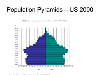
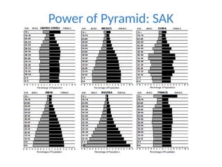
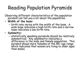
Reading Population Pyramids
Observingdifferent characteristics of the population
pyramid can tell you a lot about the population.
• Width of the base:
– birth rate varies with the width of the base. A
wide base indicates a high birth rate and a narrow
base indicates a low birth rate.
• Symmetry:
– statistically speaking pyramids should be relatively
symmetrical. Any asymmetry indicates a
difference in the male and female population. This
pyramid shows more females at the 85+ age range
which indicates that women are living to older ages
than males.
22.
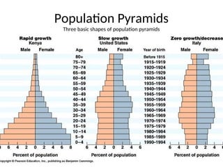
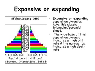
Expansive or expanding
•Expansive or expanding
population pyramids
have this classic
triangular/pyramid
shape.
• The wide base of this
population pyramid
indicates a high birth
rate & the narrow top
indicates a high death
rate
23.
Expansive or ExtendingII
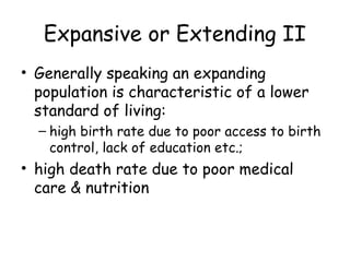
• Generally speaking an expanding
population is characteristic of a lower
standard of living:
– high birth rate due to poor access to birth
control, lack of education etc.;
• high death rate due to poor medical
care & nutrition
24.
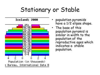
Stationary or Stable
•population pyramids
have a 1/2 elipse shape.
• The base of this
population pyramid is
similar in width to the
population of the
reproductive ages which
indicates a stable
population.
25.
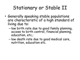
Stationary or StableII
• Generally speaking stable populations
are characteristic of a high standard of
living due to:
– low birth rate due to good family planning,
access to birth control, financial planning,
education, etc.;
– low death rate due to good medical care,
nutrition, education etc.
26.
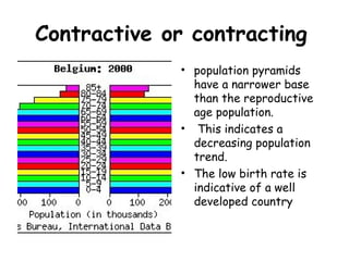
Contractive or contracting
•population pyramids
have a narrower base
than the reproductive
age population.
• This indicates a
decreasing population
trend.
• The low birth rate is
indicative of a well
developed country
27.
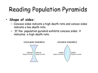
Reading Population Pyramids
•Shape of sides:
– Concave sides indicate a high death rate and convex sides
indicate a low death rate.
– If the population pyramid exhibits concave sides it
indicates a high death rate.
28.
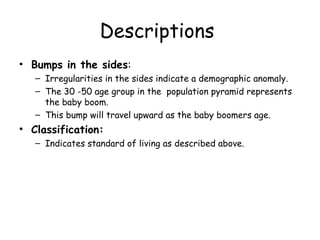
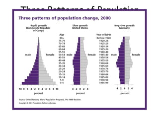
Descriptions
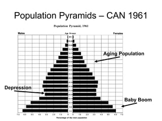
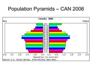
• Bumps inthe sides:
– Irregularities in the sides indicate a demographic anomaly.
– The 30 -50 age group in the population pyramid represents
the baby boom.
– This bump will travel upward as the baby boomers age.
• Classification:
– Indicates standard of living as described above.
29.
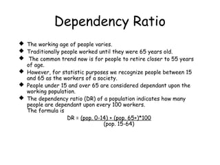
Dependency Ratio
Theworking age of people varies.
Traditionally people worked until they were 65 years old.
The common trend now is for people to retire closer to 55 years
of age.
However, for statistic purposes we recognize people between 15
and 65 as the workers of a society.
People under 15 and over 65 are considered dependant upon the
working population.
The dependency ratio (DR) of a population indicates how many
people are dependant upon every 100 workers.
The formula is
DR = (pop. 0-14) + (pop. 65+)*100
(pop. 15-64)
30.
Test Yourself
1. Whatdoes the vertical axis on the population pyramid
represent?
2. What type of population pyramid is indicative of a lesser
developed country?
3. What does a narrow base to the population pyramid indicate?
4. What type of population pyramid has a triangular shape?
5. What type of population pyramid is wider at the reproductive
age than at the pre-reproductive ages.
6. _?_ are graphs that show the age structure of a population by
age & gender.
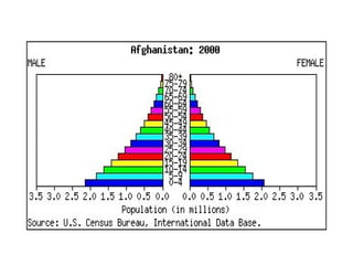
7. What type of population pyramid is depicted below? What
characteristic of this population pyramid indicate its high death
rate?
32.
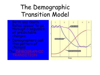
The Demographic
Transition Model
•Birth and death
Rates appear to go
through a sequence
of predictable
changes.
• Demographers call
this pattern of
changes
The DEMOGRAPHIC
TRANSITION
33.
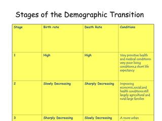
Stages of theDemographic Transition
Stage Birth rate Death Rate Conditions
1 High High Very primitive health
and medical conditions:
very poor living
conditions,a short life
expectancy
2 Slowly Decreasing Sharply Decreasing Improving
economic,social,and
health conditions:still
largely agricultural and
rural:large families
3 Sharply Decreasing Slowly Decreasing A more urban
36.
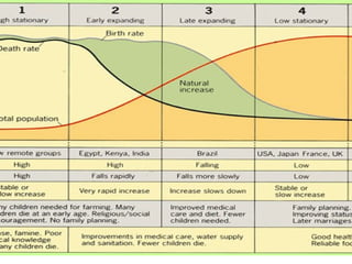
Transition 1
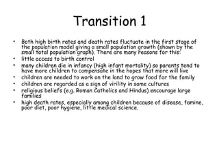
• Bothhigh birth rates and death rates fluctuate in the first stage of
the population model giving a small population growth (shown by the
small total population graph). There are many reasons for this:
• little access to birth control
• many children die in infancy (high infant mortality) so parents tend to
have more children to compensate in the hopes that more will live
• children are needed to work on the land to grow food for the family
• children are regarded as a sign of virility in some cultures
• religious beliefs (e.g. Roman Catholics and Hindus) encourage large
families
• high death rates, especially among children because of disease, famine,
poor diet, poor hygiene, little medical science.
37.
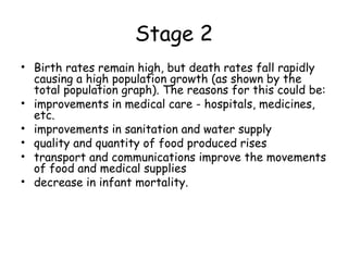
Stage 2
• Birthrates remain high, but death rates fall rapidly
causing a high population growth (as shown by the
total population graph). The reasons for this could be:
• improvements in medical care - hospitals, medicines,
etc.
• improvements in sanitation and water supply
• quality and quantity of food produced rises
• transport and communications improve the movements
of food and medical supplies
• decrease in infant mortality.
38.
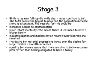
Stage 3
• Birthrates now fall rapidly while death rates continue to fall.
The total population begins to peak and the population increase
slows to a constant. The reasons for this could be:
• increased access to contraception
• lower infant mortality rate means there is less need to have a
bigger family
• industrialization and mechanization means fewer laborers are
required
• the desire for material possessions takes over the desire for
large families as wealth increases
• equality for women means that they are able to follow a career
path rather than feeling obligated to have a family.
39.
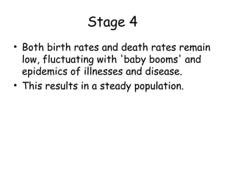
Stage 4
• Bothbirth rates and death rates remain
low, fluctuating with 'baby booms' and
epidemics of illnesses and disease.
• This results in a steady population.
40.
Stage 5?
• stage5 was not originally thought of as part
of the DTM, but some northern countries are
now reaching the stage where total population
is declining where birth rates have dropped
below death rates. One such country is
Germany, which has taken in foreign workers
to fill jobs. The UK's population is expected
to start declining by 2021.
41.
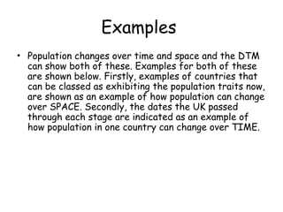
Examples
• Population changesover time and space and the DTM
can show both of these. Examples for both of these
are shown below. Firstly, examples of countries that
can be classed as exhibiting the population traits now,
are shown as an example of how population can change
over SPACE. Secondly, the dates the UK passed
through each stage are indicated as an example of
how population in one country can change over TIME.
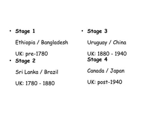
42.
• Stage 1
Ethiopia/ Bangladesh
UK: pre-1780
• Stage 2
Sri Lanka / Brazil
UK: 1780 - 1880
• Stage 3
Uruguay / China
UK: 1880 - 1940
Stage 4
Canada / Japan
UK: post-1940
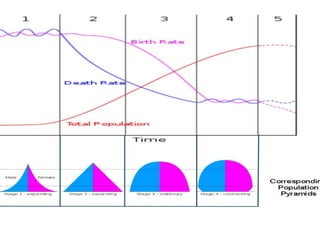
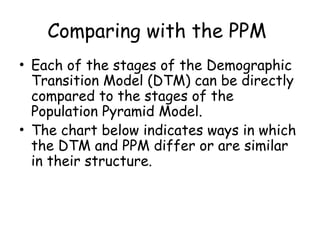
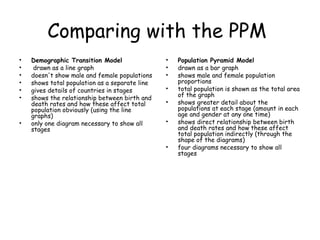
Comparing with thePPM
• Each of the stages of the Demographic
Transition Model (DTM) can be directly
compared to the stages of the
Population Pyramid Model.
• The chart below indicates ways in which
the DTM and PPM differ or are similar
in their structure.
45.
Comparing with thePPM
• Demographic Transition Model
• drawn as a line graph
• doesn't show male and female populations
• shows total population as a separate line
• gives details of countries in stages
• shows the relationship between birth and
death rates and how these affect total
population obviously (using the line
graphs)
• only one diagram necessary to show all
stages
• Population Pyramid Model
• drawn as a bar graph
• shows male and female population
proportions
• total population is shown as the total area
of the graph
• shows greater detail about the
populations at each stage (amount in each
age and gender at any one time)
• shows direct relationship between birth
and death rates and how these affect
total population indirectly (through the
shape of the diagrams)
• four diagrams necessary to show all
stages