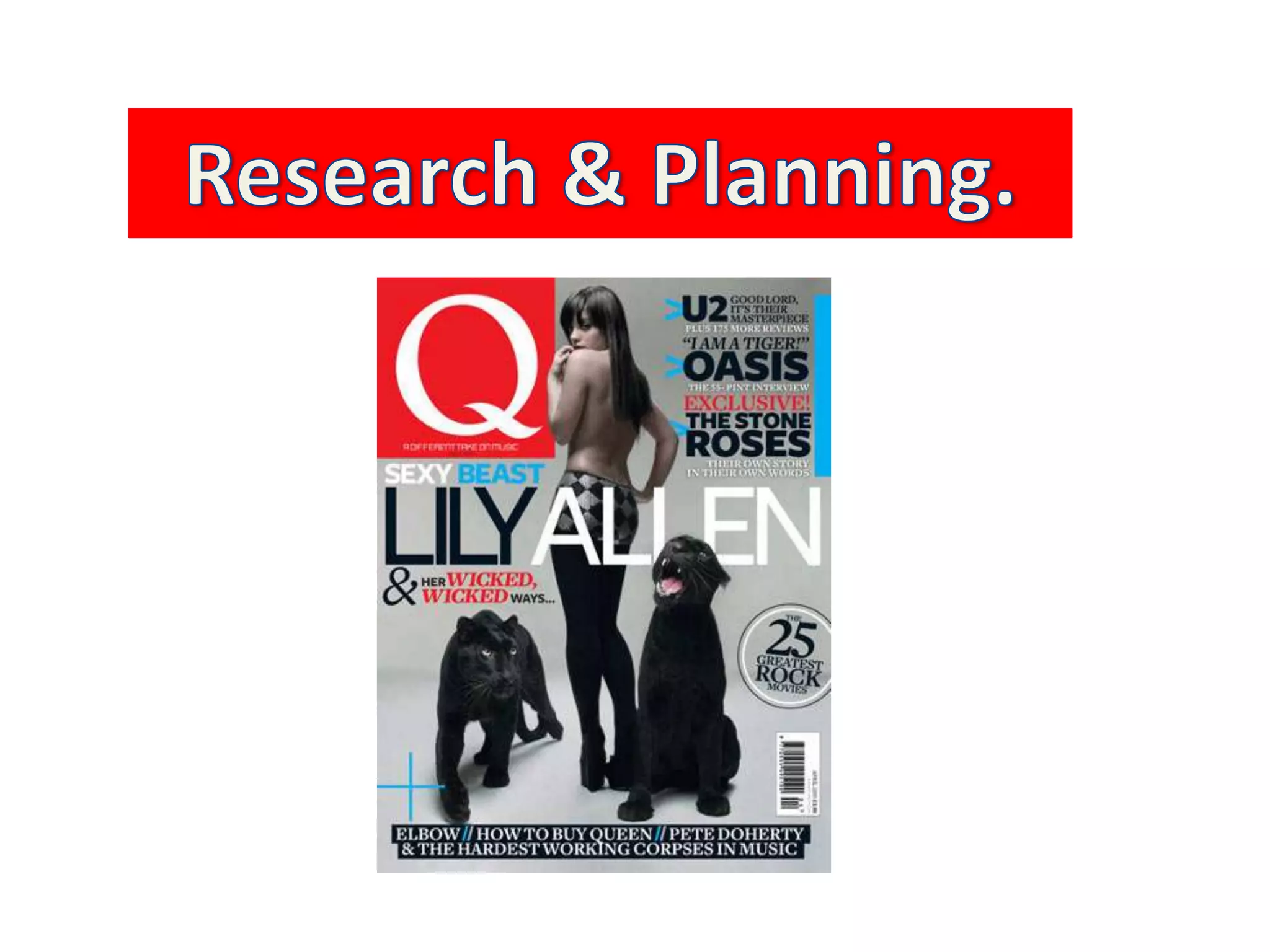
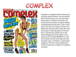
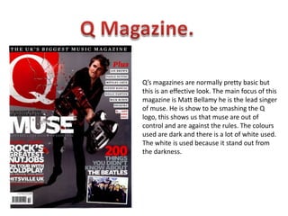
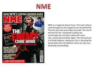
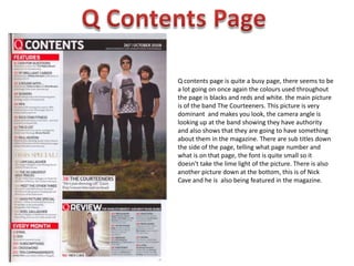
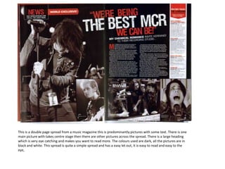
Research & Planning.
COMPLEXComplex is a magazine that involves music and also involves fashion. You can tell this from the front cover as it consists of Keri Hilson who is a female’s solo artist. We also know this as there is a speech bubble incorporating Kid Cudi who is also a music artist. The two main colours are Blue and Yellow this is because Keri Hilson the main focus point is wearing yellow so the text fits in. Also the blue stands out on the yellow background which makes it very easy to read. The title COMPLEX is in red this to boast the title and make sure that everyone sees it. Complex is a well known magazine. The font is quite childish and fun this shows that is maybe isn’t taking so seriously.
Q Magazine.Q’s magazines are normally pretty basic but this is an effective look. The main focus of this magazine is Matt Bellamy he is the lead singer of muse. He is show to be smashing the Q logo, this shows us that muse are out of control and are against the rules. The colours used are dark and there is a lot of white used. The white is used because it stand out from the darkness.
NMENME is a magazine about music. The main colours used through out the magazine are red and white. This hits you hard and makes you look. The size of the font for the  masthead is pretty, but surprisingly the sub title is about the same size, using read and white again. The main picture is of Andy Hopkins, looking as if he is shouting the words down the microphone, there are two very attracting sub headings.
Q Contents PageQ contents page is quite a busy page, there seems to be a lot going on once again the colours used throughout the page is blacks and reds and white. the main picture is of the band The Courteeners. This picture is very dominant  and makes you look, the camera angle is looking up at the band showing they have authority and also shows that they are going to have something about them in the magazine. There are sub titles down the side of the page, telling what page number and what is on that page, the font is quite small so it doesn't take the lime light of the picture. There is also another picture down at the bottom, this is of Nick Cave and he is  also being featured in the magazine.
This is a double page spread from a music magazine this is predominantly pictures with some text. There is one main picture with takes centre stage then there are other pictures across the spread. There is a large heading which is very eye catching and makes you want to read more. The colours used are dark, all the pictures are in black and white. This spread is quite a simple spread and has a easy let out, it is easy to read and easy to the eye,

Planning!

  • 1.
  • 2.
    COMPLEXComplex is amagazine that involves music and also involves fashion. You can tell this from the front cover as it consists of Keri Hilson who is a female’s solo artist. We also know this as there is a speech bubble incorporating Kid Cudi who is also a music artist. The two main colours are Blue and Yellow this is because Keri Hilson the main focus point is wearing yellow so the text fits in. Also the blue stands out on the yellow background which makes it very easy to read. The title COMPLEX is in red this to boast the title and make sure that everyone sees it. Complex is a well known magazine. The font is quite childish and fun this shows that is maybe isn’t taking so seriously.
  • 3.
    Q Magazine.Q’s magazinesare normally pretty basic but this is an effective look. The main focus of this magazine is Matt Bellamy he is the lead singer of muse. He is show to be smashing the Q logo, this shows us that muse are out of control and are against the rules. The colours used are dark and there is a lot of white used. The white is used because it stand out from the darkness.
  • 4.
    NMENME is amagazine about music. The main colours used through out the magazine are red and white. This hits you hard and makes you look. The size of the font for the masthead is pretty, but surprisingly the sub title is about the same size, using read and white again. The main picture is of Andy Hopkins, looking as if he is shouting the words down the microphone, there are two very attracting sub headings.
  • 5.
    Q Contents PageQcontents page is quite a busy page, there seems to be a lot going on once again the colours used throughout the page is blacks and reds and white. the main picture is of the band The Courteeners. This picture is very dominant and makes you look, the camera angle is looking up at the band showing they have authority and also shows that they are going to have something about them in the magazine. There are sub titles down the side of the page, telling what page number and what is on that page, the font is quite small so it doesn't take the lime light of the picture. There is also another picture down at the bottom, this is of Nick Cave and he is also being featured in the magazine.
  • 6.
    This is adouble page spread from a music magazine this is predominantly pictures with some text. There is one main picture with takes centre stage then there are other pictures across the spread. There is a large heading which is very eye catching and makes you want to read more. The colours used are dark, all the pictures are in black and white. This spread is quite a simple spread and has a easy let out, it is easy to read and easy to the eye,