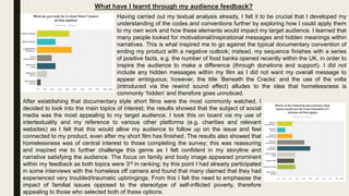
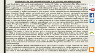
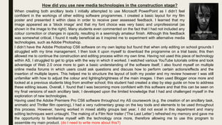
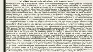
2. In what ways does your product use, develop and challenge forms and conventions of
real media products?
After choosing to do the short film brief I looked into the codes and conventions commonly used in this form of media
production. It became apparent that short films rarely consist of more than 1-3 characters; this is most likely due to the limited
screen time available within the narrative. Not only this, but due to the fast paced shift in equilibrium, the audience would find
it harder to follow if there were many more characters included. The short film ‘Lovesick’ includes more than 3 characters
(e.g. the main character, love interest #1 and her boyfriend, love interest #2 and ‘Bieber’), however these supporting roles do
not possess their own narrative; ‘Lovesick’ continues to follow the story of just one central character, therefore not effecting
the fluidity of the product. Originally, I had planned to challenge this convention by including footage of numerous homeless
people via the interview technique; I felt that if I featured more than one rough sleeper, the severity of the issue (and
therefore the overall message of my product) would be highlighted. In order to ensure overall fluidity and understanding of
the film, I had also planned to include a voice over to read shocking facts on top of the iconic footage of London (otherwise
known as the ‘story-teller’). Unfortunately, majority of individuals did not want to be filmed but many were happy to participate
in the interview off-camera; they then assured me that they did not mind their answers being used as long as it remained
anonymous. This led me to feature a small running narrative within my documentary style film as I decided to include a male
actor to play the role of a homeless person; the dialect was not superficially scripted but was taken directly from genuine
interviews. Although this follows the more traditional convention, I feel that this was effective in allowing the audience to
connect/engage with my character on a more personal basis
When looking into common portrayals of the homeless within the media, I came across a very negative
stereotype which I wanted to somewhat challenge. For example, ‘The Agony of Jimmy Quinlan’ (1) is
one of the documentaries that I looked at within my research; it focuses on the life of a homeless addict
and his battle to reach sobriety. Although there are many cases similar to this, not all individual’s living
on the street are there as a result of drug abuse, crime or alcoholism. I wanted to convey both sides of
this spectrum, therefore leading me into creating a character with visual and verbal contrast. The visual
representation follows the stereotypical conventions of a homeless person through different aspects of
mise-en-scene, e.g. costume and props. Both a cigarette and a bottle of alcohol are featured in order to
symbolise the hardships and the struggle of life on the streets (2); this coincides with the scruffy clothing
and unshaven face to create the (primarily male) stereotype. However, this is juxtaposed (and therefore
challenged) via the verbal representation of the character as the dialect refers to familial difficulties
rather than substance abuse which would have been expected.
(1)
(2)
3. In what ways does your product use, develop and challenge forms and conventions of
real media products?
Another convention that is typically associated with short films is the application of Todorov’s theory of equilibrium; it is said that
this must be followed in order to keep the audience engaged/interested in such a short space of time. This was seen during my
textual analysis as a clear sense of disruption often appeared mid narrative, e.g. the presence of a stranger in ‘Night Night
Nancy’ and the new found ability to mould facial features in ‘Plastic’. Due to my short film being based around a topic of
controversy, this convention has been somewhat challenged as there is no conclusive feeling of a new, re-balanced equilibrium
towards the end; in place of this, my product consists of a turning point mid-sequence introduced via the rewind sound effect.
This does not necessarily reflect a sense of disequilibrium, but in place offers an alternate perspective on the streets of London-
hence the title ‘Beneath the Cracks’; from this moment my film delves into the more visual representation of homelessness. In
relation to the typically linear narrative of a sh0rt film, my product does not consist of a beginning, a middle and an end; instead,
my film features a more circular narrative as the rewind also works in effect to go back to the original clips but show the harsher
reality of them.
In terms of shot types and camera techniques, many of the short films I looked at
seemed to open the film through a series of establishing shots, e.g. ‘Connected’. This is
done to introduce the setting/location of the film as well as setting up the context of the
scene. Due to my desire to include various aspects of semiotics, I found that by following
this convention it became apparent to the audience that my film was based in the iconic
city of London. The signifiers (the red buses and taxi’s present within the shots) are
perceived as resembling or imitating the signified (London itself), therefore creating an
association/link which is picked up by the audience.
Another conventional shot type commonly used within short films is that of the close-up. These are
used to familiarise the audience with the character as there is a very limited time to do so through the
onscreen narrative/storyline. When looking into this code I decided that I wanted to develop this
convention to achieve a different effect; rather than provoking a sense of recognition/familiarity, I
wanted to make it appear more personal yet maintain a sense of anonymity. I did this through a series
of close-ups and extreme close-ups that cut off the majority of my characters facial features, e.g.
when smoking, drinking and speaking, his mouth is featured but his eyes are absent from the shot.
(‘Connected’)(My Product)
(My Product)
(‘Unwind’)
4. In what ways does your product use, develop and challenge forms and conventions of
real media products?
Within my textual analysis of short films, the title sequences typically appeared on
top of the action at the beginning of the film, as seen in ‘Lovesick’, ‘Night Night
Nancy’ and ‘Plastic’. By having the titles appear over the action, time is saved and
the footage remains consistent and unbroken. However, I decided that I wanted to
challenge this convention and have my title sequence appear on a black screen; I
made this decision based on the fact that I wanted the audience to engage with the
title and the meaning behind it- when choosing to present the title on top of action,
filmmakers run the risk of the audience being distracted by the background footage
and I wanted to avoid this possibility. As well as this, I found that the placement of
the titles is often used as an introductory focus, however I felt that by placing it mid-
sequence I was able to engage the audience and spark a sense of curiosity; the
presence of the on-screen facts alludes to the nature/direction of the film before the
title is even present.
After being inspired by the documentary series ‘Can’t Pay We Will Take It Away’ on Channel
5 and numerous Micheal Moore documentaries, I decided to add facts and statistics via
consistent text inserts throughout my film. This could also have been done through the use
of a voice-over, however, due to being told that both my filming and audio recording
equipment were not permitted, I did not have the necessary authorization to go ahead with
this process. As well as this, a book I read as part of my research called ‘Documentary
Storytelling: Creative Nonfiction on Screen’ states that documentaries should ‘demand the
active engagement’ of the audience; I feel that through reading the facts themselves the
audience must stay focused and pay close attention in order to fully process the information,
whereas a voiceover may encourage them to be more passive in their response. I felt that
my central focus/topic was an area that too often resulted in a passive response from the
public (inspiring my choice of title- ‘Beneath the Cracks’ so my main initiative was to go
against this lack of social engagement and prioritise the issue that is homelessness.
(My Product Title)
(‘Night Night Nancy’ Title) (‘Lovesick’ Title)
(‘Plastic’ Title)
5. In what ways does your product use, develop and challenge forms and conventions of
real media products?
Having had no experience in the creation of a film poster, I found it vital that I go away and do some in depth textual analysis
on the codes and conventions typically used in relation to the typography, the composition and the layout.
I found that the title is commonly positioned central to the frame in width and
within the first or last third in length. I followed this convention and placed my
title at the bottom of the frame; I felt that if it was positioned any higher then I
would have run the risk of having my title overlap my image, therefore
obscuring it. The typography typically links to the themes/genre present within
the short film, e.g. more feminine fonts such as those featuring in serif are
often used to advertise ideas of romance, drama or truth (e.g.
documentaries); although I chose to follow this convention, I also decided to
present my credits in sans-serif in attempt to emphasise the severity of the
issue. The credits are traditionally placed just beneath the title and are
structured in line length; this comes across as more professional and
balances the visual appearance of the poster. (1)
(1) *CREDITS IN MY PRODUCT*
(1) *CREDITS IN ‘THE WRITER’S ROOM*
Another popular convention is the insertion of a tag line; not only is this prominent within the advertisement of short films, it is
also extremely common when applied to the documentary genre (2). In effect, a tagline is a small quote that somehow acts as
a synopsis in relation to the plot of the film. However, I wanted my image to be the main point of focus within my poster; I felt
that by going against this convention the audience would be left to interpret the poster’s true meaning on their own, therefore
grabbing the attention of individuals that may not necessarily have been interested on the topic of homelessness.
(2) *TAGLINE IN ‘NO IMPACT MAN’* (2) *TAGLINE IN ‘THE TILLMAN STORY’*
(2) *TAGLINE IN ‘BLACKFISH’*
6. In what ways does your product use, develop and challenge forms and conventions of
real media products?
Having spent a short period of time studying the conventions of the Film
Noir genre, I wanted to incorporate these traditions into my own work via
my poster. I found that through a grey scale colour scheme I was able to
truly emphasise the contrast between the colourful life of London and the
poverty that lies beneath. The use of low-key lighting and silhouettes are
strongly associated with this genre; this influenced me to experiment with
the double layered image as well as adjust the levels of opacity in order to
highlight the cyclical nature of life on the streets. Similarly, this can be
seen in the poster for the short film ‘Insomniacs’ (1); I found this to be
really effective at creating a sense of ambiguity in which I wanted to
somewhat recreate within my own piece.
(1)
When researching into the typography featured in common film posters, I found that the title
often appears in a sans-serif font; this adds a serious tone to the ambience of the poster and
coincides with the film credits, therefore creating a sense of synergy throughout. I chose to
go against this code as I felt that a serif font would be more elegant in appearance and
would differ from the every-day font seen within newspapers and books, therefore making it
stand out. I thought this to be an essential factor in the advertisement of my main product as
a memorable font equates to a memorable title. After recently watching the film ‘Red Riding Hood’ (2),
I decided to look into what drew me to that film specifically; it occurred to me that the red font colour
separated this product from various others, especially as the strong contrast against the black and
white background caused it to be more eye-catching and bolder in appearance. The title and storyline
of this film somehow interlinks with the connotations of the colour red, therefore associating itself with
the poster via the text format. I also chose to use a red font within my own product as I felt that this
colour is stereotypically representative of London life as well as being heavily featured within my
opening footage.
(2)
7. In what ways does your product use, develop and challenge forms and conventions of
real media products?
(1)
When looking into the layout of a typical film review I found that there
were slight differences depending on the media platform in which the text
is published, e.g. hard-copy magazine, online website. The information
and the text featured was no different, however the way in which this
information was structured and/or positioned varied throughout. I looked
at multiple hard-copies of ‘Empire’ magazine and found that the use of
columns to present the text was consistent and effective; through doing so
the page appeared well organised and easy to read/follow. Although this
was not seen throughout the online reviews that I analysed, I decided to
take a more traditional approach by following this convention as I felt that
it would also help me to position my images without obscuring the text.
I was strongly inspired by the ‘Blackfish’ film review,
featured on the Telegraph website; this was not the
only review I analysed that featured a summary box
to the corner of the frame, however I followed the visual conventions of ‘Blackfish’ more closely. Other
film reviews such as ‘An Inconvenient Truth (Empire) and ‘Love Rosie’ (Rotten Tomatoes) also section
off this information and position it all in one place; this is extremely effective as the audience can access
the key pieces of data quickly, without having to read the entire review.
‘Pugs’ are very short yet essential pieces of information in reference to
the presentation of a magazine; they allude to the contents and location
of the data inside. I have not yet come across a modern day magazine without the use of pugs and puffs,
so felt it to be essential that I followed this convention and included some of my own. The contents page
often informs readers of the locations of various reviews/articles, therefore influencing my decision to
include a page number so that my product can be easily found and referenced. I also included the
magazine edition/release date as well as a form of intertextuality: the name of the company/magazine.
8. In what ways does your product use, develop and challenge forms and conventions of
real media products?
I was heavily influenced by the layout of Empire magazine and the way in which they chose
to structure their reviews. One convention that I found to be interesting was the insertion of a
white text box which overlapped the headline image; this text box consisted of a small
synopsis/summary of the upcoming review and the media text in which it was based. I found
this to be very effective as it has been said that audiences are more likely to be drawn to
small sections of text, therefore drawing in the attention of the reader and giving them the
general information- it is at this point that the reader deciphers whether or not they are
interested enough to read on. I chose to follow this convention, however instead of using
bullet points to separate my information, I used a simple one liner in a larger font which stated
the nature of the film, the director (myself) and the storyline/plot. According to the typical
image/text ratio used within the Empire magazine layout, this text box should not cover more
that 20% of the image and should not divert attention away from the central focus, e.g.
characters or settings. The box is always positioned towards the edge of the frame and is
never featured in the centre of the image, as seen in the examples shown.
I also chose to use a font that is typical to the writings of everyday magazines, journals and
articles that depict the news. These fonts usually follow a serif style text in order to appear
easier for the reader to follow ; according to the article ‘Serif vs. Sans for Text in Print’
(https://www.fonts.com/content/learning/fontology/level-1/type-anatomy/serif-vs-sans-for-text-
in-print) the use of serif’s has also been credited to increase readability and reading speed as
they help the eye ‘travel across the line’. However, due to many serif fonts standing for
decorative purposes, many jeopardise the legibility of the font itself, meaning that I had to be
very precise in my selection. I took both italics and roman typography into account when
following this convention.
(My Product)
(Empire Magazine)
(Empire Magazine)
9. How effective is the combination of your main and ancillary texts?
The combination between my main product and both ancillary texts is very effective as I have enforced a strong sense of
synergy throughout; the colour red is consistently used within all three of my media texts in order to represent the
stereotypical streets of London. My introductory footage features many iconic symbols such as red buses and red phone
boxes; this is seen within my film review also as my image is taken directly from the footage used within my short film in order
to add a sense of familiarity and/or recognition. The narrative structure within my film review matches that of my short film as
the portrayal of London life is seen first (with no obvious sense of disequilibrium); however, once reaching the rewind (within
the short film) and the image featured on the second page (within the film review), the visual aspects of mise-en-scene
present something much darker. A further sense of synergy is created via the use of red titles within my film poster; this
alludes to the icon that is London itself, however also contains connotations of danger and the hardships of survival, much in
relation to the topic of homelessness.
Originally, I wanted to include a ‘cracked effect’ across all three texts (my main product and both
of my ancillary tasks). I had planned to do so by downloading a royalty free jpeg image that
fitted my idea and inserting it through the addition of a new layer (in photoshop) or a title still (in
premiere pro). However, I decided to go against this idea as I felt that the text included in the
film review and the narrative of the short film somewhat revealed the true nature/meaning
behind both of these products. The poster, on the other hand, did not obviously allude to the
issue of homelessness; I found that through adding the ‘cracked effect’ to my poster, the title
was emphasised and it somewhat became a play on words- a clever technique in which the
audience then perceived the male character as broken and/or damaged. By excluding this effect
from my film and review, I was able provoke feelings of inspiration rather than that of ambiguity.
10. What have I learnt through my audience feedback?
When creating my survey via ‘Survey Monkey’, I estimated that those who responded to it would be of a similar category as
those who would be most likely to watch my short film. Originally, I had aspired for my target audience to be varied in gender
and consist of a range of different age groups (12-50). I felt that my product would appeal to those who were interested in
controversial issues, educational videos and specifically the topic of homelessness. The survey was distributed via social
networking sites, printed hard-copies and within the classroom; this was to guarantee that the responses received were
representative of a variety of different social groups, e.g. ethnicity, race, gender, age and interests.
When I asked the gender of those who filled out the survey, the outcome was not unexpected. It
became apparent to me that females are more of an active audience than men as this was
correlational to the responses I got last year in my AS research. This allowed me to explore the
ways in which my product could entice a more masculine audience; due to males being passive in
their interaction with my survey, I wanted to ensure that my final product appealed to both genders-
this led me to include a male lead within the narrative sequence of my film. This is due to the idea
that men are more attracted to films in which they feel that they can relate to the main character; if I
had chosen to use a woman instead, the male audience may have felt it to be less personal.
The majority of those who responded to my survey fell under the age categories of ‘under 15’ and ‘15-
20’. Although this may have been due to me using an opportunity sample, it could also have been
representative of my target audience. I used this finding in order to help me filter the explicit content
from my footage, e.g. numerous individuals used examples of strong language during interviews that
had to be edited out/rewritten before the script was given to my actor. This led me to classify my film
with a PG rating due to the sensitive content that may be perceived as upsetting for younger viewers.
However, I found it crucial that older viewers were also kept engaged and that the impact of the
message would not be desensitised due to the child-friendly approach; I did this towards the end of
the sequence by directly addressing the older audience, e.g. referencing a relevant charity and
encouraging viewers to support and make donations. Research carried out by CAF and Bristol
university as they found that over 60’s are twice as likely to give to charity compared to those in a
younger age category.
11. What have I learnt through my audience feedback?
I felt that it was an important part of my research stage to establish the
audience’s film preferences within my survey; through asking this question I
discovered that feature films were more popular than short films as over 70% of
those who responded favoured them in comparison. This may be because
feature films are more globally recognised through the use of persistent
advertisement and are also seen to be more easily accessible, e.g. cinemas,
DVDs; however, I could not be certain that this is the reason behind such
preferences. To justify the outcome I felt the need to question what aspects of
film created such a vast separation between the two forms of film; this led me to
ask my next question.
I asked those who selected feature films to justify their choice by selecting one
or more of the given options. Once receiving my results it became apparent that
the cast was a very influential component in the art of filmmaking as the
featuring of popular actors/actresses was the most highly selected response;
due to both my low budget and my amateur status as a filmmaker, I was unable
to incorporate this data into my own short film. As presumed, having a
film/media product distribute through DVD and cinema contributed to how likely
the audience were to watch it; films that appear in cinemas are often released
at a similar time to the DVD- this allows the media product to become
prominent topic of conversation/discussion, somewhat enhancing audience
awareness. It also appeared that the film length itself appealed to the audience
as feature films consisted of more content and were therefore deemed more
entertaining; this was something that I could not address due to the given
briefs, however it encouraged me to experiment with the idea of narrative.
12. What have I learnt through my audience feedback?
I wanted to find out how many of my survey responders had previous experience with
the consumption of short films. To my surprise, majority of those who answered the
question stated that they had watched other short films in the past, with only 21%
stating that they had never watched one. Before this stage of my research, I had fears
that my audience would have a biased viewpoint on my product due to the typical
expectations associated with a full-length film (feature film); having a wider knowledge
of short films helped my audience to engage with my product as they could compare it
to other short films that they had watched and offer both a more critical and educated
response.
By asking what genre(s) of short film they were familiar with, I was able to incorporate a
variety of different codes and conventions into my own product that would relate back to
what appeared to be the most popular genres. Fortunately, the documentary genre
gained the most votes; this gave me more confidence to explore and develop upon the
typical documentary conventions as I felt that the audience would be attracted to my
product regardless due to the classification. It also became apparent that many of my
target viewers had watched short films that fell into the Horror/Thriller category; I used
this to my advantage through my choice of topic and use of mise-en-scene, as the
portrayal of life on the streets is seen to be quite dark and dismal in nature. Although the
genre of Animation appeared quite popular, I could not build upon this finding within my
own production piece due to not having the facilities/equipment to do so. As well as this,
animation films are typically less serious and more for entertainment purposes rather
than that of education, and would therefore juxtapose the topic of homelessness and
appear more light-hearted, e.g. cartoons. Crime/action were almost identical in
popularity and although I have included some elements of crime (e.g. in reference to
prison and alcoholism), I chose to steer clear of romantic codes and conventions as I felt
this would jeopardise my desired impact and the serious tone of my product.
13. What have I learnt through my audience feedback?
Having carried out my textual analysis already, I felt it to be crucial that I developed my
understanding of the codes and conventions further by exploring how I could apply them
to my own work and how these elements would impact my target audience. I learned that
many people looked for motivational/inspirational messages and hidden meanings within
narratives. This is what inspired me to go against the typical documentary convention of
ending my product with a negative outlook; instead, my sequence finishes with a series
of positive facts, e.g. the number of food banks opened recently within the UK, in order to
inspire the audience to make a difference (through donations and support). I did not
include any hidden messages within my film as I did not want my overall message to
appear ambiguous; however, the title ‘Beneath the Cracks’ and the use of the volta
(introduced via the rewind sound effect) alludes to the idea that homelessness is
commonly ‘hidden’ and therefore goes unnoticed.
After establishing that documentary style short films were the most commonly watched, I
decided to look into the main topics of interest; the results showed that the subject of social
media was the most appealing to my target audience. I took this on board via my use of
intertextuality and my reference to various other platforms (e.g. charities and relevant
websites) as I felt that this would allow my audience to follow up on the issue and feel
connected to my product, even after my short film has finished. The results also showed that
homelessness was of central interest to those completing the survey; this was reassuring
and inspired me to further challenge this genre as I felt confident in my storyline and
narrative satisfying the audience. The focus on family and body image appeared prominent
within my feedback as both topics were 3rd in ranking; by this point I had already participated
in some interviews with the homeless off camera and found that many claimed that they had
experienced very troubled/traumatic upbringings. From this I felt the need to emphasise the
impact of familial issues opposed to the stereotype of self-inflicted poverty, therefore
appealing to those who selected both of these options.
14. How did you use new media technologies in the planning and research stage?
Within my planning and research stage I used Web 2.0 to actively engage with websites such as Youtube and other
social media platforms, e.g. Facebook and Twitter. I watched multiple short films online and dedicated a more specific
focus on examples of amateur film making in order to assist my own knowledge into the expectations/conventions
shown throughout. Web 2.0 allowed me to interlink with other students’ work and share my own thoughts and ideas
online; not only this, but the sample of people who responded to my survey was more varied due to the vast variety
of individuals who use similar networks. I often turned to social media platforms to advertise my short film and
distribute the link to my survey in hopes of receiving more feedback. Without this, I would have had to hand out hard
copies of my survey to those who fell into an opportunity sample, e.g. other pupils and members of staff. This would
have limited my knowledge as the responses received would have been less representative of my target audience as
a whole. Through using this piece of media technology I felt more connected and active as a filmmaker.
I found the use of Survey Monkey to be a very beneficial stage within my research; it allowed me to create a survey
that could be posted online as well as simply being printed. I was able to ask the necessary questions to expand my
knowledge on my audience and their preferences in film production- before going ahead and making any final
decisions. The creation of the survey was easy and not time consuming; there was already a basic layout provided
and I had to choose the form in which my audience responded, e.g. multiple choice, text box etc. I could then
reference this survey online and distribute it through the use of a hyperlink- once clicked, the user would be taken
directly to my survey and I would receive their results in seconds. I felt that through doing so, my results were
somewhat more reliable as all answers remained anonymous, therefore making my survey less susceptible to bias.
However, due to the lack of identification, a small minority of users did not accurately respond to my survey; instead,
writing humorous or unserious comments. It was not difficult to filter through these anomalies and exclude them from
my overall findings.
I used an online blogging website called Blogger to record my findings and track my progress. Everything that I learnt
through various other media technologies (as mentioned above) was uploaded onto my blog as evidence in which I
could refer back to at any given time. It also allowed me to keep somewhat organised throughout my project as I
know where all of the information was stored and could find it via the title of the text post or the date it was published.
I used Google as my main search engine as I was very familiar with the tabs and the location of the different icons; it
also provided me with limitless amounts of information in seconds and was very easy/convenient to access.
15. How did you use new media technologies in the construction stage?
Initially I wanted to record my footage on a DSLR camera with a high megapixel rate and a high rate of frames per second; I
felt that this would ensure that the cinematography was clearly focused and aesthetically pleasing, especially in terms of the
natural lighting used. I don’t have much experience with this piece of equipment but wanted to challenge myself as well as
develop upon my AS skills. I also wanted to position the camera on a tripod when capturing my scenery shots (of London) in
order to obtain stable and accurate footage. Unfortunately, I was prevented from doing so due to the recent attacks in Paris;
an enforcement officer informed me that setting up my equipment could provoke a sense of panic from the public and that I
was unable to procure the necessary permission due to my intent to distribute the footage (despite being for educational
purposes). I then decided to take advantage of having travelled to Oxford Circus by filming some test shots on my mobile
device; luckily, many of these were of good quality and appeared more realistic due to the documentary nature of my film.
Through the use of a hand held device, my shots appeared more abstract and true to the plot; I needed to bare in mind that
the stability of my shots would be representative of my topic and that homelessness is often said to be unsteady and
precarious, much like the quality of these shots. This also relates back to the documentary ‘Catfish’; the account is seen to be
more personal as the audience follows the story of Nev (the main character) through a series of videos recorded by his friends
without the use of a tripod (https://www.youtube.com/watch?v=BuE98oeL-e0). I felt this to be very effective as it provoked a
sense of realism; this gave me more confidence and reassured me that I could record the rest of the footage (rather than
simply test shots) on a hand-held device.
+
16. How did you use new media technologies in the construction stage?
When creating both ancillary texts I initially attempted to use Microsoft PowerPoint as I didn’t feel
confident in the workings of other editing software programmes. I created a basic layout for my film
poster and presented it within class in order to receive peer assessed feedback. I learned that my
image appeared as a ‘block image’ and that my font choice was very basic and unprofessional (as
shown in the image to the right). Many students even commented on the fact that I had not included any
colour correction or changes in opacity, resulting in a seemingly amateur finish. Although this feedback
was somewhat critical, I found it really beneficial as it inspired me to experiment with alternative media
technologies, such as Adobe Photoshop.
I didn’t have the Adobe Photoshop CS6 software on my own laptop but found that when only editing on school grounds I
struggled with my time management. I then took it upon myself to download the programme on a trial basis; this then
allowed me to continue the construction and editing process within my own time. Having not used this piece of technology
within AS, I struggled to get to grips with the way in which it worked. I watched various YouTube tutorials online and took
advantage of Web 2.0 once more to gain a basic understanding of the software itself; I also found myself on multiple
online media forums in which users could ask questions and discuss how to perform certain actions/effects and the
insertion of multiple layers. This helped me to structure the layout of both my poster and my review however I was still
unfamiliar with how to adjust the colour and lighting/brightness of the main images. I then used Blogger once more and
looked at a previous students blog from another school; this student had created a step by step guide on how to address
these editing issues. Overall, I found that I was becoming more confident with this software and that this can be seen on
my final versions of each ancillary task; I developed upon the limited knowledge that I had and challenged myself in the
exploration of new technologies.
Having used the Adobe Premiere Pro CS6 software throughout my AS coursework (e.g. the creation of an ancillary task,
animatic and Thriller film opening), I had a very rudimentary grasp on the key tools and elements to be used throughout
this process. However, having worked in mixed ability groups last year, I did not excel in this department and many
editing techniques went untaught. The making of a Film Noir trailer (‘The Last Letter’) refreshed my memory and gave me
the opportunity to familiarise myself with the technology once more, therefore allowing me to use this program to
assemble my main product. (do I need to write more about this?)
17. How did you use new media technologies in the evaluation stage?
Within the evaluation stage of my coursework, I planned to use the same technologies that I used to gather the audience data
within my research. I debated as to whether or not I should make another survey using Survey Monkey, this time asking the
audience to watch my final product and respond accordingly. This would have been more specific feedback as it would have
been in reference to my own edit rather than a more general overview of the short film industry. However, after having
received some prank responses and having people skip certain questions, I decided that I wouldn’t repeat this process as it
failed to give me representative results previously. Instead of advertising my product on Facebook and Twitter as before, I
created a group chat on WhatsApp and sent the link to my video as well as a series of questions. The group chat consisted of
my media peers, friends, family and various other classmates. I asked them to rate my short film out of 10 and provide me
with a strength and improvement. When calculating the final ratings, I received an average score of 7/10. The most commonly
mentioned strengths were my use of camera angles/shot types as well as my narrative structure; it was thought that through
the introductory presentation of London, the audience were led to feel more open minded, especially due to the mood
enhancing backing track. However, I also learned that my product was let down by the audio clarity/efficiency as many people
commented on how the audio was often difficult to understand; the sudden decrease in volume when featuring the speech
was deemed as off-putting and somewhat distracting. I also asked whether or not the audience found the topic interesting
(100% answered ‘Yes’) and whether they understood the overall message behind the text (100% answered ‘Yes’). Here are
some other comments I received: “Watching this short film has definitely changed the way I see London. As someone who’s in
the central parts of the city quite often, I’ve never really given it much thought. I normally don’t take much notice of my
surroundings, but I’m going to make more of an effort to see what truly lies ‘beneath the cracks.” – Matt Hersey
“From a young age you’re always taught to avoid the homeless, you’re told that if they try to speak to you, you should ignore
them and keep walking. We need to change such ignorant beliefs. We need to stop and listen.” –Sarah Brown. I found that
through choosing WhatsApp as my social media platform, I was able to directly target individuals instead of leaving them to
come across my survey themselves. This also took away the option of responding anonymously; although this means that my
responses may have been more biased, it also excluded the possibility of prank responses. My class also carried out a focus
group in which we all received feedback on all three of our products. Having already addressed my peers through the creation
of a group chat, I did not receive any new comments/feedback; however, through looking at other peoples products (of various
briefs) I found that it enabled me to be more susceptible to identifying certain strengths and weaknesses, not only in their
work, but in mine also. I chose to use Microsoft PowerPoint to present my evaluation as it allows me to display large amounts
of data/text alongside the insertion of relevant images. I will also use Slideshare to upload onto my blog (Blogger).