Planning
•
0 likes•121 views
The document discusses choosing a name, font, color scheme, and layout for a music magazine called Reverb. After getting feedback that Reverb was the preferred name over Verse, the author selects the Freeroad font as it is bold and recognizable. The color scheme of dark red, white, and yellow is chosen to match the musician in the cover photo and stand out. The front cover layout will be sparse with little text as the target audience prefers a simple, spaced out design.
Report
Share
Report
Share

Recommended
Font and name research
The author conducted polls to choose a name and font style for their new rock/indie music magazine. Readers preferred the name "Chords" and were split between the fonts "Listen" and "Live". To satisfy both groups, the author selected a similar font. The final magazine masthead uses the name "Chords" in a font that combines elements of "Listen" and "Live".
The Pitch
Fred Flint created this presentation about designing a magazine. He began by researching existing magazine covers and music genres to promote. Fred selected rock music and decided on images for the cover and double page spread. He created a mind map and developed logo ideas, collecting more information and photos along the way. Fred plans to include his own instruments in some images and find people to pose for pictures, with the goal of finalizing the magazine design.
Media research slide
The document discusses designing posters, logos, and colors for a band. It notes that one person in a band is typically made to stand out by wearing a bright color like red. Logos for this genre of music tend to be plain with bold colors like black and white. The font used for the band's name and imagery is also important to represent their style. The designer created a logo with a plain black font on a white background based on researching other bands in the same genre. Further research is needed to inform additional aspects of the band's design and music video.
Branding questionnaire results
In this presentation, I analyse the results from my media questionnaire on my band and brand identity
Evaluation Question 1
The document discusses how a digital press supplement (DPS) about student employment followed conventions of real DPS articles. It looked closely at a Doctor Who DPS article, taking conventions like a bold headline, multiple large images with captions, and differently colored text for questions in an interview. It also followed conventions of filling the page without large blank spaces. The DPS developed on the Doctor Who article by having individual captions for each image rather than one caption explaining all images.
planning - media
The document discusses the development of a music magazine called REVERB. The word "reverb" was chosen as the name because it relates to music and describes the effect of sound reflecting in a room. Research including surveys and interviews found people preferred and understood the name. The document also discusses choosing a font style and color scheme for the magazine based on representing the word "reverb" and relating to the main stories. Examples of potential front page and contents page layouts are presented.
2. research (14)
The document discusses research conducted to design a movie poster. Product research provided an understanding of typical poster elements but lacked family appeal specifics. Questionnaires helped determine preferred humor and interests but not how to apply humor. Interviews revealed interests but not poster layout guidance. Responses suggested including colors, shapes, fonts, and characters. Black was a favored color representing bands. Research provided poster element ideas but lacked full design application details.
Planning
The document discusses the design choices for a student magazine called REVERB focusing on music. It describes selecting the name REVERB to relate to music and sound. Font choices were made to represent the word's meaning of simulated echoes or reverberations. Color schemes and layout designs were considered based on research of existing magazines, with the goal of consistency and professionalism. Sample front pages, contents pages, and double page spreads are presented.
4. proposal (10)
My product is a poster depicting a rock band that will include designs from my experiments. The poster will feature sketches of the band members along with their instruments and logo. It will also include different fonts, shapes, and colors. The target audience is teenagers and adults aged 16+ as the poster could be unsuitable for younger kids. I will be careful not to include any offensive material and ensure the poster does not infringe on any existing copyrights through distinctive designs and characters.
Media double page analysis nme
The document analyzes and compares two double page spreads from an NME magazine. The first spread stood out more with brighter colors but contained previews of new song releases. The second spread contained more writing than pictures, but the reviewer chose it because a picture can convey more than words. The second half discusses a double page spread about David Bowie, providing insights from his producer about how songs were written and selected for the album, along with details about bonus tracks. Its purpose is to satisfy audience interest in learning about Bowie from those close to him. Layout and design elements like drop caps and columns are analyzed for how they guide the reader.
Evaluation Question 1 – In what way does your media product use, develop or c...
This document discusses how the author's double page media product uses conventions of real media products. It contains the writer and photographer credits at the bottom, images with a similar tone to others in the magazine, a bold masthead with the band name, subheadings providing information, consistent color schemes and background textures throughout the magazine, and an interview excerpt featuring the magazine's logo in bold within the text. The author aimed to match conventions from their style model magazine.
Music Paress lesson 1
This document outlines the key topics and activities to be covered in a music press unit. It includes analyzing genres and conventions of music magazines, exploring students' and communities' music listening habits through surveys and charts, building media terminology knowledge through ongoing vocabulary exercises, examining typical magazine contents and formats, and assigning homework that involves purchasing a music magazine and interviewing peers about their music tastes. The goal is to help students develop understanding of music magazines as a media genre.
Music magazine project proposal form
This document contains a music magazine proposal form filled out by Omari Mensah-Davis. The proposal outlines key details for a new music magazine targeting 16-21 year old students interested in R&B, indie, and hip hop music. The proposed magazine would be called "Lyrical" and feature a main cover image of an artist. The main cover story would focus on the rise of an unnamed artist, with additional inside articles on an upcoming artist's gig and a band with an unexpected R&B sound. If produced, the magazine would have a red, white, and black color scheme and contain a two-page article interviewing an up-and-coming R&B singer about her plans for the year.
Media evaluation question 3
The document discusses feedback received from the target audience of young adults aged 16-24 for a music video. Focus groups with boys and girls of that age range confirmed that a romantic couple should be featured in the video based on the song's theme. Audience members also identified with the chosen band and felt the video included the right elements for the indie music genre. Overall, feedback indicated the narrative and creative effects aligned with expectations for a video of this type of song.
Fear for Your Life Playlist Cover Project Description
This is part of the process document for the "See the Music" project in my Elements & Principles class.
Evaluation, question 5
The document discusses how the author addressed and attracted their target audience for a hip hop magazine. Through a customer survey, the author gathered information on preferences for content, design, and pricing. This informed the design of the magazine to meet the target audience's wants. The author believes they successfully attracted readers through bright hip hop-associated colors, unique design, and relevant content. The magazine also addresses readers by featuring what they enjoy in an easy to read format. Looking back, the author feels their final drafts of the cover, contents page, and double-page spread better appeal to the target audience.
Focus group analysis
This document summarizes the results of focus group questions asked about sample magazine cover, contents page, and two-page spread designs. For the cover, participants generally liked the color scheme but suggested alternative colors. They also wanted to see more of the guitar and additional taglines. For the contents page, most felt the cover and interior styles should differ. They preferred a balanced mixture of images and content information. For the two-page spread, participants liked the layout but wanted the text consolidated to one page. They also felt the dark theme needed brighter contrasting colors.
Magazine analysis kerrang
This document provides an analysis of various elements of a Kerrang magazine issue focused on the band You Me At Six. The summary analyzes the front cover, contents page, and a double-page spread (DPS).
The front cover uses contrasting colors like black and orange to grab readers' attention. It features a long shot of the band in front of the Kerrang masthead. The contents page lists articles in warning tape-inspired yellow and black colors. It includes musician and editor images that fit Kerrang's punk style.
The analyzed DPS uses gutters to break up the large body of text for readability. It features band photographs with borders for a collage-like style. Color is
Magazine analysis kerrang
This document analyzes and summarizes various elements of a Kerrang magazine issue focused on the band You Me At Six. It examines the front cover, contents page, and a double-page spread (DPS). For the front cover, it notes the contrasting colors, celebratory image of the band, and promotional language. The contents page categorizes sections and uses warning tape colors and rock culture imagery. The DPS uses gutters to break up the large body of text and includes documentary-style band images.
Why we made changes
The magazine changed its name from "Seeing Funk" to the shorter "Funk" after research found most music magazine names were four letters or less and a shorter title would have a better effect and look better on page layouts. The initial name was chosen to relate to R&B music but was shortened for convention and improved visual design.
Main task and intial ideas media
Jo Joyce is developing ideas for a new music magazine. The presentation aims to get feedback from the potential target audience on two initial ideas:
Idea 1 focuses on hip-hop/R&B genres, targeting internet bloggers aged 16-25 who enjoy social media. It would include features on new album reviews, photoshoots, and artist interviews.
Idea 2 focuses on the dubstep genre targeting outgoing males aged 17-26 who enjoy parties and raves. The presentation seeks opinions on the ideas to help determine the overall direction and most preferred concept for the magazine.
Planning: Title + Font
The team came up with 20 possible titles for their music magazine, then narrowed it down to a survey of their top four options. The first survey was inconclusive as two titles received equal votes. A second survey of the top two titles was conducted, adding a third popular suggestion. Based on both surveys and relating best to their genre, the team chose "THE EDGE" as the magazine title. They also considered various fonts for the top title options by creating mood boards. Fonts for the second choice "Rumore" were better suited to a celebrity magazine. The chosen font "Beatnik SF" was deemed sophisticated yet modern, appealing to their target audience and coordinating with their preferred color scheme of black, white,
Planning name and font
The team came up with 20 possible titles for their music magazine, then narrowed it down to a survey of their top four options. The first survey was inconclusive as two titles received equal votes, so a second survey was conducted of just the top two titles plus a suggested alternative. Based on both surveys, the team chose the title "THE EDGE" as they felt it best represented the genre of the magazine and the views of their target audience. The team also considered various fonts for the titles but found those suited for the second choice "Rumore" were better for a celebrity magazine. After trying different unique fonts for "THE EDGE", they selected "Beatnik SF" as it looked sophisticated yet modern, appealing to
Music press 7 representation greg
This document discusses representation and stereotypes in the music industry and media. It begins by defining representation and how people and groups are portrayed. It then examines how the music industry creates and maintains images of performers to sell them as commodities and ideologies to target audiences. Several theories are introduced, such as Dyer's theory that stars are constructed by labels to make money. Gender, racial, and other stereotypes are pervasive in how magazines portray women, black people, and other groups. The document suggests that these representations normalize dominant societal views and can negatively influence audiences and limit diversity.
Visual Language Evaluation
The document evaluates the visual design of an album cover. It discusses the layout, image, texture, shape, and use of language. Positives include the uncluttered layout, representation of genre in the image, use of multiple textures, and simple square shape. Negatives are the lack of additional information, inclusion of more items in the image, use of more than two textures, and limited room for creativity with the square shape. The language is positive by relating the album title to the main track but negative by not including more text like the artist's name or quotes.
.
This document describes the design elements of a mock rock music magazine cover and contents page created by the author. For the cover, it discusses the bold masthead design in the center, a mid-close up main image of a rock artist holding a guitar, bold yellow coverlines featuring band names, and location of additional information in the bottom corner. For the contents page, it highlights the bold color scheme, images relating to the genre, centered title with drop shadow, featured and regular article categories, 3-column layout, and bolded article headings in black boxes.
Introducing main coursework
The student will produce a front cover, contents page, and double-page spread for their first issue of a music magazine on a specific genre for a particular audience. They will use software like Photoshop and InDesign and take their own photos at carefully planned locations. The student must provide evidence of their research and planning stages by uploading materials to their blog chronicling the entire process. The first task involves answering questions about what a music magazine is, what content can be found in them, what images are common, and their general characteristics.
Business ethics
People often act unethically when they feel compelled to join others in unethical behavior out of ambition, greed, or desire for power and popularity. Money is frequently cited as the cause of unethical behavior, as the love of wealth and money can never be satisfied and only leads to evil. Religious texts warn that gaining material wealth but losing one's integrity or life is ultimately unprofitable.
Presentació tonet
This document introduces a school program in Catalonia, Spain that allows children to click on pictures to learn about different schools and villages in the region. It provides images from four schools located in the villages of Vallfogona de Balaguer, Menàrguens, La Ràpita, and Camarasa and expresses a desire to become friends with the children viewing the program.
Currency futures ppt branches
The document discusses currency futures and the foreign exchange market. It provides details on:
1) The foreign exchange market is the largest financial market in the world, with an average daily trading volume of over $3.5 trillion.
2) The US dollar is the most widely traded currency due to its role as an investment, reserve, transaction, and invoice currency in global markets.
3) Currency futures provide a transparent and accessible way for individuals and businesses to hedge currency risk and speculate on exchange rate movements through an exchange-traded market.
More Related Content
What's hot
4. proposal (10)
My product is a poster depicting a rock band that will include designs from my experiments. The poster will feature sketches of the band members along with their instruments and logo. It will also include different fonts, shapes, and colors. The target audience is teenagers and adults aged 16+ as the poster could be unsuitable for younger kids. I will be careful not to include any offensive material and ensure the poster does not infringe on any existing copyrights through distinctive designs and characters.
Media double page analysis nme
The document analyzes and compares two double page spreads from an NME magazine. The first spread stood out more with brighter colors but contained previews of new song releases. The second spread contained more writing than pictures, but the reviewer chose it because a picture can convey more than words. The second half discusses a double page spread about David Bowie, providing insights from his producer about how songs were written and selected for the album, along with details about bonus tracks. Its purpose is to satisfy audience interest in learning about Bowie from those close to him. Layout and design elements like drop caps and columns are analyzed for how they guide the reader.
Evaluation Question 1 – In what way does your media product use, develop or c...
This document discusses how the author's double page media product uses conventions of real media products. It contains the writer and photographer credits at the bottom, images with a similar tone to others in the magazine, a bold masthead with the band name, subheadings providing information, consistent color schemes and background textures throughout the magazine, and an interview excerpt featuring the magazine's logo in bold within the text. The author aimed to match conventions from their style model magazine.
Music Paress lesson 1
This document outlines the key topics and activities to be covered in a music press unit. It includes analyzing genres and conventions of music magazines, exploring students' and communities' music listening habits through surveys and charts, building media terminology knowledge through ongoing vocabulary exercises, examining typical magazine contents and formats, and assigning homework that involves purchasing a music magazine and interviewing peers about their music tastes. The goal is to help students develop understanding of music magazines as a media genre.
Music magazine project proposal form
This document contains a music magazine proposal form filled out by Omari Mensah-Davis. The proposal outlines key details for a new music magazine targeting 16-21 year old students interested in R&B, indie, and hip hop music. The proposed magazine would be called "Lyrical" and feature a main cover image of an artist. The main cover story would focus on the rise of an unnamed artist, with additional inside articles on an upcoming artist's gig and a band with an unexpected R&B sound. If produced, the magazine would have a red, white, and black color scheme and contain a two-page article interviewing an up-and-coming R&B singer about her plans for the year.
Media evaluation question 3
The document discusses feedback received from the target audience of young adults aged 16-24 for a music video. Focus groups with boys and girls of that age range confirmed that a romantic couple should be featured in the video based on the song's theme. Audience members also identified with the chosen band and felt the video included the right elements for the indie music genre. Overall, feedback indicated the narrative and creative effects aligned with expectations for a video of this type of song.
Fear for Your Life Playlist Cover Project Description
This is part of the process document for the "See the Music" project in my Elements & Principles class.
Evaluation, question 5
The document discusses how the author addressed and attracted their target audience for a hip hop magazine. Through a customer survey, the author gathered information on preferences for content, design, and pricing. This informed the design of the magazine to meet the target audience's wants. The author believes they successfully attracted readers through bright hip hop-associated colors, unique design, and relevant content. The magazine also addresses readers by featuring what they enjoy in an easy to read format. Looking back, the author feels their final drafts of the cover, contents page, and double-page spread better appeal to the target audience.
Focus group analysis
This document summarizes the results of focus group questions asked about sample magazine cover, contents page, and two-page spread designs. For the cover, participants generally liked the color scheme but suggested alternative colors. They also wanted to see more of the guitar and additional taglines. For the contents page, most felt the cover and interior styles should differ. They preferred a balanced mixture of images and content information. For the two-page spread, participants liked the layout but wanted the text consolidated to one page. They also felt the dark theme needed brighter contrasting colors.
Magazine analysis kerrang
This document provides an analysis of various elements of a Kerrang magazine issue focused on the band You Me At Six. The summary analyzes the front cover, contents page, and a double-page spread (DPS).
The front cover uses contrasting colors like black and orange to grab readers' attention. It features a long shot of the band in front of the Kerrang masthead. The contents page lists articles in warning tape-inspired yellow and black colors. It includes musician and editor images that fit Kerrang's punk style.
The analyzed DPS uses gutters to break up the large body of text for readability. It features band photographs with borders for a collage-like style. Color is
Magazine analysis kerrang
This document analyzes and summarizes various elements of a Kerrang magazine issue focused on the band You Me At Six. It examines the front cover, contents page, and a double-page spread (DPS). For the front cover, it notes the contrasting colors, celebratory image of the band, and promotional language. The contents page categorizes sections and uses warning tape colors and rock culture imagery. The DPS uses gutters to break up the large body of text and includes documentary-style band images.
Why we made changes
The magazine changed its name from "Seeing Funk" to the shorter "Funk" after research found most music magazine names were four letters or less and a shorter title would have a better effect and look better on page layouts. The initial name was chosen to relate to R&B music but was shortened for convention and improved visual design.
Main task and intial ideas media
Jo Joyce is developing ideas for a new music magazine. The presentation aims to get feedback from the potential target audience on two initial ideas:
Idea 1 focuses on hip-hop/R&B genres, targeting internet bloggers aged 16-25 who enjoy social media. It would include features on new album reviews, photoshoots, and artist interviews.
Idea 2 focuses on the dubstep genre targeting outgoing males aged 17-26 who enjoy parties and raves. The presentation seeks opinions on the ideas to help determine the overall direction and most preferred concept for the magazine.
Planning: Title + Font
The team came up with 20 possible titles for their music magazine, then narrowed it down to a survey of their top four options. The first survey was inconclusive as two titles received equal votes. A second survey of the top two titles was conducted, adding a third popular suggestion. Based on both surveys and relating best to their genre, the team chose "THE EDGE" as the magazine title. They also considered various fonts for the top title options by creating mood boards. Fonts for the second choice "Rumore" were better suited to a celebrity magazine. The chosen font "Beatnik SF" was deemed sophisticated yet modern, appealing to their target audience and coordinating with their preferred color scheme of black, white,
Planning name and font
The team came up with 20 possible titles for their music magazine, then narrowed it down to a survey of their top four options. The first survey was inconclusive as two titles received equal votes, so a second survey was conducted of just the top two titles plus a suggested alternative. Based on both surveys, the team chose the title "THE EDGE" as they felt it best represented the genre of the magazine and the views of their target audience. The team also considered various fonts for the titles but found those suited for the second choice "Rumore" were better for a celebrity magazine. After trying different unique fonts for "THE EDGE", they selected "Beatnik SF" as it looked sophisticated yet modern, appealing to
Music press 7 representation greg
This document discusses representation and stereotypes in the music industry and media. It begins by defining representation and how people and groups are portrayed. It then examines how the music industry creates and maintains images of performers to sell them as commodities and ideologies to target audiences. Several theories are introduced, such as Dyer's theory that stars are constructed by labels to make money. Gender, racial, and other stereotypes are pervasive in how magazines portray women, black people, and other groups. The document suggests that these representations normalize dominant societal views and can negatively influence audiences and limit diversity.
Visual Language Evaluation
The document evaluates the visual design of an album cover. It discusses the layout, image, texture, shape, and use of language. Positives include the uncluttered layout, representation of genre in the image, use of multiple textures, and simple square shape. Negatives are the lack of additional information, inclusion of more items in the image, use of more than two textures, and limited room for creativity with the square shape. The language is positive by relating the album title to the main track but negative by not including more text like the artist's name or quotes.
.
This document describes the design elements of a mock rock music magazine cover and contents page created by the author. For the cover, it discusses the bold masthead design in the center, a mid-close up main image of a rock artist holding a guitar, bold yellow coverlines featuring band names, and location of additional information in the bottom corner. For the contents page, it highlights the bold color scheme, images relating to the genre, centered title with drop shadow, featured and regular article categories, 3-column layout, and bolded article headings in black boxes.
Introducing main coursework
The student will produce a front cover, contents page, and double-page spread for their first issue of a music magazine on a specific genre for a particular audience. They will use software like Photoshop and InDesign and take their own photos at carefully planned locations. The student must provide evidence of their research and planning stages by uploading materials to their blog chronicling the entire process. The first task involves answering questions about what a music magazine is, what content can be found in them, what images are common, and their general characteristics.
What's hot (19)
Evaluation Question 1 – In what way does your media product use, develop or c...
Evaluation Question 1 – In what way does your media product use, develop or c...
Fear for Your Life Playlist Cover Project Description
Fear for Your Life Playlist Cover Project Description
Viewers also liked
Business ethics
People often act unethically when they feel compelled to join others in unethical behavior out of ambition, greed, or desire for power and popularity. Money is frequently cited as the cause of unethical behavior, as the love of wealth and money can never be satisfied and only leads to evil. Religious texts warn that gaining material wealth but losing one's integrity or life is ultimately unprofitable.
Presentació tonet
This document introduces a school program in Catalonia, Spain that allows children to click on pictures to learn about different schools and villages in the region. It provides images from four schools located in the villages of Vallfogona de Balaguer, Menàrguens, La Ràpita, and Camarasa and expresses a desire to become friends with the children viewing the program.
Currency futures ppt branches
The document discusses currency futures and the foreign exchange market. It provides details on:
1) The foreign exchange market is the largest financial market in the world, with an average daily trading volume of over $3.5 trillion.
2) The US dollar is the most widely traded currency due to its role as an investment, reserve, transaction, and invoice currency in global markets.
3) Currency futures provide a transparent and accessible way for individuals and businesses to hedge currency risk and speculate on exchange rate movements through an exchange-traded market.
Dale carnegie's golden book
This document outlines Dale Carnegie's teachings on improving communication and overcoming worry. Some of his key principles include becoming a better listener, making others feel important, avoiding arguments, and admitting when you're wrong. He also provides techniques for analyzing problems, keeping busy to avoid worrying, and cultivating a positive mental attitude. The biography section notes that Dale Carnegie founded a global training organization in 1912 based on his best-selling books about effective communication and reducing worry.
Karlie Kloss for Manhasset's Spring 2012 Campaign
The document discusses the benefits of exercise for mental health. Regular physical activity can help reduce anxiety and depression and improve mood and cognitive functioning. Exercise boosts blood flow, releases endorphins, and promotes changes in the brain which help regulate emotions and stress levels.
Syllibus web application
This document provides an overview of the Web Application Development course offered at Universiti Utara Malaysia's School of Computing. The course introduces concepts and techniques for developing web applications, including client-side and server-side scripting, databases, and additional features like CSS and XML. Over 12 weeks students will learn skills like HTML, CSS, server-side scripting, working with databases and SQL, sessions, cookies, and more. Assessment includes assignments, a midterm exam, lab tests, and a final exam.
Bab 5
Dokumen ini memberikan panduan untuk membuat laporan di Microsoft Access 2010. Ia menjelaskan cara membuat laporan secara manual menggunakan Wizard Laporan dan Reka Bentuk Laporan, serta jenis-jenis laporan yang terdapat. Pelajar diajar bagaimana menambah medan dari jadual dan menyusun semula rekacara untuk membuat laporan yang lebih menarik.
Hasil Cetakan daripada janaan Aplikasi SRKP
Dokumen ini menjelaskan 7 jenis dokumen yang dihasilkan oleh Sistem Rekod Kehadiran Pelajar (SRKP) untuk menguruskan rekod kehadiran pelajar di institusi pendidikan termasuk lembaran rekod kehadiran, borang tandatangan pelajar, surat amaran pertama, surat tunjuk sebab, borang jawapan balas untuk surat tunjuk sebab, laporan peratus kehadiran pelajar, dan laporan pelajar yang ditahan menduduki
BUYING A HOME SERIES: Customer or Client?
Catherine Zerba's presentation discusses the differences between being a customer or client when working with a real estate agent. As a customer, the agent provides limited services and representation, whereas as a client, the agent has fiduciary duties and must advocate for the buyer's best interests. The document recommends consulting with an agent like Catherine Zerba to determine which relationship is best for the buyer's individual needs and situation when purchasing a home.
Intelligent placement of_datacenters_for_internet_services_ioanna_tsalouchidou
This document presents a framework for intelligently placing datacenters for internet services. It discusses parameters like costs, response time, and emissions that are considered. The framework formulates the placement problem by taking inputs like user numbers, servers, and existing datacenters. It evaluates solutions like linear programming and simulated annealing to find an optimal placement configuration with minimum cost. A placement tool is developed that considers location-dependent data. The tool is used to evaluate placements and tradeoffs around latency, availability, consistency, emissions and energy efficiency. The document concludes that the framework and tool can automatically place datacenters by optimizing multiple objectives and parameters.
7.howcompanieslearnyoursecrets 120318193259-phpapp01
Companies collect vast amounts of customer data through shopping histories, interests, and demographics in order to more efficiently market products that appeal to customer wants. They use predictive analytics to find patterns in customer data and understand how daily habits influence decisions. Companies then exploit the habit-formation process by identifying reward-routine loops and inserting their products into existing customer routines. This allows them to take advantage of vulnerable moments when habits may be changed and advertise strategically without suspicion. As a result, companies like Target saw explosive growth in certain product categories by keeping customer experiences familiar while inserting new routines.
Cap in depth
This document discusses the CAP theorem in depth. It begins by explaining the CAP theorem - that a distributed system can only guarantee two of consistency, availability, and partition tolerance. It then discusses how the CAP theorem has impacted modern distributed databases and NoSQL systems. Several sections provide different perspectives on CAP and discuss consistency-availability tradeoffs in system design. The document concludes by discussing how some systems overcome CAP limitations through techniques like consistent replication.
Simulation vs experimental-testbeds_ioanna_tsalouchidou
This document compares wireless mesh network simulations to experimental testbeds. It finds that while simulations are convenient, they provide inaccurate modeling of real world effects like antenna diversity and path loss. At the physical layer, testbeds performed better outdoors compared to indoors while simulations did not capture this effect. At higher layers, simulations did not accurately model the impact of transmission rate or number of hops on performance. Overall, the document concludes that testbeds are still needed to validate simulation results due to limitations in channel modeling in current simulators.
Golden Words
1) The document contains many short quotes and sayings about life lessons and attitudes.
2) Key themes include embracing challenges, having faith during difficult times, making the most of the opportunities and cards you are dealt, and focusing on positivity and gratitude.
3) Several quotes discuss the importance of treating others well, not taking them for granted, and standing up for what is right.
Session 2
The document provides guidelines and techniques for generating new ideas in multiple phases. It begins with general guidelines for entering the ideation phase, including warming up and analyzing techniques. It then describes simple idea generation techniques like substitute, combine, adapt, and modify. The document next provides more developed techniques like brainstorming, brainwriting, and mind mapping. It concludes with incubation techniques to allow ideas to develop subconsciously, such as exercising, sleeping on ideas, and taking breaks.
Session 5
The document discusses strategies for developing strong brands and new products, including defining different types of products and services, developing branding and positioning strategies, the new product development process, and approaches to leverage over the product lifecycle such as adapting the marketing strategy based on where the product is in its life cycle stages from introduction to decline.
Session 4
This document provides an overview of marketing concepts and strategies. It discusses defining marketing and understanding customer needs and the marketplace. It also summarizes designing customer-driven marketing strategies, developing integrated marketing plans and programs, building customer relationships, capturing value from customers, and measuring return on marketing investment. The key topics are presented in outline form to guide the reader through the major elements of creating and executing an effective marketing strategy.
Session 1
The document outlines an 7-session course on creativity covering topics like creativity for life, multiple intelligences, and business marketing. It includes an overview of the course sessions and timeline, discussing barriers to creativity like negative attitudes, lack of motivation or confidence, and stress. The goal is to provide a place for participants to think, shape ideas, and stretch their thinking to help them land and fly with their creativity.
Viewers also liked (20)
Intelligent placement of_datacenters_for_internet_services_ioanna_tsalouchidou
Intelligent placement of_datacenters_for_internet_services_ioanna_tsalouchidou
7.howcompanieslearnyoursecrets 120318193259-phpapp01
7.howcompanieslearnyoursecrets 120318193259-phpapp01
Simulation vs experimental-testbeds_ioanna_tsalouchidou
Simulation vs experimental-testbeds_ioanna_tsalouchidou
Similar to Planning
Evaluation - Question 5
The document summarizes how the creator of an "Acoustic" magazine used audience research via a questionnaire to design the magazine in a way that would appeal to their target audience. The questionnaire asked about favorite artists, genres, and colors. The results of the questionnaire informed design choices like the magazine title, featured artists for articles and promotions, language used, and color scheme. This was done to attract and engage the intended readership.
Presentation1
The document discusses the process of choosing a name, logo design, and layout for a music magazine called REVERB. The word "reverb" was chosen as it relates to music and describes artificial acoustics. Research showed most people preferred this name. The logo design incorporates brackets to represent sound reflections, which relates to the meaning of "reverb". Color schemes and layouts will be chosen based on the featured artist or event.
Question 1
The document provides details on how the media product uses and develops conventions of real music magazines. It discusses conventions related to page numbers, the masterhead, fonts, color scheme, photography style, writing style, pull quotes, and cover lines. Research was conducted on current music magazines to identify typical conventions in these areas. The media product generally follows conventions but makes some adaptations based on research and feedback.
Primary Data Analysed
- The document discusses the results of a survey the author conducted to help decide key design elements for a new hip hop magazine.
- Based on the survey results, the author decided to create a hip hop magazine rather than a rap magazine, and to use the name "Platinum Beat" on the cover as it received the best feedback.
- The author also chose a blue and black color scheme, an interview-style double page spread, and to feature an iTunes advertisement based on the popular survey responses.
Construction of my front cover
The document describes the process of designing a magazine called "Turntablez" focused on the genre of dubstep music. Key details include:
- Fonts and colors were chosen that related to the dubstep genre. The magazine name "Turntablez" also related to equipment used in dubstep.
- Adobe InDesign and Photoshop were used to design the magazine pages, manipulate photos, and add columns, images, and text.
- Red, black, and orange text colors were chosen for the cover based on research into colors typically used for the genre. Swatches and strokes were used to make the text stand out.
- The cover features interview coverlines of a
Masthead ideas
The document discusses name ideas for a new music magazine, including Alter, Amplify, and TM-(The Music). The author chose Alter as the name because it represents their target audience of alternative music in an "edgy" way. The document also presents initial masthead designs for the magazine, including one inspired by Billboard magazine using various colors and two simpler designs with rougher fonts in different background colors.
Front Cover Progression
The document describes the progression of designing a magazine front cover. It details how the student created a logo for "air magazine" using Photoshop. It then discusses justifying the logo name based on research about how music can transport listeners. The student took photos of a classmate styled as an R&B artist for the cover. After editing the chosen photo in Photoshop, it was incorporated into the magazine layout using Quark. The colors and fonts were also justified. Finally, the student refined the design based on additional research.
Front Cover Progression
The document describes the progression of designing a magazine front cover. It details how the student created a logo for "air magazine" using Photoshop. It then discusses taking photos of a classmate dressed as an R&B artist for the cover and editing the chosen photo in Photoshop. The student explains justifying colors and fonts used and laying out the cover in Quark, including the logo, articles, date, and barcode. Minor revisions are made to further refine the design based on additional research.
Evaluation Question 1
The document discusses how the media product uses, develops, and challenges conventions of real music magazines. It follows many conventions such as using a MCU image of an artist on the cover, including a flasher, masthead at the top, and barcode at the bottom. However, it challenges some conventions by using black and white on the cover instead of color and placing the main image under the masthead. The contents page similarly follows conventions like labeling it and using a three-column layout but develops conventions by including two artist images instead of one. The double-page spread also follows conventions in its layout and fonts but develops conventions through its black and white images and pull quotes.
Evaluation.1 (1)
The document is a portfolio submission from Lauren Ferdinand for her Amplified Magazine media product. It discusses various aspects of the magazine design and production process. Specifically, it addresses how the magazine both follows and challenges conventions of existing music magazines. It discusses design choices for the cover background, masthead, models, costumes, written content, and genre. It also reflects on lessons learned from her preliminary school magazine task and use of technologies like Photoshop. Finally, it provides examples of creative problem solving during the photo shoot and reflections on the design drafting and final outcome.
Front Cover Progression
The document describes the process of designing a magazine cover for a student coursework project on R&B and hip-hop music. It details how the student created a logo, took photos in a simulated photoshoot, edited the chosen photo in Photoshop, designed the layout in Quark, and justified design choices. The student experimented with colors, fonts, photo positioning and made revisions based on research of magazine design conventions. Potential alternative magazine names are also proposed and the process is re-done with changes to better represent the chosen genre.
Front Cover Progression
The document describes the process of designing a magazine cover for a student coursework project on R&B and hip-hop music. It details how the student created a logo, took photos in a simulated photoshoot, edited the chosen photo in Photoshop, designed the layout in Quark, and justified design choices. The student experimented with colors, fonts, photo positioning and made revisions based on research of magazine design conventions. Potential alternative magazine names are also proposed and the process is re-done with a new name and updated design elements.
Tally Results Analysis
The document summarizes the results of a questionnaire about music magazine preferences. Based on the results, the creator will:
1) Focus on alternative music as the most popular genre and also include some coverage of different language music.
2) Publish the magazine monthly as most respondents said they would buy it monthly.
3) Feature artist/band interviews prominently based on it being the most popular content choice.
4) Price the magazine at £3.50 to appeal to most respondents who chose between £2.50-£2.99 and £3.50-£3.99.
Media powerpoint
- The document discusses the author's process for creating an indie rock magazine, including researching similar magazines for design inspiration and surveying their target audience.
- The author describes various design elements and layout choices used in the magazine, such as fonts, images, and sections, and explains how they were chosen to appeal to the target audience.
- While the author is overall pleased with the result, they acknowledge areas for improvement and feel they could have created an even more professional product with more time and experience using the design software.
Mediapowerpoint 110316150607-phpapp02
- The document is a reflection by Craig Maskell on creating an indie rock magazine. He drew inspiration from magazines like Kerrang and NME for design elements.
- Craig conducted a poll to understand his target audience's interests and lifestyle. He aimed to create a magazine that best represented this audience.
- A friend within the target demographic provided feedback on bands, colors, fonts, and served as a model to help Craig design an appealing magazine for his audience.
Evaluation2
This PowerPoint presentation summarizes Fred Flint's rock magazine project. The magazine focuses on rock music and instruments. Fred chose to make a magazine instead of a film because he had more experience with design tools. He used bright colors, images, and his skull logo throughout the magazine to attract readers. Through this project, Fred learned new skills with Photoshop, magazine layout, and how to analyze other media products.
Planning- Names, Fonts and Colour Scheme
The document discusses planning for a new magazine, including naming, fonts, and color schemes. A survey was conducted to choose a name, with "Elektrow" being more popular than "Flexx". Font surveys showed "Bobsmade", "Madison Avenue", and "Green Piloww" as most popular. Another survey asked the target audience about color schemes, and they preferred bright, bold colors to represent the electro music genre. Color scheme number one of pink, green, and grey was the most popular choice.
Untitled presentation (9)
The document discusses how the magazine cover, contents page, and double page spread were designed to attract the target audience of indie music fans based on audience research. Key points addressed in the design include using fonts, images, icons, and colors that the audience responded positively to in surveys. Feedback from the audience confirmed that elements like the striking cover image and unique masthead font successfully appealed to their preferences. The price point and layout were also informed by audience research results.
Front Cover Progression
The document details the progression of designing a magazine front cover. It describes how the student created a logo for "air magazine" using Photoshop. It then discusses taking photos of a classmate styled as an R&B artist for the cover. The student edited the chosen photo in Photoshop, adjusting colors, exposure, and effects. Lastly, it explains laying out the cover design in Quark, including placement of the logo, photo, article snippets, and other typical magazine cover elements.
Similar to Planning (20)
More from butcher003j
Question 1.3
This document summarizes the key conventions of music magazine double page spreads that the author followed in their own design. These include using a large main image on one page to catch the eye and text on the other, placing the text over a lightened black block to make it stand out, and including elements like a quote, website advertisement, artist names in bold font, page numbers, and naming the writer under the text.
Question 1.2
My contents page follows conventions for music magazines by using a simple color scheme from the front cover, including small images that link to interior stories, and listing page numbers before article text. It also advertises a free poster gift and competition like other magazines.
Question 1.1
My indie rock magazine front cover follows conventions like featuring a large dominant image to catch readers' eyes, includes the magazine name in a large font, and lists the issue number and date as well as quotes and cover lines representing stories inside.
evaluation
The document describes the ways in which the media product, an indie rock music magazine, uses conventions of real music magazines. It discusses how the front cover, contents page, and double page spread follow conventions such as prominent images of artists looking at the camera, page numbers, free gifts, and text overlaid on images. The target audience is identified as young people aged 15-30 interested in indie rock and music. The document reflects on what was learned through the process, such as effective layouts and gaining knowledge of photo editing and digital publishing software.
Evaluation
The document describes the ways in which the media product, an indie rock music magazine, uses and develops conventions of real music magazines. It discusses how the front cover, contents page, and double-page spread follow conventions such as prominent images of artists looking at the camera, page numbers, free gifts, and text over images. The document also addresses how the magazine represents its target audience of 15-30 year olds interested in indie rock through the music, fashion, and design featured. It suggests a music magazine publisher like IPC Media would be a suitable distributor.
Questionaire pie charts
The document asks several questions about music magazine preferences including: which front cover design is preferred - simple with one main image or more crowded with multiple images; how often magazines are purchased; if free gifts would increase purchases; preferred magazine layout - messy/crowded or neat/organized; preferred magazine content - reviews, interviews, or both; favorite magazine - Q, NME, or Kerrang; and preferred style of artist pictures - posed or candid.
Questionaire
The document is a 7 question music magazine audience research questionnaire that asks respondents about their preferences regarding music magazines including: how often they purchase magazines, their preferred front cover design (messy vs. neat), if including a free gift would make them more likely to purchase, their preferences for artist/musician pictures (posed vs. candid), and which features like reviews and interviews they prefer reading. It concludes by asking an open-ended question about what respondents think makes a good music magazine.
Identification of Audience and Motive
The document discusses different types of audiences that can be targeted for a music magazine. Socially grouped audiences are defined by attributes like age, gender, or class, while media grouped audiences are defined by their relationship to specific media like computer games or films. The target audience for the magazine will be both socially and media grouped audiences. Other theorists have expanded on this by noting audiences can also be grouped by their aspirations, and targeting people with certain motives or aspirations allows offering content related to enhancing those motives.
Analysis of cover pages
The document provides descriptions of magazine covers and pages, analyzing layout, design elements, intended audience, and goals of drawing in readers. Key details include the use of large prominent photos, bold colorful text, quotes to entice reading, and organized yet not cluttered layouts aimed at younger or older demographics.
More from butcher003j (9)
Planning
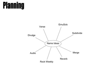
- 1. EmuSick Verse Subdivide Divulge Name Ideas Audio Merge Reverb Rock Weekly
- 2. I chose Reverb and Verse as my two favourite names from my ideas. In order to find out which name I should use (which would suit my target audience best) and would be most succesful, I asked 12 people which one they preferred. These are my results: Reverb – 8 people Verse - 4 people After hearing what people’s opinions were, I have decided to choose Reverb as the name for my music magazine.
- 3. I am now going to decide on a font for my magazine title. Possible Fonts: I chose to use the 2nd font (Freeroad) because I feel that it is the most recognisable and bold font which could stick in people’s minds. I also did not want a font with too much going on that may look childish. I also felt this was the most stylish font.
- 4. Colour Scheme: After taking my pictures, I decided on my colour scheme by looking at what the musician in my photo was wearing, and matching the colour scheme partly to that. The two main colours I chose were Dark red and White. I am also going to use Yellow because it stands out from the background/setting I’ve taken my front cover photo in. Layout: The front cover for my magazine will be quite sparse, there wont be much text. I have chosen to do this because during my market research, I found out that most of my target audience preferred the layout of a front cover on a music magazine to be quite spaced out and simple. I also think keeping the layout simple will be effective and look professional.