Information Design for Web and Print  Bernice Glenn [email_address]
Contents What is Information Design?  An Information Design Model Cognition and the Viewer  Visual Cueing and Semantic Structures Organizing Your Information  Tips for Information Designed Content
Can You Make Sense of This? On those remote pages it is written that animals are divided into   (a)   those that belong to the Emperor,  (b)   the embalmed ones,   (c)  those that are trained,  (d)   suckling pigs ,  (e)   mermaids,   (f)   fabulous ones,  (g)   stray dogs,  (h)   those that are included in this classification,  (i)   those that tremble as if they were mad,  (j)  innumerable ones,   (k)   those drawn with a very fine camel’s hair brush,  (l)   others,  (m)  those that have just broken a flower vase,   (n)  those that resemble flies from a distance.
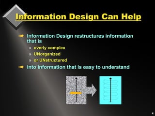
Information Design Can Help Information Design restructures information that is overly complex  UNorganized or UNstructured  into information that is easy to understand
Information Design Elements Information structures Written content  and its visual format Supporting graphics,  sound, animation Visual cueing Information access Taxonomy organization Information architecture Contents and indexes  Menus, navigation icons, links
Information Design & Style:   Content, Visuals, Sound  Information design clarifies site objectives and goals by synchronizing the style of the visual  presentation with content and text.
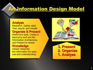
An Information Design Model 3. Present 2. Organize 1. Analyze Analyze Research. Gather data:  Text, sound, and visuals Organize & Present Determine style, Create a  taxonomy and and the Information Architecture, and Present to viewer Knowledge Viewer interprets the information for easy use and understanding
Information Design and the  Presentation   Interface The presentation interface is a 2-part structure:  1. Cognitive interface:   a metaphoric domain that attempts to replicate a viewer’s  mental processes. The content that presented to a viewer is part of the cognitive interface.  2. Physical interface:   the actual  viewable environment. When information design is used, the user experience is pleasing and successful. Information design attempts to replicate in the physical interface the mental ideas that a user has about information.
Information works with visual, semantic,  and sound  elements  Graphics, sound, and text coordinate with each other user’s expectations project goals Content is structurally  organized based on a grid  uses consistent  typographic cues Information is Multimodal
Visualizing   Semantic Structures People organize the world into  taxonomies:  categories and classes of knowledge or information. We categorize classes of objects by   visual appearance .   The organization of the  completed pattern can be comprehended as its  Gestalt, or organization of the whole .
Grids and Information Grids provide an underlying organizational skeleton on which Information is built.
Grids-Structure and Space Grids help the user or readers to   extract and integrate ideas   and instructions.   Both web and document designers use  grids for  design consistency . Grids provide  visual cues for the viewer through an underlying structure.
We Classify the World by   How Things Look For example, people are able to read about 18% faster when units are typographically segmented. 310-555-1212 Text that is deliberately mis-segmented take longer to read and are harder to understand and remember.  3-105 5-55643 Information is easier and faster to understand  when shown in meaningful components.
Cognition &   Information Design Law of Proximity:  Objects that are close together are perceived by viewers as belonging together. Law of Similarity:   Objects that look the same  are interpreted by viewers as being the same, while objects that look different are considered to be different. Gestalt is a branch of cognition asserting that  some visual formats work better than others.  Two Gestalt “rules” are:
Law of Proximity Viewers regard  objects which are close to each other belong together  (A and B.) Objects close to each other are more related  than those that are further apart  (b. and C.) A. B. C.
Law of Proximity and Text The rule or proximity implies that objects placed close together appear to belong together. Headlines and Togetherness One logical guideline states that captions should be placed close to the graphic they describe and headings should be placed closer to the text they relate to. Allow more space to the paragraph above the heading, and less space between the heading and the paragraph below to which it refers. The rule or proximity implies that objects placed close together appear to belong together. Headlines and Togetherness One logical guideline states that captions should be placed close to the graphic they describe and headings should be placed closer to the text they relate to. Allow more space to the paragraph above the heading, and less space between the heading and the paragraph below to which it refers. Logical placement of the heading Ambiguous placement of the heading
Objects that  look  the same are considered by a viewer to  be  the same.   Law of Similarity The rows of colored and bolded type form separate rows from those that   are not bolded. The rows of colored and bolded type form separate rows from  those that are not bolded. The  rows of  colored and bolded type from  separate rows form those that are not   bolded. The rows of colored and bolded  type form separate rows from those that are not bolded. The rows of colored and   bolded type form separate rows form those that are not bolded. The rows
Chunks & the Magic Number 7 Help viewers with text that is broken into short, logical, meaningful  segments. Confuse the viewer with too many different or inconsistent kinds of headings, styles, or icons. Viewers  understand and remember information in sequential clusters of no more than 5 to 7 elements at a time
Viewing Styles Vary Web readers don’t actually read;  they  scan text.  Some people know how to extract useful information better than others.  Many readers do not concentrate on the precise details of the information.  Some people are unable to, or, do not want to read or follow instructions.
A Communication Model
Information Design  and Visual Cues Use typography to  break up text visually into  meaningful idea chunks.   Typographic formats can   integrate text information. Type can place a  hierarchically ordered sequence   on text elements, according to their use. The written word also communicates through its typography and visual format
Compare Verbal & Visual  Communication Formats   The conversation opener Individual topics and  events Small talk — the actual contents of each event Audible emphasis punctuating speech Gestures Silences MEDIA FORMAT ELEMENTS VERBAL FORMAT ELEMENTS Title Stories or individual sections of a web site or document Contents of a web site, book, or document Subheadings used as visual punctuation Graphical Images White spaces like margins and paragraph indents
Headings are Landmarks Headings are visual reference points that help users navigate intuitively through the information environment. Headings   are an outline   to the text content,  Headings   focus on the given topic   and break the text into   manageable chunks .  A large, bold heading is a  major landmark  .
Visual Design Summary Use graphics and sound that  complement  the text  Coordinate the visual style with the writing style Provide typographic  cues  to help organize the implicit content. Create a style guide to ensure consistency throughout a site, a CD, or a manual. Style each element in the text so that it echoes  visually the level of meaning  in the text.
Pathways to Information The major difference between how readers view information in books or other print formats  to viewing similar information in  digital media  is the  sequence  in which information is accessed.
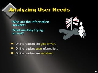
Analyzing User Needs Who are the information seekers? What are they trying  to find? Online readers are  goal driven . Online readers  scan  information, Online readers are  impatient .
Orienting the Online User Provide the online viewer with  orientation cues throughout the site Users need to be able to find or identify: The  content  they are seeking at any given moment Location  of the content How to  find additional information
Information Hierarchy and Wireframes Use Wireframes to visually display all the pages in a site. Indicate the hierarchical relationships for the complete site structure.
Naming Information Links When naming links, state what they are and where they will go Provide cross-references and provide a breadcrumb trail for context For links embedded in a paragraph, write text that describes the location
Web Content On the Web, identify each new page  with a major heading.  Use meaningful keywords for search engine access. Keep content for each page short.  Break up content with subheadings Provide menus and navigation links to  other content.  Coordinate the writing style with the visual presentation
Achieving Success with  Text Express concepts precisely Write in simple declarative sentences Use action verbs and concrete words Specify what is true Avoid generalities
Inverted Pyramid Writing   Gets to the Point! Inverted pyramid places important information first. Concise, informative introductory information is easier to find, read, and remember. a a
Measuring the Effects of  Written Content on the WEB A Jakob Neilson study measured how users read and remember text on the Web.   Comparison showed that readability was: 58% higher  when information was written  concisely . 47% higher   when it could be  scanned  visually 27% higher  when written in an  objective style  rather than one which promotes. 124% higher in measured usability when text was concise, scannable and objective.
Sample Paragraph: the format  for base comparison  SAMPLE  A, the control sample:  Promotional writing in the “marketese” used by many commercial sites.  Nebraska is filled with internationally recognized attractions that draw large crowds of people every year, without fail. In 1996, some of the most popular places were Fort Robinson State Park (355,000 visitors), Scotts Bluff National Monument (132,166), Arbor Lodge State Historical Park & Museum (100,000), Carhenge (86,598), Stuhr Museum of the Prairie Pioneer (60,002), and Buffalo Bill Ranch State Historical Park (28,446). 0 %
Bulleted Text Layout  SAMPLE B: A layout that facilitated reader scanning, using the same text as the control sample Nebraska is filled with internationally recognized attractions that draw large crowds of people every year, without fail. In 1996, some of the most popular places were:  Fort Robinson State Park (355,000 visitors)  Scotts Bluff National Monument (132,166)  Arbor Lodge State Historical Park & Museum (100,000)  Carhenge (86,598)  Stuhr Museum of the Prairie Pioneer (60,002)  Buffalo Bill Ranch State Historical Park (28,446).   47 %   usability improvement
Concise Text Sample   SAMPLE C:   A layout that facilitated reader scanning, using the same text as the control sample In 1996, six of the best-attended attractions in Nebraska were Fort Robinson State Park, Scotts Bluff National Monument, Arbor Lodge State Historical Park & Museum, Carhenge, Stuhr Museum of the Prairie Pioneer, and Buffalo Bill Ranch State Historical Park.. 58 %  usability improvement
Neutral Language Sample   SAMPLE D:   Text and layout is the same as the control, but written in “objective” language with neutral rather than subjective, or exaggerated language   Nebraska has several attractions. In 1996, some of the most-visited places were Fort Robinson State Park (355,000 visitors), Scotts Bluff National Monument (132,166), Arbor Lodge State Historical Park & Museum (100,000), Carhenge (86,598), Stuhr Museum of the Prairie Pioneer (60,002), and Buffalo Bill Ranch State Historical Park (28,446). 27 %   usability improvement
Concise, Scannable, & Objective  SAMPLE E: Combined version using all e improvements in writing style: Test that is  concise ,  scannable , and  objective .  In 1996, six of the most-visited places in Nebraska were:  Fort Robinson State Park  Scotts Bluff National Monument  Arbor Lodge State Historical Park & Museum Carhenge Stuhr Museum of the Prairie Pioneer  Buffalo Bill Ranch State Historical Park 124 %   improvement  in  usability
Neilson’s Recommendations Write short and concise  sentences to the point. Provide markers for visual scanning . Use an objective style  rather than one which promotes. In combination, text that was  concise, scannable and objective  resulted in the greatest (124% higher) measured usability. Recommendations are based on time, errors, memory, and site structure:
Caution For online viewing, rework print files  for scanning and simplicity Avoid dumping print articles directly on the screen unless they are meant to be printed for reading off-line.
Information Designers Communicate Better On those remote pages it is written that animals are divided into   (a)   those that belong to the Emperor,  (b)   the embalmed ones,   (c)  those that are trained,  (d)   suckling pigs ,  (e)   mermaids,   (f)   fabulous ones,  (g)   stray dogs,  (h)   those that are included in this classification,  (i)   those that tremble as if they were mad,  (j)  innumerable ones,   (k)   those drawn with a very fine camel’s hair brush,  (l)   others,  (m)  those that have just broken a flower vase,   (n)  those that resemble flies from a distance.

Information Design

  • 1.
    Information Design forWeb and Print Bernice Glenn [email_address]
  • 2.
    Contents What isInformation Design? An Information Design Model Cognition and the Viewer Visual Cueing and Semantic Structures Organizing Your Information Tips for Information Designed Content
  • 3.
    Can You MakeSense of This? On those remote pages it is written that animals are divided into (a) those that belong to the Emperor, (b) the embalmed ones, (c) those that are trained, (d) suckling pigs , (e) mermaids, (f) fabulous ones, (g) stray dogs, (h) those that are included in this classification, (i) those that tremble as if they were mad, (j) innumerable ones, (k) those drawn with a very fine camel’s hair brush, (l) others, (m) those that have just broken a flower vase, (n) those that resemble flies from a distance.
  • 4.
    Information Design CanHelp Information Design restructures information that is overly complex UNorganized or UNstructured into information that is easy to understand
  • 5.
    Information Design ElementsInformation structures Written content and its visual format Supporting graphics, sound, animation Visual cueing Information access Taxonomy organization Information architecture Contents and indexes Menus, navigation icons, links
  • 6.
    Information Design &Style: Content, Visuals, Sound Information design clarifies site objectives and goals by synchronizing the style of the visual presentation with content and text.
  • 7.
    An Information DesignModel 3. Present 2. Organize 1. Analyze Analyze Research. Gather data: Text, sound, and visuals Organize & Present Determine style, Create a taxonomy and and the Information Architecture, and Present to viewer Knowledge Viewer interprets the information for easy use and understanding
  • 8.
    Information Design andthe Presentation Interface The presentation interface is a 2-part structure: 1. Cognitive interface: a metaphoric domain that attempts to replicate a viewer’s mental processes. The content that presented to a viewer is part of the cognitive interface. 2. Physical interface: the actual viewable environment. When information design is used, the user experience is pleasing and successful. Information design attempts to replicate in the physical interface the mental ideas that a user has about information.
  • 9.
    Information works withvisual, semantic, and sound elements Graphics, sound, and text coordinate with each other user’s expectations project goals Content is structurally organized based on a grid uses consistent typographic cues Information is Multimodal
  • 10.
    Visualizing Semantic Structures People organize the world into taxonomies: categories and classes of knowledge or information. We categorize classes of objects by visual appearance . The organization of the completed pattern can be comprehended as its Gestalt, or organization of the whole .
  • 11.
    Grids and InformationGrids provide an underlying organizational skeleton on which Information is built.
  • 12.
    Grids-Structure and SpaceGrids help the user or readers to extract and integrate ideas and instructions. Both web and document designers use grids for design consistency . Grids provide visual cues for the viewer through an underlying structure.
  • 13.
    We Classify theWorld by How Things Look For example, people are able to read about 18% faster when units are typographically segmented. 310-555-1212 Text that is deliberately mis-segmented take longer to read and are harder to understand and remember. 3-105 5-55643 Information is easier and faster to understand when shown in meaningful components.
  • 14.
    Cognition & Information Design Law of Proximity: Objects that are close together are perceived by viewers as belonging together. Law of Similarity: Objects that look the same are interpreted by viewers as being the same, while objects that look different are considered to be different. Gestalt is a branch of cognition asserting that some visual formats work better than others. Two Gestalt “rules” are:
  • 15.
    Law of ProximityViewers regard objects which are close to each other belong together (A and B.) Objects close to each other are more related than those that are further apart (b. and C.) A. B. C.
  • 16.
    Law of Proximityand Text The rule or proximity implies that objects placed close together appear to belong together. Headlines and Togetherness One logical guideline states that captions should be placed close to the graphic they describe and headings should be placed closer to the text they relate to. Allow more space to the paragraph above the heading, and less space between the heading and the paragraph below to which it refers. The rule or proximity implies that objects placed close together appear to belong together. Headlines and Togetherness One logical guideline states that captions should be placed close to the graphic they describe and headings should be placed closer to the text they relate to. Allow more space to the paragraph above the heading, and less space between the heading and the paragraph below to which it refers. Logical placement of the heading Ambiguous placement of the heading
  • 17.
    Objects that look the same are considered by a viewer to be the same. Law of Similarity The rows of colored and bolded type form separate rows from those that are not bolded. The rows of colored and bolded type form separate rows from those that are not bolded. The rows of colored and bolded type from separate rows form those that are not bolded. The rows of colored and bolded type form separate rows from those that are not bolded. The rows of colored and bolded type form separate rows form those that are not bolded. The rows
  • 18.
    Chunks & theMagic Number 7 Help viewers with text that is broken into short, logical, meaningful segments. Confuse the viewer with too many different or inconsistent kinds of headings, styles, or icons. Viewers understand and remember information in sequential clusters of no more than 5 to 7 elements at a time
  • 19.
    Viewing Styles VaryWeb readers don’t actually read; they scan text. Some people know how to extract useful information better than others. Many readers do not concentrate on the precise details of the information. Some people are unable to, or, do not want to read or follow instructions.
  • 20.
  • 21.
    Information Design and Visual Cues Use typography to break up text visually into meaningful idea chunks. Typographic formats can integrate text information. Type can place a hierarchically ordered sequence on text elements, according to their use. The written word also communicates through its typography and visual format
  • 22.
    Compare Verbal &Visual Communication Formats The conversation opener Individual topics and events Small talk — the actual contents of each event Audible emphasis punctuating speech Gestures Silences MEDIA FORMAT ELEMENTS VERBAL FORMAT ELEMENTS Title Stories or individual sections of a web site or document Contents of a web site, book, or document Subheadings used as visual punctuation Graphical Images White spaces like margins and paragraph indents
  • 23.
    Headings are LandmarksHeadings are visual reference points that help users navigate intuitively through the information environment. Headings are an outline to the text content, Headings focus on the given topic and break the text into manageable chunks . A large, bold heading is a major landmark .
  • 24.
    Visual Design SummaryUse graphics and sound that complement the text Coordinate the visual style with the writing style Provide typographic cues to help organize the implicit content. Create a style guide to ensure consistency throughout a site, a CD, or a manual. Style each element in the text so that it echoes visually the level of meaning in the text.
  • 25.
    Pathways to InformationThe major difference between how readers view information in books or other print formats to viewing similar information in digital media is the sequence in which information is accessed.
  • 26.
    Analyzing User NeedsWho are the information seekers? What are they trying to find? Online readers are goal driven . Online readers scan information, Online readers are impatient .
  • 27.
    Orienting the OnlineUser Provide the online viewer with orientation cues throughout the site Users need to be able to find or identify: The content they are seeking at any given moment Location of the content How to find additional information
  • 28.
    Information Hierarchy andWireframes Use Wireframes to visually display all the pages in a site. Indicate the hierarchical relationships for the complete site structure.
  • 29.
    Naming Information LinksWhen naming links, state what they are and where they will go Provide cross-references and provide a breadcrumb trail for context For links embedded in a paragraph, write text that describes the location
  • 30.
    Web Content Onthe Web, identify each new page with a major heading. Use meaningful keywords for search engine access. Keep content for each page short. Break up content with subheadings Provide menus and navigation links to other content. Coordinate the writing style with the visual presentation
  • 31.
    Achieving Success with Text Express concepts precisely Write in simple declarative sentences Use action verbs and concrete words Specify what is true Avoid generalities
  • 32.
    Inverted Pyramid Writing Gets to the Point! Inverted pyramid places important information first. Concise, informative introductory information is easier to find, read, and remember. a a
  • 33.
    Measuring the Effectsof Written Content on the WEB A Jakob Neilson study measured how users read and remember text on the Web. Comparison showed that readability was: 58% higher when information was written concisely . 47% higher when it could be scanned visually 27% higher when written in an objective style rather than one which promotes. 124% higher in measured usability when text was concise, scannable and objective.
  • 34.
    Sample Paragraph: theformat for base comparison SAMPLE A, the control sample: Promotional writing in the “marketese” used by many commercial sites. Nebraska is filled with internationally recognized attractions that draw large crowds of people every year, without fail. In 1996, some of the most popular places were Fort Robinson State Park (355,000 visitors), Scotts Bluff National Monument (132,166), Arbor Lodge State Historical Park & Museum (100,000), Carhenge (86,598), Stuhr Museum of the Prairie Pioneer (60,002), and Buffalo Bill Ranch State Historical Park (28,446). 0 %
  • 35.
    Bulleted Text Layout SAMPLE B: A layout that facilitated reader scanning, using the same text as the control sample Nebraska is filled with internationally recognized attractions that draw large crowds of people every year, without fail. In 1996, some of the most popular places were: Fort Robinson State Park (355,000 visitors) Scotts Bluff National Monument (132,166) Arbor Lodge State Historical Park & Museum (100,000) Carhenge (86,598) Stuhr Museum of the Prairie Pioneer (60,002) Buffalo Bill Ranch State Historical Park (28,446). 47 % usability improvement
  • 36.
    Concise Text Sample SAMPLE C: A layout that facilitated reader scanning, using the same text as the control sample In 1996, six of the best-attended attractions in Nebraska were Fort Robinson State Park, Scotts Bluff National Monument, Arbor Lodge State Historical Park & Museum, Carhenge, Stuhr Museum of the Prairie Pioneer, and Buffalo Bill Ranch State Historical Park.. 58 % usability improvement
  • 37.
    Neutral Language Sample SAMPLE D: Text and layout is the same as the control, but written in “objective” language with neutral rather than subjective, or exaggerated language Nebraska has several attractions. In 1996, some of the most-visited places were Fort Robinson State Park (355,000 visitors), Scotts Bluff National Monument (132,166), Arbor Lodge State Historical Park & Museum (100,000), Carhenge (86,598), Stuhr Museum of the Prairie Pioneer (60,002), and Buffalo Bill Ranch State Historical Park (28,446). 27 % usability improvement
  • 38.
    Concise, Scannable, &Objective SAMPLE E: Combined version using all e improvements in writing style: Test that is concise , scannable , and objective . In 1996, six of the most-visited places in Nebraska were: Fort Robinson State Park Scotts Bluff National Monument Arbor Lodge State Historical Park & Museum Carhenge Stuhr Museum of the Prairie Pioneer Buffalo Bill Ranch State Historical Park 124 % improvement in usability
  • 39.
    Neilson’s Recommendations Writeshort and concise sentences to the point. Provide markers for visual scanning . Use an objective style rather than one which promotes. In combination, text that was concise, scannable and objective resulted in the greatest (124% higher) measured usability. Recommendations are based on time, errors, memory, and site structure:
  • 40.
    Caution For onlineviewing, rework print files for scanning and simplicity Avoid dumping print articles directly on the screen unless they are meant to be printed for reading off-line.
  • 41.
    Information Designers CommunicateBetter On those remote pages it is written that animals are divided into (a) those that belong to the Emperor, (b) the embalmed ones, (c) those that are trained, (d) suckling pigs , (e) mermaids, (f) fabulous ones, (g) stray dogs, (h) those that are included in this classification, (i) those that tremble as if they were mad, (j) innumerable ones, (k) those drawn with a very fine camel’s hair brush, (l) others, (m) those that have just broken a flower vase, (n) those that resemble flies from a distance.

Editor's Notes

  • #2 Presented at ISPILA 2006