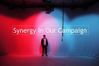
The band Pilgrim created a cohesive campaign across their logo, music video, album digipak, and website by consistently using their logo, a blue lace texture background, a color scheme of blue, white, grey and black, and keeping Pilgrim's costume, hair, and makeup the same style throughout. This consistency gave their campaign strong visual synergy and reinforced their retro, vintage brand identity.
2. Logo
We used the same logo in all three of our artefacts. The logo acted as
an anchor for our brand and was very flexible so we could include it in
many different ways across our artefacts.
Music Video
Drum Kit
Text at end
Digipak
Album Title
Website
Website Header
Digipak Spine
Merchandise in store
3. We used a blue lace texture as the background for our album cover
and website.
Both we and our audience thought that it connoted the retro,
vintage elements of Pilgrim's star identity.
Lace Texture
Digipak
Website
4. We kept our colour scheme of blue, white, grey and black consistent
throughout our three artefacts. This gave our campaign visual
synergy.
Colour Scheme
Website
Digipak
Music Video
5. Pilgrim's costume, hair and make-up stayed the same style
throughout our products.
Styling
Typically indie
costume
Naturalistic hair &
make-up
Website
Digipak
Music Video
6. Pilgrim's costume, hair and make-up stayed the same style
throughout our products.
Styling
Typically indie
costume
Naturalistic hair &
make-up
Website
Digipak
Music Video