This document discusses the selection and use of images for a hip-hop music front cover and contents page. It describes choosing an image that shows a relaxed model with shadowing on his face to match the bright and dark theme. Another image of Macklemore was selected for the contents page as it looks more serious and suits hip-hop. A third image was used for a double page spread, with strong backlighting and a pose that looks like deep thought to symbolize the featured quotation.
in this powerpoint i analysed the shots that i took in my test run before taking my official photos. By taking these photos i started to identify the usefulness of each shot to my magazine and how i could use it in my magazine for the ultimate effect.
in this powerpoint i analysed the shots that i took in my test run before taking my official photos. By taking these photos i started to identify the usefulness of each shot to my magazine and how i could use it in my magazine for the ultimate effect.
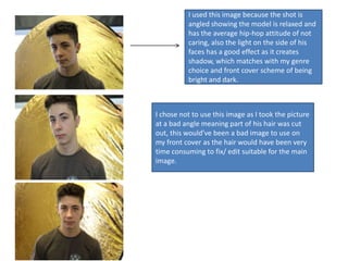
1. I used this image because the shot is
angled showing the model is relaxed and
has the average hip-hop attitude of not
caring, also the light on the side of his
faces has a good effect as it creates
shadow, which matches with my genre
choice and front cover scheme of being
bright and dark.
I chose not to use this image as I took the picture
at a bad angle meaning part of his hair was cut
out, this would’ve been a bad image to use on
my front cover as the hair would have been very
time consuming to fix/ edit suitable for the main
image.
2. This is one of the images I used on my
contents page, I used this image out of the 2
options as this one has more effect, this
image looks more serious and this image
best suites the genre of Hip-Hop. As the
image is based on artist “Macklemore” it is
iconic as this artist is a hipster meaning he
likes to set trends such as this new pose.
This image is great for the contents
page as it shows one of the models
looking down at the camera, with a
strong and bold facial expression. His
arms are crossed to show that he is
relaxed and it is often a pose that most
Hip-Hop artists in photography.
3. I used this image in my double page spread as
it has strong lighting effects from behind him
shining onto the side of his face. On my actual
double page spread I have quoted on him “I
put myself in the place of the listener when
writing”, the pose of the image makes him
look as if he is in deep thought, symbolic to
the quotation. The image also makes him look
quite serious and as if he is getting ready to
answer questions from the text on the page;
overall many different things suit this image
on the double page spread which is why I used
it as the final image for it.