1. Unit 57: Photography and
Photographic Practice
Research of other photographers
work (P1, M1, D1)
Photographer: Annie Leibovitz
Paste 6 images here include the name & date of image
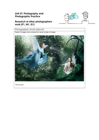
‘Pinnochio’
5. Marion Cotillard in Psycho
Theme or focus of images
Photo One – ‘Pinocchio’
I really like this picture that Annie Leibovitz took, she structured it very well and it
creates a scene perfectly, you can almost feel the magical theme created and it
actually brings a massive smile to my face because of the fact that it hasn’t only
made me feel touched but also other people. The lighting is really fitting with the
forest feel because it’s not a warm colour, it’s the opposite and without the cold feel
it wouldn’t be the same, the cold effect makes it feel more magical like it is meant to
be and if she used a warm effect it would create a different mood and theme
entirely. I enjoy the way she has positioned the characters, although I’ve never
watched Pinocchio I can imagine these two characters play an important role and
this is a different effect entirely because not many pictures by photographers make
you think of the characters and you aren’t entirely able to picture them in that
moment, I like the way they’re positioned because who knew a gigantic leaf would
be a suitable seat? Also again about the cold effect, it doesn’t just take effect on the
back ground but it also takes effect on the fairy’s dress, it’s obvious it was already a
lovely cool blue colour but the effect has made it even cooler to fit in with the effect.
It is hard for me to take in all the details at one glance, you have to really zoom in
because there is so much going on that is fitted within that frame, but I can evidently
see the magic isn’t only held within the entire picture as a whole but also in the
6. characters faces and eyes, you can really see their emotions and I can tell that Annie
Leibovitz is definitely pleased with this picture she built herself, took herself and edited
herself. The contrasts work really well with the dark objects and it also works well with
the light objects like the wand the fairy is holding, it makes it stand out more and it
also makes the sparkles from the wand stand out. I generally think that this picture is a
really big credit to Annie herself, it doesn’t just show you another world inside a
picture but it makes you feel real emotion.
Photo Two – ‘Vogue Alice 1988’
This picture that Annie did in 1988 is honestly so well structured. When I first took a look
at it I knew straight away it was Alice out of the famous Disney ‘Alice in wonderland’
so I wondered, how come she’s mixing Disney with Vogue; fashion? But that’s just
what Annie does, she’s crazy but in the best possible way (even a quote from Alice in
wonderland for you). Pushing aside my love for Alice in wonderland, I think the
colours in this photo are very loud but settled because straight away the blue dress
pops out at you and then the shoes, so you get more of a focus on her clothes than
the tiny house she is cramped in and the tiny furniture around her. I would say the
lighting’s normal, it is a little cool because she has to theme the lighting around the
dress, her face is very soft like there has been a bit of airbrushing going on. I like the
fact that you can see outside of the window behind the girl that would’ve taken a lot
of work to put in, it is always hard to take a picture and structure a picture like this but
Annie has done it and she’s done it perfectly. I don’t think anything could be
improved to this picture as it is a photo shoot for vogue Annie has focused on the
main subjects and that’s fashion and colour.
Photo Three – ‘December 2004’
I think this picture is very imaginative. People don’t seem to think where Annie was
standing while taking this picture, somehow it was taken I guess she must’ve been on
a bike herself I wouldn’t be surprised if she was! I really enjoy looking at this because
of how much fun she looks like she’s having, she has her feet up on the bike handles
and a massive smile on her face which looks very natural. ? I actually feel as if Annie
used an old vintage camera because of the Black & White effect that is used, yet still
there are a lot of contrasts an old camera wouldn’t be able to capture, like the bikes
wheels and the bikes shadows also how to metal on the bikes tires are captured the
way that they are there was definitely a smart lens used. I can see the plane and
every detail about it near enough, it actually looks like a really nice plane it could be
one of those glider planes I’m not too certain. I like the way the girls blazer is flying
from behind her a little, it makes me think she’s going pretty fast and that it must
clearly be dangerous for her to be having her feet up on the handlebars? Overall I
think this picture is amazing, there is no other way to put it and there is nothing to
change, because if Annie wouldn’t have made this picture black & white it would
lose meaning all together.
7. Composition
I am going to do a composition of picture five because this is my favourite one and
sends the clearest message. ‘Psycho’
Annie has included so many dark emotions in this photo, it’s not a single photo
though it’s a collection of 9 images into one and edited to black & white. At first I
thought this collection of images was about a psychotic girl going crazy in the shower
and overtaken by depression, feeling relentless and pathetic but that isn’t the
message at all. At first the girl is taking a shower, you can tell by her expression on her
face that she’s relaxed and feels pretty normal, it is zoomed in and could may as well
have been altered to fit in the other images because you can only see from the midst
of the tiles on the wall to the top of her head and then merely to her shoulders, you
can’t see the rest of her body. Then in the next frame you see a person or maybe not
even a person, it could be a monster, a creature, a vampire, an alien? We don’t
know and we don’t find out so that’s a mystery within itself. Then you see a close up
of her face screaming (here is where I thought she was going insane but is actually
screaming from fright. At the very end you see another close up of the woman’s face
and you can see every detail on her face so clearly, her eyebrows are very shapely
and you can see the eyeliner on her eyelids and the wet strands of hair on her face,
she is looking straight forward (here is where I thought depression had gotten her to
collapse from defeat, but she is actually dead... which is two connected messages)
out of brackets I actually think Annie did this purposely, if you block out the figure with
the knife and just focus on the girl and the knife, you see depression and defeat and
it has made me feel a very strong message, so many elements have been focused
on it’s crazy.
Techniques used
Think shutter speeds, rule of thirds & depth of field
Strengths & Weaknesses
There couldn’t possibly be any weaknesses in Annie’s work, it is too magnificent it’s
actually overpowering to think about. I know that Annie’s work is going to influence
me so massively because of all the technique’s she has used in every single picture I
have analyses and come to love, not only techniques but the way she makes you
feel just by glancing at these pictures! You feel emotion and I want to make people
feel emotion from my work!