SlideShare a Scribd company logo
1 of 36
Ranking #1: The Lost Girls, Mudslide
The minute you mentioned in the thread that you were going to go out and find a real mudslide, I was very excited. It was one of those moments
where I was like, “Yes! People are really putting the effort into this,” and it made me even happier, when the set of photos you submitted exemplified
this. Major props to your model for getting dirty. I know that it’s hard for a lot of people, but that’s partly what modeling is about. A lot of times
you’ll need to get out of your comfort zone in order to get a good shot and although this isn’t a hard core contest, we do have to judge models on how
willing they are to get out there as it is a large part of a professional model’s job. I am very pleased with how into this contest your team is.
The first photo is breathtaking. The setting is so beautiful, yet filled with sorrow. The model’s face is perfectly emotive and closing her eyes in pain
worked really well here. My only suggestions is that it’s a rather stereotypical pose; with the hand up to her face. In general I’ve noticed that while the
model’s posing is good, it’s always safe. Try to break out of the box and really get creative with your body movements. While the location was brilliant,
I wasn’t that impressed with the actual photography of this photo. Granted, it’s not really bad or anything, I just see specific ways that could have been
better. It would have been nice to see the hill of the actual landslide; with the model sitting in front and the mud from above encroaching on her
personal bubble as she stared sorrowfully into the camera. It would have made a really cool shot in terms of framing and the eye contact would have
been really powerful in this emotive situation. However, the photo is still pretty wonderful as it is.
Although I appreciated that the second photo was a close-up, I didn’t think that it was necessary for the point that you were trying to get across here.
It would have been more powerful if the photo was of the model digging through mud and rubble, only to find the collar. This photo shows that she’s
found the collar and not the dog, but because the model’s face isn’t in it, you don’t know how she feels, and in this situation I think it’s pretty critical
that we see how upset she is by the loss of her dog. It’s a good photo, it looks cool and the textures are amazing, I just think that a different set up would
of played to the storyline better.
Before I understood that the set was indeed a story board, I didn’t get the third photo at all. However, it fits with the story really well. I love you
how you got the model and the dog in apart in the same shot, with the girl looking for her and the dog coming up behind her. It would have looked even
cooler if you took the shot from the side, so that you could see the desperation of the girl looking for her dog at the same time. The problem with the
current photo is that it doesn’t stand on its own. If it wasn’t part of a story, it’d be a rather boring photo.
The fourth photo is nice; the dog looks adorable and the expression on the model’s face is cute. However, in terms of photography, this is probably
your weakest photo. Part of the model is cut off, and since it’s only a sliver it looks unintentional. Additionally, it’s not the most flattering angle of the
model. It’s also important to pay attention to the little details that can make or break a photo, for example, in this photo, the model’s bra strap is falling
down her arm. Honestly, it was the first thing I noticed. The ground texture looks great though, just try to clean up the little details.
In one word, this photo is adorable. Unfortunately, there are a lot of technical problems with it. I love the idea of a shot with the girl holding her found
pup and kissing it, but this photo doesn’t do it justice. There’s a hint of serenity on the model’s face, but you can’t really see it clearly because her hair
is covering it. Additionally, the angle and cropping is a bit awkward. This photo would have looked a lot cleaner if it had been cropped at the waist. It
would have been even better if the photo had been taken at a slightly lower angle and closer in, framing the model’s face and the dog better. When it
comes to expressing emotion, sometimes close-up shots work really well.
I wish that the model had been looking at the camera in least a couple of these photos. When expressing sadness, hopelessness, or desperation,
looking at the camera is really powerful and kind of important. I also would have liked to see the model interact with the environment more. You had a
beautiful and real set and the model obviously had a good time rolling in it, I just would have liked to see her actually in it more. Overall, your photos
were good though, not as shocking as last week, but still good.
Critiques, Head Judge: Kris Ramos (1)
I had to look at this photo set a few times to understand the story, but once I did I quite liked it. I liked that this team took the opportunity to express
how people (and yes, pets are people ;D) can find each other even through a disaster. I think some more opportunities could have taken to use lighting to
express the changing mood: from the model’s devastation at the beginning of the progression to her elation at the end being reunited with her pup-up.
I would like to commend this team on the use of an animal model. I know that they can be extremely hard to work with, especially young one’s (as
this one appears to be a puppy). As usual, your use of focus and composition is incredibly expressive, particularly in the second photo of the collar.
This time, I’d also like to commend you on your choice of location. A river bank is an excellent choice for a mudslide, since it naturally looks in a
state of erosion. Very nice thinking on the part of this team.
I would like to caution you, however. Your photos are always stunning, but many of the other teams are improving and growing in their art. There is
a degree of stagnation with this team. Try and branch out, try something new, and see if you can achieve some growth.
Summary
Excellent Focus, Composition, Choice of Location
Needs Work Lighting Variation
Critiques, Photography: Kaitlyn (2)
Critiques, Photography: Nick Sullivan (1)
Critiques, Photography: Tragidy (1)
I am more impressed with this team as we go through this competition. The first picture is gorgeous. Even though there is a limited amount of color
throughout the pictures, I can still clearly see the focal point.
Critiques, Modeling: Cassandra (3)
This team did an exceptional job once again although I really don’t see too much of a mudslide in the image. I know that the model is covered in mud
but to me it just says she fell down a cliff unfortunately. I can see the concept but I’m not sure that people that don’t know what it is will think of a
mudslide instead of just being covered in mud. The modeling in their first image is very well done and the pose really helps to tie in the distraught mood
that the model is expressing so that her pose doesn’t conflict with the feel of the picture. The model’s left hand however seems to disappear into her
pants because of the color effect so perhaps it should’ve been more defined in some manner.
Still one of the best this week, but not my absolute favorite. I hadn’t thought about taking pictures involving those affected by natural disasters, so
this is a nice spin on the assignment. A mudslide would be kind of difficult to embody, so I think this team did very well with what they had.
The first picture begins our story with a devastated young girl. The model really did a good job at making her face believable in this shot, because I
can easily tell she’s distraught. Another way to start off might have been to have the model on the ground, like she’s been caught in the mudslide and
has to get up.
The second picture is all right; I usually prefer shots that contain more of the model than a hand, but I guess if the shot were too far out the viewer
wouldn’t be able to see the dog collar.
Critiques, Modeling: Shawn Keeney (3)
Their second image is very nicely done as well and the model is holding her hand in a way that is so very elegant. Because I have seen the other three
images I know what the item the model is holding is but I feel like without prior knowledge this image doesn’t make you think of a dog collar. Honestly
my first thought was “why is there something attached to the tree and why is she holding it?” Perhaps the concept could be more clearly defined if the
tag wasn’t crooked so that we could see easier that it belongs to a dog. Until you really look for it you can’t see that there is a tag as it’s easy to look
passed. This is something to keep in mind for your future entries; try to put yourself in perspective of someone that doesn’t know anything about your
image and see if it makes sense.
The third image is decent and I really like how you were able to get the dog to pose so nicely - the dog honestly looks like it’s saying “Oh, there’s
mommy!” I did have an issue with this picture however where the model is concerned; she just doesn’t appear to be looking for her dog so it makes the
dog seem out of place. Perhaps this could’ve been more clear if the model was holding the collar so that we could see it and perhaps have her pose in a
way that looks like she is searching instead of simply standing on a hill. The fourth image is nicely played out as well and the expression on the model’s
face is very cute. Unfortunately I don’t feel as though the model is all that enthused about finding the dog so a bit more emotion and joy would really
benefit this picture. Another point is the model’s bra strap really is confusing at first glance as to what it is and once you figure out what it is you realize
how tightly it’s pulling the skin and it’s just awkward. My thought on this is that perhaps the strap should be on the edge of her shoulder or just below it
so that it doesn’t pull the skin as much and also is more clear on what it is.
The teams final image is very sweet and really gives a warm fuzzy feeling; it’s always nice to see a happy ending when something bad happens. The
model’s pose is practically perfect and you can truly feel a warm fuzzy feeling emanating off of her. While the dog’s awkward backwards glance is
confusing I like that you chose to do that as it helps to show the model’s face as she kisses the dog. I did notice something however. In this image you
can tell that the mud is fresh as it is still wet and there is a lot more on the model than the other images - especially the fourth one. While this is a minor
blunder, since the images are shown in a series it can be confusing to someone that notices. I do really enjoy that this team helped to tell a story of how a
disaster played out and they did a lovely job. As I said before I’m not sure that people will think of a mudslide without knowing ahead of time but they
really showed a nice effort. The posing is very well done and the model has done a great job at expressing emotion with more than just her face. This
team still needs a bit more tweaking to make them perfect but they have really been improving and showing a great effort. Keep up the wonderful
modeling and just continue to wow us with everything that you do.
The Good
• I adore how this has a plotline. It’s hard to get that done with 5 pictures but you managed to do it wonderfully!
• The modeling is wonderful in each photo. You can clearly feel what she’s thinking during each one—even where you just see her hand, the tenderness
in the grasp of the collar is apparent.
• The location was great for a mudslide and you can infer that something bad with mud happened—she was tastefully covered in it, not as if she had
been rolling through it, but as if she had been wading through the mud looking for something or someone.
• That puppy is adorable.
The Bad
• I really really really wish the hair wasn’t so in her face in the first picture. I can see the sadness through it but it would have been a lot more poignant if
you could see all of her face instead of having to look through the hair.
• The bra strap around her arm in the fourth photo created a strange outline to her arm.
The Mediocre
• The desaturation of the pictures added a nice effect to show the dismal aura around the first few pictures, but in my opinion (and this is just my own) a
little color on the model at the end would have shown a light of hope or happiness added to the picture.
• In the third picture, the dog almost looks like a puppet, the way he was cut off at the neck. I’m aware that it’s hard to work with live animals, though,
but it’s just a little surreal at first. Not terrible, though.
Disaster Portrayal
• Location, location, location. You did a wonderful job with the setting of the photos. The fallen trees around the model really helped with the effect of a
disaster—and also, her world falling down. The mud was, as I restate, tastefully on her, realistic and not just looking like she rolled in a mud puddle.
• The sadness around the whole thing shows the reality of the situation.
I feel the essence of ‘mudslide’ was captured well.
Critiques, Modeling: Momo (2)
The third shot is good, but not completely impressive. To give the model more of a purpose in the picture, I think she could have brought a hand to
her forehead, like she was looking for the dog, or cupped her hands around her mouth like she was calling for it.
In the fourth picture, the model is not going all the way. Her face should have been so full of light and happiness that I had to shield my eyes when I
looked at it. The facial expression is just a bit too pleased and needs more of an ecstatic look.
The fifth picture is good too, but I have to make a comment. I know they can’t really control what the dog is doing, but I think the picture should
have shown the model and the dog looking at each other, because with the dog looking away the whole sense of a happy reunion and “I’ll never let you
out of my sight again” is severely diminished.
This has been one of the most consistent teams this whole competition and I hope they keep bringing it to the table. Overall, their photos this week
weren’t totally amazing, but they were certainly not bad. I would have just liked to see some greater variety because in all the pictures, the model is in
profile and not facing the camera at all.
Ranking #2: The Lost Girls, Mudslide
Critiques, Head Judge: Kris Ramos (3)
The first thing I noticed was the decrease in quality in your photos. I understand you had a bit of a lighting issue, but I think you made it worse by
overusing Photoshop. Since the entire photo is a bit dull and fuzzy, blurring the background just calls attention to this. You should’ve increased the
contrast and levels, which would have made your photos appear much more crisp.
Your first photo is crisp, and that’s what makes it so great. The model looks incredibly fierce and perfectly embodies the energy of a hurricane. I
love the way her hair is blowing and the ferocity of her eyes. My only issue with the modeling is the pose. Her legs disappear into a black mass and her
whole body looks a bit awkward. The photo is, however, well composed.
I’m really not a fan of your second photo, which I honestly just find weird. The model looks alien and kind of creepy and while I do get a good sense
of motion, I don’t really know what that motion is. I suspect you’re going for the windswept feel, but it doesn’t really work here. Additionally, the
model’s right arm looks lumpy and deformed. As a whole, it’s not a very interesting photo.
I love the ferocity, movement, and body language of your third photo. The model looks fierce and savage, just like a hurricane. However, the
blurred background and lightness of the whole photo ruins it for me. The model’s face is so fierce, I just wish that the sharpness of the photo quality
reflected that. The model’s right arm, should also be moved a bit out more, so it’s not in direct line with her body and the arm extension is more visible.
This image does accurately and completely represent a hurricane, though it needs some technical improvement.
Your fourth photo is one of my favorites as it looks like a snapshot from some sort of survival television show. The model’s expression is wonderful
and barbaric. I love the motion of her arms, although her right arm is awkwardly cut off beneath the shoulder. Again, the blurriness really detracts from
the photo.
As with the others, the model looks especially fierce in the last photo. The lip curl is great and I like that she’s clinging to a tree since trees blowing
over remind me a lot of hurricanes. However, the model’s legs are completely hidden, making her look short, and the blurriness really detracts
I really got the movement of hurricane from the model’s body language, however, the setting didn’t really do it for me. Maybe that’s because it’s my
own fault for having a wrong preconceived idea of hurricane, but when I think hurricane, I think of tons of stuff blowing around an urbanized location. I
think, city destruction, not the forests.
Overall, the photo quality really detracted. The model has her facial expressions dead on, but could work on angling her body so that it looks better
on camera. I’d work more on set-up and paying attention to your lighting. Also, try not to over-Photoshop. So far, however, your photo sets have been
consistently strong and I can’t wait to see what else you come up with.
Critiques, Photography: Nick Sullivan (3)
Critiques, Photography: Kaitlyn (4)
Critiques, Photography: Tragidy (3)
Woah-ho! First let me say that this is one fierce looking model. I’m not a modeling judge, but this girl really rocked it out. Good photographers know
that a good model can make or break the picture.
Now, onto the photography critique.
I’m always charmed by this team’s use of color. This week, the green and grey/brown made it all come to life. These photos are full of life, even
though they don’t simulate much movement. What the setting and color/lighting helps create is that “calm before the storm” effect in the first two
photos, a violent storm in the final two, and the after-math in the final. The lighting especially illustrates the progression of a large-scale storm (from
mid, to low, back to mid lighting). I don’t know if that was all natural light, or if you had some help, but it was wonderful.
I disagree with the use of the blur effect in the final two photos. While in the fourth photo it almost works (its still a wee bit much for me) I feel that
it takes over the model in the final photo, and diminishes from the subject of the photo.
Summary
Excellent: Color, Lighting, Conceptualization, Wind-effects, choice of location
Needs Work: Less blur effect
I loved your first photo. The colors are amazing and it looks perfectly lit. However, it seems a bit out of focus. However, as I went through your
submissions, there were weak photos after weak photos. I think you might have edited a bit too much to where it looked like your camera was broken.
Editing can make a photo so much better but it can also make it so much worse. That aside, great job.
Critiques, Modeling: Cassandra (1)
I found that this team did exceptionally well this round and I was pleased that they really stuck with the theme and communicated it fantastically. I
could really see them portraying a hurricane in all of their photos which is a nice recovery from last week’s minor blunder. In the team’s first image the
model’s expression is very fierce and gives us a good idea as to what she is feeling; it’s as though this is the anticipation of an upcoming hurricane,
seeing the hurricane growl at us from a distance before it comes to attack. Her choice to pose while crouching is also nice as it helps to further give off
the impression of ‘before the attack’ as it makes her look ready to pounce. Her left hand does look awkward against the floor however - I’m not quite
sure why but it does. I really like their choice to use a fan in this scene as it helps to give the model a windy appearance which helps to tie in with their
assignment.
I have to give major kudos to this team. These are perhaps the best photos I’ve seen in this competition so far. I love the story the photos tell, and I
think that there are several ways to interpret that story.
The first picture is amazing; fierceness in the face, and a quiet sexiness that is kind of like the ominous, looming calm before the storm.
Critiques, Modeling: Shawn Keeney (1)
Their second image follows nicely with the first showing right when the hurricane is going to make it’s first strike. The model is wonderfully
positioned in a way that makes her appear to be grabbing for something to hurl at us much like a hurricane does as it’s tearing through. Another plus to
this image is the angle of the model’s face and her hair awkwardly placed makes her appear un-earthly which helps to compliment her turning herself
into a natural disaster instead of human. The model’s expression screams danger but in a way that isn’t angry which is very impressive. While I do love
the model’s pose I feel as though her right arm is a tad awkward; perhaps it shouldn’t be so twisted?
The team’s third image is another excellent photo; the model’s expression as well as body placement really portrays the aggressiveness of a
hurricane. She is even doing a great job at posing in a way that looks as though the photo was taken while she was preparing to hurl the wood instead of
her just posing for a picture. The pose is fantastic and I really love how she has her left hand in a claw that makes her look inhuman. Something that I
can find that would be better a bit different is the model’s right arm is practically non-visible yet it is a part of the picture; either the model’s hair should
have been place differently so that her arm isn’t cut off or the camera angle should be a tad different so that we can see more of her arm instead of
making it appear to be coming out of nowhere. This team’s fourth image I felt was the best at capturing the essence of the hurricane. The dampness of
the model helps to represent the rain that generally comes with hurricanes and her hair flying around demonstrates the winds. The model screaming
helps us to interpret the scream of rushing air and her arms being sprawled also show us the cyclone motion to help verify that it’s a hurricane and not
simply high winds. I can really feel a great amount of emotion from this image and the pose is practically perfect. The only flaw I can see in this image
is the same as the third one; since her right arm is part of the picture it is awkward how it looks like her forearm comes out of her chest and it would be
more preferable if we could see some of her upper arm.
Their final image I interpreted to be the hurricane’s goodbye; the model’s vicious and defiant expression ties in with the rubbish on the ground to
show her saying ‘I caused a mess and there’s nothing you can do about it.’ While I do love the model’s pose in this picture, especially the lines on her
neck causing her to appear inhuman, I can’t really see how it ties in with her emotion. I also feel as though she is holding back some and she could really
give us more emotion than she is in this picture. Overall though I feel that this team did a fantastic job; the model is great with expressing emotion as
well as giving us poses that truly go with the theme. She should work on making sure that all of the pictures they submit have the best poses she can
muster however - as the competition gets more fierce a small blunder could be devastating. Also she needs to ensure that she is giving as much emotion
as she can into all of her pictures so that they are all completely convincing. I have seen a lot of improvement in this team and they were already one of
the best in my opinion. As far as following the assignment I felt that this team did an excellent job; I really didn’t have to try to find how they played out
their disaster as every picture they turned in really just screamed hurricane. I was very pleased with how they tackled the assignment and I am glad that
they didn’t have another slip up as they did in the first round. Just make sure that you guys keep getting better and truly make all of your pictures
perfect.
The Good
• I always look forward to this team’s photos and I wasn’t disappointed this time around!
• All of these pictures scream defiance, strength! to me, which in my opinion is awesome. You don’t need to cower to nature, but if you’re going to defy
it, do it obviously. The strain can be seen in many of these, and though it isn’t very pretty it’s realistic and obvious—for example, in the last pictures,
you can see the tendons and whatnot sticking out from her neck as she braces herself against the tree.
• The outfit choice was phenomenal. She looked very tribal and feral, and it fit with the theme of the pictures. I love the blue color theme, mixed with
black and a little bit of pale yellow.
• Her faces are simply stunning… in each photo, you can see the same theme but with a slight variation. Most of them seem to be saying, “Up yours,
nature!” and in the rain one, she seems to be pure rage.
The Bad
• In the third picture, the arm we can fully see is severely distorted and it looks ridiculously undersized for her body. It’s most likely the angle that did
this but it’s a rather comical effect, and comical is not what you’re pictures seem to be going for.
• Beware of losing the neck! In pictures one, two, and four you lost it. However, the worst case would be two.
The Mediocre
• In the third picture, I’m not quite sure why she’s throwing a log… but she’s doing it angrily and with focus! You throw that log! Yeah!!
• I’m not really sure what to think about the second photo. She kind of reminds me of a spider here, just crawling along, minding her own business. It’s
just a meh picture.
Disaster Portrayal
• I feel this was wonderfully done. I definitely get wind and water out of these pictures—thus, hurricane comes naturally to mind. For some reason the
‘tribal’ feel seemed to help put two and two together for me as well, but I really can’t explain why. Her outfit even coincided with the theme!
Critiques, Modeling: Momo (1)
The second picture, again, shows some serious intensity in the eyes, and the storm is starting to brew, but I would say to watch the placement of that
right leg; it’s right up in the foreground and takes over the shot, making it the first thing I see, and then I notice the face.
Third picture: wind has picked up and passers-by should watch out for flying debris (I love the slight smirk, like there is some enjoyment in doing
this); my critique on this one is also placement of limbs and props, as the left arm looks slightly misshapen due to the angle (I like the clawed hand,
however) and it looks as if the log is growing out of the back of her head.
The fourth picture is probably my least favorite: I can feel the scream through the frame, but because of the way her head is sort of pulled down, like
she’s ducking, it looks like she’s terrified of getting wet, so I think more of a high head, looking up, powerful thing could have worked better; again,
limb placement is a little off here, because the right arm looks like it’s sticking out of her side.
Finally, the fifth picture looks like the storm has finally passed, or maybe it’s the eye of the hurricane and she’s resting up for the second go around; I
really like the neck extension in this shot, and here nothing looks deformed or out of place, but I would say to watch that lip snarl thing and relax the lips
a little more.
All in all, I think these are some spectacular shots, and these two should be very proud of themselves.
Ranking #3: Deadly Duet, Fire
These photos are a major step up on the ladder for you. You’ve really taken it to the next level, and I’m happy that you’ve showed vast
improvement. It’s obvious you put in a lot of effort for this challenge, evident by the burnt set-up, and I think all of the judges really appreciate that. In
terms of set-up, my only suggestion is that I wished you had gotten a photo with the actual fire. That could have been really fierce and really amazing.
In terms of composition, your first photo is by far my favorite. I love how the smoke and model mirror each other, however, I don’t understand what
emotion the viewer is supposed to be getting out of this photo. The model is pretty much expressionless and she’s not doing anything with her body
either. The mood of the photo doesn’t say fire to me at all.
The second photo is interesting, because you can really see the set-up you have. I specifically like the chard ground and frame. However, I’m not a
big fan of the photography. There just is no reason for it to be taken at a diagonal, and the fact that the top of the model’s head is cut off, really bothers
me. Again, the model is expressionless and I don’t know what I’m supposed to be feeling as I look at this photo.
I really like that your team decided to turn in a close-up, since variety is really nice, however, I’m not a big fan of this photo in general. The model
has a hint of expression, yet her eyes still look rather dull. I want to see some passion for her, how does she feel? I also wish this photo was right side
up, not diagonal and the background doesn’t go with the disaster. The green fields and vegetation are kind of contradictory to fire and destruction. The
overexposed sky also detracts from the photo.
Your fourth photo is obviously the best and it’s actually quite good. I love the model’s pose, although I can’t decide if I like the fact that she looks
cold. I’m not sure if contradiction to the fact that fire is very hot, was appropriate. However, this is an example of good photography. The model is
placed nicely and the angle at which the photo is taken is just right. The texture of the ground is also amazing. All in all, a wonderful photograph.
This photo is definitely different than your others. I’m relieved that your model is finally showing some raw emotion and she looks sorrowfully
beautiful. However, the angle is awkward and makes her feet look weird, the green grass in the corner is distracting, and the photo itself is slightly in
bad quality.
While these are nice photos, I don’t really understand what sort of emotion we’re supposed to be getting out of this photo. The model is rather static
in her body movement and seems to be playing it safe. Additionally, I don’t really understand your choice of wardrobe. I don’t really like the long hair,
since I think of fire as being a fierce disaster, and short hair is more edgy. I don’t really think you captured the essence of fire. Next time, I’d really like
you to focus on the meaning and goal of the task, while producing high quality photos.
Critiques, Head Judge: Kris Ramos (4)
Critiques, Photography: Kaitlyn (1)
Critiques, Photography: Nick Sullivan (4)
I mentioned in the general board that I was really impressed this week with everyone's work. However, one team topped it all off for me and that’s
Deadly Duet. They took our critiques to heart, applied them, and really rocked an amazing photoshoot. That’s why they’re my pick for winners this
week!
Deadly Duet Wee! Thank you, thank you, THANK YOU for diminishing your watermark. I didn’t even see it on the photos until I looked for it after
my critiques.
On that note, these photos are stunning. I don’t hesitate to say that this is the best work from this team this season, and that this week they are the
most improved. These photos tell a dynamic story, embrace the concepts of composition, and take a creative spin on the devastation of a fire. Excellent
work.
The focus in the first photo is a wee bit off, but the rest of this set makes up for it. The angles are interesting and new in each photo, and the subtle
changes in the model’s wardrobe help tell her story (she loses her shoes and a couple chunks of her dress). Very nice conceptualization here, and I have
very little negative feedback to give.
Keep improving! Great work!
Summary
Excellent Mood Lighting, color palate, set design, wardrobe, composition, angles
Needs Work Focus
Critiques, Photography: Tragidy (4)
Looking through your pictures, I could not seem to identify your disaster. That aside, I think the colors did not work out very well for these pictures.
The colors clashed and made for unappealing photos. The lighting was alright and the photos looked very sharp. I do not think you should have included
photo 3 because it did not really represent fire.
Critiques, Modeling: Cassandra (2)
It saddens me to say that the images that this team turned in for the second round pale in comparison to what they turned in for the preliminary
competition. The model was nowhere near as expressive as she can be and I found that not all of their images submitted really captured the essence of
fire. The first picture that the team turned in is fair and I can see the concept that they were going for however it is weakly portrayed. While the model’s
pose fits nicely with what the team is depicting she is not expressing enough emotion to get the message across to the viewer. As far as the task goes I
feel as though their best shot for depicting fire is their second image. Since most of what we see is gray the model’s red dress is able to stand out more
which causes the viewer to look for significance in the clothing; this helps to communicate the element of fire more clearly. Another good point to this
image is that the model is looking down in a way that screams arrogance which helps to portray the message that she is the fire. In this image the
model’s pose is decent however her right arm appears to be hanging limp instead of posing and isn’t quite up to the standard it should be. I do however
very much love the aspect of this picture and find it does a very nice job at depicting the disaster this team was assigned.
Again, the team went with more of a “victim” depiction of the disaster. And therein lays my issue with this team. While what they did makes perfect
sense, this was the task where they could have gone all out and crazy to make the pictures superb. This team’s disaster would have been a great one to
just use all kinds of fabric and hair and makeup stuff and extreme modeling to create a shot that would blow me off my seat. They’ve been a little too
conservative for this whole contest so far, and I really would like to see them step it up next task. My other critique has to do with the wardrobe
decisions for this shoot. I think that long wig could have been done without, as it really didn’t add anything to the pictures for me; actually I think they
made the shots worse. The model has a very boyish face, and having that wig on (especially in the third picture) makes her look kind of like a bad drag
queen. Also, the red dress is a little over the top. What’s killing me about this team is that the model is actually not bad at modeling; the choices they
make concerning concepts and styling are often what make them one of my least favorites. An amazing picture involves more than just a good model.
Critiques, Modeling: Shawn Keeney (5)
From a following the theme standpoint I found that this team’s third image was very weak and from a modeling standpoint I found that the image was
alright. This image really appears to be more of a ‘glamour shot’ then a picture expressing fire and that is disappointing. However the model’s pose is
strongly elegant (though her right hand shouldn’t be wrapped around the pole quite as firmly) and the model’s emotion is alright though should be more
enveloping. It’s hard to tell exactly what she is trying to convey in this picture and I wish that it had been a stronger emotional pull than it was. This
team’s fourth image is nicely done with how they demonstrated fire; the pose of the model expresses a fire dying out from the cold yet still angry and
wanting to continue burning. Unfortunately I once again find that the model is not quite conveying enough emotion; while she does look put-out I
would’ve liked to have seen more sorrow and fierceness in her eyes than there is so she can better match her pose. This team’s fifth image I found to be
the best from a modeling standpoint. Her posing is great and really gives you a sense of distraught as if the fire is on it’s last leg and I can see a great
amount of emotion coming from her face. The ash that was used to smudge her face helps to add to the distraught mood without being too overpowering
as well as implementing more of the fire aspect. The way that the model is holding her body and clasping her hands really helps to draw the viewer into
the image and I greatly liked that part. An issue I do have with the picture though - and I know this is photography but I thought I would point it out - is
that there is a blur on the bottom left of the model that is very distracting. While I am able to see fire in this picture I’m afraid I wouldn’t notice it unless
I knew ahead of time so the task wasn’t thoroughly met in this case.
Overall this team did a fair job at capturing the essence of fire although next round you should really push yourselves to ensure that you do the best
that you are capable of to follow the task. As the competition goes on you will have to get better instead of dwindling down. This team is very creative
and I really want you to push yourselves to see just how much you can use your creativity to give us wonderful images. The model is capable of posing
nicely but you need to make sure that every image you turn in the pose is perfect. Have the photographer help the model to know what looks good as the
photographer can see what the model is doing better than the model can. She is also great at expressing emotion but you need to make sure that there is
enough in all of your pictures. Truly try to tell a story with your eyes and facial expressions to help draw the audience in and to clearly express what it is
that you are saying to us.
The Good
• I love the red dress—fire—and the black sash-thing—soot/ash. It really fit well.
• The framing in the third picture is very nice—you get a perfect bust-shot, and I don’t even mind the bit of cut off head. The angle is interesting but you
don’t have to tilt your head completely to the side to see what’s going on.
• I really like the fourth picture and how it portrays not fire, but the absence of fire. In the ashes, she looks cold and alone without the fire. Her body
language also shows that she may be scared—what happened to everyone? I like how you showed the after-effects of fire, not just the current state of it.
This is my favorite photo by far because of the deeper meaning of it and her cool pose. Also, the bright red stands out wickedly from the pale ash and
sad brick red behind her.
• The last picture is the best display of facial emotions in this set. The makeup helps a lot, too. Even her body language here shows sadness; the
fear/alone-ness from the last picture is apparent here.
The Bad
• In the second picture, we lose the neck due to the hair, making her look strangely crunched from the shoulder-up.
• I really hate to say this, but the third picture is just… wow. Not a good wow. This almost looks like it was included as a mistake. She looks unready for
the camera, and the facial expression is strange. Her eyes look mid-blink and her mouth is just in a resting position. She just looks like she’s staring,
dead-fish, into the camera.
The Mediocre
• In the first picture, the model seems to not have much of an expression. She’s watching the steam/fire with kind of an, ‘eh’. I don’t get much feeling
here.
• In the last picture, the feet are awful small from the angle, but there’s not much you can do about that.
Disaster Portrayal
• Fire screams out in every picture. A++ on this part! If I didn’t know what was going on, I could see fire in every one of these.
Critiques, Modeling: Momo (3)
Ranking #3: 1867, Quicksand
I felt that you had one of the harder natural disasters, so when you ended up turning in stunning photos, I was mighty impressed. Your team
succeeded in both aspects of photography and modeling in pretty much every photo and I was really excited to such an improvement in the quality of
your photos. Going outside and into the natural light, really helped your photos appear crisp and I hope that you do more of this in the future.
First off, you have a spetacular setting. I was unsure about how you were going to portray your natural disaster, but you managed to make it work out
perfectly. This was in large part to the excellent photography work. The photographer managed to take the photos at just the right angle so that it really
looks like the model is sinking in the sand. Additionally, every single photo was dynamic and automatically pleasing to the eye. When I first opened up
your photos, my eye instantly wanted to look closer and really anazlyze it.
The effect of the hills of sand rolling behind the model, really make the first photo. From a photography aspect, these hills are really pleasing and
create good composition. It’s also good how the model’s hand is closer to the camera and creates good depth within the photo. The model’s stare is
very striking (my God, she has beautiful eyes), and I get a sense of surprise at the situation she is in. My only suggestion is that her face is still lacking
some emotion and could really use the extra umph. Other than that, wonderful job here.
In the second photo, the model completely nailed her facial expression. It’s a mixture of shock and confusion, verging on fear. Her body language is
also strong, although her hands look slightly flaccid and she could be gripping the sand tighter in order to make the illusion of sinking more clear. The
cropping of her left arm bothers me and I feel that this photo should have been taken closer up and from a lower vantage point. There are technical
problems with the photo, but the model’s face is so strong, it carries it home.
My favorite photo is the third photo, although considering how great the other photos are too, it was difficult to choose. I absolutely love the hand
covered in sand spread out toward the camera, close-up. It really looks like the model is stretching for help. However, while the model’s face is still
strong, I would have liked to see some sort of desperate look instead of the still sort’ve confused look. I wish the sand covered the model’s back more,
as you can tell that she’s not really sinking here. Additionally, a slice of her head is cut off, which isn’t ideal and the part of the background that isn’t
sand shows through. Other than that, it’s quite a captivating photo.
I really love the different angle and distance of the fourth photo. Finally, someone shows that they know how to use negative space. Not all photos
have to be centered completely on the model, and this photo is a great example of that. The levels of sand are really apparent in this photo, and since
it’s taken from above, it really looks like the model is sinking. The varying depths and use of space is superb in this photograph. As with the other
photos, the model’s gaze is striking and really touches the viewer. I only with that the model’s arm was straighter up so that it looked more like she was
reaching toward the camera. Also, one of her arms is just sort of laying there not doing anything. Remember to engage all limbs when posing, your
whole body needs to look alive.
Your fifth photo is by far my least favorite and stands out negatively among your other photos. This is probably because I am unsure what is going
on here. To me, it appears that one of two things could be happening. The model’s facial expression suggests that she’s losing the battle of staying
above the surface and crying her last screams, but her body positioning and language say otherwise. Her upper body is out of the sand, unlike how it is
in the other photos and her hands are simply laying on the sand in front of her. There is no tension or strength in the model’s pose. Additionally, the
photography is pretty poor, as it is slightly blurry and the cropping is awkward. Since the other photos are so brilliant, this last one is kind of a let down.
I love the intensity in the model’s expression, but the pose lacks this vivacity and the photography isn’t great.
Critiques, Head Judge: Kris Ramos (2)
Overall, I was incredibly impressed by your performance this week. It’s a gigantic leap forward compared to your other photos and I’m really
excited to see your improvement. Frankly, I probably would’ve ranked you first if your fifth photo had been as strong as your others and if you had
showed more variation. A lot of your photos are too similar and I would like to see more variety from you guys when it comes to angles and poses. The
model has expression pat down, but she needs to work on moving her body to match it. The photographer is showing a great deal of potential and
simply needs to watch for cropping. Experiment with close up and far away shots more. If you continue to improve as you have, you really have a shot
at doing well in this contest.
Critiques, Photography: Kaitlyn (5)
Critiques, Photography: Nick Sullivan (2)
Critiques, Photography: Tragidy (2)
Though I wasn’t quite sure of this teams theme, once I peeked, I understood that she was stuck in quicksand. I really commend the commitment Team
1867 had to this task: they buried their model! WOW! Though I’m really impressed with the commitment, I still have a wee bit of constructive
criticism.
In the third photo, the attempt to make the foreground hand the focus of the picture (I assume that’s what you wanted to do?) didn’t quite work. You
instead threw the whole photo into soft focus, which diminishes from the excellence of this picture…and make no mistake…its an excellent photo. Try a
different setting on your camera: Portrait mode, for example, will put the foreground in focus, and blur out the back.
Otherwise the photos are very expressive and very keen. You experimented with height, coming down to the models level and towering over her. I’d
like to see you work more with horizontal angles, not just vertical ones.
Good work this week!
Summary
Excellent: Angles, Commitment, Color palette
Needs Work: Lighting, Focus, Taking Risks
I am a little disappointed by the lack of variety in these pictures. I understand how hard it can be to take pictures of one certain subject, but there are
things to spice up these photos. That being said, I liked the first photo because it invokes a feeling of fear.
Critiques, Modeling: Cassandra (4)
I am pleased to say that I have noticed an improvement in this team although they still will need to kick it up a few more notches to keep up with
their competition. However, with how much of an improvement they’ve already made I can imagine that they will be able to get even better if they just
keep trying. In their first image the model is showing a nice amount of emotion although it doesn’t seem to tie in with the disaster that they are
portraying; I find that her ‘shocked’ look appears more to be out of curiosity than worry of her slipping into quicksand. I enjoy very much how her right
arm is outstretched and is grasping into the earth however the model’s left arm very much pales in comparison; her fingers look bizarre and the jacket
does not compliment her left arm well. The second image is better than the first as far as the model’s pose goes but the emotion is not as strong as the
first and once again doesn’t really display the theme. Once again the model’s grasp on the earth is lovely but I would like to have seen her entire left
hand, the cropping seems too bizarre. The emotion that she is displaying appears to be confused as to why she cannot grip the ground better however
there is also a hint of spacing out in her eyes. Their second image really appears more to be displaying a mudslide than quicksand unfortunately and
even knowing what it is that they are portraying it is hard for me to see it in this picture.
Out of the five images that this team turned in I feel as though their third image was the weakest from a modeling standpoint. I love how her hand
was outstretched and the staging of the dirt on her fingers showing being sucked into the filth but the model’s right hand doesn’t appear to be posing and
looks rather limp. The model is expressing desperation however there is a hint of anger which doesn’t seem to work with what she is portraying; I could
find it working had there been some hint of a person ignoring the model or even causing them to fall into the quicksand - without this, anger does not
seem to be the right emotion. Another part of the picture that doesn’t seem to be right is the arch of the model’s back. I can understand that it must’ve
been hard to pose hanging off of a sand dune but the arching just looks awkward in this shot. The team’s fourth image is one of the better ones as far as
capturing the disaster goes and I found was the best one they turned in from a modeling standpoint. The emotion that the model is expressing is very
vivid and just screams her acknowledgement of the impending doom and it almost appears as though she is giving up. Her right hand is nicely stretched
out although I do wish it was either weaker to show defeat or more risen up to show the last amount of desperation she can muster. The model’s left arm
is nicely bracing her against the sand and the backwards tilt of the model’s head is very well played out. Another part that is nice with this picture is
how, without focusing on the background, it does appear as though the model’s body is disappearing into the sand.
This team’s final image I felt was the best out of the set at portraying the quicksand. While I am usually against showing most of the body but not all
it worked in this image as if we had seen all of her it would’ve ruined the illusion of the model disappearing into the quicksand due to their set. While I
shouldn’t look at that as a reason to turn in a not-perfect picture I do understand why they did it in this case. Once again the model’s right hand is very
nicely curled up in the dirt but I feel as though her left arm and hand appear to not be posing. Also, with the emotion that is on the model’s face, it
appears as though she is trying to pull herself out but her hands make it look like she’s trying to climb up - for this image I believe it would be more
appropriate for the model to have her hands and arms poised as though trying to push against the sand or scraping at the dirt around her as though
slipping. I love how much emotion is coming off of the model’s face; she is showing a tremendous amount of desperation. I do feel however that she
could show us some more and make us truly believe that she is in quicksand if she just pushes herself a bit harder. I know it isn’t what I am judging but I
will point out that I do wish that the photo were altered a bit (or even just move the dirt a bit better) so that we couldn’t see the model’s pants. Because
we are able to see her pants we can see that she is simply sitting down in the dirt and this does kill the illusion. Another issue I had with this image is
that there is a cup in the shot which doesn’t have anything to do with quicksand - something to make sure that you guys watch out for is making sure that
your whole set has to do with what you are portraying; no matter how great a model is doing, unless the set compliments her it just won’t work.
This team is the other one that has vastly improved for me this task. Finally, I see some of that comedic quality that I saw in their audition and earlier
pictures.
Overall, their set was pretty good. The model was able to make her look of fear believable, and she is definitely photogenic, something I wasn’t too
sure about from their last few pictures. My major concern with this team for this task is that their pictures looked more like a depiction of a mudslide
than quicksand. I understand that actually sinking the model in dirt is unreasonable, but there are definitely ways to trick the camera to make certain
parts of the body invisible, making it look like those parts might have sunk into the earth. Also (even though I’m not a photography judge) I’m sure there
are ways to angle the shot to make things look a certain way. Other than that, I rather liked this team’s set.
Critiques, Modeling: Shawn Keeney (4)
Critiques, Modeling: Momo (4)
Overall I truly feel like this team has made tremendous progress, just keep pushing yourself and you can get there. Their strong points are the
model’s ability to express emotion as well as the team’s creativity and uniqueness. I would like to see more emotion in all of their shots however, make
sure that it’s the best you can do. A technique that I have used to help with expressing emotion is to just keep thinking about the situation you are
pretending to be in and just try to convince yourself that it’s really happening. The model still needs to work on proper posing techniques and learning
what looks good and what she needs to do better. Perhaps the photographer can try to help her if they notice something could be better? Another thing
they need to make sure they keep in mind from now on is proper staging. As the competition goes on the challenges will become harder and they can’t
afford to make a blunder such as staging; while they didn’t have too many issues with it they just need to make sure that they don’t have any issues later.
This team did a fair job with capturing the theme but honestly unless I knew ahead of time that they were portraying quicksand I would have thought
that it was simply falling off a cliff or perhaps a mudslide on their first three images. So, like I said before, just keep pushing yourselves to be the best
that you can be; you’ve made a lot of improvement and I’m sure you can make some more.
The Good
• The third picture in one word; wow. I really, really love this one. The outstretched hand, enlarged by the closeness to the camera, doesn’t distract from
her face at all. You can practically see her saying, “Help me, and stop taking pictures!” There’s a certain confusion in her face, but also a sadness. The
furrow in her brows really adds to her facial expressions. The way her hand is gripping the earth really shows her trying to stay afloat. In my opinion,
this is the best in the set by far.
• The model really looks like she’s scared out of her wits in the last picture. I love the head thrown back and the primal screaming I can practically hear
coming from the picture. Great expressions here!
The Bad
• Variety is the spice of life! I understand you’re working with limited resources but I feel that the photos have a sort of monotony to them. Different
locations and other poses rather than just a buried model may have helped. The angles are what broke the worst of it, though, otherwise, I feel they
would have been rather boring as a set.
• The model’s face in the first picture is more of a curiosity—like, ‘oh, there’s a camera there?’ kind of face, rather than a ‘oh, I’m sinking?’ face. It’s
hard to describe other than I feel it’s not very fitting given her situation.
• The model doesn’t look 100% in focus in the last picture.
• In the last picture, you can see a bit of her legs peeking through the dirt, revealing her crouched position and thus lessening the effect.
• Also in the last picture, a yellow piece of trash distracted me from the ‘quicksand’ effect. It just looked messy.
The Mediocre
• The model’s face in the second one is very good, but I almost laughed at the level of confusion. This is more on the good side than bad, but it’s almost
comical how confused she looks. I enjoy it, though.
Disaster Portrayal
I feel the quicksand was well portrayed; going so far as to bury her, that’s some dedication! I could really feel like she needed our help. However, there
wasn’t much sinking, leading me to doubt that she was in quicksand. A progression farther down may have helped, or starting out with a shallower
hole.
Ranking #5: Uh Oh Spaghetti-O's, Epidemic
While your photos are definitely an improvement from last week, I’m still not seeing the potential that I saw in your application photo. I would like
to see you continue to improve and tap into that talent I saw earlier. As it is, your photos are nice and interesting to look at, but they’re no where near
the quality of the current top teams.
Your first photo is really cool and I love the contrast you created between the infected arm and the rest of the photo. While I was put off by the
purple tint in your photos at first, I grew to like it as I looked closer and closer at your photos. It added the eerie feel that goes well with an epidemic,
after all, it really is a creepy disaster. I like how the arm came out crips, but I wish that the model’s face had as well. I would also like to see more
expression of horror in the model’s face. The hand is awesomely creepy, though.
I really like the second photo, although I’m put off by the fact that you can see the bottom of the model’s breast. Her arm and armpit are also too
large and focused on. Again, I’d like to see more expression in the model’s face. She has wonderful body language, she just needs to match her
expression to it.
The third photo kind of scares me and I can’t figure out whether or not this is a good thing. The model’s eyes are stunning and I love the sort’ve
deranged intense stare she has. The shadowplay on her face is a bit annoying, however, and I don’t like how her arms are cropped. The photographer
needs to play around with framing the model within a photo.
I’m not a big fan of the fourth photo, although I do like the progression of the disease. The photo is taken at an awkward angle and it’s slightly out of
focus. The model’s face is also pretty much dead. I don’t know what’s going on, how does she feel about being completely overcome by this disease?
The fifth photo confuses me. Yes, the model does look quite intense, but I really don’t understand why she’s giving us the silent symbol. I don’t get
what aspect of the disaster you’re going for. Honestly, it’s just a bit weird and creepy. It’s cropped strangely and isn’t overall that pleasing to the eye.
Your model is pretty good with posing and body language, but she often lacks in facial expression. The face is the most important thing in conveying
emotion. The photography could use a lot of work. I’d like to see more farther away shots and more close-ups; what I’m really looking for is variety.
Play with angles. Your set was also lacking this week. Big improvement, but I’d like to see more from you guys.
Critiques, Head Judge: Kris Ramos (5)
She’s…purple. And its not make-up. I can’t really get over that. The first thing I see in every picture is the purple, instead of the model or the (frankly)
excellent photo. Once I did past the insane photoshopping, I found I was really impressed by the concept and progression of these photos. They have a
clear progression of make-up, and even of intent, as if the epidemic is not only conquering the model’s body, but also her mind.
Critiques, Photography: Kaitlyn (6)
Critiques, Photography: Nick Sullivan (5)
This an excellent series of portraits…but I still can’t get over the purple!!
I liked that you chose to make all of these portraits, as an epidemic truly is about the victims. Since you only had one “victim” you had to make her
speak for an entire population. You did that very well. I quite liked it.
Summary
Excellent: Close-up composition, Conceptualization, Make-up, Progression
Needs Work: PhotoShop (Less of it?)
Critiques, Photography: Tragidy (5)
I loved the first two pictures. It was tight, focus and intriguing. However the ones that followed bore me a bit. Even though you had different poses, I
felt that it was the same photo over and over. The colors were not pleasing towards the eyes.
Critiques, Modeling: Cassandra (5)
I am pleased to say that this team has improved a lot from last week and it makes me glad that I no longer have to feel like, “what happened to all that
promise they showed before?’ I am very happy with the improvement in modeling and I can’t wait to see what you can come up with if you keep
improving as much as you have this round. The way the model is posing her hand in the first image is wonderful as it really helps to tell us what is
happening however just as I said with some other teams I would’ve liked to be able to see the model’s elbow (or at least her inner elbow) as we were so
close to seeing her whole arm and it just feels cut short. I do not feel as though the model is really giving us too much emotion in this picture with her
eyes however. She just feel as though she is staring at us intently but I can’t really place why she is staring at us or what she is trying to convey to us.
Their second image is another good picture and the posing is wonderfully done. Once again however I don’t really feel too much emotion coming from
the model; she looks neither excited or worried about her infection spreading and it’s rather confusing as to why not. This is also another image that is
cropped weirdly; I know that this has to do with the photographer but I want to point out that the cropping does need to be worked on.
I find the posing in the third image to be nicely done as well and really helps to tell us what is going on. Unfortunately I find that the emotion the
model’s face is giving off and the emotion that her body is giving us is conflicting with each other. Her body says she is struggling and that the infection
is painful but her face is saying ‘don’t mess with me’ and it just doesn’t make sense. This team’s fourth image isn’t the best with both posing and
emotion. It’s really hard to tell exactly what we are supposed to feel from it and once again the cropping is just weird. However I do believe that if we
were able to fully see the model’s left arm or at least her hand it would be a very nicely posed arm. Their final image is very good in all posing, emotion
and theme expression. The pose of the model really helps to tie into the theme of an epidemic as she looks like she has been corrupted by what has
inflicted her and she is ready to spread the disease to others. The emotion coming off of her also helps tie this in as well and you can just see the evil
nature of what has stricken her. Once again however I feel as though the cropping is weird and it detracts from the image.
I am a huge zombie fan, so I was very excited to see what this group would turn in. I was very impressed with this set of photos; the progression was
good and there was obvious storytelling going on.
The first picture is pretty good. I like the look of fear in her eyes, and I believe it. The hand makes the shot sort of awkward, however, and it looks a
little like she’s trying to claw her own face off. Maybe looking at the infected hand in fear or confusion would have made a little more sense.
Second picture, I see that the infection has appeared on a different part of the body. The expression is good, and the hand in the hair creates a sort of
“What is happening to me?” mood. The only thing to watch is opening the armpit straight to the camera because it makes it just a little weird to look at.
In the third picture, I see the infection is still spreading; she is becoming more of a monster. I’m not too crazy about it. She has absolutely no neck in this
shot, and the eyes are just a bit vacant for the mood of the picture. I like how her hands are very strong and grasping her hair, though, because it creates
a slight sense of anxiety.
The fourth picture: the infection is complete. I’m not sure if the model was trying to look dead in this picture or not, but her face certainly is. No
expression whatsoever, so that kind of makes the shot unimpressive. The thing I like about it is the makeup; the dots on her face are in more of a
uniform pattern, bringing a bit of regular fashion and beauty into this shoot about disease.
The fifth picture is my favorite. It looks a little like “I’m going to go hunt some live ones. Don’t tell them, though.” My only improvement would be a
little bit more of a smirk in the lips and a glint in the eyes; that would add a bit more of a sinister feeling to the picture, as well as a little sex appeal.
By far, these are the best pictures this team has given us. Now I’m seeing what it was I saw in their first pictures they ever gave to us. My vote for
improvement of the week goes to this team.
Critiques, Modeling: Shawn Keeney (2)
Critiques, Modeling: Momo (5)
What I like about how the team tackled the assignment is they made it into a series where the epidemic gets worse and starts messing with the model
until she has become the epidemic. That was a very nice way to play out their assignment and I am pleased. As I said earlier the model has shown great
improvement with her posing and emotion portrayal but she still needs to work on the fine tuning so that the images they submit are exceptional instead
of just average. Just keep working on it and I’m sure that you can get there - there has already been amazing improvement.
Ranking #6: Sissy Q, Quick Current
I’ve got to say, I’m really not impressed with these photos, and I had trouble deciding whether to place you or Tegan and Sierra last in my rankings.
In the end, I ended up ranking yours higher simply because you at least hinted at your disaster. Overall, your photos looked very amateur; they weren’t
crisp, high quality, or professional looking.
Your first photo is your only clear photo in which the model is looking at the camera. Yet, I see no expression whatsoever. What is going on in this
photo? Why is there a girl dressed in nothing but a sheet, staring me down? While I like the use of fabric, the model isn’t interacting with her set at all.
On top of that, the photographer awkwardly cropped her right foot and fingers out and her left looks like a strangely straight branch.
There is nothing to critique in the second photo. It’s simply some legs wrapped up in a sheet symbolizing water. Where’s the struggle? The model’s
face? Movement? Water is a particularly moving disaster, yet I don’t see any movement whatsoever.
Your third photo is kind of pretty, although, I don’t know why it’s upside-down. I think the model looks kind of serene? I’m not sure why. Every
single limb is cut off and her bathing suit is peeking out from under the sheet.
The only photo that really depicts a struggle of any sort is the fourth, although I can’t say that it’s my favorite. I don’t get why it’s sideways, photos
rarely look good turned any way other than right side up. I wish the hand wasn’t cropped so that I could see if the model was reaching toward the
camera strongly. The model does have a rather haunting look, so kudos there.
Nice back. What about a face? Seriously, it’s hard to critique anything when a model’s face isn’t even in the shot. Emotion is mainly manifested in
ones’ face, and if that isn’t there, the model should be going all out with her body positioning. This simply didn’t pull that off. I’m left confused and in
wonder...not in a good way.
Sorry for all the negative commentary, but I really don’t see much else to comment on. Your team really needs to step it up in terms of creativity and
execution. The model needs to work on expressing emotion and the photographer needs to watch their cropping and angles. As a whole, you really
need to work on bringing a professional quality to your photos. Browse deviant or flickr for some good, professional photography. Honestly, you guys
have a lot to work on and I think you’re lucky that two teams were automatically eliminated. If you want to stay in this competition, I think you really
need to step up your game.
Critiques, Head Judge: Kris Ramos (6)
I couldn’t quite tell if the model in this series of photos was supposed to be a quick current or a surfer stuck in a quick current. I finally decided, for
my own purposes, to go with the second (because of the ankle bracelet), and must say that with that decision I was very impressed.
Critiques, Photography: Kaitlyn (3)
Critiques, Photography: Nick Sullivan (6)
You managed to use your set, which was just as simple as last weeks, to convey being caught in a quick current without actually using any water.
That is not only incredibly artistic, but incredibly difficult to pull off. Additionally, the use of angles simulated movement and vastness, much like the
ocean. Very nice. My favorite photo of this week is quite possibly your fourth photo, as the kanted angle of the camera and the tight frame of the
subject all make for a choked top left corner of this photo: one that is evocative of panic or distress.
My biggest critique this week is that once again, the model has some red eye. Try and retouch that out if you can! It’s the biggest distraction from
these amazing photos.
Summary
Excellent: Angles, Lighting, Set-Design, Composition
Needs Work: Sharp Focus, removal of Red-eye
Critiques, Photography: Tragidy (7)
I think that your approach to this week’s task was effective. I understand that you might have wanted a more artistic and symbolist approach but it
didn’t work this week. I felt that none of your photos conveyed the subject that was given to you. I also think that you could have had more planning in
your photos. A few of them had poor lighting and looked out of focus.
Critiques, Modeling: Cassandra (6)
This team I felt did a pretty decent job and I am pleased with the improvement that they have made since the last round. It is really nice to see the
teams take the critiques and use them to help them become better. There is one issue that I had with the model’s wardrobe however; I do not see the
point in whatever she was wearing on her ankle. It just seems out of place and doesn’t make sense which is distracting and I find it takes away from the
images. Their first picture is alright from a modeling perspective although it would be better if the model’s right foot was fully visible in the image
instead of being cut off halfway and the same applies for her left hand. The model is showing emotion in the image but she still needs to give us more as
it’s hard to quite understand what the mood of the picture is. While the sheet twisting around the model’s left leg helps to illustrate a quick current the
picture doesn’t really make the theme obvious - even when we know ahead of time what the theme is. The pose in the second image is a fairly well done
pose however it doesn’t really say quick current; while this image is more on-theme than the first one there is still much to be desired. Just as the first
one, I would have liked to be able to see the model’s full body as we were so close to seeing it all.
I just didn’t get their concept in these pictures. There is no feeling of disaster in any of the pictures. Her face looks bland and her body poses are just
kind of static. I read in a previous critique that the idea most likely was that of a surfer being swept away, and if that was the intent it was not really
successfully conveyed. I just wanted more from them. I appreciate the effort put into creating a kind of flow-y, watery set, but it just didn’t cut it this
time. Had the model gone all the way and created a real sense of being carried away in the ocean and panicking for her life, everything might have tied
together better. However, this was one of my favorite teams last assignment, and I would like to see if this week was just a fluke-slip up.
Critiques, Modeling: Shawn Keeney (6)
This team’s third image I found to be the best as far as capturing the essence of the disaster. Since the model looks so tangled up in the sheets and
how taut they look it makes it seem as though the model is being pulled along into flowing blue streams of water. I also find this image to be the best
one they turned in from a modeling perspective. The model’s pose goes wonderfully with being pulled along and her expression is nice and dead
looking as if she was drowned in the waters. Something to improve upon in this image is I would have liked the model’s right arm to be different - either
running down her body more or perhaps being pulled up by the sheet. In the pose that it’s in it just doesn’t seem to be as good as it can be. This team’s
fourth image is nice although just like the first two it would be better if we could fully see the model’s left hand to really help implement the feel of the
image. The model is showing very nice emotion but she still needs just a dash more to really wow us. This is another picture though where I just can’t
see the theme of a quick current unfortunately. If this team wants to make it far in the competition they really need to focus on making sure that they
satisfy the task as best they can.
This team’s final image works nicely with the theme and I can see the model being a girl that has been drowned and is still floating in the quick
current. I enjoy the pose that she has although the model’s right arm I feel should be positioned differently; perhaps it should be laid behind her to help
emphasize her defeat instead of just looking like she is asleep. Once again I will point out that the entire model should have been shown; when you
show almost the full body but not quite or almost the full arm but not the tips of the hands it makes the picture look like there is something missing.
Every part of the model is significant as she is able to express emotion with even parts that you wouldn’t normally think of. This team has done a good
job all around but will still need to refine themselves a bit before they are truly awesome. The model can show great emotion but she needs to really
tune into that and make sure that all the pictures she is giving her all in. They also need to make sure that they illustrate the task in any way they can;
I’ve noticed that so far all of their shots have been inside so perhaps they can try a different setting for more options on theme capturing. I have also
noticed a lot of improvement with how the model poses - just keep up the improvement and make sure that you are doing the best you can. Perhaps you
can ask the photographer what poses look good and which ones need work - remember that everyone has some poses that are for them and others that
just don’t work.
Edit: I read some other reviews and it was brought to my attention that the thing on the model's anklet is what attaches a rider to a board. While it
does make sense now that I am aware of it I really think this should be communicated more thoroughly for people that are air heads when it comes to
sports such as myself. Perhaps this could be more clearly communicated had we been able to see a board in the first image?
The Good
• I like the idea of quick current without any water. The way the blue sheet was arranged on her looked really nice and very cool.
• The backdrop was a wonderful choice! The colors match expertly to the theme, and (even better), to the sheet. Also, to her hair, which I think is cool.
• I feel the third picture is a good way of cutting off the limbs and parts of her without ruining the focus. You’re obviously focusing on the center of the
model and you’ve filled the frame with her.
• I feel sheets were a great substitute for water. The way you can get tangled and caught in them really is like how the water can catch you. The way
they’re wrapped around her is excellent, too.
• Her face is FIERCE in the fourth picture!
The Bad
• Red eye!! Please, please touch that up. There are simple tutorials to do it and I’ve known friends who have fixed it in MS Paint, but GIMP is free and
you can easily, easily fix that. It really detracts from the quality of the pictures.
• In the first picture, I get a severe dead-faced model. Also, I’m confused as to whether she’s supposed to be the current or in the current, and I feel that a
little emotion would have helped. For example, if she’s stuck in the current—then fear, regret, sorrow, etc would have worked. If she is the current, then
perhaps a smugness or sly look would have fit. This model has wonderful expressions as I saw from the last photoshoot. Use them, please!
• In the first picture, her knee is cut off as well as at an odd place on her lower leg. It creates a stretched and warped look.
• The model’s head and arm is cut off in the second picture. Cut off limbs usually aren’t a good idea unless you’re standing up or you have a particular
focus on a certain part; in this one, it looks like you’re trying to focus on all of her and just happened to miss the top.
• Blurry models are never a good thing.
• Once again, in the fifth picture, I get; lifeless lump. Not very attractive or even interesting. Just a corpse.
The Mediocre
• The second picture makes the model just look… lifeless. A lump. Also, part of the floor is showing which takes away from the “watery” feel.
• In the third picture, I feel the black swimsuit kind of takes away from the shot. This makes me think she’s trapped in the tide, yes, but I feel the black is
harsh and doesn’t fit in the light color scheme. A well-placed blue part of the sheet or even a slightly different pose could have covered that up. The
same with the last picture.
Disaster Portrayal
• I feel the approach to this was unique, but brought down by the bland modeling this time around. This model has awesome facial expressions—I’ve
said it once and I’ll say it again—USE THEM! Please! Dead faces don’t convey anything. The only emotion I saw was anger/defiance in the fourth
picture. The sheets were a good subject to use other than water, the way the model was tangled in them was reminiscent of the dangerous waters. If I
approached this without any prior knowledge, however, I’m not sure I would have been able to figure out what it was all about. I may have gotten some
form of water out of it.
Critiques, Modeling: Momo (6)
Ranking #7: Tegan and Sierra, Tidal Wave
I’ve got to be honest, I’m a little disappointed by the apparent lack of effort from your team this week. Your photos look like they could’ve been for
any of the disasters and I’m not sure what makes them tidal wave photos. Your photos are simply of a girl who looks scared and stressed. Hell, that’s
how I look when I have too much homework. I call my boyfriend freaking out, clutch soft and furry things, wave my hands around a bunch, and look
scared. My one compliment is that I liked how you portrayed the human aspect of your disaster.
The first photo...is just straight up kind of bad. The diagonal angle is random and serves no purpose, the setting appears random, and while the
model’s expression does embody the surprise aspect, her body language is pretty cliche. I understand the whole idea of calling all your relatives,
friends, and other loved ones, but this photo doesn’t really look like it was taken for aesthetic purposes.
You second photo has the potential to actually be good, but unfortunately, it’s not at all in focus. The model and dog are adorable, but the blurriness
completely ruins it. I like the sort’ve metaphorical thing you have going here, but I don’t think it’s working well enough. It still fails in being a good
photograph on its own.
Your third photo is probably the most striking overall, but that isn’t really saying much. The back-lighting is cool and adds a nice touch, but that’s
about the only good thing I can say. I’m not sure why you chose a playground as your setting...what would a victim of a tidal wave be doing gripping a
ladder for children? The model’s left arm also looks kind of scary and mutated, I’m not sure where it is.
I simply don’t know what’s going on in the fourth.
Same with the third.
None of your photos really represented the task and I feel like your team isn’t putting as much effort into this contest as the other teams. You’re the
only team that didn’t go out and find or create a set that really catered to the task. You need to really step it up in the creativity department if you want
to make it farther and I’m hoping that you will really embrace the fact that you’ve been given another week to prove to us what you can do. The model
needs to work on varying her facial expression and going more in depth with what she is trying to portray with her body language. The photographer
needs to pay closer attention to composition and focus.
Critiques, Head Judge: Kris Ramos (7)
I think this team sort of ran out of steam after the third photo. The second photo, while compositionally is one of my favorites, floundered a bit in
execution. The focus is too soft, and ruins the nice, crisp lateral lines of the model’s arm and the house’s siding. The third, fourth, and fifth photos to me
are very weak. I have a lot of trouble finding the concept in them and would have no inkling of a tidal wave were it not for previous knowledge of the
task.
Critiques, Photography: Kaitlyn (7)
Critiques, Photography: Nick Sullivan (7)
Once again these photos are not bad by any stretch of the imagination, they’re just not the best. They fall very middle of the road compositionally,
and a bit further down the line in conceptualization. I wish this team had taken a few more risks with their effects, or even their chosen interpretation of
their theme.
Aside from the negative critiques (and I apologize for there being so much of it), I really like the diverse settings. Though I can tell you are always
very close to the house, you shot from different angles and different places so that things were always visually interesting. In addition, the subject is shot
from a different distance and angle every time. This team’s photographer has an excellent grasp on angle composition, I love it.
Summary
Excellent: Angles, Distance, Animal Model
Needs Work: More Risks, Focus, Conceptualization
Critiques, Photography: Tragidy (6)
The pictures that this team submitted were not horrible, but I wish you could have included more of the tsunami aspect in your photos. A few of the
photos did depict crisis and panic, but they were nothing extraordinary. I feel that your 3rd picture could have better lighting and I do not see your
reason for including the 4th and 5th pictures.
Critiques, Modeling: Cassandra (7)
I found that this team did an alright job as far as modeling goes but I couldn’t really see too much of what they were trying to portray and most likely
would never have guessed tsunami without knowing ahead of time what the disaster was. In their first image the model is doing a very nice job at
expressing her feelings to us with her facial expression as well as her right hand pulling her hair however I feel as though her eyes aren’t too involved
and could give us more. From what I can see the model’s posing is well played out as well. I can see this scene speaking tsunami by the buildings and
the deck as with the sky being the color it is it really helps to communicate this being a seaside event however as I said earlier I don’t think that it really
says what the disaster is without prior knowledge. Their second image is nicely posed as well although I do feel like the model’s head should be
positioned differently and the emotion just isn’t as intense as it should be. I do like that they were able to get the dog to look in the direction the model
was looking in so that it didn’t interfere with the scene however because the dog is small and scrappy it really makes me think that a tornado is coming
as Toto from the Wizard of Oz comes to mind.
Once again the model has done a good job at posing for their third image although the way the model is holding the rope ladder causes the ladder to
press on her arm and this really detracts from the image. The model is doing a very good job at communicating that she is terrified of what is coming
although once again it is hard to say what is coming. The way that the model is holding the rope ladder makes it look as though the rope ladder is
moving in the wind which once again says tornado to me instead of tsunami - it just doesn’t look like she is trying to get as high as she can which I’m
assuming is the point of this image. Perhaps this could be achieved better if the model had one of her arms raised up like she was still in the act of
climbing and instead of looking at the wave be looking frantically at her arm like she’s trying to get as high as she can in the quickest way possible. As
far as capturing the essence of a tsunami, this teams fourth picture was a lot better than the others. The act of lifting your hand like you’re about to be hit
by something you can’t stop is a classic ‘there’s a wave coming’ action and really helps to communicate to the viewer what is going on. This is a shot
though where I really would’ve liked to see more of the model as it just doesn’t seem to be strong enough with what we have. She is doing a great job at
expressing her terror but it just needs that extra oomph that an additional arm can provide.
This teams fifth image is also good at communicating a tsunami coming and the expression on the model’s face is priceless. I do however feel as
though the model’s right hand isn’t gripping the fence in a way that’s really interesting and makes her arm seem boring. Also, since we see most of her
arm but not her elbow I really feel as though her elbow should be included in the picture. Another point is the model’s left arm should either be more
included in the image or just taken out entirely as with the small amount we can see it feels rather pointless. Overall the model has really done a good
job at posing and has definitely improved from the earlier rounds. She still has a few things to work on with just getting her technique down and the
emotion that she has really put fourth this round is nicely done. Just make sure that you guys really try the best you can to fulfill the tasks assignment in
a way that is clear to anyone regardless of whether or not they know what you are trying to communicate ahead of time.
Critiques, Modeling: Shawn Keeney (7)
Critiques, Modeling: Momo (7)
Um…where was the wave? It’s funny because these pictures definitely convey disaster, yet there was no attempt to include the assigned disaster in any
of the five pictures. I think that this week, this team needed a little of what Sissy Q had, and vice versa. The model went all out with her face and really
looked frantic, but had I just seen those pictures somewhere I would never think about a tidal wave in the slightest. This task was an opportunity for the
contestants to go all out and show us what they were really made of, but this team just didn’t do that. They should count themselves very lucky those
other teams dropped out and that there will be no elimination.
The Good
• The first picture really stands out to me because of its realism. Calling your loved ones is one of the first things I think of when something’s gone
wrong, and you see this is disaster movies, too—everyone desperately trying to call someone, anyone, to get their last words in. For me, this is really a
powerful concept to include in your pictures.
• The third picture is probably the best to portray the tidal wave. Getting to higher ground is shown by the clinging to the ladder—the ladder, obviously,
being the higher ground.
• I like the expression of, ‘Oh sh—“on the model’s face in the last picture. You can really see her bracing for something to come, whether you know
what that something is or not.
The Bad
• The first picture isn’t as powerful as I’d have liked, though, due to the model being cut off and the angle severely tilted.
• The model is severely out of focus in the second picture, and I feel like while the motion is an obvious gesture to ‘stop!’, what exactly are you
stopping? Holding your hand out doesn’t seem like an appropriate response to a tidal wave.
• The model is very dark in the third picture. It’s hard to make out what’s going on. A higher ISO on the camera should help out with the lighting if you
don’t want to use flash.
• The model is once again out of focus in the last picture!
The Mediocre
• I like the modeling in the fourth picture, but I can’t for the life of me make out what she’s supposed to be doing.
Disaster Portrayal
• I feel the disaster portrayal wasn’t the best here. I did get the feeling something bad was going on—the phone call, the clinging to the ladder, the
protecting the dog, etc, but I couldn’t figure what exactly the disaster was. Without me knowing the concept behind the pictures, my first thought would
honestly be zombie invasion.

More Related Content

What's hot

Image choces for slickk pdf
Image choces for slickk pdfImage choces for slickk pdf
Image choces for slickk pdfdebbiesmediawork
 
Fashion work research sheet
Fashion work research sheetFashion work research sheet
Fashion work research sheetSarahMurrayy
 
FInal Sketchbook Presentation
FInal Sketchbook Presentation FInal Sketchbook Presentation
FInal Sketchbook Presentation JacobBudzak
 
Actual 20 Key Frames
Actual 20 Key FramesActual 20 Key Frames
Actual 20 Key FramesMitch Vc
 
Task 4 final images review portrait
Task 4 final images review portraitTask 4 final images review portrait
Task 4 final images review portraitSarahMurrayy
 
As component 1 py_14_sample 12
As component 1 py_14_sample 12As component 1 py_14_sample 12
As component 1 py_14_sample 12Melanie Powell
 
Claire walsh evaluation
Claire walsh evaluationClaire walsh evaluation
Claire walsh evaluationclairewa
 
Claire walsh evaluation
Claire walsh evaluationClaire walsh evaluation
Claire walsh evaluationclairewa
 
Top 5 photographs
Top 5 photographsTop 5 photographs
Top 5 photographsaczachor4
 
5. pre production(2)
5. pre production(2)5. pre production(2)
5. pre production(2)GraceGilbert5
 

What's hot (20)

Image choces for slickk pdf
Image choces for slickk pdfImage choces for slickk pdf
Image choces for slickk pdf
 
Fashion work research sheet
Fashion work research sheetFashion work research sheet
Fashion work research sheet
 
FInal Sketchbook Presentation
FInal Sketchbook Presentation FInal Sketchbook Presentation
FInal Sketchbook Presentation
 
Actual 20 Key Frames
Actual 20 Key FramesActual 20 Key Frames
Actual 20 Key Frames
 
Task 3
Task 3 Task 3
Task 3
 
Task 4 final images review portrait
Task 4 final images review portraitTask 4 final images review portrait
Task 4 final images review portrait
 
Evaluation 1
Evaluation 1Evaluation 1
Evaluation 1
 
As component 1 py_14_sample 12
As component 1 py_14_sample 12As component 1 py_14_sample 12
As component 1 py_14_sample 12
 
Claire walsh evaluation
Claire walsh evaluationClaire walsh evaluation
Claire walsh evaluation
 
Claire walsh evaluation
Claire walsh evaluationClaire walsh evaluation
Claire walsh evaluation
 
1. initial plans(2)
1. initial plans(2)1. initial plans(2)
1. initial plans(2)
 
1. initial plans(2)
1. initial plans(2)1. initial plans(2)
1. initial plans(2)
 
Top 5 photographs
Top 5 photographsTop 5 photographs
Top 5 photographs
 
Analysis
AnalysisAnalysis
Analysis
 
Rejected images
Rejected imagesRejected images
Rejected images
 
Fmp.research
Fmp.researchFmp.research
Fmp.research
 
Fmp.research
Fmp.researchFmp.research
Fmp.research
 
Feedback
FeedbackFeedback
Feedback
 
5. pre production(2)
5. pre production(2)5. pre production(2)
5. pre production(2)
 
Fmp.research
Fmp.researchFmp.research
Fmp.research
 

Similar to Task 2 Critiques

Pet Sematary Photoshoot.pptx
Pet Sematary Photoshoot.pptxPet Sematary Photoshoot.pptx
Pet Sematary Photoshoot.pptxAmyKilbride2
 
Presentation1
Presentation1Presentation1
Presentation1broganl4
 
Updated Development pro forma
Updated Development pro formaUpdated Development pro forma
Updated Development pro formaNicole Tunningley
 
Digital work development pro forma
Digital work development pro formaDigital work development pro forma
Digital work development pro formaNicole Tunningley
 
Presentation1
Presentation1Presentation1
Presentation1broganl4
 
Experiments evidence template
Experiments evidence templateExperiments evidence template
Experiments evidence templateHenry123456789
 
Photographer 2 out of 6 annie
Photographer 2 out of 6   anniePhotographer 2 out of 6   annie
Photographer 2 out of 6 anniewolllfie
 
CONTACT SHEET FOR IMAGE LOG actual.pptx
CONTACT SHEET FOR IMAGE LOG actual.pptxCONTACT SHEET FOR IMAGE LOG actual.pptx
CONTACT SHEET FOR IMAGE LOG actual.pptxScarlett974721
 
Portrait analysis
Portrait analysisPortrait analysis
Portrait analysiszowiley
 
Development pro forma
Development pro formaDevelopment pro forma
Development pro formagrace kennedy
 
As photography entry project
As photography entry projectAs photography entry project
As photography entry projectJoel Griffiths
 
10 ways to improve your craft
10 ways to improve your craft10 ways to improve your craft
10 ways to improve your craftNguyễn Thuận
 
Development pro forma 2
Development pro forma 2Development pro forma 2
Development pro forma 2grace kennedy
 
Experiments evidence template
Experiments evidence templateExperiments evidence template
Experiments evidence templateMarieSie
 

Similar to Task 2 Critiques (20)

Pet Sematary Photoshoot.pptx
Pet Sematary Photoshoot.pptxPet Sematary Photoshoot.pptx
Pet Sematary Photoshoot.pptx
 
Presentation1
Presentation1Presentation1
Presentation1
 
Updated Development pro forma
Updated Development pro formaUpdated Development pro forma
Updated Development pro forma
 
Digital work development pro forma
Digital work development pro formaDigital work development pro forma
Digital work development pro forma
 
Development pro forma
Development pro formaDevelopment pro forma
Development pro forma
 
Presentation1
Presentation1Presentation1
Presentation1
 
Experiments evidence template
Experiments evidence templateExperiments evidence template
Experiments evidence template
 
Model Planning 2
Model Planning 2Model Planning 2
Model Planning 2
 
Model Planning 2
Model Planning 2Model Planning 2
Model Planning 2
 
Photographer 2 out of 6 annie
Photographer 2 out of 6   anniePhotographer 2 out of 6   annie
Photographer 2 out of 6 annie
 
CONTACT SHEET FOR IMAGE LOG actual.pptx
CONTACT SHEET FOR IMAGE LOG actual.pptxCONTACT SHEET FOR IMAGE LOG actual.pptx
CONTACT SHEET FOR IMAGE LOG actual.pptx
 
Portrait analysis
Portrait analysisPortrait analysis
Portrait analysis
 
Task 2
Task 2Task 2
Task 2
 
Development pro forma
Development pro formaDevelopment pro forma
Development pro forma
 
As photography entry project
As photography entry projectAs photography entry project
As photography entry project
 
10 ways to improve your craft
10 ways to improve your craft10 ways to improve your craft
10 ways to improve your craft
 
Development pro forma 2
Development pro forma 2Development pro forma 2
Development pro forma 2
 
Development
Development Development
Development
 
Experiments evidence template
Experiments evidence templateExperiments evidence template
Experiments evidence template
 
W4 a2 thornburg_s
W4 a2 thornburg_sW4 a2 thornburg_s
W4 a2 thornburg_s
 

Recently uploaded

Value Aspiration And Culture Theory of Architecture
Value Aspiration And Culture Theory of ArchitectureValue Aspiration And Culture Theory of Architecture
Value Aspiration And Culture Theory of ArchitectureDarrenMasbate
 
Roadrunner Motel, Motel/Residence. Tucumcari, NM
Roadrunner Motel, Motel/Residence. Tucumcari, NMRoadrunner Motel, Motel/Residence. Tucumcari, NM
Roadrunner Motel, Motel/Residence. Tucumcari, NMroute66connected
 
Olympia Cafe, Restaurants-cafes, Albuquerque, NM
Olympia Cafe, Restaurants-cafes, Albuquerque, NMOlympia Cafe, Restaurants-cafes, Albuquerque, NM
Olympia Cafe, Restaurants-cafes, Albuquerque, NMroute66connected
 
Al Barsha Housewife Call Girls +971509530047 Al Barsha Call Girls
Al Barsha Housewife Call Girls +971509530047 Al Barsha Call GirlsAl Barsha Housewife Call Girls +971509530047 Al Barsha Call Girls
Al Barsha Housewife Call Girls +971509530047 Al Barsha Call Girlshayawit234
 
Lost Keys Storyboard - Randomized Timed Exercise
Lost Keys Storyboard - Randomized Timed ExerciseLost Keys Storyboard - Randomized Timed Exercise
Lost Keys Storyboard - Randomized Timed Exercisemagalybtapia
 
Element of art, Transcreation and usions and overlapping and interrelated ele...
Element of art, Transcreation and usions and overlapping and interrelated ele...Element of art, Transcreation and usions and overlapping and interrelated ele...
Element of art, Transcreation and usions and overlapping and interrelated ele...jheramypagoyoiman801
 
Jvc Call Girl +971528604116 Indian Call Girl in Jvc By Dubai Call Girl
Jvc Call Girl +971528604116 Indian Call Girl in Jvc By Dubai Call GirlJvc Call Girl +971528604116 Indian Call Girl in Jvc By Dubai Call Girl
Jvc Call Girl +971528604116 Indian Call Girl in Jvc By Dubai Call Girllijeho2176
 
Americana Motel, Motel/Residence, Tucumcari, NM
Americana Motel, Motel/Residence, Tucumcari, NMAmericana Motel, Motel/Residence, Tucumcari, NM
Americana Motel, Motel/Residence, Tucumcari, NMroute66connected
 
UNIT 5-6 anh văn chuyên nganhhhhhhh.docx
UNIT 5-6 anh văn chuyên nganhhhhhhh.docxUNIT 5-6 anh văn chuyên nganhhhhhhh.docx
UNIT 5-6 anh văn chuyên nganhhhhhhh.docxssuser519b4b
 
Kristy Soto's Industrial design Portfolio
Kristy Soto's Industrial design PortfolioKristy Soto's Industrial design Portfolio
Kristy Soto's Industrial design PortfolioKristySoto
 
Bobbie goods colorinsssssssssssg book.pdf
Bobbie goods colorinsssssssssssg book.pdfBobbie goods colorinsssssssssssg book.pdf
Bobbie goods colorinsssssssssssg book.pdflunavro0105
 
Teepee Curios, Curio shop, Tucumcari, NM
Teepee Curios, Curio shop, Tucumcari, NMTeepee Curios, Curio shop, Tucumcari, NM
Teepee Curios, Curio shop, Tucumcari, NMroute66connected
 
Rückenfigur ... back figure in paintings.ppsx
Rückenfigur ... back figure in paintings.ppsxRückenfigur ... back figure in paintings.ppsx
Rückenfigur ... back figure in paintings.ppsxguimera
 
Olivia Cox HITCS final lyric booklet.pdf
Olivia Cox HITCS final lyric booklet.pdfOlivia Cox HITCS final lyric booklet.pdf
Olivia Cox HITCS final lyric booklet.pdfLauraFagan6
 
Zoo_championship_Wrestling (action/comedy sample)
Zoo_championship_Wrestling (action/comedy sample)Zoo_championship_Wrestling (action/comedy sample)
Zoo_championship_Wrestling (action/comedy sample)DavonBrooks
 
Bai tap thuc hanh Anh 6 Mai Lan Huong.docx
Bai tap thuc hanh Anh 6 Mai Lan Huong.docxBai tap thuc hanh Anh 6 Mai Lan Huong.docx
Bai tap thuc hanh Anh 6 Mai Lan Huong.docxbichthuyt81
 
Vocal Music of the Romantic Period ~ MAPEH.pptx
Vocal Music of the Romantic Period ~ MAPEH.pptxVocal Music of the Romantic Period ~ MAPEH.pptx
Vocal Music of the Romantic Period ~ MAPEH.pptxMikaelaKaye
 
Escort Service in Abu Dhabi +971509530047 UAE
Escort Service in Abu Dhabi +971509530047 UAEEscort Service in Abu Dhabi +971509530047 UAE
Escort Service in Abu Dhabi +971509530047 UAEvecevep119
 
New_Cross_Over (Comedy storyboard sample)
New_Cross_Over (Comedy storyboard sample)New_Cross_Over (Comedy storyboard sample)
New_Cross_Over (Comedy storyboard sample)DavonBrooks
 

Recently uploaded (20)

Value Aspiration And Culture Theory of Architecture
Value Aspiration And Culture Theory of ArchitectureValue Aspiration And Culture Theory of Architecture
Value Aspiration And Culture Theory of Architecture
 
Roadrunner Motel, Motel/Residence. Tucumcari, NM
Roadrunner Motel, Motel/Residence. Tucumcari, NMRoadrunner Motel, Motel/Residence. Tucumcari, NM
Roadrunner Motel, Motel/Residence. Tucumcari, NM
 
Olympia Cafe, Restaurants-cafes, Albuquerque, NM
Olympia Cafe, Restaurants-cafes, Albuquerque, NMOlympia Cafe, Restaurants-cafes, Albuquerque, NM
Olympia Cafe, Restaurants-cafes, Albuquerque, NM
 
Al Barsha Housewife Call Girls +971509530047 Al Barsha Call Girls
Al Barsha Housewife Call Girls +971509530047 Al Barsha Call GirlsAl Barsha Housewife Call Girls +971509530047 Al Barsha Call Girls
Al Barsha Housewife Call Girls +971509530047 Al Barsha Call Girls
 
Lost Keys Storyboard - Randomized Timed Exercise
Lost Keys Storyboard - Randomized Timed ExerciseLost Keys Storyboard - Randomized Timed Exercise
Lost Keys Storyboard - Randomized Timed Exercise
 
Element of art, Transcreation and usions and overlapping and interrelated ele...
Element of art, Transcreation and usions and overlapping and interrelated ele...Element of art, Transcreation and usions and overlapping and interrelated ele...
Element of art, Transcreation and usions and overlapping and interrelated ele...
 
Jvc Call Girl +971528604116 Indian Call Girl in Jvc By Dubai Call Girl
Jvc Call Girl +971528604116 Indian Call Girl in Jvc By Dubai Call GirlJvc Call Girl +971528604116 Indian Call Girl in Jvc By Dubai Call Girl
Jvc Call Girl +971528604116 Indian Call Girl in Jvc By Dubai Call Girl
 
Americana Motel, Motel/Residence, Tucumcari, NM
Americana Motel, Motel/Residence, Tucumcari, NMAmericana Motel, Motel/Residence, Tucumcari, NM
Americana Motel, Motel/Residence, Tucumcari, NM
 
UNIT 5-6 anh văn chuyên nganhhhhhhh.docx
UNIT 5-6 anh văn chuyên nganhhhhhhh.docxUNIT 5-6 anh văn chuyên nganhhhhhhh.docx
UNIT 5-6 anh văn chuyên nganhhhhhhh.docx
 
Kristy Soto's Industrial design Portfolio
Kristy Soto's Industrial design PortfolioKristy Soto's Industrial design Portfolio
Kristy Soto's Industrial design Portfolio
 
School :)
School                                 :)School                                 :)
School :)
 
Bobbie goods colorinsssssssssssg book.pdf
Bobbie goods colorinsssssssssssg book.pdfBobbie goods colorinsssssssssssg book.pdf
Bobbie goods colorinsssssssssssg book.pdf
 
Teepee Curios, Curio shop, Tucumcari, NM
Teepee Curios, Curio shop, Tucumcari, NMTeepee Curios, Curio shop, Tucumcari, NM
Teepee Curios, Curio shop, Tucumcari, NM
 
Rückenfigur ... back figure in paintings.ppsx
Rückenfigur ... back figure in paintings.ppsxRückenfigur ... back figure in paintings.ppsx
Rückenfigur ... back figure in paintings.ppsx
 
Olivia Cox HITCS final lyric booklet.pdf
Olivia Cox HITCS final lyric booklet.pdfOlivia Cox HITCS final lyric booklet.pdf
Olivia Cox HITCS final lyric booklet.pdf
 
Zoo_championship_Wrestling (action/comedy sample)
Zoo_championship_Wrestling (action/comedy sample)Zoo_championship_Wrestling (action/comedy sample)
Zoo_championship_Wrestling (action/comedy sample)
 
Bai tap thuc hanh Anh 6 Mai Lan Huong.docx
Bai tap thuc hanh Anh 6 Mai Lan Huong.docxBai tap thuc hanh Anh 6 Mai Lan Huong.docx
Bai tap thuc hanh Anh 6 Mai Lan Huong.docx
 
Vocal Music of the Romantic Period ~ MAPEH.pptx
Vocal Music of the Romantic Period ~ MAPEH.pptxVocal Music of the Romantic Period ~ MAPEH.pptx
Vocal Music of the Romantic Period ~ MAPEH.pptx
 
Escort Service in Abu Dhabi +971509530047 UAE
Escort Service in Abu Dhabi +971509530047 UAEEscort Service in Abu Dhabi +971509530047 UAE
Escort Service in Abu Dhabi +971509530047 UAE
 
New_Cross_Over (Comedy storyboard sample)
New_Cross_Over (Comedy storyboard sample)New_Cross_Over (Comedy storyboard sample)
New_Cross_Over (Comedy storyboard sample)
 

Task 2 Critiques

  • 1.
  • 2. Ranking #1: The Lost Girls, Mudslide
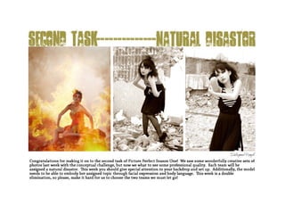
  • 3. The minute you mentioned in the thread that you were going to go out and find a real mudslide, I was very excited. It was one of those moments where I was like, “Yes! People are really putting the effort into this,” and it made me even happier, when the set of photos you submitted exemplified this. Major props to your model for getting dirty. I know that it’s hard for a lot of people, but that’s partly what modeling is about. A lot of times you’ll need to get out of your comfort zone in order to get a good shot and although this isn’t a hard core contest, we do have to judge models on how willing they are to get out there as it is a large part of a professional model’s job. I am very pleased with how into this contest your team is. The first photo is breathtaking. The setting is so beautiful, yet filled with sorrow. The model’s face is perfectly emotive and closing her eyes in pain worked really well here. My only suggestions is that it’s a rather stereotypical pose; with the hand up to her face. In general I’ve noticed that while the model’s posing is good, it’s always safe. Try to break out of the box and really get creative with your body movements. While the location was brilliant, I wasn’t that impressed with the actual photography of this photo. Granted, it’s not really bad or anything, I just see specific ways that could have been better. It would have been nice to see the hill of the actual landslide; with the model sitting in front and the mud from above encroaching on her personal bubble as she stared sorrowfully into the camera. It would have made a really cool shot in terms of framing and the eye contact would have been really powerful in this emotive situation. However, the photo is still pretty wonderful as it is. Although I appreciated that the second photo was a close-up, I didn’t think that it was necessary for the point that you were trying to get across here. It would have been more powerful if the photo was of the model digging through mud and rubble, only to find the collar. This photo shows that she’s found the collar and not the dog, but because the model’s face isn’t in it, you don’t know how she feels, and in this situation I think it’s pretty critical that we see how upset she is by the loss of her dog. It’s a good photo, it looks cool and the textures are amazing, I just think that a different set up would of played to the storyline better. Before I understood that the set was indeed a story board, I didn’t get the third photo at all. However, it fits with the story really well. I love you how you got the model and the dog in apart in the same shot, with the girl looking for her and the dog coming up behind her. It would have looked even cooler if you took the shot from the side, so that you could see the desperation of the girl looking for her dog at the same time. The problem with the current photo is that it doesn’t stand on its own. If it wasn’t part of a story, it’d be a rather boring photo. The fourth photo is nice; the dog looks adorable and the expression on the model’s face is cute. However, in terms of photography, this is probably your weakest photo. Part of the model is cut off, and since it’s only a sliver it looks unintentional. Additionally, it’s not the most flattering angle of the model. It’s also important to pay attention to the little details that can make or break a photo, for example, in this photo, the model’s bra strap is falling down her arm. Honestly, it was the first thing I noticed. The ground texture looks great though, just try to clean up the little details. In one word, this photo is adorable. Unfortunately, there are a lot of technical problems with it. I love the idea of a shot with the girl holding her found pup and kissing it, but this photo doesn’t do it justice. There’s a hint of serenity on the model’s face, but you can’t really see it clearly because her hair is covering it. Additionally, the angle and cropping is a bit awkward. This photo would have looked a lot cleaner if it had been cropped at the waist. It would have been even better if the photo had been taken at a slightly lower angle and closer in, framing the model’s face and the dog better. When it comes to expressing emotion, sometimes close-up shots work really well. I wish that the model had been looking at the camera in least a couple of these photos. When expressing sadness, hopelessness, or desperation, looking at the camera is really powerful and kind of important. I also would have liked to see the model interact with the environment more. You had a beautiful and real set and the model obviously had a good time rolling in it, I just would have liked to see her actually in it more. Overall, your photos were good though, not as shocking as last week, but still good. Critiques, Head Judge: Kris Ramos (1)
  • 4. I had to look at this photo set a few times to understand the story, but once I did I quite liked it. I liked that this team took the opportunity to express how people (and yes, pets are people ;D) can find each other even through a disaster. I think some more opportunities could have taken to use lighting to express the changing mood: from the model’s devastation at the beginning of the progression to her elation at the end being reunited with her pup-up. I would like to commend this team on the use of an animal model. I know that they can be extremely hard to work with, especially young one’s (as this one appears to be a puppy). As usual, your use of focus and composition is incredibly expressive, particularly in the second photo of the collar. This time, I’d also like to commend you on your choice of location. A river bank is an excellent choice for a mudslide, since it naturally looks in a state of erosion. Very nice thinking on the part of this team. I would like to caution you, however. Your photos are always stunning, but many of the other teams are improving and growing in their art. There is a degree of stagnation with this team. Try and branch out, try something new, and see if you can achieve some growth. Summary Excellent Focus, Composition, Choice of Location Needs Work Lighting Variation Critiques, Photography: Kaitlyn (2) Critiques, Photography: Nick Sullivan (1) Critiques, Photography: Tragidy (1) I am more impressed with this team as we go through this competition. The first picture is gorgeous. Even though there is a limited amount of color throughout the pictures, I can still clearly see the focal point. Critiques, Modeling: Cassandra (3) This team did an exceptional job once again although I really don’t see too much of a mudslide in the image. I know that the model is covered in mud but to me it just says she fell down a cliff unfortunately. I can see the concept but I’m not sure that people that don’t know what it is will think of a mudslide instead of just being covered in mud. The modeling in their first image is very well done and the pose really helps to tie in the distraught mood that the model is expressing so that her pose doesn’t conflict with the feel of the picture. The model’s left hand however seems to disappear into her pants because of the color effect so perhaps it should’ve been more defined in some manner.
  • 5. Still one of the best this week, but not my absolute favorite. I hadn’t thought about taking pictures involving those affected by natural disasters, so this is a nice spin on the assignment. A mudslide would be kind of difficult to embody, so I think this team did very well with what they had. The first picture begins our story with a devastated young girl. The model really did a good job at making her face believable in this shot, because I can easily tell she’s distraught. Another way to start off might have been to have the model on the ground, like she’s been caught in the mudslide and has to get up. The second picture is all right; I usually prefer shots that contain more of the model than a hand, but I guess if the shot were too far out the viewer wouldn’t be able to see the dog collar. Critiques, Modeling: Shawn Keeney (3) Their second image is very nicely done as well and the model is holding her hand in a way that is so very elegant. Because I have seen the other three images I know what the item the model is holding is but I feel like without prior knowledge this image doesn’t make you think of a dog collar. Honestly my first thought was “why is there something attached to the tree and why is she holding it?” Perhaps the concept could be more clearly defined if the tag wasn’t crooked so that we could see easier that it belongs to a dog. Until you really look for it you can’t see that there is a tag as it’s easy to look passed. This is something to keep in mind for your future entries; try to put yourself in perspective of someone that doesn’t know anything about your image and see if it makes sense. The third image is decent and I really like how you were able to get the dog to pose so nicely - the dog honestly looks like it’s saying “Oh, there’s mommy!” I did have an issue with this picture however where the model is concerned; she just doesn’t appear to be looking for her dog so it makes the dog seem out of place. Perhaps this could’ve been more clear if the model was holding the collar so that we could see it and perhaps have her pose in a way that looks like she is searching instead of simply standing on a hill. The fourth image is nicely played out as well and the expression on the model’s face is very cute. Unfortunately I don’t feel as though the model is all that enthused about finding the dog so a bit more emotion and joy would really benefit this picture. Another point is the model’s bra strap really is confusing at first glance as to what it is and once you figure out what it is you realize how tightly it’s pulling the skin and it’s just awkward. My thought on this is that perhaps the strap should be on the edge of her shoulder or just below it so that it doesn’t pull the skin as much and also is more clear on what it is. The teams final image is very sweet and really gives a warm fuzzy feeling; it’s always nice to see a happy ending when something bad happens. The model’s pose is practically perfect and you can truly feel a warm fuzzy feeling emanating off of her. While the dog’s awkward backwards glance is confusing I like that you chose to do that as it helps to show the model’s face as she kisses the dog. I did notice something however. In this image you can tell that the mud is fresh as it is still wet and there is a lot more on the model than the other images - especially the fourth one. While this is a minor blunder, since the images are shown in a series it can be confusing to someone that notices. I do really enjoy that this team helped to tell a story of how a disaster played out and they did a lovely job. As I said before I’m not sure that people will think of a mudslide without knowing ahead of time but they really showed a nice effort. The posing is very well done and the model has done a great job at expressing emotion with more than just her face. This team still needs a bit more tweaking to make them perfect but they have really been improving and showing a great effort. Keep up the wonderful modeling and just continue to wow us with everything that you do.
  • 6. The Good • I adore how this has a plotline. It’s hard to get that done with 5 pictures but you managed to do it wonderfully! • The modeling is wonderful in each photo. You can clearly feel what she’s thinking during each one—even where you just see her hand, the tenderness in the grasp of the collar is apparent. • The location was great for a mudslide and you can infer that something bad with mud happened—she was tastefully covered in it, not as if she had been rolling through it, but as if she had been wading through the mud looking for something or someone. • That puppy is adorable. The Bad • I really really really wish the hair wasn’t so in her face in the first picture. I can see the sadness through it but it would have been a lot more poignant if you could see all of her face instead of having to look through the hair. • The bra strap around her arm in the fourth photo created a strange outline to her arm. The Mediocre • The desaturation of the pictures added a nice effect to show the dismal aura around the first few pictures, but in my opinion (and this is just my own) a little color on the model at the end would have shown a light of hope or happiness added to the picture. • In the third picture, the dog almost looks like a puppet, the way he was cut off at the neck. I’m aware that it’s hard to work with live animals, though, but it’s just a little surreal at first. Not terrible, though. Disaster Portrayal • Location, location, location. You did a wonderful job with the setting of the photos. The fallen trees around the model really helped with the effect of a disaster—and also, her world falling down. The mud was, as I restate, tastefully on her, realistic and not just looking like she rolled in a mud puddle. • The sadness around the whole thing shows the reality of the situation. I feel the essence of ‘mudslide’ was captured well. Critiques, Modeling: Momo (2) The third shot is good, but not completely impressive. To give the model more of a purpose in the picture, I think she could have brought a hand to her forehead, like she was looking for the dog, or cupped her hands around her mouth like she was calling for it. In the fourth picture, the model is not going all the way. Her face should have been so full of light and happiness that I had to shield my eyes when I looked at it. The facial expression is just a bit too pleased and needs more of an ecstatic look. The fifth picture is good too, but I have to make a comment. I know they can’t really control what the dog is doing, but I think the picture should have shown the model and the dog looking at each other, because with the dog looking away the whole sense of a happy reunion and “I’ll never let you out of my sight again” is severely diminished. This has been one of the most consistent teams this whole competition and I hope they keep bringing it to the table. Overall, their photos this week weren’t totally amazing, but they were certainly not bad. I would have just liked to see some greater variety because in all the pictures, the model is in profile and not facing the camera at all.
  • 7. Ranking #2: The Lost Girls, Mudslide
  • 8. Critiques, Head Judge: Kris Ramos (3) The first thing I noticed was the decrease in quality in your photos. I understand you had a bit of a lighting issue, but I think you made it worse by overusing Photoshop. Since the entire photo is a bit dull and fuzzy, blurring the background just calls attention to this. You should’ve increased the contrast and levels, which would have made your photos appear much more crisp. Your first photo is crisp, and that’s what makes it so great. The model looks incredibly fierce and perfectly embodies the energy of a hurricane. I love the way her hair is blowing and the ferocity of her eyes. My only issue with the modeling is the pose. Her legs disappear into a black mass and her whole body looks a bit awkward. The photo is, however, well composed. I’m really not a fan of your second photo, which I honestly just find weird. The model looks alien and kind of creepy and while I do get a good sense of motion, I don’t really know what that motion is. I suspect you’re going for the windswept feel, but it doesn’t really work here. Additionally, the model’s right arm looks lumpy and deformed. As a whole, it’s not a very interesting photo. I love the ferocity, movement, and body language of your third photo. The model looks fierce and savage, just like a hurricane. However, the blurred background and lightness of the whole photo ruins it for me. The model’s face is so fierce, I just wish that the sharpness of the photo quality reflected that. The model’s right arm, should also be moved a bit out more, so it’s not in direct line with her body and the arm extension is more visible. This image does accurately and completely represent a hurricane, though it needs some technical improvement. Your fourth photo is one of my favorites as it looks like a snapshot from some sort of survival television show. The model’s expression is wonderful and barbaric. I love the motion of her arms, although her right arm is awkwardly cut off beneath the shoulder. Again, the blurriness really detracts from the photo. As with the others, the model looks especially fierce in the last photo. The lip curl is great and I like that she’s clinging to a tree since trees blowing over remind me a lot of hurricanes. However, the model’s legs are completely hidden, making her look short, and the blurriness really detracts I really got the movement of hurricane from the model’s body language, however, the setting didn’t really do it for me. Maybe that’s because it’s my own fault for having a wrong preconceived idea of hurricane, but when I think hurricane, I think of tons of stuff blowing around an urbanized location. I think, city destruction, not the forests. Overall, the photo quality really detracted. The model has her facial expressions dead on, but could work on angling her body so that it looks better on camera. I’d work more on set-up and paying attention to your lighting. Also, try not to over-Photoshop. So far, however, your photo sets have been consistently strong and I can’t wait to see what else you come up with. Critiques, Photography: Nick Sullivan (3) Critiques, Photography: Kaitlyn (4)
  • 9. Critiques, Photography: Tragidy (3) Woah-ho! First let me say that this is one fierce looking model. I’m not a modeling judge, but this girl really rocked it out. Good photographers know that a good model can make or break the picture. Now, onto the photography critique. I’m always charmed by this team’s use of color. This week, the green and grey/brown made it all come to life. These photos are full of life, even though they don’t simulate much movement. What the setting and color/lighting helps create is that “calm before the storm” effect in the first two photos, a violent storm in the final two, and the after-math in the final. The lighting especially illustrates the progression of a large-scale storm (from mid, to low, back to mid lighting). I don’t know if that was all natural light, or if you had some help, but it was wonderful. I disagree with the use of the blur effect in the final two photos. While in the fourth photo it almost works (its still a wee bit much for me) I feel that it takes over the model in the final photo, and diminishes from the subject of the photo. Summary Excellent: Color, Lighting, Conceptualization, Wind-effects, choice of location Needs Work: Less blur effect I loved your first photo. The colors are amazing and it looks perfectly lit. However, it seems a bit out of focus. However, as I went through your submissions, there were weak photos after weak photos. I think you might have edited a bit too much to where it looked like your camera was broken. Editing can make a photo so much better but it can also make it so much worse. That aside, great job. Critiques, Modeling: Cassandra (1) I found that this team did exceptionally well this round and I was pleased that they really stuck with the theme and communicated it fantastically. I could really see them portraying a hurricane in all of their photos which is a nice recovery from last week’s minor blunder. In the team’s first image the model’s expression is very fierce and gives us a good idea as to what she is feeling; it’s as though this is the anticipation of an upcoming hurricane, seeing the hurricane growl at us from a distance before it comes to attack. Her choice to pose while crouching is also nice as it helps to further give off the impression of ‘before the attack’ as it makes her look ready to pounce. Her left hand does look awkward against the floor however - I’m not quite sure why but it does. I really like their choice to use a fan in this scene as it helps to give the model a windy appearance which helps to tie in with their assignment.
  • 10. I have to give major kudos to this team. These are perhaps the best photos I’ve seen in this competition so far. I love the story the photos tell, and I think that there are several ways to interpret that story. The first picture is amazing; fierceness in the face, and a quiet sexiness that is kind of like the ominous, looming calm before the storm. Critiques, Modeling: Shawn Keeney (1) Their second image follows nicely with the first showing right when the hurricane is going to make it’s first strike. The model is wonderfully positioned in a way that makes her appear to be grabbing for something to hurl at us much like a hurricane does as it’s tearing through. Another plus to this image is the angle of the model’s face and her hair awkwardly placed makes her appear un-earthly which helps to compliment her turning herself into a natural disaster instead of human. The model’s expression screams danger but in a way that isn’t angry which is very impressive. While I do love the model’s pose I feel as though her right arm is a tad awkward; perhaps it shouldn’t be so twisted? The team’s third image is another excellent photo; the model’s expression as well as body placement really portrays the aggressiveness of a hurricane. She is even doing a great job at posing in a way that looks as though the photo was taken while she was preparing to hurl the wood instead of her just posing for a picture. The pose is fantastic and I really love how she has her left hand in a claw that makes her look inhuman. Something that I can find that would be better a bit different is the model’s right arm is practically non-visible yet it is a part of the picture; either the model’s hair should have been place differently so that her arm isn’t cut off or the camera angle should be a tad different so that we can see more of her arm instead of making it appear to be coming out of nowhere. This team’s fourth image I felt was the best at capturing the essence of the hurricane. The dampness of the model helps to represent the rain that generally comes with hurricanes and her hair flying around demonstrates the winds. The model screaming helps us to interpret the scream of rushing air and her arms being sprawled also show us the cyclone motion to help verify that it’s a hurricane and not simply high winds. I can really feel a great amount of emotion from this image and the pose is practically perfect. The only flaw I can see in this image is the same as the third one; since her right arm is part of the picture it is awkward how it looks like her forearm comes out of her chest and it would be more preferable if we could see some of her upper arm. Their final image I interpreted to be the hurricane’s goodbye; the model’s vicious and defiant expression ties in with the rubbish on the ground to show her saying ‘I caused a mess and there’s nothing you can do about it.’ While I do love the model’s pose in this picture, especially the lines on her neck causing her to appear inhuman, I can’t really see how it ties in with her emotion. I also feel as though she is holding back some and she could really give us more emotion than she is in this picture. Overall though I feel that this team did a fantastic job; the model is great with expressing emotion as well as giving us poses that truly go with the theme. She should work on making sure that all of the pictures they submit have the best poses she can muster however - as the competition gets more fierce a small blunder could be devastating. Also she needs to ensure that she is giving as much emotion as she can into all of her pictures so that they are all completely convincing. I have seen a lot of improvement in this team and they were already one of the best in my opinion. As far as following the assignment I felt that this team did an excellent job; I really didn’t have to try to find how they played out their disaster as every picture they turned in really just screamed hurricane. I was very pleased with how they tackled the assignment and I am glad that they didn’t have another slip up as they did in the first round. Just make sure that you guys keep getting better and truly make all of your pictures perfect.
  • 11. The Good • I always look forward to this team’s photos and I wasn’t disappointed this time around! • All of these pictures scream defiance, strength! to me, which in my opinion is awesome. You don’t need to cower to nature, but if you’re going to defy it, do it obviously. The strain can be seen in many of these, and though it isn’t very pretty it’s realistic and obvious—for example, in the last pictures, you can see the tendons and whatnot sticking out from her neck as she braces herself against the tree. • The outfit choice was phenomenal. She looked very tribal and feral, and it fit with the theme of the pictures. I love the blue color theme, mixed with black and a little bit of pale yellow. • Her faces are simply stunning… in each photo, you can see the same theme but with a slight variation. Most of them seem to be saying, “Up yours, nature!” and in the rain one, she seems to be pure rage. The Bad • In the third picture, the arm we can fully see is severely distorted and it looks ridiculously undersized for her body. It’s most likely the angle that did this but it’s a rather comical effect, and comical is not what you’re pictures seem to be going for. • Beware of losing the neck! In pictures one, two, and four you lost it. However, the worst case would be two. The Mediocre • In the third picture, I’m not quite sure why she’s throwing a log… but she’s doing it angrily and with focus! You throw that log! Yeah!! • I’m not really sure what to think about the second photo. She kind of reminds me of a spider here, just crawling along, minding her own business. It’s just a meh picture. Disaster Portrayal • I feel this was wonderfully done. I definitely get wind and water out of these pictures—thus, hurricane comes naturally to mind. For some reason the ‘tribal’ feel seemed to help put two and two together for me as well, but I really can’t explain why. Her outfit even coincided with the theme! Critiques, Modeling: Momo (1) The second picture, again, shows some serious intensity in the eyes, and the storm is starting to brew, but I would say to watch the placement of that right leg; it’s right up in the foreground and takes over the shot, making it the first thing I see, and then I notice the face. Third picture: wind has picked up and passers-by should watch out for flying debris (I love the slight smirk, like there is some enjoyment in doing this); my critique on this one is also placement of limbs and props, as the left arm looks slightly misshapen due to the angle (I like the clawed hand, however) and it looks as if the log is growing out of the back of her head. The fourth picture is probably my least favorite: I can feel the scream through the frame, but because of the way her head is sort of pulled down, like she’s ducking, it looks like she’s terrified of getting wet, so I think more of a high head, looking up, powerful thing could have worked better; again, limb placement is a little off here, because the right arm looks like it’s sticking out of her side. Finally, the fifth picture looks like the storm has finally passed, or maybe it’s the eye of the hurricane and she’s resting up for the second go around; I really like the neck extension in this shot, and here nothing looks deformed or out of place, but I would say to watch that lip snarl thing and relax the lips a little more. All in all, I think these are some spectacular shots, and these two should be very proud of themselves.
  • 12. Ranking #3: Deadly Duet, Fire
  • 13. These photos are a major step up on the ladder for you. You’ve really taken it to the next level, and I’m happy that you’ve showed vast improvement. It’s obvious you put in a lot of effort for this challenge, evident by the burnt set-up, and I think all of the judges really appreciate that. In terms of set-up, my only suggestion is that I wished you had gotten a photo with the actual fire. That could have been really fierce and really amazing. In terms of composition, your first photo is by far my favorite. I love how the smoke and model mirror each other, however, I don’t understand what emotion the viewer is supposed to be getting out of this photo. The model is pretty much expressionless and she’s not doing anything with her body either. The mood of the photo doesn’t say fire to me at all. The second photo is interesting, because you can really see the set-up you have. I specifically like the chard ground and frame. However, I’m not a big fan of the photography. There just is no reason for it to be taken at a diagonal, and the fact that the top of the model’s head is cut off, really bothers me. Again, the model is expressionless and I don’t know what I’m supposed to be feeling as I look at this photo. I really like that your team decided to turn in a close-up, since variety is really nice, however, I’m not a big fan of this photo in general. The model has a hint of expression, yet her eyes still look rather dull. I want to see some passion for her, how does she feel? I also wish this photo was right side up, not diagonal and the background doesn’t go with the disaster. The green fields and vegetation are kind of contradictory to fire and destruction. The overexposed sky also detracts from the photo. Your fourth photo is obviously the best and it’s actually quite good. I love the model’s pose, although I can’t decide if I like the fact that she looks cold. I’m not sure if contradiction to the fact that fire is very hot, was appropriate. However, this is an example of good photography. The model is placed nicely and the angle at which the photo is taken is just right. The texture of the ground is also amazing. All in all, a wonderful photograph. This photo is definitely different than your others. I’m relieved that your model is finally showing some raw emotion and she looks sorrowfully beautiful. However, the angle is awkward and makes her feet look weird, the green grass in the corner is distracting, and the photo itself is slightly in bad quality. While these are nice photos, I don’t really understand what sort of emotion we’re supposed to be getting out of this photo. The model is rather static in her body movement and seems to be playing it safe. Additionally, I don’t really understand your choice of wardrobe. I don’t really like the long hair, since I think of fire as being a fierce disaster, and short hair is more edgy. I don’t really think you captured the essence of fire. Next time, I’d really like you to focus on the meaning and goal of the task, while producing high quality photos. Critiques, Head Judge: Kris Ramos (4) Critiques, Photography: Kaitlyn (1) Critiques, Photography: Nick Sullivan (4)
  • 14. I mentioned in the general board that I was really impressed this week with everyone's work. However, one team topped it all off for me and that’s Deadly Duet. They took our critiques to heart, applied them, and really rocked an amazing photoshoot. That’s why they’re my pick for winners this week! Deadly Duet Wee! Thank you, thank you, THANK YOU for diminishing your watermark. I didn’t even see it on the photos until I looked for it after my critiques. On that note, these photos are stunning. I don’t hesitate to say that this is the best work from this team this season, and that this week they are the most improved. These photos tell a dynamic story, embrace the concepts of composition, and take a creative spin on the devastation of a fire. Excellent work. The focus in the first photo is a wee bit off, but the rest of this set makes up for it. The angles are interesting and new in each photo, and the subtle changes in the model’s wardrobe help tell her story (she loses her shoes and a couple chunks of her dress). Very nice conceptualization here, and I have very little negative feedback to give. Keep improving! Great work! Summary Excellent Mood Lighting, color palate, set design, wardrobe, composition, angles Needs Work Focus Critiques, Photography: Tragidy (4) Looking through your pictures, I could not seem to identify your disaster. That aside, I think the colors did not work out very well for these pictures. The colors clashed and made for unappealing photos. The lighting was alright and the photos looked very sharp. I do not think you should have included photo 3 because it did not really represent fire. Critiques, Modeling: Cassandra (2) It saddens me to say that the images that this team turned in for the second round pale in comparison to what they turned in for the preliminary competition. The model was nowhere near as expressive as she can be and I found that not all of their images submitted really captured the essence of fire. The first picture that the team turned in is fair and I can see the concept that they were going for however it is weakly portrayed. While the model’s pose fits nicely with what the team is depicting she is not expressing enough emotion to get the message across to the viewer. As far as the task goes I feel as though their best shot for depicting fire is their second image. Since most of what we see is gray the model’s red dress is able to stand out more which causes the viewer to look for significance in the clothing; this helps to communicate the element of fire more clearly. Another good point to this image is that the model is looking down in a way that screams arrogance which helps to portray the message that she is the fire. In this image the model’s pose is decent however her right arm appears to be hanging limp instead of posing and isn’t quite up to the standard it should be. I do however very much love the aspect of this picture and find it does a very nice job at depicting the disaster this team was assigned.
  • 15. Again, the team went with more of a “victim” depiction of the disaster. And therein lays my issue with this team. While what they did makes perfect sense, this was the task where they could have gone all out and crazy to make the pictures superb. This team’s disaster would have been a great one to just use all kinds of fabric and hair and makeup stuff and extreme modeling to create a shot that would blow me off my seat. They’ve been a little too conservative for this whole contest so far, and I really would like to see them step it up next task. My other critique has to do with the wardrobe decisions for this shoot. I think that long wig could have been done without, as it really didn’t add anything to the pictures for me; actually I think they made the shots worse. The model has a very boyish face, and having that wig on (especially in the third picture) makes her look kind of like a bad drag queen. Also, the red dress is a little over the top. What’s killing me about this team is that the model is actually not bad at modeling; the choices they make concerning concepts and styling are often what make them one of my least favorites. An amazing picture involves more than just a good model. Critiques, Modeling: Shawn Keeney (5) From a following the theme standpoint I found that this team’s third image was very weak and from a modeling standpoint I found that the image was alright. This image really appears to be more of a ‘glamour shot’ then a picture expressing fire and that is disappointing. However the model’s pose is strongly elegant (though her right hand shouldn’t be wrapped around the pole quite as firmly) and the model’s emotion is alright though should be more enveloping. It’s hard to tell exactly what she is trying to convey in this picture and I wish that it had been a stronger emotional pull than it was. This team’s fourth image is nicely done with how they demonstrated fire; the pose of the model expresses a fire dying out from the cold yet still angry and wanting to continue burning. Unfortunately I once again find that the model is not quite conveying enough emotion; while she does look put-out I would’ve liked to have seen more sorrow and fierceness in her eyes than there is so she can better match her pose. This team’s fifth image I found to be the best from a modeling standpoint. Her posing is great and really gives you a sense of distraught as if the fire is on it’s last leg and I can see a great amount of emotion coming from her face. The ash that was used to smudge her face helps to add to the distraught mood without being too overpowering as well as implementing more of the fire aspect. The way that the model is holding her body and clasping her hands really helps to draw the viewer into the image and I greatly liked that part. An issue I do have with the picture though - and I know this is photography but I thought I would point it out - is that there is a blur on the bottom left of the model that is very distracting. While I am able to see fire in this picture I’m afraid I wouldn’t notice it unless I knew ahead of time so the task wasn’t thoroughly met in this case. Overall this team did a fair job at capturing the essence of fire although next round you should really push yourselves to ensure that you do the best that you are capable of to follow the task. As the competition goes on you will have to get better instead of dwindling down. This team is very creative and I really want you to push yourselves to see just how much you can use your creativity to give us wonderful images. The model is capable of posing nicely but you need to make sure that every image you turn in the pose is perfect. Have the photographer help the model to know what looks good as the photographer can see what the model is doing better than the model can. She is also great at expressing emotion but you need to make sure that there is enough in all of your pictures. Truly try to tell a story with your eyes and facial expressions to help draw the audience in and to clearly express what it is that you are saying to us.
  • 16. The Good • I love the red dress—fire—and the black sash-thing—soot/ash. It really fit well. • The framing in the third picture is very nice—you get a perfect bust-shot, and I don’t even mind the bit of cut off head. The angle is interesting but you don’t have to tilt your head completely to the side to see what’s going on. • I really like the fourth picture and how it portrays not fire, but the absence of fire. In the ashes, she looks cold and alone without the fire. Her body language also shows that she may be scared—what happened to everyone? I like how you showed the after-effects of fire, not just the current state of it. This is my favorite photo by far because of the deeper meaning of it and her cool pose. Also, the bright red stands out wickedly from the pale ash and sad brick red behind her. • The last picture is the best display of facial emotions in this set. The makeup helps a lot, too. Even her body language here shows sadness; the fear/alone-ness from the last picture is apparent here. The Bad • In the second picture, we lose the neck due to the hair, making her look strangely crunched from the shoulder-up. • I really hate to say this, but the third picture is just… wow. Not a good wow. This almost looks like it was included as a mistake. She looks unready for the camera, and the facial expression is strange. Her eyes look mid-blink and her mouth is just in a resting position. She just looks like she’s staring, dead-fish, into the camera. The Mediocre • In the first picture, the model seems to not have much of an expression. She’s watching the steam/fire with kind of an, ‘eh’. I don’t get much feeling here. • In the last picture, the feet are awful small from the angle, but there’s not much you can do about that. Disaster Portrayal • Fire screams out in every picture. A++ on this part! If I didn’t know what was going on, I could see fire in every one of these. Critiques, Modeling: Momo (3)
  • 17. Ranking #3: 1867, Quicksand
  • 18. I felt that you had one of the harder natural disasters, so when you ended up turning in stunning photos, I was mighty impressed. Your team succeeded in both aspects of photography and modeling in pretty much every photo and I was really excited to such an improvement in the quality of your photos. Going outside and into the natural light, really helped your photos appear crisp and I hope that you do more of this in the future. First off, you have a spetacular setting. I was unsure about how you were going to portray your natural disaster, but you managed to make it work out perfectly. This was in large part to the excellent photography work. The photographer managed to take the photos at just the right angle so that it really looks like the model is sinking in the sand. Additionally, every single photo was dynamic and automatically pleasing to the eye. When I first opened up your photos, my eye instantly wanted to look closer and really anazlyze it. The effect of the hills of sand rolling behind the model, really make the first photo. From a photography aspect, these hills are really pleasing and create good composition. It’s also good how the model’s hand is closer to the camera and creates good depth within the photo. The model’s stare is very striking (my God, she has beautiful eyes), and I get a sense of surprise at the situation she is in. My only suggestion is that her face is still lacking some emotion and could really use the extra umph. Other than that, wonderful job here. In the second photo, the model completely nailed her facial expression. It’s a mixture of shock and confusion, verging on fear. Her body language is also strong, although her hands look slightly flaccid and she could be gripping the sand tighter in order to make the illusion of sinking more clear. The cropping of her left arm bothers me and I feel that this photo should have been taken closer up and from a lower vantage point. There are technical problems with the photo, but the model’s face is so strong, it carries it home. My favorite photo is the third photo, although considering how great the other photos are too, it was difficult to choose. I absolutely love the hand covered in sand spread out toward the camera, close-up. It really looks like the model is stretching for help. However, while the model’s face is still strong, I would have liked to see some sort of desperate look instead of the still sort’ve confused look. I wish the sand covered the model’s back more, as you can tell that she’s not really sinking here. Additionally, a slice of her head is cut off, which isn’t ideal and the part of the background that isn’t sand shows through. Other than that, it’s quite a captivating photo. I really love the different angle and distance of the fourth photo. Finally, someone shows that they know how to use negative space. Not all photos have to be centered completely on the model, and this photo is a great example of that. The levels of sand are really apparent in this photo, and since it’s taken from above, it really looks like the model is sinking. The varying depths and use of space is superb in this photograph. As with the other photos, the model’s gaze is striking and really touches the viewer. I only with that the model’s arm was straighter up so that it looked more like she was reaching toward the camera. Also, one of her arms is just sort of laying there not doing anything. Remember to engage all limbs when posing, your whole body needs to look alive. Your fifth photo is by far my least favorite and stands out negatively among your other photos. This is probably because I am unsure what is going on here. To me, it appears that one of two things could be happening. The model’s facial expression suggests that she’s losing the battle of staying above the surface and crying her last screams, but her body positioning and language say otherwise. Her upper body is out of the sand, unlike how it is in the other photos and her hands are simply laying on the sand in front of her. There is no tension or strength in the model’s pose. Additionally, the photography is pretty poor, as it is slightly blurry and the cropping is awkward. Since the other photos are so brilliant, this last one is kind of a let down. I love the intensity in the model’s expression, but the pose lacks this vivacity and the photography isn’t great. Critiques, Head Judge: Kris Ramos (2)
  • 19. Overall, I was incredibly impressed by your performance this week. It’s a gigantic leap forward compared to your other photos and I’m really excited to see your improvement. Frankly, I probably would’ve ranked you first if your fifth photo had been as strong as your others and if you had showed more variation. A lot of your photos are too similar and I would like to see more variety from you guys when it comes to angles and poses. The model has expression pat down, but she needs to work on moving her body to match it. The photographer is showing a great deal of potential and simply needs to watch for cropping. Experiment with close up and far away shots more. If you continue to improve as you have, you really have a shot at doing well in this contest. Critiques, Photography: Kaitlyn (5) Critiques, Photography: Nick Sullivan (2) Critiques, Photography: Tragidy (2) Though I wasn’t quite sure of this teams theme, once I peeked, I understood that she was stuck in quicksand. I really commend the commitment Team 1867 had to this task: they buried their model! WOW! Though I’m really impressed with the commitment, I still have a wee bit of constructive criticism. In the third photo, the attempt to make the foreground hand the focus of the picture (I assume that’s what you wanted to do?) didn’t quite work. You instead threw the whole photo into soft focus, which diminishes from the excellence of this picture…and make no mistake…its an excellent photo. Try a different setting on your camera: Portrait mode, for example, will put the foreground in focus, and blur out the back. Otherwise the photos are very expressive and very keen. You experimented with height, coming down to the models level and towering over her. I’d like to see you work more with horizontal angles, not just vertical ones. Good work this week! Summary Excellent: Angles, Commitment, Color palette Needs Work: Lighting, Focus, Taking Risks I am a little disappointed by the lack of variety in these pictures. I understand how hard it can be to take pictures of one certain subject, but there are things to spice up these photos. That being said, I liked the first photo because it invokes a feeling of fear.
  • 20. Critiques, Modeling: Cassandra (4) I am pleased to say that I have noticed an improvement in this team although they still will need to kick it up a few more notches to keep up with their competition. However, with how much of an improvement they’ve already made I can imagine that they will be able to get even better if they just keep trying. In their first image the model is showing a nice amount of emotion although it doesn’t seem to tie in with the disaster that they are portraying; I find that her ‘shocked’ look appears more to be out of curiosity than worry of her slipping into quicksand. I enjoy very much how her right arm is outstretched and is grasping into the earth however the model’s left arm very much pales in comparison; her fingers look bizarre and the jacket does not compliment her left arm well. The second image is better than the first as far as the model’s pose goes but the emotion is not as strong as the first and once again doesn’t really display the theme. Once again the model’s grasp on the earth is lovely but I would like to have seen her entire left hand, the cropping seems too bizarre. The emotion that she is displaying appears to be confused as to why she cannot grip the ground better however there is also a hint of spacing out in her eyes. Their second image really appears more to be displaying a mudslide than quicksand unfortunately and even knowing what it is that they are portraying it is hard for me to see it in this picture. Out of the five images that this team turned in I feel as though their third image was the weakest from a modeling standpoint. I love how her hand was outstretched and the staging of the dirt on her fingers showing being sucked into the filth but the model’s right hand doesn’t appear to be posing and looks rather limp. The model is expressing desperation however there is a hint of anger which doesn’t seem to work with what she is portraying; I could find it working had there been some hint of a person ignoring the model or even causing them to fall into the quicksand - without this, anger does not seem to be the right emotion. Another part of the picture that doesn’t seem to be right is the arch of the model’s back. I can understand that it must’ve been hard to pose hanging off of a sand dune but the arching just looks awkward in this shot. The team’s fourth image is one of the better ones as far as capturing the disaster goes and I found was the best one they turned in from a modeling standpoint. The emotion that the model is expressing is very vivid and just screams her acknowledgement of the impending doom and it almost appears as though she is giving up. Her right hand is nicely stretched out although I do wish it was either weaker to show defeat or more risen up to show the last amount of desperation she can muster. The model’s left arm is nicely bracing her against the sand and the backwards tilt of the model’s head is very well played out. Another part that is nice with this picture is how, without focusing on the background, it does appear as though the model’s body is disappearing into the sand. This team’s final image I felt was the best out of the set at portraying the quicksand. While I am usually against showing most of the body but not all it worked in this image as if we had seen all of her it would’ve ruined the illusion of the model disappearing into the quicksand due to their set. While I shouldn’t look at that as a reason to turn in a not-perfect picture I do understand why they did it in this case. Once again the model’s right hand is very nicely curled up in the dirt but I feel as though her left arm and hand appear to not be posing. Also, with the emotion that is on the model’s face, it appears as though she is trying to pull herself out but her hands make it look like she’s trying to climb up - for this image I believe it would be more appropriate for the model to have her hands and arms poised as though trying to push against the sand or scraping at the dirt around her as though slipping. I love how much emotion is coming off of the model’s face; she is showing a tremendous amount of desperation. I do feel however that she could show us some more and make us truly believe that she is in quicksand if she just pushes herself a bit harder. I know it isn’t what I am judging but I will point out that I do wish that the photo were altered a bit (or even just move the dirt a bit better) so that we couldn’t see the model’s pants. Because we are able to see her pants we can see that she is simply sitting down in the dirt and this does kill the illusion. Another issue I had with this image is that there is a cup in the shot which doesn’t have anything to do with quicksand - something to make sure that you guys watch out for is making sure that your whole set has to do with what you are portraying; no matter how great a model is doing, unless the set compliments her it just won’t work.
  • 21. This team is the other one that has vastly improved for me this task. Finally, I see some of that comedic quality that I saw in their audition and earlier pictures. Overall, their set was pretty good. The model was able to make her look of fear believable, and she is definitely photogenic, something I wasn’t too sure about from their last few pictures. My major concern with this team for this task is that their pictures looked more like a depiction of a mudslide than quicksand. I understand that actually sinking the model in dirt is unreasonable, but there are definitely ways to trick the camera to make certain parts of the body invisible, making it look like those parts might have sunk into the earth. Also (even though I’m not a photography judge) I’m sure there are ways to angle the shot to make things look a certain way. Other than that, I rather liked this team’s set. Critiques, Modeling: Shawn Keeney (4) Critiques, Modeling: Momo (4) Overall I truly feel like this team has made tremendous progress, just keep pushing yourself and you can get there. Their strong points are the model’s ability to express emotion as well as the team’s creativity and uniqueness. I would like to see more emotion in all of their shots however, make sure that it’s the best you can do. A technique that I have used to help with expressing emotion is to just keep thinking about the situation you are pretending to be in and just try to convince yourself that it’s really happening. The model still needs to work on proper posing techniques and learning what looks good and what she needs to do better. Perhaps the photographer can try to help her if they notice something could be better? Another thing they need to make sure they keep in mind from now on is proper staging. As the competition goes on the challenges will become harder and they can’t afford to make a blunder such as staging; while they didn’t have too many issues with it they just need to make sure that they don’t have any issues later. This team did a fair job with capturing the theme but honestly unless I knew ahead of time that they were portraying quicksand I would have thought that it was simply falling off a cliff or perhaps a mudslide on their first three images. So, like I said before, just keep pushing yourselves to be the best that you can be; you’ve made a lot of improvement and I’m sure you can make some more. The Good • The third picture in one word; wow. I really, really love this one. The outstretched hand, enlarged by the closeness to the camera, doesn’t distract from her face at all. You can practically see her saying, “Help me, and stop taking pictures!” There’s a certain confusion in her face, but also a sadness. The furrow in her brows really adds to her facial expressions. The way her hand is gripping the earth really shows her trying to stay afloat. In my opinion, this is the best in the set by far. • The model really looks like she’s scared out of her wits in the last picture. I love the head thrown back and the primal screaming I can practically hear coming from the picture. Great expressions here!
  • 22. The Bad • Variety is the spice of life! I understand you’re working with limited resources but I feel that the photos have a sort of monotony to them. Different locations and other poses rather than just a buried model may have helped. The angles are what broke the worst of it, though, otherwise, I feel they would have been rather boring as a set. • The model’s face in the first picture is more of a curiosity—like, ‘oh, there’s a camera there?’ kind of face, rather than a ‘oh, I’m sinking?’ face. It’s hard to describe other than I feel it’s not very fitting given her situation. • The model doesn’t look 100% in focus in the last picture. • In the last picture, you can see a bit of her legs peeking through the dirt, revealing her crouched position and thus lessening the effect. • Also in the last picture, a yellow piece of trash distracted me from the ‘quicksand’ effect. It just looked messy. The Mediocre • The model’s face in the second one is very good, but I almost laughed at the level of confusion. This is more on the good side than bad, but it’s almost comical how confused she looks. I enjoy it, though. Disaster Portrayal I feel the quicksand was well portrayed; going so far as to bury her, that’s some dedication! I could really feel like she needed our help. However, there wasn’t much sinking, leading me to doubt that she was in quicksand. A progression farther down may have helped, or starting out with a shallower hole.
  • 23. Ranking #5: Uh Oh Spaghetti-O's, Epidemic
  • 24. While your photos are definitely an improvement from last week, I’m still not seeing the potential that I saw in your application photo. I would like to see you continue to improve and tap into that talent I saw earlier. As it is, your photos are nice and interesting to look at, but they’re no where near the quality of the current top teams. Your first photo is really cool and I love the contrast you created between the infected arm and the rest of the photo. While I was put off by the purple tint in your photos at first, I grew to like it as I looked closer and closer at your photos. It added the eerie feel that goes well with an epidemic, after all, it really is a creepy disaster. I like how the arm came out crips, but I wish that the model’s face had as well. I would also like to see more expression of horror in the model’s face. The hand is awesomely creepy, though. I really like the second photo, although I’m put off by the fact that you can see the bottom of the model’s breast. Her arm and armpit are also too large and focused on. Again, I’d like to see more expression in the model’s face. She has wonderful body language, she just needs to match her expression to it. The third photo kind of scares me and I can’t figure out whether or not this is a good thing. The model’s eyes are stunning and I love the sort’ve deranged intense stare she has. The shadowplay on her face is a bit annoying, however, and I don’t like how her arms are cropped. The photographer needs to play around with framing the model within a photo. I’m not a big fan of the fourth photo, although I do like the progression of the disease. The photo is taken at an awkward angle and it’s slightly out of focus. The model’s face is also pretty much dead. I don’t know what’s going on, how does she feel about being completely overcome by this disease? The fifth photo confuses me. Yes, the model does look quite intense, but I really don’t understand why she’s giving us the silent symbol. I don’t get what aspect of the disaster you’re going for. Honestly, it’s just a bit weird and creepy. It’s cropped strangely and isn’t overall that pleasing to the eye. Your model is pretty good with posing and body language, but she often lacks in facial expression. The face is the most important thing in conveying emotion. The photography could use a lot of work. I’d like to see more farther away shots and more close-ups; what I’m really looking for is variety. Play with angles. Your set was also lacking this week. Big improvement, but I’d like to see more from you guys. Critiques, Head Judge: Kris Ramos (5) She’s…purple. And its not make-up. I can’t really get over that. The first thing I see in every picture is the purple, instead of the model or the (frankly) excellent photo. Once I did past the insane photoshopping, I found I was really impressed by the concept and progression of these photos. They have a clear progression of make-up, and even of intent, as if the epidemic is not only conquering the model’s body, but also her mind. Critiques, Photography: Kaitlyn (6) Critiques, Photography: Nick Sullivan (5)
  • 25. This an excellent series of portraits…but I still can’t get over the purple!! I liked that you chose to make all of these portraits, as an epidemic truly is about the victims. Since you only had one “victim” you had to make her speak for an entire population. You did that very well. I quite liked it. Summary Excellent: Close-up composition, Conceptualization, Make-up, Progression Needs Work: PhotoShop (Less of it?) Critiques, Photography: Tragidy (5) I loved the first two pictures. It was tight, focus and intriguing. However the ones that followed bore me a bit. Even though you had different poses, I felt that it was the same photo over and over. The colors were not pleasing towards the eyes. Critiques, Modeling: Cassandra (5) I am pleased to say that this team has improved a lot from last week and it makes me glad that I no longer have to feel like, “what happened to all that promise they showed before?’ I am very happy with the improvement in modeling and I can’t wait to see what you can come up with if you keep improving as much as you have this round. The way the model is posing her hand in the first image is wonderful as it really helps to tell us what is happening however just as I said with some other teams I would’ve liked to be able to see the model’s elbow (or at least her inner elbow) as we were so close to seeing her whole arm and it just feels cut short. I do not feel as though the model is really giving us too much emotion in this picture with her eyes however. She just feel as though she is staring at us intently but I can’t really place why she is staring at us or what she is trying to convey to us. Their second image is another good picture and the posing is wonderfully done. Once again however I don’t really feel too much emotion coming from the model; she looks neither excited or worried about her infection spreading and it’s rather confusing as to why not. This is also another image that is cropped weirdly; I know that this has to do with the photographer but I want to point out that the cropping does need to be worked on. I find the posing in the third image to be nicely done as well and really helps to tell us what is going on. Unfortunately I find that the emotion the model’s face is giving off and the emotion that her body is giving us is conflicting with each other. Her body says she is struggling and that the infection is painful but her face is saying ‘don’t mess with me’ and it just doesn’t make sense. This team’s fourth image isn’t the best with both posing and emotion. It’s really hard to tell exactly what we are supposed to feel from it and once again the cropping is just weird. However I do believe that if we were able to fully see the model’s left arm or at least her hand it would be a very nicely posed arm. Their final image is very good in all posing, emotion and theme expression. The pose of the model really helps to tie into the theme of an epidemic as she looks like she has been corrupted by what has inflicted her and she is ready to spread the disease to others. The emotion coming off of her also helps tie this in as well and you can just see the evil nature of what has stricken her. Once again however I feel as though the cropping is weird and it detracts from the image.
  • 26. I am a huge zombie fan, so I was very excited to see what this group would turn in. I was very impressed with this set of photos; the progression was good and there was obvious storytelling going on. The first picture is pretty good. I like the look of fear in her eyes, and I believe it. The hand makes the shot sort of awkward, however, and it looks a little like she’s trying to claw her own face off. Maybe looking at the infected hand in fear or confusion would have made a little more sense. Second picture, I see that the infection has appeared on a different part of the body. The expression is good, and the hand in the hair creates a sort of “What is happening to me?” mood. The only thing to watch is opening the armpit straight to the camera because it makes it just a little weird to look at. In the third picture, I see the infection is still spreading; she is becoming more of a monster. I’m not too crazy about it. She has absolutely no neck in this shot, and the eyes are just a bit vacant for the mood of the picture. I like how her hands are very strong and grasping her hair, though, because it creates a slight sense of anxiety. The fourth picture: the infection is complete. I’m not sure if the model was trying to look dead in this picture or not, but her face certainly is. No expression whatsoever, so that kind of makes the shot unimpressive. The thing I like about it is the makeup; the dots on her face are in more of a uniform pattern, bringing a bit of regular fashion and beauty into this shoot about disease. The fifth picture is my favorite. It looks a little like “I’m going to go hunt some live ones. Don’t tell them, though.” My only improvement would be a little bit more of a smirk in the lips and a glint in the eyes; that would add a bit more of a sinister feeling to the picture, as well as a little sex appeal. By far, these are the best pictures this team has given us. Now I’m seeing what it was I saw in their first pictures they ever gave to us. My vote for improvement of the week goes to this team. Critiques, Modeling: Shawn Keeney (2) Critiques, Modeling: Momo (5) What I like about how the team tackled the assignment is they made it into a series where the epidemic gets worse and starts messing with the model until she has become the epidemic. That was a very nice way to play out their assignment and I am pleased. As I said earlier the model has shown great improvement with her posing and emotion portrayal but she still needs to work on the fine tuning so that the images they submit are exceptional instead of just average. Just keep working on it and I’m sure that you can get there - there has already been amazing improvement.
  • 27. Ranking #6: Sissy Q, Quick Current
  • 28. I’ve got to say, I’m really not impressed with these photos, and I had trouble deciding whether to place you or Tegan and Sierra last in my rankings. In the end, I ended up ranking yours higher simply because you at least hinted at your disaster. Overall, your photos looked very amateur; they weren’t crisp, high quality, or professional looking. Your first photo is your only clear photo in which the model is looking at the camera. Yet, I see no expression whatsoever. What is going on in this photo? Why is there a girl dressed in nothing but a sheet, staring me down? While I like the use of fabric, the model isn’t interacting with her set at all. On top of that, the photographer awkwardly cropped her right foot and fingers out and her left looks like a strangely straight branch. There is nothing to critique in the second photo. It’s simply some legs wrapped up in a sheet symbolizing water. Where’s the struggle? The model’s face? Movement? Water is a particularly moving disaster, yet I don’t see any movement whatsoever. Your third photo is kind of pretty, although, I don’t know why it’s upside-down. I think the model looks kind of serene? I’m not sure why. Every single limb is cut off and her bathing suit is peeking out from under the sheet. The only photo that really depicts a struggle of any sort is the fourth, although I can’t say that it’s my favorite. I don’t get why it’s sideways, photos rarely look good turned any way other than right side up. I wish the hand wasn’t cropped so that I could see if the model was reaching toward the camera strongly. The model does have a rather haunting look, so kudos there. Nice back. What about a face? Seriously, it’s hard to critique anything when a model’s face isn’t even in the shot. Emotion is mainly manifested in ones’ face, and if that isn’t there, the model should be going all out with her body positioning. This simply didn’t pull that off. I’m left confused and in wonder...not in a good way. Sorry for all the negative commentary, but I really don’t see much else to comment on. Your team really needs to step it up in terms of creativity and execution. The model needs to work on expressing emotion and the photographer needs to watch their cropping and angles. As a whole, you really need to work on bringing a professional quality to your photos. Browse deviant or flickr for some good, professional photography. Honestly, you guys have a lot to work on and I think you’re lucky that two teams were automatically eliminated. If you want to stay in this competition, I think you really need to step up your game. Critiques, Head Judge: Kris Ramos (6) I couldn’t quite tell if the model in this series of photos was supposed to be a quick current or a surfer stuck in a quick current. I finally decided, for my own purposes, to go with the second (because of the ankle bracelet), and must say that with that decision I was very impressed. Critiques, Photography: Kaitlyn (3) Critiques, Photography: Nick Sullivan (6)
  • 29. You managed to use your set, which was just as simple as last weeks, to convey being caught in a quick current without actually using any water. That is not only incredibly artistic, but incredibly difficult to pull off. Additionally, the use of angles simulated movement and vastness, much like the ocean. Very nice. My favorite photo of this week is quite possibly your fourth photo, as the kanted angle of the camera and the tight frame of the subject all make for a choked top left corner of this photo: one that is evocative of panic or distress. My biggest critique this week is that once again, the model has some red eye. Try and retouch that out if you can! It’s the biggest distraction from these amazing photos. Summary Excellent: Angles, Lighting, Set-Design, Composition Needs Work: Sharp Focus, removal of Red-eye Critiques, Photography: Tragidy (7) I think that your approach to this week’s task was effective. I understand that you might have wanted a more artistic and symbolist approach but it didn’t work this week. I felt that none of your photos conveyed the subject that was given to you. I also think that you could have had more planning in your photos. A few of them had poor lighting and looked out of focus. Critiques, Modeling: Cassandra (6) This team I felt did a pretty decent job and I am pleased with the improvement that they have made since the last round. It is really nice to see the teams take the critiques and use them to help them become better. There is one issue that I had with the model’s wardrobe however; I do not see the point in whatever she was wearing on her ankle. It just seems out of place and doesn’t make sense which is distracting and I find it takes away from the images. Their first picture is alright from a modeling perspective although it would be better if the model’s right foot was fully visible in the image instead of being cut off halfway and the same applies for her left hand. The model is showing emotion in the image but she still needs to give us more as it’s hard to quite understand what the mood of the picture is. While the sheet twisting around the model’s left leg helps to illustrate a quick current the picture doesn’t really make the theme obvious - even when we know ahead of time what the theme is. The pose in the second image is a fairly well done pose however it doesn’t really say quick current; while this image is more on-theme than the first one there is still much to be desired. Just as the first one, I would have liked to be able to see the model’s full body as we were so close to seeing it all.
  • 30. I just didn’t get their concept in these pictures. There is no feeling of disaster in any of the pictures. Her face looks bland and her body poses are just kind of static. I read in a previous critique that the idea most likely was that of a surfer being swept away, and if that was the intent it was not really successfully conveyed. I just wanted more from them. I appreciate the effort put into creating a kind of flow-y, watery set, but it just didn’t cut it this time. Had the model gone all the way and created a real sense of being carried away in the ocean and panicking for her life, everything might have tied together better. However, this was one of my favorite teams last assignment, and I would like to see if this week was just a fluke-slip up. Critiques, Modeling: Shawn Keeney (6) This team’s third image I found to be the best as far as capturing the essence of the disaster. Since the model looks so tangled up in the sheets and how taut they look it makes it seem as though the model is being pulled along into flowing blue streams of water. I also find this image to be the best one they turned in from a modeling perspective. The model’s pose goes wonderfully with being pulled along and her expression is nice and dead looking as if she was drowned in the waters. Something to improve upon in this image is I would have liked the model’s right arm to be different - either running down her body more or perhaps being pulled up by the sheet. In the pose that it’s in it just doesn’t seem to be as good as it can be. This team’s fourth image is nice although just like the first two it would be better if we could fully see the model’s left hand to really help implement the feel of the image. The model is showing very nice emotion but she still needs just a dash more to really wow us. This is another picture though where I just can’t see the theme of a quick current unfortunately. If this team wants to make it far in the competition they really need to focus on making sure that they satisfy the task as best they can. This team’s final image works nicely with the theme and I can see the model being a girl that has been drowned and is still floating in the quick current. I enjoy the pose that she has although the model’s right arm I feel should be positioned differently; perhaps it should be laid behind her to help emphasize her defeat instead of just looking like she is asleep. Once again I will point out that the entire model should have been shown; when you show almost the full body but not quite or almost the full arm but not the tips of the hands it makes the picture look like there is something missing. Every part of the model is significant as she is able to express emotion with even parts that you wouldn’t normally think of. This team has done a good job all around but will still need to refine themselves a bit before they are truly awesome. The model can show great emotion but she needs to really tune into that and make sure that all the pictures she is giving her all in. They also need to make sure that they illustrate the task in any way they can; I’ve noticed that so far all of their shots have been inside so perhaps they can try a different setting for more options on theme capturing. I have also noticed a lot of improvement with how the model poses - just keep up the improvement and make sure that you are doing the best you can. Perhaps you can ask the photographer what poses look good and which ones need work - remember that everyone has some poses that are for them and others that just don’t work. Edit: I read some other reviews and it was brought to my attention that the thing on the model's anklet is what attaches a rider to a board. While it does make sense now that I am aware of it I really think this should be communicated more thoroughly for people that are air heads when it comes to sports such as myself. Perhaps this could be more clearly communicated had we been able to see a board in the first image?
  • 31. The Good • I like the idea of quick current without any water. The way the blue sheet was arranged on her looked really nice and very cool. • The backdrop was a wonderful choice! The colors match expertly to the theme, and (even better), to the sheet. Also, to her hair, which I think is cool. • I feel the third picture is a good way of cutting off the limbs and parts of her without ruining the focus. You’re obviously focusing on the center of the model and you’ve filled the frame with her. • I feel sheets were a great substitute for water. The way you can get tangled and caught in them really is like how the water can catch you. The way they’re wrapped around her is excellent, too. • Her face is FIERCE in the fourth picture! The Bad • Red eye!! Please, please touch that up. There are simple tutorials to do it and I’ve known friends who have fixed it in MS Paint, but GIMP is free and you can easily, easily fix that. It really detracts from the quality of the pictures. • In the first picture, I get a severe dead-faced model. Also, I’m confused as to whether she’s supposed to be the current or in the current, and I feel that a little emotion would have helped. For example, if she’s stuck in the current—then fear, regret, sorrow, etc would have worked. If she is the current, then perhaps a smugness or sly look would have fit. This model has wonderful expressions as I saw from the last photoshoot. Use them, please! • In the first picture, her knee is cut off as well as at an odd place on her lower leg. It creates a stretched and warped look. • The model’s head and arm is cut off in the second picture. Cut off limbs usually aren’t a good idea unless you’re standing up or you have a particular focus on a certain part; in this one, it looks like you’re trying to focus on all of her and just happened to miss the top. • Blurry models are never a good thing. • Once again, in the fifth picture, I get; lifeless lump. Not very attractive or even interesting. Just a corpse. The Mediocre • The second picture makes the model just look… lifeless. A lump. Also, part of the floor is showing which takes away from the “watery” feel. • In the third picture, I feel the black swimsuit kind of takes away from the shot. This makes me think she’s trapped in the tide, yes, but I feel the black is harsh and doesn’t fit in the light color scheme. A well-placed blue part of the sheet or even a slightly different pose could have covered that up. The same with the last picture. Disaster Portrayal • I feel the approach to this was unique, but brought down by the bland modeling this time around. This model has awesome facial expressions—I’ve said it once and I’ll say it again—USE THEM! Please! Dead faces don’t convey anything. The only emotion I saw was anger/defiance in the fourth picture. The sheets were a good subject to use other than water, the way the model was tangled in them was reminiscent of the dangerous waters. If I approached this without any prior knowledge, however, I’m not sure I would have been able to figure out what it was all about. I may have gotten some form of water out of it. Critiques, Modeling: Momo (6)
  • 32. Ranking #7: Tegan and Sierra, Tidal Wave
  • 33. I’ve got to be honest, I’m a little disappointed by the apparent lack of effort from your team this week. Your photos look like they could’ve been for any of the disasters and I’m not sure what makes them tidal wave photos. Your photos are simply of a girl who looks scared and stressed. Hell, that’s how I look when I have too much homework. I call my boyfriend freaking out, clutch soft and furry things, wave my hands around a bunch, and look scared. My one compliment is that I liked how you portrayed the human aspect of your disaster. The first photo...is just straight up kind of bad. The diagonal angle is random and serves no purpose, the setting appears random, and while the model’s expression does embody the surprise aspect, her body language is pretty cliche. I understand the whole idea of calling all your relatives, friends, and other loved ones, but this photo doesn’t really look like it was taken for aesthetic purposes. You second photo has the potential to actually be good, but unfortunately, it’s not at all in focus. The model and dog are adorable, but the blurriness completely ruins it. I like the sort’ve metaphorical thing you have going here, but I don’t think it’s working well enough. It still fails in being a good photograph on its own. Your third photo is probably the most striking overall, but that isn’t really saying much. The back-lighting is cool and adds a nice touch, but that’s about the only good thing I can say. I’m not sure why you chose a playground as your setting...what would a victim of a tidal wave be doing gripping a ladder for children? The model’s left arm also looks kind of scary and mutated, I’m not sure where it is. I simply don’t know what’s going on in the fourth. Same with the third. None of your photos really represented the task and I feel like your team isn’t putting as much effort into this contest as the other teams. You’re the only team that didn’t go out and find or create a set that really catered to the task. You need to really step it up in the creativity department if you want to make it farther and I’m hoping that you will really embrace the fact that you’ve been given another week to prove to us what you can do. The model needs to work on varying her facial expression and going more in depth with what she is trying to portray with her body language. The photographer needs to pay closer attention to composition and focus. Critiques, Head Judge: Kris Ramos (7) I think this team sort of ran out of steam after the third photo. The second photo, while compositionally is one of my favorites, floundered a bit in execution. The focus is too soft, and ruins the nice, crisp lateral lines of the model’s arm and the house’s siding. The third, fourth, and fifth photos to me are very weak. I have a lot of trouble finding the concept in them and would have no inkling of a tidal wave were it not for previous knowledge of the task. Critiques, Photography: Kaitlyn (7) Critiques, Photography: Nick Sullivan (7)
  • 34. Once again these photos are not bad by any stretch of the imagination, they’re just not the best. They fall very middle of the road compositionally, and a bit further down the line in conceptualization. I wish this team had taken a few more risks with their effects, or even their chosen interpretation of their theme. Aside from the negative critiques (and I apologize for there being so much of it), I really like the diverse settings. Though I can tell you are always very close to the house, you shot from different angles and different places so that things were always visually interesting. In addition, the subject is shot from a different distance and angle every time. This team’s photographer has an excellent grasp on angle composition, I love it. Summary Excellent: Angles, Distance, Animal Model Needs Work: More Risks, Focus, Conceptualization Critiques, Photography: Tragidy (6) The pictures that this team submitted were not horrible, but I wish you could have included more of the tsunami aspect in your photos. A few of the photos did depict crisis and panic, but they were nothing extraordinary. I feel that your 3rd picture could have better lighting and I do not see your reason for including the 4th and 5th pictures. Critiques, Modeling: Cassandra (7) I found that this team did an alright job as far as modeling goes but I couldn’t really see too much of what they were trying to portray and most likely would never have guessed tsunami without knowing ahead of time what the disaster was. In their first image the model is doing a very nice job at expressing her feelings to us with her facial expression as well as her right hand pulling her hair however I feel as though her eyes aren’t too involved and could give us more. From what I can see the model’s posing is well played out as well. I can see this scene speaking tsunami by the buildings and the deck as with the sky being the color it is it really helps to communicate this being a seaside event however as I said earlier I don’t think that it really says what the disaster is without prior knowledge. Their second image is nicely posed as well although I do feel like the model’s head should be positioned differently and the emotion just isn’t as intense as it should be. I do like that they were able to get the dog to look in the direction the model was looking in so that it didn’t interfere with the scene however because the dog is small and scrappy it really makes me think that a tornado is coming as Toto from the Wizard of Oz comes to mind.
  • 35. Once again the model has done a good job at posing for their third image although the way the model is holding the rope ladder causes the ladder to press on her arm and this really detracts from the image. The model is doing a very good job at communicating that she is terrified of what is coming although once again it is hard to say what is coming. The way that the model is holding the rope ladder makes it look as though the rope ladder is moving in the wind which once again says tornado to me instead of tsunami - it just doesn’t look like she is trying to get as high as she can which I’m assuming is the point of this image. Perhaps this could be achieved better if the model had one of her arms raised up like she was still in the act of climbing and instead of looking at the wave be looking frantically at her arm like she’s trying to get as high as she can in the quickest way possible. As far as capturing the essence of a tsunami, this teams fourth picture was a lot better than the others. The act of lifting your hand like you’re about to be hit by something you can’t stop is a classic ‘there’s a wave coming’ action and really helps to communicate to the viewer what is going on. This is a shot though where I really would’ve liked to see more of the model as it just doesn’t seem to be strong enough with what we have. She is doing a great job at expressing her terror but it just needs that extra oomph that an additional arm can provide. This teams fifth image is also good at communicating a tsunami coming and the expression on the model’s face is priceless. I do however feel as though the model’s right hand isn’t gripping the fence in a way that’s really interesting and makes her arm seem boring. Also, since we see most of her arm but not her elbow I really feel as though her elbow should be included in the picture. Another point is the model’s left arm should either be more included in the image or just taken out entirely as with the small amount we can see it feels rather pointless. Overall the model has really done a good job at posing and has definitely improved from the earlier rounds. She still has a few things to work on with just getting her technique down and the emotion that she has really put fourth this round is nicely done. Just make sure that you guys really try the best you can to fulfill the tasks assignment in a way that is clear to anyone regardless of whether or not they know what you are trying to communicate ahead of time. Critiques, Modeling: Shawn Keeney (7) Critiques, Modeling: Momo (7) Um…where was the wave? It’s funny because these pictures definitely convey disaster, yet there was no attempt to include the assigned disaster in any of the five pictures. I think that this week, this team needed a little of what Sissy Q had, and vice versa. The model went all out with her face and really looked frantic, but had I just seen those pictures somewhere I would never think about a tidal wave in the slightest. This task was an opportunity for the contestants to go all out and show us what they were really made of, but this team just didn’t do that. They should count themselves very lucky those other teams dropped out and that there will be no elimination.
  • 36. The Good • The first picture really stands out to me because of its realism. Calling your loved ones is one of the first things I think of when something’s gone wrong, and you see this is disaster movies, too—everyone desperately trying to call someone, anyone, to get their last words in. For me, this is really a powerful concept to include in your pictures. • The third picture is probably the best to portray the tidal wave. Getting to higher ground is shown by the clinging to the ladder—the ladder, obviously, being the higher ground. • I like the expression of, ‘Oh sh—“on the model’s face in the last picture. You can really see her bracing for something to come, whether you know what that something is or not. The Bad • The first picture isn’t as powerful as I’d have liked, though, due to the model being cut off and the angle severely tilted. • The model is severely out of focus in the second picture, and I feel like while the motion is an obvious gesture to ‘stop!’, what exactly are you stopping? Holding your hand out doesn’t seem like an appropriate response to a tidal wave. • The model is very dark in the third picture. It’s hard to make out what’s going on. A higher ISO on the camera should help out with the lighting if you don’t want to use flash. • The model is once again out of focus in the last picture! The Mediocre • I like the modeling in the fourth picture, but I can’t for the life of me make out what she’s supposed to be doing. Disaster Portrayal • I feel the disaster portrayal wasn’t the best here. I did get the feeling something bad was going on—the phone call, the clinging to the ladder, the protecting the dog, etc, but I couldn’t figure what exactly the disaster was. Without me knowing the concept behind the pictures, my first thought would honestly be zombie invasion.