Downloaded 330 times


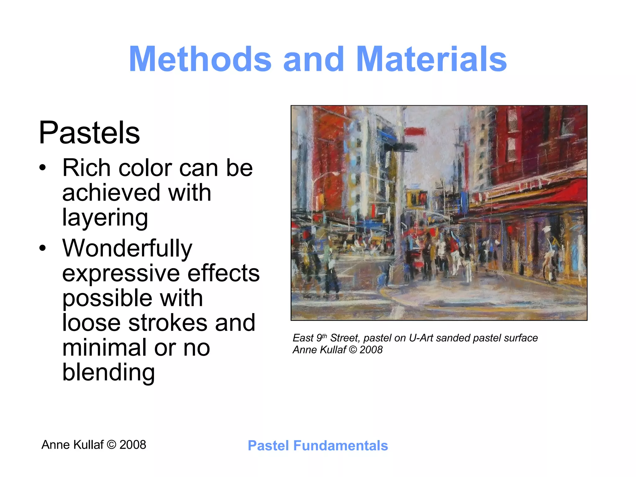


This document summarizes a course on drawing and painting with pastels. It covers techniques such as layering pastels to build color, using complementary colors for shading, and limiting the palette. It also discusses composition principles like balance, focal points, and using repeating shapes, colors and movement. The goal is to provide students new to pastels with guidance on materials, techniques and concepts to create richly colored and expressive pastel paintings.


