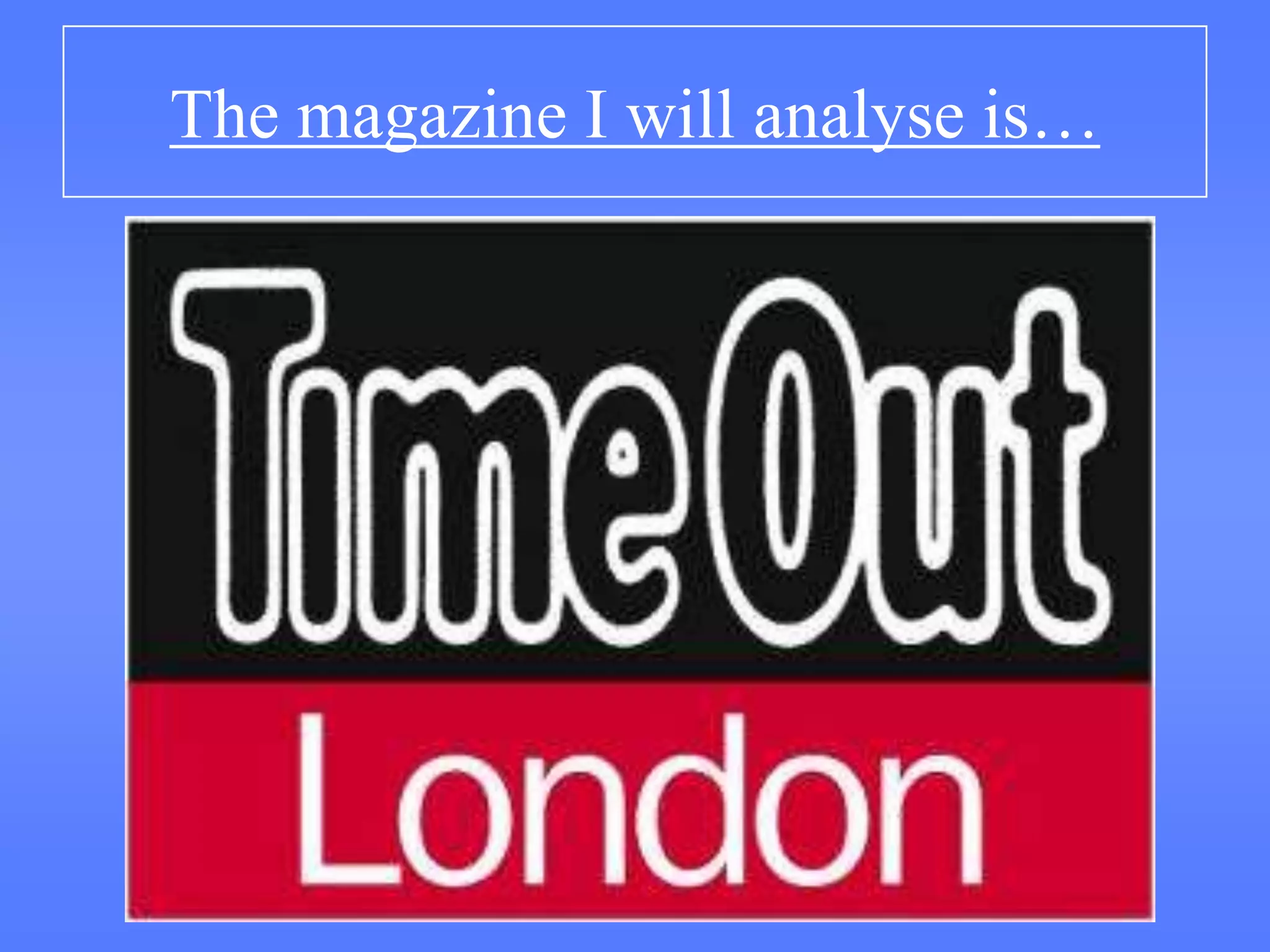
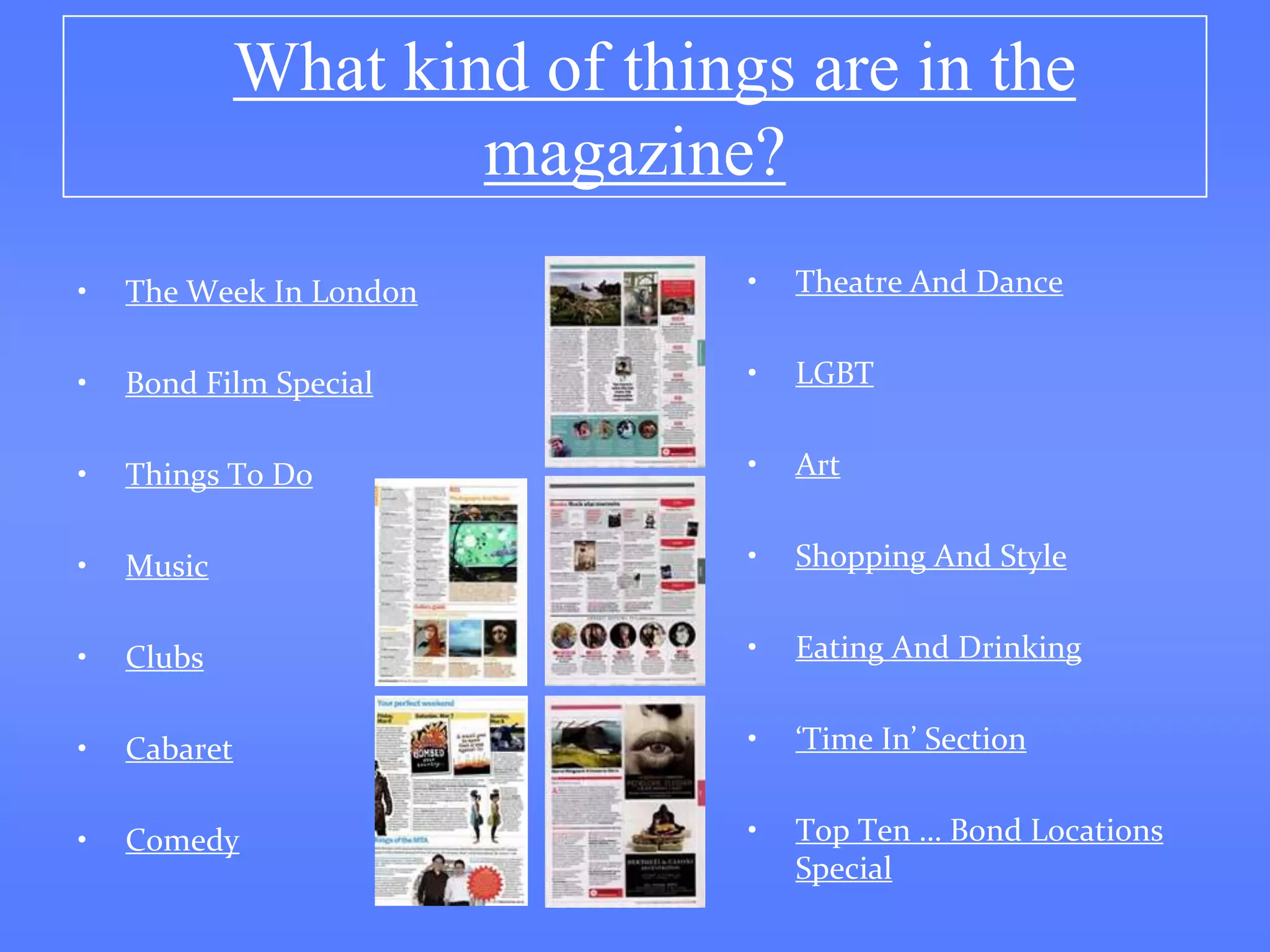
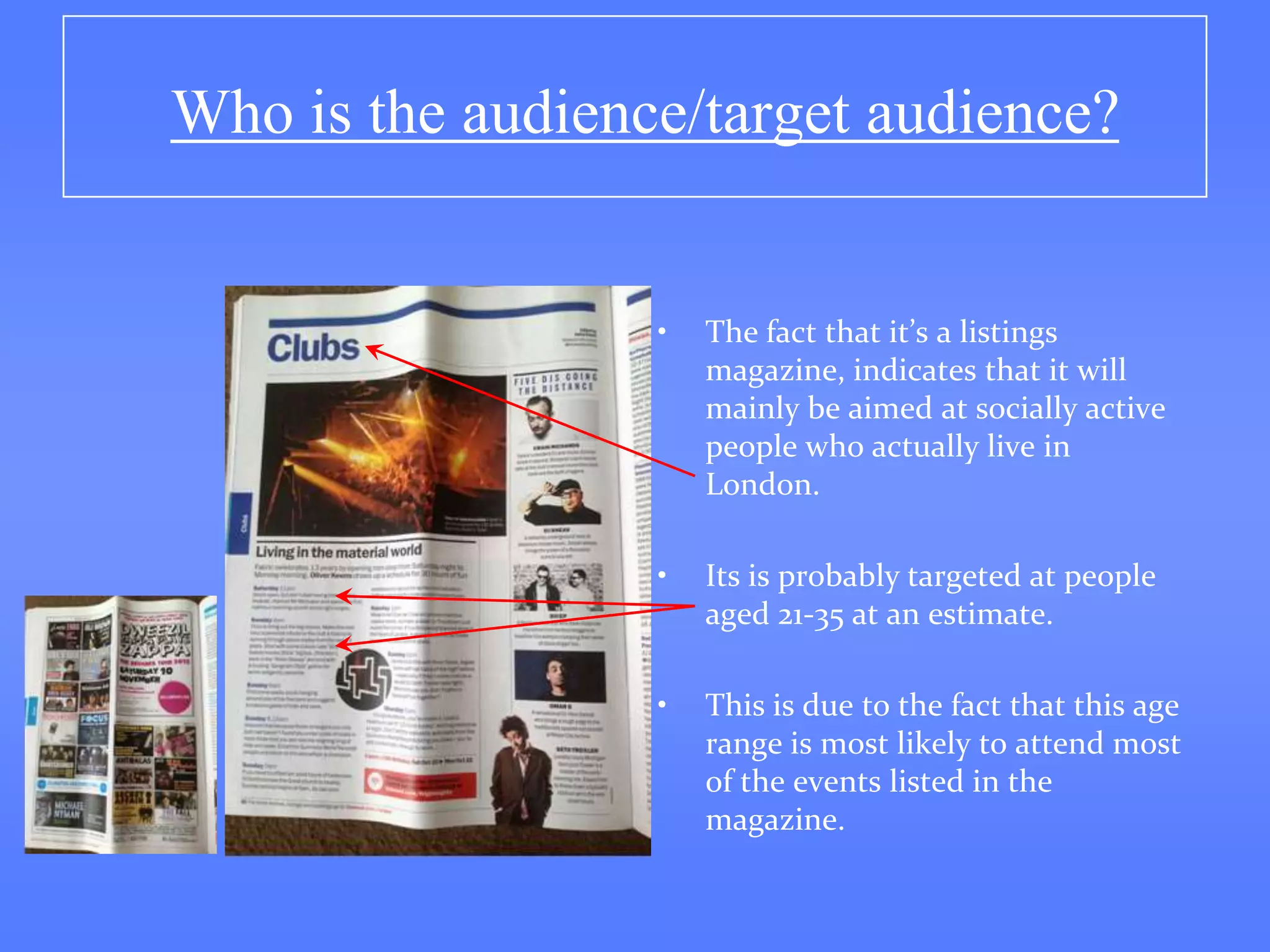
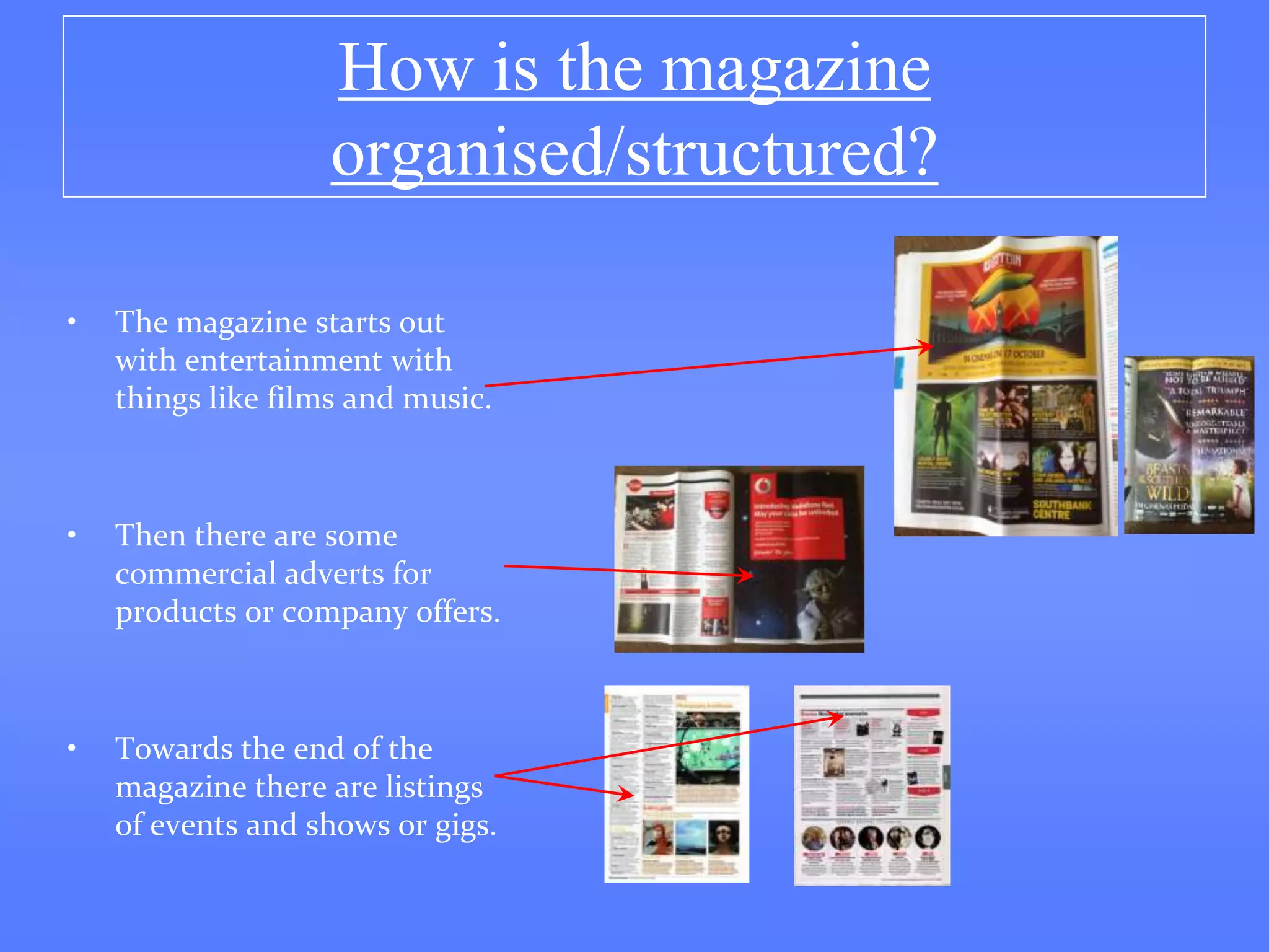
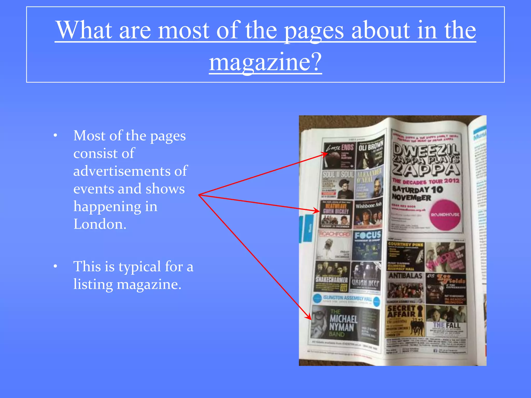
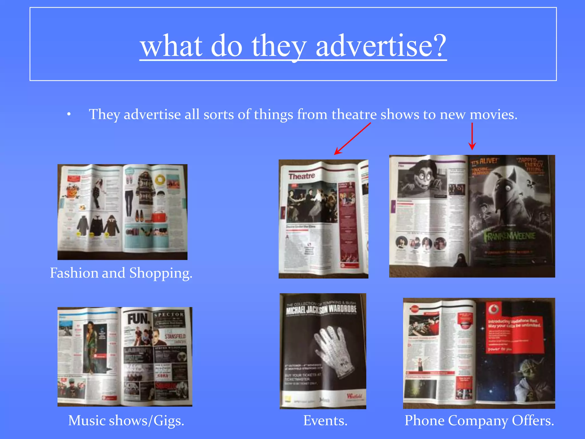
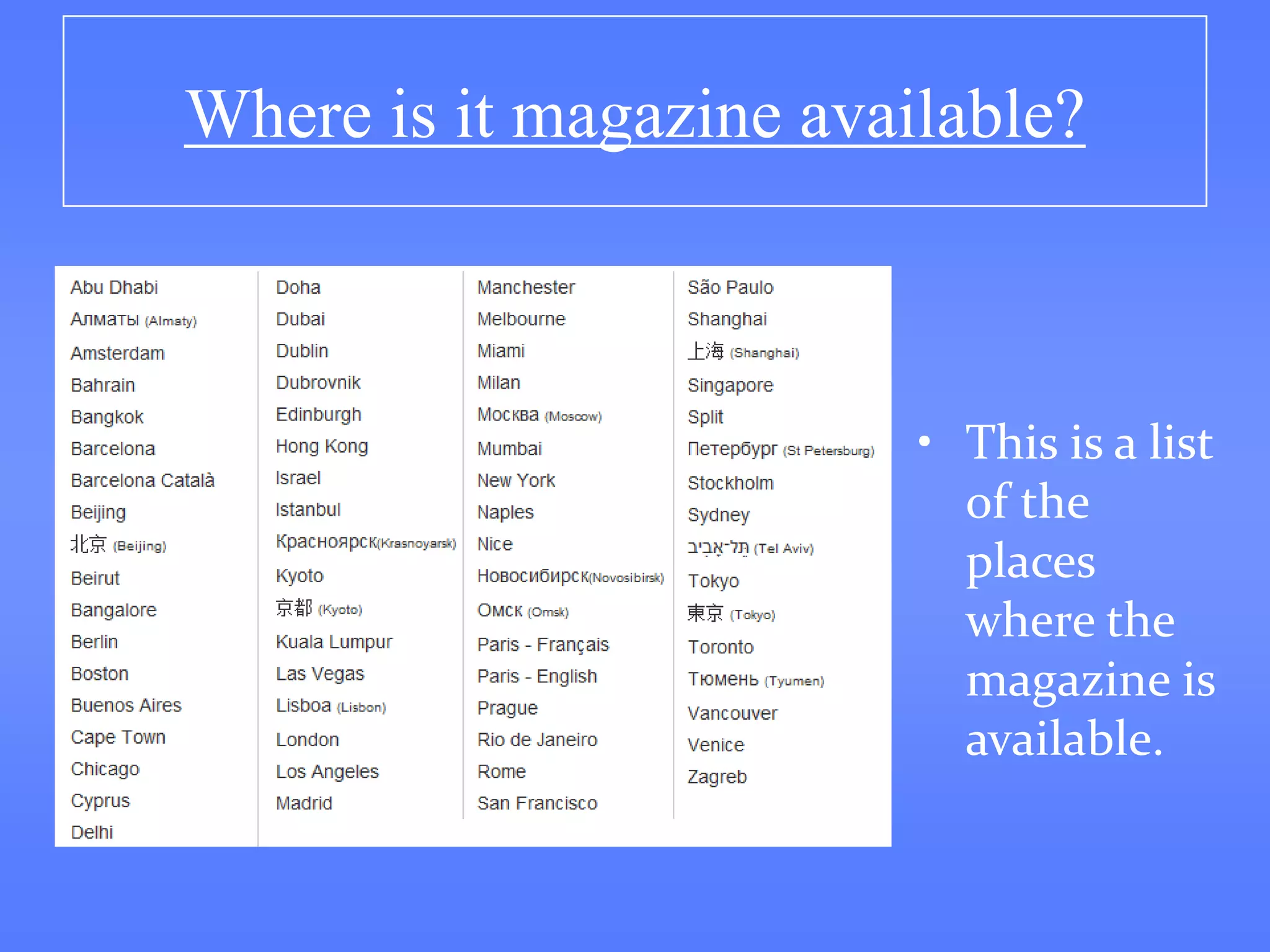
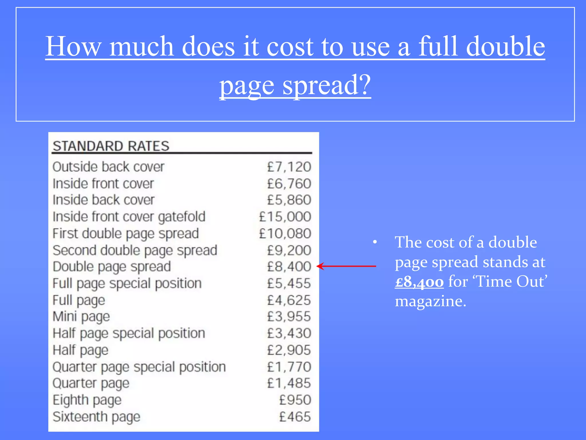
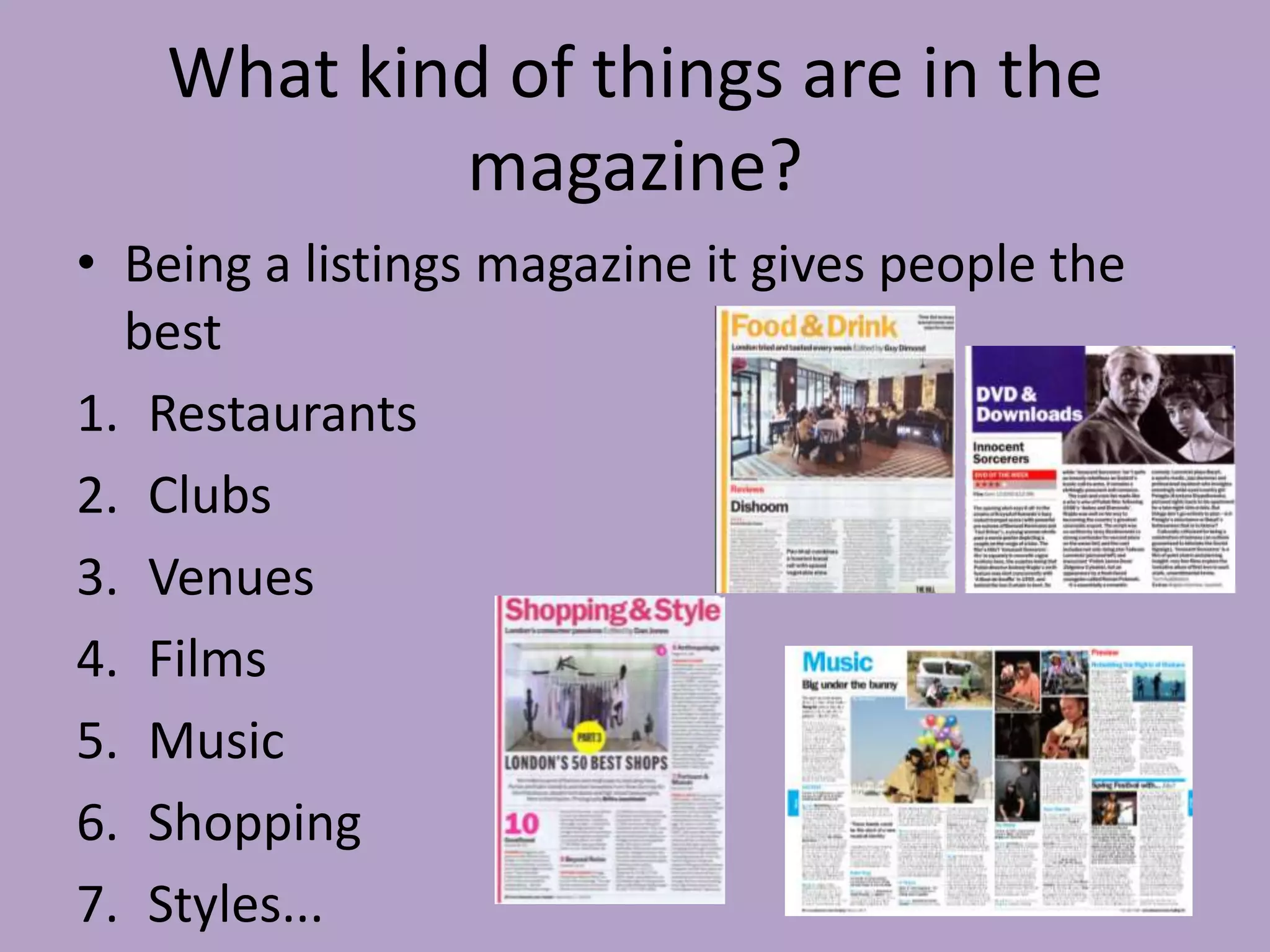
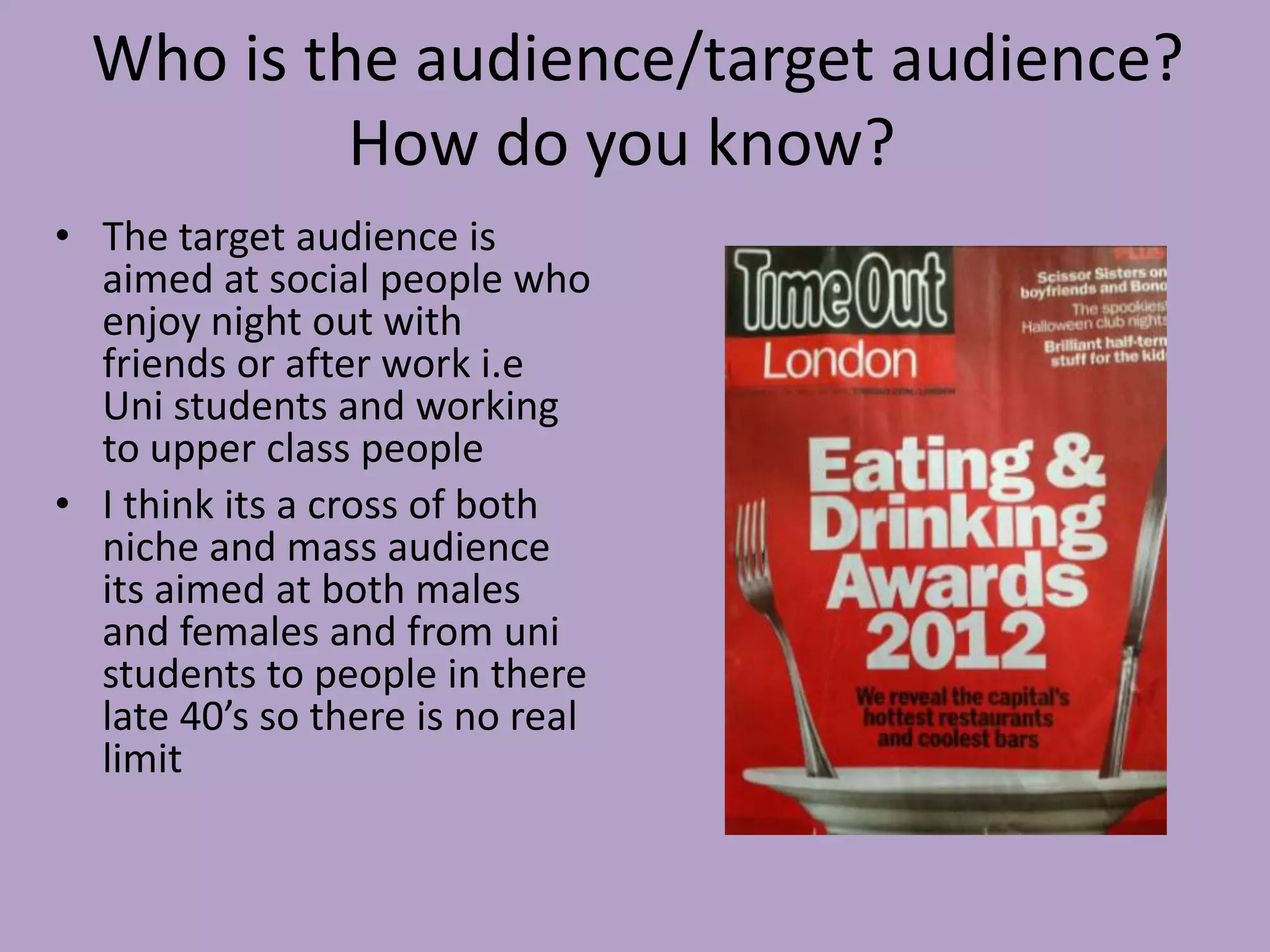
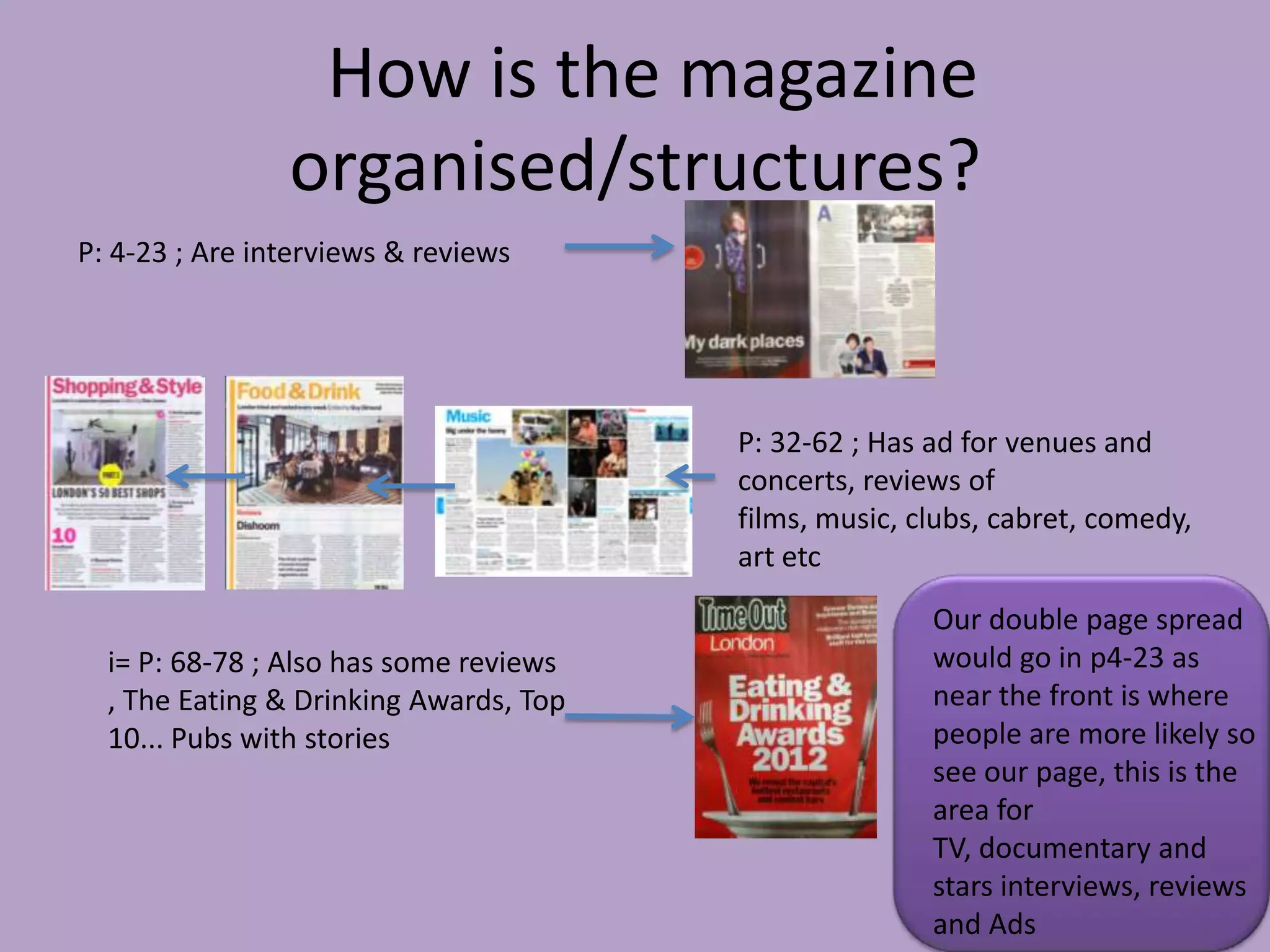
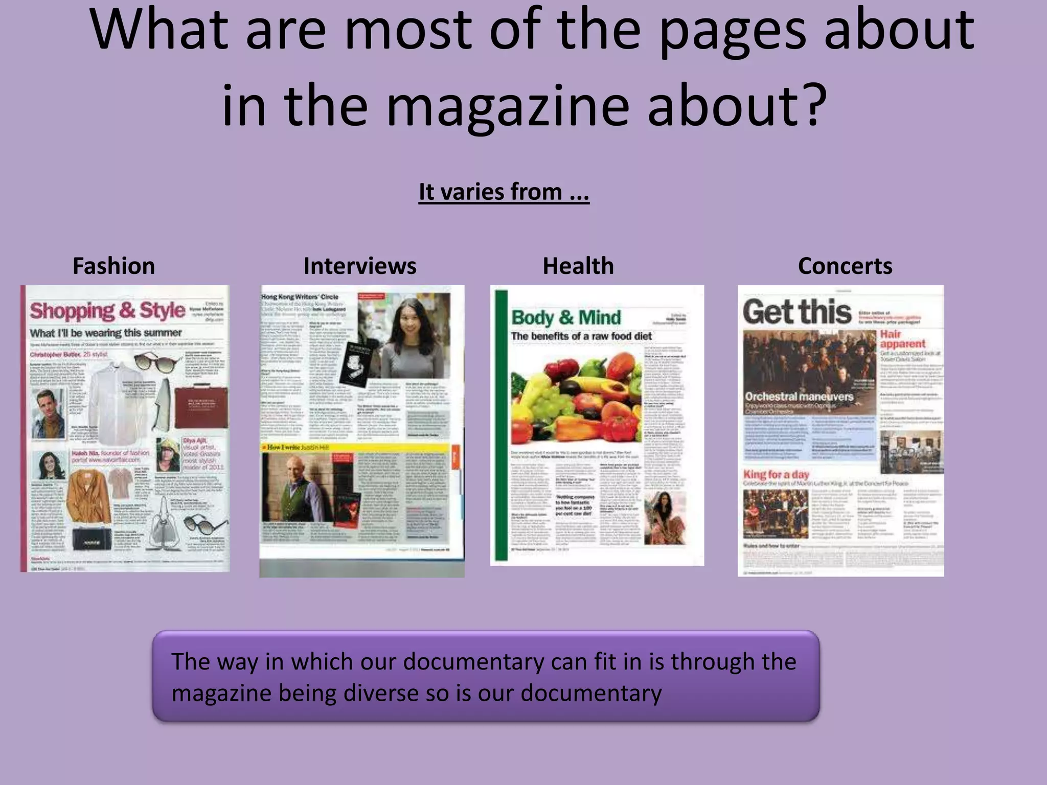
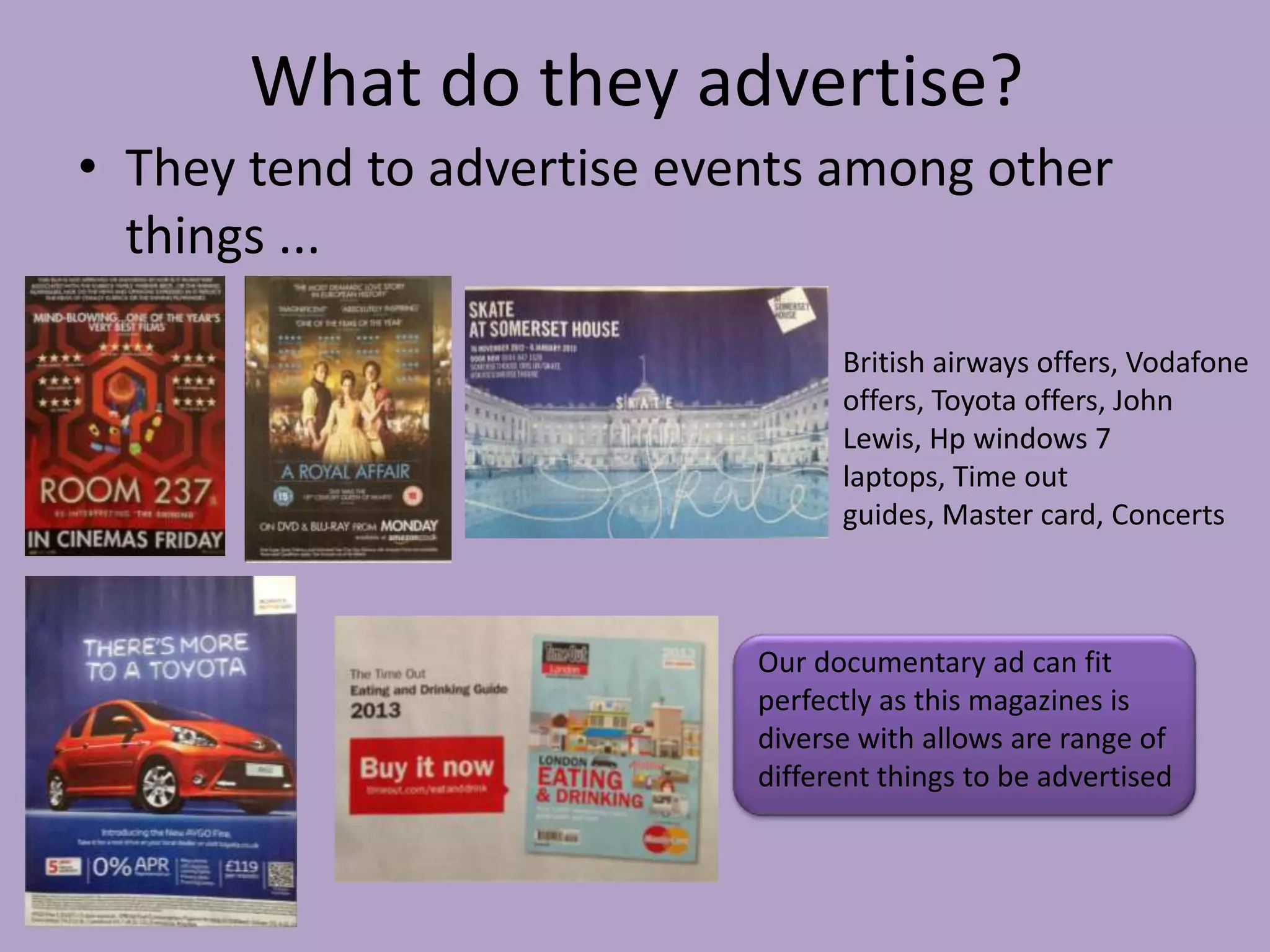
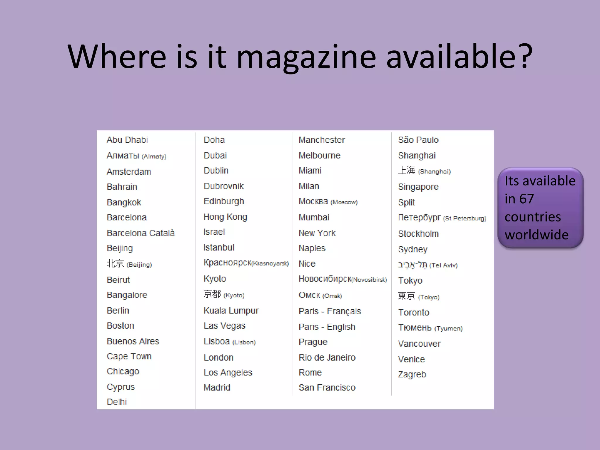
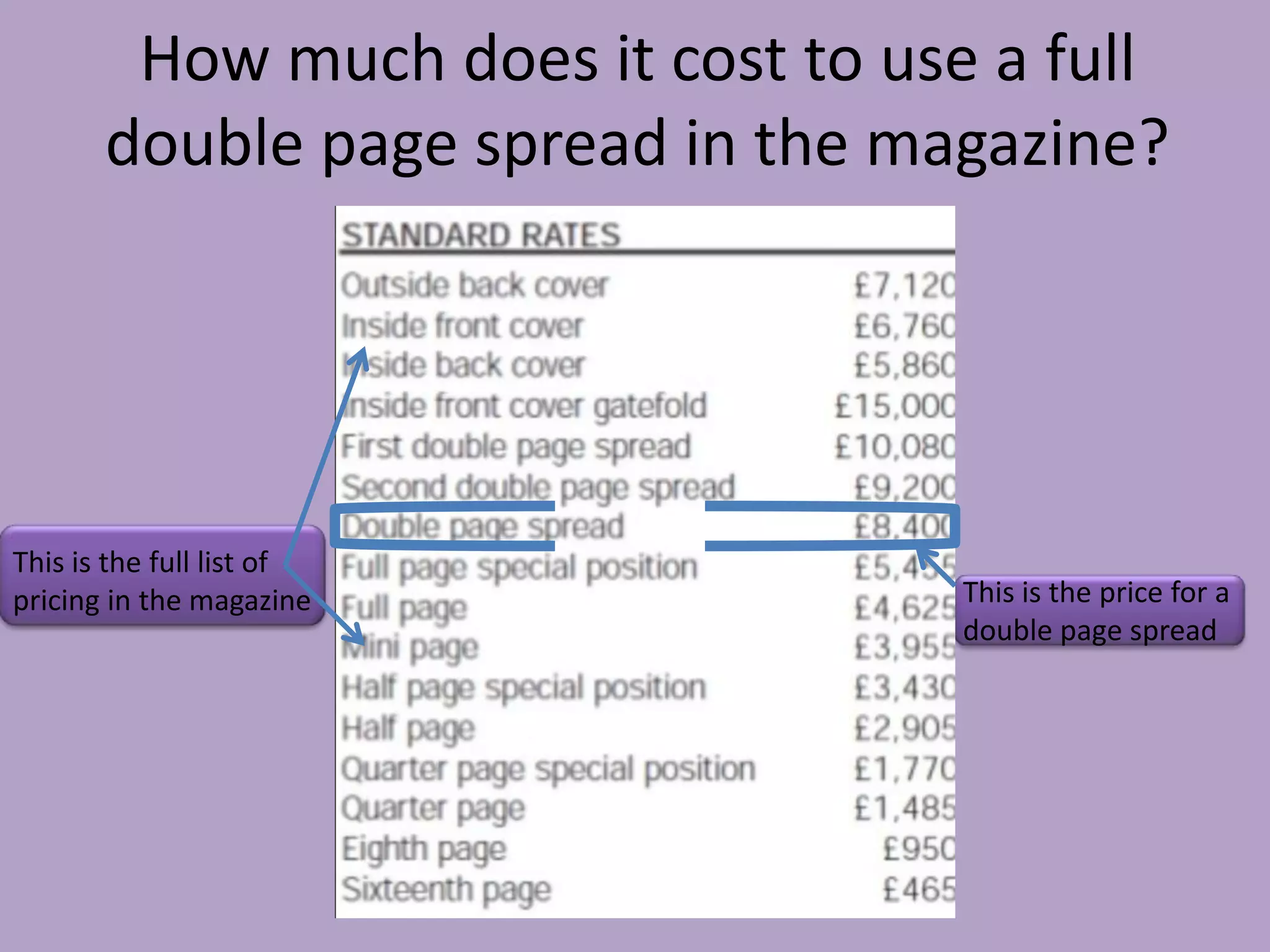
Layout Design


                                              •   This third of the
•   The text the name of the                      layout is dominated
    show and the time is in the                   by the Channel 4
    bottom right hand corner.                     logo, thus making it
                                                  stand out.
Content
•   Apart from the
    name of the                                                         •    Her facial
    programme the                                                            expression
    image also suggests                                                      implies she is in
    that it will involve                                                     danger and
    children.                                                                distress.


•   The image also
    implies the idea of
    children
    disappearing
    (swallowed by the
    ground) thus they
    are “forgotten”


       •    Text reveals the name of the     •   The channel 4     •   The recognisable
            programme, what it will be           website is also       logo indicates what
            about and the day it will be         displayed.            channel the show
            on.                                                        will be on.
Style of font
                                                   •   The white box matches the colour of the
                                                       logo.


•       The font is not chunky or
        bold, but still eye-catching
        because of the contrast of
        black and white with the
        background.


    •   Standard black coloured font is used to display information.
    •   This is surrounded by a white bow to make it stand out to the reader.
Graphics & Photo
                               manipulation
                                                          •       The people walking around have been
                                                                  blurred to emphasise the idea of them
                                                                  being negligent to match the title.


                                                              •   The colour has been manipulated to
                                                                  have a grey tinge to highlight the
                                                                  seriousness of the topic in question.


•   The ground has been manipulated and edited to appear
    as if it is pulling the child in.


•   This is to enforce the idea of children being “Forgotten”.
Organisation of information

                                            •   The first piece of information
                                                visible is the channel 4
                                                logo, which indicates the channel
                                                the show will be on.


                                            •   The second piece of information
                                                most visible is the text bow
                                                informing the audience of the name
                                                of the programme and the date it
                                                will be shown.

•   The third piece of information
    most visible is the smallest piece of
    text showing the channel 4 website
    address.
Layout Design
    •    The faces of the characters
         dominate most of the left hand
         side of the layout.


•       The text the name of the                  •   This third of the
        show and the time is in the                   layout is dominated
        bottom right hand corner.                     by the Channel 4
                                                      logo, thus making it
                                                      stand out.
Content

                                             •   The recognisable
                                                 logo indicates
                                                 what channel the
                                                 show will be on.


•   Text reveals the name of the
    programme, what it will be
    about and the day it will be
    on.
Style of font
                                                  •   The white box matches the colour of
•       The font is not chunky or                     the logo.
        bold, but still eye-
        catching because of the
        contrast of black and
        white with the
        background.


    •     Standard black coloured font is used to display information.
    •     This is surrounded by a white bow to make it stand out to the reader.
graphics & Photo
                    manipulation

                                                    •   As the programme is about
                                                        land the faces of the
                                                        characters have been
                                                        manipulated in order to
                                                        blend with the background
                                                        of a bird’s eye view of a
                                                        city.


•   The colour of the photo has been altered to
    appear completely brown in order to emphasise
    what the show will centre around. (Land)
Organisation of information


                 •   The first piece of information
                     visible is the channel 4 logo, which
                     indicates the channel the show will
                     be on.


                 •   The second piece of information
                     most visible is the text bow
                     informing the audience of the name
                     of the programme and the date it
                     will be shown.
What is consistent about channel 4 adverts?


The channel 4
logo is usually
the same colour
as the box that
outlines to title
and showing
time.
The magazine I will analyse is…
What kind of things are in the
                      magazine?
•   The Week In London          •   Theatre And Dance


•   Bond Film Special           •   LGBT


•   Things To Do                •   Art


•   Music                       •   Shopping And Style


•   Clubs                       •   Eating And Drinking


•   Cabaret                     •   ‘Time In’ Section


•   Comedy                      •   Top Ten … Bond Locations
                                    Special
Who is the audience/target audience?


                  •   The fact that it’s a listings
                      magazine, indicates that it will
                      mainly be aimed at socially active
                      people who actually live in
                      London.

                  •   Its is probably targeted at people
                      aged 21-35 at an estimate.

                  •   This is due to the fact that this age
                      range is most likely to attend most
                      of the events listed in the
                      magazine.
How is the magazine
                   organised/structured?

•   The magazine starts out
    with entertainment with
    things like films and music.


•   Then there are some
    commercial adverts for
    products or company offers.


•   Towards the end of the
    magazine there are listings
    of events and shows or gigs.
What are most of the pages about in the
             magazine?

•   Most of the pages
    consist of
    advertisements of
    events and shows
    happening in
    London.

•   This is typical for a
    listing magazine.
what do they advertise?
  •   They advertise all sorts of things from theatre shows to new movies.


Fashion and Shopping.


  Music shows/Gigs.                    Events.         Phone Company Offers.
Where is it magazine available?


                         • This is a list
                           of the
                           places
                           where the
                           magazine is
                           available.
How much does it cost to use a full double
            page spread?


                           •   The cost of a double
                               page spread stands at
                               £8,400 for ‘Time Out’
                               magazine.
I’m reviewing
What kind of things are in the
            magazine?
• Being a listings magazine it gives people the
  best
1. Restaurants
2. Clubs
3. Venues
4. Films
5. Music
6. Shopping
7. Styles...
Who is the audience/target audience?
           How do you know?
• The target audience is
  aimed at social people who
  enjoy night out with
  friends or after work i.e
  Uni students and working
  to upper class people
• I think its a cross of both
  niche and mass audience
  its aimed at both males
  and females and from uni
  students to people in there
  late 40’s so there is no real
  limit
How is the magazine
                organised/structures?
P: 4-23 ; Are interviews & reviews


                                        P: 32-62 ; Has ad for venues and
                                        concerts, reviews of
                                        films, music, clubs, cabret, comedy,
                                        art etc
                                                       Our double page spread
  i= P: 68-78 ; Also has some reviews                  would go in p4-23 as
  , The Eating & Drinking Awards, Top                  near the front is where
  10... Pubs with stories                              people are more likely so
                                                       see our page, this is the
                                                       area for
                                                       TV, documentary and
                                                       stars interviews, reviews
                                                       and Ads
What are most of the pages about
     in the magazine about?
                                   It varies from ...

Fashion               Interviews               Health                  Concerts


          The way in which our documentary can fit in is through the
          magazine being diverse so is our documentary
What do they advertise?
• They tend to advertise events among other
  things ...

                                  British airways offers, Vodafone
                                  offers, Toyota offers, John
                                  Lewis, Hp windows 7
                                  laptops, Time out
                                  guides, Master card, Concerts


                            Our documentary ad can fit
                            perfectly as this magazines is
                            diverse with allows are range of
                            different things to be advertised
Where is it magazine available?


                             Its available
                             in 67
                             countries
                             worldwide
How much does it cost to use a full
       double page spread in the magazine?


This is the full list of
pricing in the magazine             This is the price for a
                                    double page spread

Part 5

  • 1.
    Layout Design • This third of the • The text the name of the layout is dominated show and the time is in the by the Channel 4 bottom right hand corner. logo, thus making it stand out.
  • 2.
    Content • Apart from the name of the • Her facial programme the expression image also suggests implies she is in that it will involve danger and children. distress. • The image also implies the idea of children disappearing (swallowed by the ground) thus they are “forgotten” • Text reveals the name of the • The channel 4 • The recognisable programme, what it will be website is also logo indicates what about and the day it will be displayed. channel the show on. will be on.
  • 3.
    Style of font • The white box matches the colour of the logo. • The font is not chunky or bold, but still eye-catching because of the contrast of black and white with the background. • Standard black coloured font is used to display information. • This is surrounded by a white bow to make it stand out to the reader.
  • 4.
    Graphics & Photo manipulation • The people walking around have been blurred to emphasise the idea of them being negligent to match the title. • The colour has been manipulated to have a grey tinge to highlight the seriousness of the topic in question. • The ground has been manipulated and edited to appear as if it is pulling the child in. • This is to enforce the idea of children being “Forgotten”.
  • 5.
    Organisation of information • The first piece of information visible is the channel 4 logo, which indicates the channel the show will be on. • The second piece of information most visible is the text bow informing the audience of the name of the programme and the date it will be shown. • The third piece of information most visible is the smallest piece of text showing the channel 4 website address.
  • 6.
    Layout Design • The faces of the characters dominate most of the left hand side of the layout. • The text the name of the • This third of the show and the time is in the layout is dominated bottom right hand corner. by the Channel 4 logo, thus making it stand out.
  • 7.
    Content • The recognisable logo indicates what channel the show will be on. • Text reveals the name of the programme, what it will be about and the day it will be on.
  • 8.
    Style of font • The white box matches the colour of • The font is not chunky or the logo. bold, but still eye- catching because of the contrast of black and white with the background. • Standard black coloured font is used to display information. • This is surrounded by a white bow to make it stand out to the reader.
  • 9.
    graphics & Photo manipulation • As the programme is about land the faces of the characters have been manipulated in order to blend with the background of a bird’s eye view of a city. • The colour of the photo has been altered to appear completely brown in order to emphasise what the show will centre around. (Land)
  • 10.
    Organisation of information • The first piece of information visible is the channel 4 logo, which indicates the channel the show will be on. • The second piece of information most visible is the text bow informing the audience of the name of the programme and the date it will be shown.
  • 11.
    What is consistentabout channel 4 adverts? The channel 4 logo is usually the same colour as the box that outlines to title and showing time.
  • 14.
    The magazine Iwill analyse is…
  • 15.
    What kind ofthings are in the magazine? • The Week In London • Theatre And Dance • Bond Film Special • LGBT • Things To Do • Art • Music • Shopping And Style • Clubs • Eating And Drinking • Cabaret • ‘Time In’ Section • Comedy • Top Ten … Bond Locations Special
  • 16.
    Who is theaudience/target audience? • The fact that it’s a listings magazine, indicates that it will mainly be aimed at socially active people who actually live in London. • Its is probably targeted at people aged 21-35 at an estimate. • This is due to the fact that this age range is most likely to attend most of the events listed in the magazine.
  • 17.
    How is themagazine organised/structured? • The magazine starts out with entertainment with things like films and music. • Then there are some commercial adverts for products or company offers. • Towards the end of the magazine there are listings of events and shows or gigs.
  • 18.
    What are mostof the pages about in the magazine? • Most of the pages consist of advertisements of events and shows happening in London. • This is typical for a listing magazine.
  • 19.
    what do theyadvertise? • They advertise all sorts of things from theatre shows to new movies. Fashion and Shopping. Music shows/Gigs. Events. Phone Company Offers.
  • 20.
    Where is itmagazine available? • This is a list of the places where the magazine is available.
  • 21.
    How much doesit cost to use a full double page spread? • The cost of a double page spread stands at £8,400 for ‘Time Out’ magazine.
  • 22.
  • 23.
    What kind ofthings are in the magazine? • Being a listings magazine it gives people the best 1. Restaurants 2. Clubs 3. Venues 4. Films 5. Music 6. Shopping 7. Styles...
  • 24.
    Who is theaudience/target audience? How do you know? • The target audience is aimed at social people who enjoy night out with friends or after work i.e Uni students and working to upper class people • I think its a cross of both niche and mass audience its aimed at both males and females and from uni students to people in there late 40’s so there is no real limit
  • 25.
    How is themagazine organised/structures? P: 4-23 ; Are interviews & reviews P: 32-62 ; Has ad for venues and concerts, reviews of films, music, clubs, cabret, comedy, art etc Our double page spread i= P: 68-78 ; Also has some reviews would go in p4-23 as , The Eating & Drinking Awards, Top near the front is where 10... Pubs with stories people are more likely so see our page, this is the area for TV, documentary and stars interviews, reviews and Ads
  • 26.
    What are mostof the pages about in the magazine about? It varies from ... Fashion Interviews Health Concerts The way in which our documentary can fit in is through the magazine being diverse so is our documentary
  • 27.
    What do theyadvertise? • They tend to advertise events among other things ... British airways offers, Vodafone offers, Toyota offers, John Lewis, Hp windows 7 laptops, Time out guides, Master card, Concerts Our documentary ad can fit perfectly as this magazines is diverse with allows are range of different things to be advertised
  • 28.
    Where is itmagazine available? Its available in 67 countries worldwide
  • 29.
    How much doesit cost to use a full double page spread in the magazine? This is the full list of pricing in the magazine This is the price for a double page spread