Download to read offline
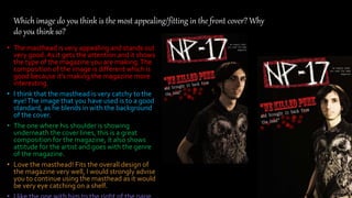
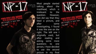
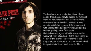

This document summarizes feedback received from peers on a magazine front cover design. The feedback addressed questions about which image was most appealing, whether filters should be added to the front cover image, and whether the overall design conveyed the impression of a punk magazine. Most respondents thought the masthead image stood out and was eye-catching. Opinions were divided on adding filters, with some suggesting lightening the model's face and others thinking the existing contrast worked well. All agreed the design successfully portrayed a punk magazine based on the dark colors, language, and high-contrast style. The designer ultimately decided to keep the original filters to maintain integrity with the overall color scheme.


