Download to read offline


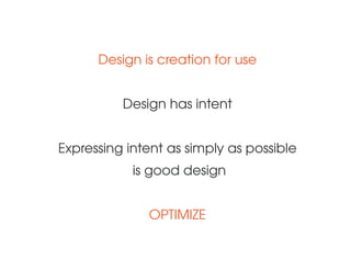
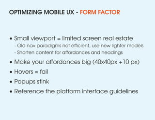


Giles Phillips discusses the challenges and opportunities of mobile UX for web pages, emphasizing the need for optimization given the limitations of small viewports and the importance of efficient navigation and content presentation. He advocates for designing with intent and understanding user scenarios, focusing on quick, task-driven interactions rather than sustained engagement. Key strategies include minimizing load times, using succinct labels, and adapting to mobile-specific affordances.


