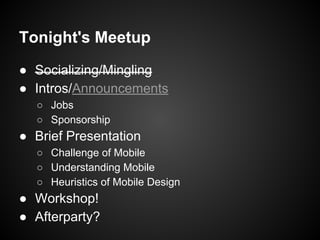
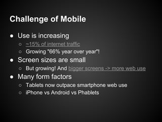
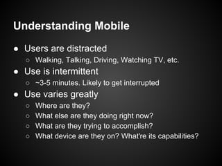
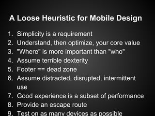
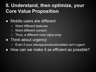
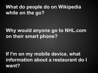
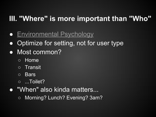
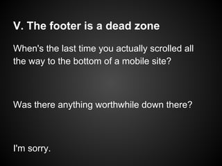
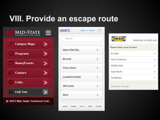
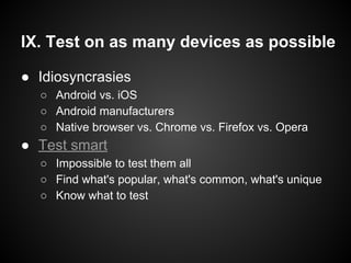
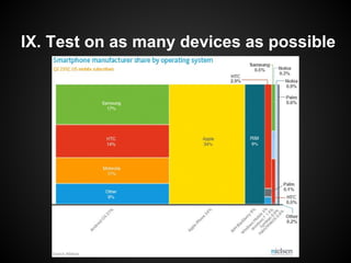
How to "mobilize"
your website
UXMad
4/18/13
Schedule
Tonight's Meetup
● Socializing/Mingling
● Intros/Announcements
○ Jobs
○ Sponsorship
● Brief Presentation
○ Challenge of Mobile
○ Understanding Mobile
○ Heuristics of Mobile Design
● Workshop!
● Afterparty?
About Me
Brad Orego
me@bradorego.com
@bradorego
B.S. in Computer Science, B.A. in Psychology
Freelance UX Designer/Web Developer
UXMad Meetup Co-Organizer
Dancer, Curler, Ultimate-er, Cyclist, Beer-batter pancake blogger
Special Thanks to Hampton
@hcatlin
Challenge of Mobile
Challenge of Mobile
● Use is increasing
○ ~15% of internet traffic
○ Growing "66% year over year"!
● Screen sizes are small
○ But growing! And bigger screens -> more web use
● Many form factors
○ Tablets now outpace smartphone web use
○ iPhone vs Android vs Phablets
Challenge of Mobile
Understanding Mobile
● Users are distracted
○ Walking, Talking, Driving, Watching TV, etc.
● Use is intermittent
○ ~3-5 minutes. Likely to get interrupted
● Use varies greatly
○ Where are they?
○ What else are they doing right now?
○ What are they trying to accomplish?
○ What device are they on? What're its capabilities?
What do we do about it?
A Loose Heuristic for Mobile Design
1. Simplicity is a requirement
2. Understand, then optimize, your core value
3. "Where" is more important than "who"
4. Assume terrible dexterity
5. Footer == dead zone
6. Assume distracted, disrupted, intermittent
use
7. Good experience is a subset of performance
8. Provide an escape route
9. Test on as many devices as possible
I. Simplicity is a Requirement
"It seems that perfection is
reached not when there is
nothing left to add, but when
there is nothing left to take away"
- Antoine de Saint-Exupery
http://en.wikipedia.
org/wiki/File:11exupery-
inline1-500.jpg
I. Simplicity is a Requirement
● Mobile Design is inherently constrained
○ Screen size, bandwidth, hardware
○ Time, focus, mental energy
○ Budget?
● Every element matters
○ Every visual element adds strain
○ Every option is another decision
I. Simplicity is a Requirement
Simplicity as the balance
between Comprehension
and Brevity
○ Comprehension - providing
enough information to fully
understand the interface
○ Brevity - providing the
absolute minimum
information
http://www.uxbooth.com/articles/a-
loose-heuristic-for-mobile-design/
II. Understand, then optimize, your
Core Value Proposition
● Mobile users are different
○ Want different features
○ Want different content
○ Thus, a different core value prop
● Think about urgency
○ Even if your site/app/product/problem isn't urgent
● How can we make it as efficient as possible?
What do people do on Wikipedia
while on the go?
Why would anyone go to NHL.com
on their smart phone?
If I'm on my mobile device, what
information about a restaurant do I
want?
III. "Where" is more important than "Who"
● Environmental Psychology
● Optimize for setting, not for user type
● Most common?
○ Home
○ Transit
○ Bars
○ ...Toilet?
● "When" also kinda matters...
○ Morning? Lunch? Evening? 3am?
"Environmental Psychology"...?
IV. Assume terrible dexterity
● Give enough space
● Make them big enough
○ Apple suggests 44px x 44px minimum
● Hampton suggests giving it to....
IV. Assume terrible dexterity
Or, if you're lucky...
V. The footer is a dead zone
When's the last time you actually scrolled all
the way to the bottom of a mobile site?
Was there anything worthwhile down there?
I'm sorry.
VI. Assume distracted, disrupted,
and intermittent use
● Average use is 70 mins/day on mobile web
○ Usually in doses of 3-5 minutes
○ While doing something else
● Easily interrupted
○ By real-world events
○ By digital events
○ By connectivity issues
● Visibility of System Status
○ Let users quickly recover
● Persistence of state
○ Session variables, user profiles, etc.
VII. Experience is a subset of performance
● Performance matters. Especially on mobile
○ Remember: limited resources
● Excellent design is meaningless if it's slow
○ It can be beautiful, but nobody will see it
○ Remember: simplicity
● Keep an eye/mind on technology
○ CSS? HTML? JS?
■ How much? 1 KB? 10 KB? 100 KB?
○ Flash?
■ Lol
VII. Experience is a subset of performance
Plenty of information/guides...
VIII. Provide an escape route
● Sometimes people want the desktop version
○ Inertia
○ Power Users
○ Capability they know has been stripped out of mobile
● Respect the back button
○ HTML5 History
● Two choices
○ Be self-righteous
○ Be accommodating
● Minimize frustration
○ Always
VIII. Provide an escape route
IX. Test on as many devices as possible
● Idiosyncrasies
○ Android vs. iOS
○ Android manufacturers
○ Native browser vs. Chrome vs. Firefox vs. Opera
● Test smart
○ Impossible to test them all
○ Find what's popular, what's common, what's unique
○ Know what to test
IX. Test on as many devices as possible
A Loose Heuristic for Mobile Design
1. Simplicity is a requirement
2. Understand, then optimize, your core value
3. "Where" is more important than "who"
4. Assume terrible dexterity
5. Footer == dead zone
6. Assume distracted, disrupted, intermittent
use
7. Good experience is a subset of performance
8. Provide an escape route
9. Test on as many devices as possible
Me!
Brad Orego
me@bradorego.com
@bradorego
B.S. in Computer Science, B.A. in Psychology
Freelance UX Designer/Web Developer
UXMad Meetup Co-Organizer
Entrepreneur
Dancer, Curler, Ultimate-er, Runner, Cyclist, Musician,
Homebrewer, Martial Artist, Spanish Speaker, Painter, Writer, Beer Pancake Blogger, Gamer, Boy, American, Human
Now what?
Tonight's Meetup
● Socializing/Mingling
● Intros/Announcements
○ Jobs
○ Sponsorship
● Brief Presentation
○ Challenge of Mobile
○ Understanding Mobile
○ Heuristics of Mobile Design
● Workshop!
● Afterparty?
Workshop!

How to "mobilize" your website

  • 1.
    How to "mobilize" yourwebsite UXMad 4/18/13
  • 2.
  • 3.
    Tonight's Meetup ● Socializing/Mingling ●Intros/Announcements ○ Jobs ○ Sponsorship ● Brief Presentation ○ Challenge of Mobile ○ Understanding Mobile ○ Heuristics of Mobile Design ● Workshop! ● Afterparty?
  • 4.
  • 5.
    Brad Orego me@bradorego.com @bradorego B.S. inComputer Science, B.A. in Psychology Freelance UX Designer/Web Developer UXMad Meetup Co-Organizer Dancer, Curler, Ultimate-er, Cyclist, Beer-batter pancake blogger
  • 6.
    Special Thanks toHampton @hcatlin
  • 7.
  • 8.
    Challenge of Mobile ●Use is increasing ○ ~15% of internet traffic ○ Growing "66% year over year"! ● Screen sizes are small ○ But growing! And bigger screens -> more web use ● Many form factors ○ Tablets now outpace smartphone web use ○ iPhone vs Android vs Phablets
  • 9.
  • 10.
  • 11.
    Understanding Mobile ● Usersare distracted ○ Walking, Talking, Driving, Watching TV, etc. ● Use is intermittent ○ ~3-5 minutes. Likely to get interrupted ● Use varies greatly ○ Where are they? ○ What else are they doing right now? ○ What are they trying to accomplish? ○ What device are they on? What're its capabilities?
  • 12.
    What do wedo about it?
  • 13.
    A Loose Heuristicfor Mobile Design 1. Simplicity is a requirement 2. Understand, then optimize, your core value 3. "Where" is more important than "who" 4. Assume terrible dexterity 5. Footer == dead zone 6. Assume distracted, disrupted, intermittent use 7. Good experience is a subset of performance 8. Provide an escape route 9. Test on as many devices as possible
  • 14.
    I. Simplicity isa Requirement "It seems that perfection is reached not when there is nothing left to add, but when there is nothing left to take away" - Antoine de Saint-Exupery http://en.wikipedia. org/wiki/File:11exupery- inline1-500.jpg
  • 15.
    I. Simplicity isa Requirement ● Mobile Design is inherently constrained ○ Screen size, bandwidth, hardware ○ Time, focus, mental energy ○ Budget? ● Every element matters ○ Every visual element adds strain ○ Every option is another decision
  • 16.
    I. Simplicity isa Requirement Simplicity as the balance between Comprehension and Brevity ○ Comprehension - providing enough information to fully understand the interface ○ Brevity - providing the absolute minimum information http://www.uxbooth.com/articles/a- loose-heuristic-for-mobile-design/
  • 17.
    II. Understand, thenoptimize, your Core Value Proposition ● Mobile users are different ○ Want different features ○ Want different content ○ Thus, a different core value prop ● Think about urgency ○ Even if your site/app/product/problem isn't urgent ● How can we make it as efficient as possible?
  • 18.
    What do peopledo on Wikipedia while on the go? Why would anyone go to NHL.com on their smart phone? If I'm on my mobile device, what information about a restaurant do I want?
  • 19.
    III. "Where" ismore important than "Who" ● Environmental Psychology ● Optimize for setting, not for user type ● Most common? ○ Home ○ Transit ○ Bars ○ ...Toilet? ● "When" also kinda matters... ○ Morning? Lunch? Evening? 3am?
  • 20.
  • 21.
    IV. Assume terribledexterity ● Give enough space ● Make them big enough ○ Apple suggests 44px x 44px minimum ● Hampton suggests giving it to....
  • 22.
    IV. Assume terribledexterity Or, if you're lucky...
  • 23.
    V. The footeris a dead zone When's the last time you actually scrolled all the way to the bottom of a mobile site? Was there anything worthwhile down there? I'm sorry.
  • 24.
    VI. Assume distracted,disrupted, and intermittent use ● Average use is 70 mins/day on mobile web ○ Usually in doses of 3-5 minutes ○ While doing something else ● Easily interrupted ○ By real-world events ○ By digital events ○ By connectivity issues ● Visibility of System Status ○ Let users quickly recover ● Persistence of state ○ Session variables, user profiles, etc.
  • 25.
    VII. Experience isa subset of performance ● Performance matters. Especially on mobile ○ Remember: limited resources ● Excellent design is meaningless if it's slow ○ It can be beautiful, but nobody will see it ○ Remember: simplicity ● Keep an eye/mind on technology ○ CSS? HTML? JS? ■ How much? 1 KB? 10 KB? 100 KB? ○ Flash? ■ Lol
  • 26.
    VII. Experience isa subset of performance Plenty of information/guides...
  • 27.
    VIII. Provide anescape route ● Sometimes people want the desktop version ○ Inertia ○ Power Users ○ Capability they know has been stripped out of mobile ● Respect the back button ○ HTML5 History ● Two choices ○ Be self-righteous ○ Be accommodating ● Minimize frustration ○ Always
  • 28.
    VIII. Provide anescape route
  • 29.
    IX. Test onas many devices as possible ● Idiosyncrasies ○ Android vs. iOS ○ Android manufacturers ○ Native browser vs. Chrome vs. Firefox vs. Opera ● Test smart ○ Impossible to test them all ○ Find what's popular, what's common, what's unique ○ Know what to test
  • 30.
    IX. Test onas many devices as possible
  • 31.
    A Loose Heuristicfor Mobile Design 1. Simplicity is a requirement 2. Understand, then optimize, your core value 3. "Where" is more important than "who" 4. Assume terrible dexterity 5. Footer == dead zone 6. Assume distracted, disrupted, intermittent use 7. Good experience is a subset of performance 8. Provide an escape route 9. Test on as many devices as possible
  • 32.
    Me! Brad Orego me@bradorego.com @bradorego B.S. inComputer Science, B.A. in Psychology Freelance UX Designer/Web Developer UXMad Meetup Co-Organizer Entrepreneur Dancer, Curler, Ultimate-er, Runner, Cyclist, Musician, Homebrewer, Martial Artist, Spanish Speaker, Painter, Writer, Beer Pancake Blogger, Gamer, Boy, American, Human
  • 33.
  • 34.
    Tonight's Meetup ● Socializing/Mingling ●Intros/Announcements ○ Jobs ○ Sponsorship ● Brief Presentation ○ Challenge of Mobile ○ Understanding Mobile ○ Heuristics of Mobile Design ● Workshop! ● Afterparty?
  • 35.