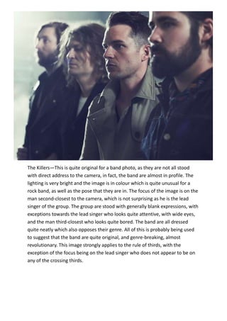
1. The Killers—This is quite original for a band photo, as they are not all stood
with direct address to the camera, in fact, the band are almost in profile. The
lighting is very bright and the image is in colour which is quite unusual for a
rock band, as well as the pose that they are in. The focus of the image is on the
man second-closest to the camera, which is not surprising as he is the lead
singer of the group. The group are stood with generally blank expressions, with
exceptions towards the lead singer who looks quite attentive, with wide eyes,
and the man third-closest who looks quite bored. The band are all dressed
quite neatly which also opposes their genre. All of this is probably being used
to suggest that the band are quite original, and genre-breaking, almost
revolutionary. This image strongly applies to the rule of thirds, with the
exception of the focus being on the lead singer who does not appear to be on
any of the crossing thirds.
2. The Pierces—This image has design balance in terms of colour and mass as
only black and white are used and the artists take up the same space, however
it is not symmetrical in terms of mass and colour as the boxes that the women
are sat on are different sizes and the colour of the girls’ shoes and hair are
different colours. The image is Black and White which suggests that the artists
are authentic, as it is reminiscent of old band images from the 1960’s. The
women are both directly addressing the camera, the blonde on with a curious
facial expression and the brunette with a blank facial expression, due to this
being a long shot, the brunettes pose is not intimidating and the blonde’s is not
overly child-like or victimised in nature. The clothing that they are both wearing
is quite revealing, showing most of their legs, which sexualises the pair
somewhat, however the level camera and expression on their faces deters from
this somewhat. This image applies to the rule of thirds.
3. Nick Cave—This photo is quite intimidating as the artist has a direct mode of
address to the camera, the background is red and there is lots of black which
opposes the lightness of his skin. He has a sharp expression with one eyebrow
raised which is quite aggressive considering the closeness and intimacy of the
camera. Had he not had one eyebrow raised and his hair been flat at the back
this image would have design symmetry, however due to these factors as well
as the fact that the shadows on his neck are not symmetrical, the image does
not have design symmetry. The image is however balanced in terms of colour.
4. Amy Lee—This image is quite dark and intimidating, which fits in with the
genre of gothic rock. The image is a close-up of the artist with direct address to
the camera. She is wearing heavy, dark makeup, has messy, black hair and is
wearing black clothing with a gothic necklace. The emphasis on her light eyes
and skin fits strongly with the genre, as does the light purple colour wash. The
artist is glaring at the camera, which is very intimidating and icy. This image is
balanced in design, particularly in regard to mass and colour, however it is not
symmetrical, as her hair is placed differently on each side and she is tilting her
head slightly.
5. Lana Del Rey– This image seems to be moulded so that it emphasises the
beauty of the artist. Her face is almost entirely symmetrical, her hand
placement, hair and clothing being the main thing that deters from design
symmetry, the image also has almost complete design balance in terms of
colour and applies to the rule of thirds in that it appears to be cropped so that
her face crosses both top crossing lines. She appears to be wearing clothing
that looks reminiscent of old American style clothing, which fits with her genre
of music, which is also nostalgic of old America.
6. Jim Morrison—This image was taken in 1967 and is regarded as iconic in terms
of band images. It shows the artist in direct mode of address to the camera,
shirtless and in black and white. It may have been done in black and white
because of the time it was taken in or simply for artistic effect. The image is
quite intimidating as it is a mid shot with the artist showing a straight face yet
directly addressing the camera, however this could be interpreted in different
ways. The image has design balance in terms of mass and colour but is not
symmetrical due to the pose he is in and the lighting being slightly brighter on
the left side. This helped to define photos for band profiles, particularly for
those in the rock genre, most since having images akin to this, to show that
they have a classic, nostalgic quality to them.
7. Marina and the Diamonds—This image is typical of a band photo, however not
of the pop genre due to the traditional look of it. The artist is displaying direct
address to the camera, smiling slightly, which creates a personal yet easy-going
feel to the image. She is posing with her hands clenched near her face and her
hair blowing behind her on one side. These are all quite typical of the genre as
it is a light-hearted, excitable pose. The image being black and white, as well as
the leather jacket that the artist is wearing is more typical of the rock genre.
This makes sense as the artist crosses genre’s often so the photographer
probably wanted to take advantage of her classic originality.
8. Linkin Park—This band image is quite interesting as although typical of rock
bands in that all are displaying quite aggressive facial expressions, the image is
in black and white and only half of their faces are in the light. However, this is
not typical in that the band are wearing quite conventional clothes and are in a
line, with each of their faces overlapping the others half-way as well as the lead
singer being in a generally unimportant place; second to the front, as opposed
to the front, the middle or the back. This image applies to the rule of thirds and
is fairly balanced in terms of colour and mass, however the front being
predominantly black does make the image lose some balance, however this
could be used so that the natural line of sight is directly on the lead singer. This
image is typical however, due to the fact that it is a band photo, in black and
white with only one half of the picture being lit up. This is reminiscent of old
band photos from the 60’s.
9. Megan Fox— This image is overtly sexual and emphasises Fox’s status as a sex
symbol. The image almost has design balance, however due to the angle of
Fox’s hip, her holding up the Marilyn Monroe book, her tattoo and her hair in
certain places the image does not have design balance, as the book deters from
design balance in both colour and mass. The book and Fox’s tattoo are both of
Marilyn Monroe, another female famous for being a sex symbol. Fox is made to
look like the image next to her, using a similar facial expression and wearing the
same eye makeup. The book overlaps one of the third corners which attracts
attention to it and due to it being placed directly next to Fox’s face it instantly
draws a comparison.
10. Chris Isaak— This image is also quite intimidating, however not directly
intimidating as the mode of address of the artist is not the camera. The image
is of Chris Isaak and he is glaring at a space unseen by the camera, which makes
him seem quite dangerous. His hairstyle and dress gives the impression of a
nostalgic rockabilly type of style, which is in sync with his style of music. This
image completely lacks mass design balance, however the colour is somewhat
balanced as the whole image is mainly black. This image also applies to the rule
of thirds as Isaak is directly on one third.