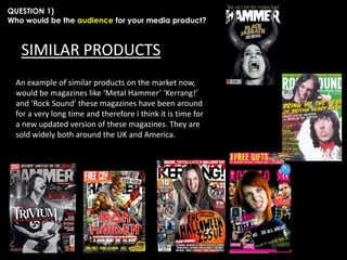
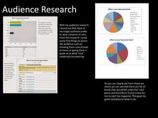
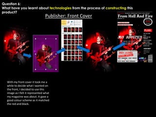
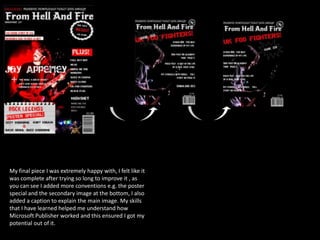
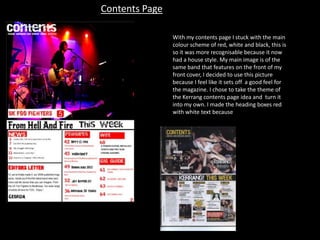
Georgia Evans submitted a portfolio for her AS Media Studies course. Her media product was a music magazine aimed at rock and heavy metal fans ages 14 and up of any gender. To attract this audience, she used conventions from real magazines like Kerrang! and Metal Hammer, including a striking cover image, prominent masthead, and advertising of exclusive content and a free giveaway. Her research showed that this demographic enjoys bands featured in her magazine as well as shopping at certain stores. She addressed both genders by including styles and topics that appeal to both male and female fans of the genre.
The document provides details about Georgia Evans' music magazine portfolio project for her AS Media Studies course. It includes her audience research which found her target audience to be people aged 14+ with a passion for rock and heavy metal music. It discusses how she addressed this audience through the design of her magazine, including using striking imagery, bold colors and fonts, and offering giveaways. The document also explains how she was inspired by existing magazines like Kerrang and Metal Hammer but aimed to make her magazine appeal to both male and female readers.
This document is a student's media product evaluation for a magazine they designed in Adobe Photoshop CS3. In response to various questions, the student discusses how their magazine draws from conventions of real magazines like Kerrang! and NME in terms of layout, design and target demographic. The student aimed their magazine at 16-24 year old males and females interested in rock and indie music. Through choices like sans-serif text, colors and featured artists, the student tailored their magazine to this audience. The student also learned skills in photography, photo editing and digital design through creating this magazine project.
The document summarizes the evaluation of a print media magazine project titled "FUSED Magazine" produced by Amelia Larkin. The magazine was modeled after existing rock magazines like Kerrang! and NME but focused on the indie rock genre instead. The target audience was teenagers aged 16-21 interested in indie rock music. Feedback indicated the magazine's presentation and content successfully attracted this target demographic. Through constructing the magazine, the author learned photography and design skills using technologies like DSLR cameras and Adobe Photoshop. Looking back, the author felt their skills and adherence to the music theme improved from the preliminary task to the final magazine product.
The document discusses a student's music magazine project. It summarizes the key design elements and conventions the student drew from real music magazines like Q Magazine. These include using moody artist photos, fitting text around images, big titles and quotes, and banners along the top. The student explains how their magazine challenges conventions by combining these elements into a unique style targeting R&B music fans aged 17-20.
This music magazine targets young girls as its audience. It is focused on the pop genre based on the bright colors, mainstream artists shown, and inclusion of the word "pop" in the masthead. Heart shapes and romantic themes throughout also indicate a focus on pop music. The target audience of young girls is evident from the pink/yellow color scheme, images of male artists, and mention of fashion, both of which would appeal to young female readers interested in pop music artists and trends.
The research found that NME was the most popular magazine among respondents. It also found that coverage of gigs/festivals was the most interesting part of magazines and interviews were the preferred content for double page spreads. Respondents also preferred to spend £1.99 or less on magazines and listed indie rock as their favorite genre. Based on this, the document summarizes that the magazine will target indie rock fans ages 16-24 by focusing on interviews, coverage of music events, and a price of £1.99 or less.
1) The document discusses the results of a questionnaire evaluating interest in a proposed pop/indie rock music magazine. It analyzes responses to questions about appealing magazine features, preferred artists to feature, and preferences around images vs. text.
2) Some open-ended questions did not receive definitive answers, and only a small portion of respondents currently purchase music magazines, indicating other sources may be more popular.
3) The key findings will still inform the creation of the magazine, which will focus on pop/indie rock content for the target 16-18 year old audience, and incorporate preferred visual elements, artists, and balanced images and text.
The document summarizes the progression of the author's media studies portfolio project from a preliminary college magazine cover to the final music magazine product. It describes how the author applied and challenged conventions of real music magazines in their final product. They learned new skills in layout, editing techniques, and applying conventions in a unique style. The author is pleased with their improved understanding and application of magazine conventions but feels they could have added more variety to the contents page imagery.
1. The document discusses the evaluation of final media products created by the student for a school project.
2. It describes how the student's magazine front cover, contents page, and double page spread used conventions from real music magazines while also including some original and unconventional design elements.
3. The student learned about technologies like photo editing and magazine design through constructing their media products using programs like Fireworks and gained experience planning for audience and purpose.
1. The document discusses the process of creating a music magazine media product and what was learned. Conventions from real music magazines like layout and pictures were used as inspiration.
2. Unconventional aspects like the black and white color scheme and unique contents page design were incorporated. Techniques like band photos and article layouts matched real magazine conventions.
3. New skills with software like Fireworks and photo editing were developed, along with understanding magazine elements like targeting audiences and distribution channels. The process allowed for improved planning and use of conventions over the preliminary task.
1) The document outlines plans for a music magazine project, including mood boards, mind maps, and production plans.
2) It proposes the name "Eclectic Music" for the magazine, with a target audience of 15-30 year olds and a monthly release schedule.
3) Production elements that are planned include the front cover layout, double page spreads, interview formats, photography, budgets, and legal/ethical considerations.
The document discusses the process of creating a music magazine as a media studies project. Key points include:
- The magazine was aimed at young people aged 14-24 interested in R&B, hip hop, and popular music.
- Cover design conventions like bold title, colors, and photos were followed to attract attention.
- Each issue has a different color scheme matching the cover model's outfit.
- Feedback was gathered through surveys to design content that interests the target audience.
- Learning experiences included difficulties editing photos and finding appropriate fonts.
1. The document presents proposals and designs for two music magazines called Exclusive and Emagazine. For Exclusive, the target audience is predicted to be students aged 15-24 based on statistics from similar magazine Q. The magazine will feature a variety of artists from different eras to appeal to a broad market.
2. For Emagazine, the target audience is also predicted to be students and those in the E, D, and C2 socioeconomic groups based on Hartley's 7 subjectivities. The magazine aims to appeal to "Explorers" who seek new music. It will feature more female artists to attract more female readers compared to the male-dominated Q magazine.
3. Design elements
This document provides details on the proposals for two music magazines - Exclusive and Emagazine. For Exclusive, the target audience would be students interested in exploring different music genres. Emagazine's target is also students classified as "Explorers" who seek new music. Both magazines would use similar house styles with bold colors and clear fonts. Sample front covers, article drafts, budgets, and advertising rates are presented to outline the business plans. The goal is for the magazines to appeal equally to male and female readers unlike the competitor Q magazine.
This document provides information for pre-producing a music magazine, including the target audience which is mainly young adults interested in popular music genres. It discusses the typical reader profile and compares the proposed magazine to similar existing products like NME and Vibe. It also analyzes conventions for music magazines, such as cover design elements like large artist images, eye-catching titles and contrasting colors. Initial proposals for the new magazine include revealing music leaks and promoting new artists.
This magazine cover targets a rock and indie music audience aged 16-29. The large red title stands out against the black background. The main image shows a band that could be featured in the main article. Additional images and text provide information on bands and articles inside the issue, including a free poster. While there is some empty space, key elements like the price and issue date are included.
The document discusses how the media product targets its audience through its use of conventions and representations. Specifically, it represents the social group of 15-25 year old metal fans by featuring a popular metal band and using fonts, language, and a color scheme commonly seen in metal magazines. It aims to attract this audience by addressing their interests in metal music and using exciting language and photos throughout the magazine that potential readers would find appealing.
Research Into Existing Publishing Companiesmarkodjuricic
The document discusses research into existing music publishing companies Revolver, NewBay Media, and Vibe. It summarizes key details about each publication, including founding dates, current owners, target audiences, and other magazines owned by their parent companies. The purpose of the research is to understand industry norms and conventions in order to design a print publication that complies with publishing rules and reaches its target demographic. Music is an essential part of human history and culture, making it an important topic area.
The document provides an analysis of a music magazine cover created by the author for their media evaluation project. [1] The author dresses subjects in punk/punk rock clothing and poses to represent the genre of loud, powerful music. [2] Key magazine design conventions are followed, such as large bold title, issue details, prices, and eye-catching images and colors extracted from the cover photo. [3] The intended teenage/young adult audience is targeted through language, articles, and association with punk rock culture to attract readers interested in music news and bands.
This document contains Sidonie Bruin's evaluation of their media product, a music magazine. Some key points:
- The color scheme, language, layout, images, and inclusion of things like a barcode and competition are meant to emulate real music magazines like Kerrang and develop conventions of the genre.
- The magazine represents social groups by featuring a female lead singer in a rock band, challenging stereotypes about gender roles in music.
- The intended publisher is IPC, known for magazines like NME, because of their experience in this genre. Distribution would be in stores nationwide.
- The target audience is teenagers and young adults interested in alternative music, seen through writing style and bands featured.
The document describes a magazine cover and contents page created as part of a media studies assignment. It analyzes various design elements used on the cover and contents page, such as colors, images, and text, and how they target a young audience interested in music charts. It also discusses conducting research to understand how to effectively engage the target demographic.
This document is a student's evaluation of their AS media coursework creating a music magazine called "SoundZ". The student conducted research on existing magazine conventions like unique mastheads, cover lines, and color schemes. They applied these conventions to their own magazine, such as placing the main image above the masthead. The student also researched music genres and stereotypes to represent their target audience of teenage girls. They conducted a questionnaire to learn what content and price their audience preferred. Overall, the student felt they progressed significantly from their initial college magazine preliminary task by improving layout, design, and use of Photoshop.
The document summarizes the process of designing and creating a music magazine called "SOUNDCLASH" as part of a school project. Key aspects included conducting market research to determine genres of interest, target audience, and price point. Front cover, contents page, and double page spread layouts were designed and evaluated based on conventions from researched magazines. Photoshop skills were applied to design the final magazine, incorporating interviews, photos, and articles on an indie band. Overall the process provided experience in magazine design and development.
The document outlines the graphic layout and design of magazine covers and spreads, including sections for the front cover, double page spreads, hand drawn drafts, final magazine pages, and proposals. It provides examples of layout configurations for key design elements like headlines, images, text blocks, and other graphical conventions across various pages. The pages are meant to demonstrate the planned structure and visual presentation of content within the magazine.
This document provides details about the planning and design for a new music magazine. It discusses the target audience as being males and females aged 17-28 who enjoy a wide variety of music genres. The magazine will focus on reviewing instruments to attract both musicians and music fans. It will fill a gap in the market for reviewing instruments. The magazine's name is UpBeat and it will be published weekly at a lower price than competitors. It will include a free song download code with each issue. The document discusses cover designs, featuring ordinary-looking indie rock band members to appeal to readers. Color schemes and visual elements are described to catch readers' attention.
Summary:
- In What Way Does My Media Product Use, Develop or Challenge Forms and Conventions of Real Media Products?
- Comparison of Front Cover
- Comparison of Content Page
- Comparison of Double Spread Article
- How Does My Media Product Represent Particular Social Group?
- Audience Feedback
- Audience Feedback
- Audience Feedback
- What Kind of Media Institutions Might Distribute My Media Product and Why?
- Media Institutions
- Who Would Be the Audience for My Media Product?
- Audience
- How Did I Attract/Address My Audience?
- Evaluation for Attracting
- Evaluation for Addressing
- What Have I Learned About Technologies From the Process of Construction This Product?
- Evaluation
- Looking Back at My Preliminary Task, What Do I Feel I Have Learned in the Progression From It to the Full Project?
- Evaluation of Front Cover
- Evaluation of Content Page
This document provides information about Lucy Phillips' media studies portfolio project to create materials for a music magazine, including a front cover, contents page, and double page spread. It discusses the research Lucy conducted into her target audience for the magazine, which is 16-22 year olds interested in pop-punk and rock music. It also addresses how the magazine would be distributed through Bauer Media Group, the parent company of Kerrang! magazine, and how the magazine uses conventions from real publications while also innovating in its own style.
This document provides details about a student's media studies portfolio project to create promotional materials for a music magazine. It includes the student's responses to questions about the intended audience for the magazine, how it would represent social groups, and how it would attract and address its target readership. The student aimed the magazine at 16-22 year olds interested in pop-punk and rock music. Key elements of the magazine identified to attract this audience included the cover star's appearance, prominent band names, and use of fonts and graphics evoking the genre.
The student drew inspiration from existing magazines like Kerrang! and incorporated conventions like competition mentions and band images while also challenging some conventions like multiple images per page spread. Responses provide specifics
The document summarizes the process of designing and creating a music magazine called "SOUNDCLASH" as part of a school project. Key aspects included conducting market research on genres and target audiences, analyzing conventions of existing magazines, designing covers, content pages and articles featuring an interview with a local band. The student evaluated their final product pages and felt they successfully incorporated research into a magazine that brought different music genres together.
The document provides guidance for a student's evaluation for a media studies coursework assignment. It outlines the seven questions that will be asked as part of the evaluation and provides advice on how to structure the response for each question. For question one on identifying the target audience, it recommends including research like an audience questionnaire, photos from a scrapbook, and diagrams to illustrate the key attributes of the target audience. It also provides sample slides responding to question one, identifying the target audience as 16-24 year old females interested in indie music and fashion.
Jack Pearson has created a magazine called "Riff" targeting fans of indie rock and rock music aged 15 and older. The magazine would be published by IPC Media and focus on music news, culture, fashion and shopping relevant to its target audience. Key elements of the magazine's design and content draw from established magazines like NME and Kerrang to appeal to readers interested in indie rock idols and their styles. Through images, text formatting and features, the magazine aims to represent its target readership and their interests in music and culture.
Luke Berry-Dagnall evaluated his media product of a heavy metal magazine. He focused on establishing a consistent house style through color palette and font choices to represent the genre. Researching conventions, he designed pages with continuity across covers, spreads, and contents through a unified visual identity. Primary research at concerts helped him understand the target audience and represent them authentically through imagery, content, and advertisements. Comparing early work to final designs showed his growth in skills like photography, layout, and understanding magazine conventions.
The document discusses the student's media magazine project. It covers various aspects of the magazine's design and construction, including the masthead, layout, target audience, and technologies used. The student aimed to challenge conventions by positioning cover lines on the right side. Photoshop was used to edit images and give them a "reactive metal" effect in line with the magazine's name, Lithium. The target audience is described as primarily females aged 16-25 interested in alternative rock/grunge music. Learning from their preliminary task, the student improved at using Photoshop to edit images and reduce distractions on the front cover.
The document is a media evaluation of a student's music magazine project. The summary analyzes how the magazine uses and challenges conventions of the genre. It represents male urban artists through images and language. The target audience is males aged 16-25 interested in urban music. Technologies like Photoshop and various software were used to construct the magazine. The student learned new skills and improved their ability to meet conventions and audience needs from their preliminary project.
The magazine aims to represent 16-25 year olds interested in indie and rock music. It uses conventions from real magazines like NME, such as featuring artists on the cover, but also challenges conventions by using original photography. The target audience would enjoy reading about music festivals, fashion, and new artists. The magazine would be distributed by IPC Media and sold in stores like WHSmith, HMV, and corner shops to be convenient for its target audience.
Cameron Tubb evaluated his performance in creating a magazine about the genre of dubstep music. He aimed to follow conventions of music magazines in terms of layout, images, and content in order to attract his target audience of 14-25 year olds interested in dubstep. Tubb researched popular music magazines to determine conventions around headlines, photos, and story types. He believes his magazine addresses the audience well through the chosen images, colors, and interviews that provide information about dubstep artists while being readable for all ages.
Luke Thomas has created a music magazine called Alva aimed at young adults aged 15-25. The magazine uses conventions of existing music magazines like logos, barcodes and mastheads to appear professional. However, it also has unconventional features like colorful comic book styling and scribbled backgrounds. The target audience is represented through simple writing, minimal text, and images of young people. The magazine would likely be distributed by an established company like Bauer or IPC Media to reach a wide national audience.
Luke Thomas has created a music magazine called Alva aimed at young adults aged 15-25 who enjoy punk, indie, and rock music. To attract this audience, the magazine uses conventions like barcodes and mastheads but also unconventional features like colorful comic book-inspired designs. It represents its target audience by using simple writing and images of young people. The magazine would likely be distributed by an established company like Bauer or IPC Media to reach a wide national audience. Through constructing this magazine on Photoshop, Luke has learned how to make the design look more polished and professional.
Luke Thomas has created a music magazine called Alva aimed at young adults aged 15-25. The magazine uses conventions of existing music magazines like logos, pricing, and article formats to appear professional. However, it also has unconventional features like colorful comic book-inspired design and unique backgrounds. The magazine represents punk, indie, and rock music cultures through imagery, themes, and an interview subject. As an independent project, the magazine would need to be distributed by an established company like Bauer Media or IPC Media to reach a wide audience nationally.
Luke Thomas created a music magazine called Alva to target young adults aged 15-25 who are interested in punk, indie, and rock music. He used conventions from existing magazines like NME and Kerrang to make his magazine look professional. However, he also included some unconventional elements like a colorful comic book theme and unique background images. Distributing the magazine through an established company like Bauer or IPC Media would help it reach a wider national audience compared to independent distribution.
Luke Thomas has created a music magazine called Alva aimed at young adults aged 15-25. The magazine uses conventions of existing music magazines like logos, barcodes and mastheads on the cover to attract the target audience. It also includes unconventional elements like colorful comic book styling and unique backgrounds. The content represents social groups like punks and indie fans through imagery, themes and an interview subject. The magazine would likely be distributed by an established company like Bauer or IPC Media to reach a wide national audience.
Luke Thomas has created a music magazine called Alva aimed at young adults aged 15-25 who enjoy punk, indie, and rock music. To attract this audience, the magazine uses conventions from existing magazines like colorful covers featuring well-known bands and competitions. However, it also uses unconventional elements like a comic book theme and unique backgrounds to make the magazine visually striking. The featured artist interview provides fun facts about the musician in an entertaining way while avoiding promoting stereotypical rock and roll lifestyles around substance abuse. For distribution, a major media company like Bauer or IPC Media would be needed to achieve national success.
The document provides instructions for a media studies evaluation assignment involving the planning and production of a music magazine. It outlines seven questions to be addressed in the evaluation and expectations for formatting the response in PowerPoint. Some key points:
- There are seven questions relating to planning, production, audience, representation, distribution, technologies used, and lessons learned.
- A minimum of five slides per question is recommended, using images, color coding, and other visual elements.
- The evaluation is worth 20 marks and each question must be addressed separately with details.
- Good communication skills should be demonstrated in submitting and presenting the evaluation.
This document contains information about a media studies student's media product portfolio for a magazine aimed at teenagers aged 14-20 who enjoy pop music and fashion. It includes details about the target audience, how the magazine represents particular social groups through its cover star and features, and why the magazine would be distributed by Prometheus Global Media publishing company. The student explains how their magazine uses conventions from real magazines like Billboard, We <3 Pop, and Top of the Pops in its design, including bright colors, posed cover stars, and column text layouts.
- Photoshop allowed me to edit photos by removing backgrounds, adjusting colors/exposure, and layering images to create composite shots for the cover and spreads. This gave me more creative control over the visual design.
- Different tools like the magic wand, vibrance, and levels helped me isolate and modify specific elements of photos to achieve the desired aesthetic.
- Layering images and text boxes gave the pages depth and allowed elements to interact visually through placement and overlap.
- Basic design principles like alignment, spacing, and consistency of fonts and colors across pages were important for cohesion and branding of the magazine.
The document describes a student's music magazine media product. The student used conventions from real music magazines like NME, including featuring an artist on the front cover. However, the student also challenged some conventions by using their own photography on the cover to make it seem more realistic. The target audience is described as males and females aged 16-25 interested in rock and indie music. The student believes IPC Media would be a suitable distributor as they already distribute magazines like NME. The student learned various technologies through creating the magazine, including Photoshop, Fireworks, and how to edit images. They reflect that their skills have progressed from the preliminary task to the full magazine product.
Leveraging Generative AI to Drive Nonprofit InnovationTechSoup
In this webinar, participants learned how to utilize Generative AI to streamline operations and elevate member engagement. Amazon Web Service experts provided a customer specific use cases and dived into low/no-code tools that are quick and easy to deploy through Amazon Web Service (AWS.)
বাংলাদেশের অর্থনৈতিক সমীক্ষা ২০২৪ [Bangladesh Economic Review 2024 Bangla.pdf] কম্পিউটার , ট্যাব ও স্মার্ট ফোন ভার্সন সহ সম্পূর্ণ বাংলা ই-বুক বা pdf বই " সুচিপত্র ...বুকমার্ক মেনু 🔖 ও হাইপার লিংক মেনু 📝👆 যুক্ত ..
আমাদের সবার জন্য খুব খুব গুরুত্বপূর্ণ একটি বই ..বিসিএস, ব্যাংক, ইউনিভার্সিটি ভর্তি ও যে কোন প্রতিযোগিতা মূলক পরীক্ষার জন্য এর খুব ইম্পরট্যান্ট একটি বিষয় ...তাছাড়া বাংলাদেশের সাম্প্রতিক যে কোন ডাটা বা তথ্য এই বইতে পাবেন ...
তাই একজন নাগরিক হিসাবে এই তথ্য গুলো আপনার জানা প্রয়োজন ...।
বিসিএস ও ব্যাংক এর লিখিত পরীক্ষা ...+এছাড়া মাধ্যমিক ও উচ্চমাধ্যমিকের স্টুডেন্টদের জন্য অনেক কাজে আসবে ...
हिंदी वर्णमाला पीपीटी, hindi alphabet PPT presentation, hindi varnamala PPT, Hindi Varnamala pdf, हिंदी स्वर, हिंदी व्यंजन, sikhiye hindi varnmala, dr. mulla adam ali, hindi language and literature, hindi alphabet with drawing, hindi alphabet pdf, hindi varnamala for childrens, hindi language, hindi varnamala practice for kids, https://www.drmullaadamali.com
Beyond Degrees - Empowering the Workforce in the Context of Skills-First.pptxEduSkills OECD
Iván Bornacelly, Policy Analyst at the OECD Centre for Skills, OECD, presents at the webinar 'Tackling job market gaps with a skills-first approach' on 12 June 2024
Chapter wise All Notes of First year Basic Civil Engineering.pptxDenish Jangid
Chapter wise All Notes of First year Basic Civil Engineering
Syllabus
Chapter-1
Introduction to objective, scope and outcome the subject
Chapter 2
Introduction: Scope and Specialization of Civil Engineering, Role of civil Engineer in Society, Impact of infrastructural development on economy of country.
Chapter 3
Surveying: Object Principles & Types of Surveying; Site Plans, Plans & Maps; Scales & Unit of different Measurements.
Linear Measurements: Instruments used. Linear Measurement by Tape, Ranging out Survey Lines and overcoming Obstructions; Measurements on sloping ground; Tape corrections, conventional symbols. Angular Measurements: Instruments used; Introduction to Compass Surveying, Bearings and Longitude & Latitude of a Line, Introduction to total station.
Levelling: Instrument used Object of levelling, Methods of levelling in brief, and Contour maps.
Chapter 4
Buildings: Selection of site for Buildings, Layout of Building Plan, Types of buildings, Plinth area, carpet area, floor space index, Introduction to building byelaws, concept of sun light & ventilation. Components of Buildings & their functions, Basic concept of R.C.C., Introduction to types of foundation
Chapter 5
Transportation: Introduction to Transportation Engineering; Traffic and Road Safety: Types and Characteristics of Various Modes of Transportation; Various Road Traffic Signs, Causes of Accidents and Road Safety Measures.
Chapter 6
Environmental Engineering: Environmental Pollution, Environmental Acts and Regulations, Functional Concepts of Ecology, Basics of Species, Biodiversity, Ecosystem, Hydrological Cycle; Chemical Cycles: Carbon, Nitrogen & Phosphorus; Energy Flow in Ecosystems.
Water Pollution: Water Quality standards, Introduction to Treatment & Disposal of Waste Water. Reuse and Saving of Water, Rain Water Harvesting. Solid Waste Management: Classification of Solid Waste, Collection, Transportation and Disposal of Solid. Recycling of Solid Waste: Energy Recovery, Sanitary Landfill, On-Site Sanitation. Air & Noise Pollution: Primary and Secondary air pollutants, Harmful effects of Air Pollution, Control of Air Pollution. . Noise Pollution Harmful Effects of noise pollution, control of noise pollution, Global warming & Climate Change, Ozone depletion, Greenhouse effect
Text Books:
1. Palancharmy, Basic Civil Engineering, McGraw Hill publishers.
2. Satheesh Gopi, Basic Civil Engineering, Pearson Publishers.
3. Ketki Rangwala Dalal, Essentials of Civil Engineering, Charotar Publishing House.
4. BCP, Surveying volume 1
Philippine Edukasyong Pantahanan at Pangkabuhayan (EPP) CurriculumMJDuyan
(𝐓𝐋𝐄 𝟏𝟎𝟎) (𝐋𝐞𝐬𝐬𝐨𝐧 𝟏)-𝐏𝐫𝐞𝐥𝐢𝐦𝐬
𝐃𝐢𝐬𝐜𝐮𝐬𝐬 𝐭𝐡𝐞 𝐄𝐏𝐏 𝐂𝐮𝐫𝐫𝐢𝐜𝐮𝐥𝐮𝐦 𝐢𝐧 𝐭𝐡𝐞 𝐏𝐡𝐢𝐥𝐢𝐩𝐩𝐢𝐧𝐞𝐬:
- Understand the goals and objectives of the Edukasyong Pantahanan at Pangkabuhayan (EPP) curriculum, recognizing its importance in fostering practical life skills and values among students. Students will also be able to identify the key components and subjects covered, such as agriculture, home economics, industrial arts, and information and communication technology.
𝐄𝐱𝐩𝐥𝐚𝐢𝐧 𝐭𝐡𝐞 𝐍𝐚𝐭𝐮𝐫𝐞 𝐚𝐧𝐝 𝐒𝐜𝐨𝐩𝐞 𝐨𝐟 𝐚𝐧 𝐄𝐧𝐭𝐫𝐞𝐩𝐫𝐞𝐧𝐞𝐮𝐫:
-Define entrepreneurship, distinguishing it from general business activities by emphasizing its focus on innovation, risk-taking, and value creation. Students will describe the characteristics and traits of successful entrepreneurs, including their roles and responsibilities, and discuss the broader economic and social impacts of entrepreneurial activities on both local and global scales.
BÀI TẬP DẠY THÊM TIẾNG ANH LỚP 7 CẢ NĂM FRIENDS PLUS SÁCH CHÂN TRỜI SÁNG TẠO ...
My evaluation
1. Name: Georgia Evans
Candidate number : AQ131509
Centre: 33435 Aquinas College
AS Media Studies
OCR G321: Foundation Portfolio
Brief from OCR syllabus
2. QUESTION 1)
Who would be the audience for your media product?
•
The audience for my music magazine is people that are really into their music and
have a passion for rock/heavy metal music. From my audience research you can
clearly see that with the questions I asked I received the perfect set of responses.
This gave me a good insight in to the kind of music magazine I wanted to do.
3. QUESTION 1)
Who would be the audience for your media product?
Who have an
interest in the
background
stories of bands
and not just their
music
Teenagers that
don’t have lots
of money, so
therefore can
afford this
magazine
People who
have a passion
for heavy/rock
music
15+ both
genders
I aimed my
magazine
at…
People who
like to shop at
afflecks
Rebellious
teenagers.
Who would be
interested in up
and coming
bands of the
same genre of
music.
People that attend
gigs/ festivals
4. QUESTION 1)
Who would be the audience for your media product?
This is my mood board, on this I included bands and TV programmes that my target audience
would enjoy. As my magazine is for metal and rock music fans I added bands such as Bring Me
The Horizon, Nirvana and Black Sabbath.
5. QUESTION 1)
Who would be the audience for your media
product?
I based my music magazine on these sorts of magazines. This is because I felt like my target
audience would appreciate it if I could make a magazine like these. It also ties in with my music
theme. I felt like my magazine would be portrayed to be more for men, when this is not the case.
Me being a massive metal fan I feel like there are not enough magazines that combine the genre of
metal and woman together. Magazine such as Metal Hammer are aimed more at men than women.
I feel like my magazine portrays both genders clearly.
6. QUESTION 1)
Who would be the audience for your media product?
Sub- genres and hybrid publications
Based on my audience research, I have found that there is a gap in the
way women are perceived in rock music industry, you very rarely see
women on the front of ‘Kerrang!’ or ‘Metal Hammer’
7. QUESTION 1)
Who would be the audience for your media product?
PRIMARY AUDIENCE
The primary audience for my music magazine was any gender and ages 14+. I
chose to do it from this age, because I believe that this age range gives me a
broader audience to reach and makes my magazine more appealing. Even
though my magazine looks like it is for a male audience, I can clearly prove
that is not the case and there is things that apply to both genders.
SECONDARY AUDIENCE
My secondary audience for my music magazine would then be people
that would not necessarily go out and buy the magazine, but perhaps
might pick it up if a friend or family member has it in their house. Even
though I aimed it at 14+ I still think that younger audiences may want to
read this, as they might be interested.
8. QUESTION 1)
Who would be the audience for your media product?
DEMOGRAPHIC
The demographic for my magazine would be people who have a
massive interest in rock/heavy metal music. Also anybody that
would shop in places such as ‘Affleck’s’, people not of a
mainstream background but like to be different.
9. QUESTION 1)
Who would be the audience for your media product?
SIMILAR PRODUCTS
An example of similar products on the market now,
would be magazines like ‘Metal Hammer’ ‘Kerrang!’
and ‘Rock Sound’ these magazines have been around
for a very long time and therefore I think it is time for
a new updated version of these magazines. They are
sold widely both around the UK and America.
10. QUESTION 1)
Who would be the audience for your media product?
AUDIENCE IDOLS
Within my research I have been looking at the biggest stars of the rock and metal
genre at the moment. I found that there isn’t one specific artist or band focused on
through out this genre. At the beginning of the year I found that Biffy Clyro had
taken over the rock scene, as they had brought out a new album after years of not
having an album out. I would not include any artists such as, Justin Bieber,
Beyonce or Katy Perry. This is because they would not appeal to my target
audience.
11. QUESTION 1)
Who would be the audience for your media product?
IDEAL READERS
My ideal reader would be someone who is very
interested in music, but also bands behind the
scenes stories. I would say my ideal reader
would also be interested in playing music or
being in a band. Also my ideal reader would be
someone who is up to date with their music.
12. QUESTION 2)
How does your media product represent particular social groups?
“Representation”
How a person, group, social group or brand is FILTERED to send
specific messages to audiences.
Representations are CONSTRUCTED to INCLUDE and EXCLUDE
different groups of people
13. QUESTION 2)
How does your media product represent particular social groups?
Mode of address:
The use of intertexuality within my features
creates a code that the audience of my publication
would understand.
Ideal reader:
My star represents the ideal reader, with the use of
mise en scene. His outfit and performance connote a
rebellious side, keeping to the traditional role of the
lead singer of a band. Therefore my target audience
would ASPIRE to be like him.
14. QUESTION 2)
How does your media product represent particular social groups?
To appeal to the correct target audience, my star would
have to represent an idealised version of the reader. To
appeal to my target audience the star must show the
genre of rock and heavy metal within the picture.
On these next few slides, I will show you how
‘Simon Neil’ one of my chosen stars filters his
appearance and performance depending on his
audience.
17. QUESTION 2)
How does your media product represent particular social groups?
Non-direct eye contact
with audience
Body language shows he
was not ready for the
picture to be taken
Un natural hair colour.
Natural/positive facial
expressions
Caught off guard,
cheesy grin
Microphone, shows he is in
the middle of talking.
Wearing a suit,
shows he is
somewhere
important
Messy hair, shows he isn’t
that bothered about
appearance
18. QUESTION 2)
How does your media product represent particular social groups?
Direct mode of address
Top half undressed,
shows he is there
maybe to show off his
tattoos
Smiling, shows the
picture is not serious
Beard, shows that
he is showing
himself as himself
and not pretending
to be someone he
isn’t
Whole persona is informal
Hands by his waist,
shows he is stood up
straight and is not
slouching.
19. Question 3:
What kind of media institution might distribute your product?
I would choose Bauer Media Group to distribute my
music magazine, as they already distribute Kerrang
and Q magazine, therefore I think they would be a
good distributer, as they know where to distribute
and where would be hitting my main target
audience.
Bauer Media Group have offices all over the world
e.g. Germany, USA, Spain, France, Mexico, Australia
and United Kingdom. This gives me a good base for
my magazine, as they might be able to publish my
magazine all over the world and therefore I would
have a bigger fan base.
20. Question 3:
What kind of media institution might distribute your product?
‘s
Kerrang website.
21. Easily recognisable logo
Gives Kerrang a chance to interact with the audience.
Having podcasts and making it easy for people
to listen on line as well as on TV gives the
magazine a wider audience as they are being
able to access Kerrang wherever they are.
22. Question 4)
In what ways does your media product use, develop or challenge forms and conventions of real media
products?
When finally deciding what genre of music I would do for my music
magazine, the first idea that came to mind was ‘Kerrang!’ but after
research I finally decided to use ‘Metal Hammer’ as a source of
inspiration. I chose this magazine, because I felt that it would give
me lots of ideas of how to style my magazine (From Hell and Fire.)
The title of my magazine comes from the band ‘Iron Maiden’ who
inspired me, after seeing them at Download Festival 2013. The
main theme of my magazine was Rock and Heavy metal, which also
ties in with the theme of ‘Metal Hammer’ as you can clearly see
from the examples I have shown you, you can see the PUG, which
includes things like ‘Poster Special’ or ‘Free CD’ I included this into
my magazine as I think it would give a positive effect on my target
audience, this is because people (especially teenagers) enjoy
getting something for in magazines, so this would entice them to
choose my magazine over any others.
As you can see from the examples, the colour scheme
from these magazines are not bright and are colours you
would normally expect from the music they promote.
Other features such as:
•
•
•
•
•
•
The main image, enticing the audience to pick up the
magazine and buy it.
An extra feature at the foot of the magazine which gave
the audience chance to see what posters are inside
Secondary images to show the audience who else features
in the magazine.
Anchorage text to explain what the Double Page Spread
will be about.
Also ‘buzz’ words such as, ‘PLUS!’ and ‘EXCLUSIVE’ both
these words are there to help me sell my magazine to the
correct audience.
In the top right- hand corner of my magazine I have used a
graphic, within this graphic I have text that reads ‘THE UK’S
BIGGEST GIG GUIDE’ it is in bold lettering and in colours
that will stand out from the page so this would hopefully be
one of the first things the reader sees.
23. Question 4)
In what ways does your media product use, develop or challenge forms and conventions of
real media products?
After finishing the plan of my contents page, I had to pull together some ideas, the main influence for my contents page design
was ‘Kerrang!’ I chose ‘Kerrang!’ because I felt their layout for the contents page was a lot clearer and easier to understand. I
then decided I would continue to use most of the layout for the structure my contents page. As you can see I have used most
conventions of the average contents page, this includes:
• The image layout, I decided to copy where the image would go on my contents page and tried to give it the feel of an actual magazine.
•
•
•
•
•
•
The top left-hand corner is identical too, this includes the texts ‘CONTENTS’ and the date and the issue number, these are all key
conventions to a music magazine and/or any magazine.
I challenged the whole idea of a music magazine as I didn’t want any secondary images placed on my main image, purely because I think
it ruins the feature for the whole magazine.
I have included page numbers so that the reader has a clear indication of where each article is, this is another key convention of any
magazine.
The editors letter I felt gave a personal touch to the magazine and I felt like the reader could interact with the editor and the people
behind the magazine, just by reading it, and this is why I included it.
I made sure I included things like headings above my articles as I think this adds a good structure to the magazine. It makes everything
clear and easily understood.
I made sure everything I put on my magazine was key to the music magazine industry as I wanted it to look as authentic as possible.
24. Question 4)
In what ways does your media product use, develop or challenge forms and
conventions of real media products?
With my Double Page Spread , I had no real inspiration for what
magazine it would come from, so I featured bits of both within it, most
of the magazines I looked at featured the main image on the left-hand
side, this is what I would do, I placed my chosen image on then lefthand side, but it didn’t feel quite right, I therefore played around with it
for a bit and found out it looked better in black and white, it stood out
from the page. Other key conventions I used were:
• The writing on the right-hand side, this is a key convention of especially
music magazines, but also any magazine. I made sure it was all neat and tidy
and by doing so I found it easier to write everything in columns , as it helped
the structure of the whole spread.
• At the top of the ‘Kerrang’ magazine with ‘Oli Sykes’ in, I found a good key
convention. I really liked the ‘news’ sign at the top, I thought it added I real
touch of individuality.
• In my text I featured a drop cap, I believe that at the beginning of texts in
magazines, they use a drop cap to indicate where the text starts.
• I also featured a subheading for my image, I believe this adds an in-depth
touch to the article you’re reading.
• I made sure that everything was quite plain and to the point as I think
readers are not looking for articles that are full of things that are irrelevant
to the main feature.
25. Question 5:
How did you attract/address your audience?
• How did you ATTRACT your audience?
When your magazine is on the newsstand with competitors, what
codes, conventions and features have you used to persuade your
primary audience to pick up and buy your product?
•
•
•
•
Bold Masthead
Bright, bold colours
Striking main image
Pug that gives away one main
feature
• Good value for money
• Many features, featured on the
front cover
• Different text sizes to show
importance of articles
• Price clearly stated
• Colour scheme (house style
throughout)
• Brand identity
26. Audience Research
With my audience research
I found out that most of
my target audience prefer
to wear converse or vans.
From this research I could
easily find things to entice
the audience such as;
showing them new arrivals
at stores or giving them a
guide as to what ‘rock’
celebrities are wearing.
As you can clearly see from these pie
charts we can see that there are lot of
bands that would fall under the ‘rock’
genre and therefore I found a base for
me to start my magazine. This gave me
good indication of what to do.
28. Question 5:
How did you attract/address your audience?
Gender and Age
Gender:
With my magazine, there is no set ‘ideal’ gender. I
made my magazine suitable for both genders, even
though my main image is of a man, I think if girls are
into the type of music my magazine promotes, they
wouldn’t care.
Age:
I originally planned for my magazine to have a 16+
age rating in case of any ‘explicit’ content inside,
but then thought, they were going to experience
and see it soon anyway. So I thought make it 14+,
this also gives me a more broad audience.
29. Question 5:
How did you attract/address your audience?
With this, I feel like that the words
‘exclusive’ and ‘give away’ entices
the reader to pick up the magazine,
because they might have a chance
to win a ticket to Download
Festival.
‘Plus’ shows that
there is more
featured inside the
magazine than what is
shown on the front
cover and this gives
makes the reader
want to buy the
magazine, to see what
else is inside.
The word ‘biggest’ makes
the audience feel like
there is no competition. It
is clearly made to stand
out as it is in white circle.
My mast head stands out
because of the way it is a white
font on a black background, this
gives a good contrast to my
magazine.
30. Question 5:
How did you attract/address your audience?
Colour:
The use of the colour, black, white and red,
compliment each other as the white stands out on
the black and the red also stands out on the black,
these colours work very well and I think pull my
magazine together even more.
Extra artists:
The use of extra artists shows that my
magazine can offer a wide range of artist
coverage, also when the reader is finished
reading about the main article they have
something else to read.
Main Image:
With my main image, I made sure it stood
out from the rest of the magazine. I also
made sure it went with my colour scheme
and luckily it had a red background and with
a bit of work, I made it look darker so the red
would stand out more.
31. Question 5:
How did you attract/address your audience?
The heading for the contents page is
in the same font and the same
colours as the whole of the
magazine. This sets a good house
style.
The use of an image, draws
the audience to flick
through the magazine, to
see what the rest of the
magazine is like.
The white writing on the red
background makes the
heading stand out so people
can easily see where
everything is.
‘WIN’ this word gives the
reader a chance to get
involved with the
magazine, it also makes
the reader want to
participate.
32. Question 5:
How did you attract/address your audience?
Heading for the main article and
it shows the reader what the
article is going to be about.
Gives the reader
an insight into how
they feel about the
band but also life
in general.
This helps the reader
understand what is
happening and what the
article is about.
Shows the audience/reader who
the article is about.
33. Question 5:
How did you attract/address your audience?
The repetitive colour scheme throughout consists of; red, white and black. These
colours represent the type of genre I want to promote in my magazine.
The white on the black stands out and then the red on the white also stands out.
This makes the magazine more appealing so the audience buy it.
34. Question 6:
What have you learnt about technologies from the process of constructing this
product?
Publisher: Front Cover
With my front cover it took me a
while to decide what I wanted on
the front, I decided to use this
image as I felt it represented what
my magazine was about. It gave a
good colour scheme as it matched
the red and black.
35. Publisher: Contents Page
With my contents page I
realised that darker the
better. I enhanced my
image by changing the
lighting. It added a good
effect to my work.
36. Publisher: Double Page Spread
I made sure that my image stood
out from the page and by doing
so I thought switch the image
round and change into black and
white, I thought the black and
white added a really good effect
to the Double Page Spread.
37. Question 7:
Looking back at your preliminary task (Aquinas College magazine), what do you feel
you have learnt in the progression to the full product?
Front Cover: Practice Draft.
40. From my first draft to my final piece I feel
like I have been able to achieve lots more
skills, this includes being able to use
publisher in an effective way. I have quickly
learned about key magazine conventions;
masthead, barcode and price etc. I think
this had reflected through my three
magazine front covers.
41. My first front cover design is plain and
boring and this would not stand out to
someone walking past. I feel like there are
not enough magazine conventions within
my first design. The colour scheme
represents the genre of music my magazine
is trying to promote. (Rock/Heavy Metal)
42. With my second design for my front cover I
decided to stick with the same image but move all
of the conventions around a little. With this I still
was unsure about the magazine on a whole. I was
unhappy with it, it looked boring. I made sure I
added a few more key features.
43. My final piece I was extremely happy with, I felt like it
was complete after trying so long to improve it , as
you can see I added more conventions e.g. the poster
special and the secondary image at the bottom, I also
added a caption to explain the main image. My skills
that I have learned helped me understand how
Microsoft Publisher worked and this ensured I got my
potential out of it.
44. Colour schemes are important when trying to represent different ideologies
within any type of magazine. With my magazine front covers I tried to keep to
the same colour scheme as I think it worked. The red, white and black all stood
out. When designing my final piece I added more of the red colour, this is
because it could reflect on the attitude the artist on the front cover may have.
45. Contents Page
With my contents page I stuck with the main
colour scheme of red, white and black, this is
so it was more recognisable because it now
had a house style. My main image is of the
same band that features on the front of my
front cover, I decided to use this picture
because I feel like it sets off a good feel for
the magazine. I chose to take the theme of
the Kerrang contents page idea and turn it
into my own. I made the heading boxes red
with white text because
46. Double Page Spread
with my first design I felt like it was quite there. I felt there
was something missing.
47.
48.
49. Evaluating my Aquinas Magazine
Technologies used:
• Publisher
• Digital Camera
• Altering and manipulating
photos.
• Photoshop
50. Evaluating my Aquinas Magazine
Strapline- this entices the reader to
read the magazine. Gives the reader an
excuse to open the magazine. ‘WIN!!’
this is in capitals to emphasis that it is
free and all you have to do is enter.
Features- gives the
Masthead- is overlapping
the main images hair,
contrast of the lettering 70%
Pug- this also gives the reader and
excuse to open the magazine as
they are getting something for free,
it is in a star to make it stand out on
the page.
reader and insight as to
what it featured in the
magazine, it also gives
page numbers so it is easy
for the reader to find the
article they want to read.
51. Photography
The main image is not centre, and is
pushing left. Georgia’s eyes are not
looking directly at the camera and are
looking right, this shows that she is
shy and hiding away.
The image is placed on a white
background to make it stand out, also
it is to make the lettering stand out
too. This created negative space, and
makes it all stand out.
I used photo shop to cut out the
background of the main image.
52. Choosing a cover photo.
I decided not to use
this picture either as
I wanted one cover
star not three
I changed my mind a
lot on deciding who to
have as my cover star. I
felt like his picture was
not right for the front
cover.
I felt like this picture was
good as it portrayed her
personality by looking
away.
54. I added a editors letter
to give an interaction
with the audience.
Also gives a bit of
detail about the
magazine itself
I made sure that the page
numbers were fairly larger
than the text, this is so the
reader can easily identify with
the articles