SlideShare a Scribd company logo
1 of 56
Siobhan Gilmore
Candidate Number:2381
Centre Number:33435 Aquinas
AS Media Studies
OCR G321 Foundation Portfolio
Brief- To create a front cover, contents page and a double page
spread of your choice.
Exam starts on slide 12
 Aimed my magazine at…
The audience who would be involved in my magazine would be someone who is interested in the music genre of Punk
and Rock this could include bands such as Green day, My Chemical Romance and All Time Low.
Primarily the target audience is teenagers and young adults as the dominating chaos and certain articles would not be
suitable for anyone younger, also it would appeal to these age groups as teenagers aim to become more rebellious.
Furthermore they must have some sort of interest in comic/childish fantasy/and popular YouTuber's as I might use the
internet and comic films as an influence to my magazine.
Music interests
Influences/ spends
money on
Goes to gigs
Film/TV interests
Other interests
16-25 years old
Aimed
Audience
WHO WOULD THE AUDIENCE BE FOR YOUR
MAGAZINE?
 Unique selling point and similarities
to others
 My music magazine will be influenced by
the style of rebellion and mutinous
behaviour that is centred around the sub
genre of particular magazines such as
Kerrang.
 Also there will be a difference in articles as
they will vary from internet based to movies
and films of particular genres that are
alternative and not as mainstream.
 This is a strong point that I have as most
magazines are more mainstream and don’t
include as much about the internet and
films so this would be my unique selling
point.
WHO WOULD THE AUDIENCE BE FOR YOUR
MAGAZINE?
 Sub genres and hybrids?
 From my research collected form my survey, the conclusion is that my target
audience would predominantly want a punk/rock magazine with information not just
about the bands but what are their tours and other relevant material towards
particular bands along with different factors of the internet and film.
 For this reason I will use this as a basis for my content within the magazine.
 Different publications
These are the
different
magazines that
I will take
inspiration
from.
WHO WOULD THE AUDIENCE BE FOR YOUR
MAGAZINE?
 Kerrang is mostly known for its bad attitude
style, this comes straight across in the front
cover the title font style is immense, daring
and cracked so it gives a sense of mutinous
behaviour and symbolises the music as being
loud and chaotic.
 This issue of Kerrang has a complementary
colours of black, white and red this signifies
danger or passion towards the magazine
contents along with a warning to other rival
magazines that they are the best.
 Further more this magazine like any other has
a slogan ‘ The UK’s BIGGEST gig guide ever’ it
not only meets the criteria of the concept of a
slogan but, it also is memorable to the
magazine and sets the standard for other
magazines to follow.
WHO WOULD THE AUDIENCE BE FOR YOUR
MAGAZINE?
 Primary Audience
 The primary audience for my magazine
would be mostly teenagers and young adults
as it would not be suitable for anyone that
much younger also because teenagers aspire
to become rebellious this may appeal to
them more . In addition mostly I would feel
that females would be more of a primary
audience as most of the information would
be about bands (which mainly consist of
males), of the punk music industry,
therefore females would be more interested
in the magazine than men.
WHO WOULD THE AUDIENCE BE FOR YOUR
MAGAZINE?
 Secondary Audience
 My secondary audience would be people that do not necessarily read the magazine but
would read it if purchased by friends, family or significant others. Predominantly I would
aim my magazine at 16-25 years old, nevertheless other age ranges may read the
magazine as well.
 The demographic for my magazine would be mainly interested in punk/rock music and
defer from the mainstream chart music.
 Moreover I would aim my magazine at people who are involved with comic/childish
fantasy/and popular YouTuber's and aspire to have some sort of career that involves this.
 However anyone could read my magazine
WHO WOULD THE AUDIENCE BE FOR YOUR
MAGAZINE?
 Demographic of my magazine
 The demographic of my magazine would be set away from the mainstream pop industry so
mainly anyone who aspires to be different/alternative.
 Also for people who like comic/childish fantasy which is also not seen as mainstream.
WHO WOULD THE AUDIENCE BE FOR YOUR
MAGAZINE?
 Similar products
 An example of a similar product
to one that I will create is
Kerrang as it has a comparable
layout and content although it
is quite well known and is
probably the most famous of the
industry so it would be good as
a rival magazine.
WHO WOULD THE AUDIENCE BE FOR YOUR
MAGAZINE?
 Audience idols
 Within my research I have been looking at
what and who my audience like and want to
aspire to. These are mainly punk idols of the
music industry and seem to ‘film buffs’ as
well as YouTuber's so these are the sort of
idols I will include in my magazine.
 These are huge names such as green day’s
lead singer Billie Joe Armstrong and
YouTuber's Dan and Phil.
 This is why my magazine will be a hybrid
genre combining punk music, films and the
internet. Therefore if readers like such
people as green day this means that they
can follow their music and what others think
through the internet section of the
magazine.
 However I would not include such people as
Lady Gaga, Jessie J or One Direction as
these artist do not appeal to my target
audience.
 Ideal readers
 My ideal readers are people that aspire to be
some sort of alternative punk that defers
from the mainstream ‘pop’ chart music.
HOW DOES YOUR MEDIA PRODUCT
REPRESENT PARTICULAR SOCIAL GROUPS?
 Mode of address
 The use of language in my
publication is to fit the audience
as they will understand the
meanings and sayings in the
magazine.
 Also the text font is some what
relatable to the genre and the
social group that it co-insides
with theme of punk by having a
cracked screen relating to a
disobedient attitude that my
audience will recognise
 Ideal Reader
 My star represents the
ideal reader. Her make
up and hair seem more
mutinous than others
which is something
that rebellious
teenagers will aspire to
be like, therefore
making it personal
HOW DOES YOUR MEDIA PRODUCT
REPRESENT PARTICULAR SOCIAL GROUPS?
 To appeal to the correct target
audience, my main cover star would
have to characterize an idealised
version of the reader. In order to
appeal to as many consumers as
possible, the star must appear more
rebellious and threating than main
stream stars.
 Moreover I will establish how Billie
Joe Armstrong from the band Green
Day filters an appearance that
appeals to the audience and which in
turn can determine his performance
or way of looking.
HOW DOES YOUR MEDIA PRODUCT
REPRESENT PARTICULAR SOCIAL GROUPS?
Has a direct glance which
is menacing.
No expression may
come across as rude
and rebellious.
Black eyeliner represents
a hidden and disobedient
behaviour.
Black clothes and hair
represent passion and
danger but do this in a
simple way.
Badges and tie are
worn
in a way that is
alternative and not
main stream,
making a statement.
Rugged looking hair gives
a sense of laziness and
attitude.
The stance is confident
therefore shows others
threatHe is creating a persona
that a younger audience
would like to aspire to
be like as they are much
more likely to follow a
path of subversive
manners.
HOW DOES YOUR MEDIA PRODUCT REPRESENT
PARTICULAR SOCIAL GROUPS?
Cover star
In all the photographs of my star, I tried to make sure she would be aspiring for the
readers. She is in the same generation and is the same gender as my ideal reader, therefore
would attract the target audience.
The persona of the star denotes a fairly mutinous female as her expression is menacing and
has an essence of attitude. Also her clothes, makeup and hair is dark which fits in well
with the sub genre PUNK.
WHAT KIND OF MEDIA INSTITUTION MIGHT
DISTRIBUTE YOUR PRODUCT?
 Institution
 My magazine will be published by Bauer Media group, as
they publish Kerrang which is a well known magazine of
the punk rock industry and therefore readers will be more
willing to buy my magazine as they know it is form a
reliable source.
 I feel that my magazine would become a rival magazine
towards Kerrang as it has some aspects that Kerrang does
not have and therefore readers would appeal more to my
magazine.
 Moreover I would like to publish the magazine fortnightly
as my target audience are teenagers and young adults, this
means that the price would be reasonable and easy to
accesses as the readers have time to save. For this reason I
have decided to sell the magazine at £1.75, the reason for
this is because teenagers and young adults have little
money and therefore this will be a suitable price.

WHAT KIND OF MEDIA INSTITUTION MIGHT
DISTRIBUTE YOUR PRODUCT?
 Making Kerplunk more well known
 ‘Kerplunk the punk music guide with a
difference!’ creates a sense of security
within the magazine and therefore the
reader can trust the magazine before
reading, as this is featured on the front
cover
 The magazine also gives links to the
website and therefore the viewer can
get the ‘latest news’ and find other
information about the magazine easily.
 Competitions can increase the brand
loyalty. This would keep a steady rate
of sales, as people like that the
publication are giving back to the
people who buy it.
WHAT KIND OF MEDIA INSTITUTION MIGHT
DISTRIBUTE YOUR PRODUCT?
 Website
 Has my brand logo so it is recognised
straight away.
 Main cover story in the magazine is
present which would appeal to the viewer.
 Hyperlinked tabs which can be clicked and
take you to a specific part of the website
with ease.
 The NEWS section is where it has the
latest news coming in which will be
updated every hour, including new gig
dates, stories about upcoming punk stars
and much more.
 Latest issue of Kerplunk is shown which is
promoting the magazine from the internet.
 Gallery of images and posters viewers can
have their say which would benefit them
greatly.
 Lucy’s blog corner will attract more
viewers via the internet and will work as
an influence to the magazine.
 Has relevant images of singers of this
genre appealing to the audience.
WHAT KIND OF MEDIA INSTITUTION MIGHT
DISTRIBUTE YOUR PRODUCT?
 Merchandise
 I would also distribute
my magazine through
common merchandise
such as hoodies and t
shirts.
 This could boost sales
of the magazine and
recognition of it by the
magazine being
distributed to a wider
audience which may
not be aware of the
product in the first
place.
WHAT KIND OF MEDIA INSTITUTION MIGHT
DISTRIBUTE YOUR PRODUCT?
 I researched the music magazines EMPIRE
and Kerrang in order to get an idea of the
different media conventions and institutions to
how I should cultivate and distribute my own
music magazine Kerplunk.
 Both magazines are from diverse genres and
so using both as samples it aided me to show
how to issue my magazine as my genre was a
mixture of both, film and punk music.
 The brand statement for Kerrang magazine is
“the worlds biggest selling weekly rock
magazine”. This statement helps sell the
brand as it uses statistics and so people are
likely to believe facts over opinions and buy
the magazine thinking it is professional and
popular. Although Kerplunk’s statement is ‘the
punk music guide with a difference’ this makes
the viewers curious of what the magazine
entails and therefore promotes and distributes
the product in a methodical way.
IN WHAT WAYS DOES YOUR MEDIA PRODUCT USE,
DEVELOP OR CHALLENGE FORMS AND CONVENTIONS
OF REAL MEDIA PRODUCTS?
 Front cover
 A front cover is used to promote a certain item in a way that
would appeal to the target audience.
 My main inspiration while making my product was Kerrang as
this magazine is a world wide known product in this sub-genre
 As you can see the style of both magazines is very similar and
therefore meets the same audience criteria.
 They have similar presentation of images such as the main
image as it is fore front of the magazine drawing you in to the
main article and keeping the audience interested .
 In addition the header at the top of the page is something I
kept the same which starts of the front cover this gives more
information or the chance for the viewer to know more about
what will be included in the magazine.
 Although the secondary images were more structured and neat
in the Kerrang magazine where as my magazine has a more
chaotic layout which relates to the theme of punk.
 I used a contrast of complementary colours to symbolise havoc
which my target audience would find appealing and stand out.
 I made sure that most of the text was in capitals this was
because it would be seen as a greater importance to read
compared to other magazine cover and make it be prominent.
IN WHAT WAYS DOES YOUR MEDIA PRODUCT USE,
DEVELOP OR CHALLENGE FORMS AND CONVENTIONS
OF REAL MEDIA PRODUCTS?
 What did I challenge (front covers)
 I challenged the way in which the magazines
empire and rolling stone used their front covers to
attract different readers.
 Rolling stone magazine has a more simple
approach of using one main image and modest text
with complementary colours like black and white,
however this works well for this magazine and I
would consider using the colour scheme I don’t
think that the order is something I would use as it
is to meek and structured.
 On the other hand Empire uses bold contrasting
colours which set the lettering away from the
image making you more drawn to this however it
uses direct shots of the main character making the
reader be drawn into the magazine more easily.
This is something I should consider in my work as
well.
IN WHAT WAYS DOES YOUR MEDIA PRODUCT USE,
DEVELOP OR CHALLENGE FORMS AND CONVENTIONS
OF REAL MEDIA PRODUCTS?
 Overall
 Generally my biggest competition to my product would be Kerrang as it is part of
the same sub genre and shares a similar style to the layout of my own magazine.
Therefore meaning that we also share the same target audience.
 However to defer from Kerrang and to be able to tell that we are different magazines
I have decided to have a colour scheme similar to the rolling stones and have a more
chaotic layout of secondary pictures, which is something that none of my other
aspiring magazines have, although form empire I would like to take a closer look at
the fact that it uses direct shots for its main image as that is something that my
magazine and its has in common.
IN WHAT WAYS DOES YOUR MEDIA PRODUCT USE,
DEVELOP OR CHALLENGE FORMS AND CONVENTIONS
OF REAL MEDIA PRODUCTS?
 Contents page
 A contents page is used to inform the reader about
what will follow on throughout the magazine.
 My main inspiration while making my product was
Kerrang as this magazine is a world wide known
product in this sub-genre.
 Most of the presentation within both contents pages is
very similar columns are used to disperse each of the
articles from each other. However I have decided to
section of each column with a straight bold line which
keeps the contents page structured and more easy for
the reader to follow, page numbers and a quote or the
name of the article was also added to lead on to more
information.
 The main image shows passion and a mutinous
behaviour towards music
 I kept the background to the content information white
which would make the viewer more focused on the
material and the images rather than the background.
IN WHAT WAYS DOES YOUR MEDIA PRODUCT USE,
DEVELOP OR CHALLENGE FORMS AND CONVENTIONS
OF REAL MEDIA PRODUCTS?
 What did I challenge (contents pages)
 I again challenged and developed ways in
which NME and Rolling stone use their
contents pages to present information to the
viewer.
 First of all I looked at NME it looked very
chaotic and not that straight forward to follow
although I liked the way they used box tabs to
show off different article items within the
magazine.
 The simplicity of the contents page of Rolling
stone follows through form it front cover and
although I didn’t like the straightforwardness
of the front cover I feel it works here and is
maybe something I should consider. Also the
column cut offs is something I like as it keeps
the page more structured.
IN WHAT WAYS DOES YOUR MEDIA PRODUCT USE,
DEVELOP OR CHALLENGE FORMS AND CONVENTIONS
OF REAL MEDIA PRODUCTS?
 Overall
 Again Kerrang would be the leading rivalry as it has a comparable layout and
continues on with the same house style before making it a referable magazine as
both magazine are included in the same sub genre.
 On the other hand I would to also highlight that I took some ideas from, again
Rolling stone as the simplicity from the Rolling stone page seemed like a likeness
towards my own contents page although not fully as it has to many main images
where my own contents page only concentrates on one.
 NME had more of a frenzied approach to the way in which it was presented which I
didn’t not think was appropriate for a contents page as it would not be readable for
the viewer.
IN WHAT WAYS DOES YOUR MEDIA PRODUCT USE,
DEVELOP OR CHALLENGE FORMS AND CONVENTIONS
OF REAL MEDIA PRODUCTS?
 Double page spread
 A double page spread is an article of something that
the target audience would find interesting
 My main inspiration while making my product was
Kerrang as this magazine is a world wide known
product in this sub-genre
 The style in which is used for the double page spread
in Kerrang and my own magazine is some what
different as the main image takes over most of the
page where on my magazine it only takes up half,
moreover the titles are dispersed in different ways as
Kerrang's is more set aside and structured where my
own is more chaotic and randomly placed on
purpose.
 However most of the secondary images and the text
is presented in the same way as it is presented in
columns and has secondary images clumped together
with borders to set them apart from the other
images.
IN WHAT WAYS DOES YOUR MEDIA PRODUCT USE,
DEVELOP OR CHALLENGE FORMS AND CONVENTIONS
OF REAL MEDIA PRODUCTS?
 Overall
 My magazine again has influential aspects from Kerrang and therefore would
become the biggest competitor on a whole, consequently we would be sharing the
same target audience.
 The text and secondary images were displayed in the same way as it is presented in
columns and has secondary images clumped together with borders to set them apart
from the other images. This means that viewers can have a relation between both
the magazines
HOW DID YOU ATTRACT/ADDRESS YOUR
AUDIENCE?
Masterhead
Secondary
images
Flashes
Main image
Strapline Cover star
Features
Repetitive
features
HOW DID YOU ATTRACT/ADDRESS YOUR
AUDIENCE?
 Gender, age and artist
 Gender
 My cover star is female with little makeup except
around the eyes which relates to by sub genre of
punks, which may appeal more to girls to read
the magazine, however males can may read the
magazine as well.
 Age
 My magazine is aimed at 16-25 year olds that
defer from the main stream chart pop music and
are more alternative and listen to punk music.
Therefore my cover star is in that age range to
make the magazine more relatable to its
audience
 Genre
 My genre is punk music the main star portrays
this by having dark hair and clothes. It is also
depicted through the other stars included in the
magazine and through the stars caption.
HOW DID YOU ATTRACT/ADDRESS YOUR
AUDIENCE?
This is a repeat of the WIN
competition the reader gets
more intrigued with the
magazine .Also it is at the top
of the magazine because this is
the first thing the reader sees
and the word ‘WIN’ is in a
different colour arrow tab so it
stands out from the rest of the
text.
The word exclusive is
separated from the rest of
the text this makes it more
important and prominent to
the reader therefore
drawing them into the
magazine and the article.
The master head is typical as
being capitals and therefore
can be seen as more significant
than other magazines, also it
has a black background which
is contrasting to the white text,
this makes the master head
stand out even more.
The word WIN is appealing towards the
audience as it is a positive term that
encourages the reader to get involved and
be intrigued. Moreover it is in its own tab
and in a bigger size than the rest this then
persuades more to buy the magaizne
HOW DID YOU ATTRACT/ADDRESS YOUR
AUDIENCE?
Using pictures emphasises the main
articles and draws the reader in to
the magazine and further on articles
within it. It also helps them
generate an idea of what else the
features include.
The heading is in the same
colour as the colours used on
the front and throughout the
rest of the contents page. This
creates a unique selling point
and keeps the house style.
Tabs such as ‘feedback’ and ‘news’ are in
black text with a blue tab giving them
prominence which readers will be drawn
to and therefore read the rest of the
magazine.
‘Kerplunk the punk music guide with a
difference!’ creates a sense of security within
the magazine and therefore the reader can
trust the magazine before reading, as this is
featured on the front cover
HOW DID YOU ATTRACT/ADDRESS YOUR
AUDIENCE?
The grey box
contains extra
information
about the star
and her albums
therefore if
readers want to
know what other
albums and
singles the star
has done then
this is what they
can read.
The use of the additional
images lets the reader see
what the artist is wearing,
consequently she becomes
influential to aspiring artists
and fans .
The use of three colours attracts
the reader in to the pull quote
stand out and gives them an
idea of what else is included in
the interview.
‘World exclusive’ gives a sense of
reputation and therefore readers want to
read on also I created a box named ‘NEWS’
this is where viewers can accesses parts of
the magazine online, this is adding extra
helpful information.
HOW DID YOU ATTRACT/ADDRESS YOUR
AUDIENCE?
The colour scheme for my magazine was red
representing danger, romance and blood, the dark
blue symbolises loyalty and hence readers can trust
the magazine, black represents evil, and it is the
colour of the night. The colour can also signify ideas
like power, sophistication and mystery for this reason
I thought that this was a colour that would depict the
right audience and attract them to my magazine.
The colour runs through out the main pages to keep
it fresh in the buyers mind the brand they are
reading, this is turn is the house style of my
magazine.
WHAT HAVE YOU LEARNT ABOUT TECHNOLOGIES
FROM THE PROCESS OF CONSTRUCTING THIS
PRODUCT?
 Constructing the front cover
 I removed the background with a
background eraser tool on adobe
Photoshop, this enabled me to get
rid of the green screen
background which then I could
overlay the image on the
background of the front cover
with ease.
 I used contrast to change the
darkness of my image making
more in line with the theme of my
magazine. I did this by selecting
the image and clicked on the
contrast tab to a drop down and
choose -10% which gave me a
darkened image for the front
cover I used this technique with
many other images on my front
cover as well.
Original
image
Method/ tool
used
Edited image
Method/tool
used Edited image
WHAT HAVE YOU LEARNT ABOUT
TECHNOLOGIES FROM THE PROCESS OF
CONSTRUCTING THIS PRODUCT?
 Constructing the front cover
I used a black background
and altered the title by
using contrast and
changed the colour white
I added the cover photo
and inserted word art to
create a cover title and
this was then placed over
the main image
I then
created a
sequence of
flashes and
information
using
publisher
shapes and
my original
images
which were
edited in
Photoshop
I created a rectangle box which had
all the relevant information and also
had a arrow shape which urges
readers to look at this before turning
the cover
WHAT HAVE YOU LEARNT ABOUT
TECHNOLOGIES FROM THE PROCESS OF
CONSTRUCTING THIS PRODUCT?
 Constructing the contents page
 Again I used contrast to create
this edited image however I
decided to keep the green screen
background as it adds to the
personality of the punk sub
genre.
 This worked when I made the
contrast +40% which made it
really dark but highlighted the
background which gave the image
great depth and a relatable
reference to the audience.
Original
image
Method/tool
usedEdited image
WHAT HAVE YOU LEARNT ABOUT
TECHNOLOGIES FROM THE PROCESS OF
CONSTRUCTING THIS PRODUCT?
I first started off with
editing and placing my
image at the top of the
screen making it
prominent.
I then added more publisher
shapes and tabs which held
information such as the slogan
and the main article reference.
This was a tab to keep in
with the house style and
remind the reader that it is
‘Kerplunk’ they are reading
I then added content with editor letter
which is displayed with an overlay of
rectangle and photo. Also I used tabs
which were blue keeping in line with
my colour scheme and
 Constructing the contents page
WHAT HAVE YOU LEARNT ABOUT
TECHNOLOGIES FROM THE PROCESS OF
CONSTRUCTING THIS PRODUCT?
 Constructing the DPS
 When constructing the double page
spread I changed the publication to
landscape and then spilt in half
using half with the main image
which was edited with contrast,
meanwhile I altered the
background colour on the left hand
side to black, this gave a contrast of
colours which added the theme of
punk.
 Then I added the text which was
Destroyand Century Schoolbook,
century schoolbook was for the
main body of the article while
destroy kept in with the theme and
house style and drew in the
attention of the reader
LOOKING BACK AT YOUR PRELIMINARY TASK, WHAT
DO YOU FEEL YOU HAVE LEARNT IN THE
PROGRESSION FROM THIS TO THE FINAL PRODUCT?
 Evaluating my college magazine (front cover)
Technologies used :
Publisher
Digital cameras
Photoshop
Editing images taken
LOOKING BACK AT YOUR PRELIMINARY TASK, WHAT
DO YOU FEEL YOU HAVE LEARNT IN THE
PROGRESSION FROM THIS TO THE FINAL PRODUCT?
 Front cover
Flashes at the top of the magazine make the viewer
want to read on.
I used a similar
text font to that
of Aquinas so
that readers
would find it
referable to the
college I also
added the logo
making the
magazine
applicable.
I used a different colours to draw
the audience in to the article also I
anchored the text over the main
image making it more relatable.
I used simple
shapes such as
circles and
squares to act as
a background to
articles within
the magazine
making them
more prominent
and significant.
Also the use of
diverse text and
colour draws the
observer in and
makes them want
to read on .
LOOKING BACK AT YOUR PRELIMINARY TASK, WHAT
DO YOU FEEL YOU HAVE LEARNT IN THE
PROGRESSION FROM THIS TO THE FINAL PRODUCT?
 Front cover
 The cover image fits its roll quite
well as this is a mid-shot
therefore it is suitable to be the
main image, furthermore the
shot is framed as a direct glare
drawing you in to the magazine.
 This stance of the cover star
creates a persona of modest and
therefore creates a sense of
curiosity about the character.
 The photo has a white
background which creates
contrasting artless space and
emphasises the star and the text
on the cover.
LOOKING BACK AT YOUR PRELIMINARY TASK, WHAT
DO YOU FEEL YOU HAVE LEARNT IN THE
PROGRESSION FROM THIS TO THE FINAL PRODUCT?
 Choosing a cover photo
This image I decided to not
use as it is not satisfactory
quality as it is blurred and
the star is not looking happy
and would not fit in with the
main article of the magazine
However these two images would work as my main
image although I have decided to use the first image of
these as it has a direct glance which the audience can
engage with, also she has a meek look making the
reader inquisitive and being directed straight to the
magazine.
LOOKING BACK AT YOUR PRELIMINARY TASK, WHAT
DO YOU FEEL YOU HAVE LEARNT IN THE
PROGRESSION FROM THIS TO THE FINAL PRODUCT?
 Evaluating my college magazine (contents page)
Technologies used :
Publisher
Digital cameras
Photoshop
Editing images taken
LOOKING BACK AT YOUR PRELIMINARY TASK, WHAT
DO YOU FEEL YOU HAVE LEARNT IN THE
PROGRESSION FROM THIS TO THE FINAL PRODUCT?
 Evaluating my college magazine (contents page)
I clumped together the
main image and other
article images together
this was because I felt
they needed to be the main
focus of the contents page
so people could be drawn
in and therefore engaged
with the magazine, also
the numbers of the pages
of the articles are included
for a quick reference
making it easy for the
reader.
I used tabs to give
a more structured
piece so readers
could follow it
easily also the
headings and page
numbers are in a
different text font
making it more
prominent and
clear and the
information clear
I incorporated the Aquinas logo to
contents text, which was also linked with
my colour scheme by changing the colour
of the ‘c’ to white.
LOOKING BACK AT YOUR PRELIMINARY TASK, WHAT
DO YOU FEEL YOU HAVE LEARNT IN THE
PROGRESSION FROM THIS TO THE FINAL PRODUCT?
 Final front cover
Generating ideas
LOOKING BACK AT YOUR PRELIMINARY TASK, WHAT
DO YOU FEEL YOU HAVE LEARNT IN THE
PROGRESSION FROM THIS TO THE FINAL PRODUCT?
 Final front cover
Features and flashes that will appeal to my
audience. The word “win” is emphasised in size,
capital letters and the use of a arrow and square tab
this makes it stand out.
I used capitals typical to the genre of punk this as a
result would be relevant to the target audience, a
black background which is contrasting to the white
text, this makes the master head stand out even
more.
Different articles are
distrusted on the front cover
so the reader has an insight
to other content in the
magazine, hence they work
as a reference to further on
in the magazine
LOOKING BACK AT YOUR PRELIMINARY TASK, WHAT
DO YOU FEEL YOU HAVE LEARNT IN THE
PROGRESSION FROM THIS TO THE FINAL PRODUCT?
 Final front cover
The Star’s head covers part of the
masthead to show her importance.
This is an example of text-image
anchoring
The banner/strap draws the reader in by using an
attractive chance to win tickets to a specific ban
which is what my target audience would like to have
in the magazine as it was in my results from my
questionnaire
The main feature is large, gives a sense of
importance and has a cracked punk font
reflecting the personality of the star and the
genre of the magazine.
LOOKING BACK AT YOUR PRELIMINARY TASK, WHAT
DO YOU FEEL YOU HAVE LEARNT IN THE
PROGRESSION FROM THIS TO THE FINAL PRODUCT?
 Final front cover
LOOKING BACK AT YOUR PRELIMINARY TASK, WHAT
DO YOU FEEL YOU HAVE LEARNT IN THE
PROGRESSION FROM THIS TO THE FINAL PRODUCT?
 Final contents page
Generating ideas
LOOKING BACK AT YOUR PRELIMINARY TASK, WHAT
DO YOU FEEL YOU HAVE LEARNT IN THE
PROGRESSION FROM THIS TO THE FINAL PRODUCT?
 Final contents page
The star stands out against the green
background and therefore makes her
more prominent so the reader will feel
more engaged with the page also the
stance of the star shows emotion which is
strong and gripping and depth along with
attitude which is something that the
target audience will aspire to and feel
relevant .
The title is bold and is a
contrast to the background
therefore it becomes more
significant.
LOOKING BACK AT YOUR PRELIMINARY TASK, WHAT
DO YOU FEEL YOU HAVE LEARNT IN THE
PROGRESSION FROM THIS TO THE FINAL PRODUCT?
 Final contents page
The content information is structured
and organised by having columns
highlighted by black lines, so that the
reader can easily follow the content,
headings and page numbers are in a
different colour or tab making them
more prominent and clear and the
information clear, in addition I created
explosion shapes to signify exclusive
and must see items within the
magazine.
The slogan becomes memorable and associated with the
magazine so therefore ‘Kerplunk the punk music guide with
a difference!’ creates a sense of security within the magazine
and therefore the reader can trust the magazine.
LOOKING BACK AT YOUR PRELIMINARY TASK, WHAT
DO YOU FEEL YOU HAVE LEARNT IN THE
PROGRESSION FROM THIS TO THE FINAL PRODUCT?
 Final contents page
LOOKING BACK AT YOUR PRELIMINARY TASK, WHAT
DO YOU FEEL YOU HAVE LEARNT IN THE
PROGRESSION FROM THIS TO THE FINAL PRODUCT?
 Final double page spread
Generating ideas
LOOKING BACK AT YOUR PRELIMINARY TASK, WHAT
DO YOU FEEL YOU HAVE LEARNT IN THE
PROGRESSION FROM THIS TO THE FINAL PRODUCT?
 Final double page spread
The news tab gives
extra information
and helps to
distribute the
product further
through the
internet.
The main image shows the
artist again, this is because
the reader is reminded who
the article is about also to
depict and show off the
rebellious theme of the
magazine which the
audience can follow and
aspire to be like
The strip to the
right side of the
double page
spread gives
extra
information
about the artist
without reading
the article this
maybe if the
audience want to
find out more
about the artist
effortlessly.
LOOKING BACK AT YOUR PRELIMINARY TASK, WHAT
DO YOU FEEL YOU HAVE LEARNT IN THE
PROGRESSION FROM THIS TO THE FINAL PRODUCT?
 Final double page spread
My final music magazine DPS is about a
Punk/Rock singer with a sarcastic attitude, so the
red, black and white font portray a more
dangerous idea.
The sub heading gives an insight to the item, hence
the viewer can know about the article and make them
more curious about the editorial.
LOOKING BACK AT YOUR PRELIMINARY TASK, WHAT
DO YOU FEEL YOU HAVE LEARNT IN THE
PROGRESSION FROM THIS TO THE FINAL PRODUCT?
 Final double page spread

More Related Content

What's hot

Media complete when get home
Media complete when get homeMedia complete when get home
Media complete when get homegeorgehunt
 
Media Coursework
Media CourseworkMedia Coursework
Media Courseworkgeorgehunt
 
Music magazines presentation task
Music magazines presentation taskMusic magazines presentation task
Music magazines presentation taskbethhoran
 
I have finished media buzzing
I have finished media buzzingI have finished media buzzing
I have finished media buzzinggeorgeahunt
 
Music magazine evaluation
Music magazine evaluationMusic magazine evaluation
Music magazine evaluationkels_lewis
 
Sub genre research
Sub  genre researchSub  genre research
Sub genre researchzoetoase
 
Task 1, Cover Analysis
Task 1, Cover AnalysisTask 1, Cover Analysis
Task 1, Cover Analysis06whidon
 
Media evaluation coursework
Media evaluation courseworkMedia evaluation coursework
Media evaluation courseworkPhilWhitehead97
 
Magazine genre research
Magazine genre researchMagazine genre research
Magazine genre researchzoetoase
 
Media evaluation coursework
Media evaluation courseworkMedia evaluation coursework
Media evaluation courseworkPhilWhitehead
 
Magazine research
Magazine researchMagazine research
Magazine researchashhillfilm
 
Double page spread [autosaved]
Double page spread  [autosaved]Double page spread  [autosaved]
Double page spread [autosaved]Emma Leslie
 
Music magazine evaluation
Music magazine evaluationMusic magazine evaluation
Music magazine evaluationTom Jenkins
 
Preliminary Project - Media signs and signifiers
Preliminary Project - Media signs and signifiersPreliminary Project - Media signs and signifiers
Preliminary Project - Media signs and signifiers09pthompson
 
Media coursework: Evaluation part 2.
Media coursework: Evaluation part 2.Media coursework: Evaluation part 2.
Media coursework: Evaluation part 2.JDSMEDIACOURSEWORK
 

What's hot (20)

Media complete when get home
Media complete when get homeMedia complete when get home
Media complete when get home
 
Media Coursework
Media CourseworkMedia Coursework
Media Coursework
 
Music magazines presentation task
Music magazines presentation taskMusic magazines presentation task
Music magazines presentation task
 
I have finished media buzzing
I have finished media buzzingI have finished media buzzing
I have finished media buzzing
 
Evaluation
EvaluationEvaluation
Evaluation
 
Music magazine evaluation
Music magazine evaluationMusic magazine evaluation
Music magazine evaluation
 
Questions 2 - 5
Questions 2 - 5Questions 2 - 5
Questions 2 - 5
 
Case study
Case studyCase study
Case study
 
Sub genre research
Sub  genre researchSub  genre research
Sub genre research
 
Task 1, Cover Analysis
Task 1, Cover AnalysisTask 1, Cover Analysis
Task 1, Cover Analysis
 
Media evaluation coursework
Media evaluation courseworkMedia evaluation coursework
Media evaluation coursework
 
Evaluation questions
Evaluation questionsEvaluation questions
Evaluation questions
 
Magazine genre research
Magazine genre researchMagazine genre research
Magazine genre research
 
Media evaluation coursework
Media evaluation courseworkMedia evaluation coursework
Media evaluation coursework
 
Magazine research
Magazine researchMagazine research
Magazine research
 
Double page spread [autosaved]
Double page spread  [autosaved]Double page spread  [autosaved]
Double page spread [autosaved]
 
Music magazine evaluation
Music magazine evaluationMusic magazine evaluation
Music magazine evaluation
 
Preliminary Project - Media signs and signifiers
Preliminary Project - Media signs and signifiersPreliminary Project - Media signs and signifiers
Preliminary Project - Media signs and signifiers
 
Media coursework: Evaluation part 2.
Media coursework: Evaluation part 2.Media coursework: Evaluation part 2.
Media coursework: Evaluation part 2.
 
Question Two
Question TwoQuestion Two
Question Two
 

Viewers also liked

Capstone powerpoint final master
Capstone powerpoint final masterCapstone powerpoint final master
Capstone powerpoint final masterLisa Gillespie
 
Nw summer 2014 final web
Nw summer 2014 final webNw summer 2014 final web
Nw summer 2014 final webBrin Lewis
 
Math Strategy Night PP
Math Strategy Night PPMath Strategy Night PP
Math Strategy Night PPjhumeniuk2014
 
023 pieces ch 4à12 serie h cat
023 pieces  ch 4à12 serie h cat023 pieces  ch 4à12 serie h cat
023 pieces ch 4à12 serie h catValeddia Gutierrez
 
Capstone powerpoint Ethics
Capstone powerpoint EthicsCapstone powerpoint Ethics
Capstone powerpoint EthicsLisa Gillespie
 
Así creamos la marca Farmacia Quintalegre Granada
Así creamos la marca Farmacia Quintalegre GranadaAsí creamos la marca Farmacia Quintalegre Granada
Así creamos la marca Farmacia Quintalegre GranadaFrancisco Cobo Jiménez
 
Intoduction Presentation to Sons of Union Veterans of the Civil War
Intoduction Presentation to Sons of Union Veterans of the Civil WarIntoduction Presentation to Sons of Union Veterans of the Civil War
Intoduction Presentation to Sons of Union Veterans of the Civil WarBrin Lewis
 
produk DAK BkkbN 2014
produk DAK BkkbN 2014produk DAK BkkbN 2014
produk DAK BkkbN 2014bumi astra
 
Digitalización de la oficina de farmacia: más allá de la web y las redes soci...
Digitalización de la oficina de farmacia: más allá de la web y las redes soci...Digitalización de la oficina de farmacia: más allá de la web y las redes soci...
Digitalización de la oficina de farmacia: más allá de la web y las redes soci...Francisco Cobo Jiménez
 
關於服貿我反對懶人包
關於服貿我反對懶人包關於服貿我反對懶人包
關於服貿我反對懶人包audreycyt
 

Viewers also liked (16)

Capstone powerpoint final master
Capstone powerpoint final masterCapstone powerpoint final master
Capstone powerpoint final master
 
Nw summer 2014 final web
Nw summer 2014 final webNw summer 2014 final web
Nw summer 2014 final web
 
Math Strategy Night PP
Math Strategy Night PPMath Strategy Night PP
Math Strategy Night PP
 
023 pieces ch 4à12 serie h cat
023 pieces  ch 4à12 serie h cat023 pieces  ch 4à12 serie h cat
023 pieces ch 4à12 serie h cat
 
Twittertalk2
Twittertalk2Twittertalk2
Twittertalk2
 
Capstone powerpoint Ethics
Capstone powerpoint EthicsCapstone powerpoint Ethics
Capstone powerpoint Ethics
 
NIT
NITNIT
NIT
 
Lesson 2
Lesson 2Lesson 2
Lesson 2
 
Así creamos la marca Farmacia Quintalegre Granada
Así creamos la marca Farmacia Quintalegre GranadaAsí creamos la marca Farmacia Quintalegre Granada
Así creamos la marca Farmacia Quintalegre Granada
 
Intoduction Presentation to Sons of Union Veterans of the Civil War
Intoduction Presentation to Sons of Union Veterans of the Civil WarIntoduction Presentation to Sons of Union Veterans of the Civil War
Intoduction Presentation to Sons of Union Veterans of the Civil War
 
sta
stasta
sta
 
O. Henry. Stylistic devices
O. Henry. Stylistic devicesO. Henry. Stylistic devices
O. Henry. Stylistic devices
 
Egyptian Mythology
Egyptian MythologyEgyptian Mythology
Egyptian Mythology
 
produk DAK BkkbN 2014
produk DAK BkkbN 2014produk DAK BkkbN 2014
produk DAK BkkbN 2014
 
Digitalización de la oficina de farmacia: más allá de la web y las redes soci...
Digitalización de la oficina de farmacia: más allá de la web y las redes soci...Digitalización de la oficina de farmacia: más allá de la web y las redes soci...
Digitalización de la oficina de farmacia: más allá de la web y las redes soci...
 
關於服貿我反對懶人包
關於服貿我反對懶人包關於服貿我反對懶人包
關於服貿我反對懶人包
 

Similar to AS Media Evaulation updated

Media publisher evaluation - Alanah Wright
Media publisher evaluation - Alanah Wright Media publisher evaluation - Alanah Wright
Media publisher evaluation - Alanah Wright aq131905
 
Pitch document final
Pitch document finalPitch document final
Pitch document finalKatie Farrow
 
Evaluation questions
Evaluation questionsEvaluation questions
Evaluation questionsemmafoley1111
 
Evaluation questions
Evaluation questionsEvaluation questions
Evaluation questionsemmafoley1111
 
The evaluation (1)
The evaluation (1)The evaluation (1)
The evaluation (1)Matt Cliffe
 
Evaluation on powerpoint
Evaluation on powerpointEvaluation on powerpoint
Evaluation on powerpointjessicablumsom
 
Media evaluation
Media evaluationMedia evaluation
Media evaluationajennings_
 
Question 2: Who would be your target audience?
Question 2: Who would be your target audience?Question 2: Who would be your target audience?
Question 2: Who would be your target audience?olivia bayliss
 
My evaluation
My evaluationMy evaluation
My evaluationevansg
 
Media Evaluation Final Draft
Media Evaluation Final DraftMedia Evaluation Final Draft
Media Evaluation Final Draftabbiejennings
 
Media evaluation
Media evaluationMedia evaluation
Media evaluationGabAlexAbi
 
Media evaluation
Media evaluationMedia evaluation
Media evaluationGabAlexAbi
 
Media evaluation
Media evaluationMedia evaluation
Media evaluationGabAlexAbi
 

Similar to AS Media Evaulation updated (20)

Media publisher evaluation - Alanah Wright
Media publisher evaluation - Alanah Wright Media publisher evaluation - Alanah Wright
Media publisher evaluation - Alanah Wright
 
Pitch document final
Pitch document finalPitch document final
Pitch document final
 
Evaluation questions
Evaluation questionsEvaluation questions
Evaluation questions
 
Evaluation questions
Evaluation questionsEvaluation questions
Evaluation questions
 
Evaluation
EvaluationEvaluation
Evaluation
 
The evaluation (1)
The evaluation (1)The evaluation (1)
The evaluation (1)
 
Proposal
ProposalProposal
Proposal
 
The evaluation
The evaluationThe evaluation
The evaluation
 
Media evaluation 2
Media evaluation 2Media evaluation 2
Media evaluation 2
 
Evaluation on powerpoint
Evaluation on powerpointEvaluation on powerpoint
Evaluation on powerpoint
 
Media evaluation
Media evaluationMedia evaluation
Media evaluation
 
Social groups
Social groupsSocial groups
Social groups
 
My Evaluation
My EvaluationMy Evaluation
My Evaluation
 
Question 2: Who would be your target audience?
Question 2: Who would be your target audience?Question 2: Who would be your target audience?
Question 2: Who would be your target audience?
 
My evaluation
My evaluationMy evaluation
My evaluation
 
Media Evaluation Final Draft
Media Evaluation Final DraftMedia Evaluation Final Draft
Media Evaluation Final Draft
 
Media evaluation
Media evaluationMedia evaluation
Media evaluation
 
Media evaluation
Media evaluationMedia evaluation
Media evaluation
 
Media evaluation
Media evaluationMedia evaluation
Media evaluation
 
Q4 (evaluation)
Q4 (evaluation)Q4 (evaluation)
Q4 (evaluation)
 

Recently uploaded

mini mental status format.docx
mini    mental       status     format.docxmini    mental       status     format.docx
mini mental status format.docxPoojaSen20
 
Kisan Call Centre - To harness potential of ICT in Agriculture by answer farm...
Kisan Call Centre - To harness potential of ICT in Agriculture by answer farm...Kisan Call Centre - To harness potential of ICT in Agriculture by answer farm...
Kisan Call Centre - To harness potential of ICT in Agriculture by answer farm...Krashi Coaching
 
URLs and Routing in the Odoo 17 Website App
URLs and Routing in the Odoo 17 Website AppURLs and Routing in the Odoo 17 Website App
URLs and Routing in the Odoo 17 Website AppCeline George
 
Introduction to ArtificiaI Intelligence in Higher Education
Introduction to ArtificiaI Intelligence in Higher EducationIntroduction to ArtificiaI Intelligence in Higher Education
Introduction to ArtificiaI Intelligence in Higher Educationpboyjonauth
 
Class 11 Legal Studies Ch-1 Concept of State .pdf
Class 11 Legal Studies Ch-1 Concept of State .pdfClass 11 Legal Studies Ch-1 Concept of State .pdf
Class 11 Legal Studies Ch-1 Concept of State .pdfakmcokerachita
 
Enzyme, Pharmaceutical Aids, Miscellaneous Last Part of Chapter no 5th.pdf
Enzyme, Pharmaceutical Aids, Miscellaneous Last Part of Chapter no 5th.pdfEnzyme, Pharmaceutical Aids, Miscellaneous Last Part of Chapter no 5th.pdf
Enzyme, Pharmaceutical Aids, Miscellaneous Last Part of Chapter no 5th.pdfSumit Tiwari
 
_Math 4-Q4 Week 5.pptx Steps in Collecting Data
_Math 4-Q4 Week 5.pptx Steps in Collecting Data_Math 4-Q4 Week 5.pptx Steps in Collecting Data
_Math 4-Q4 Week 5.pptx Steps in Collecting DataJhengPantaleon
 
POINT- BIOCHEMISTRY SEM 2 ENZYMES UNIT 5.pptx
POINT- BIOCHEMISTRY SEM 2 ENZYMES UNIT 5.pptxPOINT- BIOCHEMISTRY SEM 2 ENZYMES UNIT 5.pptx
POINT- BIOCHEMISTRY SEM 2 ENZYMES UNIT 5.pptxSayali Powar
 
How to Make a Pirate ship Primary Education.pptx
How to Make a Pirate ship Primary Education.pptxHow to Make a Pirate ship Primary Education.pptx
How to Make a Pirate ship Primary Education.pptxmanuelaromero2013
 
Hybridoma Technology ( Production , Purification , and Application )
Hybridoma Technology  ( Production , Purification , and Application  ) Hybridoma Technology  ( Production , Purification , and Application  )
Hybridoma Technology ( Production , Purification , and Application ) Sakshi Ghasle
 
Presiding Officer Training module 2024 lok sabha elections
Presiding Officer Training module 2024 lok sabha electionsPresiding Officer Training module 2024 lok sabha elections
Presiding Officer Training module 2024 lok sabha electionsanshu789521
 
A Critique of the Proposed National Education Policy Reform
A Critique of the Proposed National Education Policy ReformA Critique of the Proposed National Education Policy Reform
A Critique of the Proposed National Education Policy ReformChameera Dedduwage
 
Presentation by Andreas Schleicher Tackling the School Absenteeism Crisis 30 ...
Presentation by Andreas Schleicher Tackling the School Absenteeism Crisis 30 ...Presentation by Andreas Schleicher Tackling the School Absenteeism Crisis 30 ...
Presentation by Andreas Schleicher Tackling the School Absenteeism Crisis 30 ...EduSkills OECD
 
Interactive Powerpoint_How to Master effective communication
Interactive Powerpoint_How to Master effective communicationInteractive Powerpoint_How to Master effective communication
Interactive Powerpoint_How to Master effective communicationnomboosow
 
Alper Gobel In Media Res Media Component
Alper Gobel In Media Res Media ComponentAlper Gobel In Media Res Media Component
Alper Gobel In Media Res Media ComponentInMediaRes1
 
Introduction to AI in Higher Education_draft.pptx
Introduction to AI in Higher Education_draft.pptxIntroduction to AI in Higher Education_draft.pptx
Introduction to AI in Higher Education_draft.pptxpboyjonauth
 
MENTAL STATUS EXAMINATION format.docx
MENTAL     STATUS EXAMINATION format.docxMENTAL     STATUS EXAMINATION format.docx
MENTAL STATUS EXAMINATION format.docxPoojaSen20
 

Recently uploaded (20)

mini mental status format.docx
mini    mental       status     format.docxmini    mental       status     format.docx
mini mental status format.docx
 
Kisan Call Centre - To harness potential of ICT in Agriculture by answer farm...
Kisan Call Centre - To harness potential of ICT in Agriculture by answer farm...Kisan Call Centre - To harness potential of ICT in Agriculture by answer farm...
Kisan Call Centre - To harness potential of ICT in Agriculture by answer farm...
 
URLs and Routing in the Odoo 17 Website App
URLs and Routing in the Odoo 17 Website AppURLs and Routing in the Odoo 17 Website App
URLs and Routing in the Odoo 17 Website App
 
Introduction to ArtificiaI Intelligence in Higher Education
Introduction to ArtificiaI Intelligence in Higher EducationIntroduction to ArtificiaI Intelligence in Higher Education
Introduction to ArtificiaI Intelligence in Higher Education
 
Class 11 Legal Studies Ch-1 Concept of State .pdf
Class 11 Legal Studies Ch-1 Concept of State .pdfClass 11 Legal Studies Ch-1 Concept of State .pdf
Class 11 Legal Studies Ch-1 Concept of State .pdf
 
Enzyme, Pharmaceutical Aids, Miscellaneous Last Part of Chapter no 5th.pdf
Enzyme, Pharmaceutical Aids, Miscellaneous Last Part of Chapter no 5th.pdfEnzyme, Pharmaceutical Aids, Miscellaneous Last Part of Chapter no 5th.pdf
Enzyme, Pharmaceutical Aids, Miscellaneous Last Part of Chapter no 5th.pdf
 
_Math 4-Q4 Week 5.pptx Steps in Collecting Data
_Math 4-Q4 Week 5.pptx Steps in Collecting Data_Math 4-Q4 Week 5.pptx Steps in Collecting Data
_Math 4-Q4 Week 5.pptx Steps in Collecting Data
 
POINT- BIOCHEMISTRY SEM 2 ENZYMES UNIT 5.pptx
POINT- BIOCHEMISTRY SEM 2 ENZYMES UNIT 5.pptxPOINT- BIOCHEMISTRY SEM 2 ENZYMES UNIT 5.pptx
POINT- BIOCHEMISTRY SEM 2 ENZYMES UNIT 5.pptx
 
How to Make a Pirate ship Primary Education.pptx
How to Make a Pirate ship Primary Education.pptxHow to Make a Pirate ship Primary Education.pptx
How to Make a Pirate ship Primary Education.pptx
 
Hybridoma Technology ( Production , Purification , and Application )
Hybridoma Technology  ( Production , Purification , and Application  ) Hybridoma Technology  ( Production , Purification , and Application  )
Hybridoma Technology ( Production , Purification , and Application )
 
Model Call Girl in Bikash Puri Delhi reach out to us at 🔝9953056974🔝
Model Call Girl in Bikash Puri  Delhi reach out to us at 🔝9953056974🔝Model Call Girl in Bikash Puri  Delhi reach out to us at 🔝9953056974🔝
Model Call Girl in Bikash Puri Delhi reach out to us at 🔝9953056974🔝
 
Presiding Officer Training module 2024 lok sabha elections
Presiding Officer Training module 2024 lok sabha electionsPresiding Officer Training module 2024 lok sabha elections
Presiding Officer Training module 2024 lok sabha elections
 
A Critique of the Proposed National Education Policy Reform
A Critique of the Proposed National Education Policy ReformA Critique of the Proposed National Education Policy Reform
A Critique of the Proposed National Education Policy Reform
 
Presentation by Andreas Schleicher Tackling the School Absenteeism Crisis 30 ...
Presentation by Andreas Schleicher Tackling the School Absenteeism Crisis 30 ...Presentation by Andreas Schleicher Tackling the School Absenteeism Crisis 30 ...
Presentation by Andreas Schleicher Tackling the School Absenteeism Crisis 30 ...
 
Código Creativo y Arte de Software | Unidad 1
Código Creativo y Arte de Software | Unidad 1Código Creativo y Arte de Software | Unidad 1
Código Creativo y Arte de Software | Unidad 1
 
Interactive Powerpoint_How to Master effective communication
Interactive Powerpoint_How to Master effective communicationInteractive Powerpoint_How to Master effective communication
Interactive Powerpoint_How to Master effective communication
 
Alper Gobel In Media Res Media Component
Alper Gobel In Media Res Media ComponentAlper Gobel In Media Res Media Component
Alper Gobel In Media Res Media Component
 
Introduction to AI in Higher Education_draft.pptx
Introduction to AI in Higher Education_draft.pptxIntroduction to AI in Higher Education_draft.pptx
Introduction to AI in Higher Education_draft.pptx
 
MENTAL STATUS EXAMINATION format.docx
MENTAL     STATUS EXAMINATION format.docxMENTAL     STATUS EXAMINATION format.docx
MENTAL STATUS EXAMINATION format.docx
 
TataKelola dan KamSiber Kecerdasan Buatan v022.pdf
TataKelola dan KamSiber Kecerdasan Buatan v022.pdfTataKelola dan KamSiber Kecerdasan Buatan v022.pdf
TataKelola dan KamSiber Kecerdasan Buatan v022.pdf
 

AS Media Evaulation updated

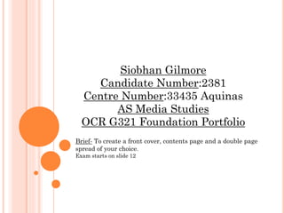
  • 1. Siobhan Gilmore Candidate Number:2381 Centre Number:33435 Aquinas AS Media Studies OCR G321 Foundation Portfolio Brief- To create a front cover, contents page and a double page spread of your choice. Exam starts on slide 12
  • 2.  Aimed my magazine at… The audience who would be involved in my magazine would be someone who is interested in the music genre of Punk and Rock this could include bands such as Green day, My Chemical Romance and All Time Low. Primarily the target audience is teenagers and young adults as the dominating chaos and certain articles would not be suitable for anyone younger, also it would appeal to these age groups as teenagers aim to become more rebellious. Furthermore they must have some sort of interest in comic/childish fantasy/and popular YouTuber's as I might use the internet and comic films as an influence to my magazine. Music interests Influences/ spends money on Goes to gigs Film/TV interests Other interests 16-25 years old Aimed Audience
  • 3. WHO WOULD THE AUDIENCE BE FOR YOUR MAGAZINE?  Unique selling point and similarities to others  My music magazine will be influenced by the style of rebellion and mutinous behaviour that is centred around the sub genre of particular magazines such as Kerrang.  Also there will be a difference in articles as they will vary from internet based to movies and films of particular genres that are alternative and not as mainstream.  This is a strong point that I have as most magazines are more mainstream and don’t include as much about the internet and films so this would be my unique selling point.
  • 4. WHO WOULD THE AUDIENCE BE FOR YOUR MAGAZINE?  Sub genres and hybrids?  From my research collected form my survey, the conclusion is that my target audience would predominantly want a punk/rock magazine with information not just about the bands but what are their tours and other relevant material towards particular bands along with different factors of the internet and film.  For this reason I will use this as a basis for my content within the magazine.  Different publications These are the different magazines that I will take inspiration from.
  • 5. WHO WOULD THE AUDIENCE BE FOR YOUR MAGAZINE?  Kerrang is mostly known for its bad attitude style, this comes straight across in the front cover the title font style is immense, daring and cracked so it gives a sense of mutinous behaviour and symbolises the music as being loud and chaotic.  This issue of Kerrang has a complementary colours of black, white and red this signifies danger or passion towards the magazine contents along with a warning to other rival magazines that they are the best.  Further more this magazine like any other has a slogan ‘ The UK’s BIGGEST gig guide ever’ it not only meets the criteria of the concept of a slogan but, it also is memorable to the magazine and sets the standard for other magazines to follow.
  • 6. WHO WOULD THE AUDIENCE BE FOR YOUR MAGAZINE?  Primary Audience  The primary audience for my magazine would be mostly teenagers and young adults as it would not be suitable for anyone that much younger also because teenagers aspire to become rebellious this may appeal to them more . In addition mostly I would feel that females would be more of a primary audience as most of the information would be about bands (which mainly consist of males), of the punk music industry, therefore females would be more interested in the magazine than men.
  • 7. WHO WOULD THE AUDIENCE BE FOR YOUR MAGAZINE?  Secondary Audience  My secondary audience would be people that do not necessarily read the magazine but would read it if purchased by friends, family or significant others. Predominantly I would aim my magazine at 16-25 years old, nevertheless other age ranges may read the magazine as well.  The demographic for my magazine would be mainly interested in punk/rock music and defer from the mainstream chart music.  Moreover I would aim my magazine at people who are involved with comic/childish fantasy/and popular YouTuber's and aspire to have some sort of career that involves this.  However anyone could read my magazine
  • 8. WHO WOULD THE AUDIENCE BE FOR YOUR MAGAZINE?  Demographic of my magazine  The demographic of my magazine would be set away from the mainstream pop industry so mainly anyone who aspires to be different/alternative.  Also for people who like comic/childish fantasy which is also not seen as mainstream.
  • 9. WHO WOULD THE AUDIENCE BE FOR YOUR MAGAZINE?  Similar products  An example of a similar product to one that I will create is Kerrang as it has a comparable layout and content although it is quite well known and is probably the most famous of the industry so it would be good as a rival magazine.
  • 10. WHO WOULD THE AUDIENCE BE FOR YOUR MAGAZINE?  Audience idols  Within my research I have been looking at what and who my audience like and want to aspire to. These are mainly punk idols of the music industry and seem to ‘film buffs’ as well as YouTuber's so these are the sort of idols I will include in my magazine.  These are huge names such as green day’s lead singer Billie Joe Armstrong and YouTuber's Dan and Phil.  This is why my magazine will be a hybrid genre combining punk music, films and the internet. Therefore if readers like such people as green day this means that they can follow their music and what others think through the internet section of the magazine.  However I would not include such people as Lady Gaga, Jessie J or One Direction as these artist do not appeal to my target audience.  Ideal readers  My ideal readers are people that aspire to be some sort of alternative punk that defers from the mainstream ‘pop’ chart music.
  • 11. HOW DOES YOUR MEDIA PRODUCT REPRESENT PARTICULAR SOCIAL GROUPS?  Mode of address  The use of language in my publication is to fit the audience as they will understand the meanings and sayings in the magazine.  Also the text font is some what relatable to the genre and the social group that it co-insides with theme of punk by having a cracked screen relating to a disobedient attitude that my audience will recognise  Ideal Reader  My star represents the ideal reader. Her make up and hair seem more mutinous than others which is something that rebellious teenagers will aspire to be like, therefore making it personal
  • 12. HOW DOES YOUR MEDIA PRODUCT REPRESENT PARTICULAR SOCIAL GROUPS?  To appeal to the correct target audience, my main cover star would have to characterize an idealised version of the reader. In order to appeal to as many consumers as possible, the star must appear more rebellious and threating than main stream stars.  Moreover I will establish how Billie Joe Armstrong from the band Green Day filters an appearance that appeals to the audience and which in turn can determine his performance or way of looking.
  • 13. HOW DOES YOUR MEDIA PRODUCT REPRESENT PARTICULAR SOCIAL GROUPS? Has a direct glance which is menacing. No expression may come across as rude and rebellious. Black eyeliner represents a hidden and disobedient behaviour. Black clothes and hair represent passion and danger but do this in a simple way. Badges and tie are worn in a way that is alternative and not main stream, making a statement. Rugged looking hair gives a sense of laziness and attitude. The stance is confident therefore shows others threatHe is creating a persona that a younger audience would like to aspire to be like as they are much more likely to follow a path of subversive manners.
  • 14. HOW DOES YOUR MEDIA PRODUCT REPRESENT PARTICULAR SOCIAL GROUPS? Cover star In all the photographs of my star, I tried to make sure she would be aspiring for the readers. She is in the same generation and is the same gender as my ideal reader, therefore would attract the target audience. The persona of the star denotes a fairly mutinous female as her expression is menacing and has an essence of attitude. Also her clothes, makeup and hair is dark which fits in well with the sub genre PUNK.
  • 15. WHAT KIND OF MEDIA INSTITUTION MIGHT DISTRIBUTE YOUR PRODUCT?  Institution  My magazine will be published by Bauer Media group, as they publish Kerrang which is a well known magazine of the punk rock industry and therefore readers will be more willing to buy my magazine as they know it is form a reliable source.  I feel that my magazine would become a rival magazine towards Kerrang as it has some aspects that Kerrang does not have and therefore readers would appeal more to my magazine.  Moreover I would like to publish the magazine fortnightly as my target audience are teenagers and young adults, this means that the price would be reasonable and easy to accesses as the readers have time to save. For this reason I have decided to sell the magazine at £1.75, the reason for this is because teenagers and young adults have little money and therefore this will be a suitable price. 
  • 16. WHAT KIND OF MEDIA INSTITUTION MIGHT DISTRIBUTE YOUR PRODUCT?  Making Kerplunk more well known  ‘Kerplunk the punk music guide with a difference!’ creates a sense of security within the magazine and therefore the reader can trust the magazine before reading, as this is featured on the front cover  The magazine also gives links to the website and therefore the viewer can get the ‘latest news’ and find other information about the magazine easily.  Competitions can increase the brand loyalty. This would keep a steady rate of sales, as people like that the publication are giving back to the people who buy it.
  • 17. WHAT KIND OF MEDIA INSTITUTION MIGHT DISTRIBUTE YOUR PRODUCT?  Website  Has my brand logo so it is recognised straight away.  Main cover story in the magazine is present which would appeal to the viewer.  Hyperlinked tabs which can be clicked and take you to a specific part of the website with ease.  The NEWS section is where it has the latest news coming in which will be updated every hour, including new gig dates, stories about upcoming punk stars and much more.  Latest issue of Kerplunk is shown which is promoting the magazine from the internet.  Gallery of images and posters viewers can have their say which would benefit them greatly.  Lucy’s blog corner will attract more viewers via the internet and will work as an influence to the magazine.  Has relevant images of singers of this genre appealing to the audience.
  • 18. WHAT KIND OF MEDIA INSTITUTION MIGHT DISTRIBUTE YOUR PRODUCT?  Merchandise  I would also distribute my magazine through common merchandise such as hoodies and t shirts.  This could boost sales of the magazine and recognition of it by the magazine being distributed to a wider audience which may not be aware of the product in the first place.
  • 19. WHAT KIND OF MEDIA INSTITUTION MIGHT DISTRIBUTE YOUR PRODUCT?  I researched the music magazines EMPIRE and Kerrang in order to get an idea of the different media conventions and institutions to how I should cultivate and distribute my own music magazine Kerplunk.  Both magazines are from diverse genres and so using both as samples it aided me to show how to issue my magazine as my genre was a mixture of both, film and punk music.  The brand statement for Kerrang magazine is “the worlds biggest selling weekly rock magazine”. This statement helps sell the brand as it uses statistics and so people are likely to believe facts over opinions and buy the magazine thinking it is professional and popular. Although Kerplunk’s statement is ‘the punk music guide with a difference’ this makes the viewers curious of what the magazine entails and therefore promotes and distributes the product in a methodical way.
  • 20. IN WHAT WAYS DOES YOUR MEDIA PRODUCT USE, DEVELOP OR CHALLENGE FORMS AND CONVENTIONS OF REAL MEDIA PRODUCTS?  Front cover  A front cover is used to promote a certain item in a way that would appeal to the target audience.  My main inspiration while making my product was Kerrang as this magazine is a world wide known product in this sub-genre  As you can see the style of both magazines is very similar and therefore meets the same audience criteria.  They have similar presentation of images such as the main image as it is fore front of the magazine drawing you in to the main article and keeping the audience interested .  In addition the header at the top of the page is something I kept the same which starts of the front cover this gives more information or the chance for the viewer to know more about what will be included in the magazine.  Although the secondary images were more structured and neat in the Kerrang magazine where as my magazine has a more chaotic layout which relates to the theme of punk.  I used a contrast of complementary colours to symbolise havoc which my target audience would find appealing and stand out.  I made sure that most of the text was in capitals this was because it would be seen as a greater importance to read compared to other magazine cover and make it be prominent.
  • 21. IN WHAT WAYS DOES YOUR MEDIA PRODUCT USE, DEVELOP OR CHALLENGE FORMS AND CONVENTIONS OF REAL MEDIA PRODUCTS?  What did I challenge (front covers)  I challenged the way in which the magazines empire and rolling stone used their front covers to attract different readers.  Rolling stone magazine has a more simple approach of using one main image and modest text with complementary colours like black and white, however this works well for this magazine and I would consider using the colour scheme I don’t think that the order is something I would use as it is to meek and structured.  On the other hand Empire uses bold contrasting colours which set the lettering away from the image making you more drawn to this however it uses direct shots of the main character making the reader be drawn into the magazine more easily. This is something I should consider in my work as well.
  • 22. IN WHAT WAYS DOES YOUR MEDIA PRODUCT USE, DEVELOP OR CHALLENGE FORMS AND CONVENTIONS OF REAL MEDIA PRODUCTS?  Overall  Generally my biggest competition to my product would be Kerrang as it is part of the same sub genre and shares a similar style to the layout of my own magazine. Therefore meaning that we also share the same target audience.  However to defer from Kerrang and to be able to tell that we are different magazines I have decided to have a colour scheme similar to the rolling stones and have a more chaotic layout of secondary pictures, which is something that none of my other aspiring magazines have, although form empire I would like to take a closer look at the fact that it uses direct shots for its main image as that is something that my magazine and its has in common.
  • 23. IN WHAT WAYS DOES YOUR MEDIA PRODUCT USE, DEVELOP OR CHALLENGE FORMS AND CONVENTIONS OF REAL MEDIA PRODUCTS?  Contents page  A contents page is used to inform the reader about what will follow on throughout the magazine.  My main inspiration while making my product was Kerrang as this magazine is a world wide known product in this sub-genre.  Most of the presentation within both contents pages is very similar columns are used to disperse each of the articles from each other. However I have decided to section of each column with a straight bold line which keeps the contents page structured and more easy for the reader to follow, page numbers and a quote or the name of the article was also added to lead on to more information.  The main image shows passion and a mutinous behaviour towards music  I kept the background to the content information white which would make the viewer more focused on the material and the images rather than the background.
  • 24. IN WHAT WAYS DOES YOUR MEDIA PRODUCT USE, DEVELOP OR CHALLENGE FORMS AND CONVENTIONS OF REAL MEDIA PRODUCTS?  What did I challenge (contents pages)  I again challenged and developed ways in which NME and Rolling stone use their contents pages to present information to the viewer.  First of all I looked at NME it looked very chaotic and not that straight forward to follow although I liked the way they used box tabs to show off different article items within the magazine.  The simplicity of the contents page of Rolling stone follows through form it front cover and although I didn’t like the straightforwardness of the front cover I feel it works here and is maybe something I should consider. Also the column cut offs is something I like as it keeps the page more structured.
  • 25. IN WHAT WAYS DOES YOUR MEDIA PRODUCT USE, DEVELOP OR CHALLENGE FORMS AND CONVENTIONS OF REAL MEDIA PRODUCTS?  Overall  Again Kerrang would be the leading rivalry as it has a comparable layout and continues on with the same house style before making it a referable magazine as both magazine are included in the same sub genre.  On the other hand I would to also highlight that I took some ideas from, again Rolling stone as the simplicity from the Rolling stone page seemed like a likeness towards my own contents page although not fully as it has to many main images where my own contents page only concentrates on one.  NME had more of a frenzied approach to the way in which it was presented which I didn’t not think was appropriate for a contents page as it would not be readable for the viewer.
  • 26. IN WHAT WAYS DOES YOUR MEDIA PRODUCT USE, DEVELOP OR CHALLENGE FORMS AND CONVENTIONS OF REAL MEDIA PRODUCTS?  Double page spread  A double page spread is an article of something that the target audience would find interesting  My main inspiration while making my product was Kerrang as this magazine is a world wide known product in this sub-genre  The style in which is used for the double page spread in Kerrang and my own magazine is some what different as the main image takes over most of the page where on my magazine it only takes up half, moreover the titles are dispersed in different ways as Kerrang's is more set aside and structured where my own is more chaotic and randomly placed on purpose.  However most of the secondary images and the text is presented in the same way as it is presented in columns and has secondary images clumped together with borders to set them apart from the other images.
  • 27. IN WHAT WAYS DOES YOUR MEDIA PRODUCT USE, DEVELOP OR CHALLENGE FORMS AND CONVENTIONS OF REAL MEDIA PRODUCTS?  Overall  My magazine again has influential aspects from Kerrang and therefore would become the biggest competitor on a whole, consequently we would be sharing the same target audience.  The text and secondary images were displayed in the same way as it is presented in columns and has secondary images clumped together with borders to set them apart from the other images. This means that viewers can have a relation between both the magazines
  • 28. HOW DID YOU ATTRACT/ADDRESS YOUR AUDIENCE? Masterhead Secondary images Flashes Main image Strapline Cover star Features Repetitive features
  • 29. HOW DID YOU ATTRACT/ADDRESS YOUR AUDIENCE?  Gender, age and artist  Gender  My cover star is female with little makeup except around the eyes which relates to by sub genre of punks, which may appeal more to girls to read the magazine, however males can may read the magazine as well.  Age  My magazine is aimed at 16-25 year olds that defer from the main stream chart pop music and are more alternative and listen to punk music. Therefore my cover star is in that age range to make the magazine more relatable to its audience  Genre  My genre is punk music the main star portrays this by having dark hair and clothes. It is also depicted through the other stars included in the magazine and through the stars caption.
  • 30. HOW DID YOU ATTRACT/ADDRESS YOUR AUDIENCE? This is a repeat of the WIN competition the reader gets more intrigued with the magazine .Also it is at the top of the magazine because this is the first thing the reader sees and the word ‘WIN’ is in a different colour arrow tab so it stands out from the rest of the text. The word exclusive is separated from the rest of the text this makes it more important and prominent to the reader therefore drawing them into the magazine and the article. The master head is typical as being capitals and therefore can be seen as more significant than other magazines, also it has a black background which is contrasting to the white text, this makes the master head stand out even more. The word WIN is appealing towards the audience as it is a positive term that encourages the reader to get involved and be intrigued. Moreover it is in its own tab and in a bigger size than the rest this then persuades more to buy the magaizne
  • 31. HOW DID YOU ATTRACT/ADDRESS YOUR AUDIENCE? Using pictures emphasises the main articles and draws the reader in to the magazine and further on articles within it. It also helps them generate an idea of what else the features include. The heading is in the same colour as the colours used on the front and throughout the rest of the contents page. This creates a unique selling point and keeps the house style. Tabs such as ‘feedback’ and ‘news’ are in black text with a blue tab giving them prominence which readers will be drawn to and therefore read the rest of the magazine. ‘Kerplunk the punk music guide with a difference!’ creates a sense of security within the magazine and therefore the reader can trust the magazine before reading, as this is featured on the front cover
  • 32. HOW DID YOU ATTRACT/ADDRESS YOUR AUDIENCE? The grey box contains extra information about the star and her albums therefore if readers want to know what other albums and singles the star has done then this is what they can read. The use of the additional images lets the reader see what the artist is wearing, consequently she becomes influential to aspiring artists and fans . The use of three colours attracts the reader in to the pull quote stand out and gives them an idea of what else is included in the interview. ‘World exclusive’ gives a sense of reputation and therefore readers want to read on also I created a box named ‘NEWS’ this is where viewers can accesses parts of the magazine online, this is adding extra helpful information.
  • 33. HOW DID YOU ATTRACT/ADDRESS YOUR AUDIENCE? The colour scheme for my magazine was red representing danger, romance and blood, the dark blue symbolises loyalty and hence readers can trust the magazine, black represents evil, and it is the colour of the night. The colour can also signify ideas like power, sophistication and mystery for this reason I thought that this was a colour that would depict the right audience and attract them to my magazine. The colour runs through out the main pages to keep it fresh in the buyers mind the brand they are reading, this is turn is the house style of my magazine.
  • 34. WHAT HAVE YOU LEARNT ABOUT TECHNOLOGIES FROM THE PROCESS OF CONSTRUCTING THIS PRODUCT?  Constructing the front cover  I removed the background with a background eraser tool on adobe Photoshop, this enabled me to get rid of the green screen background which then I could overlay the image on the background of the front cover with ease.  I used contrast to change the darkness of my image making more in line with the theme of my magazine. I did this by selecting the image and clicked on the contrast tab to a drop down and choose -10% which gave me a darkened image for the front cover I used this technique with many other images on my front cover as well. Original image Method/ tool used Edited image Method/tool used Edited image
  • 35. WHAT HAVE YOU LEARNT ABOUT TECHNOLOGIES FROM THE PROCESS OF CONSTRUCTING THIS PRODUCT?  Constructing the front cover I used a black background and altered the title by using contrast and changed the colour white I added the cover photo and inserted word art to create a cover title and this was then placed over the main image I then created a sequence of flashes and information using publisher shapes and my original images which were edited in Photoshop I created a rectangle box which had all the relevant information and also had a arrow shape which urges readers to look at this before turning the cover
  • 36. WHAT HAVE YOU LEARNT ABOUT TECHNOLOGIES FROM THE PROCESS OF CONSTRUCTING THIS PRODUCT?  Constructing the contents page  Again I used contrast to create this edited image however I decided to keep the green screen background as it adds to the personality of the punk sub genre.  This worked when I made the contrast +40% which made it really dark but highlighted the background which gave the image great depth and a relatable reference to the audience. Original image Method/tool usedEdited image
  • 37. WHAT HAVE YOU LEARNT ABOUT TECHNOLOGIES FROM THE PROCESS OF CONSTRUCTING THIS PRODUCT? I first started off with editing and placing my image at the top of the screen making it prominent. I then added more publisher shapes and tabs which held information such as the slogan and the main article reference. This was a tab to keep in with the house style and remind the reader that it is ‘Kerplunk’ they are reading I then added content with editor letter which is displayed with an overlay of rectangle and photo. Also I used tabs which were blue keeping in line with my colour scheme and  Constructing the contents page
  • 38. WHAT HAVE YOU LEARNT ABOUT TECHNOLOGIES FROM THE PROCESS OF CONSTRUCTING THIS PRODUCT?  Constructing the DPS  When constructing the double page spread I changed the publication to landscape and then spilt in half using half with the main image which was edited with contrast, meanwhile I altered the background colour on the left hand side to black, this gave a contrast of colours which added the theme of punk.  Then I added the text which was Destroyand Century Schoolbook, century schoolbook was for the main body of the article while destroy kept in with the theme and house style and drew in the attention of the reader
  • 39. LOOKING BACK AT YOUR PRELIMINARY TASK, WHAT DO YOU FEEL YOU HAVE LEARNT IN THE PROGRESSION FROM THIS TO THE FINAL PRODUCT?  Evaluating my college magazine (front cover) Technologies used : Publisher Digital cameras Photoshop Editing images taken
  • 40. LOOKING BACK AT YOUR PRELIMINARY TASK, WHAT DO YOU FEEL YOU HAVE LEARNT IN THE PROGRESSION FROM THIS TO THE FINAL PRODUCT?  Front cover Flashes at the top of the magazine make the viewer want to read on. I used a similar text font to that of Aquinas so that readers would find it referable to the college I also added the logo making the magazine applicable. I used a different colours to draw the audience in to the article also I anchored the text over the main image making it more relatable. I used simple shapes such as circles and squares to act as a background to articles within the magazine making them more prominent and significant. Also the use of diverse text and colour draws the observer in and makes them want to read on .
  • 41. LOOKING BACK AT YOUR PRELIMINARY TASK, WHAT DO YOU FEEL YOU HAVE LEARNT IN THE PROGRESSION FROM THIS TO THE FINAL PRODUCT?  Front cover  The cover image fits its roll quite well as this is a mid-shot therefore it is suitable to be the main image, furthermore the shot is framed as a direct glare drawing you in to the magazine.  This stance of the cover star creates a persona of modest and therefore creates a sense of curiosity about the character.  The photo has a white background which creates contrasting artless space and emphasises the star and the text on the cover.
  • 42. LOOKING BACK AT YOUR PRELIMINARY TASK, WHAT DO YOU FEEL YOU HAVE LEARNT IN THE PROGRESSION FROM THIS TO THE FINAL PRODUCT?  Choosing a cover photo This image I decided to not use as it is not satisfactory quality as it is blurred and the star is not looking happy and would not fit in with the main article of the magazine However these two images would work as my main image although I have decided to use the first image of these as it has a direct glance which the audience can engage with, also she has a meek look making the reader inquisitive and being directed straight to the magazine.
  • 43. LOOKING BACK AT YOUR PRELIMINARY TASK, WHAT DO YOU FEEL YOU HAVE LEARNT IN THE PROGRESSION FROM THIS TO THE FINAL PRODUCT?  Evaluating my college magazine (contents page) Technologies used : Publisher Digital cameras Photoshop Editing images taken
  • 44. LOOKING BACK AT YOUR PRELIMINARY TASK, WHAT DO YOU FEEL YOU HAVE LEARNT IN THE PROGRESSION FROM THIS TO THE FINAL PRODUCT?  Evaluating my college magazine (contents page) I clumped together the main image and other article images together this was because I felt they needed to be the main focus of the contents page so people could be drawn in and therefore engaged with the magazine, also the numbers of the pages of the articles are included for a quick reference making it easy for the reader. I used tabs to give a more structured piece so readers could follow it easily also the headings and page numbers are in a different text font making it more prominent and clear and the information clear I incorporated the Aquinas logo to contents text, which was also linked with my colour scheme by changing the colour of the ‘c’ to white.
  • 45. LOOKING BACK AT YOUR PRELIMINARY TASK, WHAT DO YOU FEEL YOU HAVE LEARNT IN THE PROGRESSION FROM THIS TO THE FINAL PRODUCT?  Final front cover Generating ideas
  • 46. LOOKING BACK AT YOUR PRELIMINARY TASK, WHAT DO YOU FEEL YOU HAVE LEARNT IN THE PROGRESSION FROM THIS TO THE FINAL PRODUCT?  Final front cover Features and flashes that will appeal to my audience. The word “win” is emphasised in size, capital letters and the use of a arrow and square tab this makes it stand out. I used capitals typical to the genre of punk this as a result would be relevant to the target audience, a black background which is contrasting to the white text, this makes the master head stand out even more. Different articles are distrusted on the front cover so the reader has an insight to other content in the magazine, hence they work as a reference to further on in the magazine
  • 47. LOOKING BACK AT YOUR PRELIMINARY TASK, WHAT DO YOU FEEL YOU HAVE LEARNT IN THE PROGRESSION FROM THIS TO THE FINAL PRODUCT?  Final front cover The Star’s head covers part of the masthead to show her importance. This is an example of text-image anchoring The banner/strap draws the reader in by using an attractive chance to win tickets to a specific ban which is what my target audience would like to have in the magazine as it was in my results from my questionnaire The main feature is large, gives a sense of importance and has a cracked punk font reflecting the personality of the star and the genre of the magazine.
  • 48. LOOKING BACK AT YOUR PRELIMINARY TASK, WHAT DO YOU FEEL YOU HAVE LEARNT IN THE PROGRESSION FROM THIS TO THE FINAL PRODUCT?  Final front cover
  • 49. LOOKING BACK AT YOUR PRELIMINARY TASK, WHAT DO YOU FEEL YOU HAVE LEARNT IN THE PROGRESSION FROM THIS TO THE FINAL PRODUCT?  Final contents page Generating ideas
  • 50. LOOKING BACK AT YOUR PRELIMINARY TASK, WHAT DO YOU FEEL YOU HAVE LEARNT IN THE PROGRESSION FROM THIS TO THE FINAL PRODUCT?  Final contents page The star stands out against the green background and therefore makes her more prominent so the reader will feel more engaged with the page also the stance of the star shows emotion which is strong and gripping and depth along with attitude which is something that the target audience will aspire to and feel relevant . The title is bold and is a contrast to the background therefore it becomes more significant.
  • 51. LOOKING BACK AT YOUR PRELIMINARY TASK, WHAT DO YOU FEEL YOU HAVE LEARNT IN THE PROGRESSION FROM THIS TO THE FINAL PRODUCT?  Final contents page The content information is structured and organised by having columns highlighted by black lines, so that the reader can easily follow the content, headings and page numbers are in a different colour or tab making them more prominent and clear and the information clear, in addition I created explosion shapes to signify exclusive and must see items within the magazine. The slogan becomes memorable and associated with the magazine so therefore ‘Kerplunk the punk music guide with a difference!’ creates a sense of security within the magazine and therefore the reader can trust the magazine.
  • 52. LOOKING BACK AT YOUR PRELIMINARY TASK, WHAT DO YOU FEEL YOU HAVE LEARNT IN THE PROGRESSION FROM THIS TO THE FINAL PRODUCT?  Final contents page
  • 53. LOOKING BACK AT YOUR PRELIMINARY TASK, WHAT DO YOU FEEL YOU HAVE LEARNT IN THE PROGRESSION FROM THIS TO THE FINAL PRODUCT?  Final double page spread Generating ideas
  • 54. LOOKING BACK AT YOUR PRELIMINARY TASK, WHAT DO YOU FEEL YOU HAVE LEARNT IN THE PROGRESSION FROM THIS TO THE FINAL PRODUCT?  Final double page spread The news tab gives extra information and helps to distribute the product further through the internet. The main image shows the artist again, this is because the reader is reminded who the article is about also to depict and show off the rebellious theme of the magazine which the audience can follow and aspire to be like The strip to the right side of the double page spread gives extra information about the artist without reading the article this maybe if the audience want to find out more about the artist effortlessly.
  • 55. LOOKING BACK AT YOUR PRELIMINARY TASK, WHAT DO YOU FEEL YOU HAVE LEARNT IN THE PROGRESSION FROM THIS TO THE FINAL PRODUCT?  Final double page spread My final music magazine DPS is about a Punk/Rock singer with a sarcastic attitude, so the red, black and white font portray a more dangerous idea. The sub heading gives an insight to the item, hence the viewer can know about the article and make them more curious about the editorial.
  • 56. LOOKING BACK AT YOUR PRELIMINARY TASK, WHAT DO YOU FEEL YOU HAVE LEARNT IN THE PROGRESSION FROM THIS TO THE FINAL PRODUCT?  Final double page spread