EVALUATION
IN WHAT WAY DOES MY MEDIA PRODUCT USE,
DEVELOP OR CHALLENGE FORMS AND
CONVENTIONS OF REAL MEDIA PRODUCTS?
COMPARISON
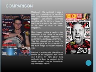
Masthead – My masthead in easy o
read and located along the top of the
front cover following the conventional
magazine conventions. Masthead
compiles with the genre of magazine
and does hide behind the main image,
as is seen in most of music
magazines.
Main Image - using a medium shot
positioned in the centre of the front
cover I have directly addressed the
audience in order to appeal to them.
This has allowed me to place the
subheadings of the front cover around
the main image, in visually attractive
way.
Barcode is strategically placed in the
bottom of the magazine front cover
and it gives my front cover more
professional look, by placing it in the
bottom corner it does not distract from
the advertised articles.
COMPARISON
Images – The images in the content
page take a half of the contents, this
way they allow the text to be aligned
in one column. This makes the
magazine visual and easy to read as
well as navigate.
I have included the magazine name
and issue date so the audience is
aware that the magazine is up to
date. This feature follows the coeds
and conventions of a magazine
media product.
Layout – I have aligned the images
to the right side and positioned text
on the left side of the content page,
as my target audience is firstly
attracted to visual features of my
content page, the main image is a bit
centered. This follows the codes and
conventions of real media product on
the right.
COMPARISON Masthead – The title is clearly visible and eye catchy which
will attract my target audience. The title being “Band o’
Glavi” is intriguing as it doesn’t give much information about
the article.
Main Image – The image in the article is used as a
background to the text that is displayed there, the text is
taking up half of the double spread article. This follow the
codes and conventions of real media product on the left.
Text – the text occupies half of the article, as already
stated, the questions of the interview are colored read, and
the introduction’s first letter is enlarged and colored. This
also follows the codes and conventions of the real media
product on the left.
Pull quotes – In order to attract more attention to the
magazine’s double spread article I have pulled out a
quote from the interview, enlarged it, colored it and
placed it on a visible spot, the same is done in the
real media product on the left, but due to image
source it is not clearly visible.
Topic – I have chosen a topic that is relative to my
magazine, and have been mentioned several times
already, once on the front cover and once on the
content page.
HOW DOES MY MEDIA PRODUCT REPRESENT
PARTICULAR SOCIAL GROUP?
AUDIENCE FEEDBACK
My magazine “Horizon Zero” is aimed toward people listening to rock,
metal, even rap music, as these genres cannot be divided into age
groups, there aren’t any particular age group that is focuses towards
to. The gender that it is aimed towards is also not specified as music
does not chose the gender, it is open to everybody, it does not
require a certain age to be listened to, or a certain gender. Therefore
I have decided that my target group is ranged across all ages and
genders, the only specification is listening to those three genres of
music. As those genres are popular and there are three of them, that
makes my target audience a big part of music listeners.
After asking 10 different people who listen to those genres about my
magazine designs, I have collected the information and presented it
in a pie chart.
AUDIENCE FEEDBACK
• Sample of questions that I have asked my target audience
90%
10%
1. Does name "Horizon Zero" suit music
magazine?
Yes
No
80%
20%
2. Do you like my color scheme?
Yes
No
100%
0%
3. Does the font suite the name of the
magazine?
Yes
No
60%20%
10%
10%
4. What music would you mostly associate
this color scheme with?
Rock
Metal
Rap
Pop
AUDIENCE FEEDBACK
After analyzing the data that I have collected from my target audience with
the questionnaire, I have concluded that:
• I have chose a suitable name
• The font used for the name is acceptable
• Successfully chosen color scheme
• Incorporated appropriate font styles
• Selected an attractive image for the front cover, content page and double
spread article
If I was to focus and develop my magazine more, I would focus on the fonts,
the chosen fonts do look okay and are appropriate according to my target
audience, yet I feel as if the font could have been improved or selected more
carefully with more thought put into it. Overall I do think that I have achieved
suitable media product that represents my target audience with its contents
and color scheme, also the title of the magazine, which has a deeper
meaning to it. I do believe this since the target audience gave me a positive
response to all of my questions.
WHAT KIND OF MEDIA INSTITUTIONS MIGHT
DISTRIBUTE MY MEDIA PRODUCT AND WHY?
MEDIA INSTITUTION
Through previous research into publishing companies I have conclude that
New Bay Media and SpinMedia as two publishing companies that may be
interested into publishing and distributing my magazine.
New Bay Media is a publishing company that was established in 2006, it
publishes some of the most famous and successful music magazines, such
as Revolver, Guitar Player and Bass Player. The company publishes over 40
different magazines based on five different themes, music, gaming, video
and broadcasting, education and pro audio.
SpinMedia, formerly known as Buzz Media was created in 2006, the source of
the company was a blog that was created in 1999. SpinMedia was acquired
by Buzz Media in 2012 and the following year the company name was
changed. SpinMedia publishes magazines such as Vibe and SPIN.
This concludes that New Bay Media is more suitable to publish my magazine,
as their magazines more focus on rock music, rather then SpinMedia, which
publishes music magazines with no specific genre.
WHO WOULD BE THE AUDIENCE FOR MY
MEDIA PRODUCT?
AUDIENCE
• Not gender specific
• Aged 14-50
• Likes to play or listen to a guitar
• Keeps up with the latest singles and albums
• Studies, works, between jobs
HOW DID I ATTRACT/ADDRESS MY
AUDIENCE?
EVALUATION
Codes and conventions that I have used to attract my audience are:
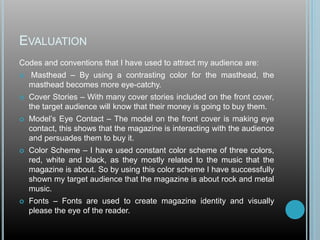
 Masthead – By using a contrasting color for the masthead, the
masthead becomes more eye-catchy.
 Cover Stories – With many cover stories included on the front cover,
the target audience will know that their money is going to buy them.
 Model’s Eye Contact – The model on the front cover is making eye
contact, this shows that the magazine is interacting with the audience
and persuades them to buy it.
 Color Scheme – I have used constant color scheme of three colors,
red, white and black, as they mostly related to the music that the
magazine is about. So by using this color scheme I have successfully
shown my target audience that the magazine is about rock and metal
music.
 Fonts – Fonts are used to create magazine identity and visually
please the eye of the reader.
To address my audience:
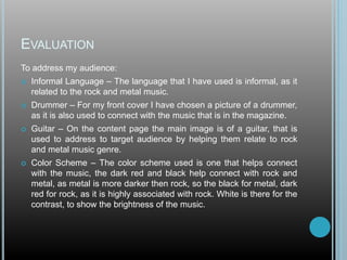
 Informal Language – The language that I have used is informal, as it
related to the rock and metal music.
 Drummer – For my front cover I have chosen a picture of a drummer,
as it is also used to connect with the music that is in the magazine.
 Guitar – On the content page the main image is of a guitar, that is
used to address to target audience by helping them relate to rock
and metal music genre.
 Color Scheme – The color scheme used is one that helps connect
with the music, the dark red and black help connect with rock and
metal, as metal is more darker then rock, so the black for metal, dark
red for rock, as it is highly associated with rock. White is there for the
contrast, to show the brightness of the music.
EVALUATION
WHAT HAVE I LEARNED ABOUT
TECHNOLOGIES FROM THE PROCESS OF
CONSTRUCTING THIS PRODUCT?
EVALUATION
By using Adobe Photoshop I was able to create,
design, construct and develop my music magazine.
I learned how to create images from the scratch,
how to crop and reshape images, how to enhance
images in regard to contrast. Stroke, bevel and
emboss helped me to make my masthead have a
3D effect. Overlapping images over images to
make the effect end attractiveness of the magazine
increase.
LOOKING BACK AT MY PRELIMINARY TASK, WHAT
DO I FEEL I HAVE LEARNED IN THE
PROGRESSION FROM IT TO THE FULL PROJECT?
EVALUATION
Looking back at my preliminary task, I would say that
my skills have greatly improved and I have learned
more about codes and conventions of media products.
First improvement
that can be seen I
that I have greatly
developed my
Photoshop skills, as
in my preliminary
task the effects on
the letters were over
abused and not
nicely made, to
muck stroke, or
bevel or emboss.
Second improvement can be seen in the color
scheme, as the preliminary task has to many
colors to it, the final front cover keeps to it
constant color scheme.
EVALUATION
By analyzing my content pages, I can clearly see how
much my skills have developed, I have improved my
layout design. From complicate and unreadable
content page I have moved to very simple and clearly
readable content page.
From placing articles
random and pictures just so
they could be there, I have
move to organizing articles
to they could fit there and
placing image where it is
needed.
Through using three fonts
and constant colors rather
then random colors, I have specialized myself into
making more professional looking magazine.
My skills have greatly improved, I have learned how to
use codes and conventions of media products, how
attract costumers and how to analyze existing
magazines more efficiently.

Evaluation

  • 1.
  • 2.
    IN WHAT WAYDOES MY MEDIA PRODUCT USE, DEVELOP OR CHALLENGE FORMS AND CONVENTIONS OF REAL MEDIA PRODUCTS?
  • 3.
    COMPARISON Masthead – Mymasthead in easy o read and located along the top of the front cover following the conventional magazine conventions. Masthead compiles with the genre of magazine and does hide behind the main image, as is seen in most of music magazines. Main Image - using a medium shot positioned in the centre of the front cover I have directly addressed the audience in order to appeal to them. This has allowed me to place the subheadings of the front cover around the main image, in visually attractive way. Barcode is strategically placed in the bottom of the magazine front cover and it gives my front cover more professional look, by placing it in the bottom corner it does not distract from the advertised articles.
  • 4.
    COMPARISON Images – Theimages in the content page take a half of the contents, this way they allow the text to be aligned in one column. This makes the magazine visual and easy to read as well as navigate. I have included the magazine name and issue date so the audience is aware that the magazine is up to date. This feature follows the coeds and conventions of a magazine media product. Layout – I have aligned the images to the right side and positioned text on the left side of the content page, as my target audience is firstly attracted to visual features of my content page, the main image is a bit centered. This follows the codes and conventions of real media product on the right.
  • 5.
    COMPARISON Masthead –The title is clearly visible and eye catchy which will attract my target audience. The title being “Band o’ Glavi” is intriguing as it doesn’t give much information about the article. Main Image – The image in the article is used as a background to the text that is displayed there, the text is taking up half of the double spread article. This follow the codes and conventions of real media product on the left. Text – the text occupies half of the article, as already stated, the questions of the interview are colored read, and the introduction’s first letter is enlarged and colored. This also follows the codes and conventions of the real media product on the left. Pull quotes – In order to attract more attention to the magazine’s double spread article I have pulled out a quote from the interview, enlarged it, colored it and placed it on a visible spot, the same is done in the real media product on the left, but due to image source it is not clearly visible. Topic – I have chosen a topic that is relative to my magazine, and have been mentioned several times already, once on the front cover and once on the content page.
  • 6.
    HOW DOES MYMEDIA PRODUCT REPRESENT PARTICULAR SOCIAL GROUP?
  • 7.
    AUDIENCE FEEDBACK My magazine“Horizon Zero” is aimed toward people listening to rock, metal, even rap music, as these genres cannot be divided into age groups, there aren’t any particular age group that is focuses towards to. The gender that it is aimed towards is also not specified as music does not chose the gender, it is open to everybody, it does not require a certain age to be listened to, or a certain gender. Therefore I have decided that my target group is ranged across all ages and genders, the only specification is listening to those three genres of music. As those genres are popular and there are three of them, that makes my target audience a big part of music listeners. After asking 10 different people who listen to those genres about my magazine designs, I have collected the information and presented it in a pie chart.
  • 8.
    AUDIENCE FEEDBACK • Sampleof questions that I have asked my target audience 90% 10% 1. Does name "Horizon Zero" suit music magazine? Yes No 80% 20% 2. Do you like my color scheme? Yes No 100% 0% 3. Does the font suite the name of the magazine? Yes No 60%20% 10% 10% 4. What music would you mostly associate this color scheme with? Rock Metal Rap Pop
  • 9.
    AUDIENCE FEEDBACK After analyzingthe data that I have collected from my target audience with the questionnaire, I have concluded that: • I have chose a suitable name • The font used for the name is acceptable • Successfully chosen color scheme • Incorporated appropriate font styles • Selected an attractive image for the front cover, content page and double spread article If I was to focus and develop my magazine more, I would focus on the fonts, the chosen fonts do look okay and are appropriate according to my target audience, yet I feel as if the font could have been improved or selected more carefully with more thought put into it. Overall I do think that I have achieved suitable media product that represents my target audience with its contents and color scheme, also the title of the magazine, which has a deeper meaning to it. I do believe this since the target audience gave me a positive response to all of my questions.
  • 10.
    WHAT KIND OFMEDIA INSTITUTIONS MIGHT DISTRIBUTE MY MEDIA PRODUCT AND WHY?
  • 11.
    MEDIA INSTITUTION Through previousresearch into publishing companies I have conclude that New Bay Media and SpinMedia as two publishing companies that may be interested into publishing and distributing my magazine. New Bay Media is a publishing company that was established in 2006, it publishes some of the most famous and successful music magazines, such as Revolver, Guitar Player and Bass Player. The company publishes over 40 different magazines based on five different themes, music, gaming, video and broadcasting, education and pro audio. SpinMedia, formerly known as Buzz Media was created in 2006, the source of the company was a blog that was created in 1999. SpinMedia was acquired by Buzz Media in 2012 and the following year the company name was changed. SpinMedia publishes magazines such as Vibe and SPIN. This concludes that New Bay Media is more suitable to publish my magazine, as their magazines more focus on rock music, rather then SpinMedia, which publishes music magazines with no specific genre.
  • 12.
    WHO WOULD BETHE AUDIENCE FOR MY MEDIA PRODUCT?
  • 13.
    AUDIENCE • Not genderspecific • Aged 14-50 • Likes to play or listen to a guitar • Keeps up with the latest singles and albums • Studies, works, between jobs
  • 14.
    HOW DID IATTRACT/ADDRESS MY AUDIENCE?
  • 15.
    EVALUATION Codes and conventionsthat I have used to attract my audience are:  Masthead – By using a contrasting color for the masthead, the masthead becomes more eye-catchy.  Cover Stories – With many cover stories included on the front cover, the target audience will know that their money is going to buy them.  Model’s Eye Contact – The model on the front cover is making eye contact, this shows that the magazine is interacting with the audience and persuades them to buy it.  Color Scheme – I have used constant color scheme of three colors, red, white and black, as they mostly related to the music that the magazine is about. So by using this color scheme I have successfully shown my target audience that the magazine is about rock and metal music.  Fonts – Fonts are used to create magazine identity and visually please the eye of the reader.
  • 16.
    To address myaudience:  Informal Language – The language that I have used is informal, as it related to the rock and metal music.  Drummer – For my front cover I have chosen a picture of a drummer, as it is also used to connect with the music that is in the magazine.  Guitar – On the content page the main image is of a guitar, that is used to address to target audience by helping them relate to rock and metal music genre.  Color Scheme – The color scheme used is one that helps connect with the music, the dark red and black help connect with rock and metal, as metal is more darker then rock, so the black for metal, dark red for rock, as it is highly associated with rock. White is there for the contrast, to show the brightness of the music. EVALUATION
  • 17.
    WHAT HAVE ILEARNED ABOUT TECHNOLOGIES FROM THE PROCESS OF CONSTRUCTING THIS PRODUCT?
  • 18.
    EVALUATION By using AdobePhotoshop I was able to create, design, construct and develop my music magazine. I learned how to create images from the scratch, how to crop and reshape images, how to enhance images in regard to contrast. Stroke, bevel and emboss helped me to make my masthead have a 3D effect. Overlapping images over images to make the effect end attractiveness of the magazine increase.
  • 19.
    LOOKING BACK ATMY PRELIMINARY TASK, WHAT DO I FEEL I HAVE LEARNED IN THE PROGRESSION FROM IT TO THE FULL PROJECT?
  • 20.
    EVALUATION Looking back atmy preliminary task, I would say that my skills have greatly improved and I have learned more about codes and conventions of media products. First improvement that can be seen I that I have greatly developed my Photoshop skills, as in my preliminary task the effects on the letters were over abused and not nicely made, to muck stroke, or bevel or emboss. Second improvement can be seen in the color scheme, as the preliminary task has to many colors to it, the final front cover keeps to it constant color scheme.
  • 21.
    EVALUATION By analyzing mycontent pages, I can clearly see how much my skills have developed, I have improved my layout design. From complicate and unreadable content page I have moved to very simple and clearly readable content page. From placing articles random and pictures just so they could be there, I have move to organizing articles to they could fit there and placing image where it is needed. Through using three fonts and constant colors rather then random colors, I have specialized myself into making more professional looking magazine. My skills have greatly improved, I have learned how to use codes and conventions of media products, how attract costumers and how to analyze existing magazines more efficiently.