Download to read offline
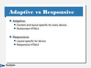
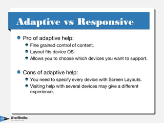
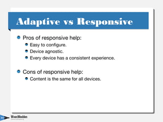
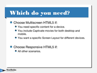


This document discusses the differences between responsive HTML5 and multi-screen HTML5 output when creating help content in RoboHelp. Responsive HTML5 layouts adapt content to fit different devices, while multi-screen HTML5 allows specifying unique layouts and content for specific devices. The document recommends using responsive HTML5 for most cases but using multi-screen HTML5 if you need device-specific content or movies. It also discusses using a responsive layout within multi-screen HTML5 for a hybrid approach. Contact information is provided for the presenters.