Download to read offline


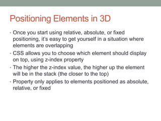
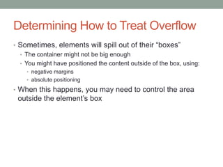
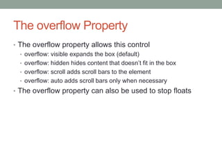
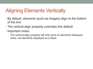

1. CSS provides advantages over using tables for page layout such as creating liquid layouts that adapt to screen size and separating content from presentation. 2. When beginning a CSS layout, content and presentation should be separated, pages should be tested across browsers, and fixed, fluid, or hybrid layouts can be chosen. 3. Elements have box properties of content, padding, border, and margin that can be controlled with CSS, and positioning elements allows control of alignment.