
More Related Content
What's hot
What's hot (19)
Viewers also liked
Viewers also liked (15)
Similar to Mixmag clubbing magazine
Similar to Mixmag clubbing magazine (20)
Recently uploaded
Recently uploaded (20)
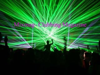
Mixmag clubbing magazine
- 2. Front Cover • This magazine cover is very simple. It has a plain white background with a pair of headphones in the centre as the main image with lots of cover lines on the right hand side. There is linking text to the headphones to the biggest cover line- “Who is the greatest DJ of all time?” There is also a barcode and the price shown at the bottom, (£4.20) which is more expensive than you’d think for this mag, as there are lots of adverts inside, however the paper quality isn’t bad. It has a pug in the top left hand corner saying “Free CD” to make that stand out, as people may want a CD to try out new music and to see what is being played at the moment, but not everyone buys CD’s any more. There is a colour theme of black and gold. Black is a good colour for a clubbing magazine as it could reflect nightclubs, night time etc. The gold is a luxurious expensive colour, maybe suggesting that it is a luxury/ a expensive hobby to be interested in. These colours are also slightly masculine due to the darkness of the black, maybe suggesting that more men go out or listen to this genre. The fonts on the front cover are very wide and bold, suggesting that you need to be out there and loud when you go out. The cover lines are very easy to read, maybe trying to get the audience to read what is inside the magazine instead of judging what’s inside through the photos. There are lots of artist’s names on the cover to try and draw people in to buy the magazine, as a fan may want to read about that particular artist that they listen to frequently. There is a small image on the top right corner of a woman at a club. This image shows people exactly what this magazine is about, as well as linking to the text underneath: “Your clubbing plans sorted every month.”
- 3. Contents Page • Immediately as the audience we know what this magazine is going to include, as there is a large image which is the vocal point of the page of a DJ in a club on the left hand side of the page. This image draws in your eye, due to the bright colours of the lighting in the image, suggesting that clubbing is fun and exciting. There is no editors note, showing that this magazine is all about the music and getting out, maybe because some people who want to go out or want to find some new music will go straight to the reading instead of an editors note which won’t help them much. Opposite the main image on the right is a smaller photo of some people in a club, relating to the image on the left reinforcing the genre of music mentioned in this magazine. The people in this photo are looking happy and that they’re having a good time, advertising that people should go out sometime. At the bottom there is a track list of all the songs on the free CD that comes with this issue. This is helpful as people will want to know what particular songs are called. Also, if a stranger was flicking through this magazine in a shop, they could read through the list to see if there were any songs or artists they know of which might make them want to buy this issue, or it will do the opposite if they’ve already heard of these songs and artists. On the right hand side of the page is a “Features” list of what’s inside which is very brief. I think this magazine company has realized that people don’t always read the contents page- they might go straight to the reading. The contents page colour is black, referring back to the theme of night time, colour of clubs etc. Once again the fonts are very bold, round and large, maybe saying that people who buy this magazine are fun confident people who love going out and meeting new people. • On the 2nd contents page, The main image is now on the right hand side of the page which is an image of a model eating a strawberry in a sensual way. This image is a poster further on in the magazine along with other images, maybe stereotyping people who listen to dance music or people who go clubbing enjoy seeing and flirting with girls. Under this image there are two other photos of some artists, which could make the reader want to buy this magazine as it’s saying that these artists are featured at some point in the magazine, and I can assume that lots of fans of certain artists/DJs would want to read about these people.
- 4. Double page spread • The double page spread I chose was page 48 and 49, as the title caught my eye. It goes across both pages in a diagonal line which is more fun than keeping it straight. It is also in black (referring back to the night time theme) with a bold font with caps lock, making it stand out. The title is “Unstoppable” which makes the readers want to read this article as they want to know what is unstoppable. Because the title is slanted, it links to the word “Unstoppable” as it could show that it’s just going to get better and better with a positive gradual effect which keeps going up. This article is also about a famous DJ couple who might have a lot of fans who would want to read about them as they listen to them. The main image on this spread is on both pages like the title and is of the DJ couple. They are wearing smart clothes with top hats, suits and they’re also holding newspapers. One of them is reading the paper and the other is looking at the camera in a typical model pose. The camera has taken this shot from underneath them making them look taller, suggesting that they are important and that they are amazing at what they do. This image is interesting, and I think they are wearing smart clothes to create a contrast to what they normally wear when they perform at clubs or gigs. (Casual wear.) The tag line under the title is also slanted only on the left page, talking briefly about what these DJs have been up to recently and how their music has got better over the years. This makes readers want to read this article as it mentions the band’s name which readers might recognise as well as mentioning how they’ve got better- making readers want to listen to their new songs. On the left page, there is a small text box of about 35 lines starting off the article about this couple. On the right hand page the rest of the writing is on there where there are two columns, showing that this magazine doesn’t have a huge amount of writing, and the things that are mentioned in the articles are the vital parts, suggesting that the majority of people who pick this magazine up are more interested in the musical content. The article also includes many quotes from the DJs, as well as them talking about another famous artist which could make readers listen to them. Because of this, there is a small image of the artist underneath the text so that readers recognise who this is. The background colour under the text is white and the writing is in black, creating a contrast and making the writing stand out.