Download to read offline
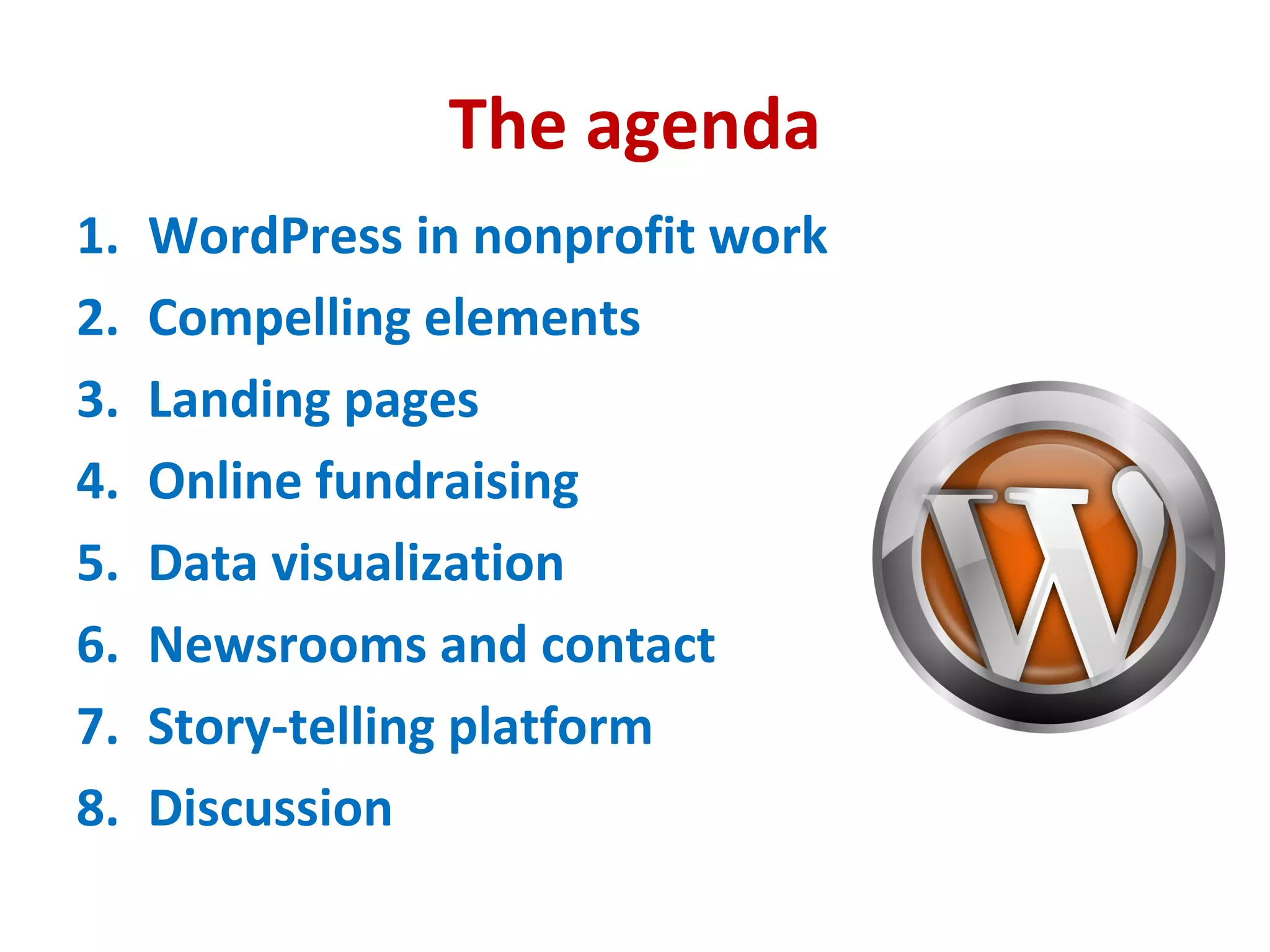
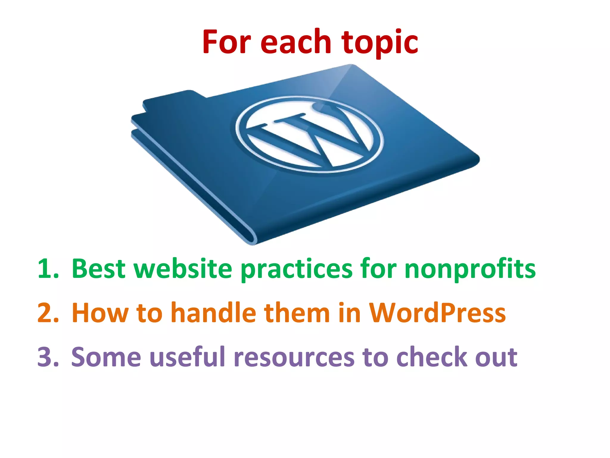
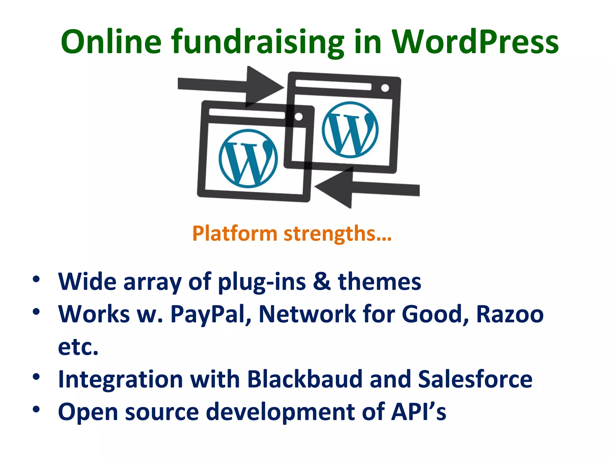
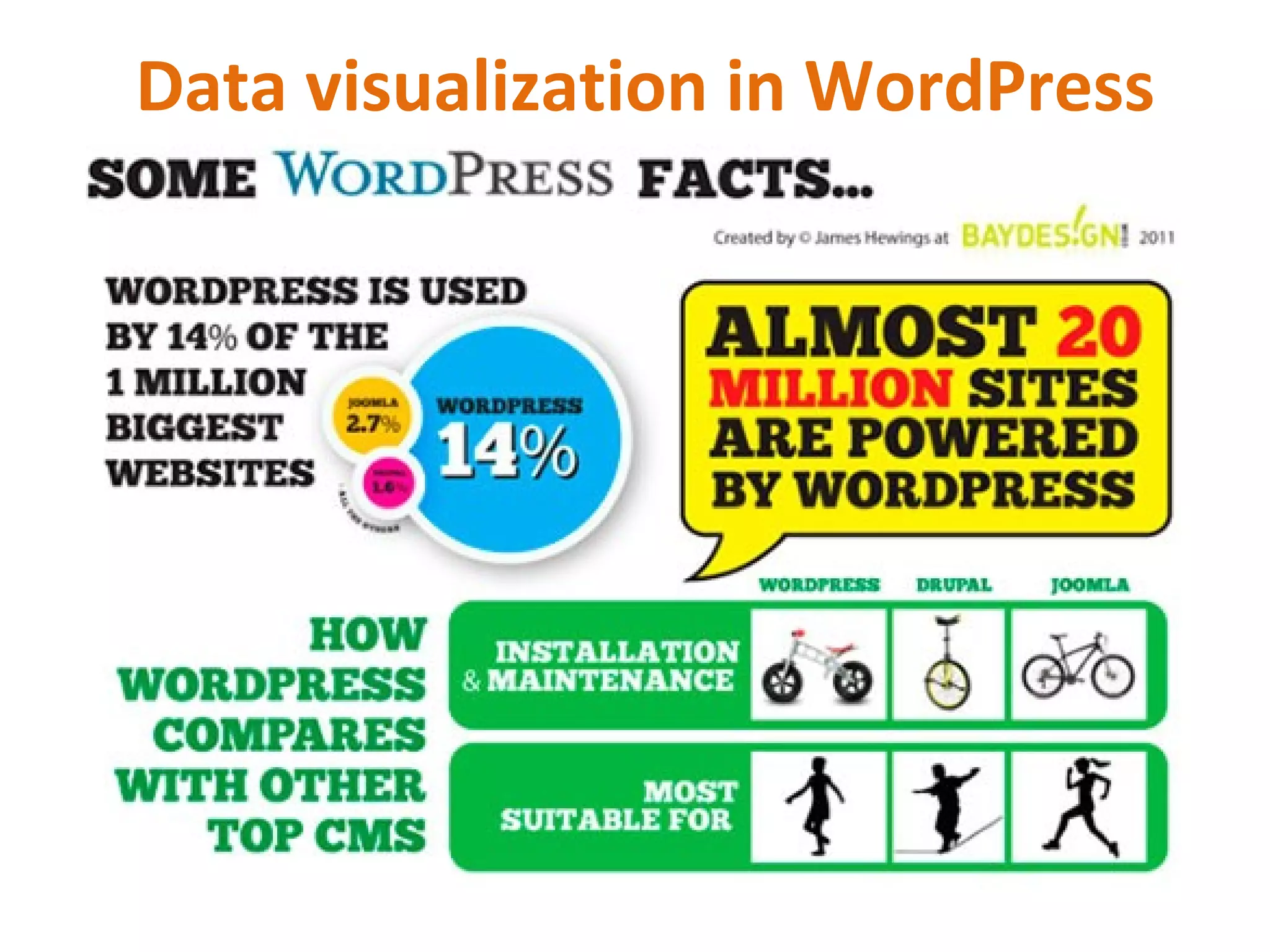

This document outlines how to build an effective nonprofit website using WordPress. It discusses using WordPress for storytelling, online fundraising, data visualization, newsrooms, contact pages, and landing pages. For each topic, it provides best practices, WordPress resources, and examples. The overall message is that WordPress is a powerful yet affordable open source platform for nonprofits to manage websites, engage supporters, and achieve their missions through compelling digital storytelling and calls to action.


![Computer Networks 01[1 using all terms].pptx](https://cdn.slidesharecdn.com/ss_thumbnails/computernetworks011-251214040533-327dd9f8-thumbnail.jpg?width=640&height=640&fit=bounds)


