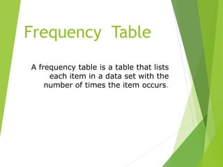
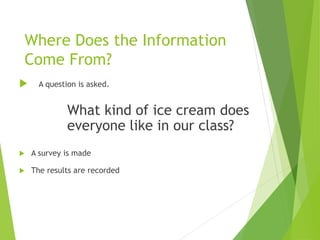
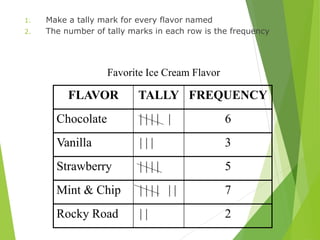
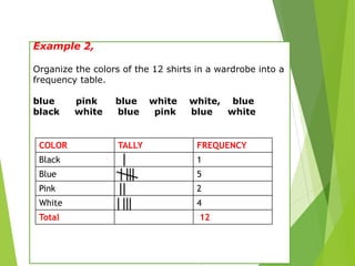
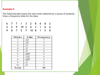
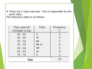
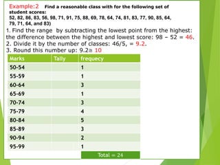
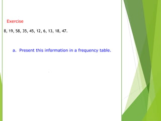
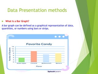
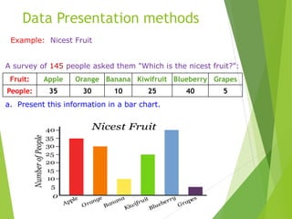
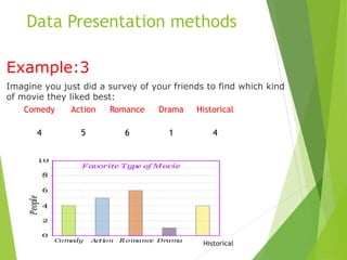
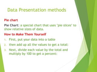
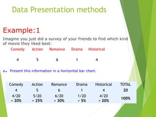
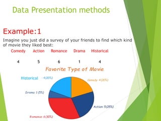
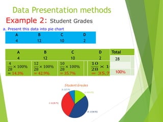
Data Presentation methods
 Frequency table
 • Bar chart •
 Pie chart •
 Histogram
 Pictogram
Frequency Table
A frequency table is a table that lists
each item in a data set with the
number of times the item occurs.
Where Does the Information
Come From?
 A question is asked.
What kind of ice cream does
everyone like in our class?
 A survey is made
 The results are recorded
1. Make a tally mark for every flavor named
2. The number of tally marks in each row is the frequency
FLAVOR TALLY FREQUENCY
Chocolate | | | | | 6
Vanilla | | | 3
Strawberry | | | | 5
Mint & Chip | | | | | | 7
Rocky Road | | 2
Favorite Ice Cream Flavor
Example 2,
Organize the colors of the 12 shirts in a wardrobe into a
frequency table.
blue pink blue white white, blue
black white blue pink blue white
COLOR TALLY FREQUENCY
Black 1
Blue 5
Pink 2
White 4
Total 12
Example 3
The marks awarded for an assignment set for a
class of 20 students were as follows:
6 7 5 7 7 8 7 6 9 7
4 10 6 8 8 9 5 6 4 8
Present this information in a frequency table.
6 7 7 1 3 2 8 6 8 2
4 4 9 10 2 6 3 1 6 6
9 8 7 5 7 10 8 1 5 8
Example:4
The following data shows the test marks obtained by a group of students.
Draw a frequency table for the data.
23, 24, 24, 23, 24, 25, 21
Example:5
Here are the temperatures at midday for 7 days (in ०C)
Frequency tables with Class Intervals
The data is grouped into class intervals if
the frequency table becomes too large to help us
organize, interpret and analyze the data. The frequency
of a class interval is the number of data values that fall
in the range specified by the interval.
Frequency Tables with Class Intervals
A frequency table for a data set containing a large
number of data values is constructed as follows:
•Determine the data range of the data set.
•Decide the width of the class intervals.
•Divide the range by the chosen width of the class
interval to determine the number of intervals.
Example 1
A school nurse weighed 30 students. Their weights (in
kg) were recorded as follows:
50 52 53 54 55 65 60 70 48 63
74 40 46 59 68 44 47 56 49 58
63 66 68 61 57 58 62 52 56 58
a. Present this information in a frequency table.
Solution:
a.
 There are 7 class intervals. This is reasonable for the
given data.
The frequency table is as follows:
Total
1. Find the range by subtracting the lowest point from the highest:
the difference between the highest and lowest score: 98 – 52 = 46.
2. Divide it by the number of classes: 46/5, = 9.2.
3. Round this number up: 9.2≅ 10
Example:2 Find a reasonable class with for the following set of
student scores:
52, 82, 86, 83, 56, 98, 71, 91, 75, 88, 69, 78, 64, 74, 81, 83, 77, 90, 85, 64,
79, 71, 64, and 83)
Marks Tally frequecy
50-54 1
55-59 1
60-64 3
65-69 1
70-74 3
75-79 4
80-84 5
85-89 3
90-94 2
95-99 1
Exercise
8, 19, 58, 35, 45, 12, 6, 13, 18, 47.
a. Present this information in a frequency table.
Data Presentation methods
 Frequency table
 Bar chart
 Pie chart •
 Histogram
 Pictogram
Data Presentation methods
 What is a Bar Graph?
A bar graph can be defined as a graphical representation of data,
quantities, or numbers using bars or strips.
Data Presentation methods
 Properties of Bar Graph
• A bar graph is the representation of numerical data by
rectangles (or bars) of equal width and varying height.
• The gap between one bar and another should be uniform
throughout.
• It can be either horizontal or vertical.
• The height or length of each bar relates directly to its value.
Data Presentation methods
 Types of Bar Graph
 Horizontal: Here, the bars are drawn horizontally from left to
right. The data categories are placed on the vertical axis and
numerical values are placed on the graph’s horizontal axis.
 Vertical: Here, the bars are drawn vertically from down to top.
Data Presentation methods
Example: Nicest Fruit
A survey of 145 people asked them "Which is the nicest fruit?":
a. Present this information in a bar chart.
Fruit: Apple Orange Banana Kiwifruit Blueberry Grapes
People: 35 30 10 25 40 5
Data Presentation methods
Example: Nicest Fruit
A survey of 145 people asked them "Which is the nicest fruit?":
a. Present this information in a bar chart.
 That group of people think Blueberries are the nicest.
Fruit: Apple Orange Banana Kiwifruit Blueberry Grapes
People: 35 30 10 25 40 5
Data Presentation methods
Example: Nicest Fruit
A survey of 145 people asked them "Which is the nicest fruit?":
a. Present this information in a vertical bar chart.
 That group of people think Blueberries are the nicest.
Fruit: Apple Orange Banana Kiwifruit Blueberry Grapes
People: 35 30 10 25 40 5
Data Presentation methods
Example: Nicest Fruit
A survey of 145 people asked them "Which is the nicest fruit?":
a. Present this information in a horizontal bar chart.
 That group of people think Blueberries are the nicest.
Fruit: Apple Orange Banana Kiwifruit Blueberry Grapes
People: 35 30 10 25 40 5
Data Presentation methods
Example:2 students grade
In a recent test, this many students got these grades:
a. Present this information in a bar chart.
Grade: A B C D
Students: 4 12 10 2
Data Presentation methods
Example:3
Imagine you just did a survey of your friends to find which kind
of movie they liked best:
Comedy Action Romance Drama Historical
4 5 6 1 4
Historical
Data Presentation methods
 Frequency table
 Bar chart
 Pie chart •
 Histogram
 Pictogram
Data Presentation methods
Pie chart
Pie Chart: a special chart that uses "pie slices" to
show relative sizes of data.
How to Make Them Yourself
1. First, put your data into a table
2. then add up all the values to get a total:
3. Next, divide each value by the total and
multiply by 100 to get a percent:
Data Presentation methods
Example:1
Imagine you just did a survey of your friends to find which kind
of movie they liked best:
a. Present this information in a horizontal bar chart.
Comedy Action Romance Drama Historical
4 5 6 1 4
Comedy Action Romance Drama Historical TOTAL
4 5 6 1 4 20
4/20
= 20%
5/20
= 25%
6/20
= 30%
1/20
= 5%
4/20
= 20%
100%
Data Presentation methods
Example:1
Imagine you just did a survey of your friends to find which kind
of movie they liked best:
Comedy Action Romance Drama Historical
4 5 6 1 4
Historical
Data Presentation methods
Example 2: Student Grades
a. Present this data into pie chart
A B C D
4 12 10 2
Total
28
A B C D
4 12 10 2
Data Presentation methods
Histograms
A histogram is represented by a set of rectangles,
adjacent to each other, where each bar represent a kind of
data.
How to Make a Histogram?
 The process of making a histogram using the given data is
described below:
• Step 1: Choose a suitable scale to represent on the
horizontal axis.
• Step 2: Choose a suitable scale to represent the
frequencies on the vertical axis.
 There is no space in between the bars.
Histograms
Example: 1 in a hospital, there are 20 newborn
babies whose ages in increasing order are as
follows: 1, 1, 1, 1, 2, 2, 2, 2, 2, 3, 3, 3, 3, 3, 3, 3, 3,
4, 4, 5.
a. Present this information histogram
This information can be shown in a frequency
distribution table as follows:
Age (in days) Frequency
1 4
2 5
3 8
4 2
5 1
Histograms
Example: 1 in a hospital, there are 20 newborn
babies whose ages in increasing order are as
follows: 1, 1, 1, 1, 2, 2, 2, 2, 2, 3, 3, 3, 3, 3, 3, 3, 3,
4, 4, 5.
a. Present this information histogram
This data can be now shown using a frequency
histogram.
Histograms
Example: 2 The table below shows the number of hours
students watch TV in one week.
a. Present this information histogram
Frequency
Number of hours of TV
15
1-3
17
4-6
16
7-9
Histograms
Choose an appropriate scale and interval for the vertical
axis. Te greatest value on the scale should be at least as
great as the greatest frequency.
 Choose an appropriate scale and interval for
the vertical axis. The greatest value on the
scale should be at least as great as the
greatest frequency.
Hours of Television
Watched
0
4
8
12
16
20
1-3 4-6 7-9
Hours
Number
of
students
Exercise Try this
The list below shows the results of a typing test in words per minute. Make a
histogram of the data.
62, 55, 68, 47, 50, 41, 62, 39, 54, 70, 56, 70, 56, 47, 64, 55, 60, 42
Results of typing test Frequency
39-46 3
47-54 4
55-62 7
63-70 4
0
1
2
3
4
5
6
7
Results of
Typing Test
39-46
47-54
55-62
63-72
Line plot
Definition A line plot is a graph that
displays the data by stacking X’s
above each data value on a number
line.
Making a Line Plot
 Suppose thirty people live in an apartment
building. These are the following ages:
58, 30, 37, 36, 34, 49, 35, 40, 47, 47, 39, 54, 47,
48, 54, 50, 35, 40, 38, 47, 48, 34, 40, 46, 49,
47, 35, 48, 47, 46
 Your first step should be: placing the values in
numerical order.
30, 34, 34, 35, 35, 35, 36, 37, 38, 39, 40, 40, 40,
46, 46, 47, 47, 47, 47, 47, 47, 48, 48, 48, 49,
49, 50, 54, 54, 58
This graph shows all the ages of the people who live in
the apartment building. It shows the youngest person is
30, and the oldest is 58. Most people in the building are
over 46 years of age. The most common age is 47.
EXAMPLE 2
The frequency table shows how many books the students
in a class read during summer vacation.
a. Make a line plot of the data.
SOLUTION
a. Make a line plot of the data.

Chapter 2, Data presentation methods.ppt

  • 1.
    Data Presentation methods Frequency table  • Bar chart •  Pie chart •  Histogram  Pictogram
  • 2.
    Frequency Table A frequencytable is a table that lists each item in a data set with the number of times the item occurs.
  • 3.
    Where Does theInformation Come From?  A question is asked. What kind of ice cream does everyone like in our class?  A survey is made  The results are recorded
  • 4.
    1. Make atally mark for every flavor named 2. The number of tally marks in each row is the frequency FLAVOR TALLY FREQUENCY Chocolate | | | | | 6 Vanilla | | | 3 Strawberry | | | | 5 Mint & Chip | | | | | | 7 Rocky Road | | 2 Favorite Ice Cream Flavor
  • 5.
    Example 2, Organize thecolors of the 12 shirts in a wardrobe into a frequency table. blue pink blue white white, blue black white blue pink blue white COLOR TALLY FREQUENCY Black 1 Blue 5 Pink 2 White 4 Total 12
  • 6.
    Example 3 The marksawarded for an assignment set for a class of 20 students were as follows: 6 7 5 7 7 8 7 6 9 7 4 10 6 8 8 9 5 6 4 8 Present this information in a frequency table.
  • 7.
    6 7 71 3 2 8 6 8 2 4 4 9 10 2 6 3 1 6 6 9 8 7 5 7 10 8 1 5 8 Example:4 The following data shows the test marks obtained by a group of students. Draw a frequency table for the data.
  • 8.
    23, 24, 24,23, 24, 25, 21 Example:5 Here are the temperatures at midday for 7 days (in ०C)
  • 9.
    Frequency tables withClass Intervals The data is grouped into class intervals if the frequency table becomes too large to help us organize, interpret and analyze the data. The frequency of a class interval is the number of data values that fall in the range specified by the interval. Frequency Tables with Class Intervals A frequency table for a data set containing a large number of data values is constructed as follows: •Determine the data range of the data set. •Decide the width of the class intervals. •Divide the range by the chosen width of the class interval to determine the number of intervals.
  • 10.
    Example 1 A schoolnurse weighed 30 students. Their weights (in kg) were recorded as follows: 50 52 53 54 55 65 60 70 48 63 74 40 46 59 68 44 47 56 49 58 63 66 68 61 57 58 62 52 56 58 a. Present this information in a frequency table. Solution: a.
  • 11.
     There are7 class intervals. This is reasonable for the given data. The frequency table is as follows: Total
  • 12.
    1. Find therange by subtracting the lowest point from the highest: the difference between the highest and lowest score: 98 – 52 = 46. 2. Divide it by the number of classes: 46/5, = 9.2. 3. Round this number up: 9.2≅ 10 Example:2 Find a reasonable class with for the following set of student scores: 52, 82, 86, 83, 56, 98, 71, 91, 75, 88, 69, 78, 64, 74, 81, 83, 77, 90, 85, 64, 79, 71, 64, and 83) Marks Tally frequecy 50-54 1 55-59 1 60-64 3 65-69 1 70-74 3 75-79 4 80-84 5 85-89 3 90-94 2 95-99 1
  • 13.
    Exercise 8, 19, 58,35, 45, 12, 6, 13, 18, 47. a. Present this information in a frequency table.
  • 14.
    Data Presentation methods Frequency table  Bar chart  Pie chart •  Histogram  Pictogram
  • 15.
    Data Presentation methods What is a Bar Graph? A bar graph can be defined as a graphical representation of data, quantities, or numbers using bars or strips.
  • 16.
    Data Presentation methods Properties of Bar Graph • A bar graph is the representation of numerical data by rectangles (or bars) of equal width and varying height. • The gap between one bar and another should be uniform throughout. • It can be either horizontal or vertical. • The height or length of each bar relates directly to its value.
  • 17.
    Data Presentation methods Types of Bar Graph  Horizontal: Here, the bars are drawn horizontally from left to right. The data categories are placed on the vertical axis and numerical values are placed on the graph’s horizontal axis.  Vertical: Here, the bars are drawn vertically from down to top.
  • 18.
    Data Presentation methods Example:Nicest Fruit A survey of 145 people asked them "Which is the nicest fruit?": a. Present this information in a bar chart. Fruit: Apple Orange Banana Kiwifruit Blueberry Grapes People: 35 30 10 25 40 5
  • 19.
    Data Presentation methods Example:Nicest Fruit A survey of 145 people asked them "Which is the nicest fruit?": a. Present this information in a bar chart.  That group of people think Blueberries are the nicest. Fruit: Apple Orange Banana Kiwifruit Blueberry Grapes People: 35 30 10 25 40 5
  • 20.
    Data Presentation methods Example:Nicest Fruit A survey of 145 people asked them "Which is the nicest fruit?": a. Present this information in a vertical bar chart.  That group of people think Blueberries are the nicest. Fruit: Apple Orange Banana Kiwifruit Blueberry Grapes People: 35 30 10 25 40 5
  • 21.
    Data Presentation methods Example:Nicest Fruit A survey of 145 people asked them "Which is the nicest fruit?": a. Present this information in a horizontal bar chart.  That group of people think Blueberries are the nicest. Fruit: Apple Orange Banana Kiwifruit Blueberry Grapes People: 35 30 10 25 40 5
  • 22.
    Data Presentation methods Example:2students grade In a recent test, this many students got these grades: a. Present this information in a bar chart. Grade: A B C D Students: 4 12 10 2
  • 23.
    Data Presentation methods Example:3 Imagineyou just did a survey of your friends to find which kind of movie they liked best: Comedy Action Romance Drama Historical 4 5 6 1 4 Historical
  • 24.
    Data Presentation methods Frequency table  Bar chart  Pie chart •  Histogram  Pictogram
  • 25.
    Data Presentation methods Piechart Pie Chart: a special chart that uses "pie slices" to show relative sizes of data. How to Make Them Yourself 1. First, put your data into a table 2. then add up all the values to get a total: 3. Next, divide each value by the total and multiply by 100 to get a percent:
  • 26.
    Data Presentation methods Example:1 Imagineyou just did a survey of your friends to find which kind of movie they liked best: a. Present this information in a horizontal bar chart. Comedy Action Romance Drama Historical 4 5 6 1 4 Comedy Action Romance Drama Historical TOTAL 4 5 6 1 4 20 4/20 = 20% 5/20 = 25% 6/20 = 30% 1/20 = 5% 4/20 = 20% 100%
  • 27.
    Data Presentation methods Example:1 Imagineyou just did a survey of your friends to find which kind of movie they liked best: Comedy Action Romance Drama Historical 4 5 6 1 4 Historical
  • 28.
    Data Presentation methods Example2: Student Grades a. Present this data into pie chart A B C D 4 12 10 2 Total 28 A B C D 4 12 10 2
  • 29.
    Data Presentation methods Histograms Ahistogram is represented by a set of rectangles, adjacent to each other, where each bar represent a kind of data. How to Make a Histogram?  The process of making a histogram using the given data is described below: • Step 1: Choose a suitable scale to represent on the horizontal axis. • Step 2: Choose a suitable scale to represent the frequencies on the vertical axis.  There is no space in between the bars.
  • 30.
    Histograms Example: 1 ina hospital, there are 20 newborn babies whose ages in increasing order are as follows: 1, 1, 1, 1, 2, 2, 2, 2, 2, 3, 3, 3, 3, 3, 3, 3, 3, 4, 4, 5. a. Present this information histogram This information can be shown in a frequency distribution table as follows: Age (in days) Frequency 1 4 2 5 3 8 4 2 5 1
  • 31.
    Histograms Example: 1 ina hospital, there are 20 newborn babies whose ages in increasing order are as follows: 1, 1, 1, 1, 2, 2, 2, 2, 2, 3, 3, 3, 3, 3, 3, 3, 3, 4, 4, 5. a. Present this information histogram This data can be now shown using a frequency histogram.
  • 32.
    Histograms Example: 2 Thetable below shows the number of hours students watch TV in one week. a. Present this information histogram Frequency Number of hours of TV 15 1-3 17 4-6 16 7-9
  • 33.
    Histograms Choose an appropriatescale and interval for the vertical axis. Te greatest value on the scale should be at least as great as the greatest frequency.  Choose an appropriate scale and interval for the vertical axis. The greatest value on the scale should be at least as great as the greatest frequency. Hours of Television Watched 0 4 8 12 16 20 1-3 4-6 7-9 Hours Number of students
  • 34.
    Exercise Try this Thelist below shows the results of a typing test in words per minute. Make a histogram of the data. 62, 55, 68, 47, 50, 41, 62, 39, 54, 70, 56, 70, 56, 47, 64, 55, 60, 42 Results of typing test Frequency 39-46 3 47-54 4 55-62 7 63-70 4
  • 35.
  • 36.
    Line plot Definition Aline plot is a graph that displays the data by stacking X’s above each data value on a number line.
  • 37.
    Making a LinePlot  Suppose thirty people live in an apartment building. These are the following ages: 58, 30, 37, 36, 34, 49, 35, 40, 47, 47, 39, 54, 47, 48, 54, 50, 35, 40, 38, 47, 48, 34, 40, 46, 49, 47, 35, 48, 47, 46  Your first step should be: placing the values in numerical order. 30, 34, 34, 35, 35, 35, 36, 37, 38, 39, 40, 40, 40, 46, 46, 47, 47, 47, 47, 47, 47, 48, 48, 48, 49, 49, 50, 54, 54, 58
  • 38.
    This graph showsall the ages of the people who live in the apartment building. It shows the youngest person is 30, and the oldest is 58. Most people in the building are over 46 years of age. The most common age is 47.
  • 39.
    EXAMPLE 2 The frequencytable shows how many books the students in a class read during summer vacation. a. Make a line plot of the data.
  • 40.
    SOLUTION a. Make aline plot of the data.