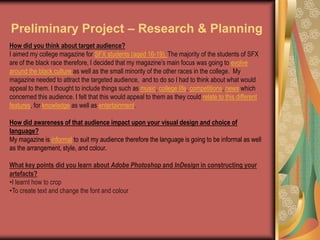
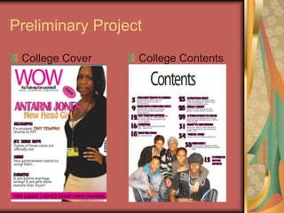
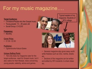
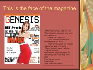
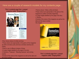
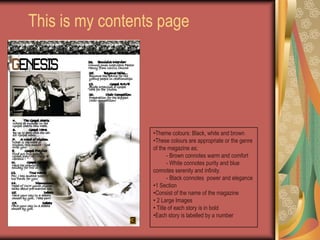
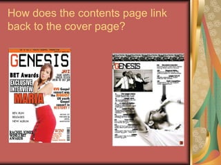
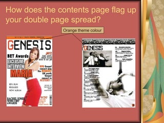
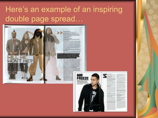
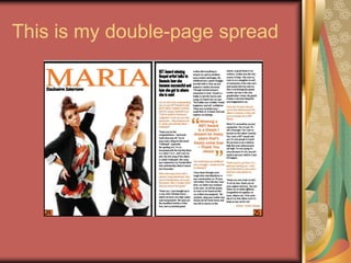
AS MEDIASTUDIESFOUNDATION PORTFOLIORESEARCH & PLANNINGCENTRE NO: 11049ST FRANCIS XAVIER COLLEGE
My name is: 	OghenevorkeKalusi-GbekeCandidate No: 1284
Preliminary Project – Research & PlanningHow did you think about target audience?I aimed my college magazine for SFX students (aged 16-19). The majority of the students of SFX are of the black race therefore, I decided that my magazine’s main focus was going to evolve around the black culture as well as the small minority of the other races in the college.  My magazine needed to attract the targeted audience,  and to do so I had to think about what would appeal to them. I thought to include things such as music, college life, competitions, news which concerned this audience. I felt that this would appeal to them as they could relate to this different features, for knowledge as well as entertainment. How did awareness of that audience impact upon your visual design and choice of language?My magazine is informal to suit my audience therefore the language is going to be informal as well as the arrangement, style, and colour.  What key points did you learn about Adobe Photoshop and InDesign in constructing your artefacts?I learnt how to crop
To create text and change the font and colourPreliminary ProjectCollege CoverCollege Contents
Reflections & FeedbackWhat would you do differently next time?I would do many things differently next time. Next time I would make sure that I structure my time well so that I would not miss any deadlines. I would also attend the Media Studies after college sessions at least twice a week to help with my knowledge of Adobe Photoshop and InDesign. I would make sure that if I did not understand or know something I would ask for help so I could understand. What kind of feedback did you get that might influence you?From my evaluation and feedback given by my target audience there are quite a few things that I would change. Firstly, I got some feedback that my front cover somehow looked like a poster – this is because the cover lines are in line, same font, same colour and sizes. Next time, I would change the fonts of the different cover lines and let my main story be bold and bigger so it would stand out from the rest. Secondly, I evaluated that my contents page did not have a professional look. It did not look like and was not similar to content pages of my research, therefore, next time to get a professional look I will section the contents of the magazine to different categories – this will also be user friendly. Feedback showed that the image that I used on my contents page was too big and it needed more pictures. Next time I would use a few more pictures, which will appeal to my target audience. What aspects of your understanding of Adobe Photoshop and InDesign do you need to improve?I started this course with no understanding of Adobe Photoshop and InDesign. To date, I have a basic knowledge on how to use this programs. I am now able to edit a photo in Adobe Photoshop and  edit text in Adobe InDesign however, I will need to improve on this knowledge.
The music genre of my music magazine is:Genre? The genre of my music magazine is Gospel which is associated with Christianity.Chosen title? The title of my music magazine is Genesis. I felt this would be an appropriate name for my music magazine as Gospel is associated with Christianity, I wanted the title to reflect this link so the target audience will associate the title with this as well. Therefore as Genesis has religious connotations (first book of Christians holy book – the bible), the title is then linked with this idea which is linked to Gospel.
Research:As part of research for this project, I studied two Gospel magazines which are shown below:Gospel TruthGospel USA
Research:Freebies – Appeals to target audienceTheme colours: Black and red. Red has connotations of energy, strength, power, determination as well as passion, desire, and love.Bold title – Stands out and it’s the biggest text on the pageLogoBarcodeDateClose up imagePromoting their websiteThe contentImage dominantly portraying the black racePriceWhite cover lines stand out from dark background White background makes the text stand out and has connotations of goodness, innocence and purity which can be associated with the Christian faith.Target Audience:   Christians/People who like Gospel music
  Mainly black people
  Age: 30+
  Social Status: A – E (everyone)Gospel artist: Marvin Sapp who will appeal to its target audience as he is well known.
For my music magazine….Typical readers of my magazine: Students of SFX collegeTarget Audience:   Christians/People who like Gospel music
   Young people: 13 – 29 years old
   Social Group: C1/C2/DFrequency:   MonthlyCover Price:   £1.50 - £2.50Publisher:   Oghenevorke Kalusi-GbekeUnique Selling Point:    Not only does my magazine cater for the  target audiences  need for Gospel music, but it also caters for their lifestyle, news concerning young people, celebrity, advice and games.
   Genesis magazine also gives away worth while freebies such as CDs, t-shirts, tickets etc.
   Sections of the magazine can be written and edited by SFX students: to share ideas etc.This is the face of the magazineTheme colours: Orange, Black and white
These colours are appropriate or the genre of the magazine as;          - Orange connotes warmth         - White connotes purity and blue connotes serenity and infinity.         - Black connotes  power and eleganceColour of text relate to the image
 Different shades of orange = effective
7 bold sub headings
Main cover line story Is the biggest and boldest linking to the main image of the model
Price, date and barcode
Issue Number

Media presentation.final

  • 1.
    AS MEDIASTUDIESFOUNDATION PORTFOLIORESEARCH& PLANNINGCENTRE NO: 11049ST FRANCIS XAVIER COLLEGE
  • 2.
    My name is: OghenevorkeKalusi-GbekeCandidate No: 1284
  • 3.
    Preliminary Project –Research & PlanningHow did you think about target audience?I aimed my college magazine for SFX students (aged 16-19). The majority of the students of SFX are of the black race therefore, I decided that my magazine’s main focus was going to evolve around the black culture as well as the small minority of the other races in the college. My magazine needed to attract the targeted audience, and to do so I had to think about what would appeal to them. I thought to include things such as music, college life, competitions, news which concerned this audience. I felt that this would appeal to them as they could relate to this different features, for knowledge as well as entertainment. How did awareness of that audience impact upon your visual design and choice of language?My magazine is informal to suit my audience therefore the language is going to be informal as well as the arrangement, style, and colour. What key points did you learn about Adobe Photoshop and InDesign in constructing your artefacts?I learnt how to crop
  • 4.
    To create textand change the font and colourPreliminary ProjectCollege CoverCollege Contents
  • 5.
    Reflections & FeedbackWhatwould you do differently next time?I would do many things differently next time. Next time I would make sure that I structure my time well so that I would not miss any deadlines. I would also attend the Media Studies after college sessions at least twice a week to help with my knowledge of Adobe Photoshop and InDesign. I would make sure that if I did not understand or know something I would ask for help so I could understand. What kind of feedback did you get that might influence you?From my evaluation and feedback given by my target audience there are quite a few things that I would change. Firstly, I got some feedback that my front cover somehow looked like a poster – this is because the cover lines are in line, same font, same colour and sizes. Next time, I would change the fonts of the different cover lines and let my main story be bold and bigger so it would stand out from the rest. Secondly, I evaluated that my contents page did not have a professional look. It did not look like and was not similar to content pages of my research, therefore, next time to get a professional look I will section the contents of the magazine to different categories – this will also be user friendly. Feedback showed that the image that I used on my contents page was too big and it needed more pictures. Next time I would use a few more pictures, which will appeal to my target audience. What aspects of your understanding of Adobe Photoshop and InDesign do you need to improve?I started this course with no understanding of Adobe Photoshop and InDesign. To date, I have a basic knowledge on how to use this programs. I am now able to edit a photo in Adobe Photoshop and edit text in Adobe InDesign however, I will need to improve on this knowledge.
  • 6.
    The music genreof my music magazine is:Genre? The genre of my music magazine is Gospel which is associated with Christianity.Chosen title? The title of my music magazine is Genesis. I felt this would be an appropriate name for my music magazine as Gospel is associated with Christianity, I wanted the title to reflect this link so the target audience will associate the title with this as well. Therefore as Genesis has religious connotations (first book of Christians holy book – the bible), the title is then linked with this idea which is linked to Gospel.
  • 7.
    Research:As part ofresearch for this project, I studied two Gospel magazines which are shown below:Gospel TruthGospel USA
  • 8.
    Research:Freebies – Appealsto target audienceTheme colours: Black and red. Red has connotations of energy, strength, power, determination as well as passion, desire, and love.Bold title – Stands out and it’s the biggest text on the pageLogoBarcodeDateClose up imagePromoting their websiteThe contentImage dominantly portraying the black racePriceWhite cover lines stand out from dark background White background makes the text stand out and has connotations of goodness, innocence and purity which can be associated with the Christian faith.Target Audience: Christians/People who like Gospel music
  • 9.
    Mainlyblack people
  • 10.
  • 11.
    SocialStatus: A – E (everyone)Gospel artist: Marvin Sapp who will appeal to its target audience as he is well known.
  • 12.
    For my musicmagazine….Typical readers of my magazine: Students of SFX collegeTarget Audience: Christians/People who like Gospel music
  • 13.
    Young people: 13 – 29 years old
  • 14.
    Social Group: C1/C2/DFrequency: MonthlyCover Price: £1.50 - £2.50Publisher: Oghenevorke Kalusi-GbekeUnique Selling Point: Not only does my magazine cater for the target audiences need for Gospel music, but it also caters for their lifestyle, news concerning young people, celebrity, advice and games.
  • 15.
    Genesis magazine also gives away worth while freebies such as CDs, t-shirts, tickets etc.
  • 16.
    Sections of the magazine can be written and edited by SFX students: to share ideas etc.This is the face of the magazineTheme colours: Orange, Black and white
  • 17.
    These colours areappropriate or the genre of the magazine as; - Orange connotes warmth - White connotes purity and blue connotes serenity and infinity. - Black connotes power and eleganceColour of text relate to the image
  • 18.
    Different shadesof orange = effective
  • 19.
    7 bold subheadings
  • 20.
    Main cover linestory Is the biggest and boldest linking to the main image of the model
  • 21.
  • 22.