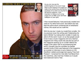
1. As you can now see the
positioning/size of my cover image
takes up the majority of my page as it
really is the central focus and that the
popularity of my artist is so big that he
will sell the magazine. I took
inspiration to feature such as big
image from an NME cover with Noel
Gallagher on (see right)
I then reused features I had previously created and
used on my other front cover, the bottom bar was
kept the same which contained lots of artist/band
names, this would act as a sell line.
With the sky bar I made my model Dom smaller. On
my previous cover the writing said ‘Celebrating the
best of British’ by making Dom smaller it made me
able to fit the word ‘music’ on so that people would
know it was a music magazine and not a fashion
magazine etc if they could only see the top part of
the magazine sticking up on a shelf. Before the
image in the colour had no accompanying text
which I thought may be a problem as people
wouldn’t know if Dom was featured in the magazine
as a poster or interview or just a feature on him
therefore I added anchorage text saying ‘Free Carl
Posters!’. I renamed him Carl after Carl Barat from
the Libertines, also Carl has 4 letters so it would
look balanced next to ‘free’.
2. Using a constant font I
added the masthead GSOQ.
in underneath I had the
------find out what the word
is---- saying ‘God save the
queen’ explaining the GSOQ
meaning, this is also similar
to NME where they
sometimes feature new
musical express in smaller
writing.
Also added was:
-The date
- ‘ AIDAN MUNNELLY
EXCLUSIVE INTERVIEW’
again using the same font, I
had ‘Aidan Munnelly’ in big
letters so it really stood out
however was kept within the
image.
3. = ORANGE and TEAL
other colours that feature quite a
lot are yellow and red however
they are more secondary features
I chose orange as it really stood out against the white background
and image therefore was striking and caught peoples attention, the
teal blue colour was also used as it completely contrasted with the
orange but worked well. However orange was the main colour and
this colour will continue through my pages and be the constant
4. Next added was a circle, I again used the teal colour, as
the space was only small in the circle to write in, I chose
TITP 2013. ‘TITP’ is short for T in the Park a popular UK
festival, and acted as an anchorage to lure in readers
who were interested in that festival. The 2013 showed
that it would be about the upcoming festival so may
contain news about the line up and make them want to
buy the magazine. Next to that button like shape, I
included the official T in the Park logo incase people were
unfamiliar with the acronym TITP. It also worked well
because the logo featured the colours yellow and red
which picked up on my bottom bar.
To fill up the remaining white space, I
added other musician names and an
article which would be featured inside
called ’50 best front men’, this offered an
insight into what would be inside the
magazine
5. • As a finishing touch I added a dark grey gradient fading into the previous white
background. This made it look more professional and less plain/dull.
6. • As a finishing touch I added a dark grey gradient fading into the previous white
background. This made it look more professional and less plain/dull.