
Recommended
More Related Content
What's hot
What's hot (20)
Viewers also liked
Similar to Question 1
Similar to Question 1 (20)
Recently uploaded
Recently uploaded (20)
Question 1
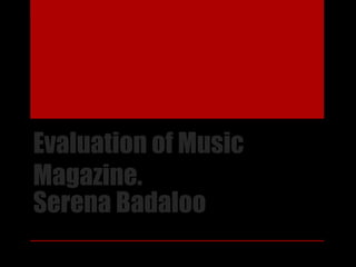
- 1. Evaluation of Music Magazine. Serena Badaloo
- 2. Forms & Conventions(cover) Q1: In what ways does your media product use, develop or challenge forms and conventions of real media product? • All of the forms & conventions that I have used in my first page are: coverlines, dateline, headline, masthead, cover image, selling line, and a sub-heading. These are all the things that made up my front cover.
- 3. Masthead • From the image you can see that I have made it stand out by adding a big font and size so that it is the first thing you can see on the page, and so that it is obvious that ‘NRM’ is the title of the magazine, and this stand for ‘No Role Modelz’. To make the finishing touches to it you can see that I have put I a ‘stroke’ which basically gives it more depth to the text.
- 4. Coverlines • To grab the audiences attention I made sure that I made there be the wel-known music artist’s in RnB so that people would want to read more. I included celebrities such as Rihanna, J-cole and Drake because they were some of my favorite artist’s that would match the audience to the genre of music I based my magazine on which was RnB and HipHop.
- 5. Headline • For my front cover was ‘Tyler’ I made sure that you could see his name clearly, and I also placed it in front of the cover image so that it was very obvious that it was him. I also made it a different font to all the others and made sure that it wasn’t in sync with the others that were on the page. The size of his name I also made sure was very big, but not so that it would overpower my masthead.
- 6. Selling Line • I decided to put this above my masthead because I felt that it would be the first thing people see when they are looking at the front page. I also thought that by putting ‘a one time production RnB & Hip Hop’ I decided that this sentence made the magazine more clear of what it is all about. For this as you can see I used the stroke effect but not too dense but so that the words were noticeable. Just to finish it all off decided to underline it to give it it’s title.
- 7. Cover Image • For my magazine I used a few effects on the person I chose to take a picture of which was tyler. I made the muscle in his arm bigger by using the smudge tool in the programme photo shop, then I decided to add a shadow which in the original image there was no depth in the picture at al, so I thought that by including all these effects in my photo of tyler it would then make the image of him come across as more intimidating. I wanted to make sure that I caught the audiences attention of the main image on the page and for it to relate to the genre. I gave him that ‘badass’ look in a way but I also think I made the image complete by having my model wear branded clothing such as the calvin klein boxers that he was wearing in the photo. I also made sure that he made eye contact with the camera and having a serious face as well.
- 8. Dateline • This was an accessory to my magazine, it doesn’t have that much meaning for my front cover apart from when people buy my magazine they would want to know how late the magazine had been published, also how many days old the magazine might be because sometimes people will buy a magazine one day old so not the actual date of the day they decide to purchase one.
- 9. Sub-heading • This was ‘Master of Music’ and it linked in very well with cover image, and it all came together really nice, because of my color scheme was black, white and red, the red was mainly the color that was used to make the important things on my page stand out, hence why I decided to make ‘Master of Music’ be in red with a black ‘stroke’ to make the sub-heading more bold.
- 10. Contents- dateline • For my dateline I only included the month and the year because it didn’t need to be written twice. I decided to place it it in the top left corner, but also so it’s the first thing you see on the page.
- 11. Page Numbers • I then had my page numbers and I decided to lay it out after my stories, I started it from a page number of 6 going up to 14. I then made the font bold so that you can see clearly which ones which.
- 12. Graphics • Next was my graphics and as you can see I have made red blocks to outline my text. I only used them to make the important information stand out on the page, because my color scheme was red, white and black I chose to have red as the dominant color in my front cover, contents and article. Also you can see that I highlighted the name of my celebrities in red because they are important to my magazine and also it is the first thing that you would be reading because it is very bright and clear that those are the main focuses in the magazine.
- 13. Artist name • For this it was important that I chose my artists wisely simply because it reflected back onto the genre which I chose to focus my magazine on. So as you can see from my front cover I have mentioned artists such as Rihanna, Drake and J Cole and these are very loved people by their fans and they would read anything to do with them, this is why I thought about who I would have in my magazine to make it more interesting and make people want to read about it. Then the other 4 artists I made up, and those names were Krisanne, Imogen, Tyler and Callum I created a theses artists and made them have that certain reputation and what they are best known for which is Grime, Hip Hop and RnB.
- 14. Title • For my title I made it be ‘CONTENTS’ just because I felt that it didn’t need another title because everything was on my front cover, I did this to get straight to the point so that the audience know what they are reading straight away. I made it the biggest thing on the page so that it was very noticeable and easy to see I also outlined it in red, this color shows being alert and that’s what I wanted to get across the audience so they know what that specific page is all about.
- 15. Feature Article • I have featured 3 main articles all together from my contents and the stories that the audience are reading about, these are Krisanne, Krissy& Imogen and lastly Tyler & Callum. I have basically written tasters of these so that the audience have a little bit of flavor about what will be going on in these articles. For example in Ty& Cal’s I have mentioned them being a duo and creating grime and RnB music but I have said enough for the audience to be interested but not too much so I give the story away.
- 16. Pull Quote • I included a quote from one of the artists I had made up (tyler) right at the bottom of my contents page, this was to give a reminder that Tyler is the ‘master of music’ the quote said by tyler was “my aspiration is to inspire the younger generation and make a change to the world”. This quote I felt would really draw the audiences attention because it shows that Tyler takes a real passion to music just like other people so this would be an inspiration to them reading it and would make them want to read more about my article.
- 17. Article • Drop Cap- this was inserted into my text to make the sentence starter more noticeable and so that you would know where to look, most magazines have a drop cap in them so to make it look more like an article and story page I added a drop cap.
- 18. Headline The headline for my article is 'Tyler Graham' and this I feel stands out a lot because of the font I decided to use and also where I placed it on the page, it was on the right hand side of my article page and was near the top of the page so this meant that it was the first thing you saw, and this also meant that the main image for my article you would know what the name of the person was because of how I presented and had the page laid out.
- 19. Insert image As you can see from this image I decided to include this in my article and the reason for this is because my topic was around Tyler and the people he was producing music with so I thought that it would be a good idea to put and insert image in so that the focus is not fully on Tyler so added callum into the text to make things more interesting. I placed this in the middle of my two columns so that it drew the audience in.
- 20. Photoshoot image My main big photo was of tyler and this was a very effective photo, because he is making eye contact with the audience and I also made the image a reasonable size so that my audience would know which was the main photo of my article.