Download to read offline
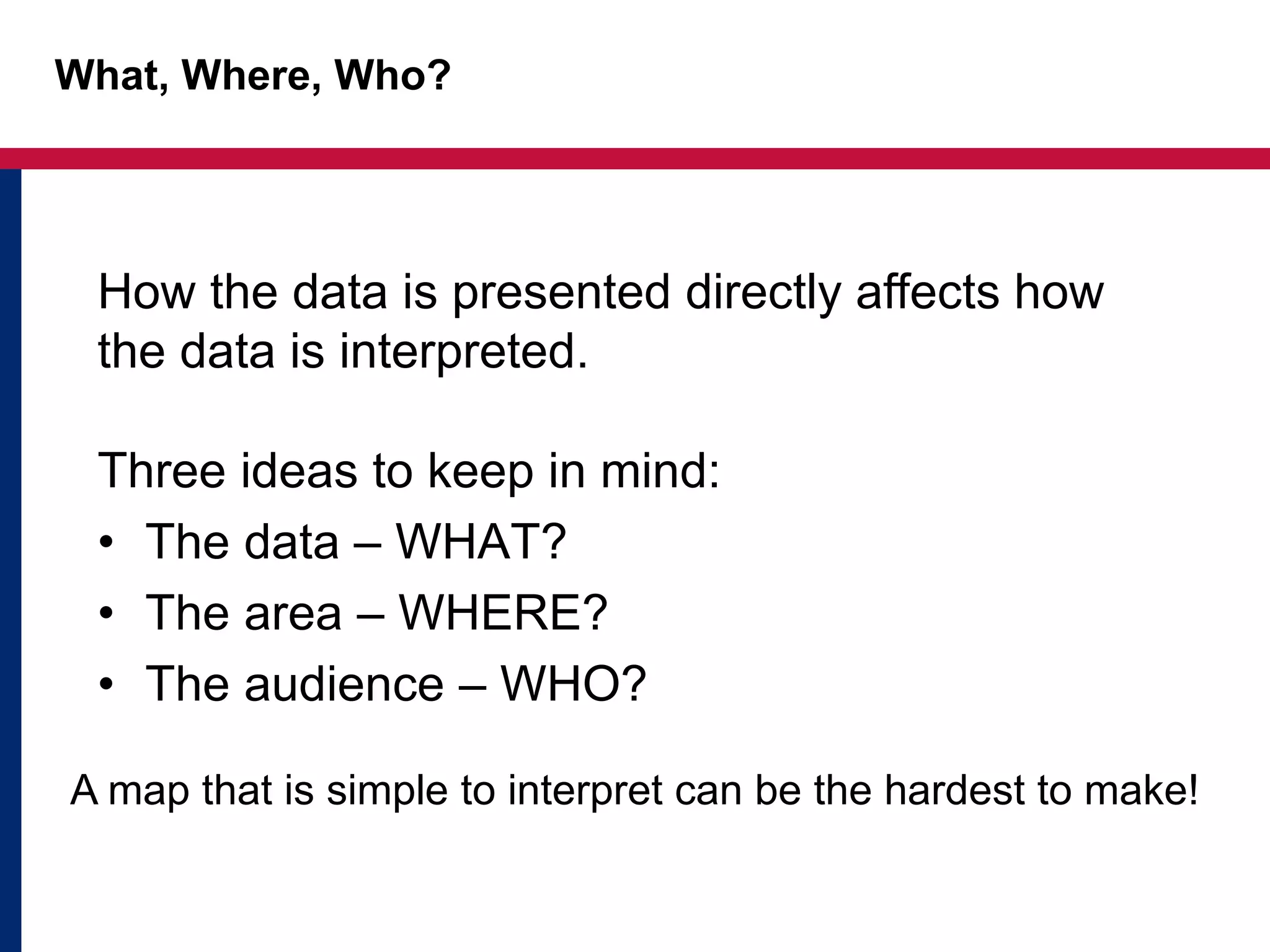
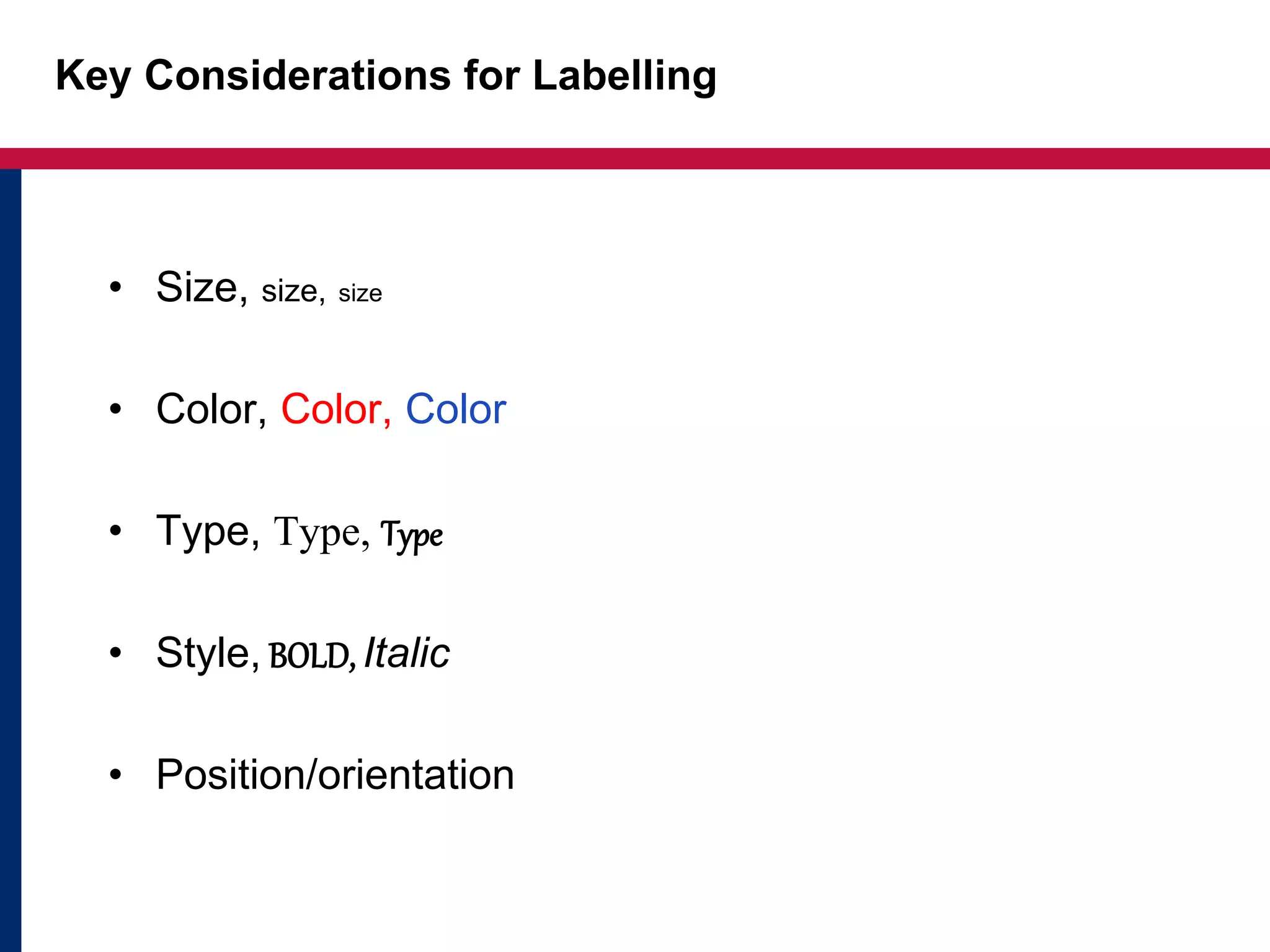
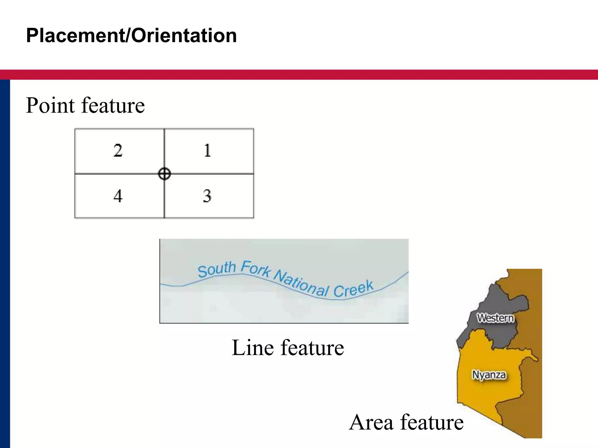
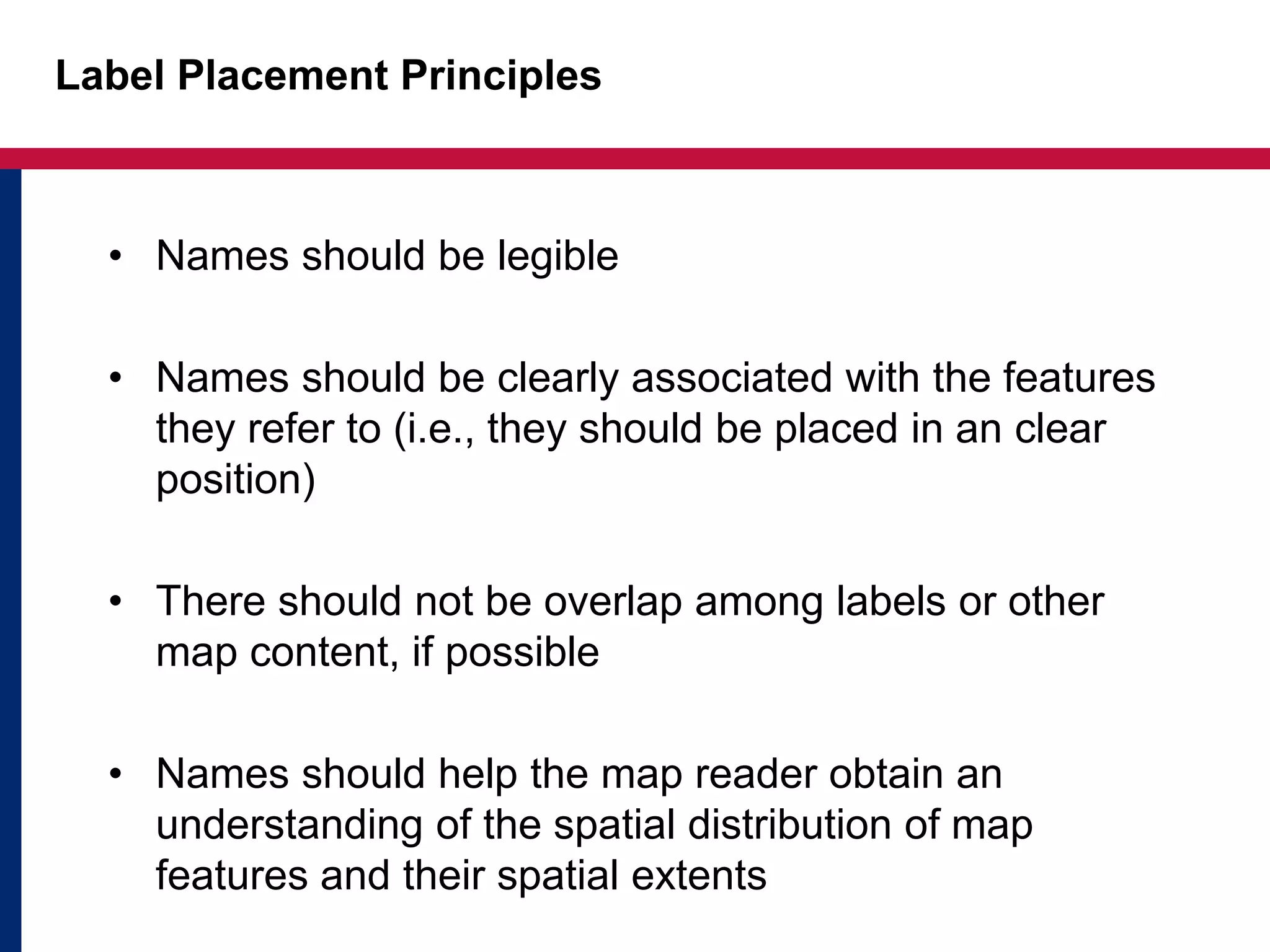
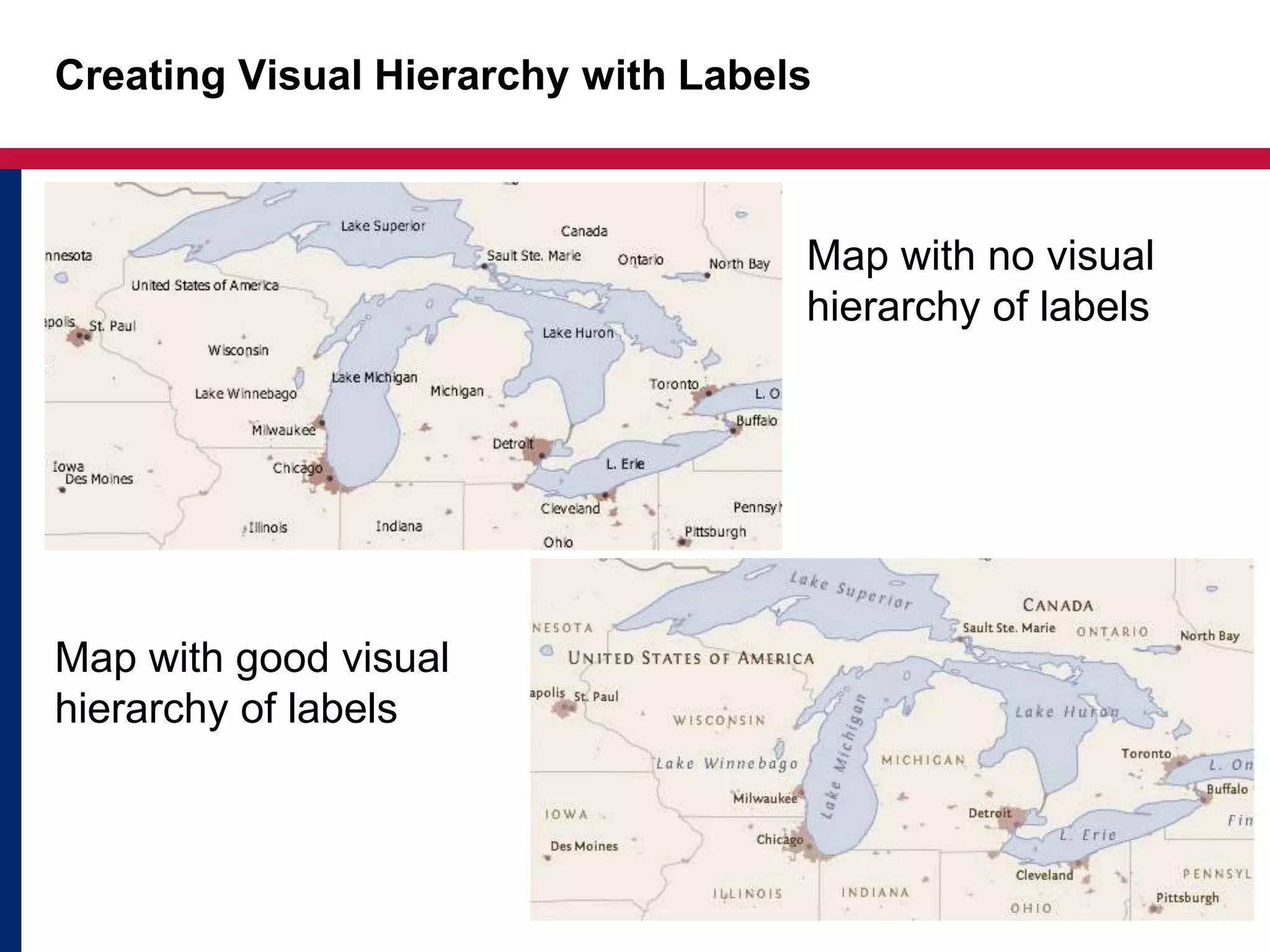
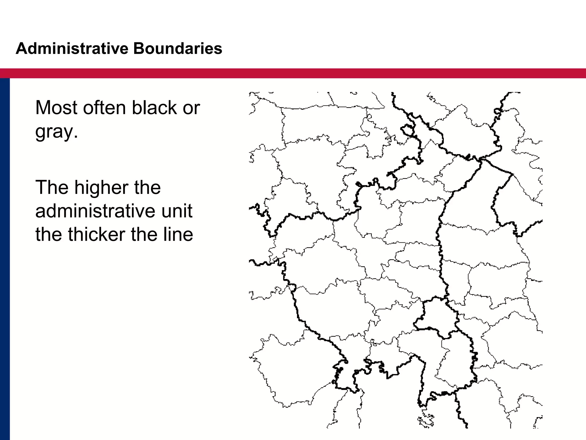
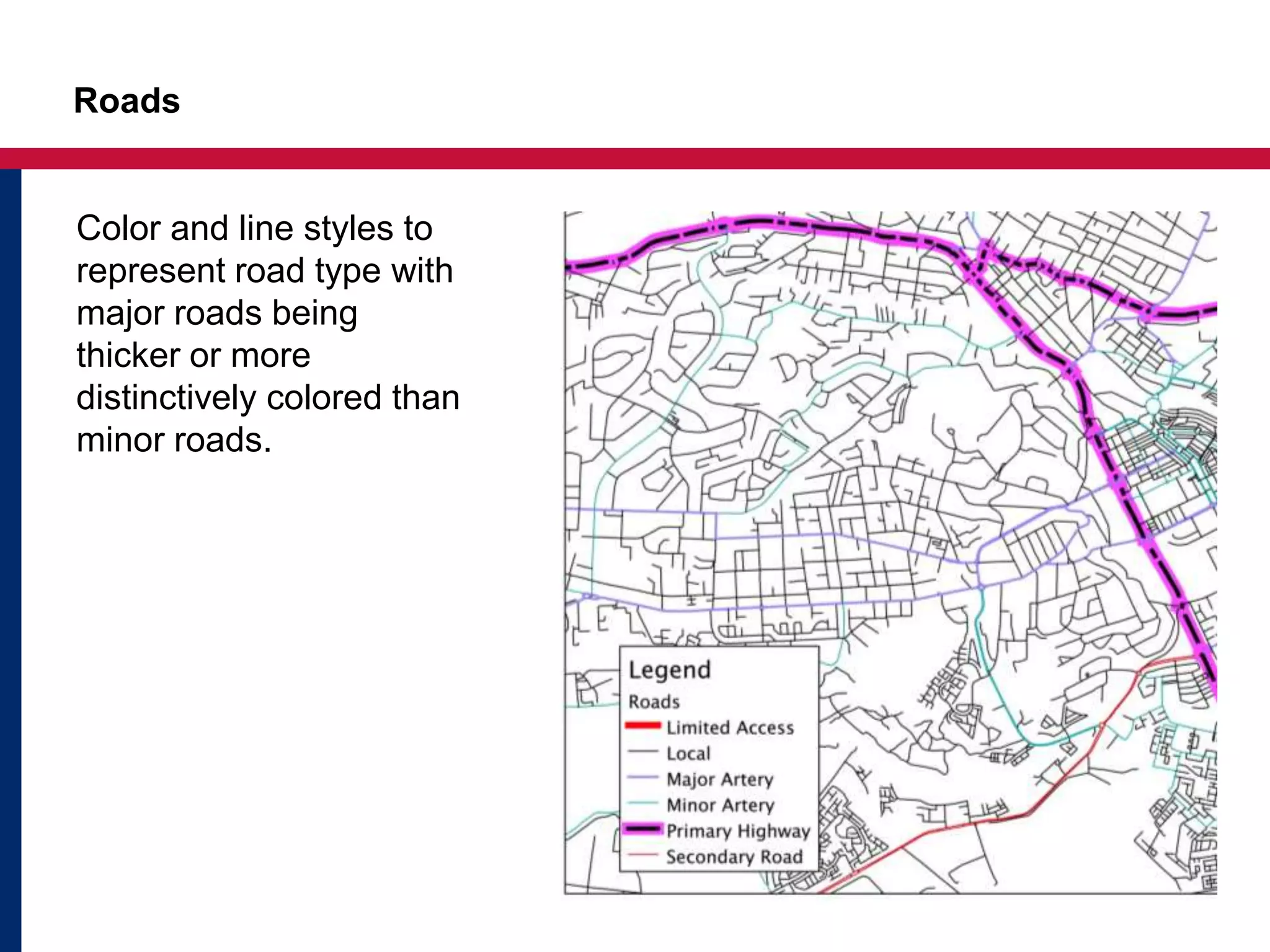
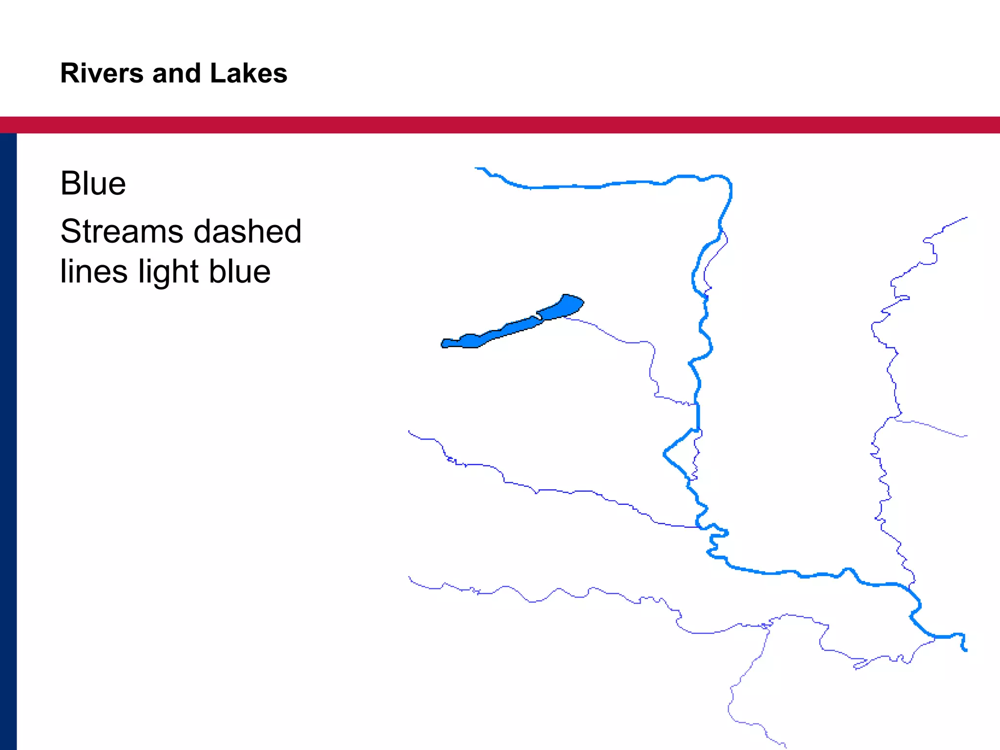


The document discusses key concepts for effectively labeling maps. It emphasizes considering the data, area, and audience to determine labeling. Size, color, type, style and position are important factors for legible labels that clearly associate with features. Labels should avoid overlap and help readers understand spatial distributions. Creating a visual hierarchy with varying label sizes establishes an order. While not required, following cartographic standards makes maps more readable. These standards provide conventions for administrative boundaries, roads, and hydrography labeling. The document stresses labels are an important design element and asks the three W's to guide labeling decisions.


