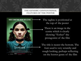
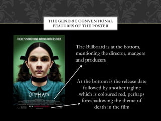
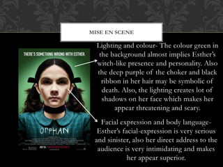
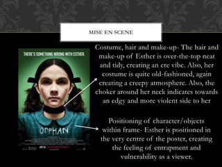
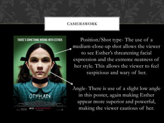
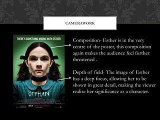
POSTER ANALYSIS- ORPHAN 
By Olivia Houlton
THE GENERIC CONVENTIONAL 
FEATURES OF THE POSTER 
The tagline is positioned at 
the top of the poster 
There is an image in the 
centre which is clearly 
showing “Esther” the 
protagonist of the film 
The title is nearer the bottom. The 
font used is very scratchy and 
rough looking, perhaps reflecting 
on the horror genre of the film
THE GENERIC CONVENTIONAL 
FEATURES OF THE POSTER 
The Billboard is at the bottom, 
mentioning the director, mangers 
and producers 
At the bottom is the release date 
followed by another tagline 
which is coloured red, perhaps 
foreshadowing the theme of 
death in the film
MISE EN SCENE 
Lighting and colour- The colour green in 
the background almost implies Esther’s 
witch-like presence and personality. Also 
the deep purple of the choker and black 
ribbon in her hair may be symbolic of 
death. Also, the lighting creates lot of 
shadows on her face which makes her 
appear threatening and scary. 
Facial expression and body language- 
Esther’s facial-expression is very serious 
and sinister, also her direct address to the 
audience is very intimidating and makes 
her appear superior.
MISE EN SCENE 
Costume, hair and make-up- The hair and 
make-up of Esther is over-the-top neat 
and tidy, creating an ere vibe. Also, her 
costume is quite old-fashioned, again 
creating a creepy atmosphere. Also, the 
choker around her neck indicates towards 
an edgy and more violent side to her 
Positioning of character/objects 
within frame- Esther is positioned in 
the very centre of the poster, creating 
the feeling of entrapment and 
vulnerability as a viewer.
CAMERAWORK 
Position/Shot type- The use of a 
medium-close-up shot allows the viewer 
to see Esther’s threatening facial 
expression and the extreme neatness of 
her style. This allows the viewer to feel 
suspicious and wary of her. 
Angle- There is use of a slight low angle 
in this poster, again making Esther 
appear more superior and powerful, 
making the viewer cautious of her.
CAMERAWORK 
Composition- Esther is in the very 
centre of the poster, this composition 
again makes the audience feel further 
threatened . 
Depth of field- The image of Esther 
has a deep focus, allowing her to be 
shown in great detail, making the viewer 
realise her significance as a character.

Poster analysis orphan

  • 1.
    POSTER ANALYSIS- ORPHAN By Olivia Houlton
  • 2.
    THE GENERIC CONVENTIONAL FEATURES OF THE POSTER The tagline is positioned at the top of the poster There is an image in the centre which is clearly showing “Esther” the protagonist of the film The title is nearer the bottom. The font used is very scratchy and rough looking, perhaps reflecting on the horror genre of the film
  • 3.
    THE GENERIC CONVENTIONAL FEATURES OF THE POSTER The Billboard is at the bottom, mentioning the director, mangers and producers At the bottom is the release date followed by another tagline which is coloured red, perhaps foreshadowing the theme of death in the film
  • 4.
    MISE EN SCENE Lighting and colour- The colour green in the background almost implies Esther’s witch-like presence and personality. Also the deep purple of the choker and black ribbon in her hair may be symbolic of death. Also, the lighting creates lot of shadows on her face which makes her appear threatening and scary. Facial expression and body language- Esther’s facial-expression is very serious and sinister, also her direct address to the audience is very intimidating and makes her appear superior.
  • 5.
    MISE EN SCENE Costume, hair and make-up- The hair and make-up of Esther is over-the-top neat and tidy, creating an ere vibe. Also, her costume is quite old-fashioned, again creating a creepy atmosphere. Also, the choker around her neck indicates towards an edgy and more violent side to her Positioning of character/objects within frame- Esther is positioned in the very centre of the poster, creating the feeling of entrapment and vulnerability as a viewer.
  • 6.
    CAMERAWORK Position/Shot type-The use of a medium-close-up shot allows the viewer to see Esther’s threatening facial expression and the extreme neatness of her style. This allows the viewer to feel suspicious and wary of her. Angle- There is use of a slight low angle in this poster, again making Esther appear more superior and powerful, making the viewer cautious of her.
  • 7.
    CAMERAWORK Composition- Estheris in the very centre of the poster, this composition again makes the audience feel further threatened . Depth of field- The image of Esther has a deep focus, allowing her to be shown in great detail, making the viewer realise her significance as a character.