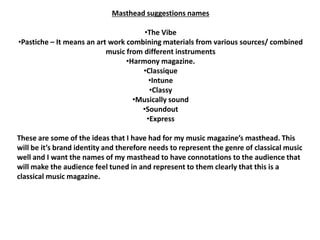
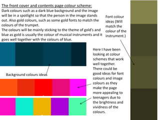
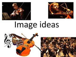
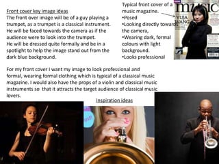
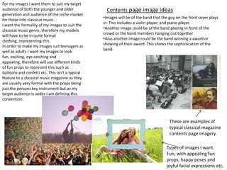
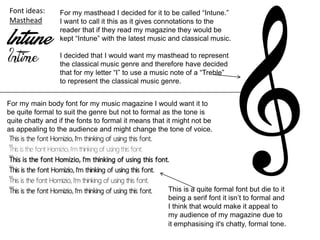
Music magazine over brief
The music genre I have chosen is classical
The target audience is for both male and females of over the age of 20. This is
as most teenagers aren’t into much classical music, and therefore is more
designed for the older generation as they are more likely to like this type of
genre of music and buy the magazine.
Age 20+ is going to be the target audience
Gender is both male and female
The magazine will include a CD of classical music for advertise the audience to
buy
Other types of classical music magazines and maybe jazz magazines as they are
quite similar genres of music.
Price of the magazine would be around £2:50
Masthead suggestions names
•The Vibe
•Pastiche – It means an art work combining materials from various sources/ combined
music from different instruments
•Harmony magazine.
•Classique
•Intune
•Classy
•Musically sound
•Soundout
•Express
These are some of the ideas that I have had for my music magazine’s masthead. This
will be it’s brand identity and therefore needs to represent the genre of classical music
well and I want the names of my masthead to have connotations to the audience that
will make the audience feel tuned in and represent to them clearly that this is a
classical music magazine.
The front cover and contents page colour scheme:
Dark colours such as a dark blue background and the image
will be in a spotlight so that the person in the image stands
out. Also gold colours, such as some gold fonts to match the
colours of the trumpet.
The colours will be mainly sticking to the theme of gold's and
blue as gold is usually the colour of musical instruments and it
goes well together with the colours of blue.
Background colours ideas
Font colour
ideas (Will
match the
colour of the
instrument.)
Here I have been
looking at colour
schemes that work
well together.
There could be
good ideas for font
colours and image
colours as they
make the page
more appealing to
teenagers due to
the brightness and
vividness of the
colours.
Image ideas
Front cover key image ideas
The front over image will be of a guy playing a
trumpet, as a trumpet is a classical instrument.
He will be faced towards the camera as if the
audience were to look into the trumpet.
He will be dressed quite formally and be in a
spotlight to help the image stand out from the
dark blue background.
Inspiration ideas
Typical front cover of a
music magazine.
•Posed
•Looking directly towards
the camera,
•Wearing dark, formal
colours with light
background.
•Looks professional
For my front cover I want my image to look professional and
formal, wearing formal clothing which is typical of a classical music
magazine. I would also have the props of a violin and classical music
instruments so that it attracts the target audience of classical music
lovers.
Contents page image ideas
•Images will be of the band that the guy on the front cover plays
in. This includes a violin player, and piano player.
•Another image could be of the band playing in front of the
crowd or the band members hanging out together
•Also another image could be the band winning a award or
showing of their award. This shows the sophistication of the
band
For my images I want them to suit my target
audience of both the younger and older
generation and audience of the niche market
for those into classical music.
I want the formality of my images to suit the
classical music genre, therefore my models
will have to be in quite formal
clothing, representing this.
In order to make my images suit teenagers as
well as adults I want my images to look
fun, exciting, eye catching and
appealing, therefore will use different kinds
of fun props to represent this such as
balloons and confetti etc. This isn't a typical
feature to a classical music magazine as they
are usually very formal with the props being
just the persons key instrument but as my
target audience is wider I am defining this
convention.
These are examples of
typical classical magazine
contents page imagery.
Types of images I want.
Fun, with appealing fun
props, happy poses and
joyful facial expressions etc.
Font ideas:
Masthead
For my masthead I decided for it to be called “Intune.”
I want to call it this as it gives connotations to the
reader that if they read my magazine they would be
kept “Intune” with the latest music and classical music.
I decided that I would want my masthead to represent
the classical music genre and therefore have decided
that for my letter “I” to use a music note of a “Treble”
to represent the classical music genre.
For my main body font for my music magazine I would want it to
be quite formal to suit the genre but not to formal as the tone is
quite chatty and if the fonts to formal it means that it might not be
as appealing to the audience and might change the tone of voice.
This is a quite formal font but die to it
being a serif font it isn’t to formal and
I think that would make it appeal to
my audience of my magazine due to
it emphasising it's chatty, formal tone.

Magazine research

  • 1.
    Music magazine overbrief The music genre I have chosen is classical The target audience is for both male and females of over the age of 20. This is as most teenagers aren’t into much classical music, and therefore is more designed for the older generation as they are more likely to like this type of genre of music and buy the magazine. Age 20+ is going to be the target audience Gender is both male and female The magazine will include a CD of classical music for advertise the audience to buy Other types of classical music magazines and maybe jazz magazines as they are quite similar genres of music. Price of the magazine would be around £2:50
  • 2.
    Masthead suggestions names •TheVibe •Pastiche – It means an art work combining materials from various sources/ combined music from different instruments •Harmony magazine. •Classique •Intune •Classy •Musically sound •Soundout •Express These are some of the ideas that I have had for my music magazine’s masthead. This will be it’s brand identity and therefore needs to represent the genre of classical music well and I want the names of my masthead to have connotations to the audience that will make the audience feel tuned in and represent to them clearly that this is a classical music magazine.
  • 3.
    The front coverand contents page colour scheme: Dark colours such as a dark blue background and the image will be in a spotlight so that the person in the image stands out. Also gold colours, such as some gold fonts to match the colours of the trumpet. The colours will be mainly sticking to the theme of gold's and blue as gold is usually the colour of musical instruments and it goes well together with the colours of blue. Background colours ideas Font colour ideas (Will match the colour of the instrument.) Here I have been looking at colour schemes that work well together. There could be good ideas for font colours and image colours as they make the page more appealing to teenagers due to the brightness and vividness of the colours.
  • 4.
  • 5.
    Front cover keyimage ideas The front over image will be of a guy playing a trumpet, as a trumpet is a classical instrument. He will be faced towards the camera as if the audience were to look into the trumpet. He will be dressed quite formally and be in a spotlight to help the image stand out from the dark blue background. Inspiration ideas Typical front cover of a music magazine. •Posed •Looking directly towards the camera, •Wearing dark, formal colours with light background. •Looks professional For my front cover I want my image to look professional and formal, wearing formal clothing which is typical of a classical music magazine. I would also have the props of a violin and classical music instruments so that it attracts the target audience of classical music lovers.
  • 6.
    Contents page imageideas •Images will be of the band that the guy on the front cover plays in. This includes a violin player, and piano player. •Another image could be of the band playing in front of the crowd or the band members hanging out together •Also another image could be the band winning a award or showing of their award. This shows the sophistication of the band For my images I want them to suit my target audience of both the younger and older generation and audience of the niche market for those into classical music. I want the formality of my images to suit the classical music genre, therefore my models will have to be in quite formal clothing, representing this. In order to make my images suit teenagers as well as adults I want my images to look fun, exciting, eye catching and appealing, therefore will use different kinds of fun props to represent this such as balloons and confetti etc. This isn't a typical feature to a classical music magazine as they are usually very formal with the props being just the persons key instrument but as my target audience is wider I am defining this convention. These are examples of typical classical magazine contents page imagery. Types of images I want. Fun, with appealing fun props, happy poses and joyful facial expressions etc.
  • 7.
    Font ideas: Masthead For mymasthead I decided for it to be called “Intune.” I want to call it this as it gives connotations to the reader that if they read my magazine they would be kept “Intune” with the latest music and classical music. I decided that I would want my masthead to represent the classical music genre and therefore have decided that for my letter “I” to use a music note of a “Treble” to represent the classical music genre. For my main body font for my music magazine I would want it to be quite formal to suit the genre but not to formal as the tone is quite chatty and if the fonts to formal it means that it might not be as appealing to the audience and might change the tone of voice. This is a quite formal font but die to it being a serif font it isn’t to formal and I think that would make it appeal to my audience of my magazine due to it emphasising it's chatty, formal tone.