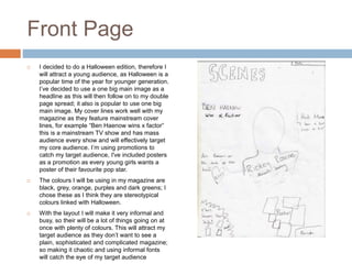
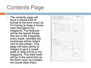
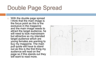
MAGAZINE DRAFT
ANALYSIS
Jordan Chilton
Front Page
 I decided to do a Halloween edition, therefore I
will attract a young audience, as Halloween is a
popular time of the year for younger generation.
I’ve decided to use a one big main image as a
headline as this will then follow on to my double
page spread; it also is popular to use one big
main image. My cover lines work well with my
magazine as they feature mainstream cover
lines, for example “Ben Haenow wins x factor”
this is a mainstream TV show and has mass
audience every show and will effectively target
my core audience. I’m using promotions to
catch my target audience, I've included posters
as a promotion as every young girls wants a
poster of their favourite pop star.
 The colours I will be using in my magazine are
black, grey, orange, purples and dark greens; I
chose these as I think they are stereotypical
colours linked with Halloween.
 With the layout I will make it very informal and
busy, so their will be a lot of things going on at
once with plenty of colours. This will attract my
target audience as they don’t want to see a
plain, sophisticated and complicated magazine;
so making it chaotic and using informal fonts
will catch the eye of my target audience
Contents Page
 The contents page will
have a similar kind of
format to the front cover as
I'm having to keep a house
style throughout my
magazine. The features
will be the typical things
that are in the magazine
every week, whereas the
exclusives will be what’s
new to this edition. This
page will have plenty of
images to give a sneak
peak of what will be in my
magazine. The mast head
will be in the same font as
the front cover as it keeps
my house style intact.
Double Page Spread
 With the double page spread
I think that the main image is
the focus point as this is the
exclusive in the magazine
and the main image needs to
attract the target audience, he
will need to look mainstream
but attractive so my intended
target audience which are
young females are wanting to
buy my magazine. The main
pull quote will have to stand
out as this is the first thing my
audience will read on the
page so if this stands out they
will want to read more.

Magazine draft analysis

  • 1.
  • 2.
    Front Page  Idecided to do a Halloween edition, therefore I will attract a young audience, as Halloween is a popular time of the year for younger generation. I’ve decided to use a one big main image as a headline as this will then follow on to my double page spread; it also is popular to use one big main image. My cover lines work well with my magazine as they feature mainstream cover lines, for example “Ben Haenow wins x factor” this is a mainstream TV show and has mass audience every show and will effectively target my core audience. I’m using promotions to catch my target audience, I've included posters as a promotion as every young girls wants a poster of their favourite pop star.  The colours I will be using in my magazine are black, grey, orange, purples and dark greens; I chose these as I think they are stereotypical colours linked with Halloween.  With the layout I will make it very informal and busy, so their will be a lot of things going on at once with plenty of colours. This will attract my target audience as they don’t want to see a plain, sophisticated and complicated magazine; so making it chaotic and using informal fonts will catch the eye of my target audience
  • 3.
    Contents Page  Thecontents page will have a similar kind of format to the front cover as I'm having to keep a house style throughout my magazine. The features will be the typical things that are in the magazine every week, whereas the exclusives will be what’s new to this edition. This page will have plenty of images to give a sneak peak of what will be in my magazine. The mast head will be in the same font as the front cover as it keeps my house style intact.
  • 4.
    Double Page Spread With the double page spread I think that the main image is the focus point as this is the exclusive in the magazine and the main image needs to attract the target audience, he will need to look mainstream but attractive so my intended target audience which are young females are wanting to buy my magazine. The main pull quote will have to stand out as this is the first thing my audience will read on the page so if this stands out they will want to read more.