Download to read offline
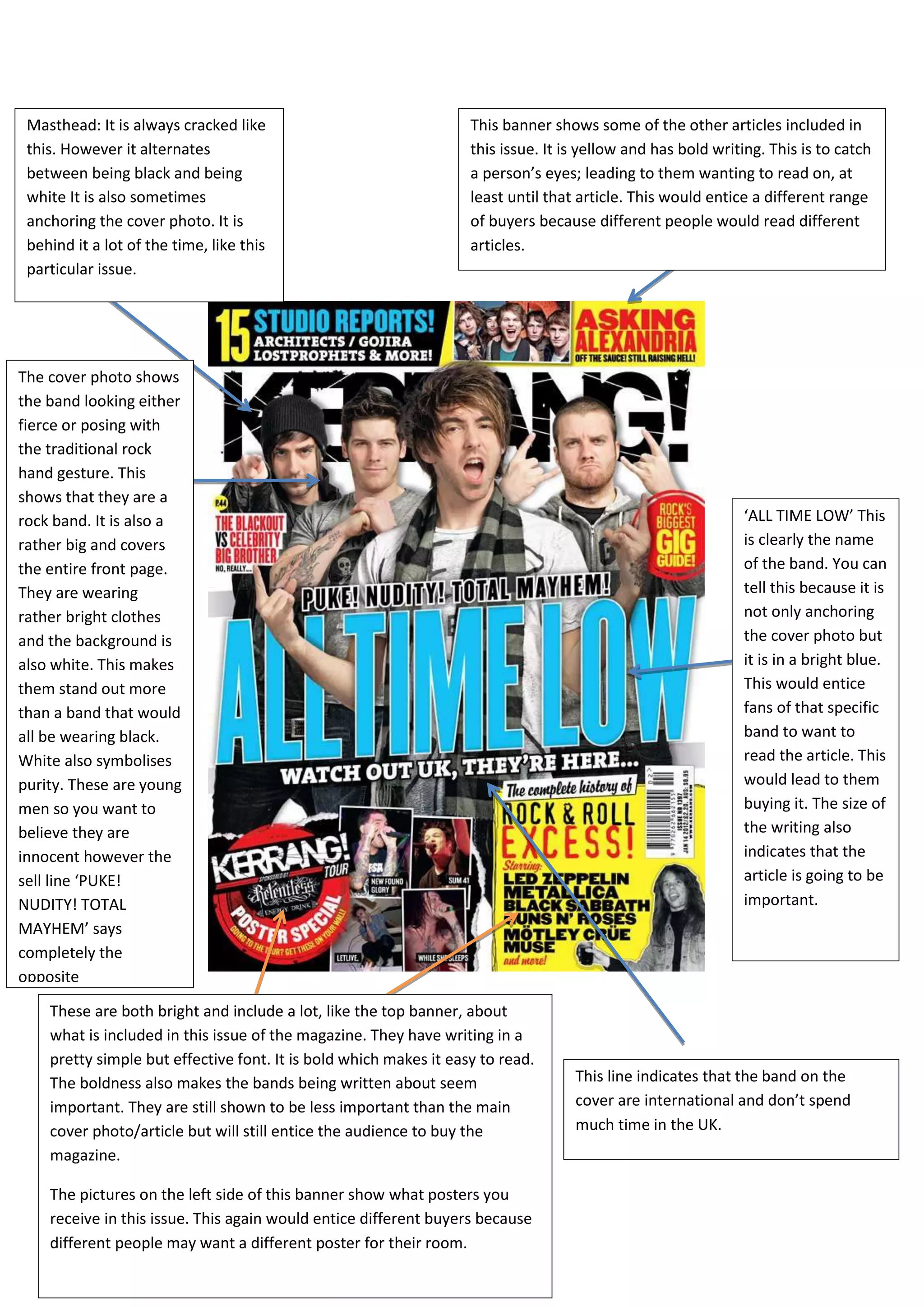
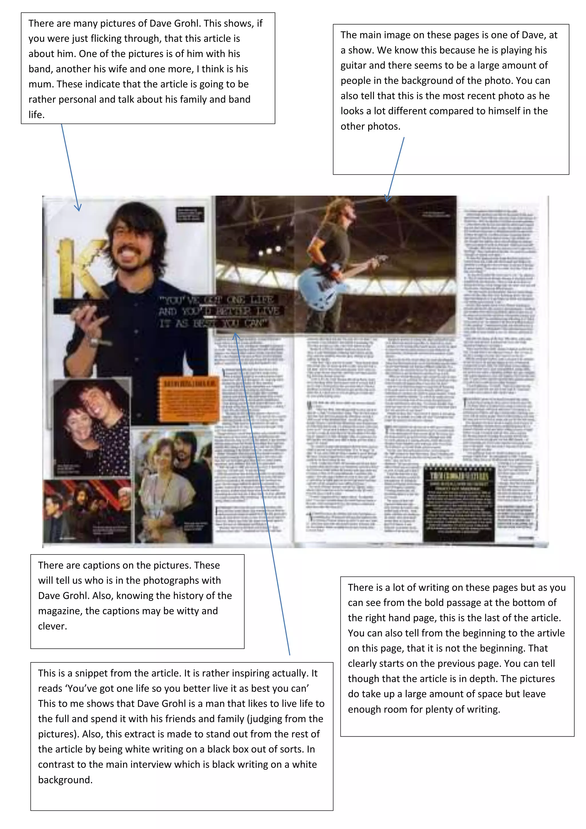
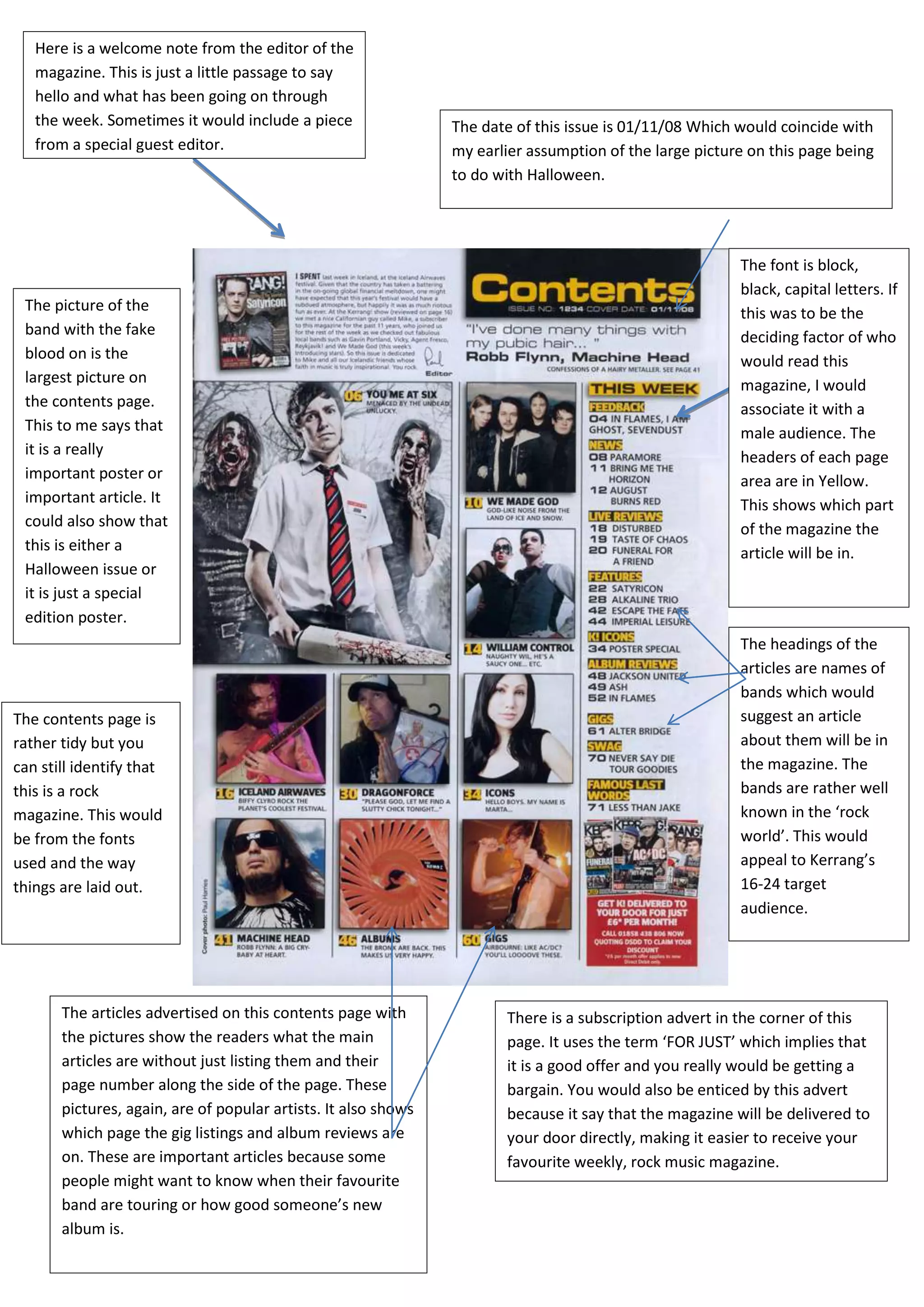

The document discusses the visual and textual elements of a rock magazine issue, focusing on its vibrant masthead, bold article titles, and eye-catching cover photo featuring the band 'All Time Low'. It highlights the layout choices aimed at attracting a youthful audience, with prominent advertisements for posters and gig listings, while providing an engaging article about Dave Grohl. Additionally, it mentions a welcome note from the editor and emphasizes the magazine's appeal through captivating design and content that caters to rock music fans.


