The document summarizes the process of designing a poster for a short film project. Key points discussed include:
1) Researching conventions of short film and independent movie posters for inspiration and understanding layout techniques.
2) Choosing a simple, neat text layout with title as the largest font and credits as the smallest.
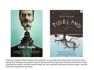
3) Liking posters that create mystery or have simplicity and effective use of text and photography.
4) Selecting a feminine, eye-catching font that also relates to the author's name.
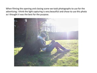
5) Choosing the best photograph taken during filming for the poster.