
More Related Content
What's hot
What's hot (19)
Viewers also liked
Viewers also liked (20)
Similar to Magazine cover analysis q
Similar to Magazine cover analysis q (20)
Magazine cover analysis q
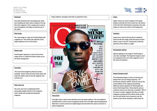
- 1. Salford City College Eccles Centre AS Media Studies Foundation Portfolio Masthead Very bold masthead with red background, white text including one letter which is placed in the top left of the magazine. This is unique and is used on every Q magazine, this helps to catch the eye of the public. Main image The main image is a close up of TinieTempah with sunglasses on. This catches the attention of the target audience as he is in the charts. Model credit TinieTempah’s signature is used in front of the image of him in a white font which stands out on the darker background. Coverlines ‘The music that changed my life by 25 artists including’ doesn’t show all of the artists which will make the readers want to buy the magazine and read the rest. Main cover line The main cover line is emphasised which encourages peoples interest in the magazine, what’s inside and actually purchasing the magazine. Colour Lighter colours are used to appeal to the target audience and help the text to stand out, the colours of the shirt that TinieTempah is wearing in the main image are used as the colour of the background. Typefaces Larger text is used on the text that is needed to stand out like the model credit and quote and also where is says it’s the 25th anniversary so that the attention of the readers is caught Photography Lighting High key lighting as the image of TinieTempah is very clear and bright. This helps the image to stand out compared to the rest of the magazine so he is the centre of attention. Design Principles Used? The Guttenberg design is used as at the top and bottom there are two things important. ‘25th anniversary collector edition’ shows its not just the normal edition of the magazine (something different) and the signature of TinieTempah will attract TinieTempah fans. These help the sales as customers want to see what else is available. ‘#01 of 25 covers to collect’ suggests that there are other magazines coming soon that will be similar to this one, this will attract more consumers over the weeks as they will be wanting to collect them all. House Style Very light colours used to draw attention from the target audience. The red traditional masthead that is used on every Q magazine stands out on the light coloured background. Black font is used to stand out on light background and white font used to stand out on darker background. Target audience: teenagers who listen to pop/chart music.