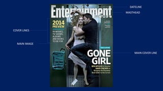
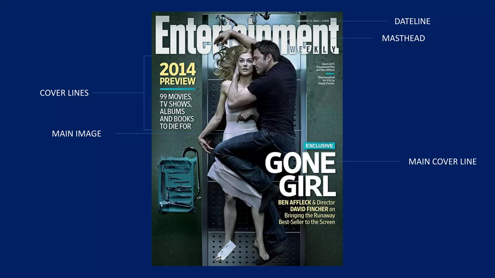
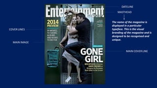
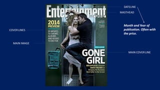
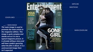
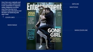
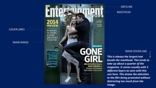
The document discusses different elements of a magazine cover, including the masthead displaying the magazine's name, the publication date, the main cover image used to promote the featured article, cover lines that were originally used to attract readers but are now less common, and the main cover line that takes up a large portion of the cover to promote the topic without distracting from the main image.