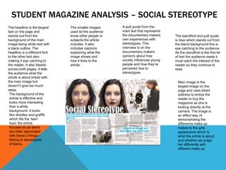
STUDENT MAGAZINE ANALYSIS – SOCIAL STEREOTYPE
Main image is the
largest image on the
page and uses direct
address to entice the
reader to buy the
magazine as she is
looking directly at the
camera. The image is
an effect way of
demonstrating the
difference make up
makes to the girls
appearance which is
what the article is about
and whether we judge
her differently with
different make up.
The headline is the largest
text on the page and
stands out from the
background of the main
image being white text with
a black outline. The
headline is a different font
to the other text also
making it eye catching to
the reader. It also bleeds
across both pages. It tells
the audience what the
article is about linked with
the main image but
doesn't’t give too much
away.
The smaller images
used let the audience
know other people or
subjects the article
includes. It also
includes captions
explaining what the
image shows and
how it links to the
article.
A pull quote from the
main text that represents
the documentary makers
own experiences with
stereotypes. This
interview is on the
documentary makers
opinions about how
society influences young
people and how they’re
perceived due to
stereotypes.
The background of the
article is effective and
looks more interesting
than a white
background. It looks
like doodles and graffiti
which fits the ‘teen’
topic the article
focuses on as teens
are often associated
with these 2 things –
linking to stereotypes
of teens.
The standfirst and pull quote
is blue which stands out from
the bland background this is
eye catching to the audience.
As the standfirst is the first bit
of text the audience reads it
must catch the interest of the
reader so they continue to
read.
STUDENT MAGAZINE ANALYSIS – MADE IN BRUM
The main image
features the
documentary
maker and takes
up one page of the
double page
spread. The phone
and flash is
effective and links
to the article topic
of ‘selfies’. It
cleverly looks like
he’s taking a selfie
but is infact a
professional photo.
The headline is bold
black that stands out
from the white
background. The
same font is used on
the standfirst and pull
quote but in red text
which makes this text
more eye catching to
the audience. The
headline bleeds
across the double
page and main
image.
The smaller
images show
people from the
documentary
taking selfies.
This effectively
links to the
documentary
topic while
promoting it
too.
The standfirst introduces
Joe and how he’s made his
way to fame through the
documentary and blog he
created. It intrigues the
reader and makes them
want to continue reading.
The text is red which stands
out from the white
background. It is the first
thing that the audience
reads in the article as it is
eye catching.
The pull quote has a
box similar to the
colour of Joe’s shirt.
This effectively links
the colour scheme
to the main image
and draws the
readers eye this
text.
The name of the
documentary,
the date time
and channel are
also in red. This
is at the end of
the article. It
reminds the
audience to
watch the
documentary
and where to
find it. It is also
bigger text than
the rest of the
article
The headline is bold black
text. It is the biggest text
on the article and a
different text to the rest.
This makes it eye catching
to the audience. It
introduces the topic of the
article the audience knows
they’re investigating
videogames.
The main image is of the two
main onscreen presenters. It
links to documentary as it is a
screenshot of one of the shots.
They look professional but are
wearing typical teenage
clothing.. The colour scheme
links to the colour of one of the
boys shirts. They are standing
in a formal manner in a setting
they interviewed the public.
The other image on the page
features the same two
presenters above an Xbox.
The image is quite comical
indicating to the audience it is
not a completely serious
documentary.
The standfirst is italic and
a different font. It further
explains what the
documentary is about.
This is the second thing
the audience reads after
looking at the main image
and has to stand out and
catch the interest of the
audience by being short
and snappy.
The colour scheme fits the
genre of the magazine and
links to the main image as
the shirt the presenter is
wearing is also blue. This is a
clever way of linking the
image which is the first thing
the audience would look at.
This blue circles would then
draw the eyes of the
audience to the rest of the
text.
STUDENT MAGAZINE ANALYSIS – WHO’S COMPLAINING
ABOUT VIDEOGAMING?

Magazine analysis12

  • 2.
    STUDENT MAGAZINE ANALYSIS– SOCIAL STEREOTYPE Main image is the largest image on the page and uses direct address to entice the reader to buy the magazine as she is looking directly at the camera. The image is an effect way of demonstrating the difference make up makes to the girls appearance which is what the article is about and whether we judge her differently with different make up. The headline is the largest text on the page and stands out from the background of the main image being white text with a black outline. The headline is a different font to the other text also making it eye catching to the reader. It also bleeds across both pages. It tells the audience what the article is about linked with the main image but doesn't’t give too much away. The smaller images used let the audience know other people or subjects the article includes. It also includes captions explaining what the image shows and how it links to the article. A pull quote from the main text that represents the documentary makers own experiences with stereotypes. This interview is on the documentary makers opinions about how society influences young people and how they’re perceived due to stereotypes. The background of the article is effective and looks more interesting than a white background. It looks like doodles and graffiti which fits the ‘teen’ topic the article focuses on as teens are often associated with these 2 things – linking to stereotypes of teens. The standfirst and pull quote is blue which stands out from the bland background this is eye catching to the audience. As the standfirst is the first bit of text the audience reads it must catch the interest of the reader so they continue to read.
  • 3.
    STUDENT MAGAZINE ANALYSIS– MADE IN BRUM The main image features the documentary maker and takes up one page of the double page spread. The phone and flash is effective and links to the article topic of ‘selfies’. It cleverly looks like he’s taking a selfie but is infact a professional photo. The headline is bold black that stands out from the white background. The same font is used on the standfirst and pull quote but in red text which makes this text more eye catching to the audience. The headline bleeds across the double page and main image. The smaller images show people from the documentary taking selfies. This effectively links to the documentary topic while promoting it too. The standfirst introduces Joe and how he’s made his way to fame through the documentary and blog he created. It intrigues the reader and makes them want to continue reading. The text is red which stands out from the white background. It is the first thing that the audience reads in the article as it is eye catching. The pull quote has a box similar to the colour of Joe’s shirt. This effectively links the colour scheme to the main image and draws the readers eye this text. The name of the documentary, the date time and channel are also in red. This is at the end of the article. It reminds the audience to watch the documentary and where to find it. It is also bigger text than the rest of the article
  • 4.
    The headline isbold black text. It is the biggest text on the article and a different text to the rest. This makes it eye catching to the audience. It introduces the topic of the article the audience knows they’re investigating videogames. The main image is of the two main onscreen presenters. It links to documentary as it is a screenshot of one of the shots. They look professional but are wearing typical teenage clothing.. The colour scheme links to the colour of one of the boys shirts. They are standing in a formal manner in a setting they interviewed the public. The other image on the page features the same two presenters above an Xbox. The image is quite comical indicating to the audience it is not a completely serious documentary. The standfirst is italic and a different font. It further explains what the documentary is about. This is the second thing the audience reads after looking at the main image and has to stand out and catch the interest of the audience by being short and snappy. The colour scheme fits the genre of the magazine and links to the main image as the shirt the presenter is wearing is also blue. This is a clever way of linking the image which is the first thing the audience would look at. This blue circles would then draw the eyes of the audience to the rest of the text. STUDENT MAGAZINE ANALYSIS – WHO’S COMPLAINING ABOUT VIDEOGAMING?