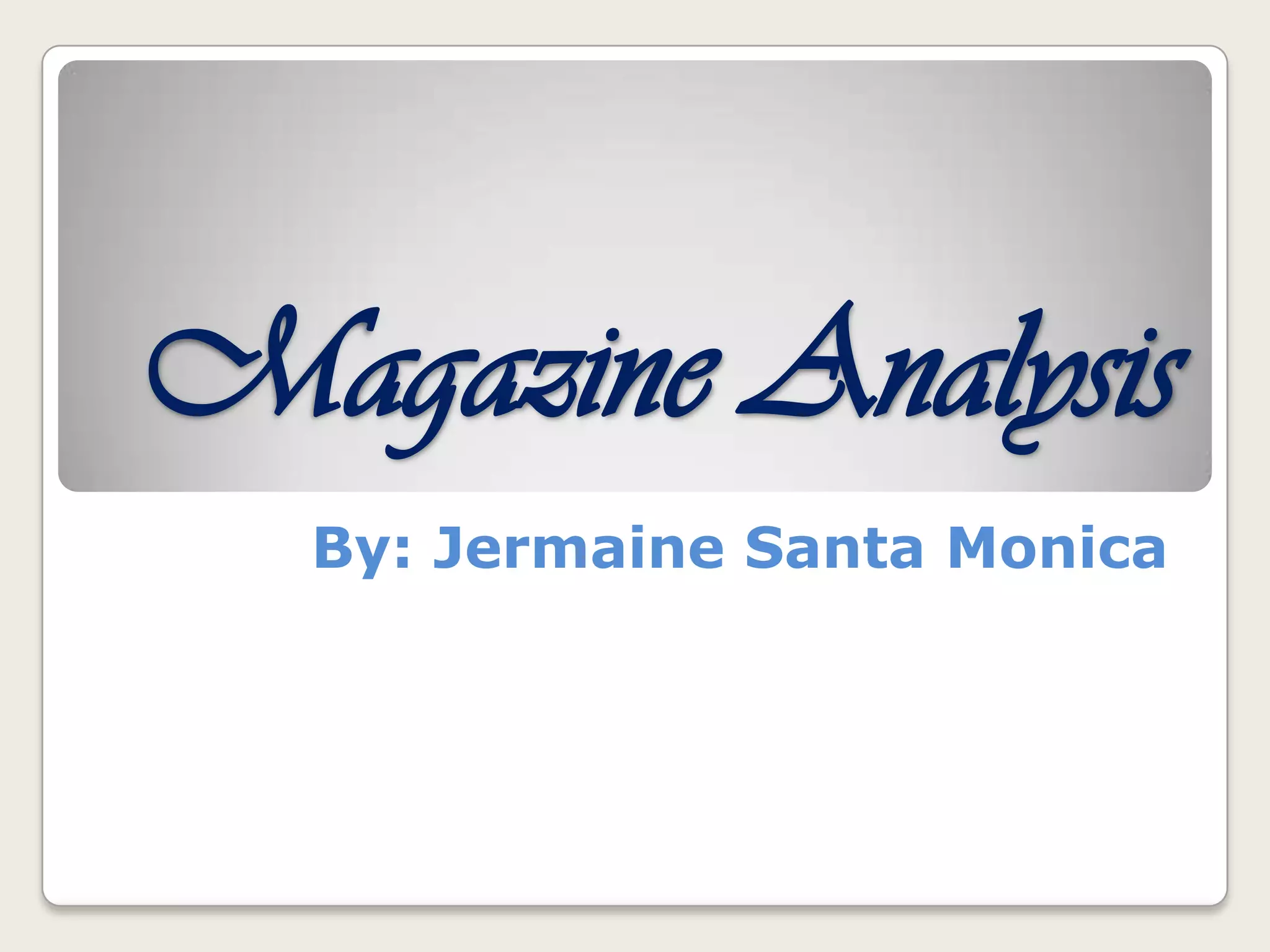
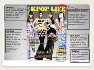
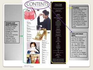
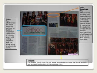
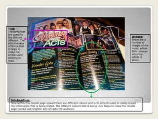
Magazine Analysis
By: Jermaine Santa Monica
Front Cover
Analysis
Issue date and number:
These will inform the
audience about when the
magazine was issued.
Whereas, the issue number
will indicate how
magazines the company
has been distributing.
Masthead:
The font of the masthead
is bold that shows what
the name of the magazine
company is. Also it clear
specifies what the
magazine is about.
Sell lines:
The effectiveness of
having sell lines is
to give a
straightforward
insight of what are
exciting for the
audience to read.
Moreover, the titles
are bold to
emphasis what
each article is
about. Website:
By having a company’s
website the audience is
able to access the
subscription to
instantly buy their
magazine.
Focal image:
The image is enlarged
and it takes up most of
the front page to
indicate what is the
exclusive article in the
magazine.
Sell lines:
For each sell line
the titles are in
different fonts
and they’re all in
bold. This is
effective because
straight away the
audience are
going to read the
article that
they’re interested
in.
Masthead, Website,
Issue date and
number:
Referring to, the issue
date it shows that the
magazine is distribute
every month. Whereas,
the issue number
conveys that within
every month there are
a numerous of issues
sold. The masthead is
bold because it’ll tell
the audience who is the
company that
published the
magazine. Also the
within the website
there is information
given on how the
audience can purchase
their magazine.
Sell line:
The title of this
sell line is
enlarged and
bold. It connotes
that this sell line
is exclusive.
Focal image:
The model in this
image shows that
she is the cover
girl for the
magazine. This
may also indicate
that there is an
article that focus
on informing the
audience about
her.
Contents Page
Analysis
Credits:
Here these are the
names of the
people that took
part in putting the
magazine together.
This gives each
individual some
recognition of what
they did to make
the magazine sell
well.
Title and issue
date:
The effectiveness of
having an issue
date is to help the
audience to keep
up- to- date with
the different issues
that are distributed.
The font of
‘Contents’ is in
capital and is bigger
to clearly show what
the page is.
Images and
page numbers:
There are page
numbers that
overlap the
images to clearly
show the
exclusive articles.
The images
indicate what
each exclusive
article is about.
Issue number and date:
The effectiveness of the magazine
stating when the magazine was
issued is that it’ll show how recent
the magazine is. Moreover, the issue
number will help the audience to
know what magazine they need to
buy to keep themselves updated on
the latest stories and music.
Images:
Through the images that are used
on the contents page it informs
what the audience need to look
out for. Such as, the image of the
magazine. It shows what is the
next issue that will be available for
purchasing.
Titles and page numbers:
By using bold fonts and page
numbers there is a chance that
the audience will know would be
interesting for them to read.
Also it helps to make it clear to
the audience where to find each
article.
Double Page
Spread Analysis
Sub-
headings:
The
effectiveness
of using sub-
headings is to
organise topic
within this
article to be
clearly shown.
It means that
the audience
will be able to
receive
information on
what happened
in the event
that is being
discussed.
Images:
The images that is used for this article emphasises on what the article is about
and grasps the attention of the audience more
Titles:
The
effectiveness
the title is
that is big
and bold so
that the
reader can
clearly read
it. The mini
green bold
writing
emphasis
what the
whole article
is going to be
about.
Sub-headings:
Here within this double page spread there are different colours and sizes of fonts used to neatly layout
the information that is being stated. The different colours that is being used helps to make the double
page spread look brighter and attracts the audience.
Images:
There are a
number of
images of the
music artists.
This conveys
what the
article is
about.
Title:
The fonts that
are used for
the title are
different. The
effectiveness
of this is that
it helps to
make the
article seem
exciting to
read.

Magazine analysis

  • 1.
  • 2.
  • 3.
    Issue date andnumber: These will inform the audience about when the magazine was issued. Whereas, the issue number will indicate how magazines the company has been distributing. Masthead: The font of the masthead is bold that shows what the name of the magazine company is. Also it clear specifies what the magazine is about. Sell lines: The effectiveness of having sell lines is to give a straightforward insight of what are exciting for the audience to read. Moreover, the titles are bold to emphasis what each article is about. Website: By having a company’s website the audience is able to access the subscription to instantly buy their magazine. Focal image: The image is enlarged and it takes up most of the front page to indicate what is the exclusive article in the magazine.
  • 4.
    Sell lines: For eachsell line the titles are in different fonts and they’re all in bold. This is effective because straight away the audience are going to read the article that they’re interested in. Masthead, Website, Issue date and number: Referring to, the issue date it shows that the magazine is distribute every month. Whereas, the issue number conveys that within every month there are a numerous of issues sold. The masthead is bold because it’ll tell the audience who is the company that published the magazine. Also the within the website there is information given on how the audience can purchase their magazine. Sell line: The title of this sell line is enlarged and bold. It connotes that this sell line is exclusive. Focal image: The model in this image shows that she is the cover girl for the magazine. This may also indicate that there is an article that focus on informing the audience about her.
  • 5.
  • 6.
    Credits: Here these arethe names of the people that took part in putting the magazine together. This gives each individual some recognition of what they did to make the magazine sell well. Title and issue date: The effectiveness of having an issue date is to help the audience to keep up- to- date with the different issues that are distributed. The font of ‘Contents’ is in capital and is bigger to clearly show what the page is. Images and page numbers: There are page numbers that overlap the images to clearly show the exclusive articles. The images indicate what each exclusive article is about.
  • 7.
    Issue number anddate: The effectiveness of the magazine stating when the magazine was issued is that it’ll show how recent the magazine is. Moreover, the issue number will help the audience to know what magazine they need to buy to keep themselves updated on the latest stories and music. Images: Through the images that are used on the contents page it informs what the audience need to look out for. Such as, the image of the magazine. It shows what is the next issue that will be available for purchasing. Titles and page numbers: By using bold fonts and page numbers there is a chance that the audience will know would be interesting for them to read. Also it helps to make it clear to the audience where to find each article.
  • 8.
  • 9.
    Sub- headings: The effectiveness of using sub- headingsis to organise topic within this article to be clearly shown. It means that the audience will be able to receive information on what happened in the event that is being discussed. Images: The images that is used for this article emphasises on what the article is about and grasps the attention of the audience more Titles: The effectiveness the title is that is big and bold so that the reader can clearly read it. The mini green bold writing emphasis what the whole article is going to be about.
  • 10.
    Sub-headings: Here within thisdouble page spread there are different colours and sizes of fonts used to neatly layout the information that is being stated. The different colours that is being used helps to make the double page spread look brighter and attracts the audience. Images: There are a number of images of the music artists. This conveys what the article is about. Title: The fonts that are used for the title are different. The effectiveness of this is that it helps to make the article seem exciting to read.