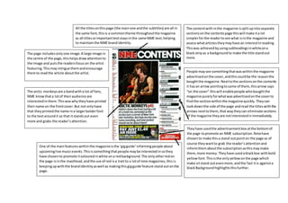
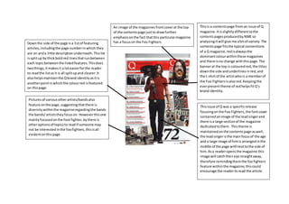
This document analyzes the contents pages of music magazines NME and Q. It notes that NME splits its content into clearly labeled sections to help readers easily find articles of interest. Q's contents page focuses on promoting a feature about the Foo Fighters, with a large central image and listings of related articles divided by bold red lines. Both magazines use visual cues like fonts, colors and images that reinforce their established brand identities and draw attention to key sections.