This document discusses album cover designs that inspire the author. It summarizes three album covers: [1] James Blake - The Wilhelm Scream, which features a blurred face in white and blue tones against a similarly colored background; [2] Wilco - A Ghost Is Born, which uses contrasting tones of the same color to make the band and album names stand out simply and effectively; [3] Miami Horror - Illumination, which draws the eye to a salmon pink dot in a pink-filtered desert photograph, creating a tonal color scheme that evokes isolation.
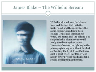


![Cd cover analyse [autosaved]](https://cdn.slidesharecdn.com/ss_thumbnails/cdcoveranalyseautosaved-120411175802-phpapp02-thumbnail.jpg?width=640&height=640&fit=bounds)


