SlideShare a Scribd company logo
1 of 3
------------------------------------------------------------------
process bar codes html codes where you want your process bar
-----------------------------------------------------------------


<div class="progress-bar blue stripes">
    <span style="width: 40%"></span>
</div>


-------------------------------------------------------------------
css codes under /b:skin tag
--------------------------------------------------------------------
.progress-bar {
      background-color: #1a1a1a;
      height: 25px;
      padding: 5px;
      width: 350px;
      margin: 50px 0;
      -moz-border-radius: 5px;
      -webkit-border-radius: 5px;
      border-radius: 5px;
      -moz-box-shadow: 0 1px 5px #000 inset, 0 1px 0 #444;
      -webkit-box-shadow: 0 1px 5px #000 inset, 0 1px 0 #444;
      box-shadow: 0 1px 5px #000 inset, 0 1px 0 #444;
}

.progress-bar span {
      display: inline-block;
      height: 100%;
      -moz-border-radius: 3px;
      -webkit-border-radius: 3px;
      border-radius: 3px;
      -moz-box-shadow: 0 1px 0 rgba(255, 255, 255, .5) inset;
      -webkit-box-shadow: 0 1px 0 rgba(255, 255, 255, .5) inset;
      box-shadow: 0 1px 0 rgba(255, 255, 255, .5) inset;
        -webkit-transition: width .4s ease-in-out;
        -moz-transition: width .4s ease-in-out;
        -ms-transition: width .4s ease-in-out;
        -o-transition: width .4s ease-in-out;
        transition: width .4s ease-in-out;
}
.blue span {
      background-color: #34c2e3;
}

.orange span {
        background-color: #fecf23;
        background-image: -webkit-gradient(linear, left top, left bottom,
from(#fecf23), to(#fd9215));
        background-image: -webkit-linear-gradient(top, #fecf23, #fd9215);
        background-image: -moz-linear-gradient(top, #fecf23, #fd9215);
        background-image: -ms-linear-gradient(top, #fecf23, #fd9215);
        background-image: -o-linear-gradient(top, #fecf23, #fd9215);
        background-image: linear-gradient(top, #fecf23, #fd9215);
}

.green span {
        background-color: #a5df41;
        background-image: -webkit-gradient(linear, left top, left bottom,
from(#a5df41), to(#4ca916));
        background-image: -webkit-linear-gradient(top, #a5df41, #4ca916);
        background-image: -moz-linear-gradient(top, #a5df41, #4ca916);
background-image: -ms-linear-gradient(top, #a5df41, #4ca916);
       background-image: -o-linear-gradient(top, #a5df41, #4ca916);
       background-image: linear-gradient(top, #a5df41, #4ca916);
}
.stripes span {
      -webkit-background-size: 30px 30px;
      -moz-background-size: 30px 30px;
      background-size: 30px 30px;
      background-image: -webkit-gradient(linear, left top, right bottom,
                                    color-stop(.25, rgba(255, 255, 255, .15)),
color-stop(.25, transparent),
                                    color-stop(.5, transparent), color-stop(.5,
rgba(255, 255, 255, .15)),
                                    color-stop(.75, rgba(255, 255, 255, .15)),
color-stop(.75, transparent),
                                    to(transparent));
      background-image: -webkit-linear-gradient(135deg, rgba(255, 255, 255, .15)
25%, transparent 25%,
                                    transparent 50%, rgba(255, 255, 255, .15)
50%, rgba(255, 255, 255, .15) 75%,
                                    transparent 75%, transparent);
      background-image: -moz-linear-gradient(135deg, rgba(255, 255, 255, .15)
25%, transparent 25%,
                                    transparent 50%, rgba(255, 255, 255, .15)
50%, rgba(255, 255, 255, .15) 75%,
                                    transparent 75%, transparent);
      background-image: -ms-linear-gradient(135deg, rgba(255, 255, 255, .15)
25%, transparent 25%,
                                    transparent 50%, rgba(255, 255, 255, .15)
50%, rgba(255, 255, 255, .15) 75%,
                                    transparent 75%, transparent);
      background-image: -o-linear-gradient(135deg, rgba(255, 255, 255, .15) 25%,
transparent 25%,
                                    transparent 50%, rgba(255, 255, 255, .15)
50%, rgba(255, 255, 255, .15) 75%,
                                    transparent 75%, transparent);
      background-image: linear-gradient(135deg, rgba(255, 255, 255, .15) 25%,
transparent 25%,
                                    transparent 50%, rgba(255, 255, 255, .15)
50%, rgba(255, 255, 255, .15) 75%,
                                    transparent 75%, transparent);

     -webkit-animation: animate-stripes 3s linear infinite;
     -moz-animation: animate-stripes 3s linear infinite;
}

@-webkit-keyframes animate-stripes {
      0% {background-position: 0 0;} 100% {background-position: 60px 0;}
}

@-moz-keyframes animate-stripes {
      0% {background-position: 0 0;} 100% {background-position: 60px 0;}
}
.shine span {
      position: relative;
}

.shine span::after {
      content: '';
      opacity: 0;
      position: absolute;
      top: 0;
      right: 0;
      bottom: 0;
left: 0;
     background: #fff;
     -moz-border-radius: 3px;
     -webkit-border-radius: 3px;
     border-radius: 3px;

     -webkit-animation: animate-shine 2s ease-out infinite;
     -moz-animation: animate-shine 2s ease-out infinite;
}

@-webkit-keyframes animate-shine {
      0% {opacity: 0; width: 0;}
      50% {opacity: .5;}
      100% {opacity: 0; width: 95%;}
}


@-moz-keyframes animate-shine {
      0% {opacity: 0; width: 0;}
      50% {opacity: .5;}
      100% {opacity: 0; width: 95%;}
}
.glow span {
      -moz-box-shadow: 0 5px 5px rgba(255, 255, 255, .7) inset, 0 -5px 5px
rgba(255, 255, 255, .7) inset;
      -webkit-box-shadow: 0 5px 5px rgba(255, 255, 255, .7) inset, 0 -5px 5px
rgba(255, 255, 255, .7) inset;
      box-shadow: 0 5px 5px rgba(255, 255, 255, .7) inset, 0 -5px 5px rgba(255,
255, 255, .7) inset;

     -webkit-animation: animate-glow 1s ease-out infinite;
     -moz-animation: animate-glow 1s ease-out infinite;
}

@-webkit-keyframes animate-glow {
 0% { -webkit-box-shadow: 0 5px 5px rgba(255, 255, 255, .7) inset, 0 -5px 5px
rgba(255, 255, 255, .7) inset;}
 50% { -webkit-box-shadow: 0 5px 5px rgba(255, 255, 255, .3) inset, 0 -5px 5px
rgba(255, 255, 255, .3) inset;}
 100% { -webkit-box-shadow: 0 5px 5px rgba(255, 255, 255, .7) inset, 0 -5px 5px
rgba(255, 255, 255, .7) inset;}
 }

@-moz-keyframes animate-glow {
 0% { -moz-box-shadow: 0 5px 5px rgba(255, 255, 255, .7) inset, 0 -5px 5px
rgba(255, 255, 255, .7) inset;}
 50% { -moz-box-shadow: 0 5px 5px rgba(255, 255, 255, .3) inset, 0 -5px 5px
rgba(255, 255, 255, .3) inset;}
 100% { -moz-box-shadow: 0 5px 5px rgba(255, 255, 255, .7) inset, 0 -5px 5px
rgba(255, 255, 255, .7) inset;}
 }

More Related Content

Similar to Css3 process bar

Learn to Love CSS3 [English]
Learn to Love CSS3 [English]Learn to Love CSS3 [English]
Learn to Love CSS3 [English]ThemePartner
 
Eye Candy Without Images: Fun With CSS3
Eye Candy Without Images: Fun With CSS3Eye Candy Without Images: Fun With CSS3
Eye Candy Without Images: Fun With CSS3Shoshi Roberts
 
Making Links Magical Again with CSS
Making Links Magical Again with CSSMaking Links Magical Again with CSS
Making Links Magical Again with CSSJenn Lukas
 
Tecnicas avanzadas con CSS3
Tecnicas avanzadas con CSS3Tecnicas avanzadas con CSS3
Tecnicas avanzadas con CSS3Marta Armada
 
UIWebViewでつくるUI
UIWebViewでつくるUIUIWebViewでつくるUI
UIWebViewでつくるUIcocopon
 
[A5]deview 2012 pt hds webkit_gpu
[A5]deview 2012 pt hds webkit_gpu[A5]deview 2012 pt hds webkit_gpu
[A5]deview 2012 pt hds webkit_gpuNAVER D2
 
Sass, Compass and the new tools - Open Web Camp IV
Sass, Compass and the new tools - Open Web Camp IVSass, Compass and the new tools - Open Web Camp IV
Sass, Compass and the new tools - Open Web Camp IVDirk Ginader
 
cssstyle.cssbody { font-family Montserrat, Arial, sa
cssstyle.cssbody {    font-family Montserrat, Arial, sacssstyle.cssbody {    font-family Montserrat, Arial, sa
cssstyle.cssbody { font-family Montserrat, Arial, saMargenePurnell14
 
HTML5 and CSS3 – exploring mobile possibilities - Dynabyte event
HTML5 and CSS3 – exploring mobile possibilities - Dynabyte eventHTML5 and CSS3 – exploring mobile possibilities - Dynabyte event
HTML5 and CSS3 – exploring mobile possibilities - Dynabyte eventRobert Nyman
 
Advanced CSS Techniques
Advanced CSS TechniquesAdvanced CSS Techniques
Advanced CSS TechniquesKopepasah
 
HTML and CSS Help I have an assignment where I need to recreate th.pdf
HTML and CSS Help  I have an assignment where I need to recreate th.pdfHTML and CSS Help  I have an assignment where I need to recreate th.pdf
HTML and CSS Help I have an assignment where I need to recreate th.pdfpratyushraj61
 
Mobile-first OOCSS, Sass & Compass at BBC Responsive News
Mobile-first OOCSS, Sass & Compass at BBC Responsive NewsMobile-first OOCSS, Sass & Compass at BBC Responsive News
Mobile-first OOCSS, Sass & Compass at BBC Responsive NewsKaelig Deloumeau-Prigent
 
Web Design Trends 2010 - What Is CSS3 All About?
Web Design Trends 2010 - What Is CSS3 All About?Web Design Trends 2010 - What Is CSS3 All About?
Web Design Trends 2010 - What Is CSS3 All About?Alexandra Lo Cascio
 
The CSS3 of Tomorrow
The CSS3 of TomorrowThe CSS3 of Tomorrow
The CSS3 of TomorrowPeter Gasston
 

Similar to Css3 process bar (20)

Learn to Love CSS3 [English]
Learn to Love CSS3 [English]Learn to Love CSS3 [English]
Learn to Love CSS3 [English]
 
Sass, Compass
Sass, CompassSass, Compass
Sass, Compass
 
Eye Candy Without Images: Fun With CSS3
Eye Candy Without Images: Fun With CSS3Eye Candy Without Images: Fun With CSS3
Eye Candy Without Images: Fun With CSS3
 
Making Links Magical Again with CSS
Making Links Magical Again with CSSMaking Links Magical Again with CSS
Making Links Magical Again with CSS
 
popular posts widget
popular posts widgetpopular posts widget
popular posts widget
 
Tecnicas avanzadas con CSS3
Tecnicas avanzadas con CSS3Tecnicas avanzadas con CSS3
Tecnicas avanzadas con CSS3
 
Css3
Css3Css3
Css3
 
UIWebViewでつくるUI
UIWebViewでつくるUIUIWebViewでつくるUI
UIWebViewでつくるUI
 
[A5]deview 2012 pt hds webkit_gpu
[A5]deview 2012 pt hds webkit_gpu[A5]deview 2012 pt hds webkit_gpu
[A5]deview 2012 pt hds webkit_gpu
 
Sass, Compass and the new tools - Open Web Camp IV
Sass, Compass and the new tools - Open Web Camp IVSass, Compass and the new tools - Open Web Camp IV
Sass, Compass and the new tools - Open Web Camp IV
 
cssstyle.cssbody { font-family Montserrat, Arial, sa
cssstyle.cssbody {    font-family Montserrat, Arial, sacssstyle.cssbody {    font-family Montserrat, Arial, sa
cssstyle.cssbody { font-family Montserrat, Arial, sa
 
HTML5 and CSS3 – exploring mobile possibilities - Dynabyte event
HTML5 and CSS3 – exploring mobile possibilities - Dynabyte eventHTML5 and CSS3 – exploring mobile possibilities - Dynabyte event
HTML5 and CSS3 – exploring mobile possibilities - Dynabyte event
 
Advanced CSS Techniques
Advanced CSS TechniquesAdvanced CSS Techniques
Advanced CSS Techniques
 
HTML and CSS Help I have an assignment where I need to recreate th.pdf
HTML and CSS Help  I have an assignment where I need to recreate th.pdfHTML and CSS Help  I have an assignment where I need to recreate th.pdf
HTML and CSS Help I have an assignment where I need to recreate th.pdf
 
CSS3 pronti all'uso
CSS3 pronti all'usoCSS3 pronti all'uso
CSS3 pronti all'uso
 
Theme 23
Theme 23Theme 23
Theme 23
 
HTML5 y CSS3
HTML5 y CSS3HTML5 y CSS3
HTML5 y CSS3
 
Mobile-first OOCSS, Sass & Compass at BBC Responsive News
Mobile-first OOCSS, Sass & Compass at BBC Responsive NewsMobile-first OOCSS, Sass & Compass at BBC Responsive News
Mobile-first OOCSS, Sass & Compass at BBC Responsive News
 
Web Design Trends 2010 - What Is CSS3 All About?
Web Design Trends 2010 - What Is CSS3 All About?Web Design Trends 2010 - What Is CSS3 All About?
Web Design Trends 2010 - What Is CSS3 All About?
 
The CSS3 of Tomorrow
The CSS3 of TomorrowThe CSS3 of Tomorrow
The CSS3 of Tomorrow
 

Css3 process bar

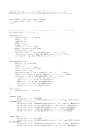
  • 1. ------------------------------------------------------------------ process bar codes html codes where you want your process bar ----------------------------------------------------------------- <div class="progress-bar blue stripes"> <span style="width: 40%"></span> </div> ------------------------------------------------------------------- css codes under /b:skin tag -------------------------------------------------------------------- .progress-bar { background-color: #1a1a1a; height: 25px; padding: 5px; width: 350px; margin: 50px 0; -moz-border-radius: 5px; -webkit-border-radius: 5px; border-radius: 5px; -moz-box-shadow: 0 1px 5px #000 inset, 0 1px 0 #444; -webkit-box-shadow: 0 1px 5px #000 inset, 0 1px 0 #444; box-shadow: 0 1px 5px #000 inset, 0 1px 0 #444; } .progress-bar span { display: inline-block; height: 100%; -moz-border-radius: 3px; -webkit-border-radius: 3px; border-radius: 3px; -moz-box-shadow: 0 1px 0 rgba(255, 255, 255, .5) inset; -webkit-box-shadow: 0 1px 0 rgba(255, 255, 255, .5) inset; box-shadow: 0 1px 0 rgba(255, 255, 255, .5) inset; -webkit-transition: width .4s ease-in-out; -moz-transition: width .4s ease-in-out; -ms-transition: width .4s ease-in-out; -o-transition: width .4s ease-in-out; transition: width .4s ease-in-out; } .blue span { background-color: #34c2e3; } .orange span { background-color: #fecf23; background-image: -webkit-gradient(linear, left top, left bottom, from(#fecf23), to(#fd9215)); background-image: -webkit-linear-gradient(top, #fecf23, #fd9215); background-image: -moz-linear-gradient(top, #fecf23, #fd9215); background-image: -ms-linear-gradient(top, #fecf23, #fd9215); background-image: -o-linear-gradient(top, #fecf23, #fd9215); background-image: linear-gradient(top, #fecf23, #fd9215); } .green span { background-color: #a5df41; background-image: -webkit-gradient(linear, left top, left bottom, from(#a5df41), to(#4ca916)); background-image: -webkit-linear-gradient(top, #a5df41, #4ca916); background-image: -moz-linear-gradient(top, #a5df41, #4ca916);
  • 2. background-image: -ms-linear-gradient(top, #a5df41, #4ca916); background-image: -o-linear-gradient(top, #a5df41, #4ca916); background-image: linear-gradient(top, #a5df41, #4ca916); } .stripes span { -webkit-background-size: 30px 30px; -moz-background-size: 30px 30px; background-size: 30px 30px; background-image: -webkit-gradient(linear, left top, right bottom, color-stop(.25, rgba(255, 255, 255, .15)), color-stop(.25, transparent), color-stop(.5, transparent), color-stop(.5, rgba(255, 255, 255, .15)), color-stop(.75, rgba(255, 255, 255, .15)), color-stop(.75, transparent), to(transparent)); background-image: -webkit-linear-gradient(135deg, rgba(255, 255, 255, .15) 25%, transparent 25%, transparent 50%, rgba(255, 255, 255, .15) 50%, rgba(255, 255, 255, .15) 75%, transparent 75%, transparent); background-image: -moz-linear-gradient(135deg, rgba(255, 255, 255, .15) 25%, transparent 25%, transparent 50%, rgba(255, 255, 255, .15) 50%, rgba(255, 255, 255, .15) 75%, transparent 75%, transparent); background-image: -ms-linear-gradient(135deg, rgba(255, 255, 255, .15) 25%, transparent 25%, transparent 50%, rgba(255, 255, 255, .15) 50%, rgba(255, 255, 255, .15) 75%, transparent 75%, transparent); background-image: -o-linear-gradient(135deg, rgba(255, 255, 255, .15) 25%, transparent 25%, transparent 50%, rgba(255, 255, 255, .15) 50%, rgba(255, 255, 255, .15) 75%, transparent 75%, transparent); background-image: linear-gradient(135deg, rgba(255, 255, 255, .15) 25%, transparent 25%, transparent 50%, rgba(255, 255, 255, .15) 50%, rgba(255, 255, 255, .15) 75%, transparent 75%, transparent); -webkit-animation: animate-stripes 3s linear infinite; -moz-animation: animate-stripes 3s linear infinite; } @-webkit-keyframes animate-stripes { 0% {background-position: 0 0;} 100% {background-position: 60px 0;} } @-moz-keyframes animate-stripes { 0% {background-position: 0 0;} 100% {background-position: 60px 0;} } .shine span { position: relative; } .shine span::after { content: ''; opacity: 0; position: absolute; top: 0; right: 0; bottom: 0;
  • 3. left: 0; background: #fff; -moz-border-radius: 3px; -webkit-border-radius: 3px; border-radius: 3px; -webkit-animation: animate-shine 2s ease-out infinite; -moz-animation: animate-shine 2s ease-out infinite; } @-webkit-keyframes animate-shine { 0% {opacity: 0; width: 0;} 50% {opacity: .5;} 100% {opacity: 0; width: 95%;} } @-moz-keyframes animate-shine { 0% {opacity: 0; width: 0;} 50% {opacity: .5;} 100% {opacity: 0; width: 95%;} } .glow span { -moz-box-shadow: 0 5px 5px rgba(255, 255, 255, .7) inset, 0 -5px 5px rgba(255, 255, 255, .7) inset; -webkit-box-shadow: 0 5px 5px rgba(255, 255, 255, .7) inset, 0 -5px 5px rgba(255, 255, 255, .7) inset; box-shadow: 0 5px 5px rgba(255, 255, 255, .7) inset, 0 -5px 5px rgba(255, 255, 255, .7) inset; -webkit-animation: animate-glow 1s ease-out infinite; -moz-animation: animate-glow 1s ease-out infinite; } @-webkit-keyframes animate-glow { 0% { -webkit-box-shadow: 0 5px 5px rgba(255, 255, 255, .7) inset, 0 -5px 5px rgba(255, 255, 255, .7) inset;} 50% { -webkit-box-shadow: 0 5px 5px rgba(255, 255, 255, .3) inset, 0 -5px 5px rgba(255, 255, 255, .3) inset;} 100% { -webkit-box-shadow: 0 5px 5px rgba(255, 255, 255, .7) inset, 0 -5px 5px rgba(255, 255, 255, .7) inset;} } @-moz-keyframes animate-glow { 0% { -moz-box-shadow: 0 5px 5px rgba(255, 255, 255, .7) inset, 0 -5px 5px rgba(255, 255, 255, .7) inset;} 50% { -moz-box-shadow: 0 5px 5px rgba(255, 255, 255, .3) inset, 0 -5px 5px rgba(255, 255, 255, .3) inset;} 100% { -moz-box-shadow: 0 5px 5px rgba(255, 255, 255, .7) inset, 0 -5px 5px rgba(255, 255, 255, .7) inset;} }