Downloaded 103 times
![. Widgets and Layouts Qt in Education Semana de tecnologia do Barão de Mauá Instrutor: Marcelo Barros de Almeida [email_address]](https://image.slidesharecdn.com/l3slides-100916175946-phpapp01/75/Treinamento-Qt-basico-aula-III-1-2048.jpg)

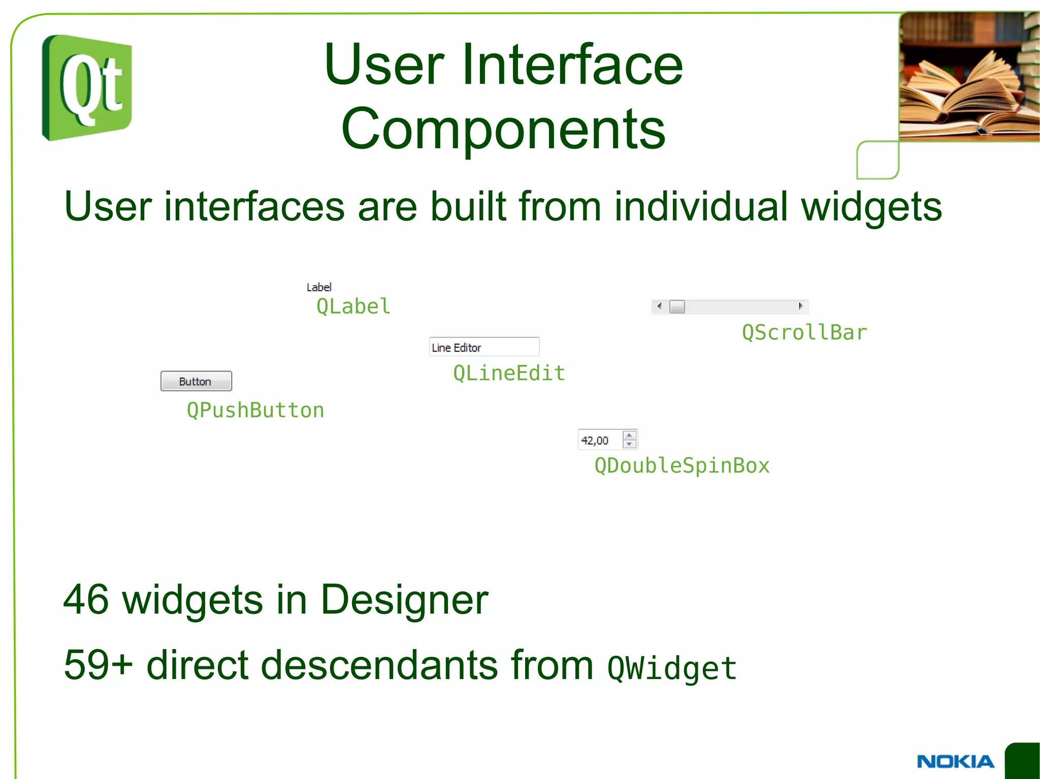
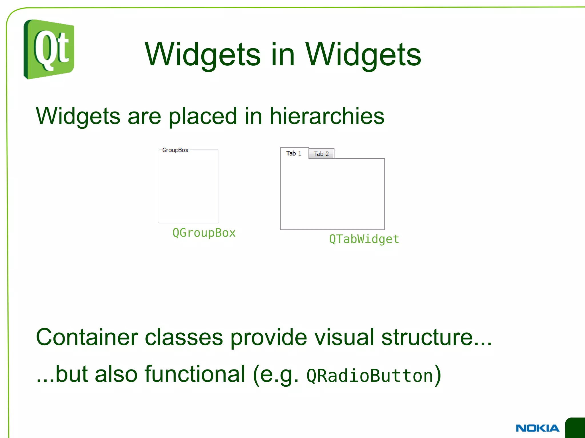
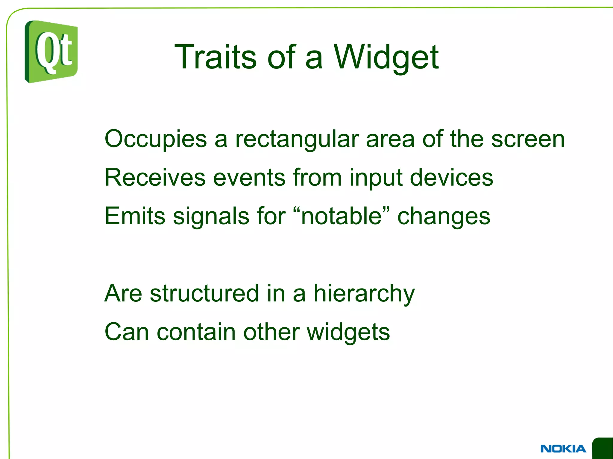
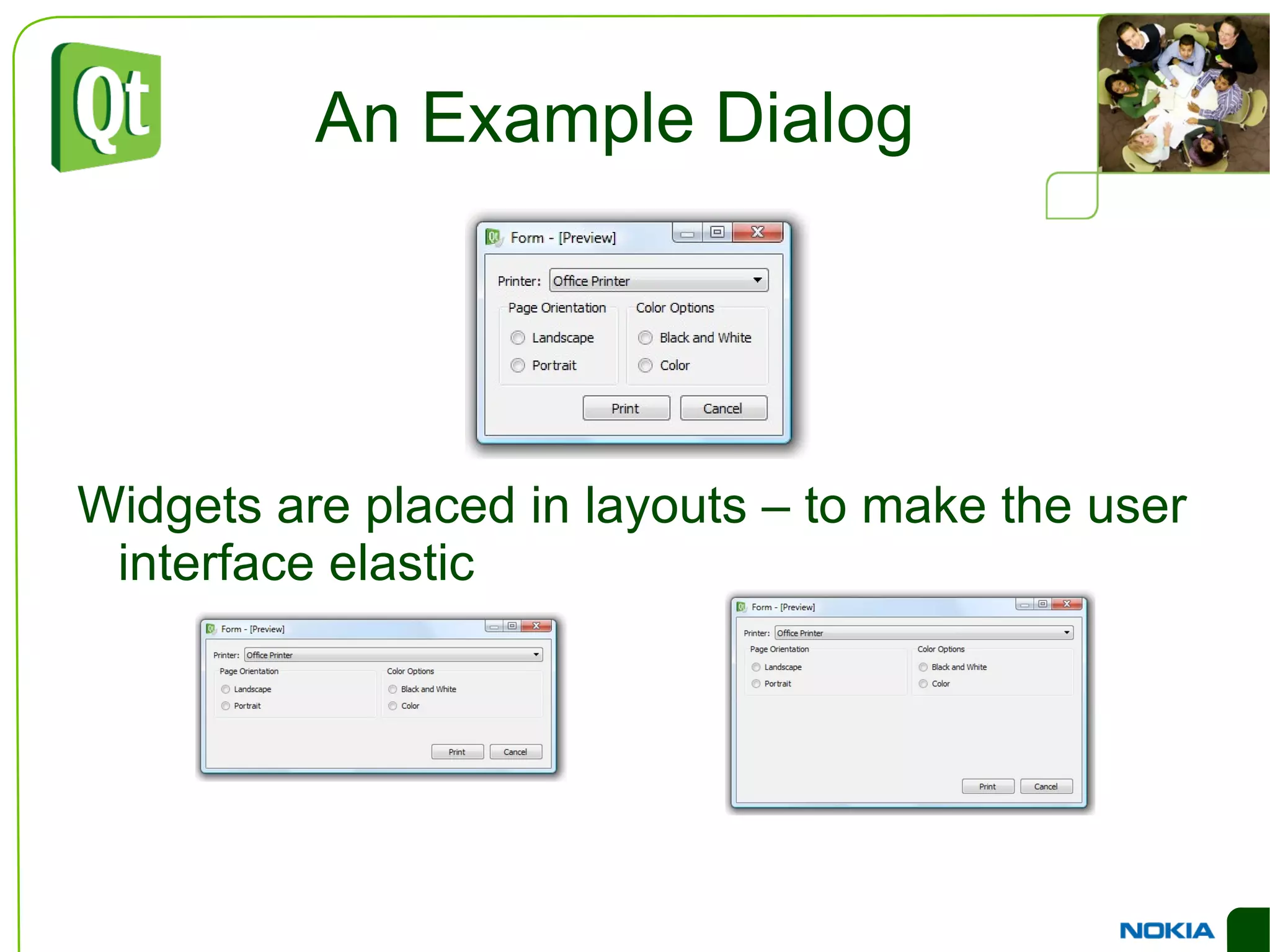
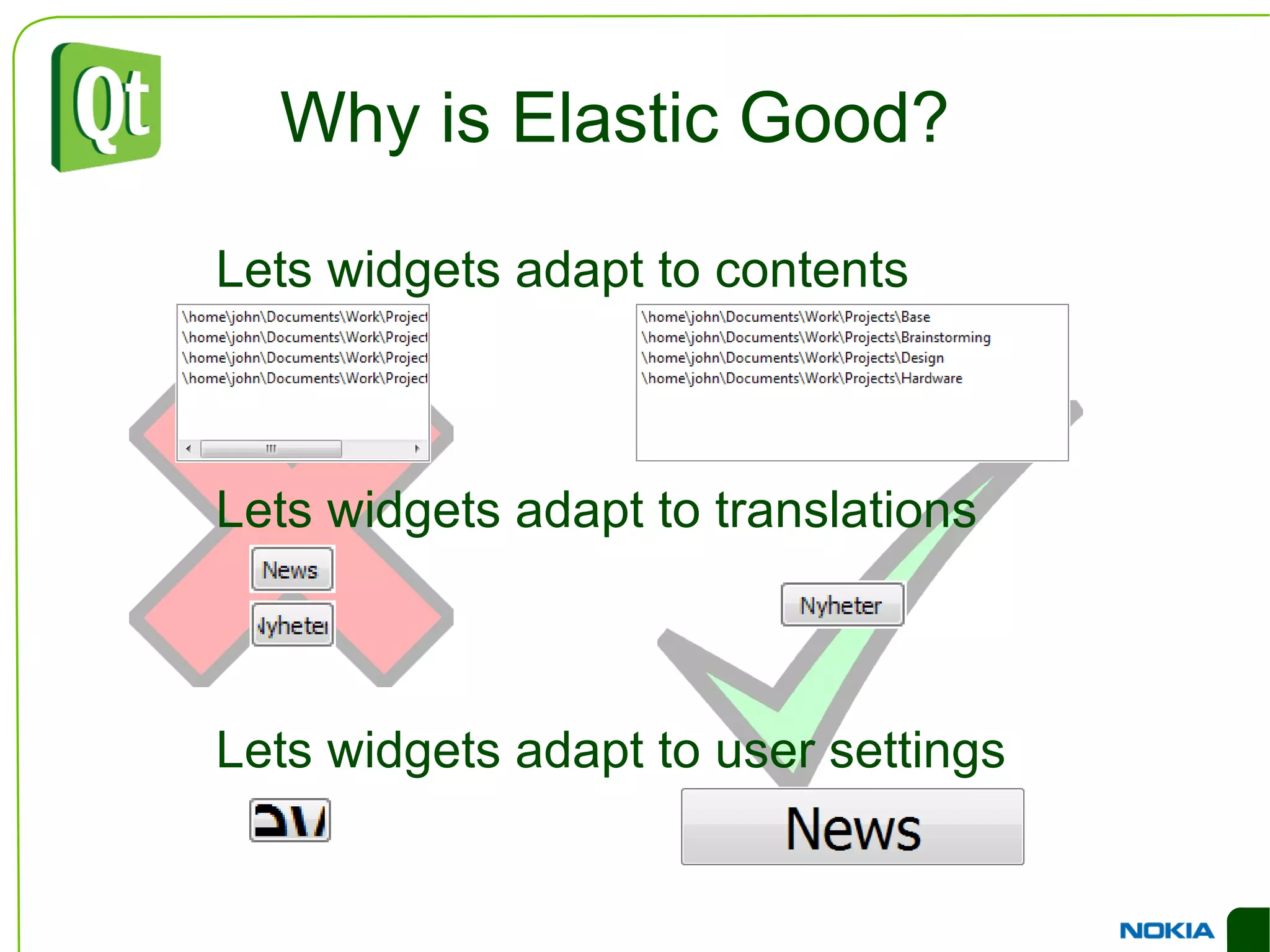
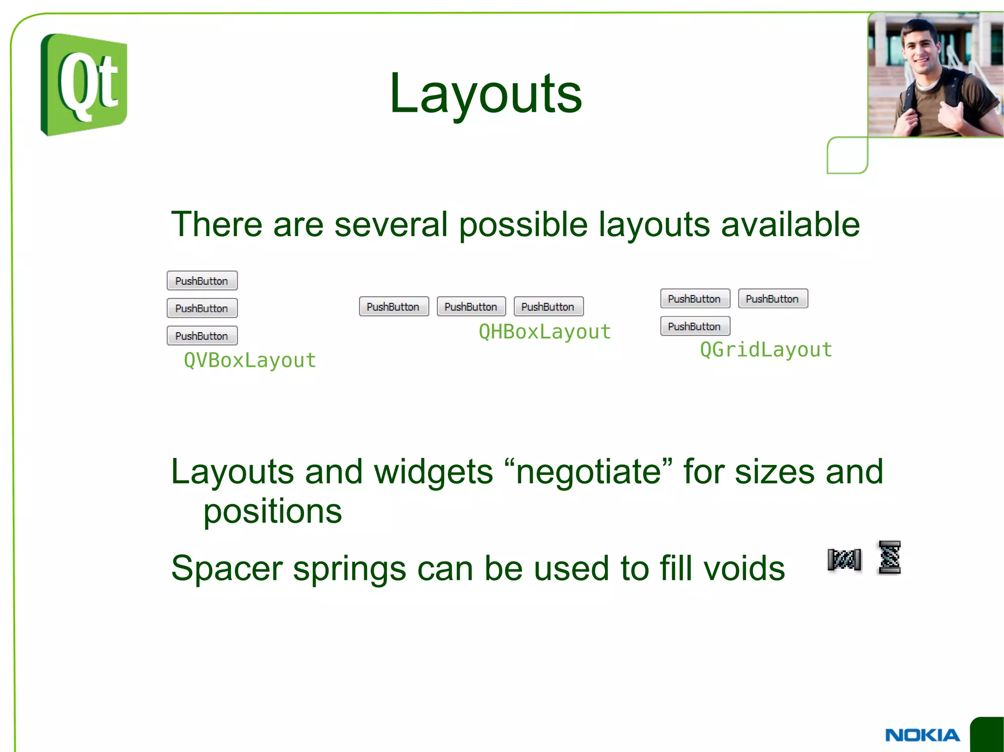
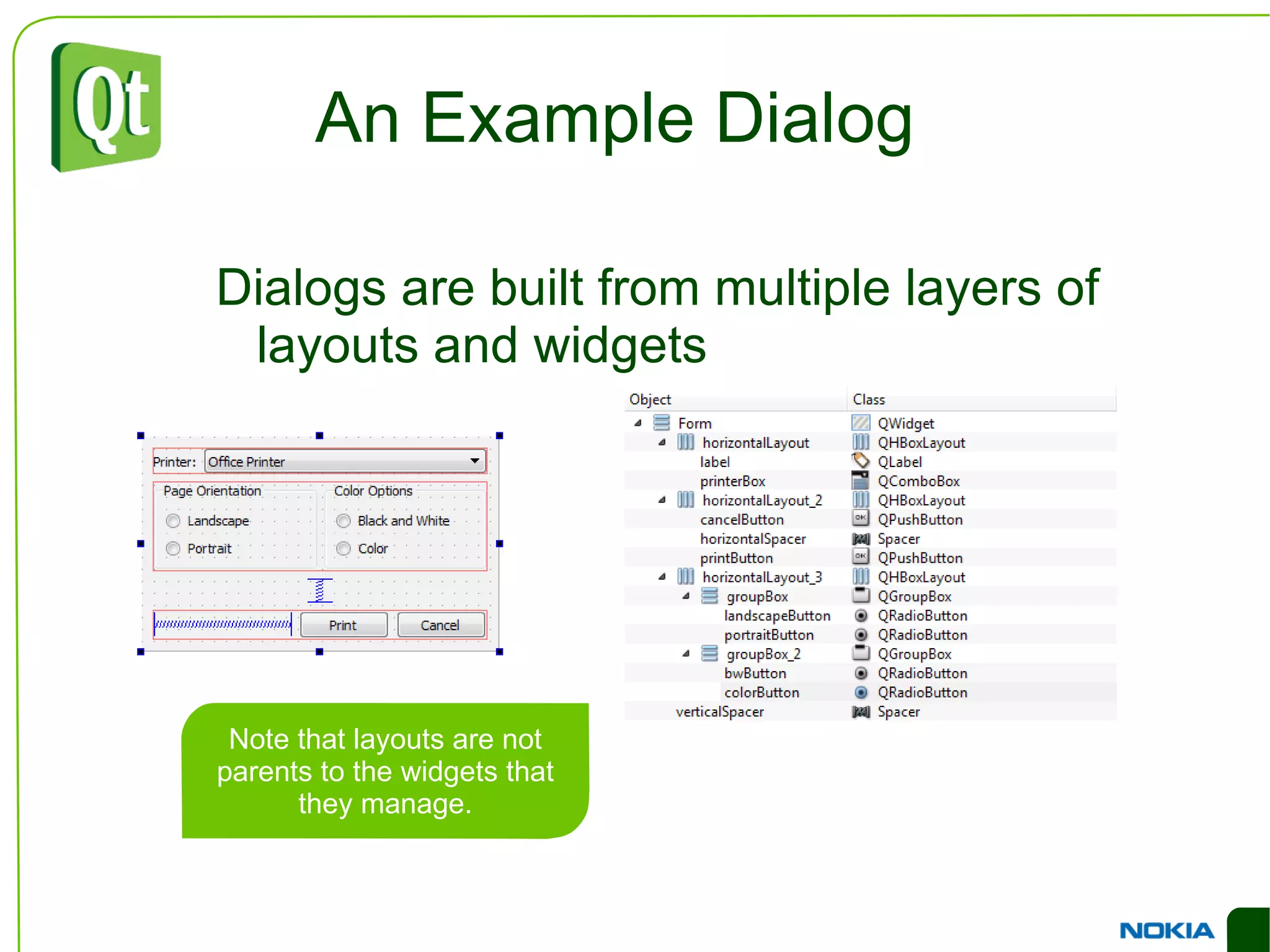
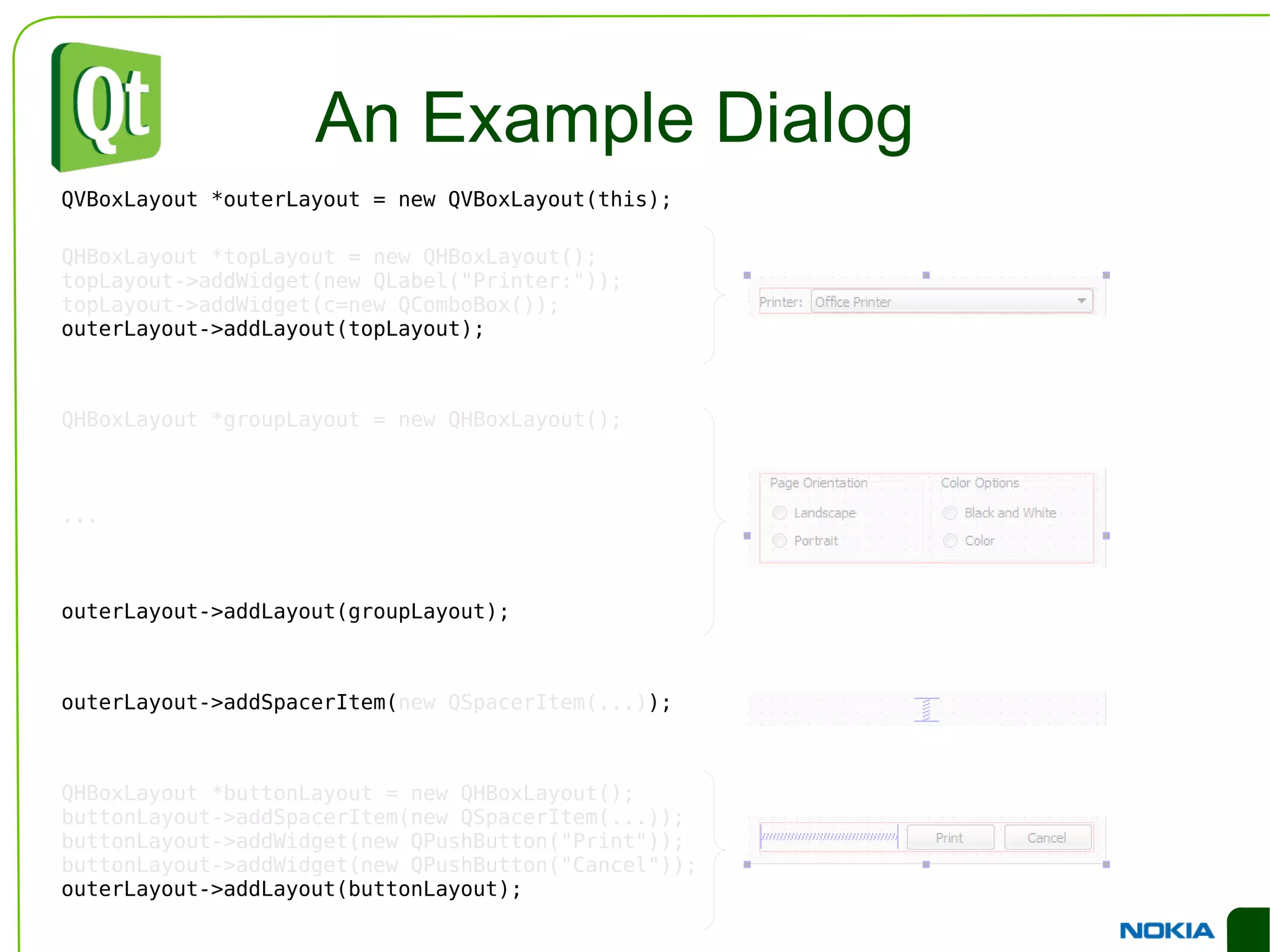
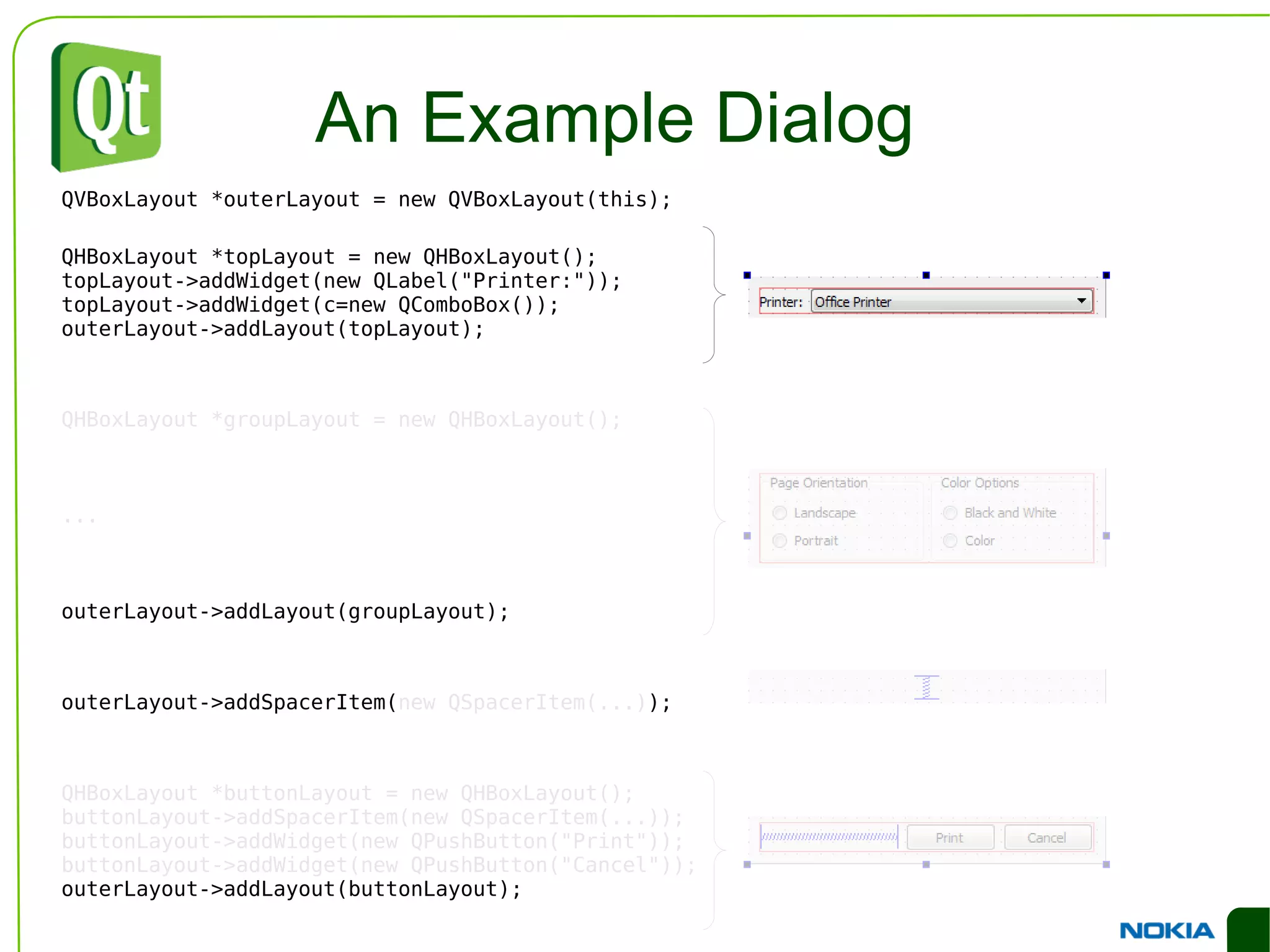
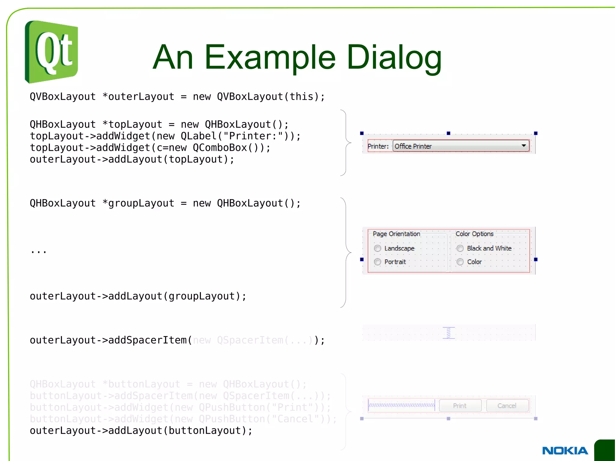
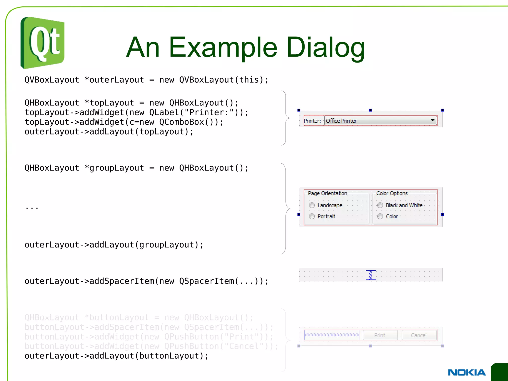
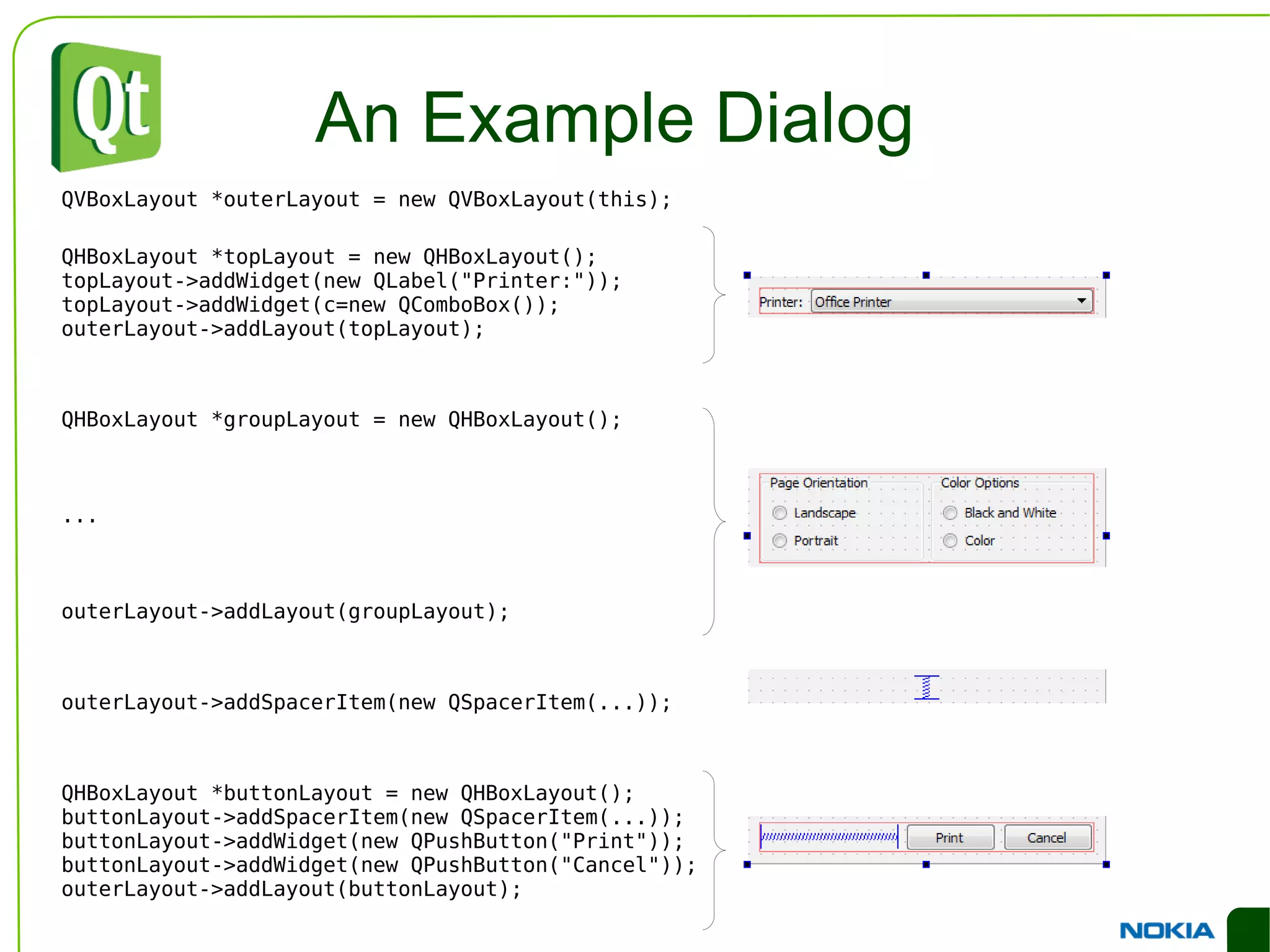
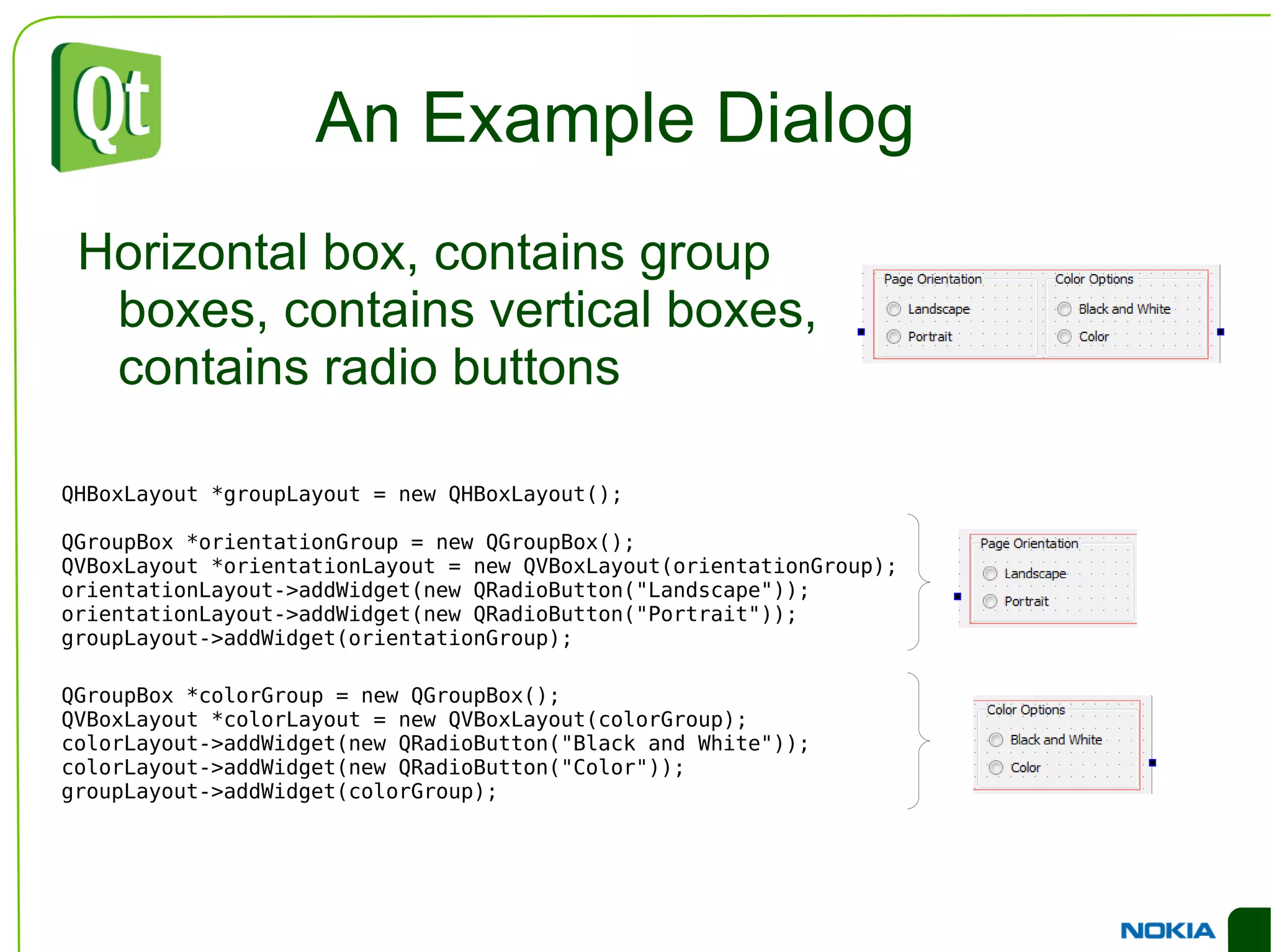
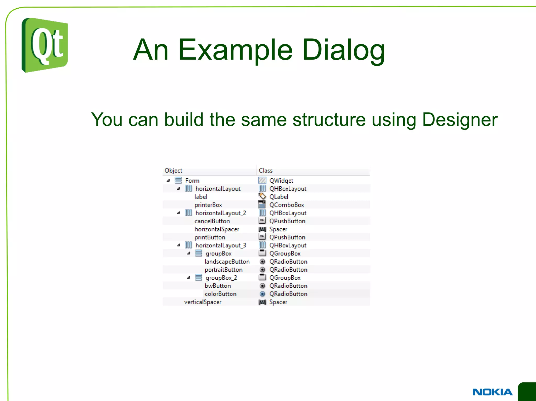
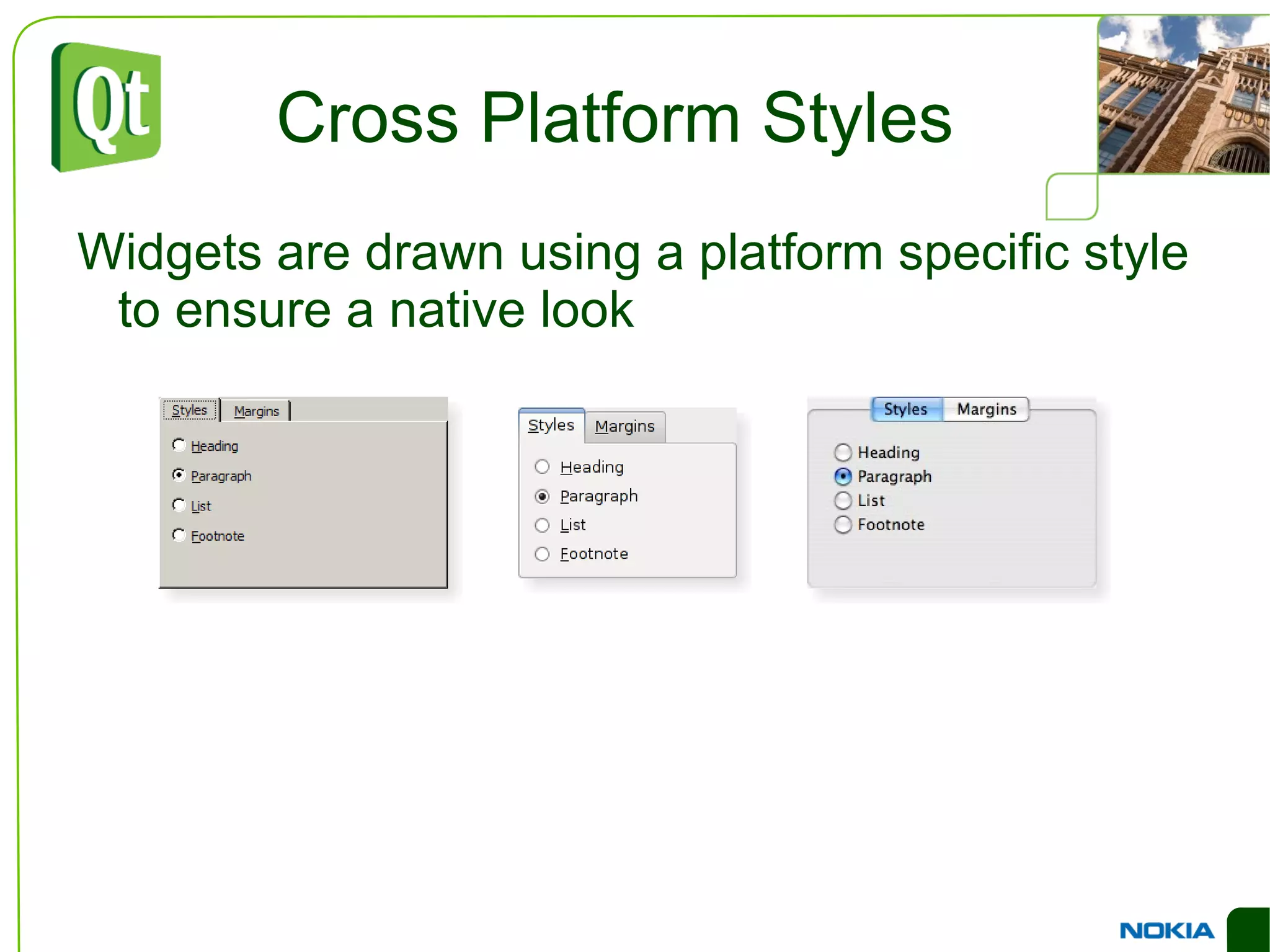
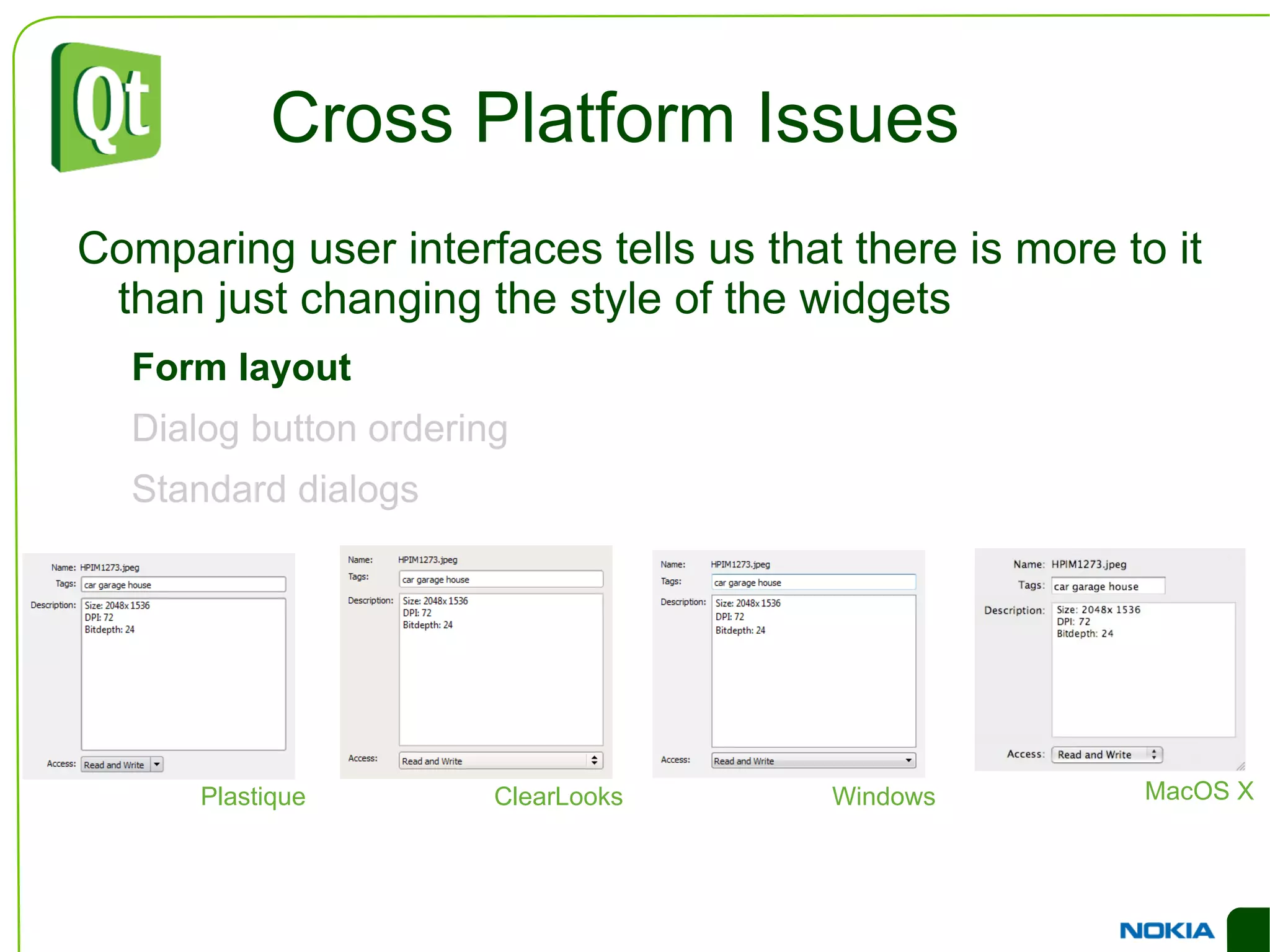
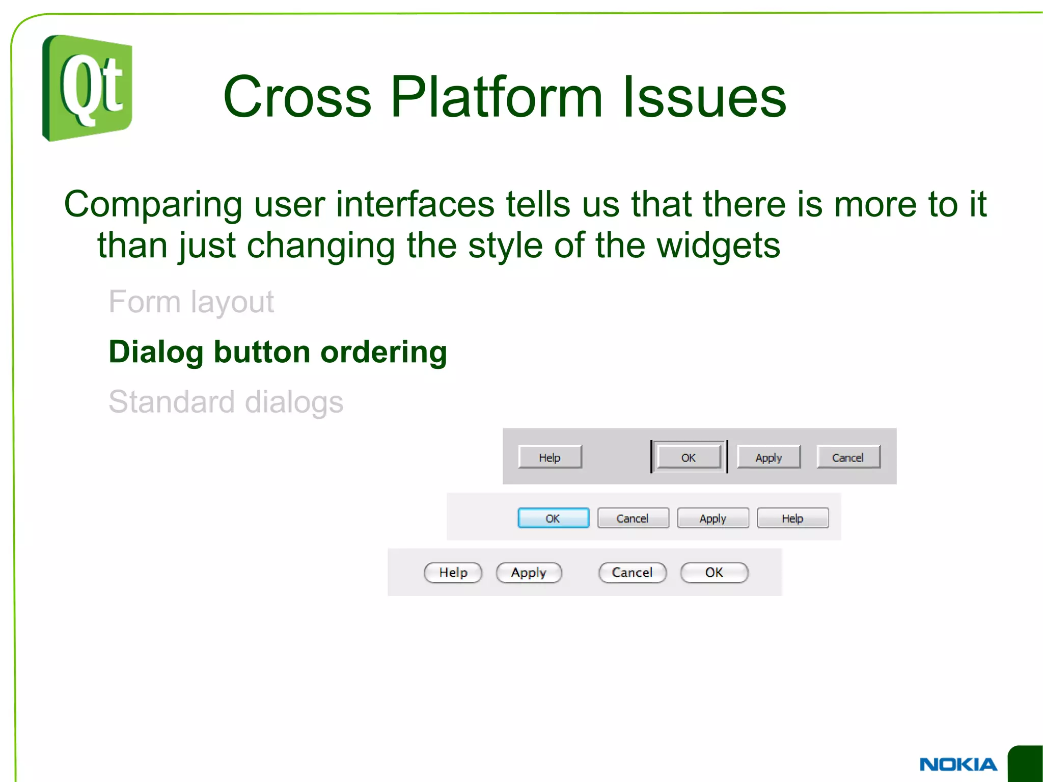
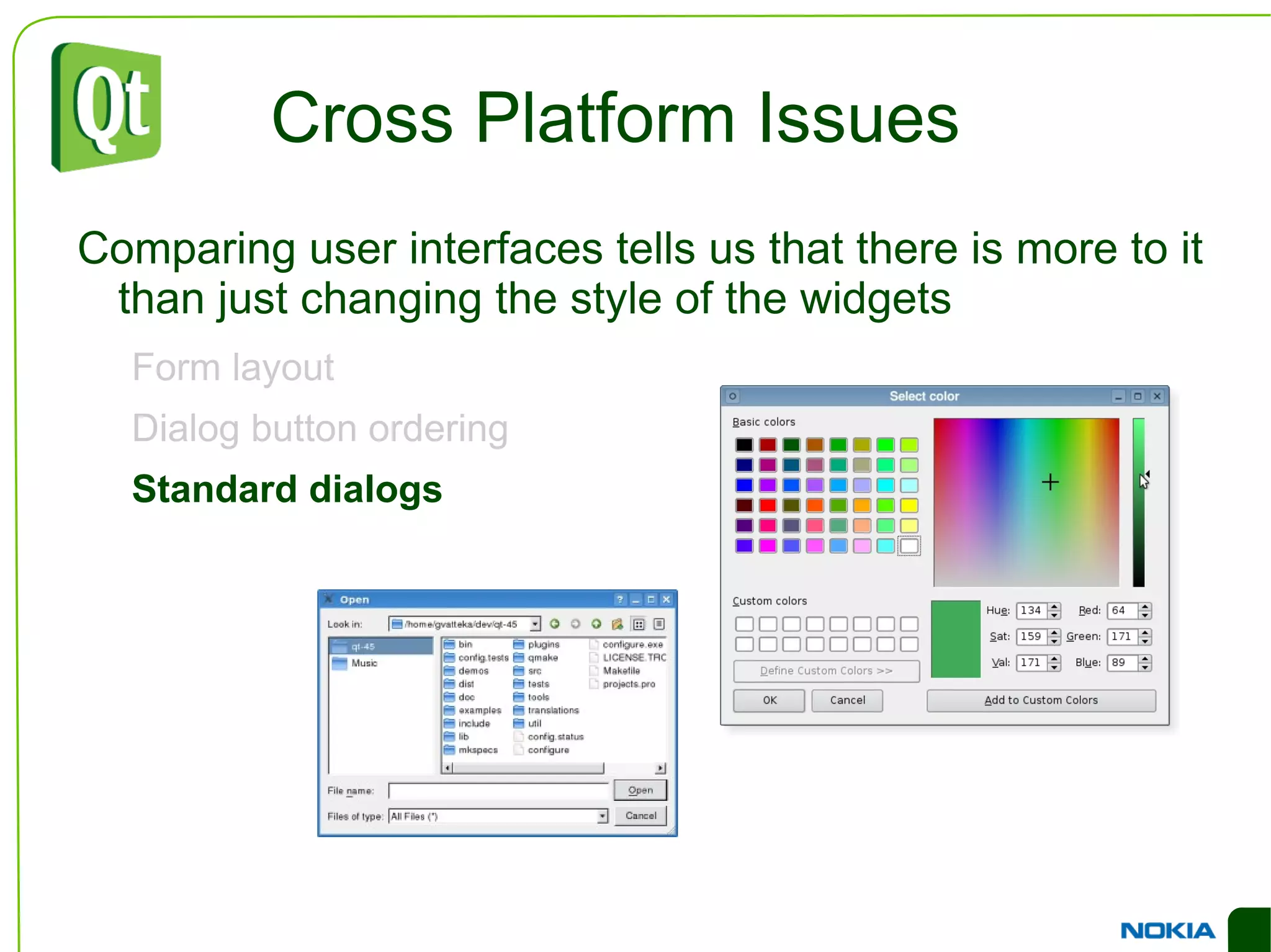
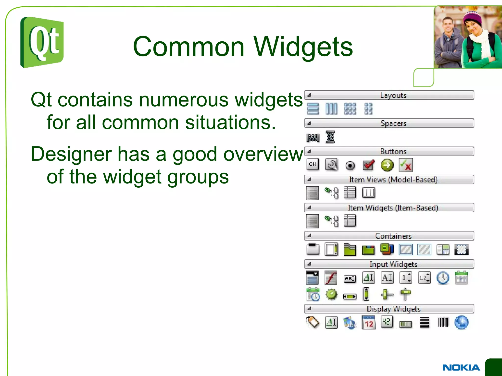
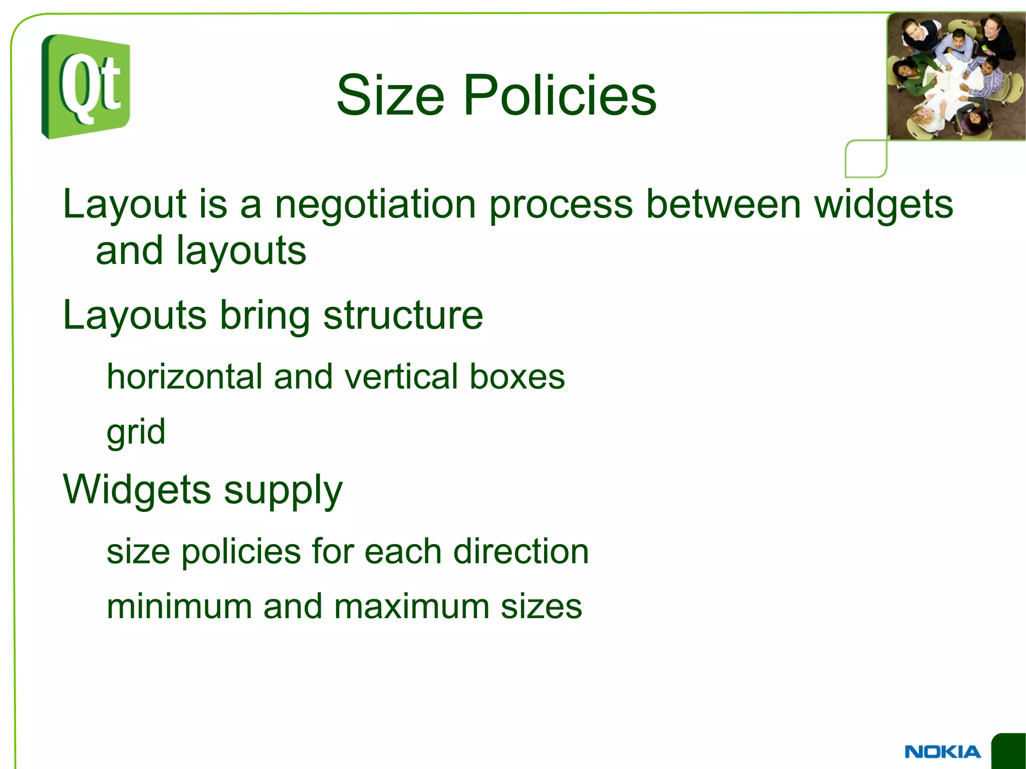
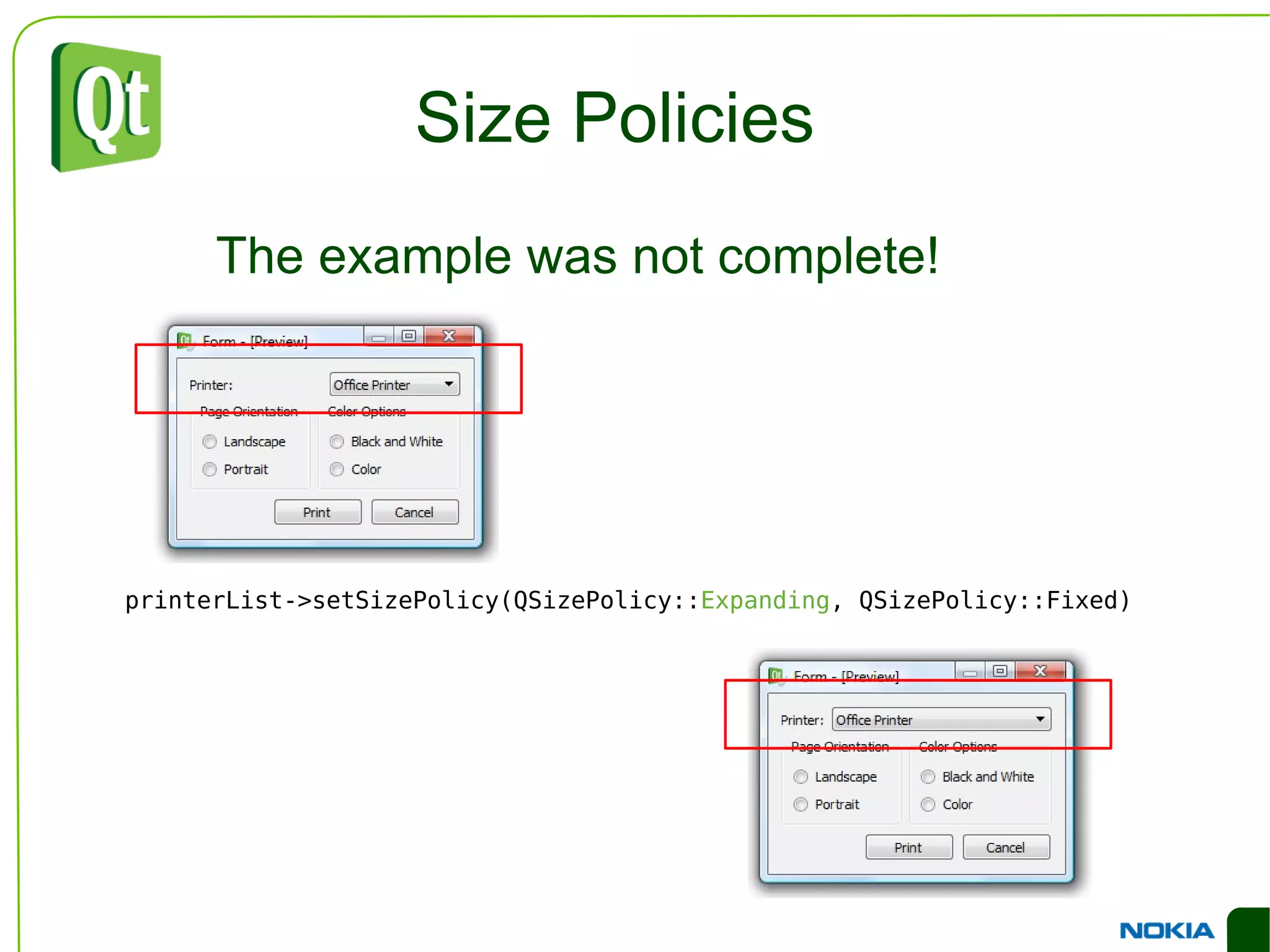
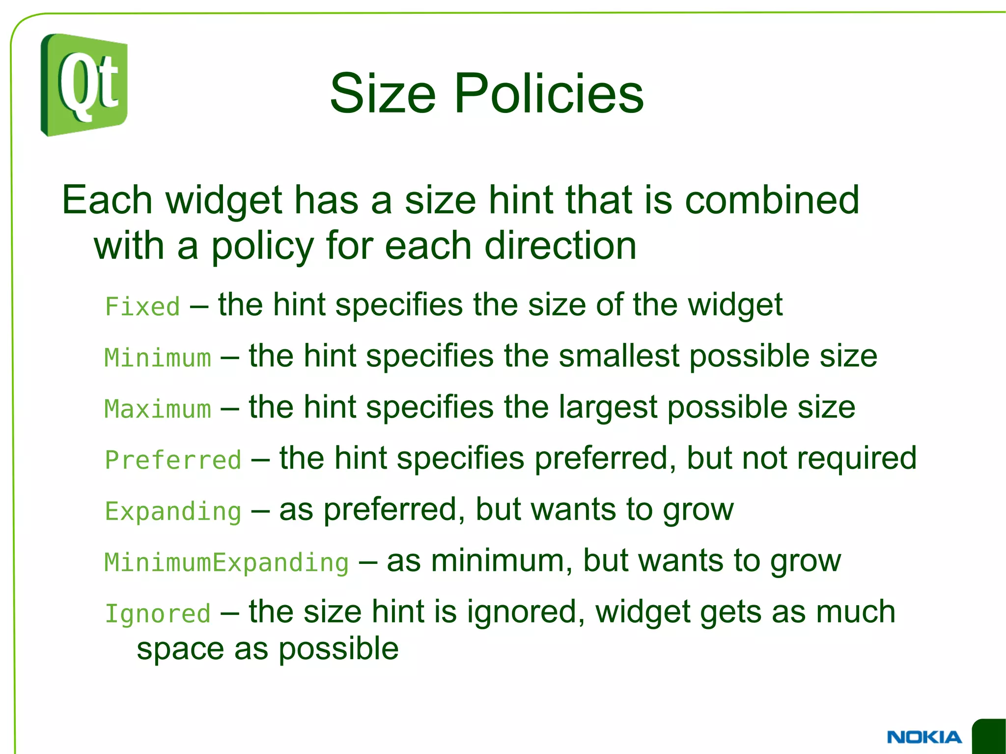
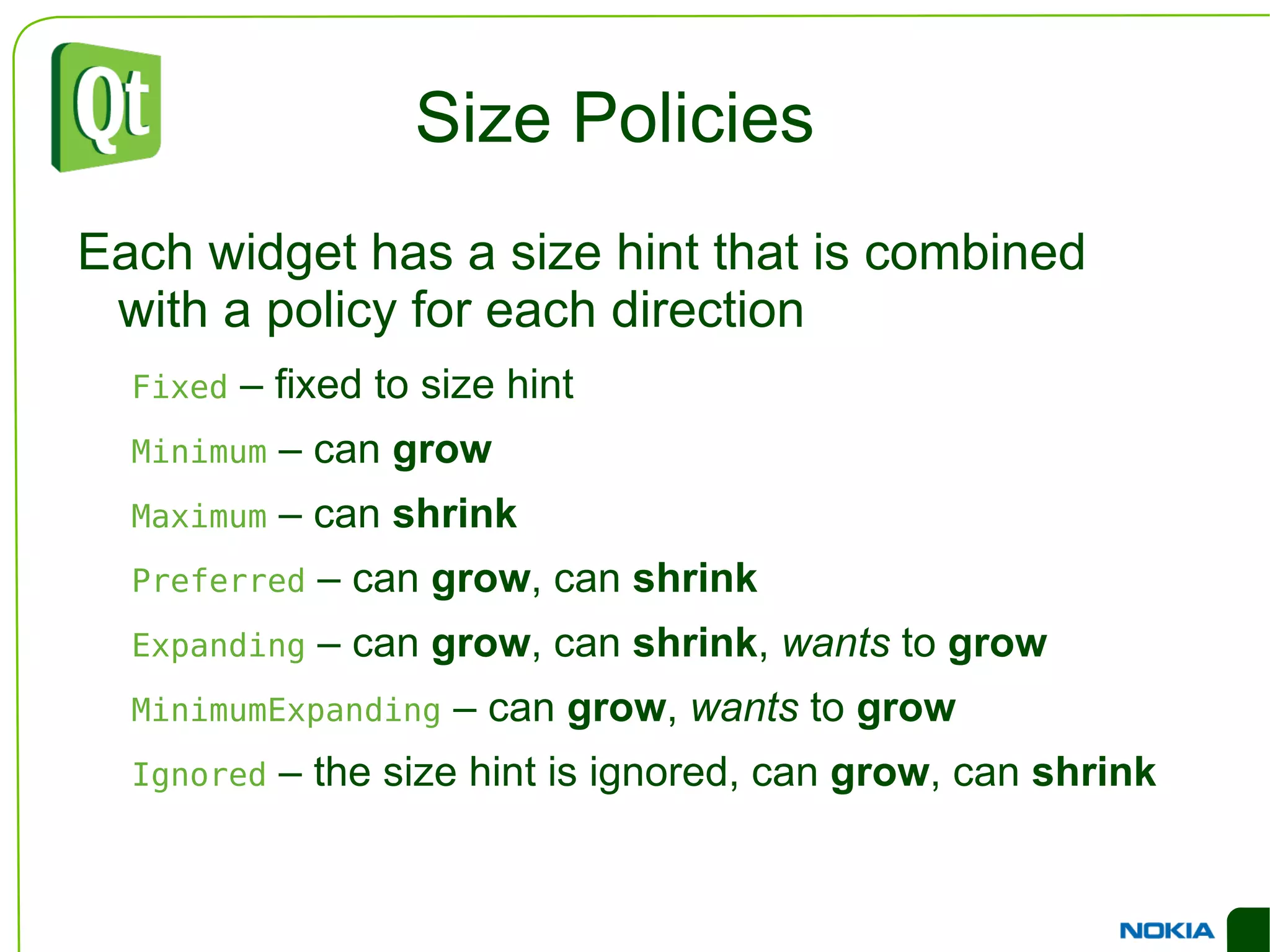
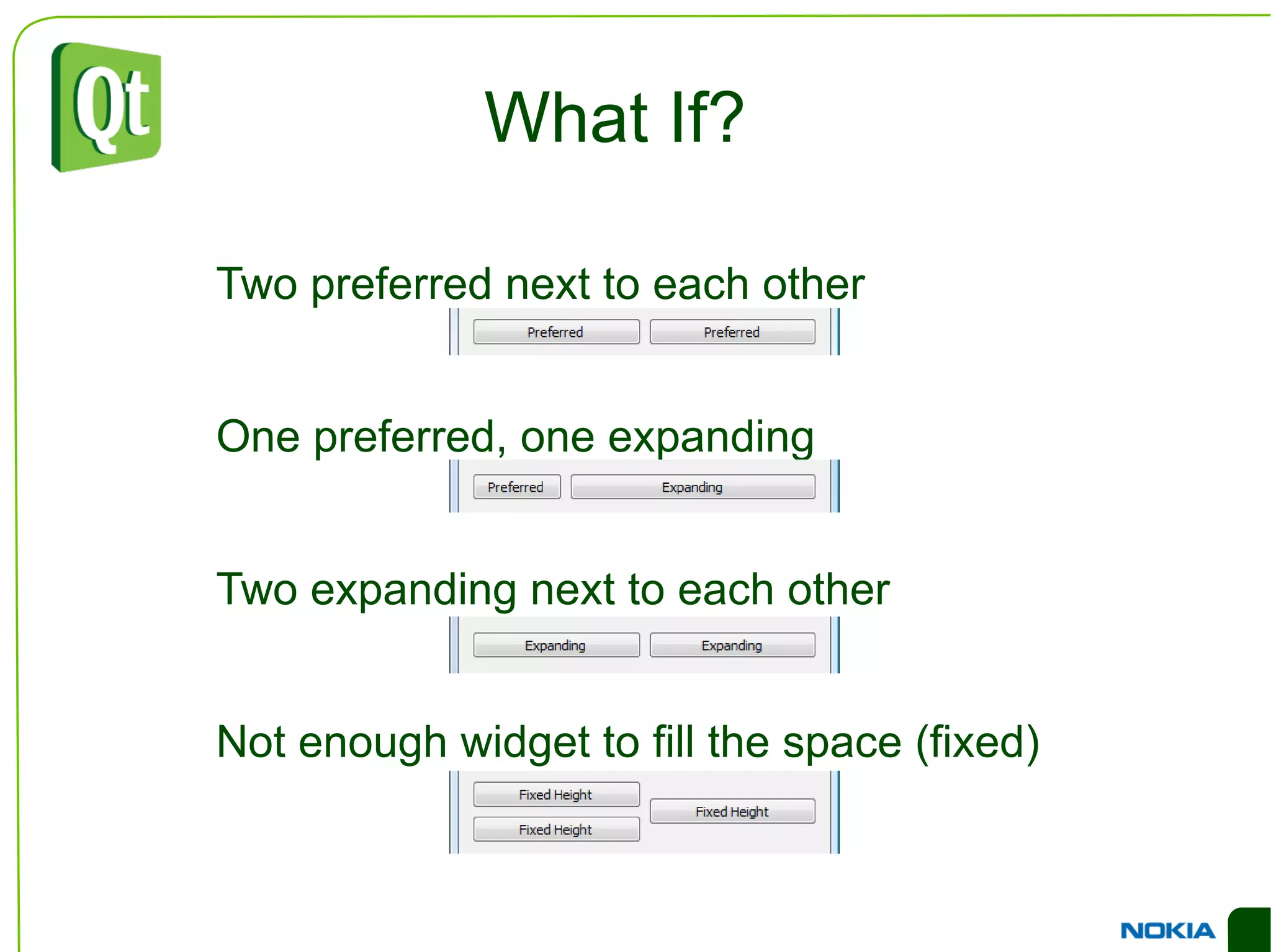
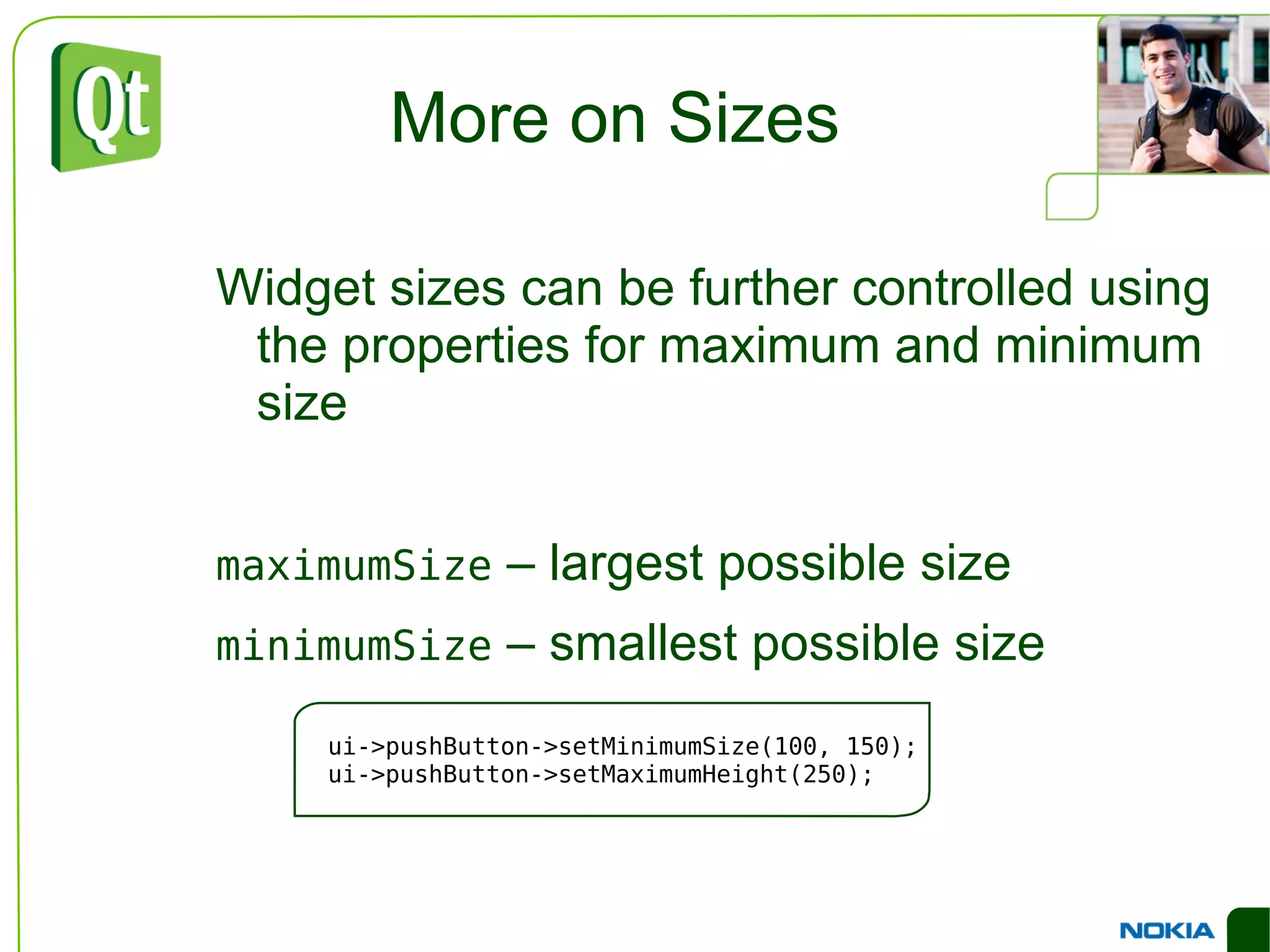
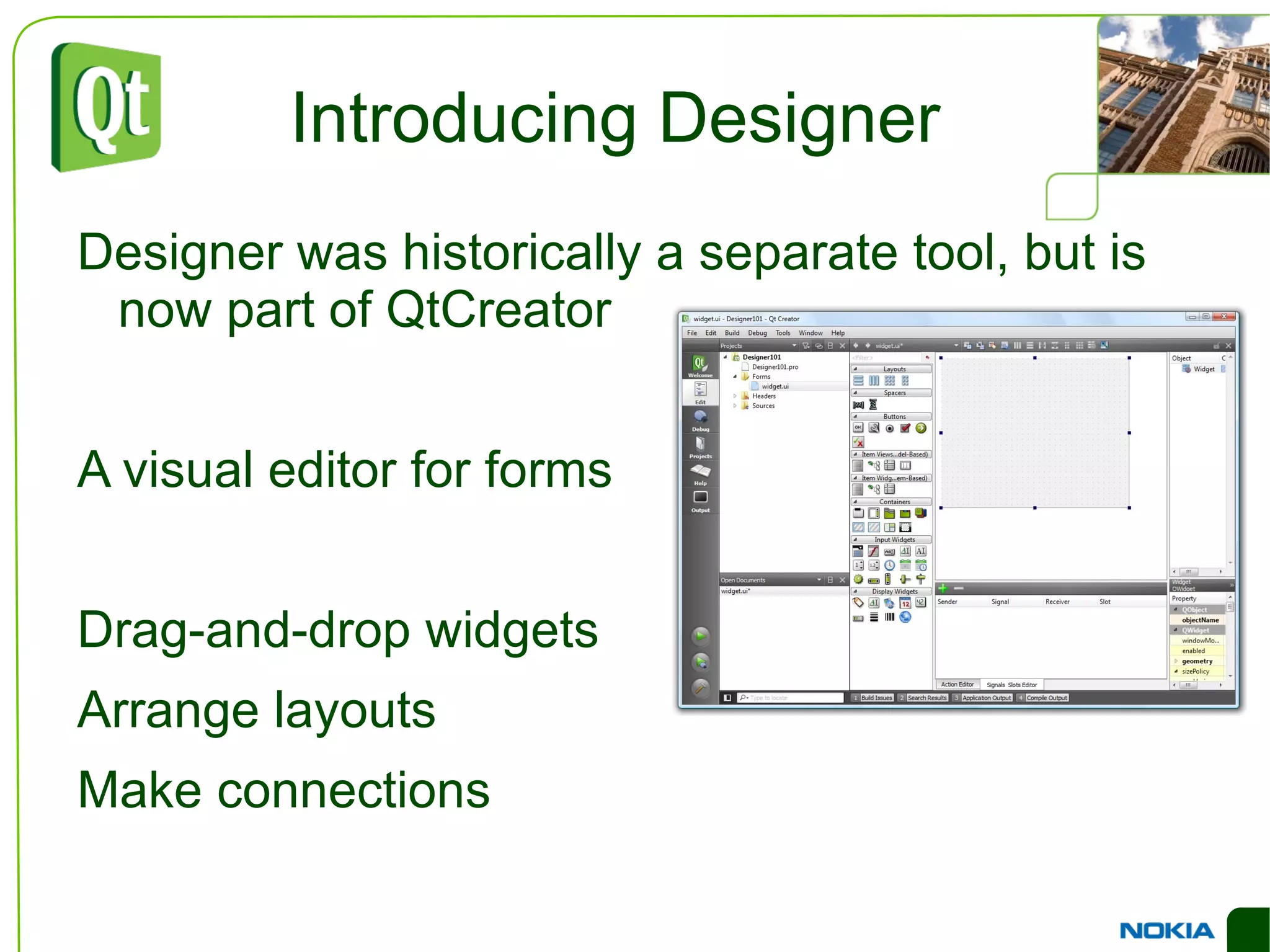
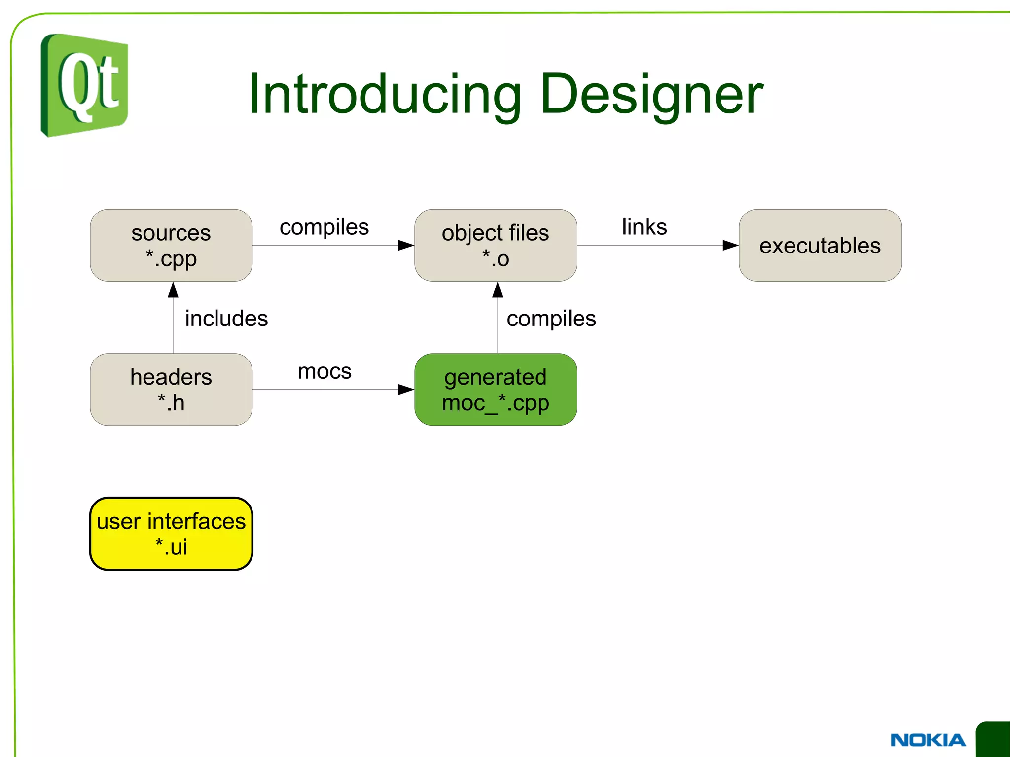
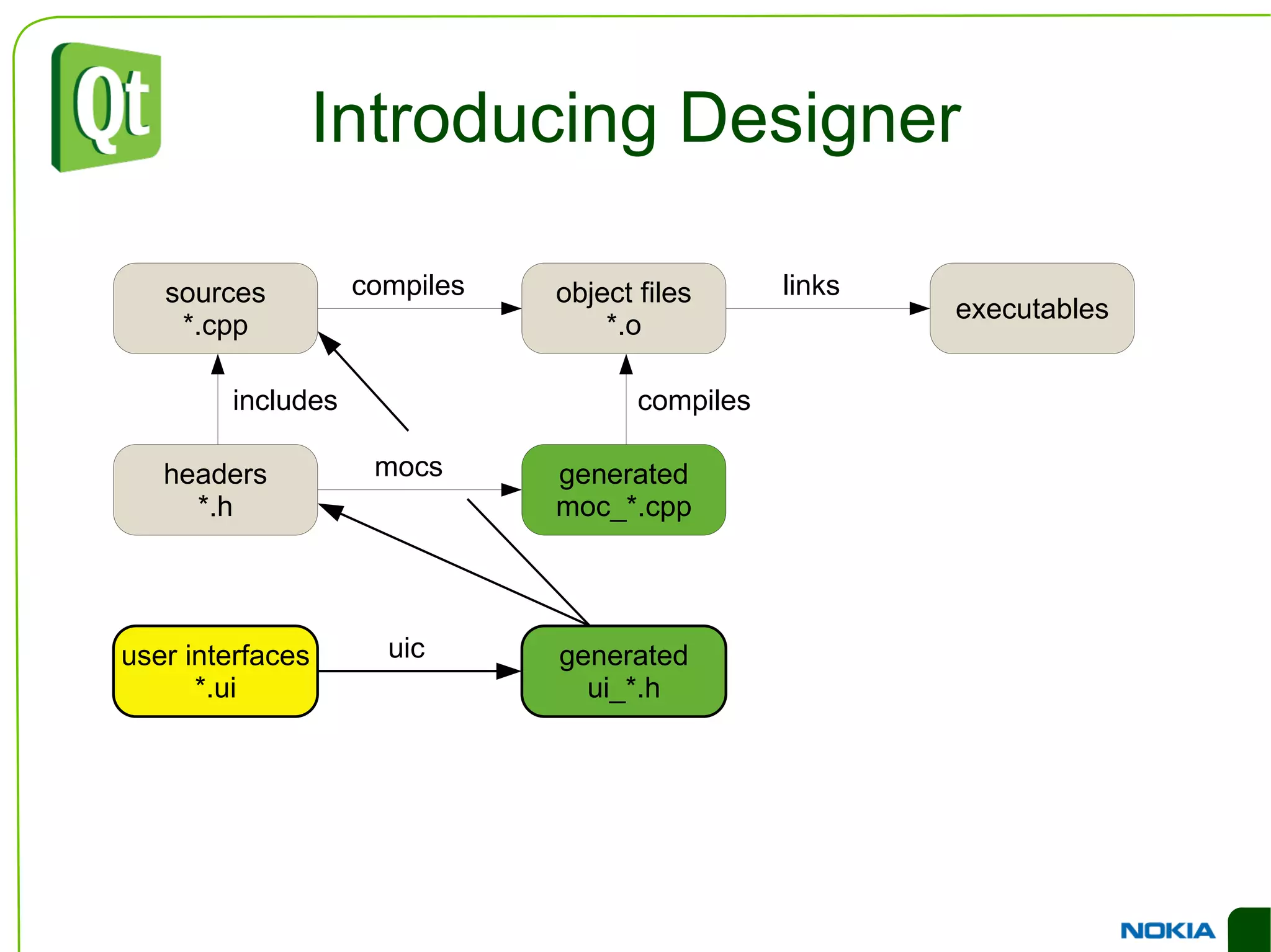
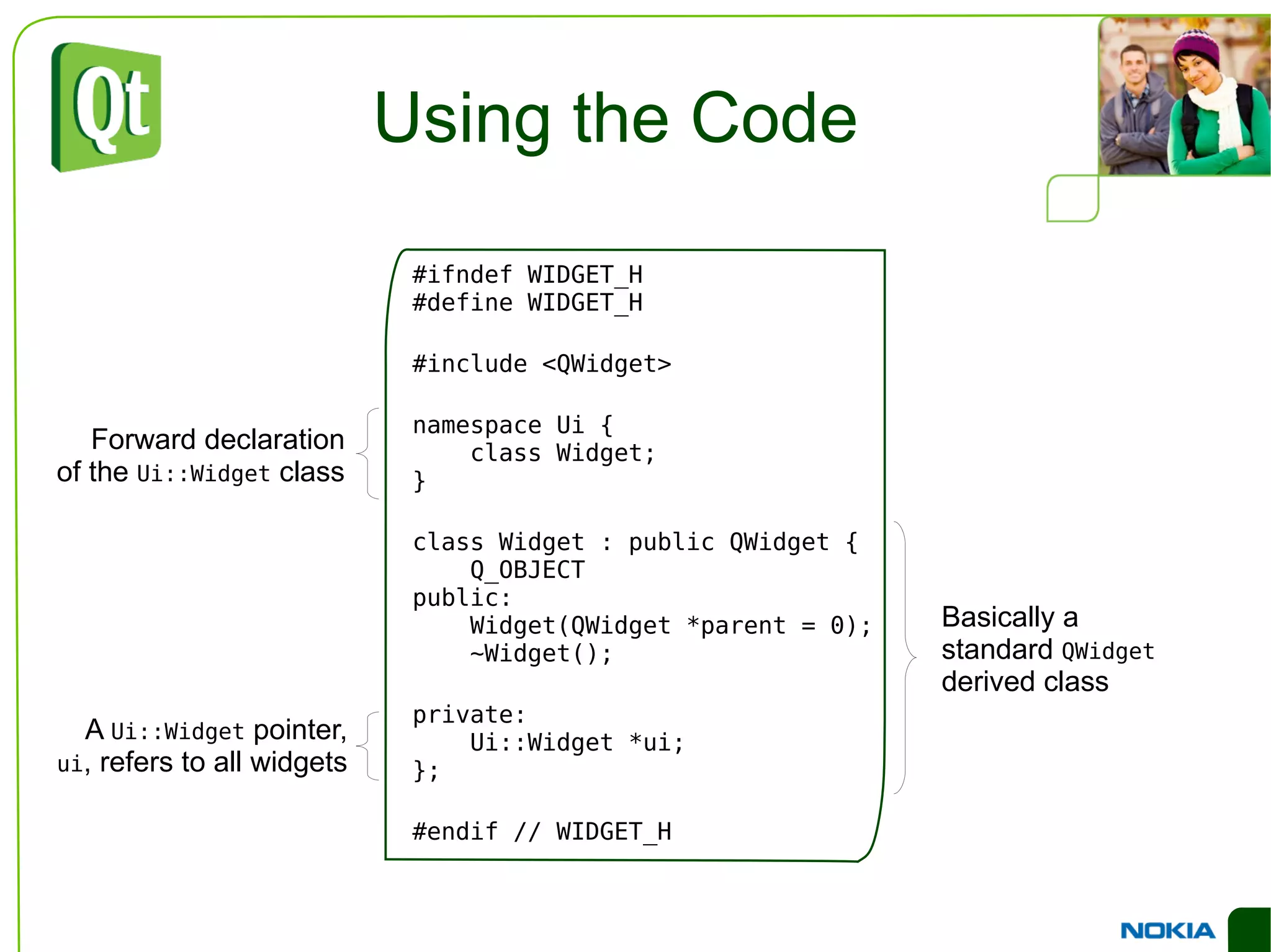
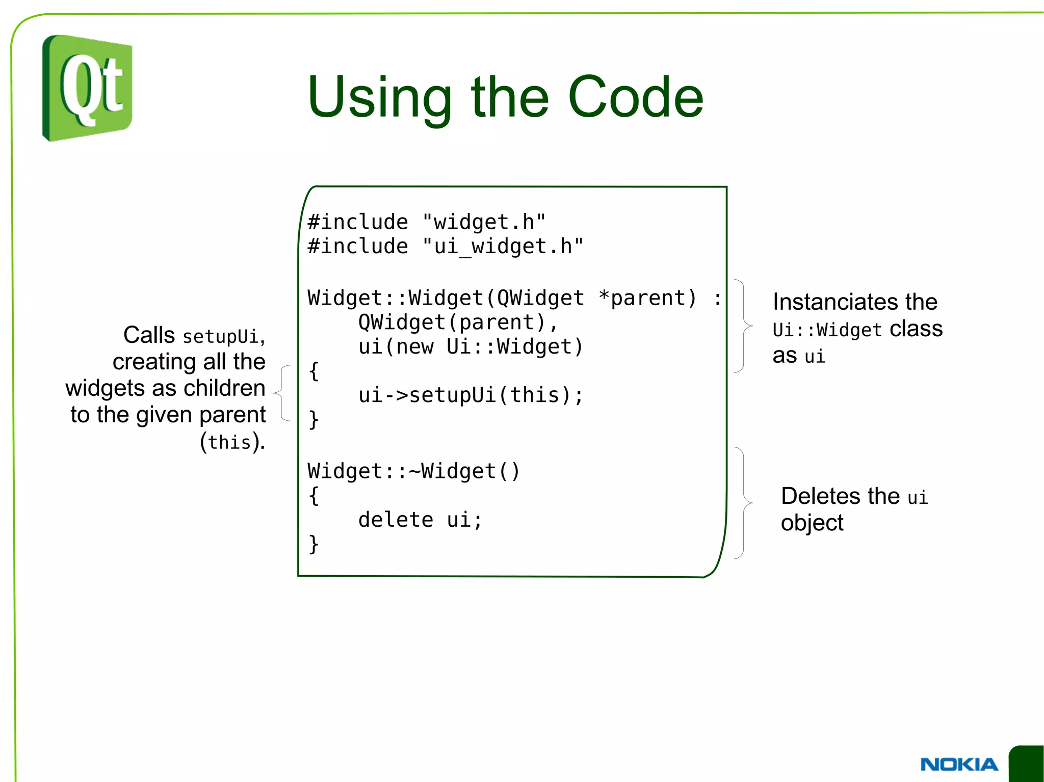
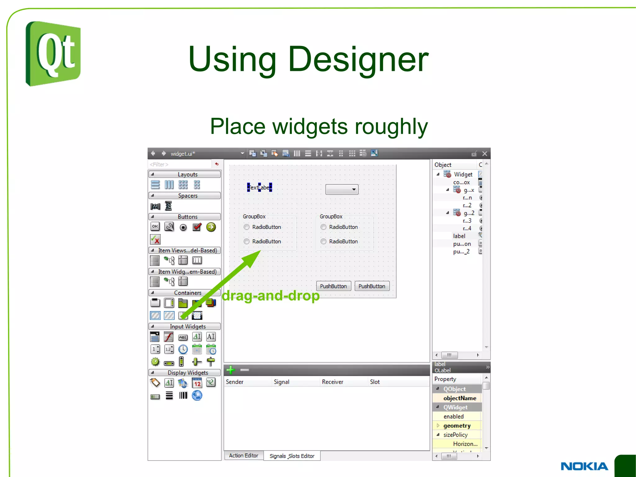
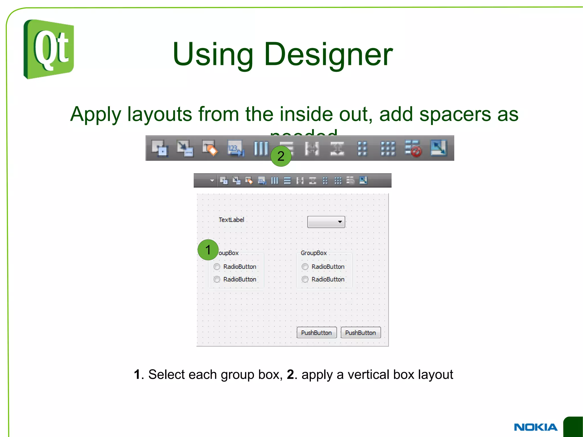
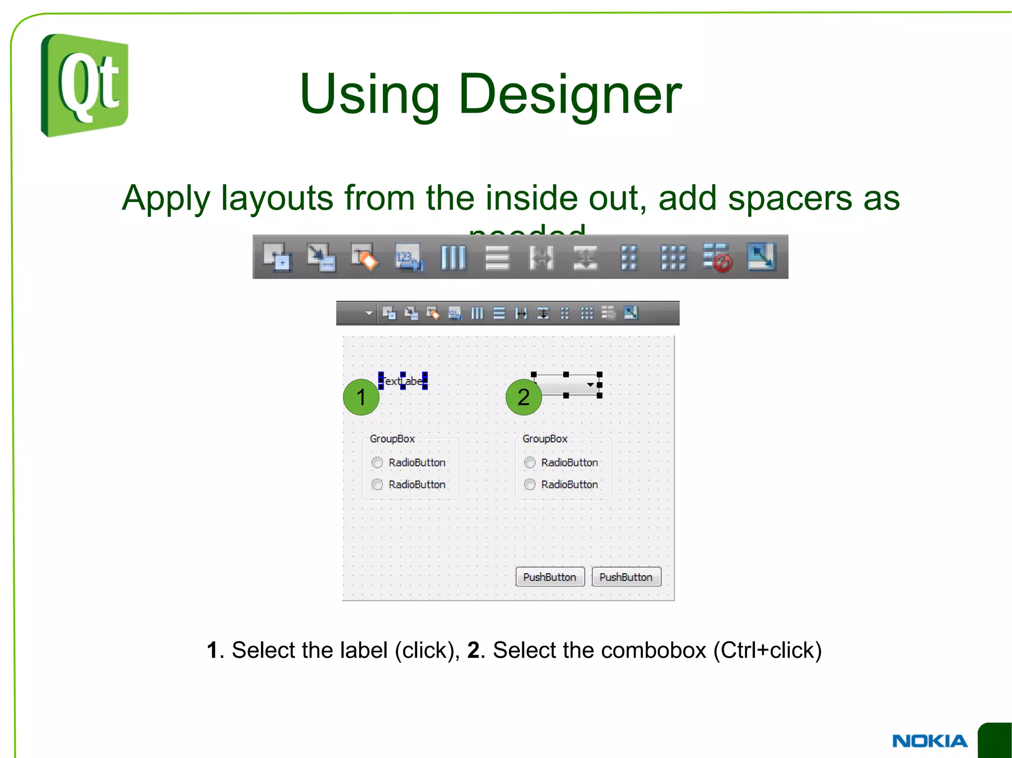
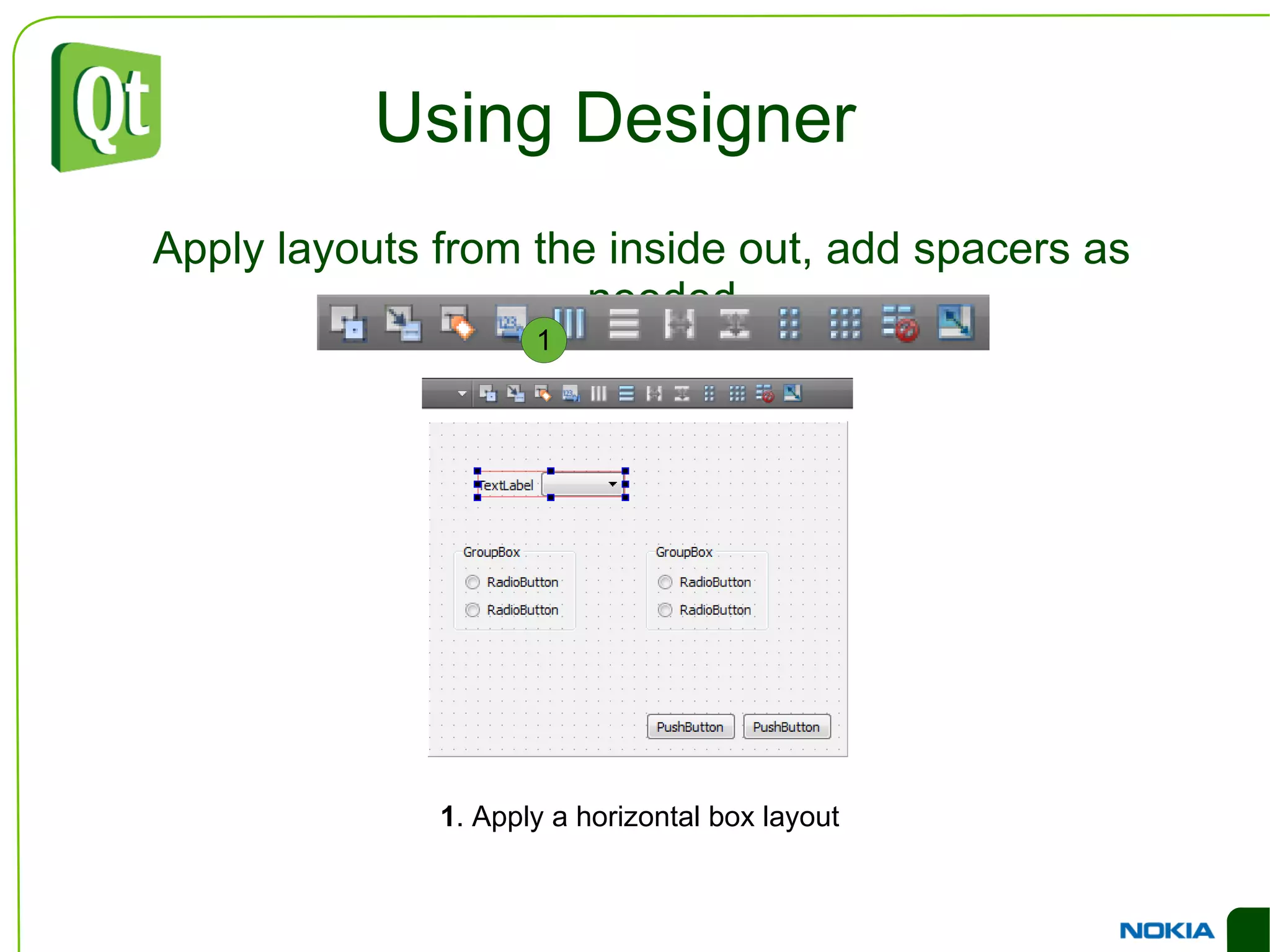
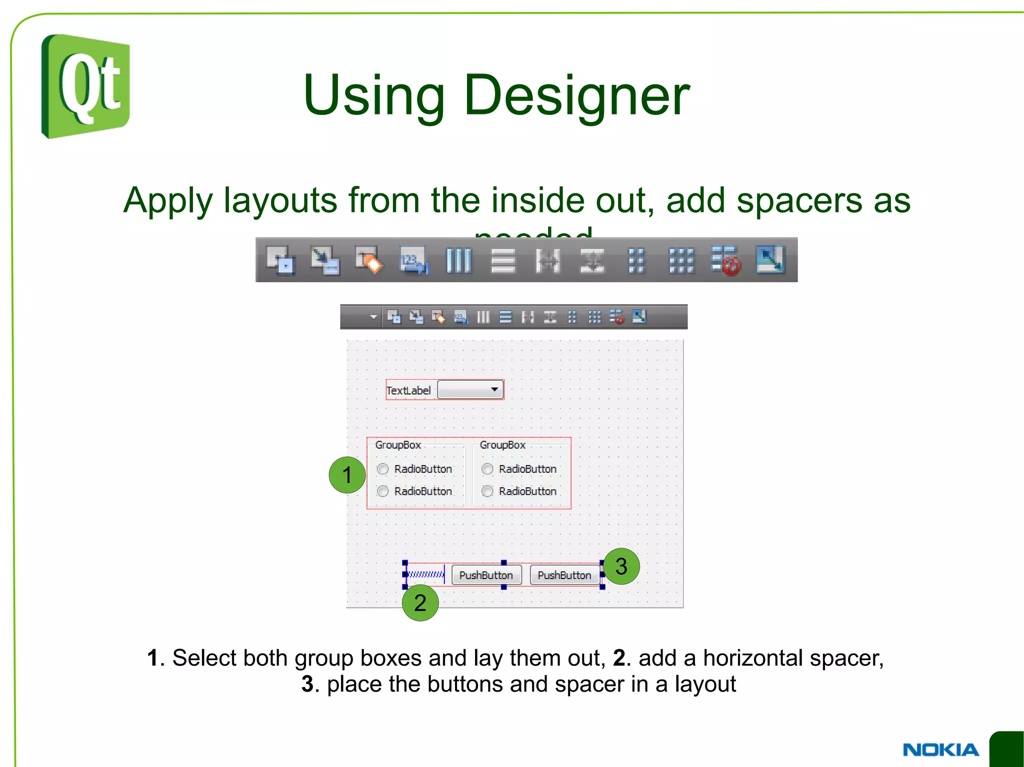
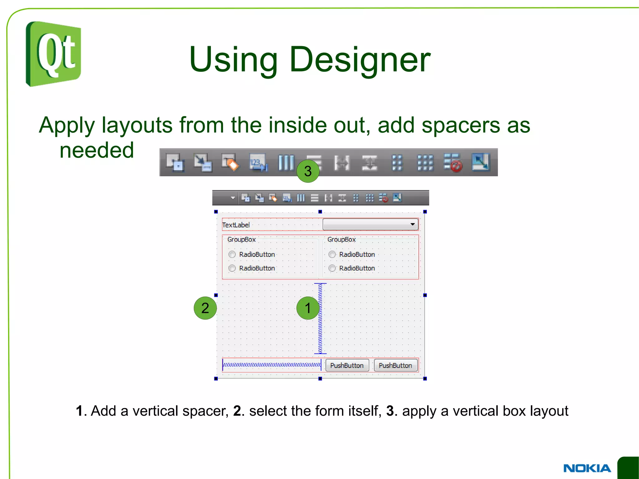
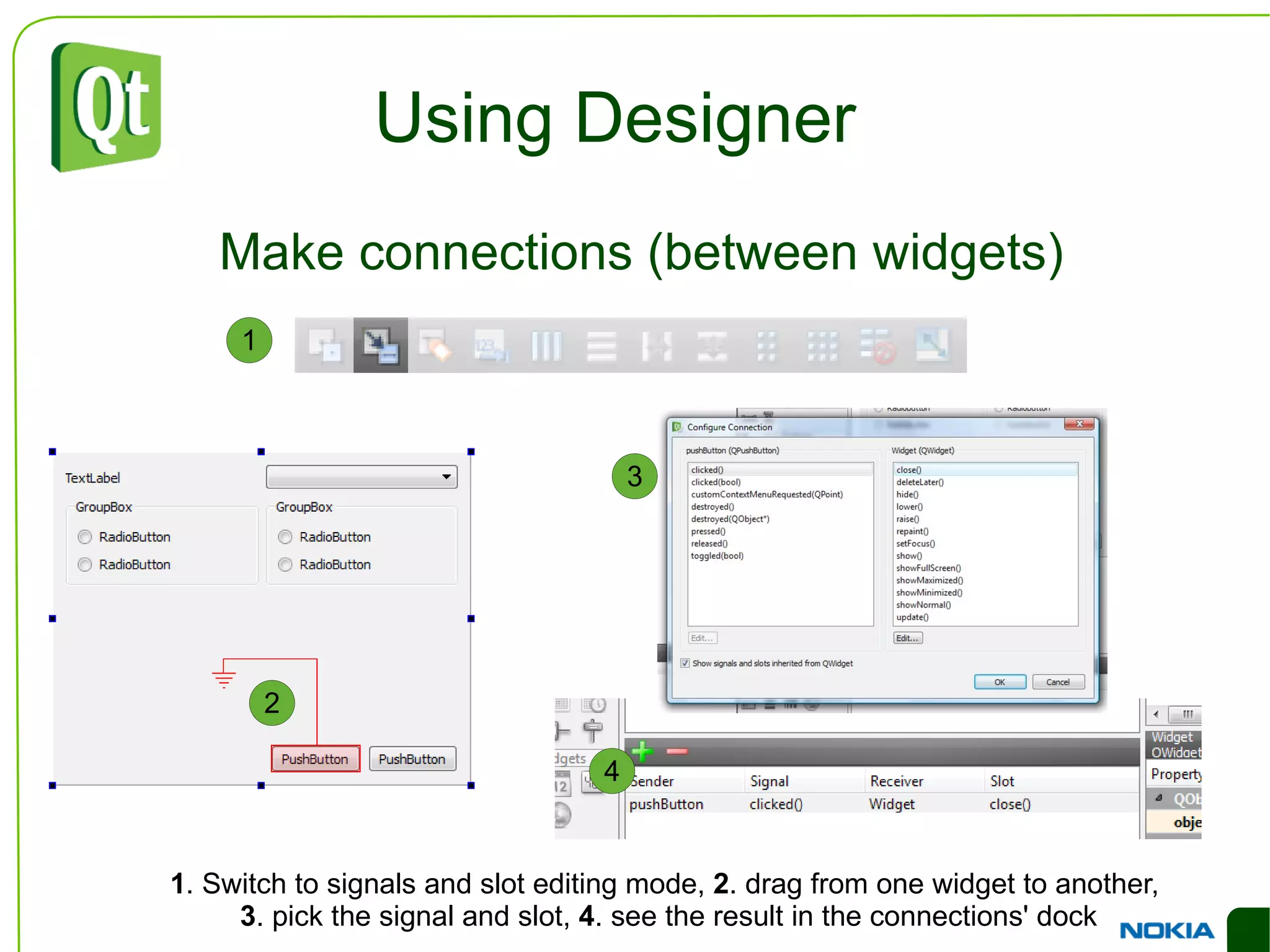
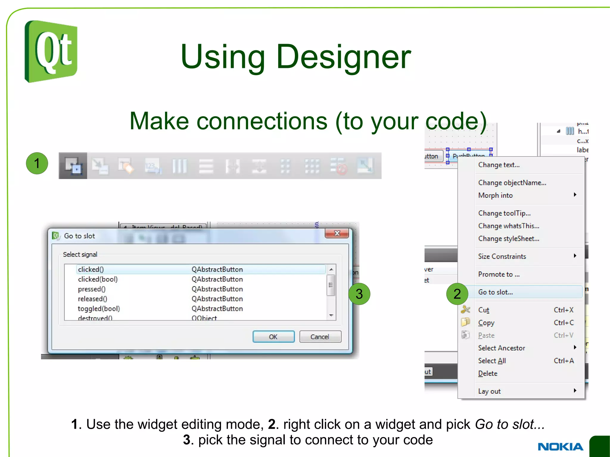
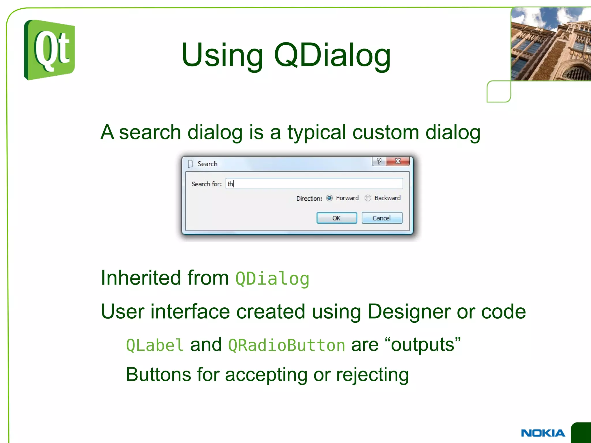
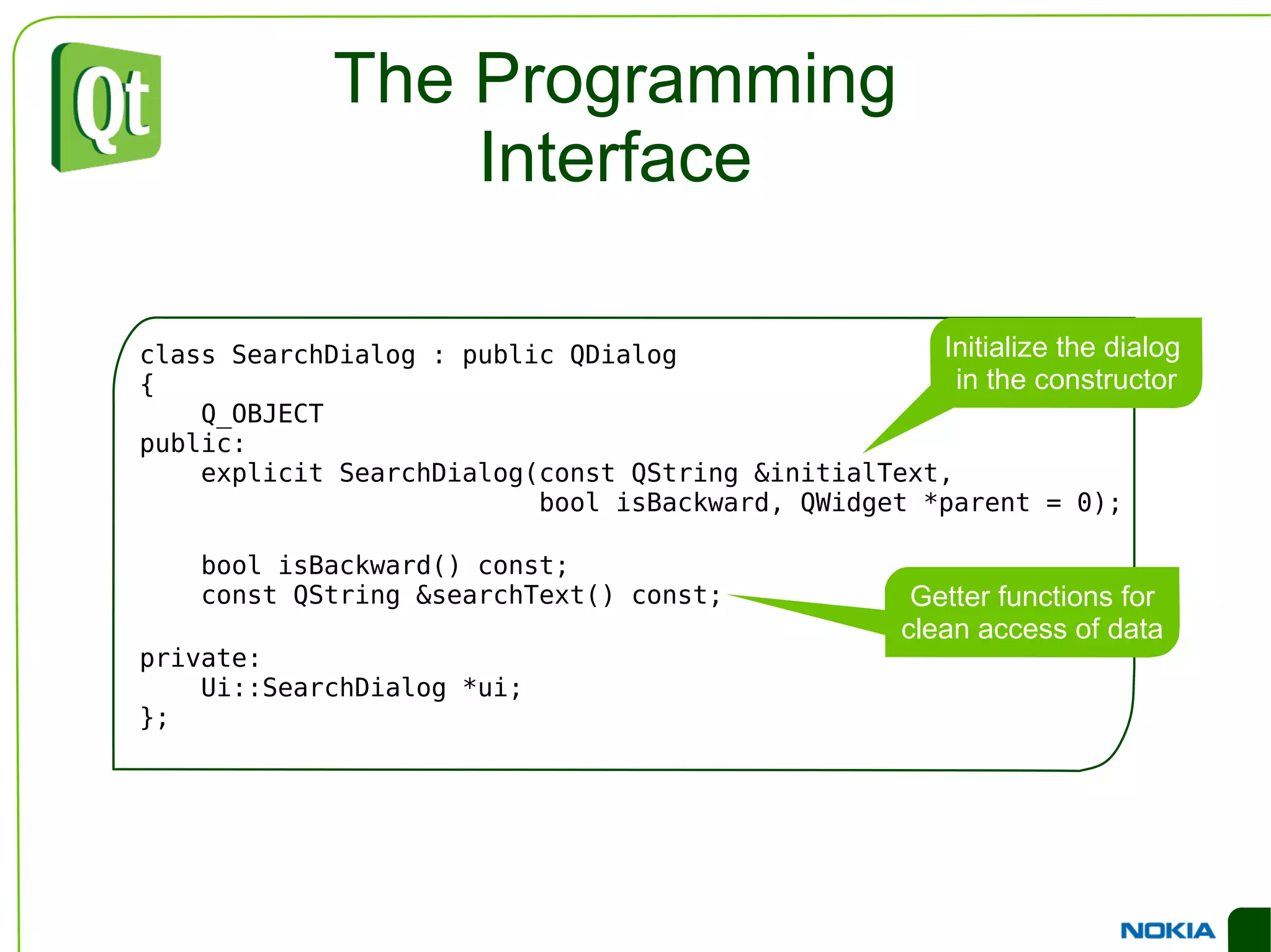
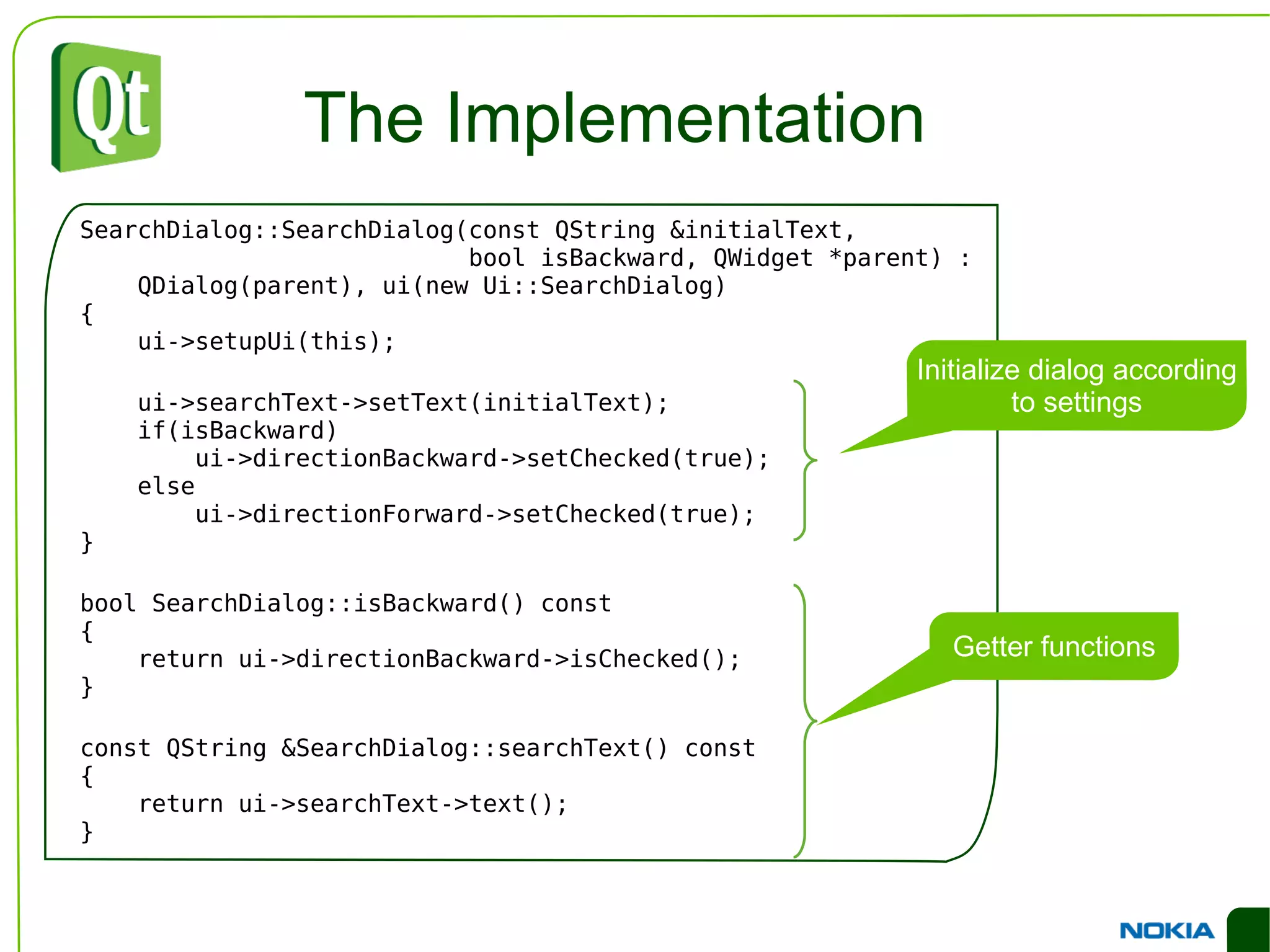
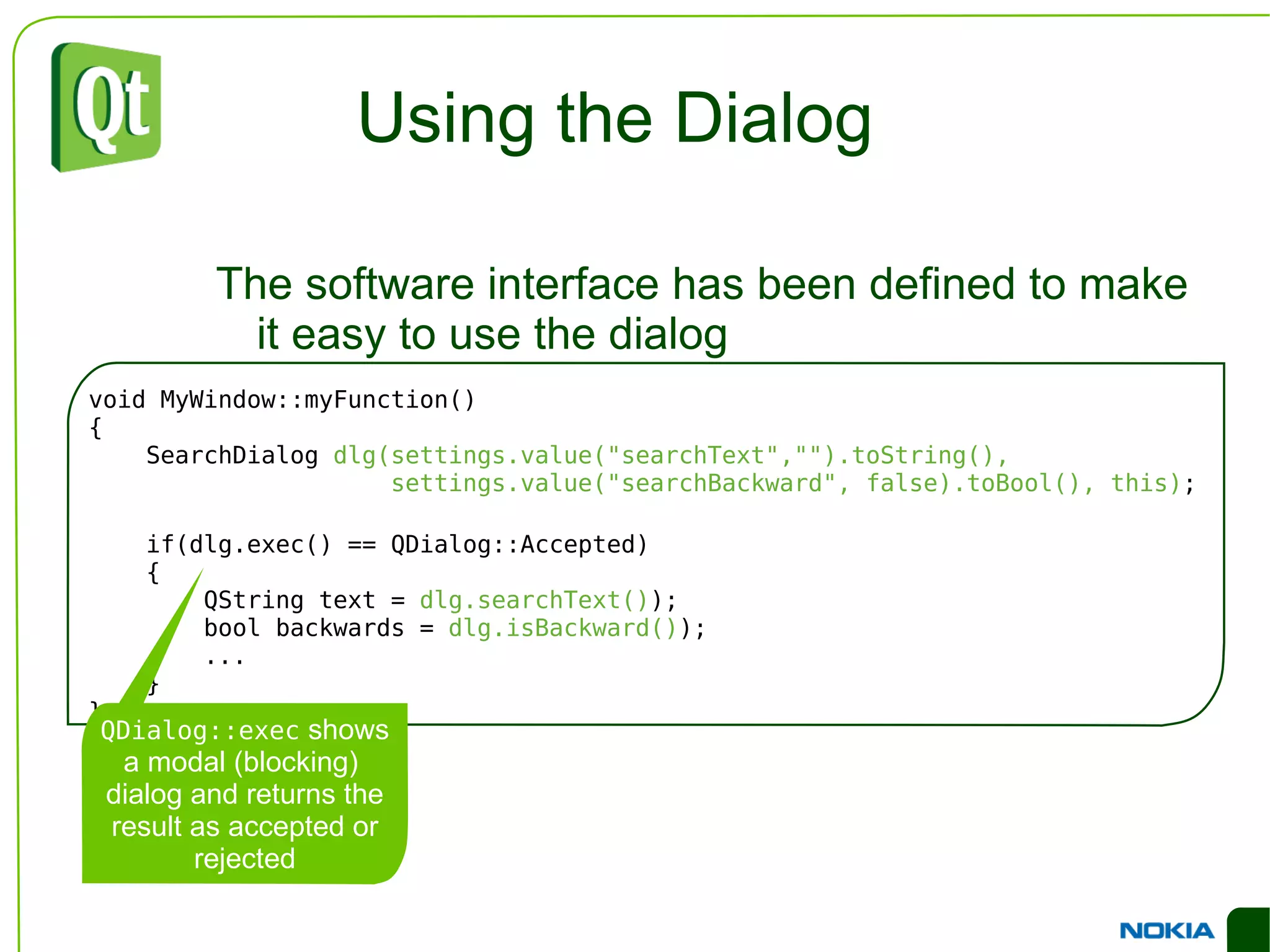
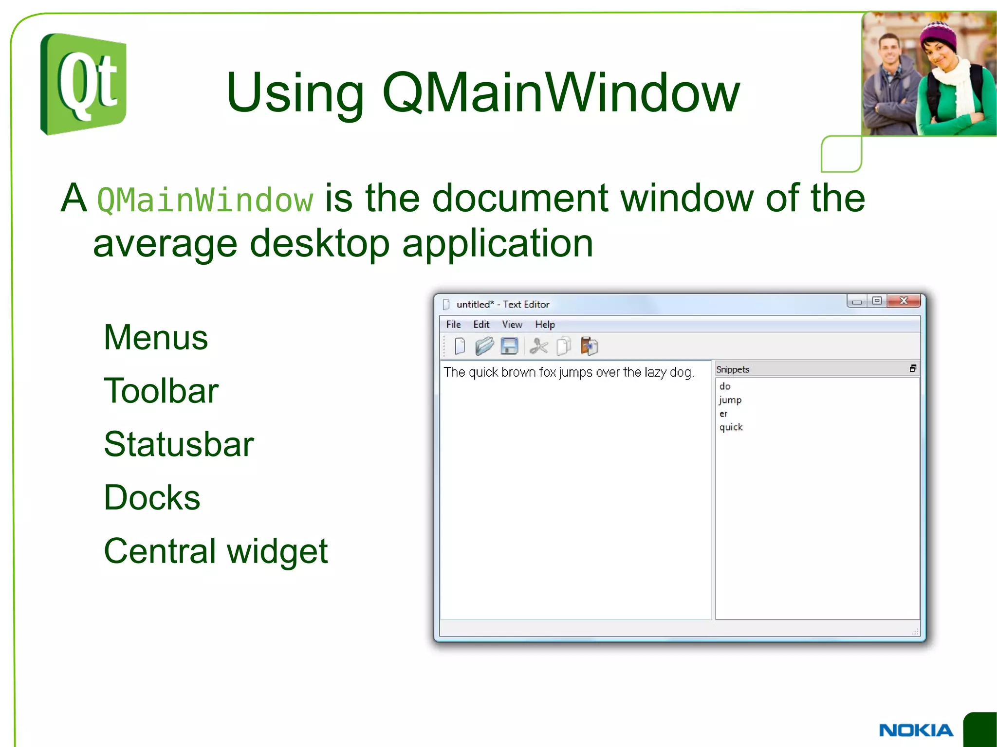
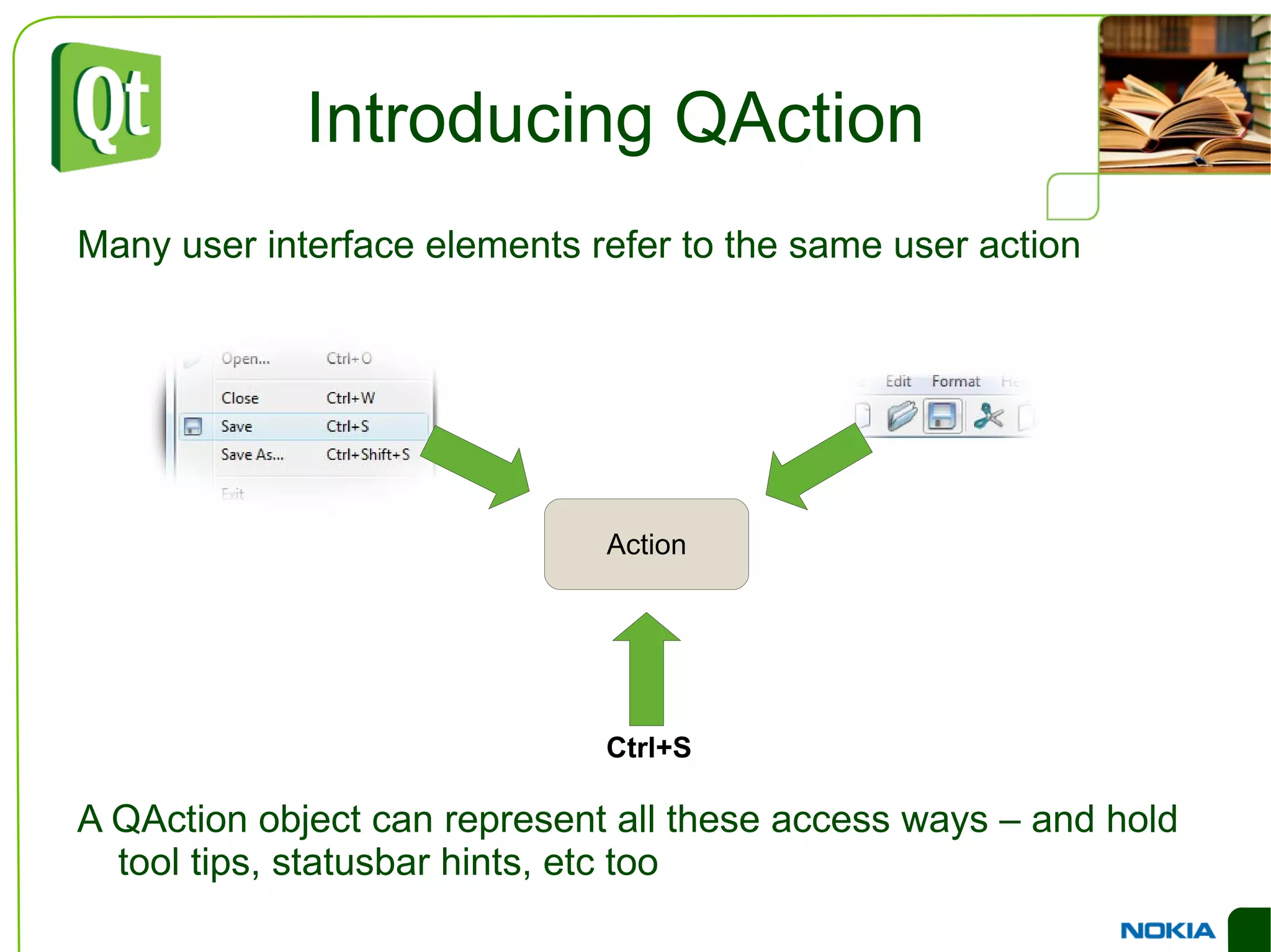
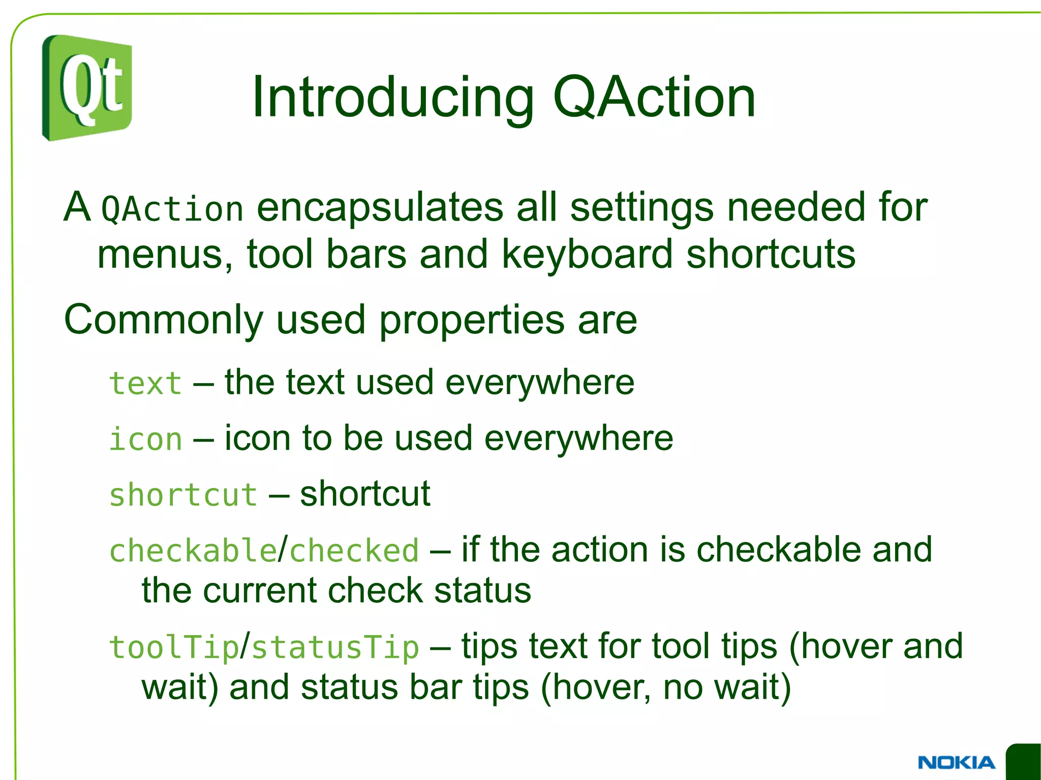
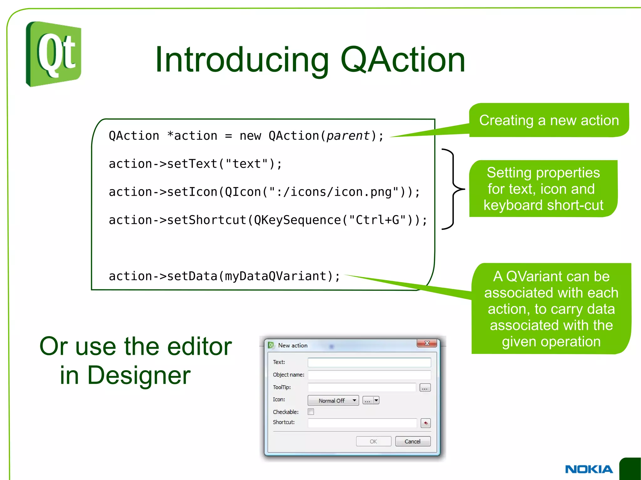
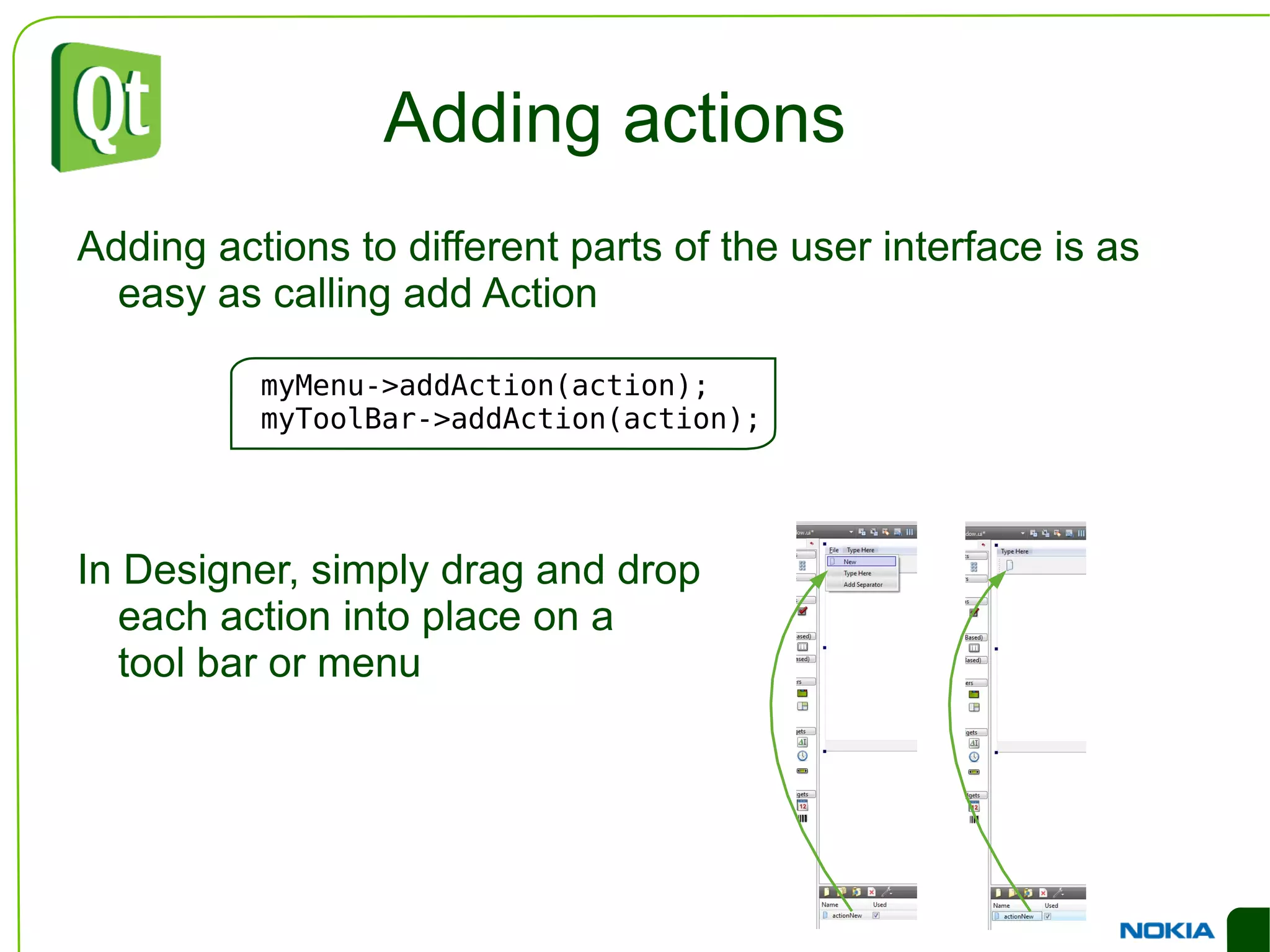
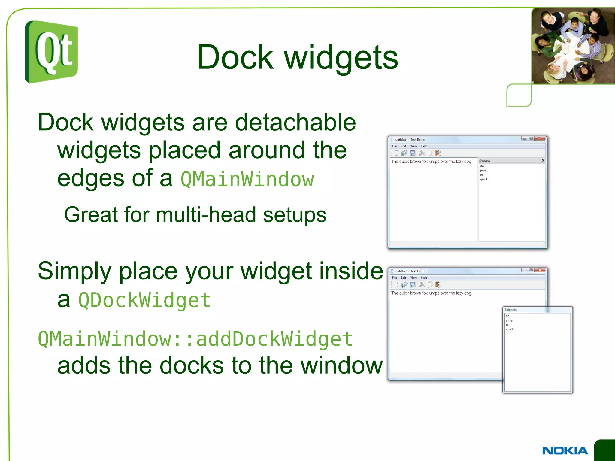
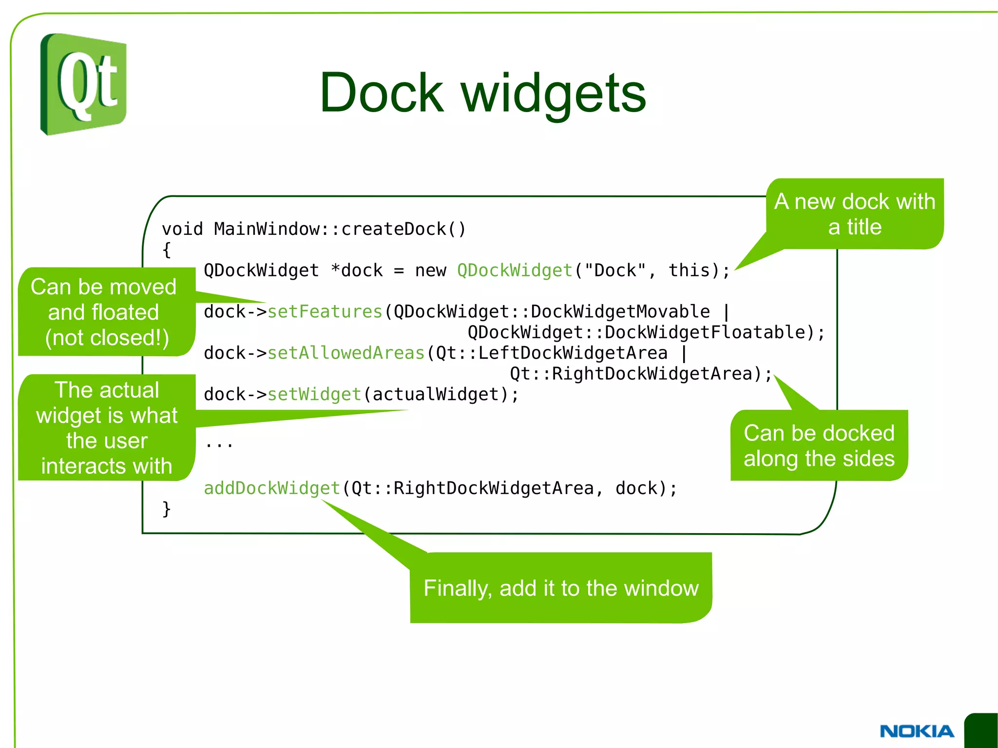

The document provides an overview of using Qt for developing user interface components, focusing on widgets and layouts essential for creating flexible and responsive designs. It explains various widget types, their properties, and how to arrange them using layout managers to enhance UI usability. Additionally, it covers the usage of the Qt Designer tool for visual design and development of applications.


![[4/9] Sistemas embarcados de alto desempenho para tratamento e processamento ...](https://cdn.slidesharecdn.com/ss_thumbnails/03-cubeworkbench-171031095316-thumbnail.jpg?width=640&height=640&fit=bounds)
![[8/9] Sistemas embarcados de alto desempenho para tratamento e processamento ...](https://cdn.slidesharecdn.com/ss_thumbnails/07-exemplodeaplicacao-171031095714-thumbnail.jpg?width=640&height=640&fit=bounds)
![[3/9] Sistemas embarcados de alto desempenho para tratamento e processamento ...](https://cdn.slidesharecdn.com/ss_thumbnails/02-stm32f7-p1-171031095110-thumbnail.jpg?width=640&height=640&fit=bounds)


![[2/9] Sistemas embarcados de alto desempenho para tratamento e processamento ...](https://cdn.slidesharecdn.com/ss_thumbnails/01-cortexm-171031094440-thumbnail.jpg?width=640&height=640&fit=bounds)

![[6/9] Sistemas embarcados de alto desempenho para tratamento e processamento ...](https://cdn.slidesharecdn.com/ss_thumbnails/05-cmsis-171031095533-thumbnail.jpg?width=640&height=640&fit=bounds)
![[5/9] Sistemas embarcados de alto desempenho para tratamento e processamento ...](https://cdn.slidesharecdn.com/ss_thumbnails/04-handsoncomled-171031095419-thumbnail.jpg?width=640&height=640&fit=bounds)
![[9/9] Sistemas embarcados de alto desempenho para tratamento e processamento ...](https://cdn.slidesharecdn.com/ss_thumbnails/08-handsoncomdmaeadc-171031095754-thumbnail.jpg?width=640&height=640&fit=bounds)
![[7/9] Sistemas embarcados de alto desempenho para tratamento e processamento ...](https://cdn.slidesharecdn.com/ss_thumbnails/06-stm32f7-p2-171031095616-thumbnail.jpg?width=640&height=640&fit=bounds)


